
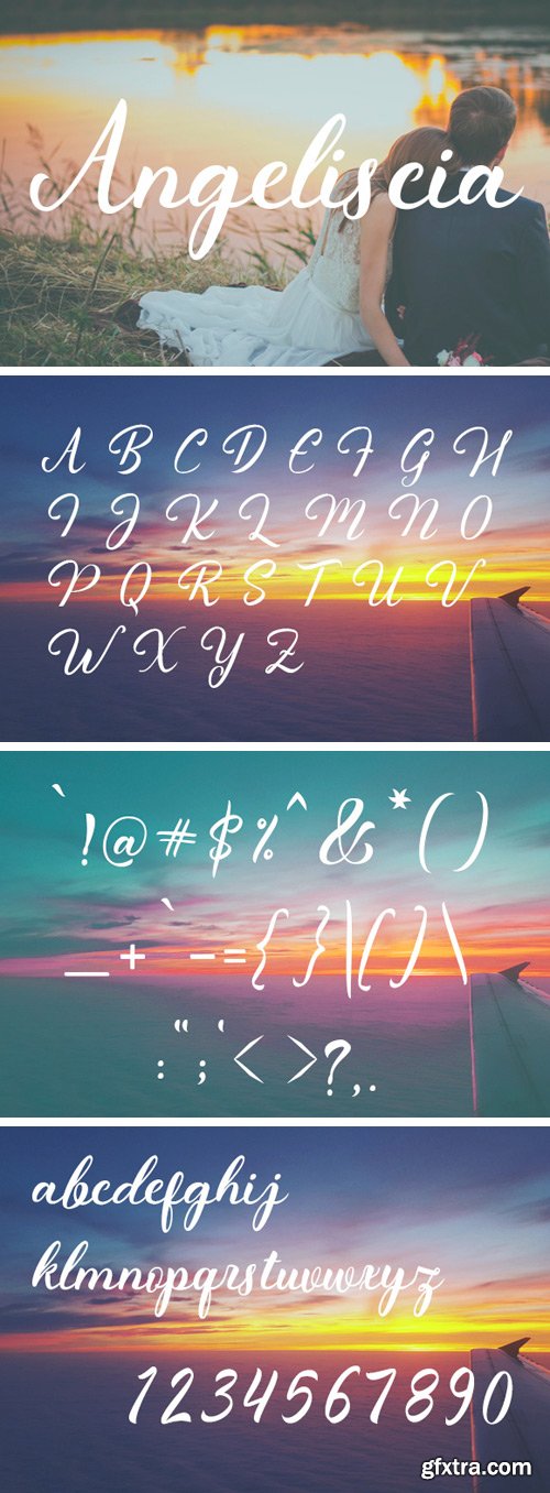
https://www.creativefabrica.com/product/angeliscia/
Angeliscia is a beautiful hand drawn typeface. With it’s clear letters, Angeliscia can help you create a stunning handwriting design.
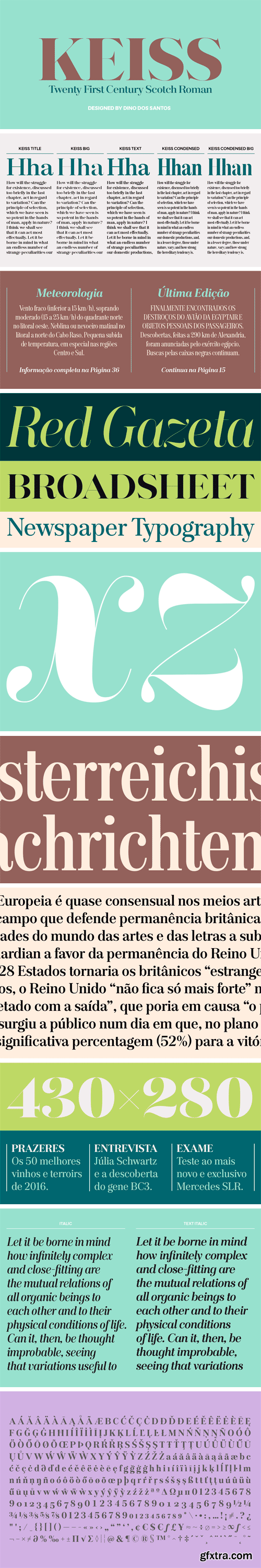
Keiss Type Family - Title, Big, Condensed, Condensed Big
The Keiss type family is our interpretation of the popular nineteen century Scotch Roman typefaces. We intended to keep a very classic approach while introducing a couple of new elements that differentiate this type family from it’s ancestors. This design, with short descenders and ascenders, along with three very distinct optical sizes makes this type family well suited for contemporary newspapers.
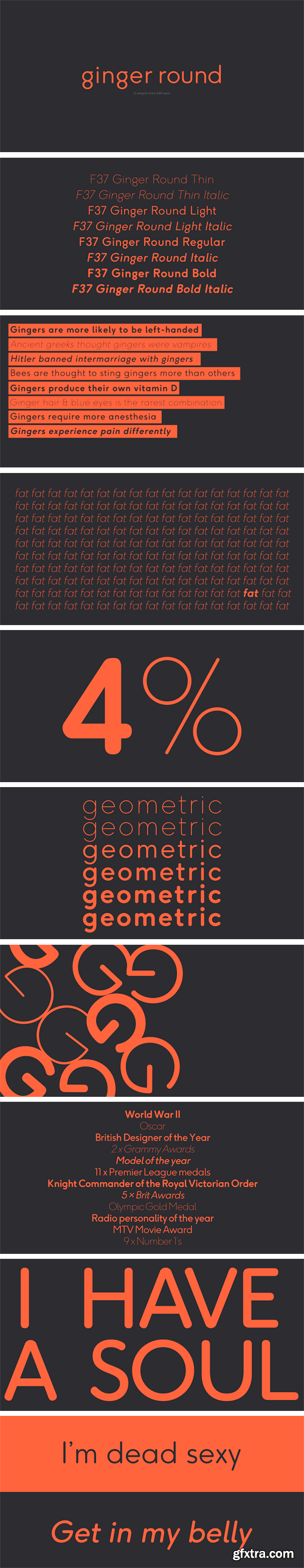
https://www.hypefortype.com/f37-ginger-rounded-10.html
F37 Ginger Round is designed Rick Banks, and is exclusive to HypeForType. F37 Ginger Round is the follow up to the hugely successful F37 Ginger. The family contains alternatives, and covers an extensive range of Latin-based languages, including Western and Eastern European.
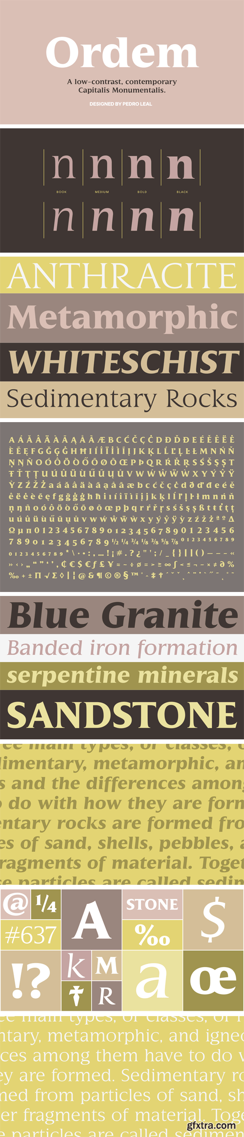
Ordem Font Family
Ordem is the result of a study on the Roman Quadrata, it’s structural proportions and geometric relationships. Reflecting part of the European cultural aesthetic, Ordem is simultaneously very granitic and delicate. The lack of variation in stroke width is part of what makes Ordem look so interesting – a serif font dressed in the more utilitarian clothing of the sans-serif fonts.
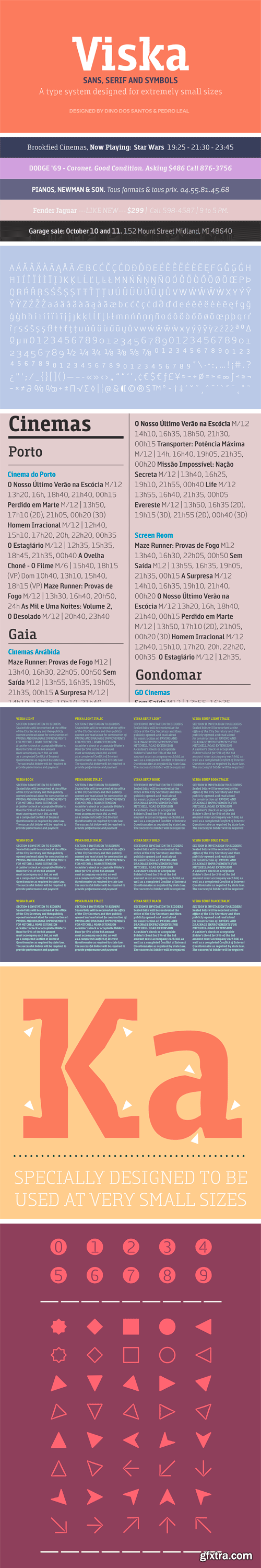
Viska Font Family
Designed to be used in the classifieds section of newspapers and magazines, Viska is a type system containing Sans, Serif and Symbols. Viska might look very weird when used big because it was specially conceived to be used in agate sizes (5.5 points).
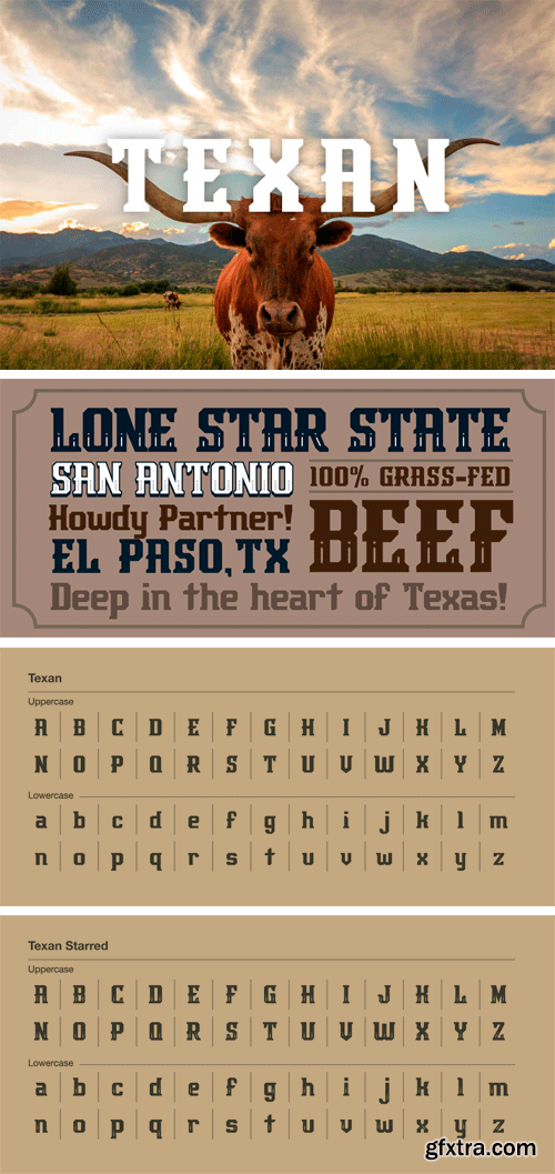
Texan Font Family
They say everything’s BIG in Texas, and this font is no exception. Rustle this one up before it gets away. Comes with both upper and lowercase letterforms and in regular and starred versions.
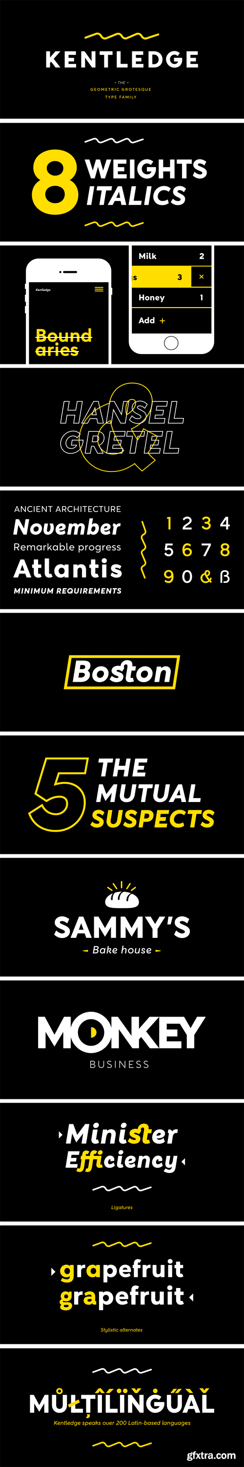
https://www.myfonts.com/fonts/namogo/kentledge/
Kentledge is a grotesque sans type family based on geometric forms that have been optically corrected for better legibility. The family includes extended language support (over 200 languages), alternates, ligatures and more. It is best suited for graphic design and any display / text use.
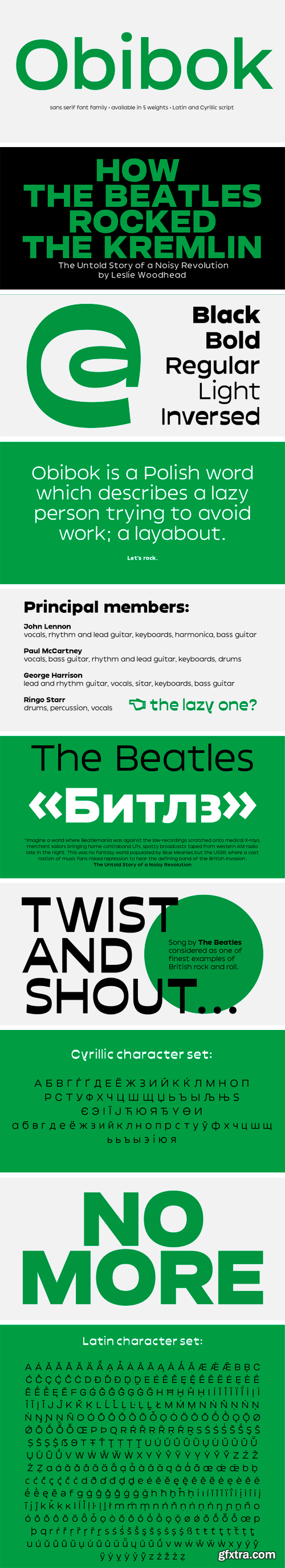
Obibok Typeface
Round shapes building the glyphs seem to be somewhat squarish and lazy – like a tire low on air. Obibok is built on geometric shapes and has a uncommon proportion between lowercase and uppercase letters. The latter are distinguishably lower compared to classical letter proportions, feeling almost like small caps. Besides the height proportion, uppercase letters are quite wide, which is an overall quality of the typeface.
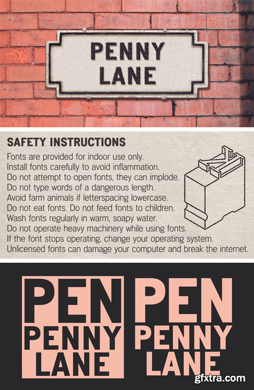
https://www.myfonts.com/fonts/k-type/penny-lane/
PENNY LANE is a sans serif derived from twentieth-century cast-iron signs displaying Liverpool street names. Although the lettering used for vintage street signs varies in width and style, the semi-condensed Penny Lane Bold is fairly typical. The waist of letters like X and Y is positioned on the midline so may appear unusually high, the G is without a crossbar, and pointed characters like the Z might seem at odds with generally grotesque letter shapes.
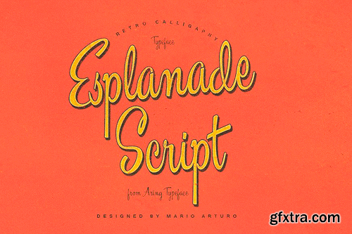
https://creativemarket.com/MansGreback/1120593-Esplanade-Script
High quality script font with multilingual support and a large number of special characters. Designed by Mario Arturo and Måns Grebäck, this hand-crafted typeface works great in logotypes and for titles and slogans.
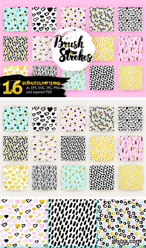
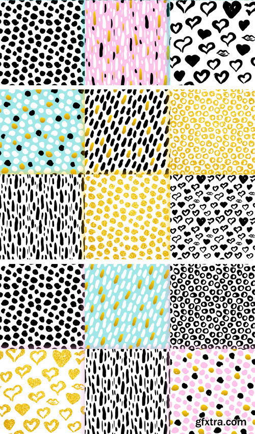
https://designbundles.net/anna_leni/55232-brush-strokes-trendy-seamless-patterns
Brush Strokes Trendy Seamless Patterns. Vector illustrations with hand drawn grunge hipster textures.
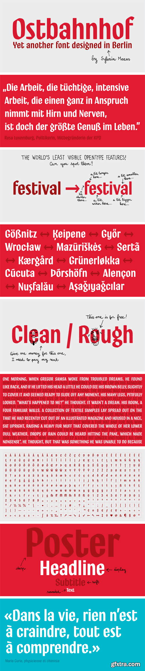
https://www.myfonts.com/fonts/sylvain-mazas/ostbahnhof/
Ostbahnhof is a headline font inspired by both german blackletter and hand-painted signs. The 4 weights can be combined together to achieve a fancy letterpress effect, where slightly rounded corners are not proportional to the font size.
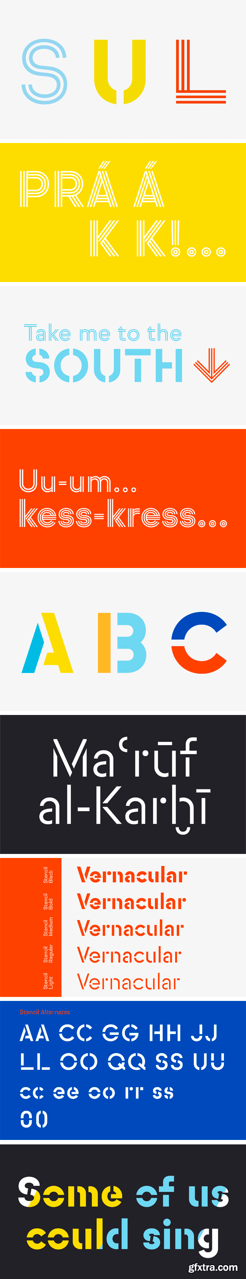
Sul Effects Font Family
Sul Effects is a group of constructivist spin-offs of Sul Sans comprising five stencil weights, a double-line and a triple-line. They emphasise the construction of the original Sul Sans by exposing the geometric elements that form the letters.
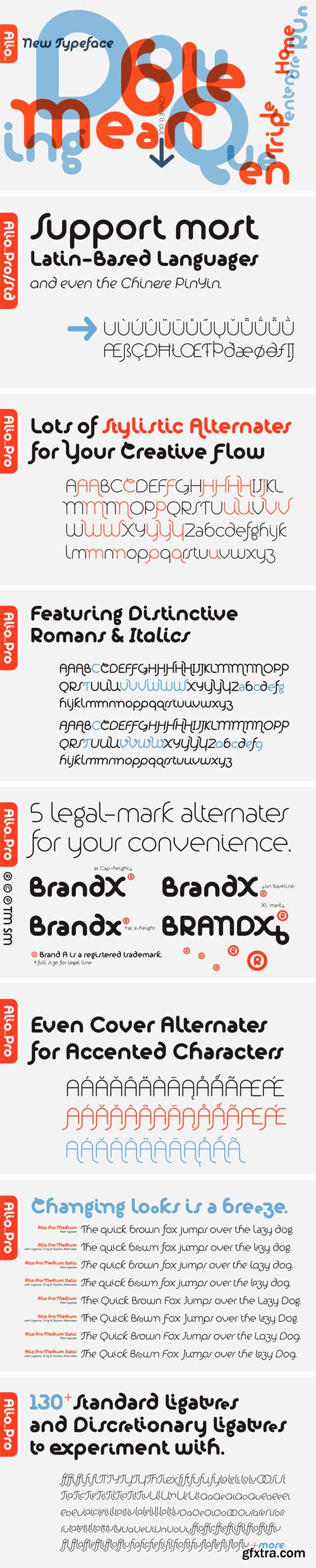
Alio Pro Font Family
Inspired by sleek sans serifs and flowing cursives, Alio™ features the best of both worlds. The hybrid modular design gives you tons of alternates and options to play. Just let your creativity flow and enjoy creating a broad range of styles from minimalistic modern to decorative flourish.
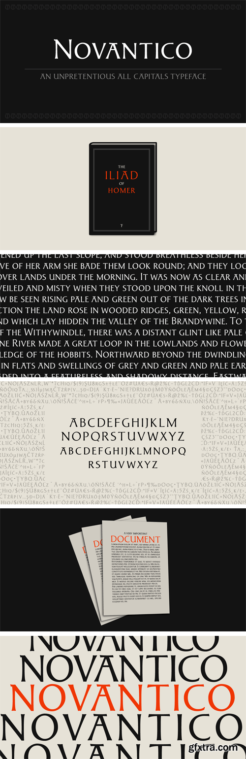
https://www.myfonts.com/fonts/typofactura/novantico/
Novantico is an all capitals typeface, influenced mainly by roman inscriptional capitals and renaissance typefaces. Classicly designed forms give text a noble and elegant feel. It is intended to be used for relatively short and important texts, titles, headings, quotes, etc.
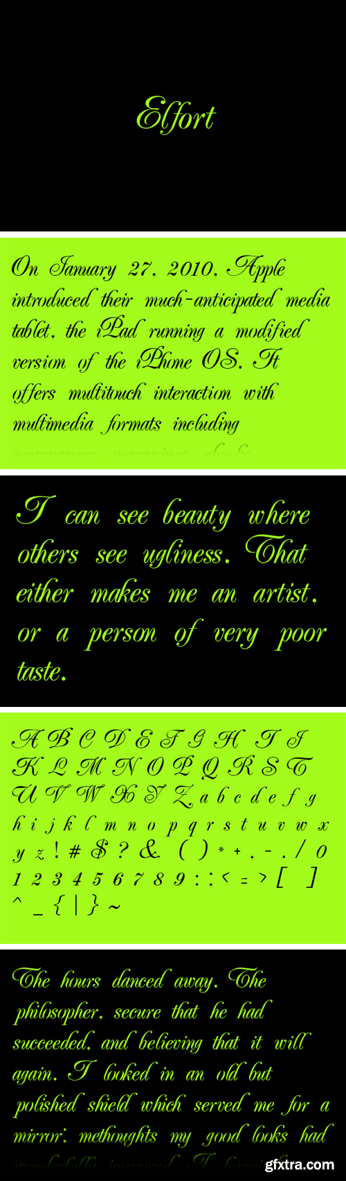
Elfort Font
A lovely script face remastered from found drawings, great for antique, vintage and romantic designs.
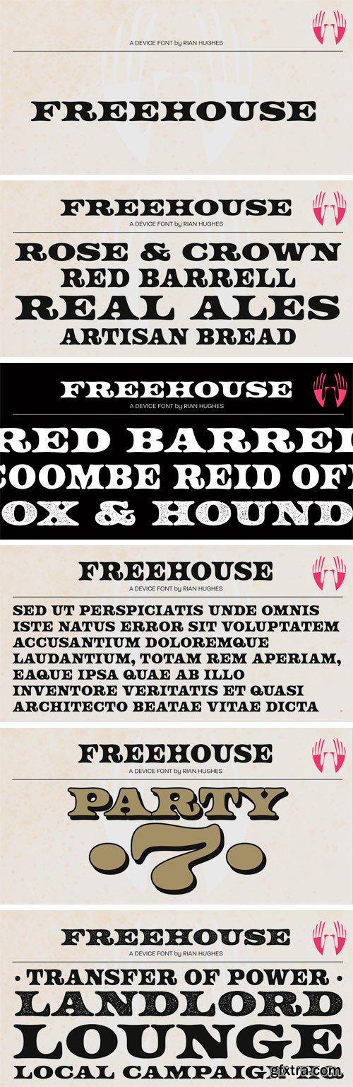
https://www.myfonts.com/fonts/device/freehouse/
Freehouse is a reinterpretation of the well-remembered Watney’s logo, a brewery and pub chain infamous for its poor quality beer and brutalist decor. In Design Research Unit’s corporate guidelines from 1966 the font is described as Clarendon Bold Expanded — however, this is not the case.
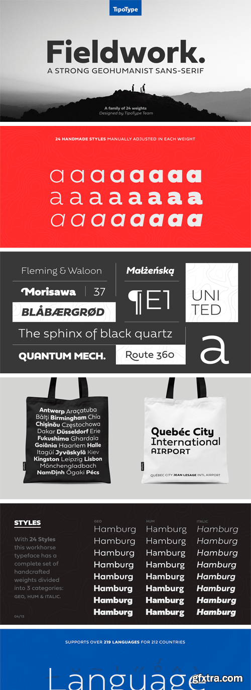
https://www.myfonts.com/fonts/tipotype/fieldwork/
Fieldwork brings back the manual tradition of typography production, veering away from lab interpolations. Each of its 24 variants was drawn based on optical evaluation; many of its curves and details were specifically adjusted for each weight, reformulating them to better suit the requirements of the distinct stroke weighs.
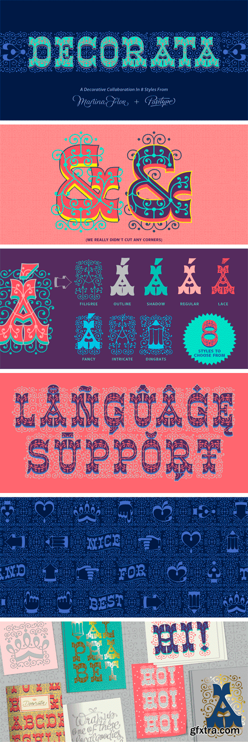
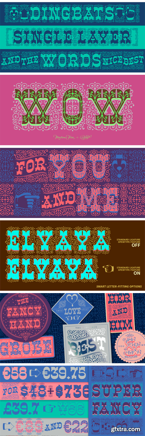
https://www.myfonts.com/fonts/positype/decorata/
How many times have you seen lettering on a book cover, poster, or card and wanted to make something similar? Decorata’s eight intertwining weights finally make that possible in an intelligent way. The first major collaboration of its kind, Decorata pairs the talents of supreme lettering artist Martina Flor and masterful type designer Neil Summerour.
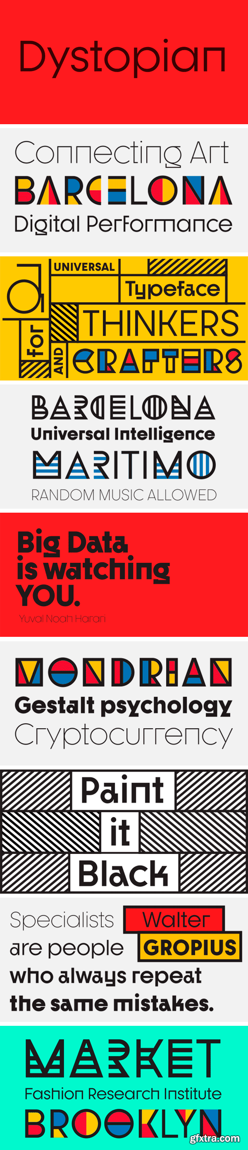
Dystopian Font Family
UTOPIAN is a color font family based on primary colors and pure geometric shapes, influenced by Bauhaus, DeStijl and Art Deco. Its pure shapes and basic colors are inspired by the beauty of simplicity of modular order and grid, creating a perfect environment where all these elements live in a perfect color harmony.
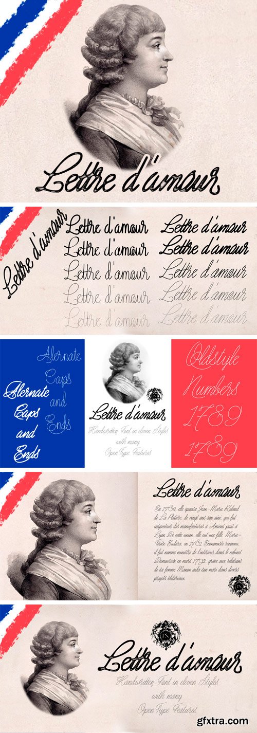
https://www.myfonts.com/fonts/otto-maurer/lettre-damour/
Lettre D'amour is an Oldstyle Handwriting Font. It comes in 11 Styles and two Angles with many OpenType Features. Alternate Caps, Alternate Ends and old style Numbers.
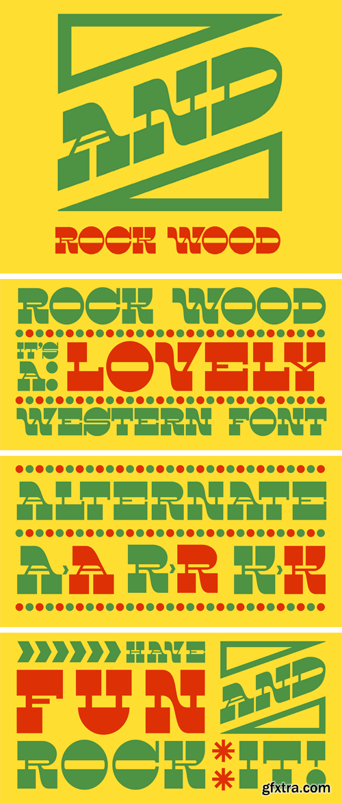
https://www.myfonts.com/fonts/kprojects/rock-wood/
Rock Wood is a fresh version of old western wood type. With its strong and sinuous lines it has a taste of vintage and modern at the same time.
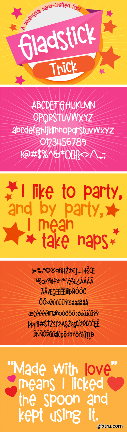
https://fontbundles.net/illustration-ink/147956-pn-gladstick-thick
This whimsical hand-crafted font has a bold feel and a bouncy baseline.
126,000 Royalty-Free 3D Model

Udemy Türkçe


Top Rated News
- CreativeLive Tutorial Collections
- Fasttracktutorials Course
- Chaos Cosmos Library
- MRMockup - Mockup Bundle
- Finding North Photography
- Sean Archer
- John Gress Photography
- Motion Science
- AwTeaches
- Learn Squared
- PhotoWhoa
- Houdini-Course
- Photigy
- August Dering Photography
- StudioGuti
- Creatoom
- Creature Art Teacher
- Creator Foundry
- Patreon Collections
- Udemy - Turkce
- BigFilms
- Jerry Ghionis
- ACIDBITE
- BigMediumSmall
- Globe Plants
- Unleashed Education
- The School of Photography
- Visual Education
- LeartesStudios - Cosmos
- Fxphd
- All Veer Fancy Collection!
- All OJO Images
- All ZZVe Vectors
- CGTrader 1 CGTrader 2


