
Categories: GFXTRA Special » Special Fonts
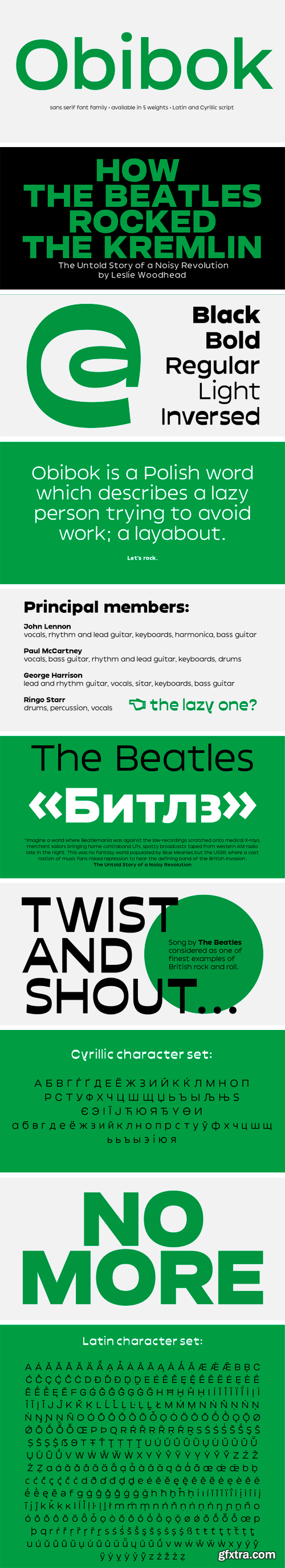
Obibok Typeface
Round shapes building the glyphs seem to be somewhat squarish and lazy – like a tire low on air. Obibok is built on geometric shapes and has a uncommon proportion between lowercase and uppercase letters. The latter are distinguishably lower compared to classical letter proportions, feeling almost like small caps. Besides the height proportion, uppercase letters are quite wide, which is an overall quality of the typeface.


Related Posts
126,000 Royalty-Free 3D Model

Udemy Türkçe


Top Rated News
- CreativeLive Tutorial Collections
- Fasttracktutorials Course
- Chaos Cosmos Library
- MRMockup - Mockup Bundle
- Finding North Photography
- Sean Archer
- John Gress Photography
- Motion Science
- AwTeaches
- Learn Squared
- PhotoWhoa
- Houdini-Course
- Photigy
- August Dering Photography
- StudioGuti
- Creatoom
- Creature Art Teacher
- Creator Foundry
- Patreon Collections
- Udemy - Turkce
- BigFilms
- Jerry Ghionis
- ACIDBITE
- BigMediumSmall
- Globe Plants
- Unleashed Education
- The School of Photography
- Visual Education
- LeartesStudios - Cosmos
- Fxphd
- All Veer Fancy Collection!
- All OJO Images
- All ZZVe Vectors
- CGTrader 1 CGTrader 2


