
Viska Font Family
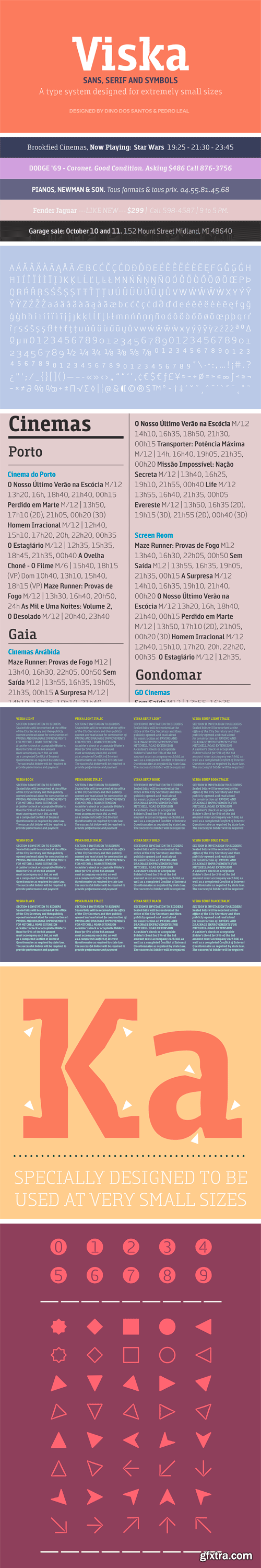
Designed to be used in the classifieds section of newspapers and magazines, Viska is a type system containing Sans, Serif and Symbols. Viska might look very weird when used big because it was specially conceived to be used in agate sizes (5.5 points).
The big inktraps and narrow proportions, short ascenders and descenders, ensure the readability and clarity of the texts even in the worst printing conditions. Because it’s so hard to properly set text in such small sizes, we decided to design each family with the same character width, so that all the styles and weights of each component of this type family occupy exactly the same horizontal space. This interchangeability of weights and styles allow the text to be set once and never to reflow. 

126,000 Royalty-Free 3D Model

Udemy Türkçe


Top Rated News
- CreativeLive Tutorial Collections
- Fasttracktutorials Course
- Chaos Cosmos Library
- MRMockup - Mockup Bundle
- Finding North Photography
- Sean Archer
- John Gress Photography
- Motion Science
- AwTeaches
- Learn Squared
- PhotoWhoa
- Houdini-Course
- Photigy
- August Dering Photography
- StudioGuti
- Creatoom
- Creature Art Teacher
- Creator Foundry
- Patreon Collections
- Udemy - Turkce
- BigFilms
- Jerry Ghionis
- ACIDBITE
- BigMediumSmall
- Globe Plants
- Unleashed Education
- The School of Photography
- Visual Education
- LeartesStudios - Cosmos
- Fxphd
- All Veer Fancy Collection!
- All OJO Images
- All ZZVe Vectors
- CGTrader 1 CGTrader 2


