
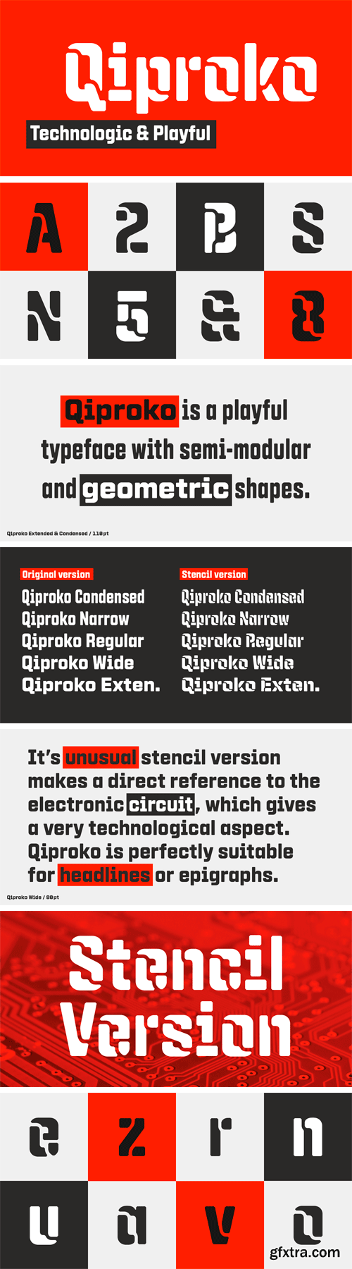
https://www.myfonts.com/fonts/nootype/qiproko/
Qiproko is a typeface with semi-modular and geometric shapes. The squared curves remind the shape of the cathode ray tube monitor, giving a retro feel to the characters. It’s unusual stencil version makes a direct reference to the electronic circuit, which gives a very technological aspect. Each font includes OpenType Features such as Tabular Figures and Capital alignement.
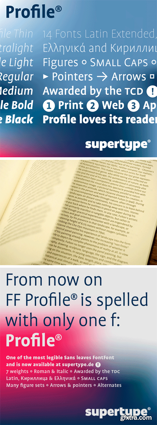
Profile Pro Font Family
Profile® is one of a growing number of sans serif typefaces that are characteristically clean and spare in appearance but that have little to do with established sans serif categories — the clunky 19th-century tradition of serifless grotesques or the rational, modernist 20th-century tradition of geometrical sans serifs.
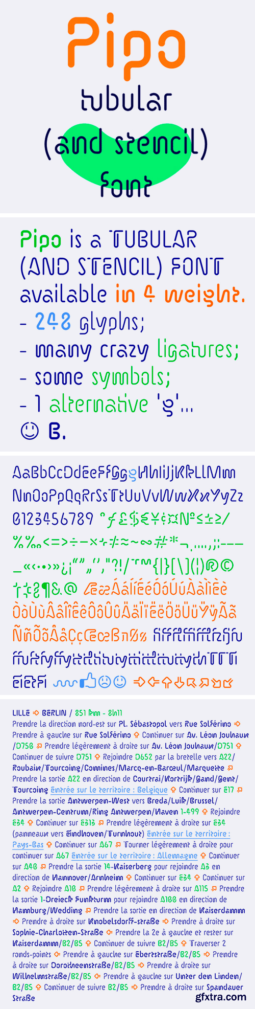
https://www.myfonts.com/fonts/benbenworld/pipo/
Pipo - with its hand-drawn style and sinuous, tubular drawing - is all about departure and arrival. These characters are defined by the route they have undertaken during design, and Pipo can be used (should be used, according to its designer!) for a variety of things - expected and unexpected - resulting, once again, in a new destination.
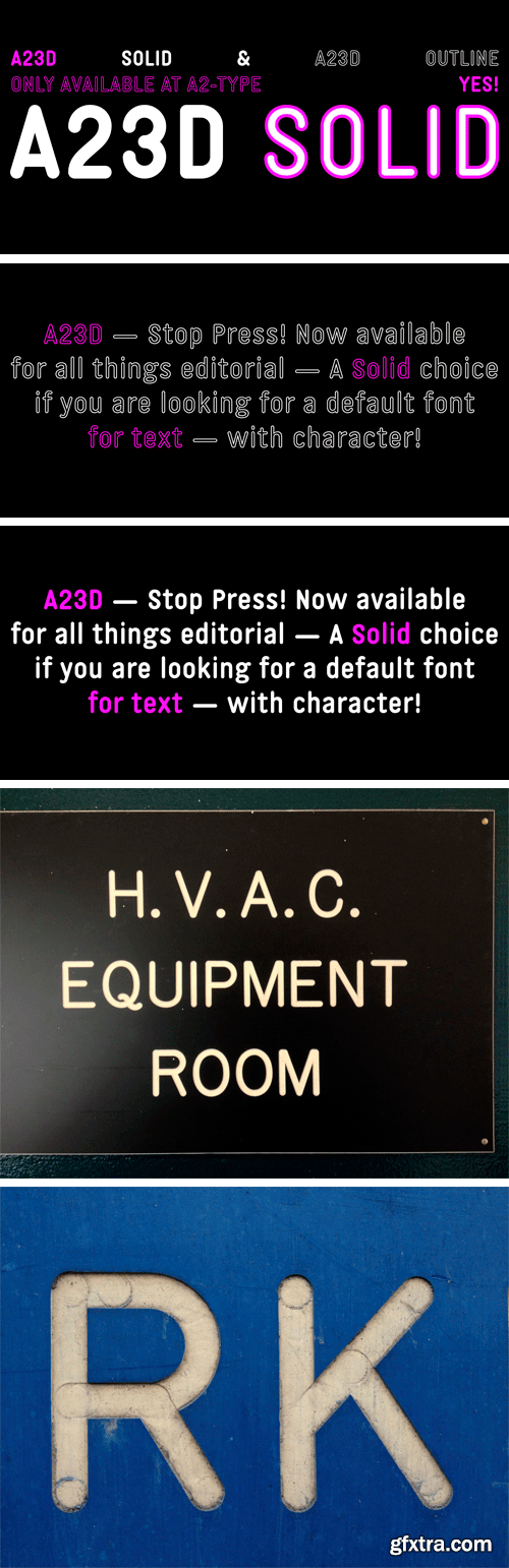
A23D SOLID Font Family
A23D SOLID is the starting point, and hidden core for the design of our A23D letterpress wireframe alphabet, commissioned by New North Press in London. This solid, mono-linear, rounded style font was designed as a ‘skeleton’, in order to then extrude the core form into a wireframe mesh – which was later 3D printed and supplied to the client as a fully working letterpress font set. A23D Outline (2018) is a perfectly crafted ‘exoskeleton’ iteration of the Solid style.
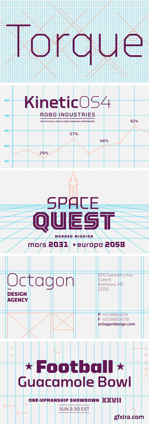
Torque Font Family
Soft yet stern, Torque is capable of representing nearly everything from modern athletics to advanced technology.
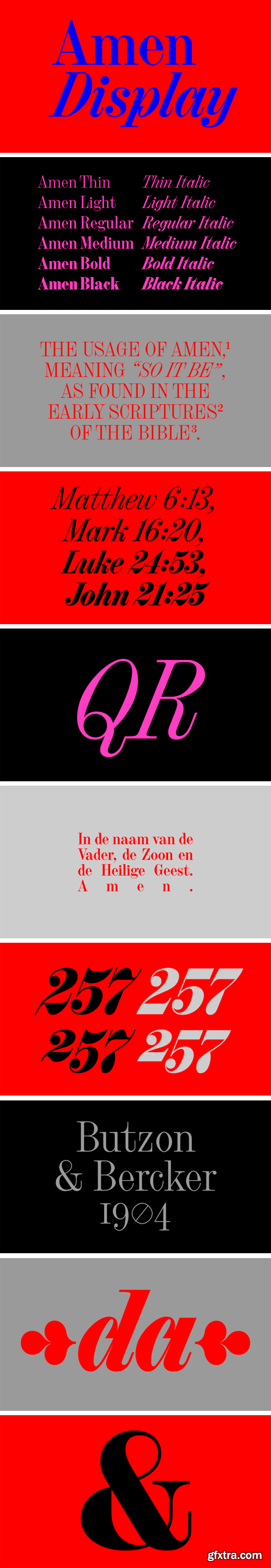
Amen Display Font Family
I made the first sketches and digital files at my Type and Media studies as a revival project under the name Gewaard. Project leader: Paul van der Laan. The Medium weight is an interpretation of Halfvette Aldine, shown in the Lettergieterij Amsterdam specimen of c.1906. I’ve found the original typeface on an old prayer-book, from Butzon and Bercker, Kevelaer, 1904. The type was set in large size, in 24 pt.
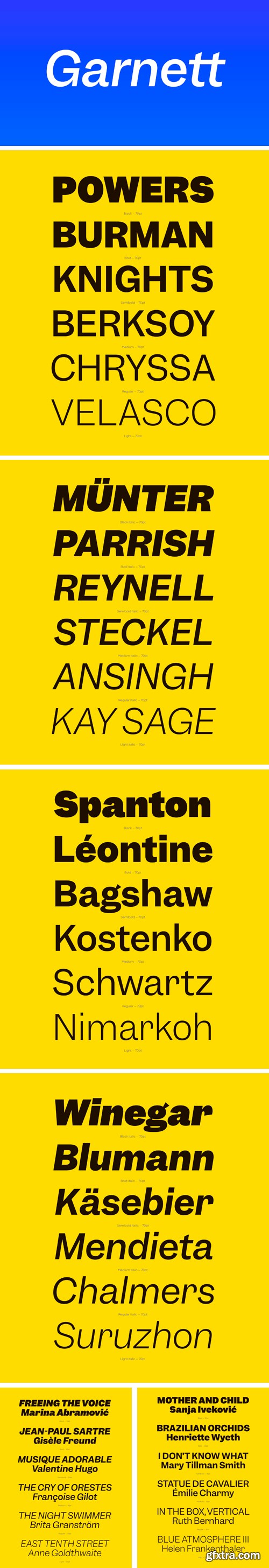
Garnett Font Family
Garnett is the first typeface designed by Connor Davenport. The evolution of it’s design has tracked the development of his craft, beginning as an incredibly ambitious and comprehensive drawing exercise, and culminating in a typeface both rooted in history and imbued with the perfectionism and eccentric personality of its creator. Garnett is a sturdy, contemporary grotesk that glows with the affable quirkiness of 19th-century metal type.
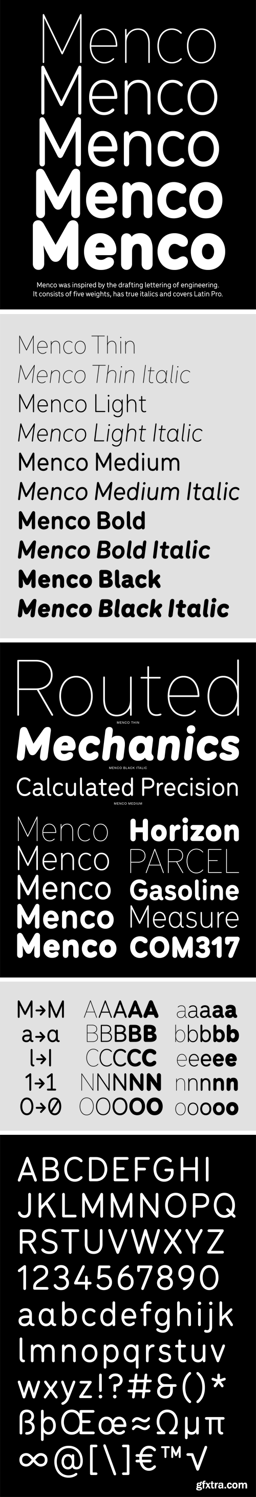
Menco Font Family
Menco was inspired by the lettering of engineering, found on blueprints, mechanical drawings, stencils and templates. The family has 10 weights, ranging from Thin to Black (including italics) and is ideally suited for advertising and packaging, editorial and publishing, logo, branding and creative industries as well as small text.
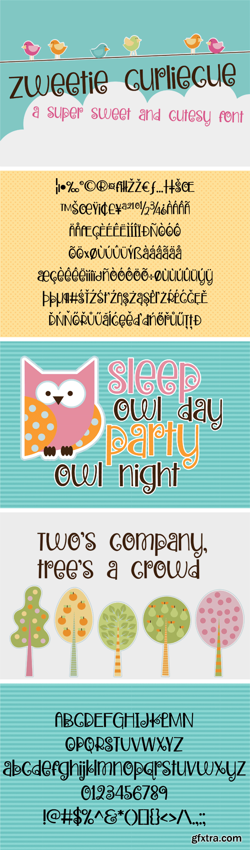
https://fontbundles.net/illustration-ink/147959-zp-zweetie-curliecue
This whimsical font has a lowercase with adorable stubby descenders and has curly details throughout.
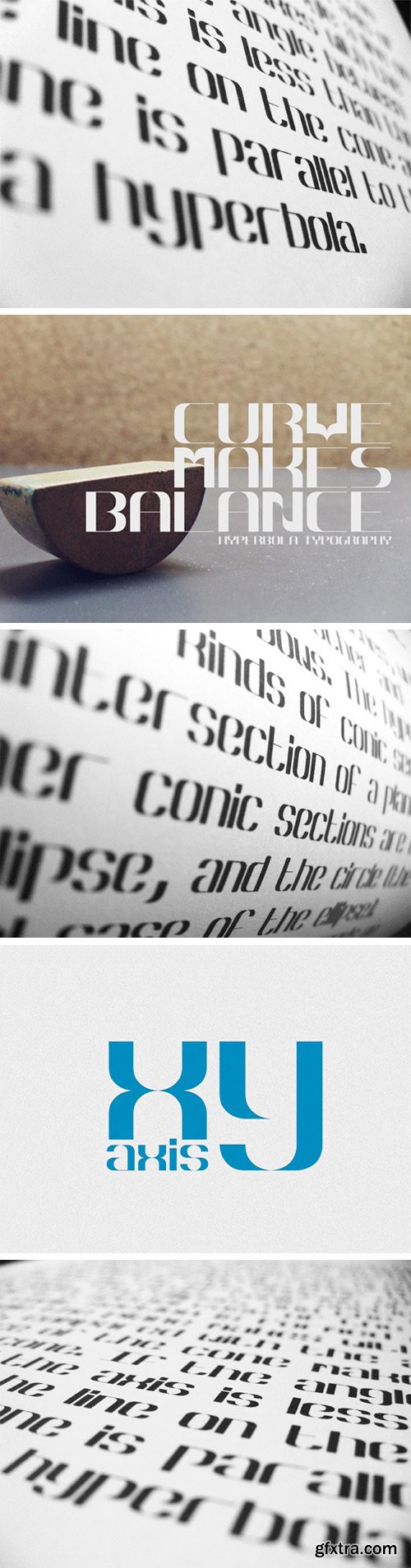
Hyperbola Font
In mathematics a hyperbola is a curve, specifically a smooth curve that lies in a plane, which can be defined either by its geometric properties or by the kinds of equations for which it is the solution set. A hyperbola has two pieces, called connected components or branches, which are mirror images of each other and resembling two infinite bows. The hyperbola is one of the four kinds of conic section, formed by the intersection of a plane and a cone.
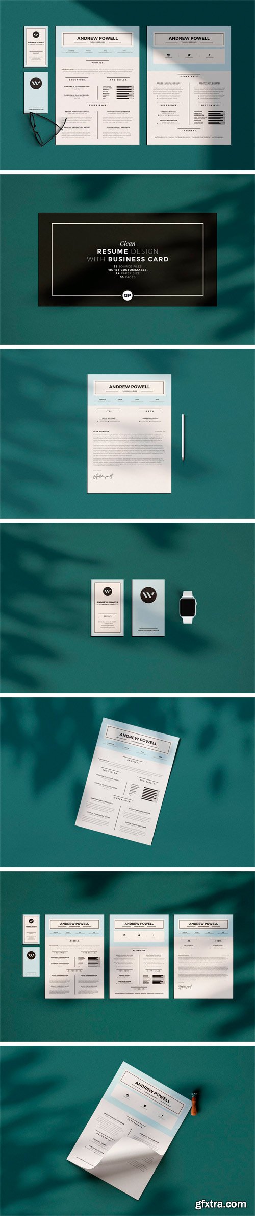
CM - Clean Resume with Business Card 2950309
Clean Resume Template page designs are easy to use and customize, so you can quickly tailor-make your job resume for any opportunity and help you to get your job. This Clean Resume CV Template is made in Adobe Photoshop, Illustrator format and very popular word processor, MS Word aka Microsoft Word.
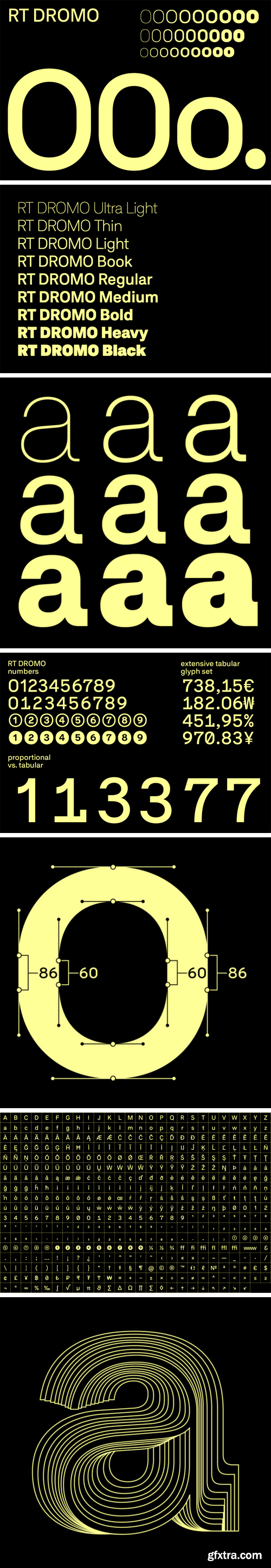
RT Dromo Font Family
RT Dromo is based on double-gothic typefaces used for impact printing concert tickets during the 1980s. By extracting their essence and injecting it into a grotesque, RT Dromo was designed as a contemporary type family consisting of 9 weights.
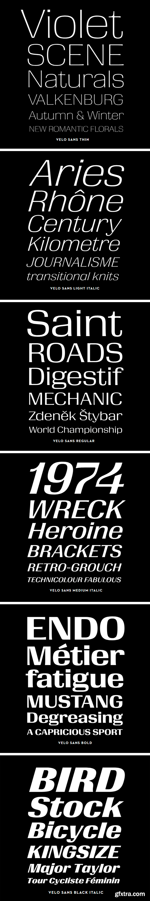
Velo Sans Font Family
Velo Sans is a poised typographic workhorse that’s also ready to lead the pack with expressive superelliptical shapes and a deep well of alphabetic aptitude. With weights ranging from lithe-limbed lights to bombastic bolds and blacks, Velo Sans can win one-day design classics while going the distance in the most challenging graphic arts grand tours.
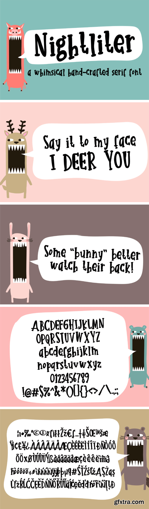
Creativefabrica - Nightliter
This whimsical hand-crafted font is sporting serifs and a bit of bounce in the baseline.
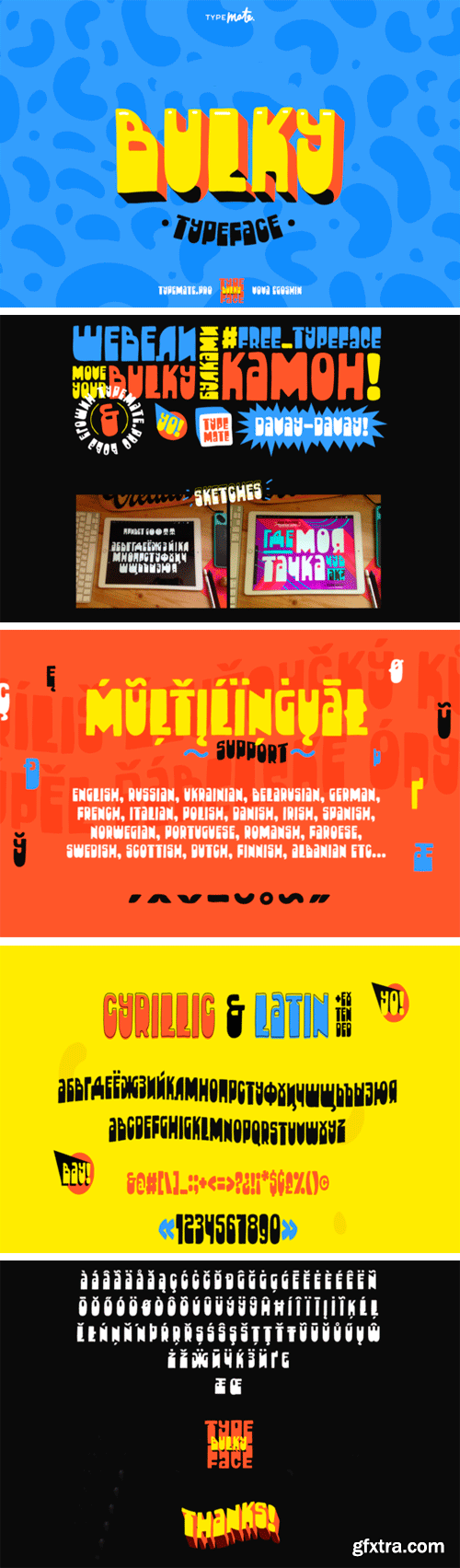
Creativefabrica - Bulky 648392
The Bulky is a cheerful hand drawn typeface. It has a super friendly feel with a huge contrast. It looks pretty cool in headlines, logos, posters, music covers, and much more! Cool fun fact – the word “Bulky” in Russian is pronounced exactly like the word “Булки” which means as “buns”!
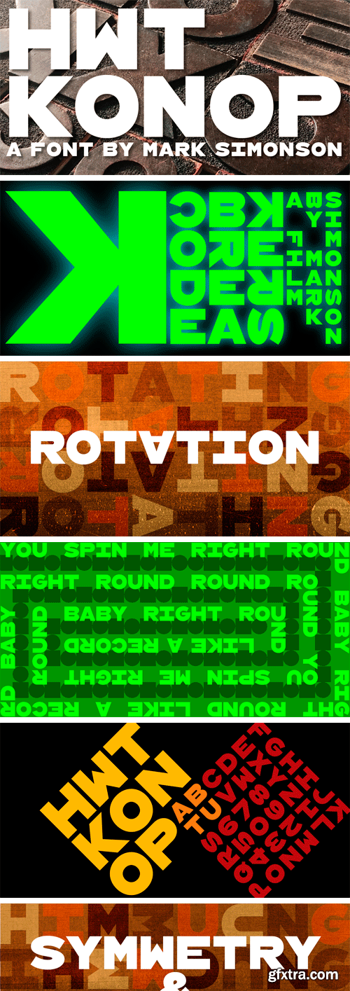
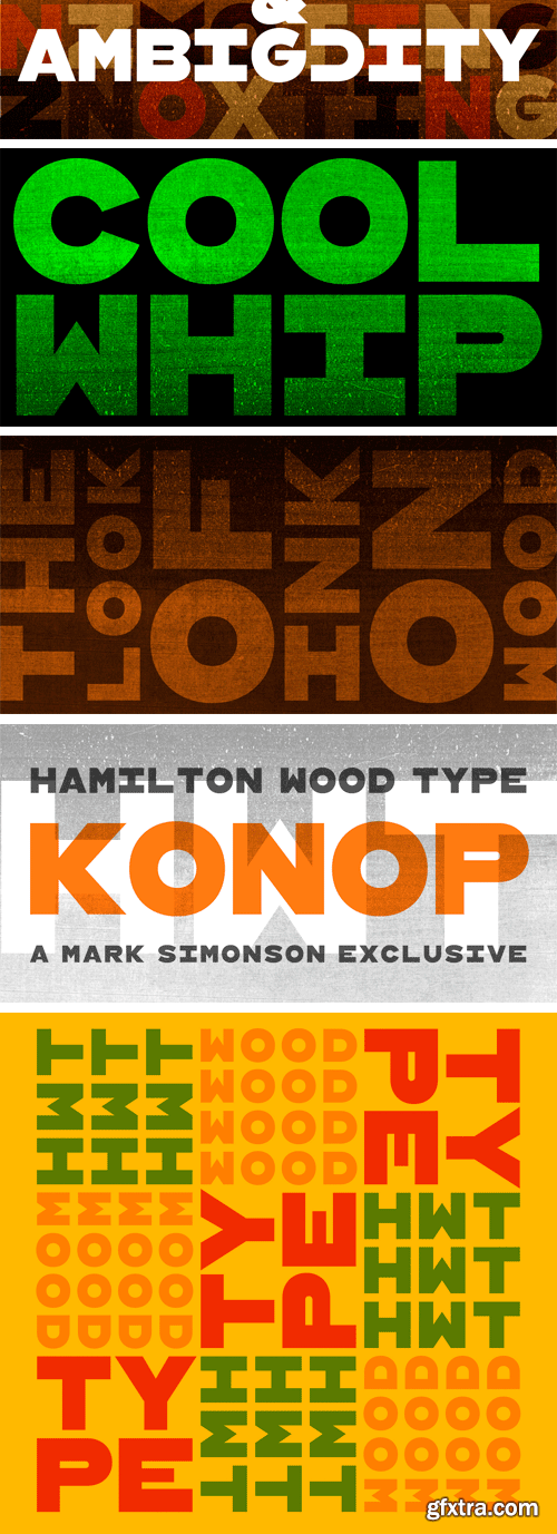
HWT Konop Font Family
HWT Konop is a monospaced (fixed-width) typeface that is also square! Designed by Mark Simonson (Proxima Nova) as square characters that can be arranged vertically or horizontally and in any orientation. To a traditional letterpress job printer, a font like this wouldn’t make much sense. But to a modern letterpress printer it is an unusual and creative design toolkit.
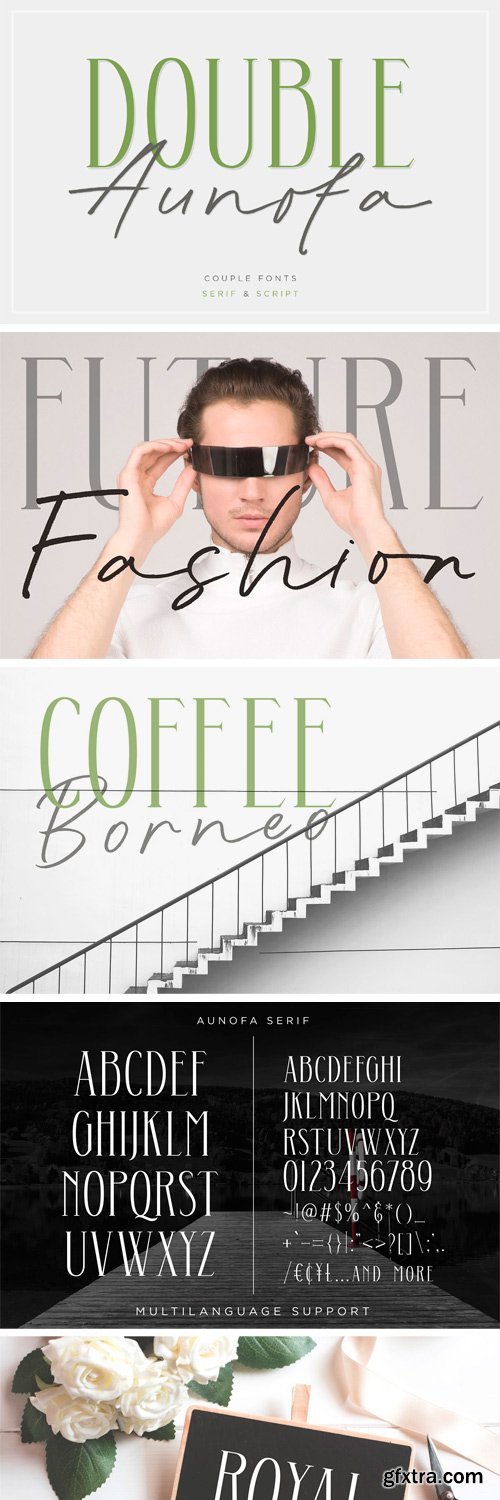
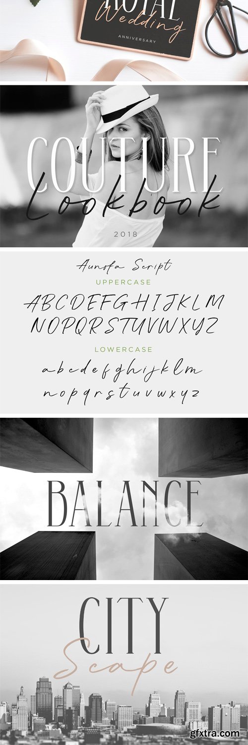
https://creativemarket.com/konstantinestudio/2813541-Double-Aunofa-Couple-Font
Double Aunofa, a couple of beautiful fonts with the approach to luxury branding and classy feels. Comes in clean tall serif and handwritten script style. Perfectly fit for your simple branding, logo, classy visual identity, you name it.
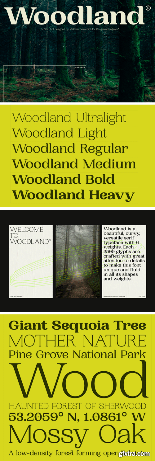
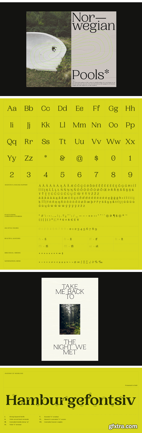
Woodland Font Family
Woodland is a beautiful, curvy, versatile serif typeface with 6 weights. Each 2500 glyphs are crafted with great attention to details to make this font unique and fluid in all its shapes and weights.
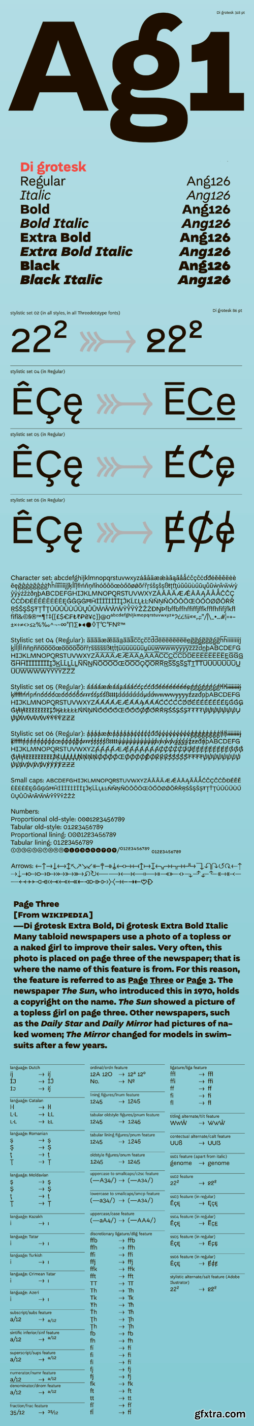
Di Grotesk Font Family
"Di" stands for "diacritics" – the font features multiple versions of them based on historical forms. "Grotesk" refers to the early 19th-century sans-serif fonts the typeface draws upon. The height in the upper case letters is smaller than in the minuscules with ascenders, which provides additional room for diacritics. The diacritics signs, in turn, have variants derived from various typographic traditions - from incunabula to the substitute solutions of the shortage economy of People’s Republic of Poland.
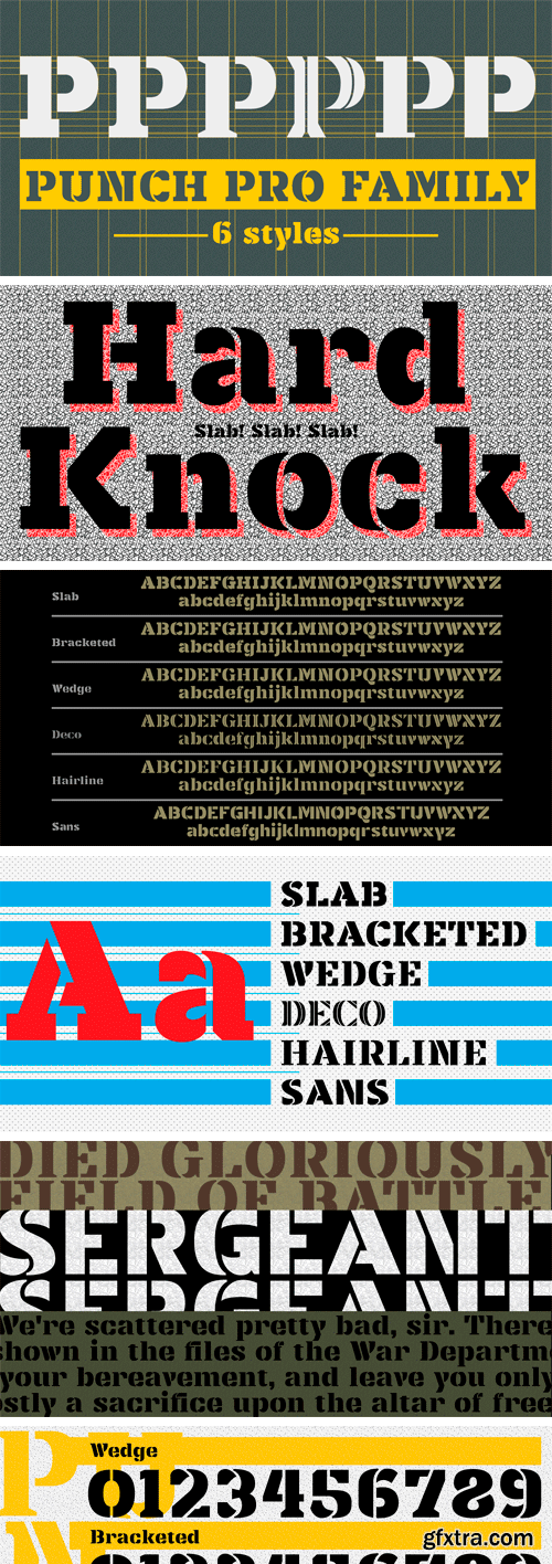
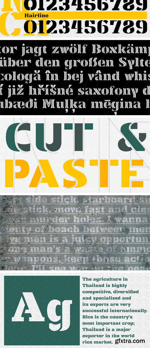
https://www.myfonts.com/fonts/produce/punch-pro/
Punch was born because we wanted to create a stencil font. At first glance, Punch gives out an audacious persona with its bold shape and form. It’s softer side is revealed in it’s carefully cut stencil lines. The balance of heavy and refined gives the font family its very own charm. Punch Pro comes in six different weights; Slab, Bracketed, Wedge, Deco, Hairline and Sans.
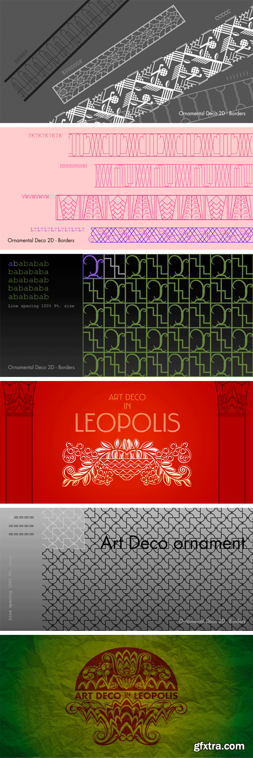
https://www.myfonts.com/fonts/2d-typo/ornamental-deco-2d/
This font was inspired by Lviv ArtDeco architecture dominating in 1920s-30s. This collection of ornaments is a graphic representation of building decorative elements, mostly of metal tracery elements and wall bas-relief. This font can be used for a variety of purposes, in graphic design as well as in industrial design.
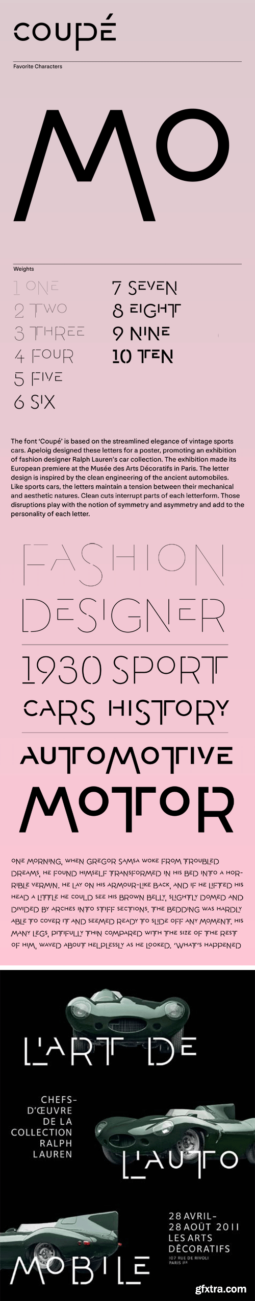
A. Coupe Font Family
The font ‘Coupé’ is based on the streamlined elegance of vintage sports cars. Apeloig designed these letters for a poster, promoting an exhibition of fashion designer Ralph Lauren’s car collection. The exhibition made its European premiere at the Musée des Arts Décoratifs in Paris. The letter design is inspired by the clean engineering of the ancient automobiles. Like sports cars, the letters maintain a tension between their mechanical and aesthetic natures. Clean cuts interrupt parts of each letterform. Those disruptions play with the notion of symmetry and asymmetry and add to the personality of each letter.
126,000 Royalty-Free 3D Model

Udemy Türkçe


Top Rated News
- CreativeLive Tutorial Collections
- Fasttracktutorials Course
- Chaos Cosmos Library
- MRMockup - Mockup Bundle
- Finding North Photography
- Sean Archer
- John Gress Photography
- Motion Science
- AwTeaches
- Learn Squared
- PhotoWhoa
- Houdini-Course
- Photigy
- August Dering Photography
- StudioGuti
- Creatoom
- Creature Art Teacher
- Creator Foundry
- Patreon Collections
- Udemy - Turkce
- BigFilms
- Jerry Ghionis
- ACIDBITE
- BigMediumSmall
- Globe Plants
- Unleashed Education
- The School of Photography
- Visual Education
- LeartesStudios - Cosmos
- Fxphd
- All Veer Fancy Collection!
- All OJO Images
- All ZZVe Vectors
- CGTrader 1 CGTrader 2


