
Categories: GFXTRA Special » Special Fonts
Di Grotesk Font Family
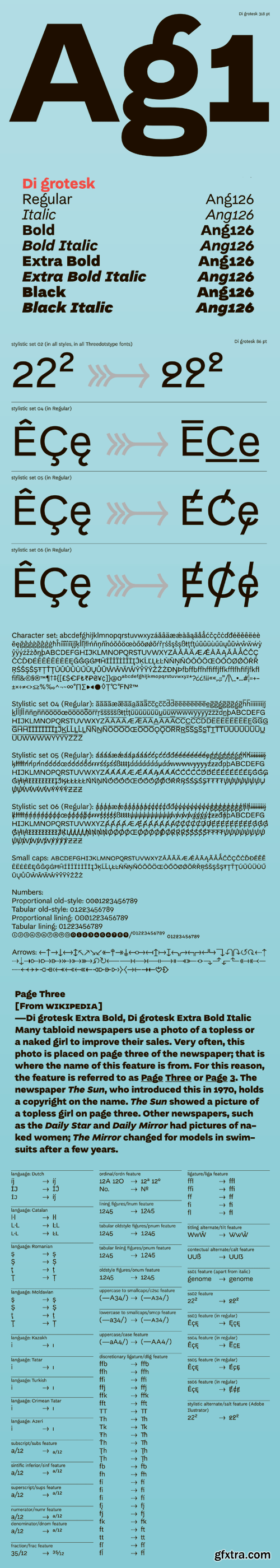
"Di" stands for "diacritics" – the font features multiple versions of them based on historical forms. "Grotesk" refers to the early 19th-century sans-serif fonts the typeface draws upon. The height in the upper case letters is smaller than in the minuscules with ascenders, which provides additional room for diacritics. The diacritics signs, in turn, have variants derived from various typographic traditions - from incunabula to the substitute solutions of the shortage economy of People’s Republic of Poland.


126,000 Royalty-Free 3D Model

Udemy Türkçe


Top Rated News
- CreativeLive Tutorial Collections
- Fasttracktutorials Course
- Chaos Cosmos Library
- MRMockup - Mockup Bundle
- Finding North Photography
- Sean Archer
- John Gress Photography
- Motion Science
- AwTeaches
- Learn Squared
- PhotoWhoa
- Houdini-Course
- Photigy
- August Dering Photography
- StudioGuti
- Creatoom
- Creature Art Teacher
- Creator Foundry
- Patreon Collections
- Udemy - Turkce
- BigFilms
- Jerry Ghionis
- ACIDBITE
- BigMediumSmall
- Globe Plants
- Unleashed Education
- The School of Photography
- Visual Education
- LeartesStudios - Cosmos
- Fxphd
- All Veer Fancy Collection!
- All OJO Images
- All ZZVe Vectors
- CGTrader 1 CGTrader 2


