
Amen Display Font Family
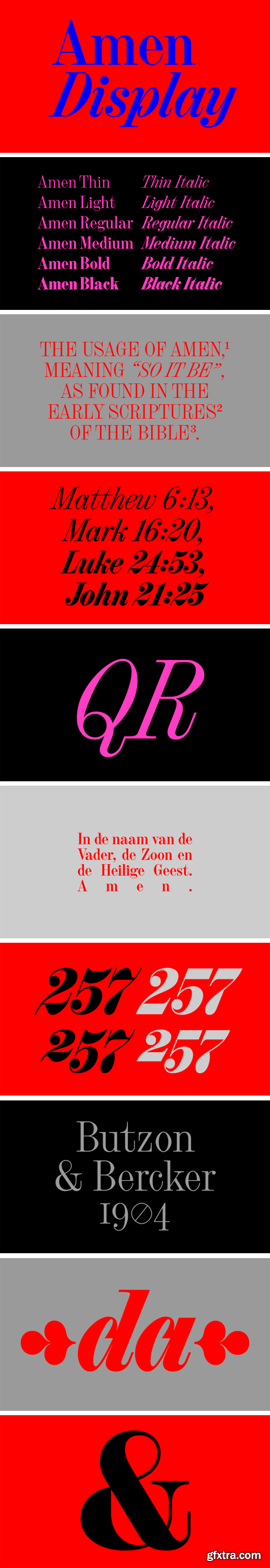
I made the first sketches and digital files at my Type and Media studies as a revival project under the name Gewaard. Project leader: Paul van der Laan. The Medium weight is an interpretation of Halfvette Aldine, shown in the Lettergieterij Amsterdam specimen of c.1906. I’ve found the original typeface on an old prayer-book, from Butzon and Bercker, Kevelaer, 1904. The type was set in large size, in 24 pt.
Since 2013 I have redrawn the letters several times, but I’ve found it’s clear voice only 5 years after the first sketches. In 2018 I redesigned all the characters with more geometric details and a comletely new italic style. The horizontal part of the 2, and 7, the vertical tails of the a, t, R show the clear geometric attitude. Amen Display has 6 weights in Roman and Italic styles. The cursive lowercase letters are true italics, the construction of the shapes follow the movement of a writing hand. The rounded characters (a,b,d,p,q) have a special inbound, to reflect to the structure of a handwritten letter. The height of the serifs are always the same between the different weights. The typeface works best in large sizes, the smallest recommended point size is 24 pt. Later I’m planning to expand the family with text optical size. 

126,000 Royalty-Free 3D Model

Udemy Türkçe


Top Rated News
- CreativeLive Tutorial Collections
- Fasttracktutorials Course
- Chaos Cosmos Library
- MRMockup - Mockup Bundle
- Finding North Photography
- Sean Archer
- John Gress Photography
- Motion Science
- AwTeaches
- Learn Squared
- PhotoWhoa
- Houdini-Course
- Photigy
- August Dering Photography
- StudioGuti
- Creatoom
- Creature Art Teacher
- Creator Foundry
- Patreon Collections
- Udemy - Turkce
- BigFilms
- Jerry Ghionis
- ACIDBITE
- BigMediumSmall
- Globe Plants
- Unleashed Education
- The School of Photography
- Visual Education
- LeartesStudios - Cosmos
- Fxphd
- All Veer Fancy Collection!
- All OJO Images
- All ZZVe Vectors
- CGTrader 1 CGTrader 2


