


Language: English | Size: 1.41 GB | Duration: 2h 33m
https://www.udemy.com/course/interior-design-ai-master-interior-design-with-chatgpt-ai/
Interior Design Course to Plan, Design and Complete Interior Design Projects Using ChatGPT and Interior Design Tactics

Language: English | Size: 3.42 GB | Duration: 2h 9m
https://www.udemy.com/course/illustrate-animate-in-procreate-procreate-dreams/
Level Up Your Digital Illustration & Animation Skills In Procreate & Procreate Dreams

Language: English + subtitle | Duration: 28m 10s | Size: 100 MB
https://www.linkedin.com/learning/maximizing-short-form-video-performance-and-manychat-automations
Learn to optimize your video content for platforms like Instagram, TikTok, YouTube Shorts, and LinkedIn.

I created this presetpack over the years (use them myself) to make my editing easier and faster, immediately showing the potential of my images while hoovering over the presets.
My philosophy in editing is that you can create more stunning images if it doesnt get too time-consuming, therefore not stalling your creative vibe,
on the other side of things i do not believe a preset can fully edit an image that is stunning enough (seldom this is the case) but it almost always needs a personal touch, often created by local adjustments using brushes, radials and/or graduated filters. Therefore this is not only a presetpack with only presets but also brush/radial/grad filter presets included, which you can use to create more your own style, preferred personal editing and so on..... In my oppinion this makes it possible for you to boost your editing process in the direction you want it to go!

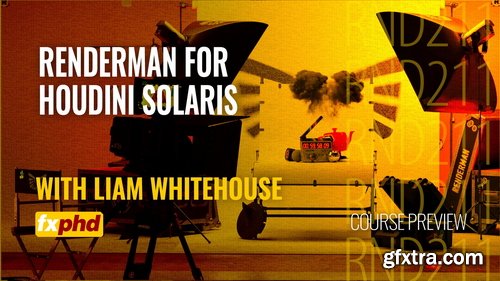
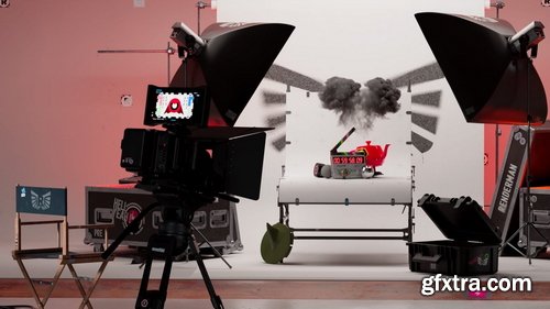
- This comprehensive workshop introduces artists and technical directors to Solaris and RenderMan's deep integration with USD workflows inside Houdini. Designed for both newcomers and seasoned users, it explores how to harness RenderMan's latest capabilities to build, light, and render scenes using the USD framework.
- Beginning with an overview of navigating the USD scene in the Solaris stage, the course walks through essential RenderMan geometry settings, shader assignment using the preset browser, and material workflow fundamentals. Members will gain practical experience with camera setup, including film back, depth of field, bokeh, and motion blur in Class 5, before diving into advanced lighting techniques using Solaris’ native lighting tools and RenderMan’s Hydra render delegate. The course covers light creation, parameter tuning, exposure control, and mixing. Artists will also explore light linking and using light filters such as barn doors and gobos to achieve nuanced, cinematic lighting effects.
- Liam Whitehouse is an Australian-based senior VFX artist who has been in the 3D industry since 2003 and has used RenderMan for many years. He has worked on various projects over the past 21 years, including most recently environments in The Fall Guy, underwater environments in Aquaman 2, Lindon forests in The Rings Of Power, photorealistic canyon environments for The Falcon and the Winter Soldier on Disney Plus, and the hollow earth environments for Godzilla vs Kong, as well as photogrammetry rocks in Avatar 2.
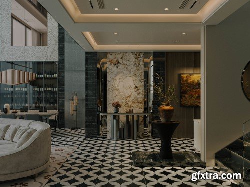
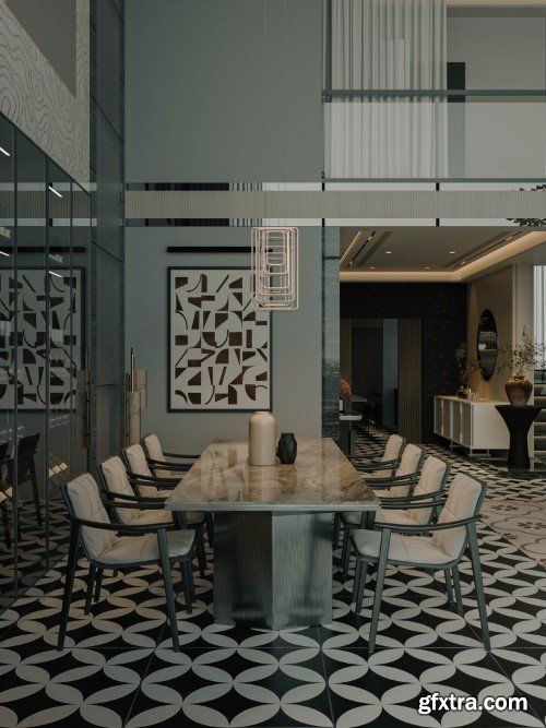
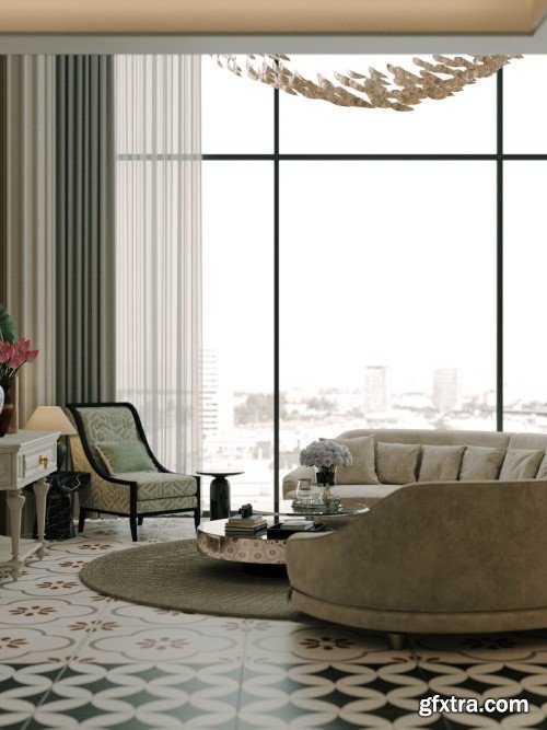
Living Room Interior Scene 03
Format: MAX | Textures Included | 1.6 GB RAR

Premiere Pro Video Effects. Get the fastest native video effects for Adobe Premiere Pro! Rocket-fast plugins with many customization options.
- If you’re a Capture One user, this pack of 10 styles is for you. They will give you an amazing starting point to get your images to a whole new level. If you have issues with PayPal coming from the Facebook link on your phone, please copy the link and open your browser or try from the computer or use the “add to card” button to pay with Credit Card. Facebook on phones and PayPal have some known issues.
Subtitles: English, German, French, Spanish, Arabic, Türkçe
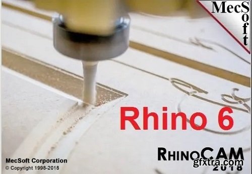
RhinoCAM is a Computer Aided Machining (CAM) plug-in for CNC that runs completely inside of Rhinoceros 5.0. This plug-in is a general purpose machining program targeted at the general machinist. RhinoCAM marries the power of Rhino’s freeform modeling with the legendary machining capabilities of VisualCAM to bring you a product of unrivaled capability for free form surface machining. With the seamless user interface, selection and display integration RhinoCAM acts and feels like you are working with Rhino when creating your cutter paths.

Udemy - Instagram Photography & Viral Reels Mastery

Udemy - iPhone Photo Editing: Lightroom Mobile, Snapseed & VSCO
Help you understand and use popular mobile photo editing apps: Lightroom Mobile, Snapseed, VSCO, and the iOS Photos App

Udemy - Mastering Documentary Film: Modes, Narrative & Ethics

Language: English | Duration: 6h 19m | Size: 5.71 GB
https://www.udemy.com/course/ansys-maxwell-electromagnetic-design-basics-to-advanced/
ANSYS MAXWELL, FEA, Electromagnetic Design, Magnets, Conductors, Ferromagnetic material, R&D, Research Experience

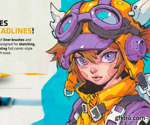
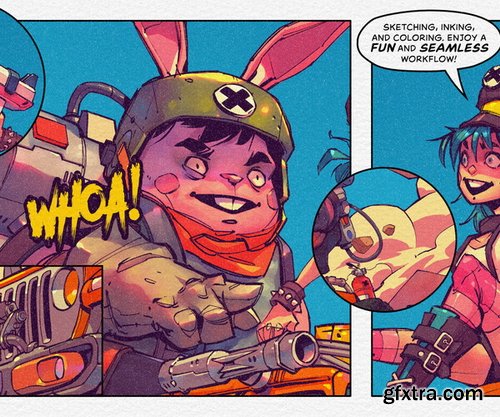
- Crisp Liners – From ultra-fine details to bold, striking strokes.
- Gritty Markers – Perfect for raw, textured inking and shading.
- Watercolor & Ink Washes – Add depth, texture, and fluid motion to your art.
- Dynamic Shading Tools – Designed for smooth gradients and rich tonal variation.
- Fluid Brush Pens & Markers – True-to-life tools with an organic, expressive feel.
- 3 High-Resolution Templates (.clip format) featuring dual-texture grain & fiber details, giving your work a traditional, hand-crafted feel.
- 5 Copic-inspired Color Palettes: Copic Grays, Toned Grays, 36 General Colors, Manga Pastels, Skin Tones
- Compatibility: Clip Studio Paint 3+ (Mac, Windows, iPad OS)
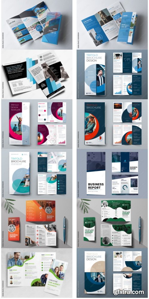
Business Trifold Brochure Layout 66xAI
Full Editable 500 AI | + JPG PREVIEW | EPS10 | RAR 49 MB
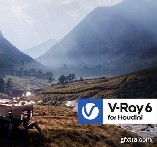
- V-Ray 7 is here to empower you to create anything imaginable with new features including: Tighter integration for an even smoother workflow. Support for Houdini 20, plus a fully-featured V-Ray Hydra delegate for Solaris. Native support for Houdini’s ocean tools, letting you create the perfect ocean waves faster and without any texture baking.Smart tools to unleash your creativity. Generate more realistic volumetric effects such as clouds, smoke, and more with Phase Function. Easily create masks for your volumetrics. Bring scenes to life with Chaos Cosmos, our free library of high-quality V-Ray content. Customize just the right clouds for your environment without spending hours browsing through HDRI libraries and animating. Use V-Ray Decal to add displacement to any surface for even more realistic cracked walls, rocks, scratched and rusty surfaces, embossed lettering, and more. Repeat geometry across the surface of an object in the most memory-efficient way possible. Create complex surfaces with lots of detail such as chain mail, car grilles, metal grids, panels, fences, fabrics, and so much more in just a few clicks.
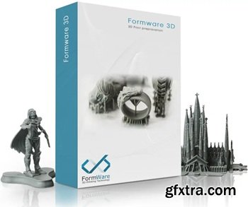
Powerful 3D Printing slice and support generation software. 3D Print job preparation can be a time consuming task. Orienting, supporting and slicing your build jobs in a way that they actually print can be challenging.
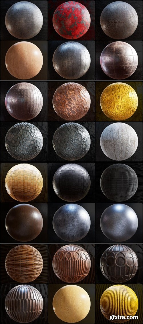
https://cgaxis.com/cgaxis_preview/Physical-9/
8K Карты: Base Color, Normal, Normal OpenGL, Height, Ambient Occlusion, Roughness, Metallic, Diffuse, Glossiness, IOR, Reflection, Specular
.png .tif

- This preset pack was created specifically for pet photography to speed up editing time and instantly enhance your photos. Your furry family members will look their best in any photo with these presets! Instantly brighten up dark images, bring out those eyes, enhance the colors, and give fur a clean and soft look.
126,000 Royalty-Free 3D Model

Udemy Türkçe


Top Rated News
- CreativeLive Tutorial Collections
- Fasttracktutorials Course
- Chaos Cosmos Library
- MRMockup - Mockup Bundle
- Finding North Photography
- Sean Archer
- John Gress Photography
- Motion Science
- AwTeaches
- Learn Squared
- PhotoWhoa
- Houdini-Course
- Photigy
- August Dering Photography
- StudioGuti
- Creatoom
- Creature Art Teacher
- Creator Foundry
- Patreon Collections
- Udemy - Turkce
- BigFilms
- Jerry Ghionis
- ACIDBITE
- BigMediumSmall
- Globe Plants
- Unleashed Education
- The School of Photography
- Visual Education
- LeartesStudios - Cosmos
- Fxphd
- All Veer Fancy Collection!
- All OJO Images
- All ZZVe Vectors
- CGTrader 1 CGTrader 2


