

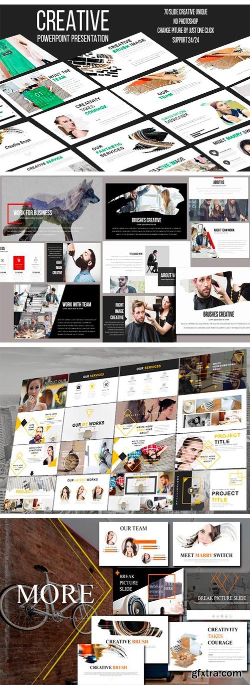

CM 1340396 - 10 MINIMAL POWERPOINT
Core Features:
• PPTX & PPT File Format
• Based in Master Slides
• FULL ANIMATION
• 10 MINIMAL POWERPOINT PRESENTATION BUNDLE!
• Aspect Ratio 16:9
• 1920×1080 (HD)
• Unlimited Color Just One Click to change the color
• Easy Drag and Drop to change picture
• Tons of unique layouts
• Easily and Fully Editable in Powerpoint
• Infographic Slides
• Data driven charts and diagrams
• Portfolio Slides
• Break Slides
• Process Slides
• Team Slides
• Maps Slides
• Charts Slides
• Device Slides
• The stock images used in the demos are NOT included
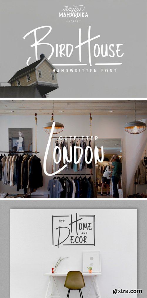
CM 1360742 - Bird House
Bird House is a handwritten font designed using markers. This font perfect for branding, signature, and more. It includes uppercase, lowercase standard character, punctuation and multiple language support.
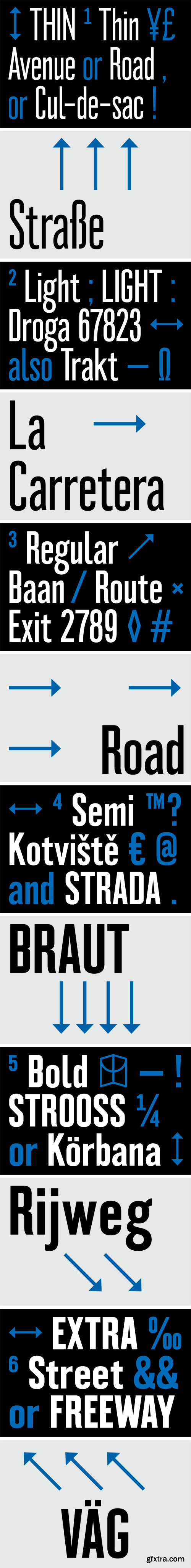
https://www.colophon-foundry.org/typefaces/montefiore/
Montefiore was originally referenced from a Victorian road sign found in Hove, England. It was drawn from a single photograph of Montefiore Road. The production methods utilised on the sign added warmth and depth that, through process affected the form of the type. Initially drawn in two condensed weights, the typeface was created in a way not to re-draw it like-for-like, but by extrapolating an essence — this was pushed across the full two weights. In 2017, Montefiore was extended and updated to include six weights, and further language support.
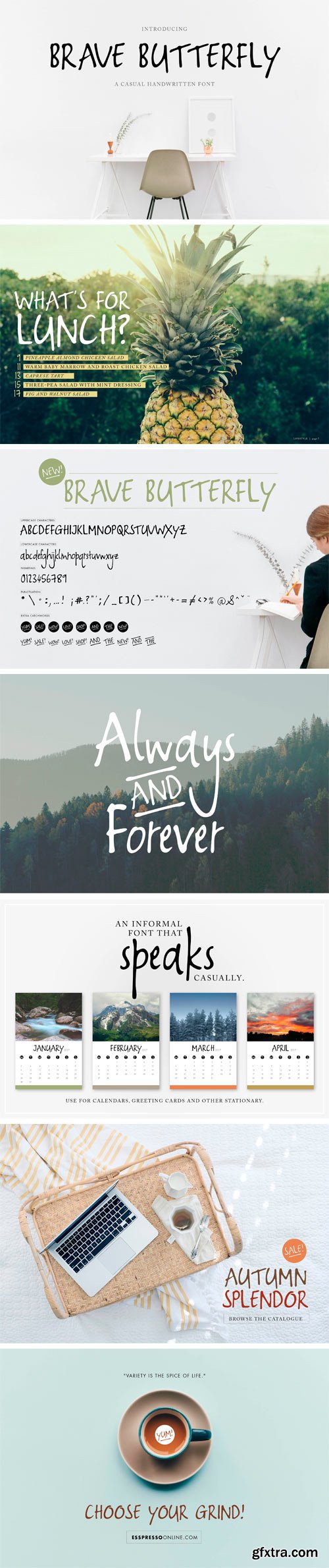
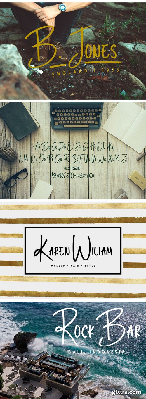
CM 1360601 - Brave Butterfly
Brave Butterfly is a marker font created to be playful and bouncy, yet bold and clearly legible. The font includes all basic punctuation as well as some fun catchwords and phrases to add a little extra to your designs. Brave Butterfly is perfect to use on corporate branding, stationary, advertisements, magazine layouts, inspirational quotes and much more.
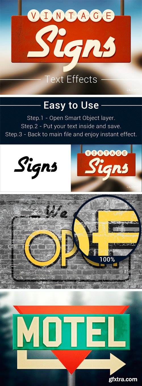
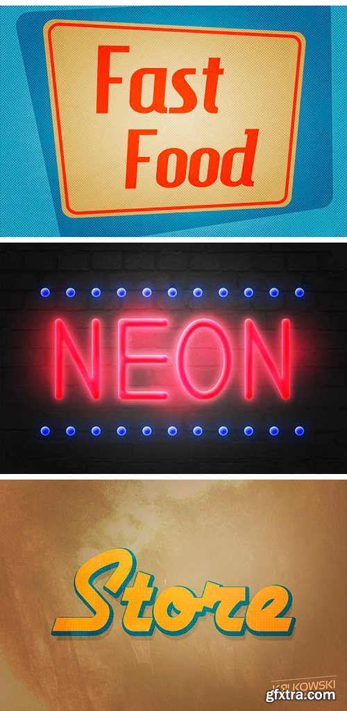
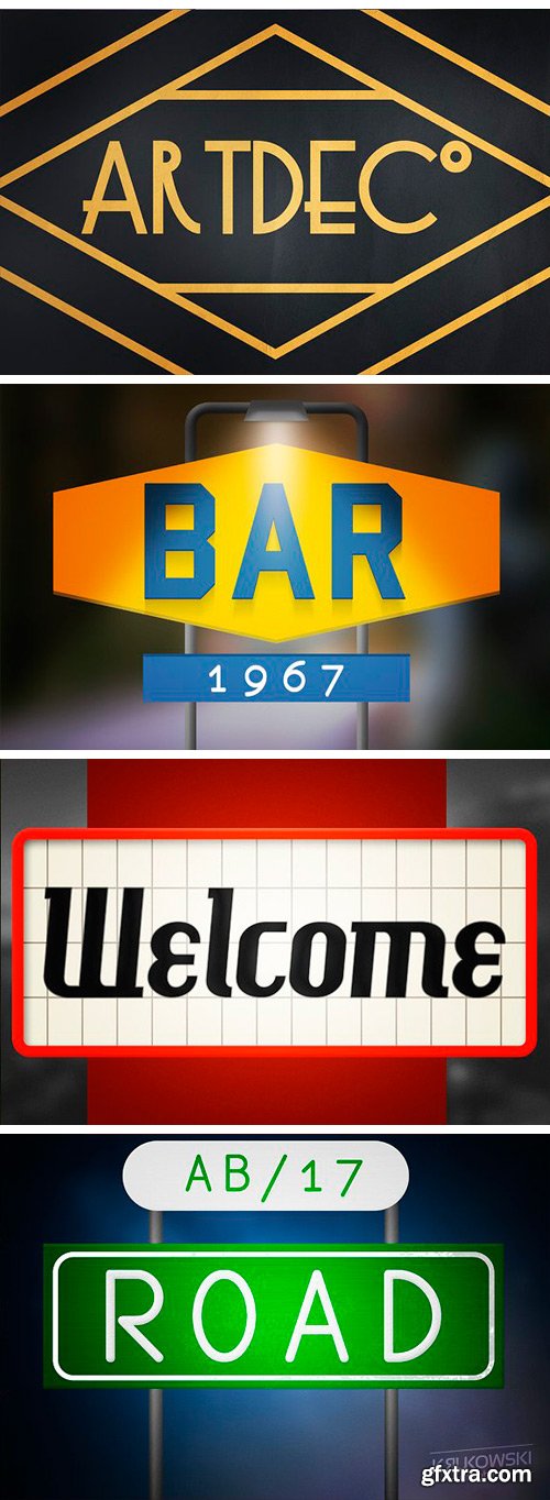
CM 1360575 - Vintage Sign Text Effects Mockup
Vintage Sign Text Effects will add instant high quality vintage style to any text or logo. You just need to replace text inside smart object and it will look like old road sign in seconds! You can use it in both personal and commercial projects for yourself, your company or your customer. All texts are editable only free fonts were used (links to fonts included).
Features:
• 10 Different Styles
• Unique, editable background for each style
• Layered PSD Files
• Smart Object Replacement
• 3000×2000 px 300 dpi RGB
• Free Fonts (Download Links included)
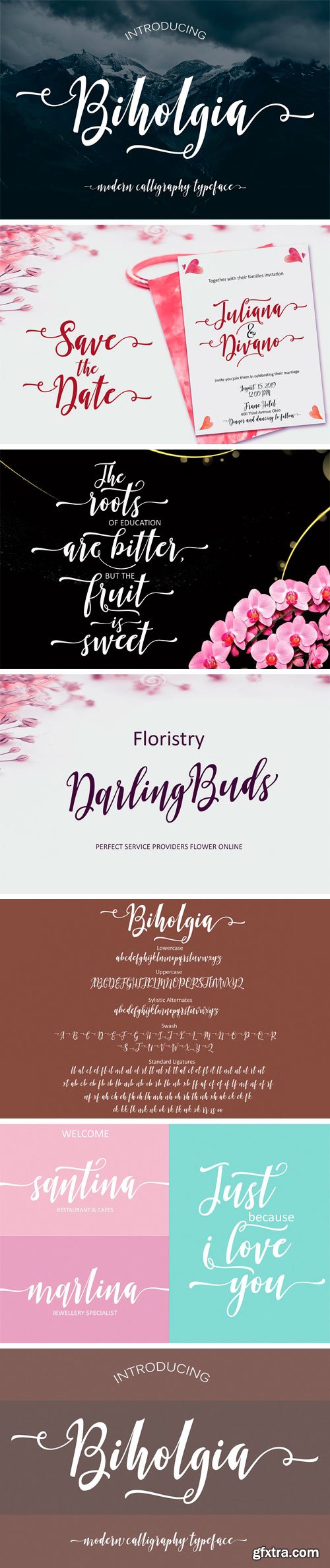
CM 1361483 - Biholgia Script
Biholgia Script - a new fresh & modern script with a handmade calligraphy style, decorative characters and a dancing baseline! So beautiful on invitation like greeting cards, branding materials, business cards, quotes, posters, and more! Biholgia Script: features 560 glyphs, including 81 Standart ligatures and has given PUA unicode (specially coded fonts), can be accessed easily with the character map, can be accessed in full by the lovers of letters or artisans to increase career in the design world. Also supports in pragram : Adobe Illustrator, Adobe Photoshop, Adobe InDesign, Corel Draw X version, Microsoft Word. Language Support : Albanian, Basque, Breton, Chamorro, Danish, Dutch, English, Faroese, Finnish, French, Frisian, Galician, German, Icelandic, Italian, Malagasy, Norwegian, Portuguese, Swedish.
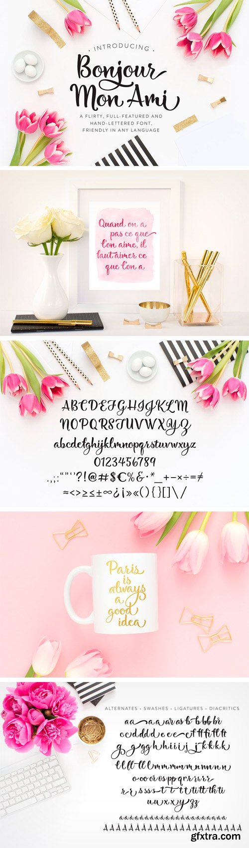
CM 1361786 - Bonjour Mon Ami
My latest font includes over 500 characters for a range of languages, including Western European, Central European, South Eastern European and Vietnamese, as well as stylistic alternates, ligatures. I'll be adding some ornaments and catchwords very soon! I recommend you use the font in an app that is Open-Type savvy such as Adobe Illustrator, InDesign, or one of the more recent versions of Photoshop (CC2015+) to access and take advantage of these features. Make sure that you install the .OTF version of the font. The .TTF will not have the features like alternates.
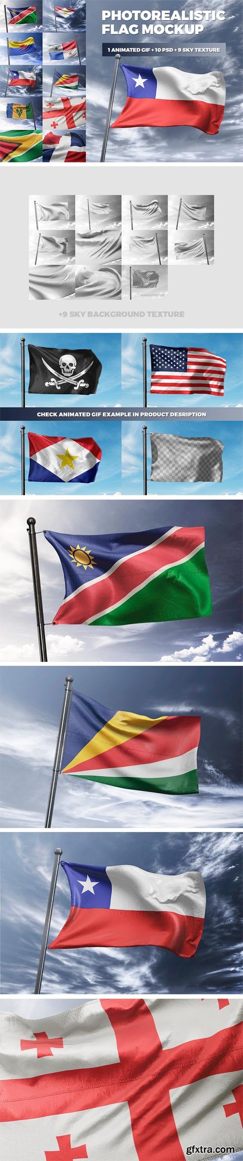
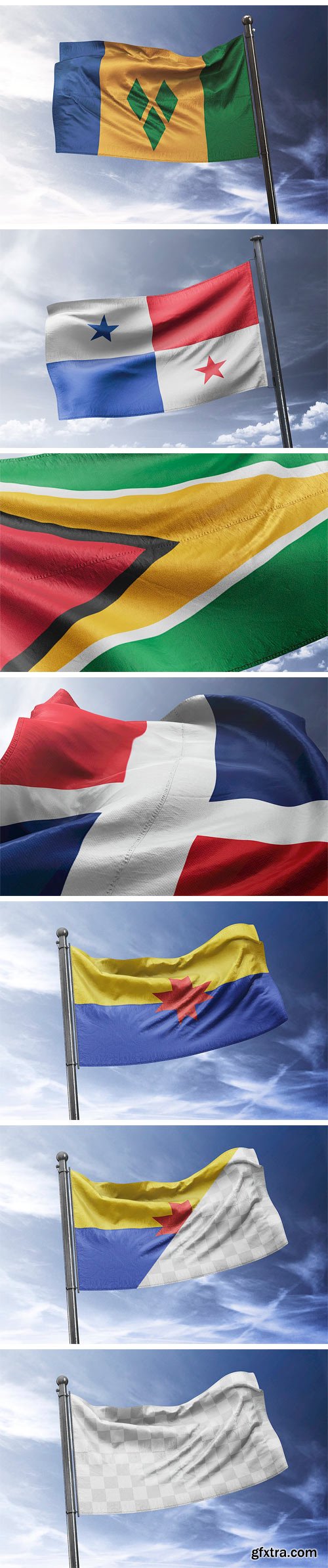
CM 1320725 - Photorealistic Flag MockUp
Create a realistic Flag presentation in few seconds. Photorealistic Flag MockUp is a pack of 10 PSD files, perfect for show-up your design. Simple structure and replacing via Smart Objects make your work easier.
Features:
• 10 PSD with different shoots and angle
• 1 Animated PSD mockup (1000×750 px)
• 9 background texture
• automatic background perspective
• easy for compositing
• easy to cut out – all mask included
• photorealistic look
• fully layered PSD
• easy file structure with help file
• 4000×3000 px, 150 DPI
• Adobe CS 6+
• videotutorial
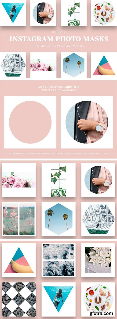
CM 1341247 - Instagram Photo Masks
Looking to create an awe-inspiring Instagram? These photo masks have been created to do just that. Stand out with striking white frames that add dimensions and intrigue to any Instagram account. With easy to use Photoshop and PNG files, you can quickly create an Instagram worth talking about! Included in this bundle: 12 high-resolution Photoshop + PNG Photo Masks designed for Instagram.


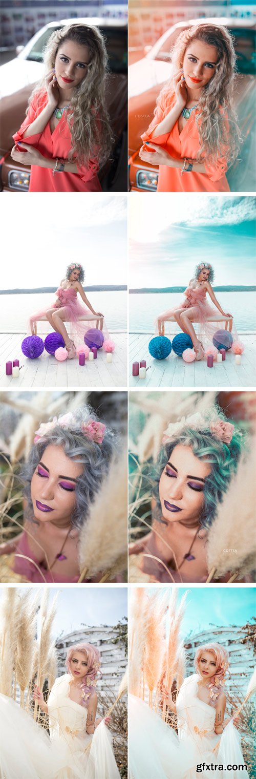
CM 1360568 - Lightroom Presets Spring In The Air
20 "Spring In The Air" Lightroom Presets. Designed to give your photography a creative edge and a first breath of spring with a love spirit. These presets looks best on outdoor photoshoots, portraits, landscapes and creative images. Each preset has been designed by a professional photographer to look great with a wide variety of images. Get beautiful spring pics with these 20 Lightroom presets compatible with Lightroom 4, 5, 6 and your Creative Cloud Version. These can only be used in Adobe Lightroom (Compatible with Raw, Tiff and JPEG formats) and won't work in Photoshop.
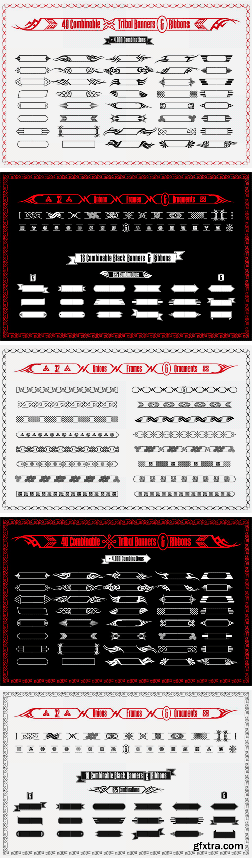
CM 1341636 - Tribal Banners & Frames
• Great collection of 40 banners of tribal style combinable with each other, which give rise to more than 4000 possible combinations.
• Also 18 other banners in negative, retro style, which give rise to 625 different combinations.
• Finally 32 unions, separators and ornaments to complement the banners or to create continuous frames.
• Formats: .AICS2, .EPS, .PDF
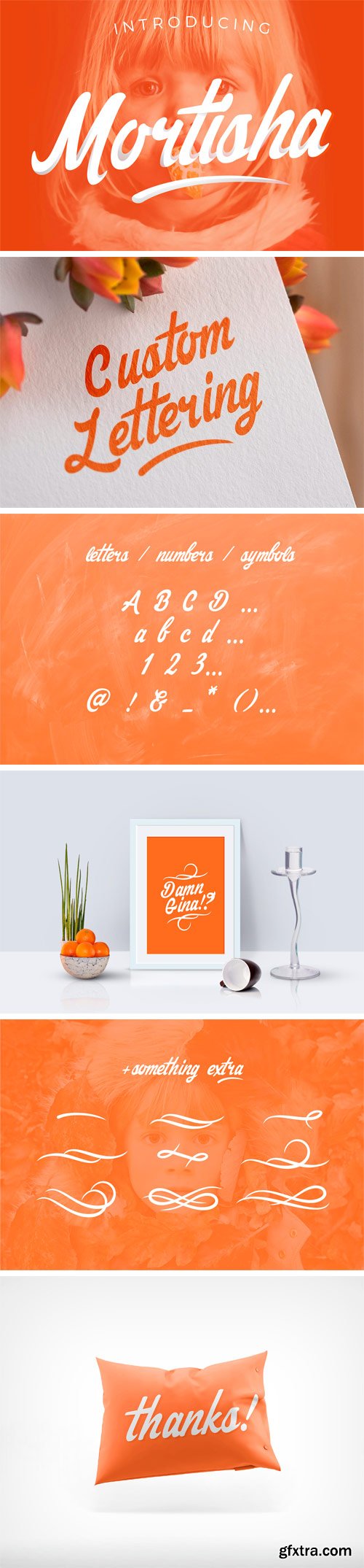
CM 1341958 - Mortisha Script + Swashes
Introducing, Mortisha Script. A unique personalized handmade font that has interesting flowing feel to it which is great for logotype / wordmark, posters, badges , headlines, apparel, cards & invitations, etc. The font comes with Swashes created to complement its movement. Mortisha Script is a young & attention demanding font that would be a great addition to your display font collection. Both the font and the swashes come in .OTF and .TTF formats so it is compatible with whatever design applications you use.
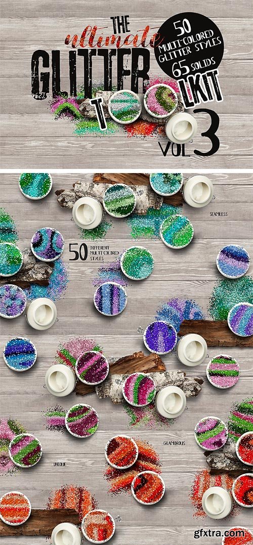
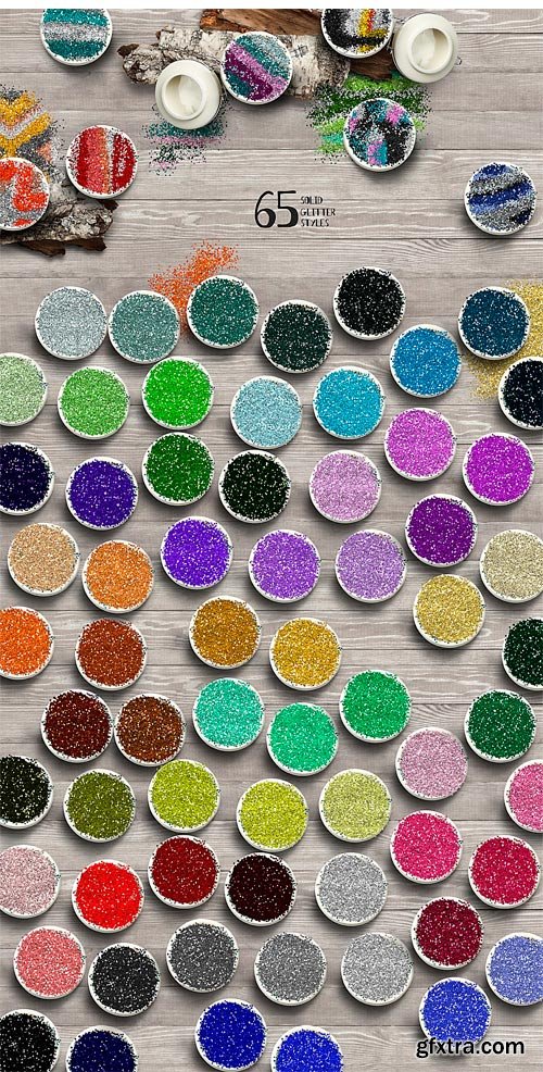
CM 1339443 - The Ultimate Glitter Toolkit Vol. 3
The ultimate Glitter Toolkit Volume 3. This set includes 50 different multicolored glitter styles, 65 solid glitter styles, all high quality asl files.
CM 1319088 - 29 Professional Lightroom Presets
29 Professional Lightroom Presets. Professional look in one click
~ Unlimited results with your photos (100%adjustable)
~ Compatible with both Mac & PC
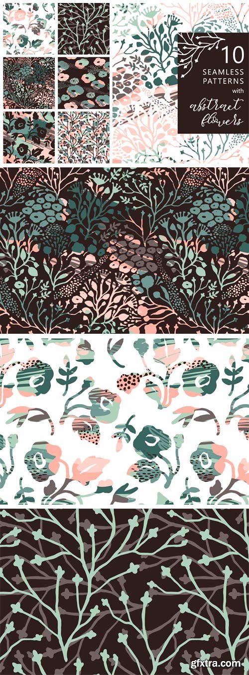
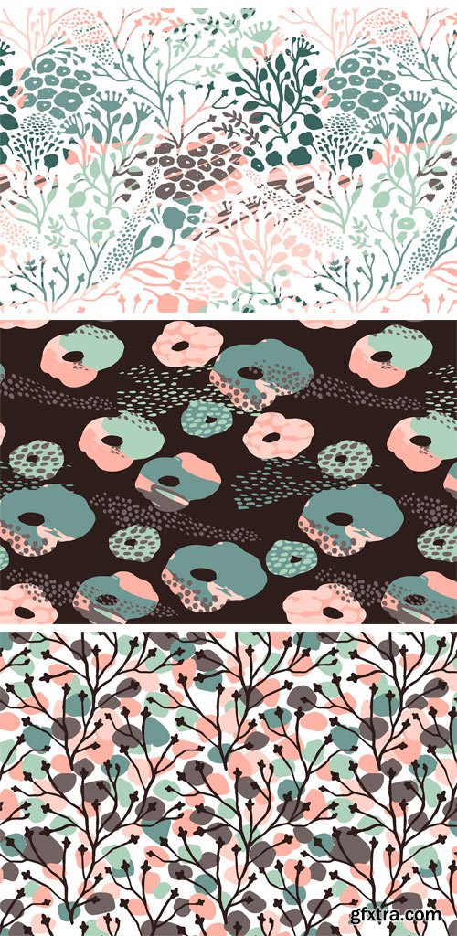
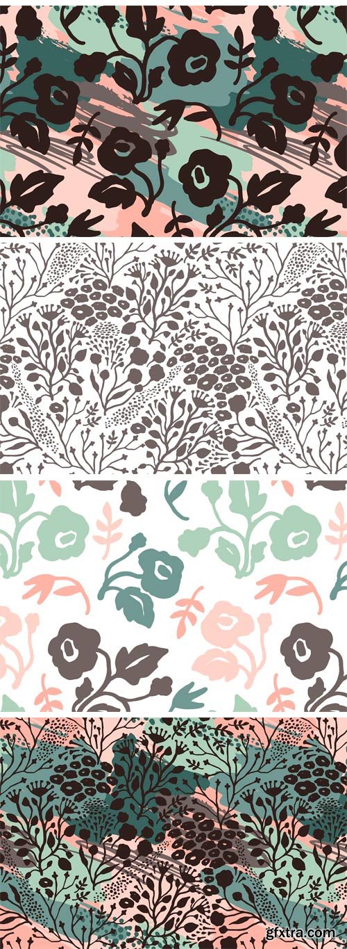
CM 1341596 - 10 Artistic Seamless Patterns
Set of artistic seamless pattern with trendy abstract flowers and brush strokes. Modern abstract design for paper, cover, fabric, interior decor and other users.
You will get:
• EPS(10) file with 10 patterns
• 10 JPG (300 dpi) files
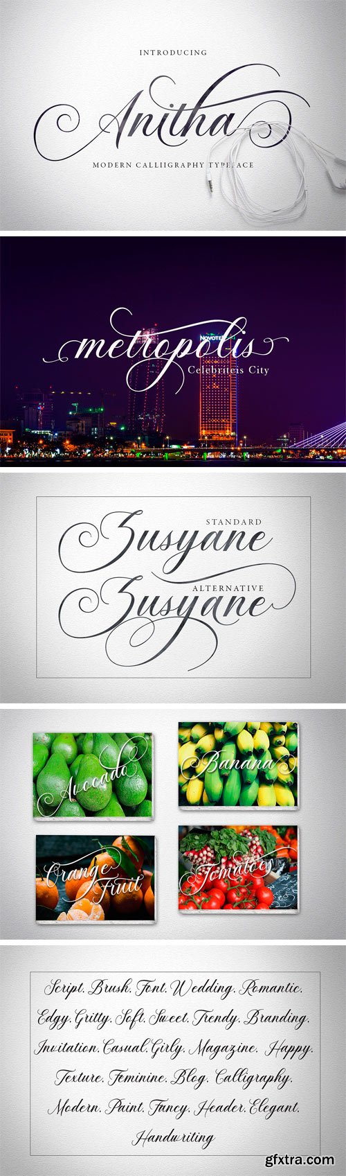
CM 1380045 - Anitha
Anitha is another lovely modern calligraphy typefaces, which is combining the style of classic calligraphy with an modern style. combines from copperplate to contemporary typeface with a dancing baseline, modern and elegant touch. Anitha features 496 glyphs and alternate characters Include . including initial and terminal letters, alternates, ligatures and multiple language support.
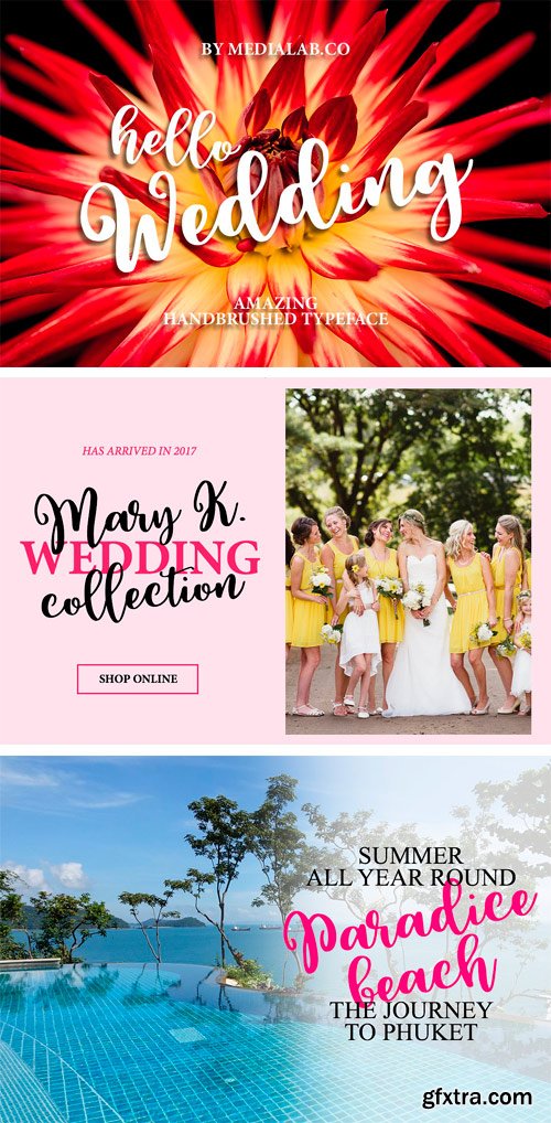
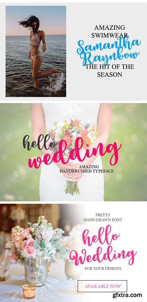
CM 1339411 - Hello Wedding
Introducing Hello Wedding. It's a sweet hand lettered font with swirls and alternates. Also with this type, you will see a lot of interesting extras. This brush font is ideal for branding and decorate your any project. This font are perfect for wedding postcard. Or you can create perfect and unique design of your logo, blog, stationery, marketing, magazines and more :)
https://www.youtube.com/watch?v=wd08TZLth4w
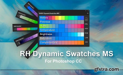
CM 1341600 - RH Dynamic Swatches MS
The Dynamic Swatches MS extension for Adobe Photoshop CC instantly and automatically generates nearby color swatches according to your preferences. When painting, color picking from the canvas is standard workflow. But the fluidity is broken when you need a variation of a color not already on the image. Perhaps you want a more saturated version, a brighter version, warmer, colder etc.
While the photoshop default swatches are handy for some situations they're far from adaptive, and usually not relevant to the image you're working on. So you pick a color and then start fiddling with sliders. And they can be fiddly.
Dynamic swatches are artist orientated in their utility, they take no CPU time while painting, they're completely integrated into Photoshop and can be docked, floated, scaled as large as you want right down to ridiculously small. They can be iconised, double tapped as tabs and held on secondary monitors etc if preferred.
Dynamic Swatches MS is a single panel product born of the surprisingly popular Dynamic Swatch series, combining all of them into one place with additional features. Dynamic Swatches MS has been tremendously recieved and has been tailored to encompass many requests.. all happy so far ! :)
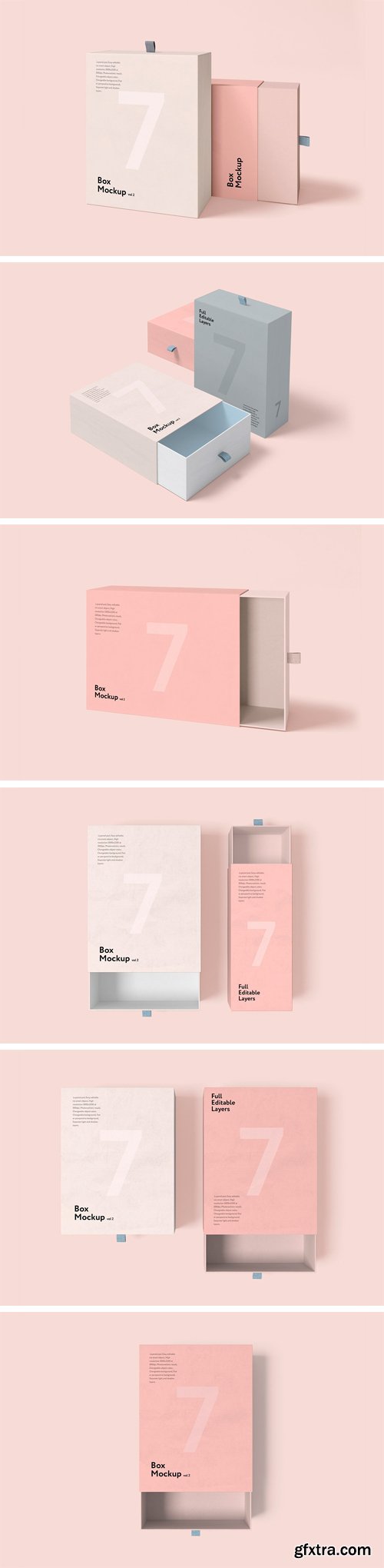
CM 1319908 - Box Mockup vol.2
Box and bag mock-up set includes 7psd files with organized layers and folders and help pdf file.
Features:
• Layered psd,
• Easy editable via smart object,
• High resolution 3000x2250 at 300dpi,
• Photorealistic result,
• Changeable object color,
• Changeable background,
• Separate light and shadow layers.
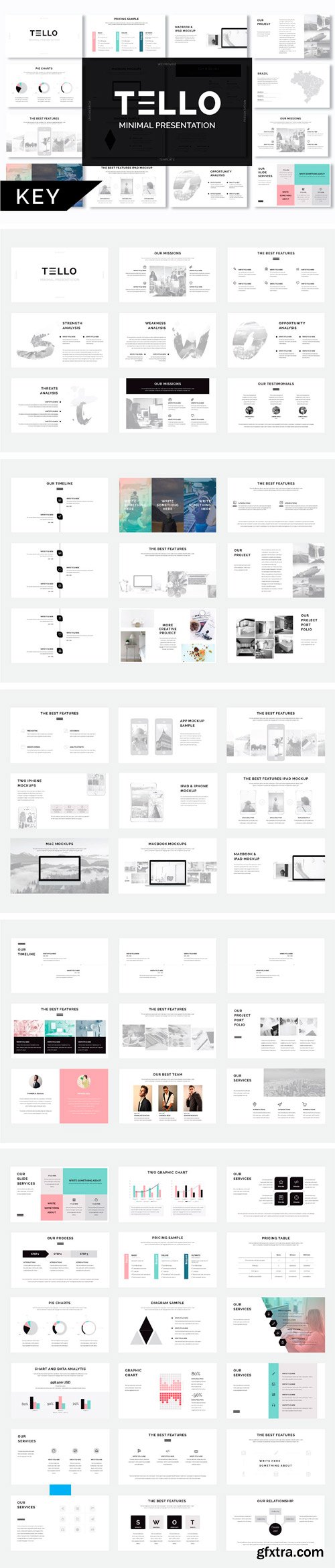
CM 1321545 - Tello Minimal Keynote Template
Show your awesome work with Tello minimal keynote template. to the audience or clients were amazed with the results of your presentation. The design is modern, minimalist and professional. photo layouts, charts, infographics, maps, tables, vector icons, diagrams, and other very easy to edit.
Exclusive features:
• Modern and minimal design
• 87+ Awesome slides
• 16:9 Slides size
• Easy and fully editable in keynote
• Easy Drag and Drop to change picture
• Vector icons included in presentation
• More details inside of PDF Help
• Including Links of Fonts (Free Font)
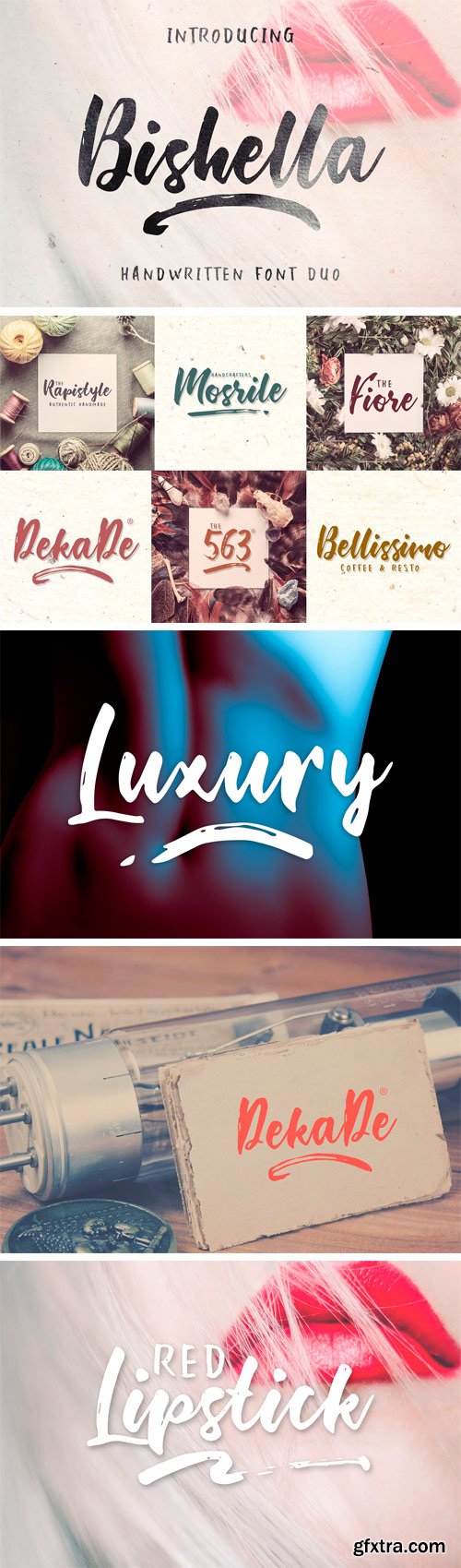
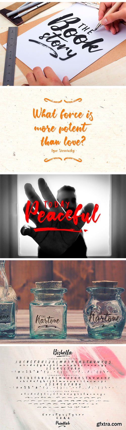
CM 1341585 - Bishella Script Font Duo
Again presented a hand brush products. The style of handwriting and irregular but still elegant, and you will enjoy to use this font style. Bishella Script has standard ligatures included - to give the font a more natural, scripted look when you have any double letters in your design. It also has multilingual support with accented characters for international users. Bishella Script is perfect for branding projects, homeware designs, product packaging - or simply as a stylish text overlay to any background image.
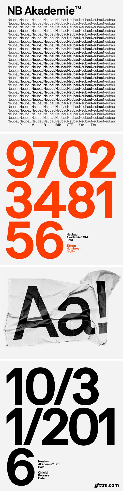
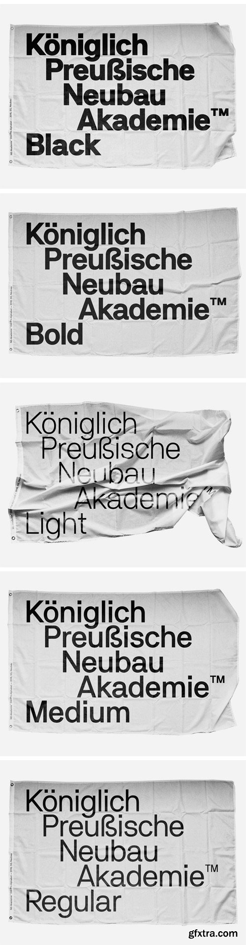
https://neubauladen.com/product/nb-akademie-edition/
NB Akademie™ is a contemporary sans-serif grotesque type system designed by Stefan Gandl comprising of 20 styles: Light, Light-Italic, Mono Light, Mono Light-Italic, Regular, Italic, Mono, Mono-Italic, Medium, Medium-Italic, Mono Medium, Mono Medium-Italic, Bold, Bold-Italic, Mono Bold, Mono Bold-Italic, Black, Black-Italic, Mono Black, Mono Black-Italic. The typeface’s infuences and naming go way back to legendary German type designer Ferdinand Theinhardt and his revolutionary typeset ‘Royal Grotesk’ (1880) designed for the publications of the “Königlich-Preußischen Akademie der Wissenschaften zu Berlin”. After selling his own type foundry ‘Ferd. Theinhardt Schriftgiesserei Berlin’ Theinhardt’s ‘Royal Grotesk’ later became internationally successful as Berthold’s Akzidenz Grotesk (1896) — the godmother of all modern grotesque typefaces.
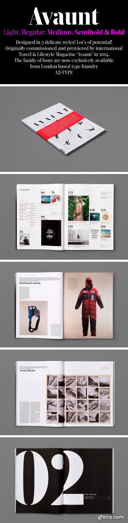
https://www.a2-type.co.uk/avaunt-stencil
Avaunt Stencil was originally commissioned by art director Matt Willey for his design and launch of AVAUNT Magazine in early 2014. Avaunt Stencil was designed with a limited character set in one weight only by Henrik Kubel. In 2016 Kubel reworked the font and added multiple weights plus an expanded glyph set covering multiple languages.
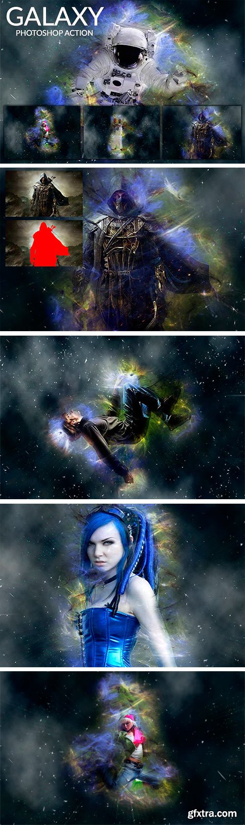
CM 1340933 - Galaxy - Photoshop Action
Galaxy - Photoshop Action is Amazing action wich is well organized The layers based on smart filters so you can easily adjust later the tones and detail layer. . File Included ATN and Help file – Easy and simple to use! The images showed in this preview are not included. Action is Created and tested in ENGLISH VERSION OF PHOTOSHOP To have better result use High quality Photos 1920×1080 and Higher Resulution.
126,000 Royalty-Free 3D Model

Udemy Türkçe


Top Rated News
- CreativeLive Tutorial Collections
- Fasttracktutorials Course
- Chaos Cosmos Library
- MRMockup - Mockup Bundle
- Finding North Photography
- Sean Archer
- John Gress Photography
- Motion Science
- AwTeaches
- Learn Squared
- PhotoWhoa
- Houdini-Course
- Photigy
- August Dering Photography
- StudioGuti
- Creatoom
- Creature Art Teacher
- Creator Foundry
- Patreon Collections
- Udemy - Turkce
- BigFilms
- Jerry Ghionis
- ACIDBITE
- BigMediumSmall
- Globe Plants
- Unleashed Education
- The School of Photography
- Visual Education
- LeartesStudios - Cosmos
- Fxphd
- All Veer Fancy Collection!
- All OJO Images
- All ZZVe Vectors
- CGTrader 1 CGTrader 2


