
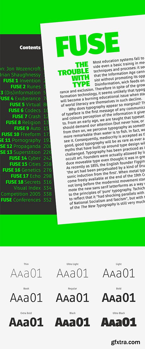
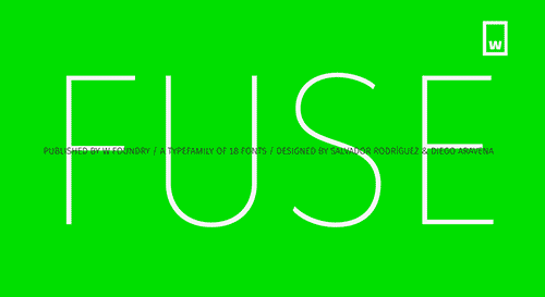
Fuse - 18 Styles Font Family $180
18 Fonts | OTF | TTF | WoFF | +Previews | Turkish Support | SALE PAGE
- This font is inspired by two typographic styles, having geometry on one hand and humanism in the other. Combining the rhythm of typefaces such as Meta pro and The Sans, as well as terminations and structures from fonts such as Din and Futura, which translates into a font which plays between condensation and a parallel rhythm simple and functional.Fuse is perfectly equipped with Opentype, it contains alternative glyphs, fractions, modern and old numbers, superscripts and subscripts, ligatures and Small Caps. We always kept the idea of having Fuse be humanistic, rational and universal, which is why it is ideal for graphic design, printed publications, web design, motion graphics, interaction design and branding.
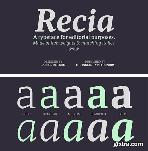
Recia - 10 Styles Font Family $260
10 Fonts | OTF | TTF | WoFF | Turkish Support | Multilingual | +Previews | SALE PAGE
- Recia is Carlos De Toro’s debut typeface with ITF. Recia is a contemporary-style serif. The family comes in 10 styles, and its five Italic fonts are ‘true-italic’ designs, which feature a cursive-structure in the letters. Its x-height is pretty high and the characters are slightly condensed, with strokes that are rather low-contrast. In the lighter weights, hardly any stroke contrast is visible between the thick and thin portions of the letters, but in the Bold weights, stroke contrast is clear, but the thinner strokes are still quite chunky. The serifs all take wedge-shapes. Each font contains 516 glyphs, and the character set offers users multiple figure styles via OpenType features. The default numeral versions are proportional oldstyle figures. Recia is optimised for use in running text, particularly in less-than-optimal printing environments were sturdy letterforms are needed.

Kanzen - Typeface of Cyberpunk Realm £29
by Studio Innate
OFT / TTF | WOFF / WOFF2 | SALE PAGE
289 glyphs | 234 letters & numbers (including alternates)
- Experience the cyberpunk realm with Kanzen font. This impeccably crafted typeface is perfect for logos and headers. With a modular design and alternative characters, Kanzen captures the essence of a futuristic digital age. Introducing Kanzen, an impeccably crafted font that will transport you into the cyberpunk realm of a distant future. This futuristic typeface exudes an aura of technological prowess, replete with a vast array of alternative characters and a modular design. With each letter of Kanzen comprised of multiple parts, it seamlessly facilitates the creation of logos, symbols, and headers with unparalleled ease. A true testament to advanced technology, Kanzen encompasses a staggering 300 characters, each meticulously crafted to embody the essence of a digital age yet to come.

Andromecha - A Futuristic Font by Studio Innate £18
by AN Górski
OTF | TTF | WoFF/WoFF2 | +Previews | SALE PAGE
Uppercase (175) | Numbers (13) | Punctuation (41) | Others (54) | Supports over 100 languages
- Andromecha is a versatile display typeface that combines upper and lowercase characters, making it suitable for a wide range of design projects. With support for over 100 languages, it ensures inclusivity and accessibility. Drawing inspiration from androids and mechas, Andromecha captures their futuristic vibe with its wide structure and distinctive 45° cuts. Whether you’re working on logos, headlines, posters, or any creative project, Andromecha adds a touch of modernity and uniqueness to your designs.

YFF Zusker 50 Styles & 1 Variable Fonts Collection
by YourFontFetish
50 Fonts | OTF | TTF | WoFF/WoFF2 | 1 Variable Font TTF | +Previews | SALE PAGE
- YFF Zusker will close the need for a good working geometric grotesque. for speakers of rare and small Cyrillic languages. In addition, there are arrows, numbers in circles, and icons. There are ten options for icons with eyes alone. YFF Zusker typeface was designed from 2019 to 2025 by Alexander Kapusta.
- YFF Zusker is a warm geometric sans serif with a vintage feel. It’s versatile and works equally well in text paragraphs on information-rich websites, friendly logos, and bold, expressive headings. Style system. The typeface includes 50 styles, ranging from moderately condensed to normal widths, and from Thin to Extra Bold. All styles are combined in a variable font.
- The primary source of inspiration for the designer, Alexander Kapusta, was Soviet-era catalogs and atlases set in Zhurnalnaya Rublenaya (Journal Sans). The Thin and Extra Bold styles, meanwhile, draw from mid-20th-century American appliance manuals and the iconic geometric sans serif Futura. As a result, YFF Zusker is an excellent choice when you want to bring a sense of nostalgia and human warmth into a design. Character set. A distinctive feature of YFF Zusker is its extensive language support. It covers more than 400 languages, including all minority languages of Russia — from Abazin to Yukagir.


GT Canon - New!
2026's Biggest 224 Styles Font Family $1512
Designed by Grilli Type | Released in 2026 | Available in 224 styles
- GT Canon’s design is pragmatic but not static: movement and liveliness are embedded in the letterforms. It is our answer to what our digital times require of a serif today. It’s what a contemporary serif should be in both form and function. Like its sans serif sibling, GT Standard, it aims for modern functionality rather than stylistic reinvention.

Discount - 16 Styles Font Family $65
16 Fonts | OTF | Web Fonts | +Previews | PDF | SALE PAGE
- A sans serif, all-caps typeface with 16 styles! It all started with the street sign concept. There are a billion different ways to do a street sign, but most of them just feel old. Tactile is now no longer hip. No more shadows, no more 3D skeumorphic, nothing. I sat down, started to make the sign using a font that Dathan (Boardman) and I created and it just… appeared!
- Available fonts: Thin, Thin Slant, Extra Light, Extra Light Slant, Light, Light Slant, Regular, Regular Slant, Medium, Medium Slant, Bold, Bold Slant, Heavy, Heavy Slant, Black, Black Slant.


GT Era - 28 Styles Font Family NEW! $630
Pre-Modern Grotesk Typefaces
Designed by Thierry Blancpain with Grilli Type | Released in 2025
Available in 28 styles | TTF | Display & Text Fonts | RAR 3 MB | HOME PAGE
- GT Era reimagines the warmth and idiosyncrasies of early grotesk typefaces for our own era. These pre-modernist tools were being pushed to their extremes in the radical designs of the modernist movements—like Bauhaus and De Stijl—of the period. The typeface shuns neutrality and embraces friction, championing recognition over uniformity and flavor over conformity.
- GT Era, released in 2025 by Grilli Type AG in Luzern, Switzerland, is a grotesque sans-serif typeface offered in 8 weights, display and text styles, and upright and oblique slants. Its distinguished by a warmth characteristic of pre-modern grotesk typefaces but adapted to contemporary applications.

Grunt Grotesk 7 OTF, 1 TTF Variable Fonts $120
MYFONTS NEW! | 7 OTF | 1 TTF Variable | +Previews | RAR 1 MB | SALE PAGE
Grunt Grotesk is a modern Ukrainian sans-serif typeface with a number of distinct characteristics,
which make it unboring but still great in the massive text blocks.

KTF Prima - 7 Styles Font Family €90
7 Fonts | OTF | WoFF2 | +Previews | PDF Specimen | 8 MB RAR | SALE PAGE
- It began ten years ago, during his studies at ECAL, when Yevgeniy Anfalov became interested* in Forma—often perceived as one of the warmer modernist sans serifs due to its proportions and restrained contrast. Its history reflects tensions between individual authorship and collective production, shaped by technical and organizational changes in Italian type foundry Nebiolo during the late 1960s and 1970s.


Rytual by Superior Type NEW, April 2026!
54xOTF, 1xTTF Variable €1620
Regular | Condensed | Extra Condensed | 18x3=54xOTF | 1xTTF Variable | RAR 11 MB | SALE PAGE
- The name came from a running. Same time, same route, whatever the weather, coffee after. A Rytual. The typeface follows the same logic: no single dramatic move, just one decision repeated consistently until the character accumulates. What started as a custom job for a friend grew into a full family, shaped by the rhythm that ran alongside it.
- Rytual is a grotesque built on clean, modern forms with a slightly narrow stance. Pointed terminals are cut away and replaced with sharp, rectangular endings, giving the letters a more constructed, precise quality throughout. The same logic carries into letters with fully or partially rectangular constructions, keeping the feeling consistent across the set. Narrow by nature, not by force. Stylistic alternates and three widths (Normal, Condensed, and ExtraCondensed) round out the system.

Gardenia - 18 Styles Font Family $180
18 Fonts | OTF | +Previews | Turkish Support | Multilingual | SALE PAGE
- Gardenia is a grotesk sans-serif. It comes in 9 weights with matching italics. It was designed by Salvador Rodríguez in 2015/2016. It is characterized by legibility in the medium sizes, black and thin weights are great performers in display sizes. Gardenia is well suited for longer texts and headlines. It’s perfect for graphic design, web, print, motion graphics, interaction design etc… Gardenia is equipped with a wide range of opentype features.

Twine - 4 Styles Font Family $99
4 Fonts | OTF | +Previews | SALE PAGE
- By twisting and weaving separate strands of rope together, a stronger TWINE is created. The distinctive “valleys” that give the twine its twisted and wavy appearance is the result of the twining process.
- Similarly, TWINE the font, is an exaggerated representation of the calligrapher’s individual pen strokes that create a cohesive character which is enhanced with the stencil. Unlike other stencils, TWINE emphasizes calligraphic strokes, so you will find it very legible even in small point sizes. Check it out!
- Furthermore, twine is inspired by Plantin, an old-style serif typeface named after the printer Christophe Plantin, which is based on the 16th century Gros Cicero face cut by Robert Granjon.
- Twine is a great choice when you need a font that is timeless, contemporary and distinctive. Perfect for Advertising, Corporate identities and Packaging design, Museum display, Technology, Hospitality, Travel, and Retail applications.
- Twine is available in TWINE Regular, TWINE Italic, TWINE Bold, TWINE Bold Italic. It is a Stencil that is Distinctive, Contemporary, and Timeless.

Azbuka - 20 Styles Font Family $420
20 Fonts | OTF | TTF | WoFF | +Previews | Turkish Support | Multilanguage | SALE PAGE
- The Azbuka™ typeface family has its roots in a fairly pedestrian source. “The idea came in part from an old sign in London that read ‘SPRINKLER STOP VALVE’,” says Dave Farey, designer of the typeface. Like all good sign spotters, Farey took a photograph of the sign and filed it away for possible use in a lettering or typeface design project. In Prague a number of years later, the street signs reminded Farey of the London signage - and his camera came out again. Comparing the two back in his studio, he realized that the signs from London and Prague were not as similar as he initially thought. However, they were enough alike to serve as the foundation for a no-frills, 21st century sans serif typeface family.


Perec - 13 of 18 Styles of Font Family $394
- The type family Perec pays tribute to the genius of Georges Perec, it is a versatile super family that can be used at a wide range of applications, formed by three subfamilies:
- Perec, a sensitive sanserif grotesque, including 15 fonts: romans, italics, and small caps declined in five weights. With a more delicate spirit than that of a sans grotesque Perec performs well not only in display sizes where elegance and flair are needed, but also in text sizes as its open counters make it comfortably readable. Its smooth color texture and range of weights from SuperBlanca to SuperNegra allow for a pleasant reading experience.

Proband Special - 6 Styles Font Family $105
- The goal was to create a typeface that looks reputable and still original. Notably, some uppercase characters indicate this font its unique character. It is ideally suited for both body text and headings, or modern logos.

Ratio Modern - 5 Styles Font Family $100
- Designed in 1923 by Friedrich Kleukens for the Stempel foundry, Ratio was one of the first metal faces to bring the Didone genre to the forefront of industrial mass publishing as a headline and magazine face. Though essentially modern in construct, Ratio incorporates some old-style and transitional traits, managing to summarize the European evolution of this particular aesthetic. This is evident in its shaped serifs, soft roundings, an elegantly subdued italic, the variation of its shapes between weights, and the obvious fat face influence in the ExtraBold. Thus Ratio finds the balance between modern elegance and fine typographic tradition.This exclusive digitization expands on the original metal set by including small capitals and many alternates in all the styles. It also boasts a larger than usual linguistic support.


Quercus Serif - 16 Styles Font Family $349
16 Fonts | OTF | TTF | SALE PAGE
- Quercus is characterised by open, yet a little bit condensed drawing with sufficient spacing so that the neighbouring letters never touch. It has eight interpolated weights with respective italics. Their fine gradation allows to find an exact valeur for any kind of design, especially on the web. Quercus serif styles took inspiration from classicistic typefaces with vertical shadows, ball terminals and thin serifs. The italics have the same width proportion as upright styles. This “modern” attitude is applied to both families and calls for use on the same page, e g in dictionaries and cultural programmes. Serif styles marked by “10” are dedicated to textual point sizes and long reading. The sans-serif principle is rather minimalistic, with subtle shadows and thinned joints between curved shapes and stems. Quercus family comprises of the usual functionality such as Small Caps, Cyrillics, diacritics, ligatures, scientific and aesthetic variants, swashes, and other bells & whistles. It excels in informational and magazine design, corporate identity and branding, but it’s very well suited for book covers, catalogues and posters as well.

Quercus Sans - 16 Styles Font Family $349
16 Fonts | OTF | TTF | SALE PAGE
- “Quercus” is characterised by open, yet a little bit condensed drawing with sufficient spacing so that the neighbouring letters never touch. It has eight interpolated weights with respective italics. Their fine gradation allows to find an exact valeur for any kind of design, especially on the web. Quercus serif styles took inspiration from classicistic typefaces with vertical shadows, ball terminals and thin serifs. The italics have the same width proportion as upright styles. This “modern” attitude is applied to both families and calls for use on the same page, e g in dictionaries and cultural programmes. Serif styles marked by “10” are dedicated to textual point sizes and long reading. The sans-serif principle is rather minimalistic, with subtle shadows and thinned joints between curved shapes and stems. Quercus family comprises of the usual functionality such as Small Caps, Cyrillics, diacritics, ligatures, scientific and aesthetic variants, swashes, and other bells & whistles. It excels in informational and magazine design, corporate identity and branding, but it’s very well suited for book covers, catalogues and posters as well.


Neutraliser Serif - 6 Styles Font Family $120
- The Neutraliser family is a versatile collection of geometric-based fonts with 24 styles. The 6 Alternate styles are suitable for headlines and are complemented by the Sans and Serif styles suitable for small amounts text. The Caps styles allow for extra typographic variation within the family.
- Neutraliser is a direct result of the designers' initial exploration of typography and is uncompromising in its geometric nature. As the name suggests, the typeface celebrates the precision of the digital medium as a drawing tool in which the critical points that make up a letterform can be almost ‘plotted’ according to a grid-based logic.
126,000 Royalty-Free 3D Model

Udemy Türkçe


Top Rated News
- CreativeLive Tutorial Collections
- Fasttracktutorials Course
- Chaos Cosmos Library
- MRMockup - Mockup Bundle
- Finding North Photography
- Sean Archer
- John Gress Photography
- Motion Science
- AwTeaches
- Learn Squared
- PhotoWhoa
- Houdini-Course
- Photigy
- August Dering Photography
- StudioGuti
- Creatoom
- Creature Art Teacher
- Creator Foundry
- Patreon Collections
- Udemy - Turkce
- BigFilms
- Jerry Ghionis
- ACIDBITE
- BigMediumSmall
- Globe Plants
- Unleashed Education
- The School of Photography
- Visual Education
- LeartesStudios - Cosmos
- Fxphd
- All Veer Fancy Collection!
- All OJO Images
- All ZZVe Vectors
- CGTrader 1 CGTrader 2


