

Festivo Letters Font Family - 19 Fonts for $95
OTF | 19 Fonts | +Preview | 7.2 Mb RAR | SALE PAGE
- Festivo Font Family is a handmade layered font which includes several textures, shadows. Different font types can be created using various combinations of Festivo Fonts and colors. All fonts of Festivo letters are created as hand-drawn design based on F.L. NO:8 Font’s Letters. The fonts No:16, No:17 and No:19 have the same metric and kerning structure than the other Festivo Fonts except No:18. So each one of these 3 fonts are a layer. But they can also be use as wide spaced fonts. No:18 is specific with its metric and kerning structure which was formed by No:17 but No:18 is its bold version. It was designed as a supplemental font. The fonts No:12 and No:15 can be used as shadows. This font family also includes a few ornaments. For your convenience, the files of the fonts were termed by their numbers. The various possibilities of the Festivo Font Family allows you to create a lot of great works such as posters, magazines, printings, t-shirts etc.

Progressiva Font Family - 11 Fonts for $120
OTF | 11 Fonts | +Previews | 3.3 Mb RAR | SALE PAGE
- Progressiva is a sans serif type family for text and display usage. With some unique playful forms and a little bit condensed structure, the family is ideal for texts that require some personality and titles with great visual presence. Progressiva family is composed by 11 roman styles, from Thin to UltraBlack, giving a lot of space for visual variance. Each font includes some standard and discretionary ligatures as well as some alternative letterforms included in stylistic alternates and stylistic sets OpenType features. It’s suitable for magazines, posters, packaging, advertising, signage systems, corporate material and so on.
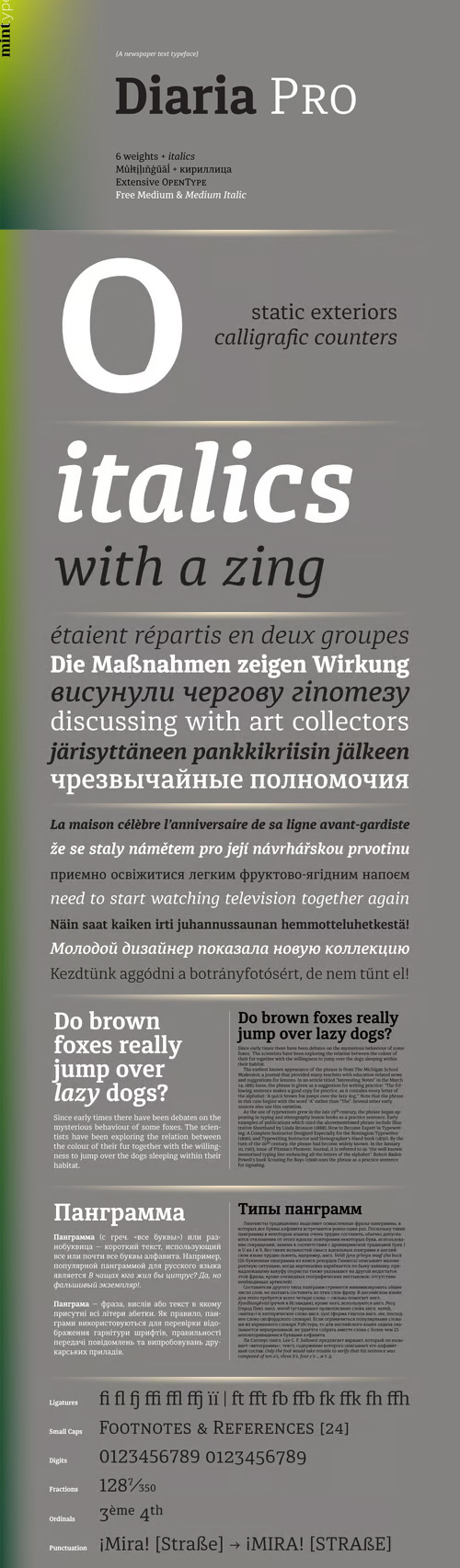
Diaria Pro - A Newspaper Text Typeface 12 Fonts $245
OTF | 12 Fonts | +Preview | SALE PAGE
- Diaria started as a project in Typeface Architecture for Master in Advanced Typograghy at EINA, Centre Universitari de Disseny i Art de Barcelona, a course tutored by Laura Meseguer and Íñigo Jerez Quintana. Later it has developed into Diaria Pro, an extensive typeface including Cyrillic script, small caps, and various OpenType features. Diaria Pro is a low-contrast serif typeface designed as a primary text face for the newspapers. Its large x-height and static exteriors allow comfortable reading in narrow columns, and calligrafic counters as well as dynamic serifs add humanist detail to overall perception and incline contrast axis without affecting interletter counterforms. Besides extensive language support, Diaria Pro includes various OpenType features: ligatures, discretionary ligatures, small caps, 6 sets of digits, superiors, inferiors, fractions, ordinals, upper-case punctuation, and some language-specific features.

Halogen Pro Font Family 19xOTF $260
14 Halogen Pro, 5 Halogen Flare Fonts | OTF | 3.7 Mb RAR | SALE PAGE
- Who doesn't want or need an expansive contemporary extended sans that has a sense of style and swagger… what if it had a lowercase, small caps and various numeral options… how could you say no? This was the foundational argument I made for myself when I drew the initial alphabet on my birthday last year (something I do each year, draw a new font, kind of a fun OCD thing). I wanted to see a wide, utilitarian sans that had more to it than just a basic character set and didn't resemble standard geometric models. As I continued sketching, the letterforms were being influenced more by my ‘lettering tendencies’ than the normal mechanical trappings of drawing flat, wide letters. The letters have retained aspects of letters created by hand — stresses, modulation, naturally ending terminals. Truncation and quick clipping of strokes became antithetical to the letterforms I drew, so I continued this once I brought the design into the computer. I kept it precise and dependable, but made every attempt to keep a conscientiously crafted typeface and not let it devolve into a grid-based drone. As such, it works just as well looking back in time as much as it does assuming a lead role in a sci-fi movie.
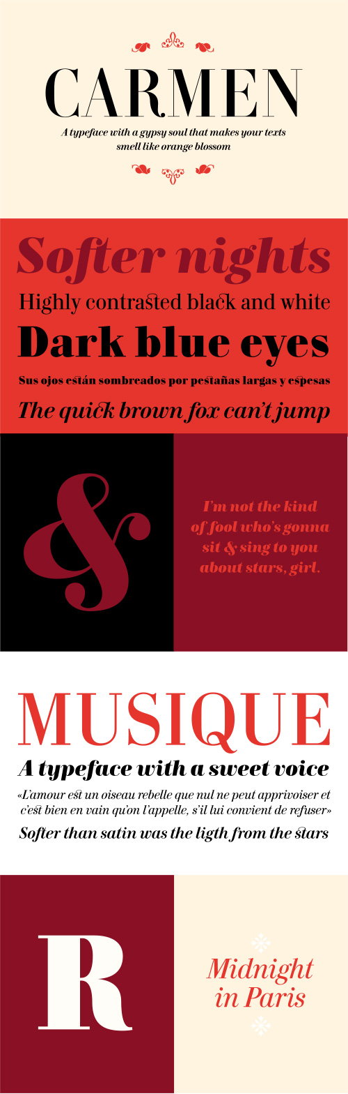
Carmen Font Family 6 Fonts €250
Best typeface of 2008 (typographica.org)
- Carmen is a text type family inspired on the famous Prosper Mérimée’s book character Carmen, the Spanish gypsy woman who defied her fate for the sake of love.
- It was first designed as a commissioned work for a new revised edition of the famous novel “Carmen”. The typeface has some sort of Latin Spanish-French flavor that leads us into the early nineteenth century but with a contemporary view. It works fine for both reading text and headlines. Its Italics provide a nice rythm and dinamism within the text. The shapes of letters show a taste for elegance and extravaganza at the same time.
- Carmen Black exaggerates some of the details visible in the Regular and Medium styles, providing greater strength and character to the whole.
- A customized version of Carmen was used as a corporate typeface for Victoria’s Secret lingerie and women’s clothing company. It has been also used for fashion magazines in different countries since it includes an extended character set and a complete set of ligatures, also.

Crystal Rhinestone Sports Hotfix
TTF RHINESTONE Template
OTF/TTF | SALE PAGE
Get the perfect TTF RHINESTONE Template font, just install and type any word using any Rhinestone size you want and create words in seconds. Get yours today!
PRODUCT DESCRIPTION
This is a very cool Rhinestone Template TTF will let you create words in seconds! simply download, install, and type… It’s that easy! In addition, when you type, each letter is filled perfectly with rhinestones or arranged and trapped for heat transfer vinyl so you can conveniently customize your designs with text. SEE the size of each letter in the images of the publication. This TTF RHINESTONE Template font comes in two font formats. (.OTF & .TTF). Use this to make rhinestone T-shirts, heat transfer vinyl, and more.


Clasica Sans Font Family $126
- Clasic Sans is a fresh and contemporary typeface family. Consisting of 7 standard fonts and 7 italic fonts, it is perfect for all kinds of editorial and print designs. Clasic Sans covers a lot of weights, working well into paragraphs of small and large text sizes. Independent of it’s use, size or alignment, this family maintains a solid appearance, product of their balanced contrast. In short, it is a font based on classical proportions, but with a fresh and contemporary look. Ideal for the most versatile designs.

DR-Pecker Typeface
OTF/TTF | HOME PAGE
- Daniel Reed designed the beautiful DR-Pecker typeface. In a time of uncertainty, fear and frustration, Daniel wanted to provide some light relief by creating a typeface that was silly, playful and hopefully produces a smile. DR-Pecker is as absurd as it sounds, yes it really is a typeface made from penises!
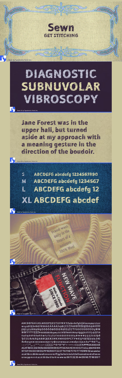
Sewn - Mechanically Embroidered Fonts $108
4 Fonts | OTF/TTF | WoFF + Setyle Sheet | +Previews | 3.7 MB | SALE PAGE
- Sewn is a mechanically embroidered font in four sizes: small, medium, large & extra-large. Smaller sizes have heavier thread and less stitches. The OpenType format feautures autoligs which automatically swap common letter pairs with variations to create a more realistic, less repetetive effect.

Usual Font Family $242
- Usual is an utilitarian typeface, suitable for whenever typographic sobriety and neutrality is needed.
- With a clear modernist inspiration, Usual was born of the attempt at using a scale of proportions in type design.
- Similarly to Le Corbusier’s Modulor, the scale of proportions used in Usual, works as a tool or program for the typeface’s metrics, and consequently, the rhythm of the stems.
- Usual comprises 5 weights from Light to Extra Bold, with matching italics. It was designed to work well in a broad range of body sizes, from text settings to headlines. In addition to stylistic alternates and arrows, Usual’s OpenType features include letters with shorter descenders, useful for setting headlines with tight line-spacing.


Coegit Font Family - 32 Font $1024
OTF | WOFF | 2.3 MB | SALE PAGE
- In the world of webfonts, Condensed proportions are key to maximizing your page’s premium real estate while keeping your copy clean and catchy as you cut down to the essentials. Soon after the introduction of webfonts, I began to see Insigne’s Le Havre used frequently for web headlines, not so much for its Art Deco look as for its more compact proportions. There seemed to be a need for a font that was designed to be used solely for the web’s unique constraints. Enter Coegit Sans.Coegit is built specifically for web applications. Its highly Condensed forms range from thin--offering the greatest number of uses--to the attractive, accenting black. With three widths--Compressed, Compact, and the widest, Condensed --the family holds a total of sixteen fonts. The typefamily has also been hinted for excellent, onscreen display quality, even at small sizes. Overall, its lighter, humanist features provide the reader a more congenial welcome than its square, sans-serif counterparts can offer.Coegit is equipped for complex professional typography with stems, small caps and plenty of alts, including titling capitals. The face includes a number of numeral sets, including fractions, old-style and lining figures with superiors and inferiors. OpenType-capable applications such as Quark or the Adobe suite can take full advantage of automatically replacing ligatures and alternates. You can find these features demonstrated in the .pdf brochure.The family also includes glyphs to support a wide range of languages, including Central, Eastern and Western European languages. In all, Coegit supports over 40 languages that use the Latin script, making the new addition a great choice for multi-lingual publications and packaging.While the advanced OpenType features of webfonts are not currently supported in many browsers, the near future promises wide support. As acceptance of these features grow, Coegit Sans will prove to be a versatile element for your wide range of web projects.


Yorkten Font Family 54 Fonts $124
54 Fonts | OTF/TTF | +Preview | 5.7 Mb RAR | SALE PAGE
- Clean and welcoming, the distinct look of Yorkten is remarkably satisfying to the eye. Straight to the point, Yorkton features a fashionable, geometric composition with angled main stems. There are no fewer than fifty-four fonts in the family, all of which are characterized by one of three widths – extended, normal or condensed. Each individual subfamily is equipped with eight weights from Thin to Black with respective Italics, giving Yorkten a breathtaking range of fonts to boast. The greater value for you, though, is its members’ ability to work well together. With a deep toolbox of weights and widths to choose from, this family provides you with significant value and a broad number of design solutions, making sure you have the tools you need for each challenge. So where should you use the font? Jeremy Dooley designed Yorkten’s underpinning structure to be compact. Combined with its superior features and terrific legibility, this versatile font can be used effectively for many jobs, whether in print or on screen. Use it freely for e-books and apps. Yorkten is particularly great for headlines, banners, posters, and websites. As with all insigne fonts, fonts that are well received by the market are expanded into future variants such as rounded or slab serif types. Yorkten’s later expansions will increase the versatility and functionality of the family. There’s no need to wait for these future releases, though. This new face already complements a number of other insigne faces, such as Grayfel, Look, or the Cabrito Superfamily. So what are you waiting for? Get Yorkten today and bask in the rich potential it offers! Get Yorkten and luxuriate in its straightforward multifunctionality!

Sansational Font Family $118
6 Fonts | OTF/TTF | SALE PAGE
- “Sansational” is an original design by Alex Kaczun. The inspiration started with the shape of a “paper clip”. Simple and elegant. A condensed sans serif that’s, well... just sansational! It’s a delight to use and view. Great for advertising, large headlines, web applications, and well... just about anything. Works equally well in a broad range of text point sizes.
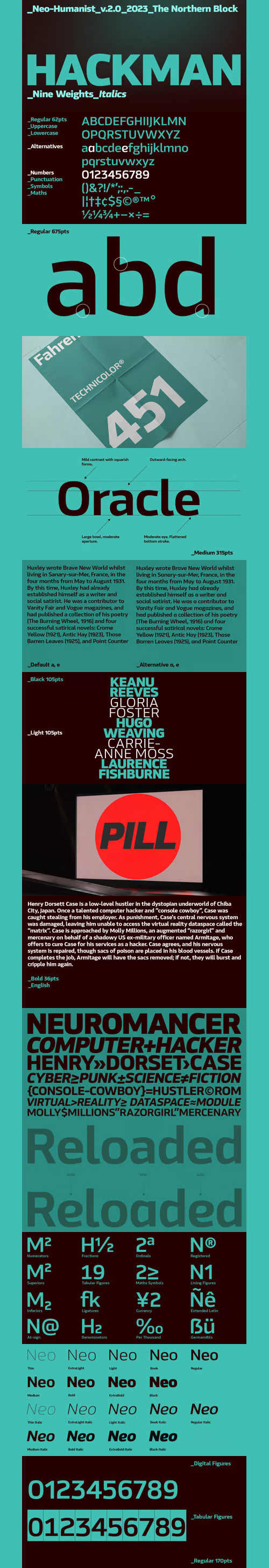
Hackman Font Family $299
- A geometric sans serif with contemporary lines. Distinctive curves are combined with classical letterforms to produce a clean, linear typeface best suited to identity, mobile and web applications. Details include 9 weights with italics, 500 characters, 5 variations of numerals, stylistic alternatives, manually edited kerning and OpenType features.

Karlsen Round Font Family $100
14 Fonts | OTF/TTF | SALE PAGE
- Designed and built in London by TypeUnion, Karlsen Round is a structured, functional typeface which embraces harmony, flow and versatility, but with a cheeky twist.
- The Karlsen Round Family is made up of 14 styles, which range from a delicate thin, all the way through to a substantial extra-bold and each carry a versatility for multiple applications and uses.Karlsen Round provides extensive language support to provide a flexible, substantial user experience.
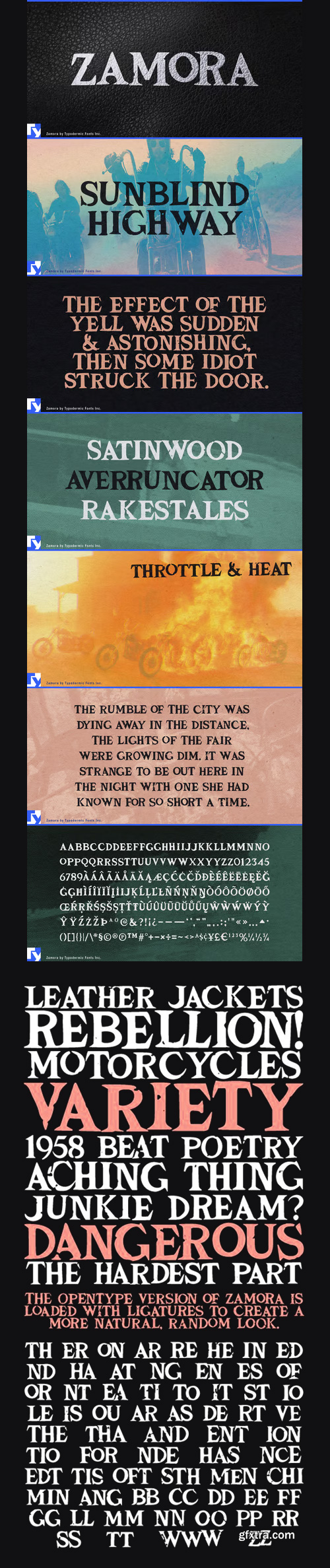
Zamora - A Rugged Latin-Serif OTF $70
OTF | TTF | 157 KB | SALE PAGE
Zamora wears its scrapes and scratches like battle scars.
Sharp Latin serifs give Zamora real intensity.
Zamora comes loaded with a variety of ligatures that give text a natural, random look.


Paquita Pro - Organic Slab Serif $39
3 OTF Fonts | Designer: Juanjo Lopez | SALE PAGE
- Paquita was my first foray into the turbulent world of typography. Created in full in about three hours drawing directly into the program, technically speaking was a disaster. Once achieved the highest levels of misery I decided to get serious and after a lot of studies and tweaks, is now in its Pro version on sale in this prestigious store.

Monosketch - Hand-Drawn Fonts
Inspired by Monospaced $26
3 OTF Fonts | Designer: Bartek Nowak | TURKISH SUPPORT | SALE PAGE
![]()
![]()
![]()
![]()
![]()
![]()
![]()
- Monosketch is a hand-drawn font inspired by monospaced fonts like Andale Mono. Monosketch Layer and Monosketch Black can be used together by layering Monosketch Layer above a differently colored Monosketch Black. Language support includes Western, Central and Eastern European character sets, as well as Baltic and Turkish languages.

Dimitrina - Minimum of Sharp Angles $150
6 OTF Fonts | Designer: Bobby Nikolaev Marinov | Publisher: Evolutionfonts | TURKISH SUPPORT |
- Dimitrina was created with a simple premise: Can there exist a typeface which features a minimum of sharp angles? And a readable typeface, as well? With these strict rules in mind, the development started. At first the typeface looked more like a script, and some characters ( M G or R, to name a few) still hold traces of a handwritten style which spices the overall taste of Dimitrina. Since the first draft every character was redrawn, and edited several times, for the purpose of making the typeface readable, and distinct at the same time. Estimate for yourself if our goals are achieved, while you observe the three weights which are available exclusively in MyFonts. All of them feature a full set of characters plus cyrillic support. You can also try the regular weight which is offered free.

DF Park - Biodiversity Dynamic Typeface $171
6 OTF Font Files | Designer: Ko Sliggers | SALE PAGE
DF Park is designed by Ko Sliggers from 2013-2014 and released by dutchfonts.
DF Park is a font six pack with the following styles:
DF Parkone | DF Parktwo | DF Parkthree | DF Parkfour | DF Parkfive | DF Parksix
- DF Park originates from an opportunistic attempt to develop a visual language for a huge theme pavilion for a country hosting a universal exhibition about food. The subject of the strip of greenhouses dealt with the history of biodiversity with it’s scope on food production. The fonts set (six styles) is designed not only to transfer the content of the exhibition but also to dress up the greenhouses facades with its lines and patterns. All the characters are composed of hand-painted lines when superimposed, form an endless variety of (letter)forms. Executed in transparent colourful layers you will find yourself entering a cathedral on a sunny day. In black and white it is more a charcoal calligraphy.

FF Fontesque Font Family
OTF | 20 Fonts | Preview | 1 Mb RAR | SALE PAGE
- Canadian type designer Nick Shinn created this display, serif, and script FontFont between 1994 and 2010. The family is ideally suited for advertising and packaging, book text as well as festive occasions. FF Fontesque provides advanced typographical support with features such as ligatures, alternate characters, case-sensitive forms, and stylistic alternates. It comes with a complete range of figure set options – oldstyle and lining figures, each in tabular and proportional widths.
126,000 Royalty-Free 3D Model

Udemy Türkçe


Top Rated News
- CreativeLive Tutorial Collections
- Fasttracktutorials Course
- Chaos Cosmos Library
- MRMockup - Mockup Bundle
- Finding North Photography
- Sean Archer
- John Gress Photography
- Motion Science
- AwTeaches
- Learn Squared
- PhotoWhoa
- Houdini-Course
- Photigy
- August Dering Photography
- StudioGuti
- Creatoom
- Creature Art Teacher
- Creator Foundry
- Patreon Collections
- Udemy - Turkce
- BigFilms
- Jerry Ghionis
- ACIDBITE
- BigMediumSmall
- Globe Plants
- Unleashed Education
- The School of Photography
- Visual Education
- LeartesStudios - Cosmos
- Fxphd
- All Veer Fancy Collection!
- All OJO Images
- All ZZVe Vectors
- CGTrader 1 CGTrader 2


