

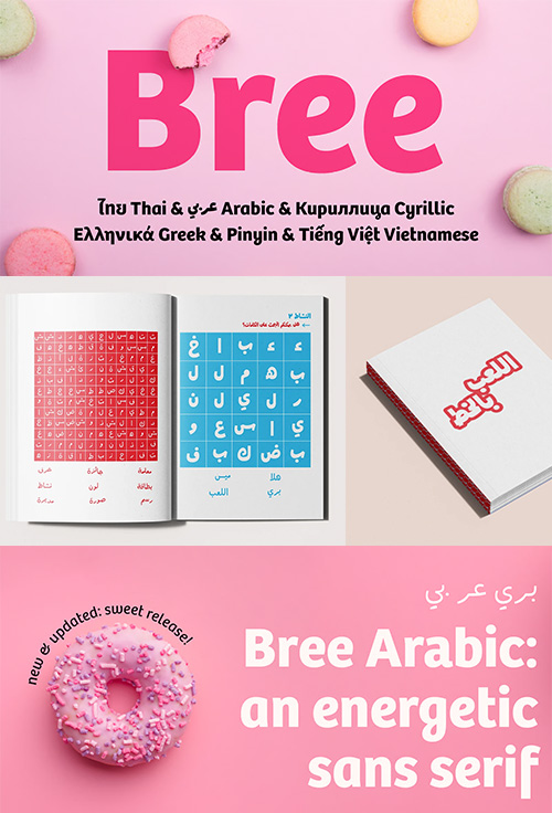
Bree Arabic - 7 Styles Font Family
7 Fonts | OTF | TTF | WoFF/WoFF2 | +Previews | PDF | RAR 11.6 MB | SALE PAGE $365
- The Bree Arabic font family is Azza Alameddine’s spry companion to the original Bree design by Veronika Burian and José Scaglione. The Arabic script delivers a spirited look and feel for branding and headline usage, while retaining a welcoming tone in paragraph text.

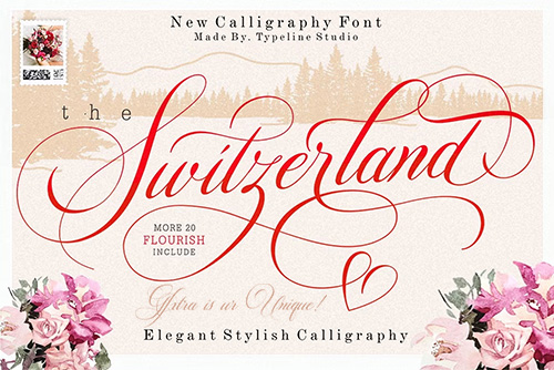
CM - Switzerland - Elegant Stylish Calligraphy 4221435
OTF | TTF | +Previews | RAR 2.3 MB | SALE PAGE $59
- Switzerland is Stylish calligraphy font,Switzerland made by hand with copperplate pen and opentype feature with pua encode,Switzerland calligraphy include alternative,stylistic set,ligature,and swash,Every glyph lowercase have a stylistic style,Switzerland is perfect for branding, wedding invites and cards or quote.
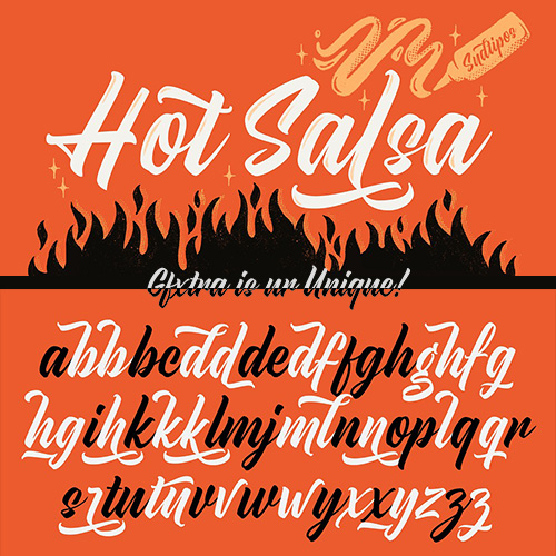
CM - Hot Salsa Brush Font 4221435
OTF | +Previews | RAR 2.5 MB | SALE PAGE $59
- Hot Salsa is a calligraphic script font inspired by the classic, fairly well-made brush letters from the casual sign painting style, mixed with the fast and gestural tags you can find on walls all around the world. This is a fresh font that allows you to play with its numerous swashes, alternates and ligatures to make it feel more sober or a little flirty depending on your needs. Hot Salsa started with a brush pen and a lot of paper. These were later re-traced onto many layers of tracing paper with the intention of maintaining the brush pen and handmade feeling while making the structure consistent to ensure its readability and performance.
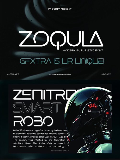
Zoqula – Futuristic Font byFlawless
OTF | +Previews | RAR 6.1 MB | SALE PAGE $19
Uppercase & Lowercase | Alternates & Ligatures | Numerals & Punctuation | Multilingual Support
- Zoqula is a futuristic sans serif font that fuses sleek minimalism with bold sci-fi aesthetics. Inspired by cyberpunk visions and high-tech interfaces, Zoqula features sharp angles, wide letterforms, and a distinct geometric structure that gives it a powerful, modern presence. Designed for digital-forward design projects such as tech branding, game titles, user interfaces, and experimental posters, Zoqula brings a cutting-edge and visionary style to any layout. Every character is shaped with precision and impact, giving your typography a clean yet commanding voice. The font includes dynamic alternates and unique ligatures, allowing you to push your creative boundaries and add futuristic flair to your designs.
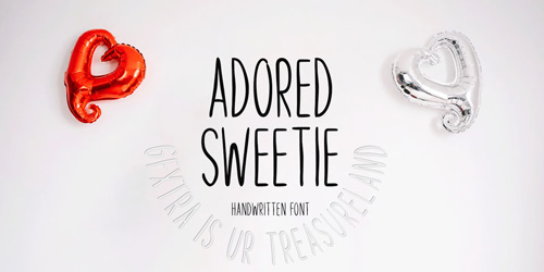
Adored Sweetie by Seemly Fonts
MyFonts | OTF | +Previews | Creation Feb 2024 | RAR 2.1 MB | SALE PAGE
- With its delightful handwritten style, Adored Sweetie brings a touch of warmth and personality to your projects. Whether you're crafting invitations, posters, or digital designs, this font adds a distinctive flair that sets your creations apart.
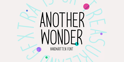
Another Wonder - A Simple & Sweet Handwritten
Myfonts | OTF | +Previews |Created Jul 2023 | RAR 1.3 MB | SALE PAGE
- Another Wonder is a sweet and simple handwritten font. This font is ideal for stationery, logos, t-shirts, papers, print designs, website headers, picture frames, flyers, album covers, posters, image sliders, and many other things.
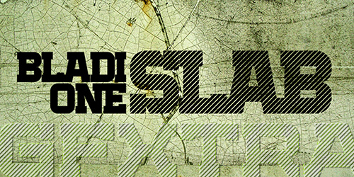
Bladi One Slab 4F - 12 Styles Font Family
12 Fonts | OTF | TTF | SALE PAGE $75
- Bladi One Slab 4F is a display slab font family. This typeface has twelve styles. The most masculine slab serif font for headlines and posters. It's so rugged it can withstand a direct hit from an anti-tank missile. Designed by Sergey Tkachenko.
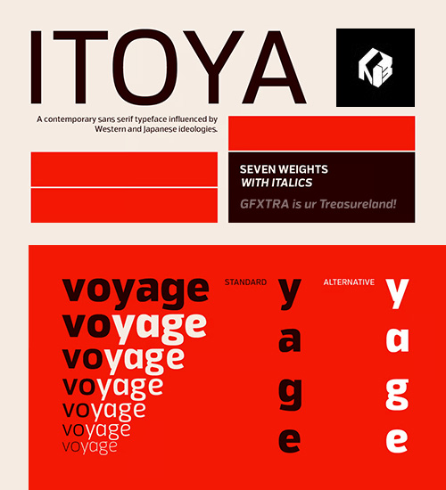
Itoya - 14 Styles Font Family $235
Influenced by Western and Japanese ideologies.
14 Fonts | OTF | TTF | WoFF | +Previews | Glyph 658 | SALE PAGE
- Itoya is a contemporary sans serif font influenced by Western and Japanese ideologies. A fusion of modern machine-like functions with a warmer, emotional and more spiritual ethic. The marriage of a western precision and eastern expression forms a sharp functional font with a modern edge ideally suited to graphic novels, fashion and product design. Details include seven carefully chosen weight with true cursive italics, over 600 characters, alternative lowercase a, e, g and y. Five variations of numerals, ligatures, manually edited kerning and Opentype features.

Skarpa 2.0 - 12 Styles Font Family
OTF, WOFF | 12 Fonts | +Preview | 3.8 Mb RAR | SALE PAGE
- This is a pro upgrade of my very first font I have ever released back in July 2011. My inspiration for this font were Roman Capitals, which I have initially designed as hairline - monotone, which gave an impression of high-end fashion look. Encouraged by the success of my initial design I have decided to redo / facelift my 2011 design. The fonts available here are revised throughout, also new glyphs/letters are added (808 glyphs in total) so you can use the font(s) in a majority of languages where latin script is present. The family of Skarpa 2.0 fonts contains 12 files - you find there three weights, three types - both in regular & italic style.
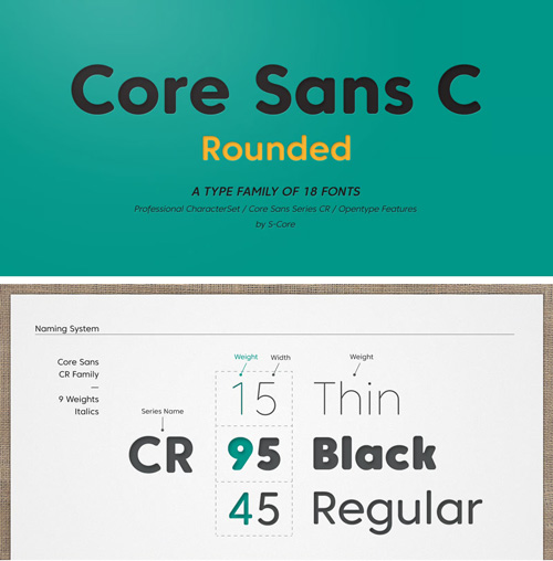
Core Sans CR - 18 Styles Font Family
18 Fonts | OTF | TTF | + Previews | RAR 5 MB SALE PAGE $140
- Core Sans CR family is a rounded version of Core Sans C; a part of the Core Sans Series, such as Core Sans N, Core Sans M, Core Sans E, Core Sans A, Core Sans D, Core Sans G, Core Sans R and Core Sans B. Core Sans CR is inspired by classic geometric sans (Futura, Avenir, Avant Garde etc.). It is based on geometric shapes, like near-perfect circle and square. It has a much higher x-height (height of lowercase letters), an effect which promotes readability especially at small print sizes. The Core Sans C Family consists of 9 weights (Thin, Extra Light, Light, Regular, Medium, Bold, Extra Bold, Heavy, Black) and Italics for each format. Core Sans C supports complete Basic Latin, Cyrillic, Central European, Turkish, Baltic character sets. Each font includes proportional figures, tabular figures, oldstyle figures, numerators, denominators, superscript, scientific inferiors, subscript, fractions and case features. Core Sans C is an ideal font family for use in magazines, web pages, screens, displays, and so on.
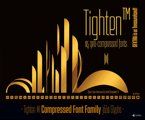
Tighten - 5 Styles Font Family by deFharo
MyFonts | 5 Fonts | SALE PAGE $80
- Tighten is a compressed sans serif typeface family, notable for its elegance derived from an exaggerated vertical proportion. Its style is a fusion of Art Deco and Futurism, giving it a distinctive and highly readable presence in any medium. Designed specifically for those seeking to stand out in graphic design, brand creation, publishing, videos, and editorial design, Tighten emphasizes consistency, functionality, and distinction.
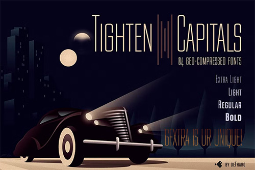
CM - Tighten Capitals - 4 Styles Font Family 289902122
4 Fonts | OTF | TTF | +Previews | SALE PAGE
- Tighten Caps is a compressed-style sans serif typeface family with multiple options (Advanced Open Type Features), making it an essential tool for any designer seeking the balance between elegance, functionality and efficiency; Tighten Capitals not only saves space, but elevates the aesthetic quality of any project where graphic differentiation is essential. Tighten Caps is available in four weights: Light, Regular, Medium and Bold, each designed to suit a wide range of creative projects, is exceptionally versatile and is recommended for a variety of applications, from editorial typesetting, brochure design, product packaging, to logo creation or signage.
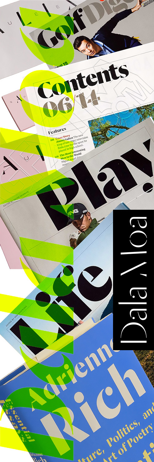
Dala Moa - 16 Styles Font Family
16 Fonts | OTF | +Previews | PDF | SALE PAGE $350
- Dala Moa is a sans serif stencil typeface for display, sharing the proportions of its cousin Dala Floda. It takes the same inspiration – the erosion of letters on stones – but takes the idea one stage further with the removal of serifs, revealing basic structures. The forms and proportions of the romans come directly from Dala Floda, while the italic diverges into the upright humanist tradition. The lighter weights show the influence Jan Tschichold’s stencil experiments of the 1930s, and in particular his lesser-known display face Saskia released by Schelter & Giesecke.
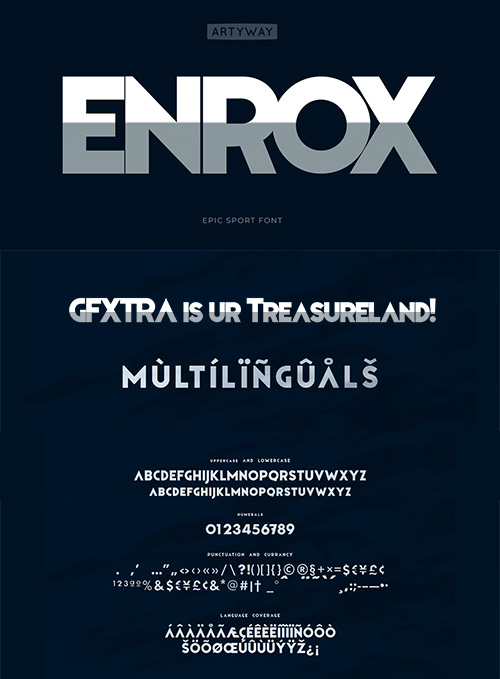
Enrox - 2 Styles Font Family NEW!
2 Fonts | OTF | +Previews | RAR 0.6 MB | SALE PAGE
Enrox Font is a strong, bold typeface that excels in delivering powerful messages with minimal space.
- Perfect for impactful headlines, posters, and branding projects that require both clarity and intensity. Offering a clean and solid appearance that ensures your text stands out. Ideal for designers looking to create compelling visuals in editorial design, advertising, or digital media where space efficiency and readability are crucial
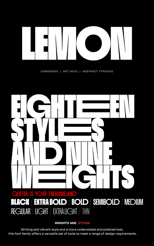
Lemon Typeface - 18 Styles & Variable
18 Static Fonts | OTF/TTF/WEB / VARIABLE TTF | +Previews | SALE PAGE
- Say Hello to "Lemon" Font Family – The Super Heavy Condensed Typeface. From sleek modernism to timeless Art Deco, and even a touch of abstract intrigue, it's all wrapped up in one versatile font family. With nine weights, eighteen styles, OpenType features, multi-language support, and variable type options, "Lemon" is a must-have for any designer. Plus, the Regular weight is free for both personal and commercial projects.
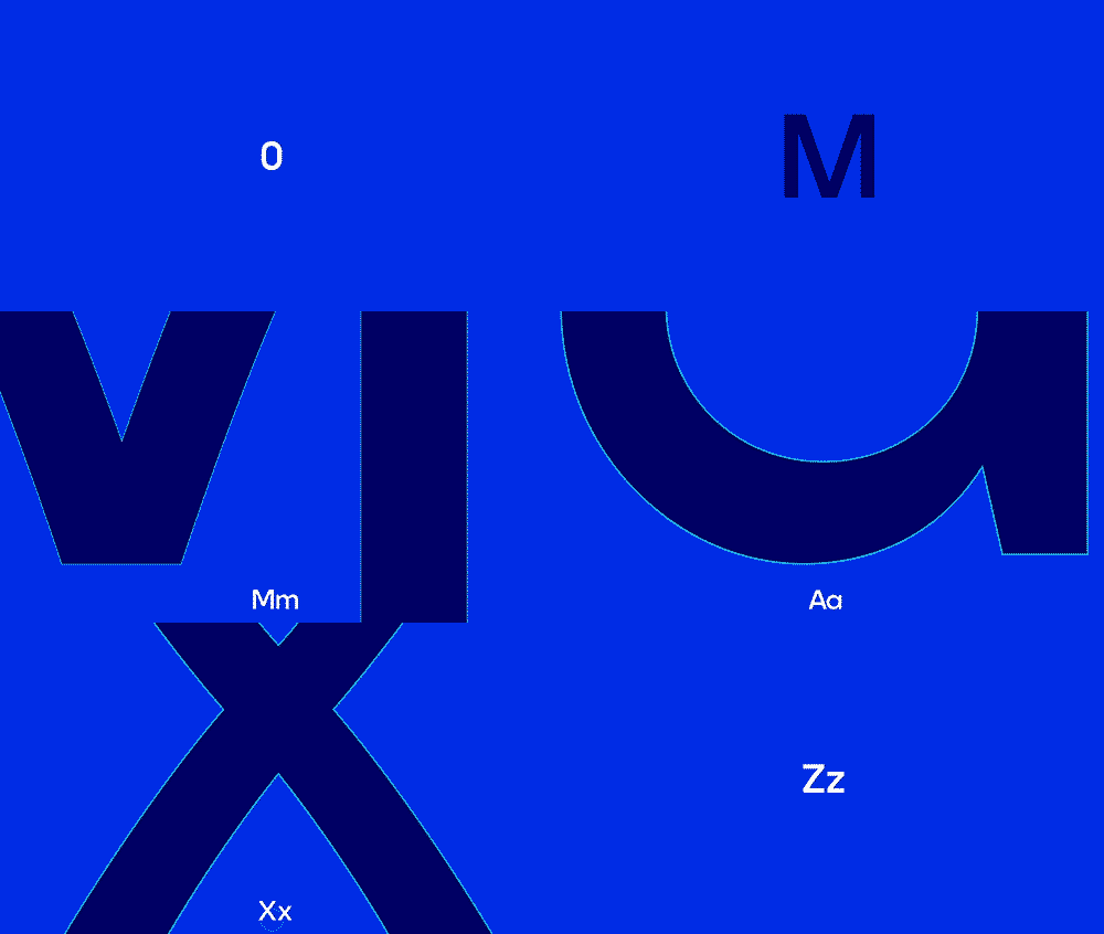
Max Sans - 10 Styles Font Family for Warner Media
10 Fonts | OTF | TTF | +Previews | Multilingual | RAR 2.9 MB | F37 FOUNDRY
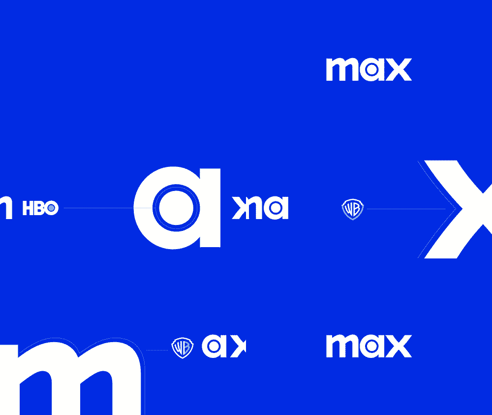
- A modified version of F37 Moon was the perfect choice when HBO Max became simply Max in April 2023, after WarnerMedia merged with Discovery, creating a new company called Warner Bros. Discovery. Max is built around the libraries of Warner Bros., Discovery Channel, HBO, CNN, Cartoon Network and many more, as well as creating its own programming. The friendly font comes in 10 different styles and includes extended Latin, Greek and Cyrillic alphabets.
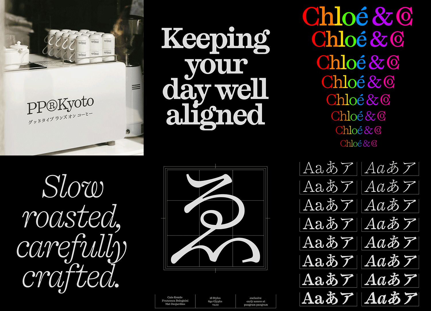
PP Kyoto - 18 Styles Multilingual Font Family $540
18 Fonts | OTF | +Previews | SALE PAGE
A broad set of Japanese punctuation with 692 glyphs & stylish alternates.
- PP Kyoto is a slab serif that naturally bridges tradition and modernity. With a solid structure, distinctive features, and expressive character, it was designed to stand out, especially in headlines. Its bold slabs contrast with soft, teardrop terminals, while prominent dots create a rhythmic flow, adding energy to the composition.
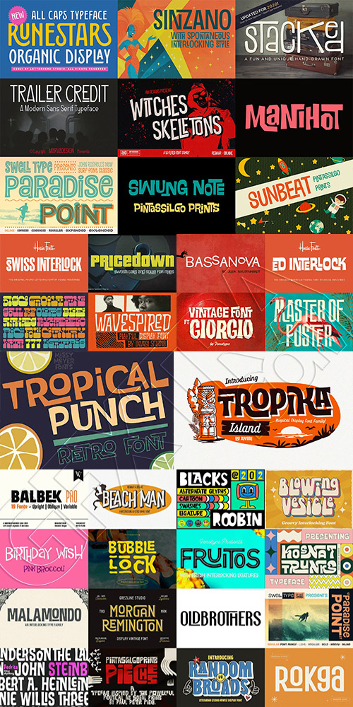
40 Interlocking Fonts Super Bundle
40 Typesets | 160+ Fonts | OTF | TTF | +Previews | RAR 34.1 MB | MyFonts | CreativeMarket
- Includes: Bassanova by Julia Bausenhardt, Ed Interlock by House Fonts, FT Giorgio by Fenotype, FT Master of Poster by Fenotype, Plinc Swiss Interlock, Pricedown by Typodermic, the Saturday Night Family by Aiyari, Tropika Island by Aiyari, Tropical Punch by Missy Meyer, and Wavespired by Invasi Studio, Balbek Pro by Valentino Vergan; Beach Man & Witches Skeletons by AM Designs; Birthday Wish by Pink Broccoli; Blacks Roobin by Garisman Studio; Blowing Vesicle, Random Broads, & Runestars by Letterhend Studio; BubbleLock by Indotype Foundry; Fruitos & Malamondo by Fenotype; Granz, Manihot, Pedrita, Pieches, Sunbeat, & Swung Note by PintassilgoPrints, Paradise Point by Swell Type (regular & inline); Kosnat Trunks by Alit Design; Morgan Remington by Grezline Studio; Rokga by Pandeka Studio; Sinzano by Typodermic; Stacked by Denise Chandler; Trailer Credit by Marvadesign.
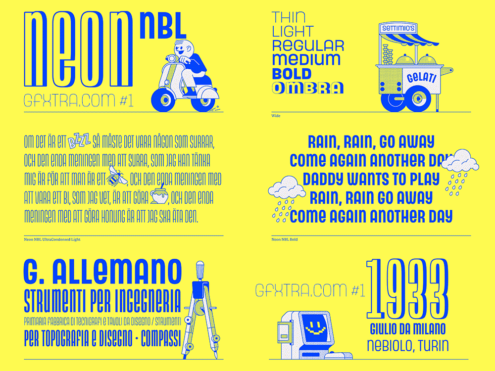
Neon NBL - 42 Styles Super Font Family NEW!
42 TTF | 717 glyphs | +Previews | PDF Specimen | SALE PAGE $3990
- Neon NBL is the faithful digital redesign of the original geometric monocase sans designed by Nebiolo in 1933. The redesign follows the proportions of the 1930s design, with varying widths for each type size, and includes the shaded titling version Ombra. Working at is best for headlines, posters, and logos, thanks to its range of styles and weights, it can suit small text settings as well.
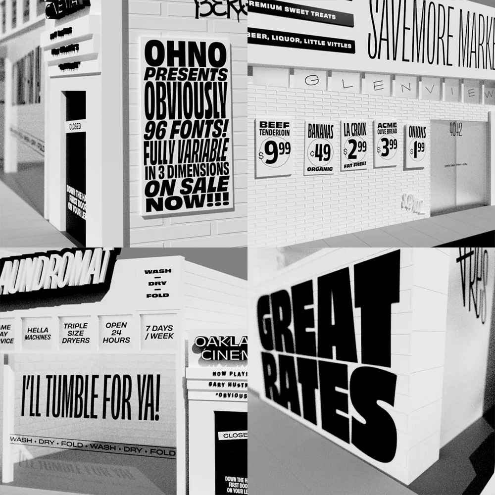
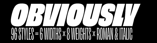
Obviously - 96 Styles Super Font Family
Compressed + Condensed + Extended + Narrow + Normal Wide = 96 TTF Fonts | SALE PAGE $599
- DESIGNER'S NOTE: As a lover of hand-painted signage, I have a dark side I rarely mention: I have a soft spot for vinyl too. I love to see Impact made extremely wide, and Antique Olive Nord squished to comical proportions. I love when the vinyl starts peeling up on the sides, and the corners are the only bits that manage to remain adhered to the substrate. I love the billboards for HEMPCON, TATTOOCON, and all the other CONS that advertise with black on an obnoxious shade of pink or neon green. With all those things in mind, I set out to make Obviously. There are 96 styles for all sorts of feelings. Use it for the nail salon, the laundromat, and the mechanic. Subtlety is for the birds. Let’s communicate OBVIOUSLY.
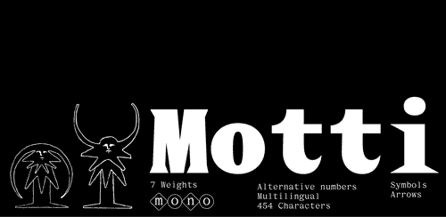
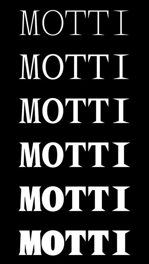
GFT Motti - 7 Styles Font Family
7 weights / 1 style | Monospace | European Language Support | Release 2025
OTF | +Previews | RAR 0.8 MB | SALE PAGE €280
- GTF Motti is a monospaced typeface tailored with spiky serifs. From the thinnest weight bringing elegance and a refined touch, to the Black weight that can be used as a striking display font for titles, this comprehensive font is designed and crafted for a wide range of applications. Designed by Mathis El Idrissi and Kenneth Knutsen (GTF).
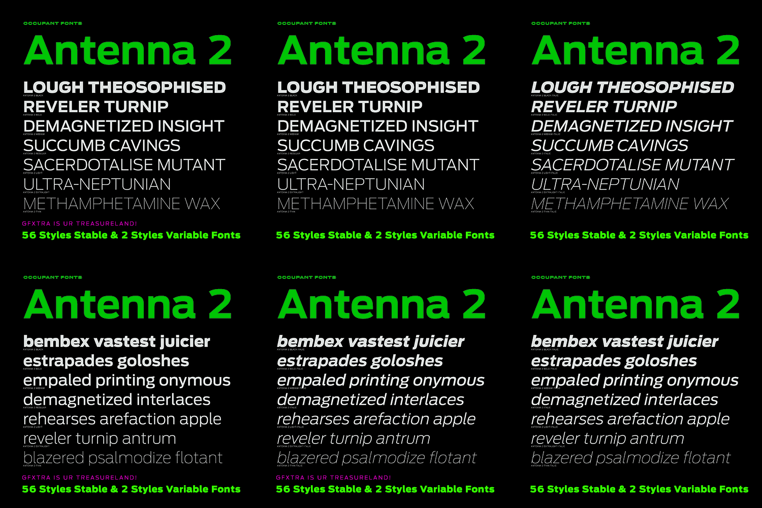
Antenna 2 - 56 Styles Static
& 2 Variable Fonts NEW!
56 TTF Static | 2 TTF Variable | +Previews | PDF Instructions | SALE PAGE $560
- Cyrus Highsmith’s Antenna 2 is a versatile industrial sans serif that projects confidence and deliberation. He slowed down his usual fast curves and shifted the emphasis to pattern of white shapes formed inside and between characters. With seven weights in four widths and matching italics, Antenna 2 is ready for almost anything. Originally released in 2006, the 2025 release, led by Victoria Rushton, includes more language support as well as variable fonts.
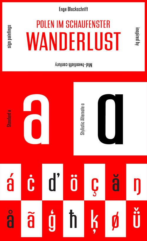
PiS Wanderlust - Regular & Rounded Styles
2 Fonts | OTF | +Previews | SALE PAGE $68
- PiS Wanderlust is inspired by specimens from the book „Die Schriften des Malers“ from 1950 and by vintage hand painted signposts and guides found on hikes in the outskirts of Vienna and rural Austria, hence the name Wanderlust! Although classic, constructed modernist it features some charmingly unfashionable quirks and is available in rounded for a smooth and warm feel. Lace up those hiking boots, don't forget to pack some Landjäger and cool drinks and enjoy the view from above the treeline!
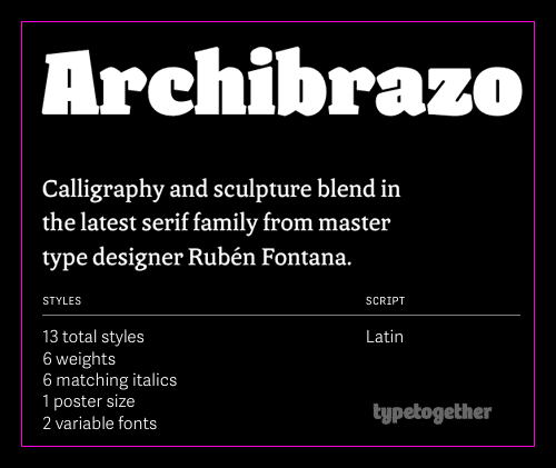
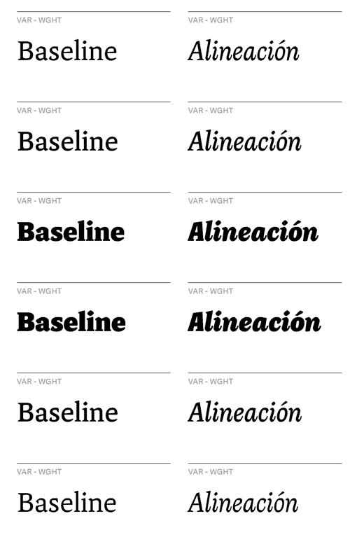
Archibrazo - 13 Stable, 2 Variable Styles NEW!
13 OTF Stable | 2 TTF Variable | +Previews | RAR 16.4 MB | SALE PAGE $440
- NEW RELEASE Archibrazo : Master type designer Rubén Fontana's Archibrazo serif family combines calligraphy with sculpture for maximum readability. Its seven weights optimise readability with sculptural wedge serifs and carved countershapes, and the Archibrazo Rotunda weight excels in uses such as titling, branding, and posters.
NeoSkola Bütün Kursları
Udemy Türkçe


Top Rated News
- TheBoudoirDivas All Tutorial
- 126,000 Royalty-Free 3D Models
- CreativeLive Tutorial Collections
- Fasttracktutorials Course
- Chaos Cosmos Library
- MRMockup - Mockup Bundle
- Finding North Photography
- Sean Archer
- John Gress Photography
- Motion Science
- AwTeaches
- Learn Squared
- PhotoWhoa
- Houdini-Course
- Photigy
- August Dering Photography
- StudioGuti
- Creatoom
- Creature Art Teacher
- Creator Foundry
- Patreon Collections
- Udemy - Turkce
- BigFilms
- Jerry Ghionis
- ACIDBITE
- BigMediumSmall
- Globe Plants
- Unleashed Education
- The School of Photography
- Visual Education
- LeartesStudios - Cosmos
- Fxphd
- All Veer Fancy Collection!
- All OJO Images
- All ZZVe Vectors
- CGTrader 1 CGTrader 2



















