

Rytual by Superior Type NEW, April 2026!
54xOTF, 1xTTF Variable €1620
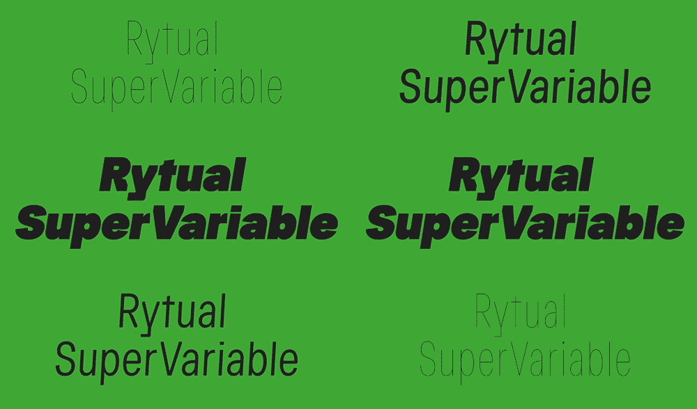
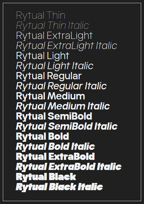
Regular | Condensed | Extra Condensed | 18x3=54xOTF | 1xTTF Variable | RAR 11 MB | SALE PAGE
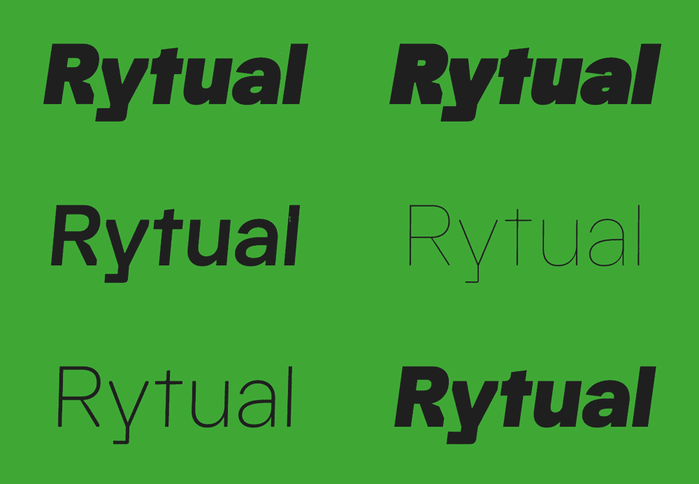
- The name came from a running. Same time, same route, whatever the weather, coffee after. A Rytual. The typeface follows the same logic: no single dramatic move, just one decision repeated consistently until the character accumulates. What started as a custom job for a friend grew into a full family, shaped by the rhythm that ran alongside it.
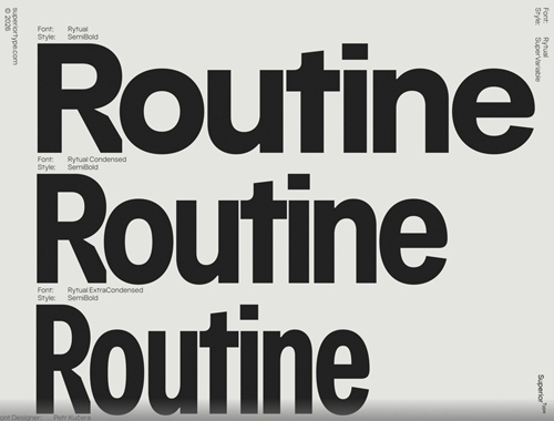
- Rytual is a grotesque built on clean, modern forms with a slightly narrow stance. Pointed terminals are cut away and replaced with sharp, rectangular endings, giving the letters a more constructed, precise quality throughout. The same logic carries into letters with fully or partially rectangular constructions, keeping the feeling consistent across the set. Narrow by nature, not by force. Stylistic alternates and three widths (Normal, Condensed, and ExtraCondensed) round out the system.

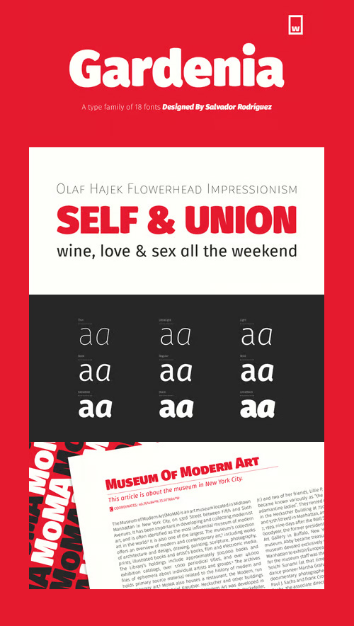
Gardenia - 18 Styles Font Family $180
18 Fonts | OTF | +Previews | Turkish Support | Multilingual | SALE PAGE
- Gardenia is a grotesk sans-serif. It comes in 9 weights with matching italics. It was designed by Salvador Rodríguez in 2015/2016. It is characterized by legibility in the medium sizes, black and thin weights are great performers in display sizes. Gardenia is well suited for longer texts and headlines. It’s perfect for graphic design, web, print, motion graphics, interaction design etc… Gardenia is equipped with a wide range of opentype features.
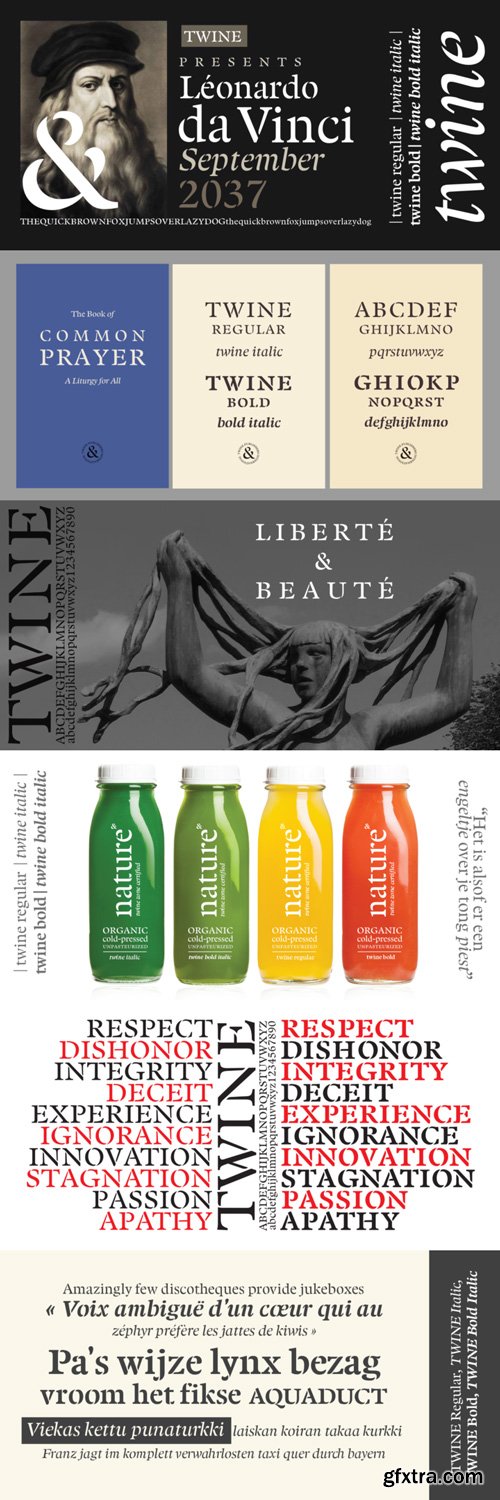
Twine - 4 Styles Font Family $99
4 Fonts | OTF | +Previews | SALE PAGE
- By twisting and weaving separate strands of rope together, a stronger TWINE is created. The distinctive “valleys” that give the twine its twisted and wavy appearance is the result of the twining process.
- Similarly, TWINE the font, is an exaggerated representation of the calligrapher’s individual pen strokes that create a cohesive character which is enhanced with the stencil. Unlike other stencils, TWINE emphasizes calligraphic strokes, so you will find it very legible even in small point sizes. Check it out!
- Furthermore, twine is inspired by Plantin, an old-style serif typeface named after the printer Christophe Plantin, which is based on the 16th century Gros Cicero face cut by Robert Granjon.
- Twine is a great choice when you need a font that is timeless, contemporary and distinctive. Perfect for Advertising, Corporate identities and Packaging design, Museum display, Technology, Hospitality, Travel, and Retail applications.
- Twine is available in TWINE Regular, TWINE Italic, TWINE Bold, TWINE Bold Italic. It is a Stencil that is Distinctive, Contemporary, and Timeless.
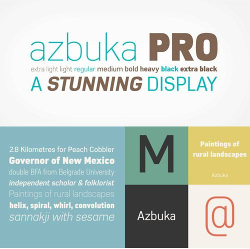
Azbuka - 20 Styles Font Family $420
20 Fonts | OTF | TTF | WoFF | +Previews | Turkish Support | Multilanguage | SALE PAGE
- The Azbuka™ typeface family has its roots in a fairly pedestrian source. “The idea came in part from an old sign in London that read ‘SPRINKLER STOP VALVE’,” says Dave Farey, designer of the typeface. Like all good sign spotters, Farey took a photograph of the sign and filed it away for possible use in a lettering or typeface design project. In Prague a number of years later, the street signs reminded Farey of the London signage - and his camera came out again. Comparing the two back in his studio, he realized that the signs from London and Prague were not as similar as he initially thought. However, they were enough alike to serve as the foundation for a no-frills, 21st century sans serif typeface family.
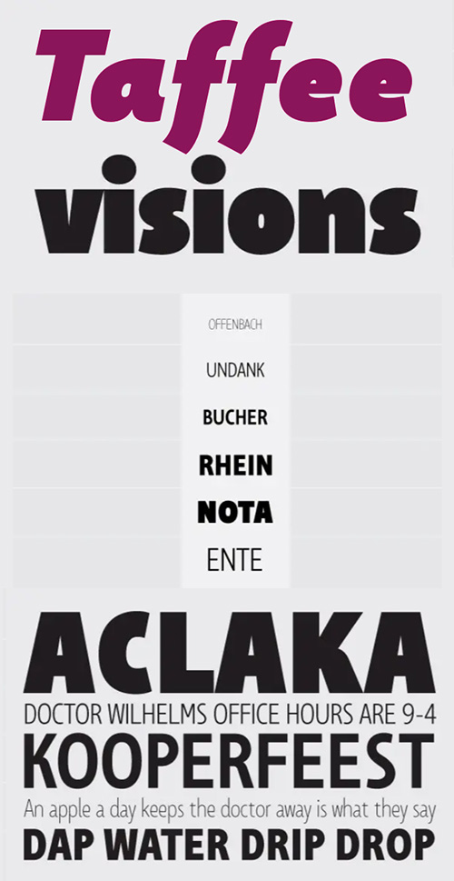
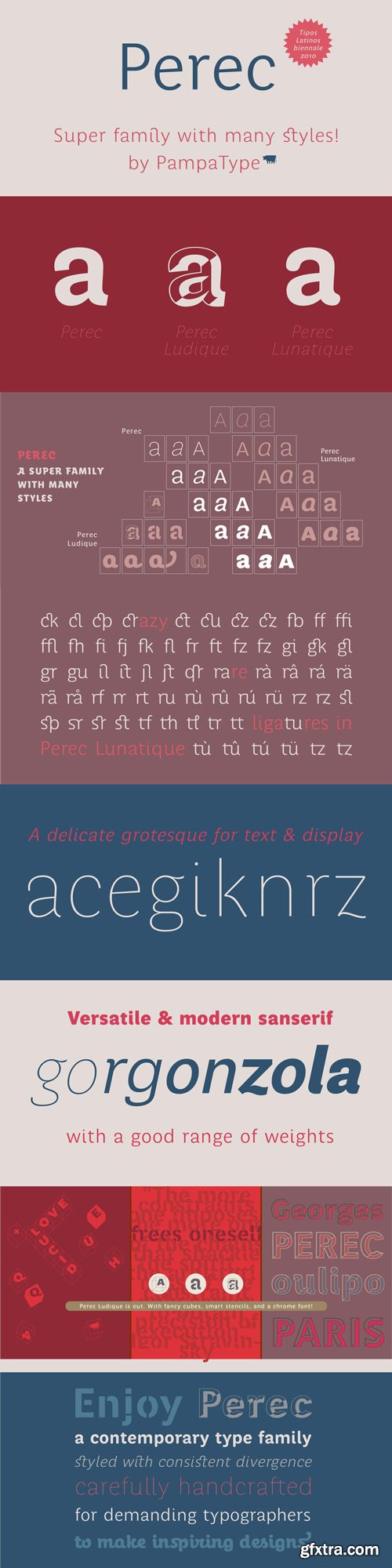
Perec - 13 of 18 Styles of Font Family $394
- The type family Perec pays tribute to the genius of Georges Perec, it is a versatile super family that can be used at a wide range of applications, formed by three subfamilies:
- Perec, a sensitive sanserif grotesque, including 15 fonts: romans, italics, and small caps declined in five weights. With a more delicate spirit than that of a sans grotesque Perec performs well not only in display sizes where elegance and flair are needed, but also in text sizes as its open counters make it comfortably readable. Its smooth color texture and range of weights from SuperBlanca to SuperNegra allow for a pleasant reading experience.
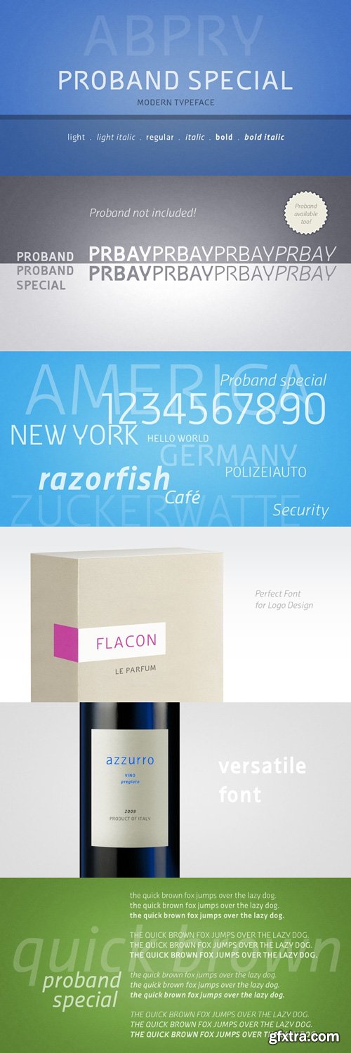
Proband Special - 6 Styles Font Family $105
- The goal was to create a typeface that looks reputable and still original. Notably, some uppercase characters indicate this font its unique character. It is ideally suited for both body text and headings, or modern logos.
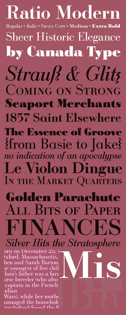
Ratio Modern - 5 Styles Font Family $100
- Designed in 1923 by Friedrich Kleukens for the Stempel foundry, Ratio was one of the first metal faces to bring the Didone genre to the forefront of industrial mass publishing as a headline and magazine face. Though essentially modern in construct, Ratio incorporates some old-style and transitional traits, managing to summarize the European evolution of this particular aesthetic. This is evident in its shaped serifs, soft roundings, an elegantly subdued italic, the variation of its shapes between weights, and the obvious fat face influence in the ExtraBold. Thus Ratio finds the balance between modern elegance and fine typographic tradition.This exclusive digitization expands on the original metal set by including small capitals and many alternates in all the styles. It also boasts a larger than usual linguistic support.
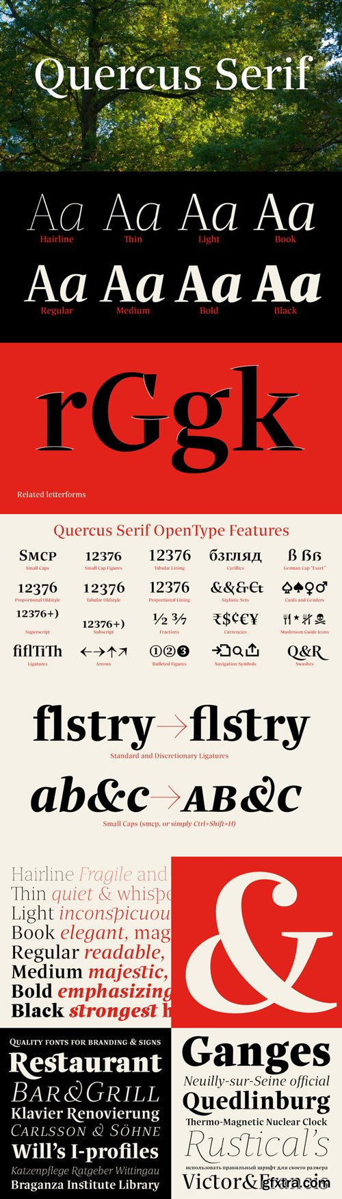
Quercus Serif - 16 Styles Font Family $349
16 Fonts | OTF | TTF | SALE PAGE
- Quercus is characterised by open, yet a little bit condensed drawing with sufficient spacing so that the neighbouring letters never touch. It has eight interpolated weights with respective italics. Their fine gradation allows to find an exact valeur for any kind of design, especially on the web. Quercus serif styles took inspiration from classicistic typefaces with vertical shadows, ball terminals and thin serifs. The italics have the same width proportion as upright styles. This “modern” attitude is applied to both families and calls for use on the same page, e g in dictionaries and cultural programmes. Serif styles marked by “10” are dedicated to textual point sizes and long reading. The sans-serif principle is rather minimalistic, with subtle shadows and thinned joints between curved shapes and stems. Quercus family comprises of the usual functionality such as Small Caps, Cyrillics, diacritics, ligatures, scientific and aesthetic variants, swashes, and other bells & whistles. It excels in informational and magazine design, corporate identity and branding, but it’s very well suited for book covers, catalogues and posters as well.
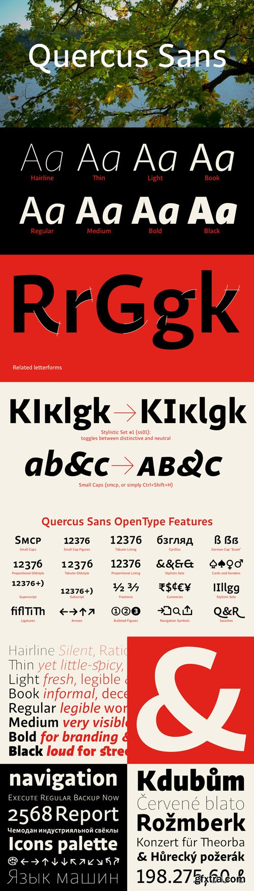
Quercus Sans - 16 Styles Font Family $349
16 Fonts | OTF | TTF | SALE PAGE
- “Quercus” is characterised by open, yet a little bit condensed drawing with sufficient spacing so that the neighbouring letters never touch. It has eight interpolated weights with respective italics. Their fine gradation allows to find an exact valeur for any kind of design, especially on the web. Quercus serif styles took inspiration from classicistic typefaces with vertical shadows, ball terminals and thin serifs. The italics have the same width proportion as upright styles. This “modern” attitude is applied to both families and calls for use on the same page, e g in dictionaries and cultural programmes. Serif styles marked by “10” are dedicated to textual point sizes and long reading. The sans-serif principle is rather minimalistic, with subtle shadows and thinned joints between curved shapes and stems. Quercus family comprises of the usual functionality such as Small Caps, Cyrillics, diacritics, ligatures, scientific and aesthetic variants, swashes, and other bells & whistles. It excels in informational and magazine design, corporate identity and branding, but it’s very well suited for book covers, catalogues and posters as well.
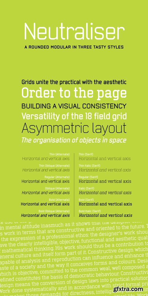
Neutraliser Serif - 6 Styles Font Family $120


- The Neutraliser family is a versatile collection of geometric-based fonts with 24 styles. The 6 Alternate styles are suitable for headlines and are complemented by the Sans and Serif styles suitable for small amounts text. The Caps styles allow for extra typographic variation within the family.
- Neutraliser is a direct result of the designers' initial exploration of typography and is uncompromising in its geometric nature. As the name suggests, the typeface celebrates the precision of the digital medium as a drawing tool in which the critical points that make up a letterform can be almost ‘plotted’ according to a grid-based logic.
TyfoonSans - 12 Styles Font Family $160
12 Fonts | OTF | TTF | WoFF | 1.5 MB RAR | SALE PAGE
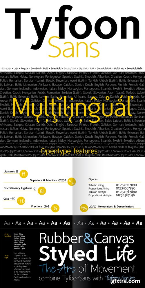
- TyfoonSans is a clear, modern, versatile font family of six weights plus matching italics, excellently suited for both display and text. It is designed by Fontforecast in 2013. A very complete character set supports a wide range of languages. OpenType features such as five numeral styles, fractions and both standard and discretionary ligatures, make TyfoonSans well equipped for professional typography.In addition to the design possibilities of TyfoonSans, there is TyfoonScript, a handwritten family of three weights built on the same metrics. When combining TyfoonSans and TyfoonScript, design possibilities become endless. Two font families that blend perfectly and are always found in successive order in your font list thanks to their family name.
Liebe Ruth - 4 Styles Font Family $76
4 Fonts | OTF | WOFF | 1 MB | SALE PAGE
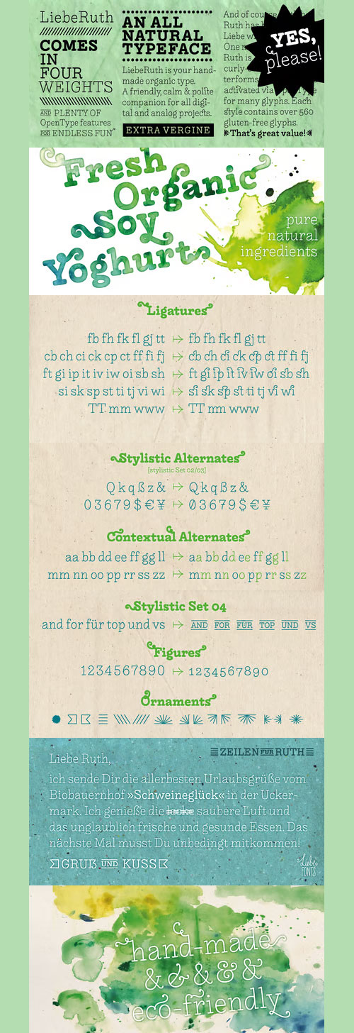
- LiebeRuth is your 100 percent hand-made organic type. She absolutely loves to be typeset in large *and* small sizes, because Legibility is her middle name. (Yes, we know it’s not a typical girl’s name.) She is friendly and polite, but she also has a few quirks. Her friends are impressed with how natural she manages to look every day.Her four weights ensure that Ruth has the right boldness for any context: birthday invitation, personal correspondence, photo album, or billboard ad.During the creation of this font, her designer ate plenty of healthy, organic foods. We think this is the reason why Ruth looks so fresh and lively. And of course Ruth has been designed with lots of Liebe (which is German for “love”—and she speaks many other languages, too).One more thing Ruth is marvelous at: showing off her curly-swirly swashed alternative letterforms that can be activated via OpenType. (Please make sure your software supports OpenType if you wish to use the advanced features.) Each style contains more than 560 gluten-free glyphs—now that is great value!If you like this font, you may want to look at LiebeRuth’s bolder sister LiebeDoni and our best-sellers LiebeErika and LiebeKlara. Or add in some LiebeOrnaments to prepare a curly-licious feast.By the way: LiebeRuth also gets along great with our wide range of illustrative fonts, including LiebeCook, LiebeFish, and LiebeTweet.
Pilcrow - 5 Styles Font Family $130
5 Fonts | OTF | TTF | +Previews | SALE PAGE
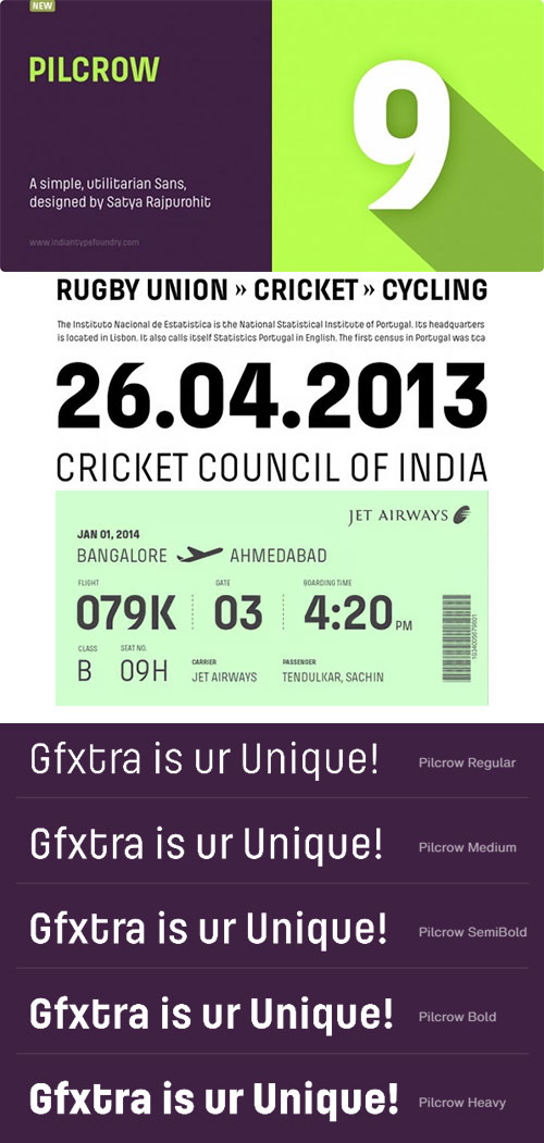
- Pilcrow is a Latin-script sans serif family. Its design is simple and utilitarian, similar to forms found on street and highway signs around the world – or in-use on cast-metal lettering for industrial products. The fonts are available in two versions: straight-cornered and rounded. While the normal Pilcrow fonts have sharp corners at their stroke terminals, Pilcrow Soft’s have been filed down. Pilcrow and Pilcrow Soft each include five weights: Regular through Heavy. In keeping with the design’s mechanical nature, the family does not include Italics, as Pilcrow’s style of letter fits better with typographic hierarchies using contrasting weights to define emphasis, whereas Italics use slants or a cursive stroke pattern.
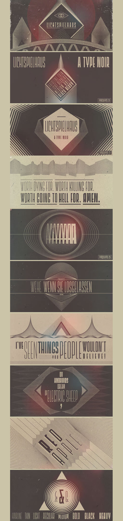
Lichtspielhaus Sans - 8 Styles Font Family $89
8 Fonts | OTF| TTF | +Previews | SALE PAGE
- Lichtspielhaus is an ultra condensed Lichtspiele spin-Off with 8 weights. It still transports you back to a time where neon lights and marquee letters decorated cinema facades. There are 8 styles: Hairline, Thin, Light, Regular, Medium, Bold, Black and Heavy. "Lichtspielhaus" is the first part of a new Type Noir Quadrilogy.
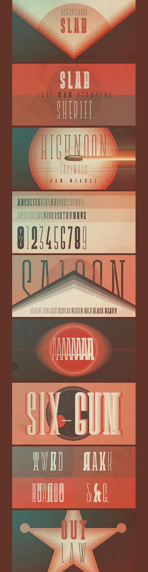
Lichtspielhaus Slab - 8 Fonts Family $89
8 Fonts | OTF | WOFF | +Previews | SALE PAGE
- Lichtspielhaus Slab is an ultra condensed handwritten typeface based on Lichtspielhaus. It still transports you back to a time where neon lights and marquee letters decorated cinema facades. This time with Slab. There are 8 styles: Hairline, Thin, Light, Regular, Medium, Bold, Black and Heavy. “Lichtspielhaus Slab” is the third part of a Type Noir Quadrilogy.
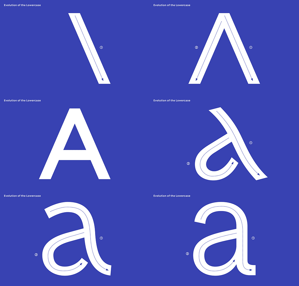
Decathlon - 32 Fonts Family
30 Static TTF | 2 Variable TTF | +Previews | DESIGNER'S PAGE
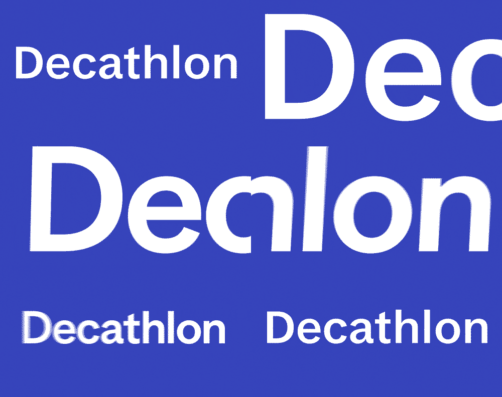
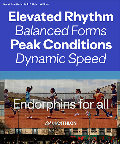
- Decathlon, the global sports retailer, asked us to create a custom typeface system. We designed a bespoke type family and built a clear, functional typographic framework for the brand to move with.
- What do sport and type design have in common? Well, it was our job to find out. In close collaboration with Wolff Olins, as part of the international agency’s rebrand of the French sporting giant Decathlon, we developed a bespoke type family and engineered a rigorous typographic system for the brand to bounce off.
- Making the connection between calligraphy and sport, we unified athleticism and design under a simple idea: movement. A notion that captures the shared essence of motion in both sport and typography — active, technical and human. Enter: Decathlon Sans. Warmth, precision and performance in motion.
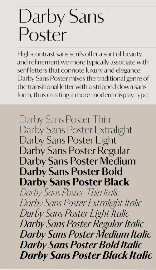
Darby Sans Poster - 14 Fonts Family $350
14 Fonts | OTF | TTF | Turkish Support | Multilanguage | SALE PAGE
- High-contrast sans serifs offer a form of beauty and refinement we more typically associate with serif letters of luxury and elegance. Darby Sans Poster mixes the traditional form of the transitional letter with a stripped down sans form to create a modern display form. Sans letters with high contrast reappeared in Britain in the late eighteenth and early nineteenth centuries, and Darby Sans Poster draws on these sources: lettering found on memorials, lettering on coins, and later in the typefaces of the Figgins foundry. While Darby Sans features a simple slanted italic, Darby Sans Poster’s italics are patterned on the condensed and upright style of Joseph Fry. More limited in use than its lower contrast sibling, Darby Sans Poster works best at large sizes where its beauty can truly sparkle.
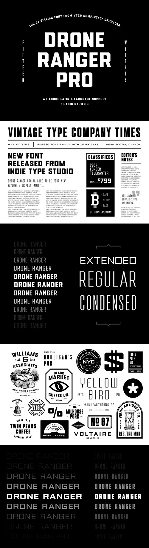
Drone Ranger Pro - 15 Fonts Family $39
15 Fonts | OTF | TTF | +Previews | SALE PAGE
- The original, highly acclaimed, Drone Ranger Display Font has been completely re-drawn, re-vamped, and upgraded with a ton of extra features. Drone Ranger PRO is a bold, chiseled display family inspired by dystopian, retro propaganda. The font is very industrial in its aesthetic, and is built on strict, rigid geometry. Features include a full uppercase alphabet with alternate glyphs, varying stroke weights for better legibility, improved glyphs & numerals, fractions, and a full set of Adobe Latin 4 diacritics + basic cyrillic.
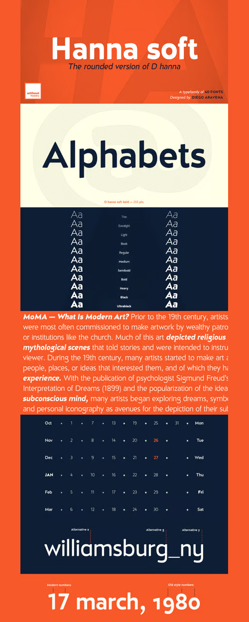
D Hanna Soft Font Family $150
20 Fonts | OTF | TTF | WoFF | +Previews | SALE PAGE
- D Hanna Soft is a sans serif type family of 9 weights plus matching italics. It is inspired by the geometric style sans serif faces with a mix of rounded shapes and a little bit of black in some corners. The medium weights serve very well in body text, while the thinner and bolder styles make an excellent choice for headlines. D Hanna Soft is equipped with a complete set of opentype features including alternative glyphs, fractions, ligatures and many more. It is perfectly suited for highlighting lettering, magazines, web, interaction design, advertising, logotypes, etc.
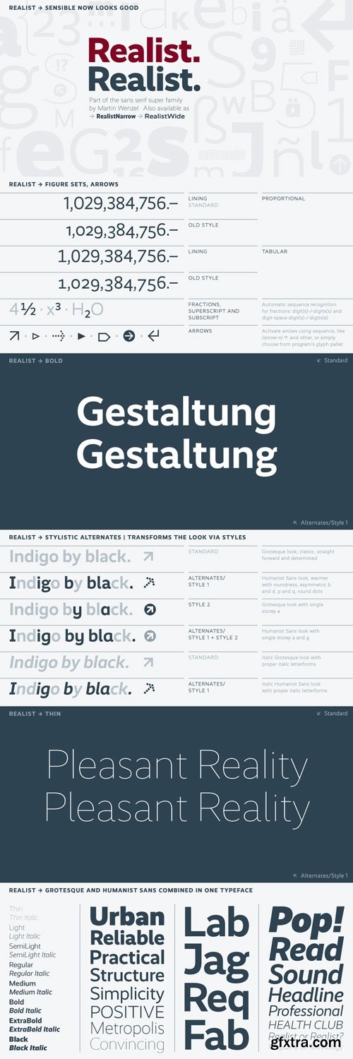
Realist - 16 Fonts Family $699
16 Fonts | OTF | +Previews | SALE PAGE | SALE 2
- Realist is a straightforward typeface that speaks in a clear voice without appearing stern. It has so far been used for demanding editorial and corporate design, as well as product design and a film poster. It works for all expressions where the message plays the leading role. Realist is flexible in weight and style (16 fonts), and next to the standard typographic forms Realist comes with alternates, various figure sets, sets of arrows, and ornaments. Realist is furthermore available as Realist Narrow and Realist Wide.
NeoSkola Bütün Kursları
Udemy Türkçe


Top Rated News
- TheBoudoirDivas All Tutorial
- 126,000 Royalty-Free 3D Models
- CreativeLive Tutorial Collections
- Fasttracktutorials Course
- Chaos Cosmos Library
- MRMockup - Mockup Bundle
- Finding North Photography
- Sean Archer
- John Gress Photography
- Motion Science
- AwTeaches
- Learn Squared
- PhotoWhoa
- Houdini-Course
- Photigy
- August Dering Photography
- StudioGuti
- Creatoom
- Creature Art Teacher
- Creator Foundry
- Patreon Collections
- Udemy - Turkce
- BigFilms
- Jerry Ghionis
- ACIDBITE
- BigMediumSmall
- Globe Plants
- Unleashed Education
- The School of Photography
- Visual Education
- LeartesStudios - Cosmos
- Fxphd
- All Veer Fancy Collection!
- All OJO Images
- All ZZVe Vectors
- CGTrader 1 CGTrader 2



















