
PP Kyoto - 18 Styles Multilingual Font Family $540
18 Fonts | OTF | +Previews | SALE PAGE
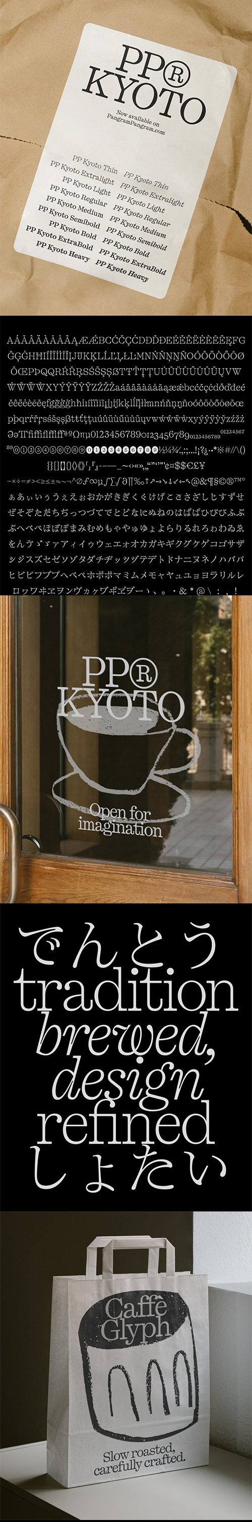
A broad set of Japanese punctuation with 692 glyphs & stylish alternates.
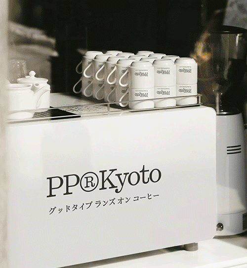
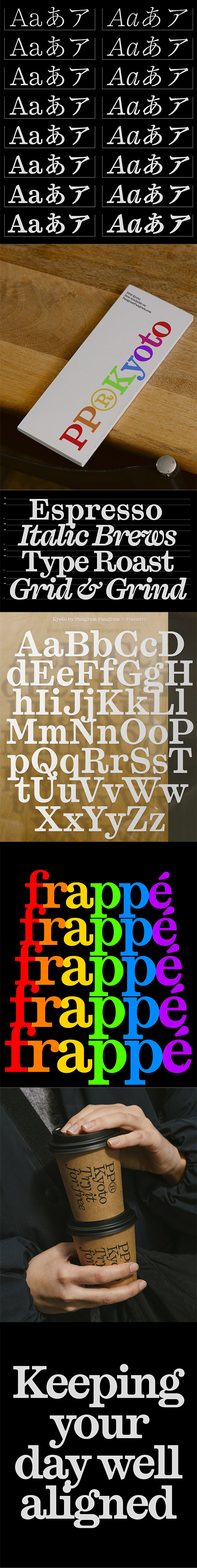
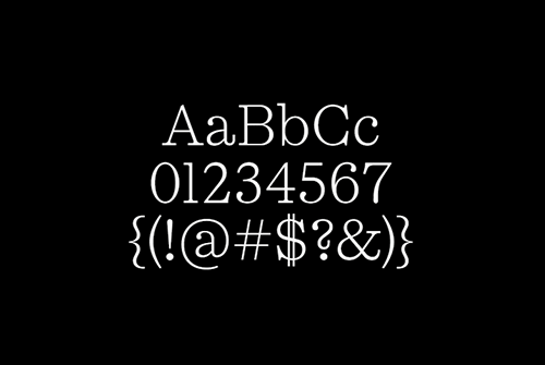
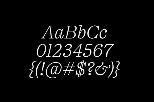
- PP Kyoto is a slab serif that naturally bridges tradition and modernity. With a solid structure, distinctive features, and expressive character, it was designed to stand out, especially in headlines. Its bold slabs contrast with soft, teardrop terminals, while prominent dots create a rhythmic flow, adding energy to the composition.


126,000 Royalty-Free 3D Model

Udemy Türkçe


Top Rated News
- CreativeLive Tutorial Collections
- Fasttracktutorials Course
- Chaos Cosmos Library
- MRMockup - Mockup Bundle
- Finding North Photography
- Sean Archer
- John Gress Photography
- Motion Science
- AwTeaches
- Learn Squared
- PhotoWhoa
- Houdini-Course
- Photigy
- August Dering Photography
- StudioGuti
- Creatoom
- Creature Art Teacher
- Creator Foundry
- Patreon Collections
- Udemy - Turkce
- BigFilms
- Jerry Ghionis
- ACIDBITE
- BigMediumSmall
- Globe Plants
- Unleashed Education
- The School of Photography
- Visual Education
- LeartesStudios - Cosmos
- Fxphd
- All Veer Fancy Collection!
- All OJO Images
- All ZZVe Vectors
- CGTrader 1 CGTrader 2


