

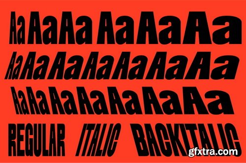
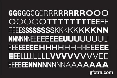
CM - JT Mekito - Geometric Modernism Font 92040524
63 Fonts | OTF | +Previews | Multilingual | RAR 4.32 MB | SALE PAGE $50
REGULAR+CONDANSED+EXTRA CONDENSED+SEMI CONDENSED
SEMI EXPANDED+ULTRA CONDENSED
- JT Mekito is a Modernism Geometric Sans serif designed by Laire in 2023 and released in early 2024, Inspired by Gothic and Geometry Sans serif styles, where we give a unique added touch to the letters f and t as well as to other letters to legible function at small sizes but still cool if used at large sizes too, and gives a mono style to our letter i so it still looks different and unique, We make it in 63 Weight Styles from Thin to Black where for each width we give Ultra Condensed, Extra Condensed, Semi Condensed, Regular, Condensed, Semi Expanded, Expanded widths. We hope that our users can freely explore our fonts, That's not enough, we also made it Variable, which is more flexible to change Total Glyph 485 covering 89 Languages
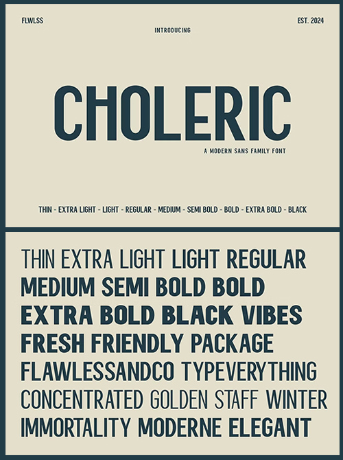
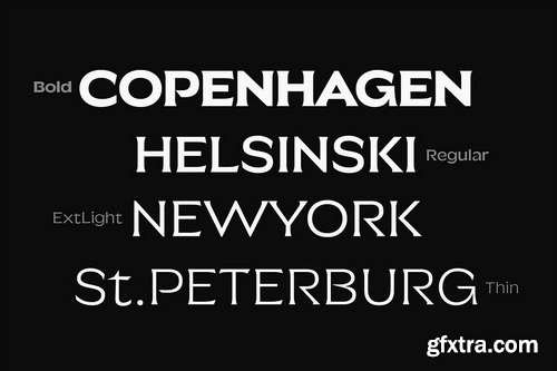
CM - Choleric Modern Sans Serif Family 92290387
9 Fonts | OTF | +previews | Multilingual | SALE PAGE $34
- Choleric - Modern Sans Serif Family, Font Family, Sans Serif Font, Family Sans Serif, Modern Font, Elegant Font, Branding Font, Logo Font, Magazine Font
- Choleric is a versatile modern sans serif font family consisting of various weights ranging from thin to black styles, including thin, extra light, light, regular, medium, semi-bold, bold, extra bold, and black. Each style within the Choleric family maintains a strong and assertive impression with balanced characters. Featuring clean and sans-serif designs, Choleric emphasizes clarity and precision in every letter across its diverse weight spectrum. Its sharp and proportional lines ensure readability and aesthetic appeal, making it suitable for a wide range of design applications, from elegant titles to body text and modern graphic designs that demand a bold and contemporary look.
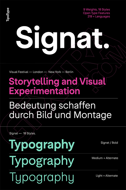
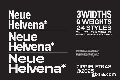
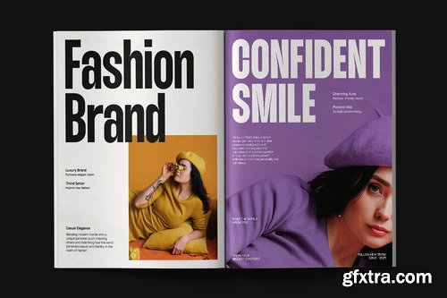
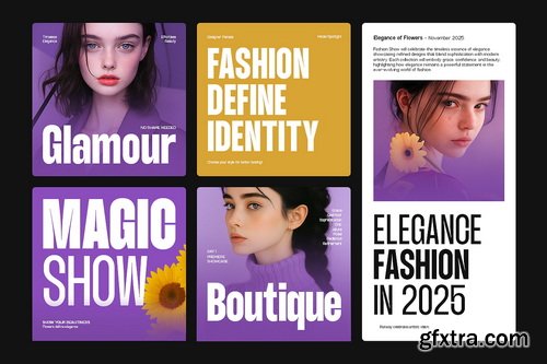
Signat - 18 Styles Font Family by TipoType NEW!
18 Fonts | OTF | TTF | +Previews | NEW! | SALE PAGE $99
- Signat emerges from a rigorous—yet never rigid—structural logic. Its construction is guided by precise optical criteria, where every curve, junction, and proportion is carefully calibrated to achieve seamless visual continuity. It is not a grotesque that seeks impact through eccentricity, but through consistency: a refined grotesque with a sense of distinction and elegance.
- It retains the clarity and legibility inherent to the genre while introducing a strategic neutrality that allows it to adapt without losing its identity. It conveys authority without harshness and presence without excess, drawing attention through balance rather than exaggerated contrast.
- Thanks to this optical and structural foundation, Signat performs naturally across institutional identities, technology and service environments, fashion and high-end editorial contexts, as well as brand systems that require continuity and control. At large scales, its personality becomes more expressive; in text, it maintains composure and clarity.


GT Canon - New!
2026's Biggest 224 Styles Font Family $1512
Designed by Grilli Type | Released in 2026 | Available in 224 styles
- GT Canon’s design is pragmatic but not static: movement and liveliness are embedded in the letterforms. It is our answer to what our digital times require of a serif today. It’s what a contemporary serif should be in both form and function. Like its sans serif sibling, GT Standard, it aims for modern functionality rather than stylistic reinvention.


GT Era - 28 Styles Font Family NEW! $630
Pre-Modern Grotesk Typefaces
Designed by Thierry Blancpain with Grilli Type | Released in 2025
Available in 28 styles | TTF | Display & Text Fonts | RAR 3 MB | HOME PAGE
- GT Era reimagines the warmth and idiosyncrasies of early grotesk typefaces for our own era. These pre-modernist tools were being pushed to their extremes in the radical designs of the modernist movements—like Bauhaus and De Stijl—of the period. The typeface shuns neutrality and embraces friction, championing recognition over uniformity and flavor over conformity.
- GT Era, released in 2025 by Grilli Type AG in Luzern, Switzerland, is a grotesque sans-serif typeface offered in 8 weights, display and text styles, and upright and oblique slants. Its distinguished by a warmth characteristic of pre-modern grotesk typefaces but adapted to contemporary applications.

Grunt Grotesk 7 OTF, 1 TTF Variable Fonts $120
MYFONTS NEW! | 7 OTF | 1 TTF Variable | +Previews | RAR 1 MB | SALE PAGE
Grunt Grotesk is a modern Ukrainian sans-serif typeface with a number of distinct characteristics,
which make it unboring but still great in the massive text blocks.

KTF Prima - 7 Styles Font Family €90
7 Fonts | OTF | WoFF2 | +Previews | PDF Specimen | 8 MB RAR | SALE PAGE
- It began ten years ago, during his studies at ECAL, when Yevgeniy Anfalov became interested* in Forma—often perceived as one of the warmer modernist sans serifs due to its proportions and restrained contrast. Its history reflects tensions between individual authorship and collective production, shaped by technical and organizational changes in Italian type foundry Nebiolo during the late 1960s and 1970s.


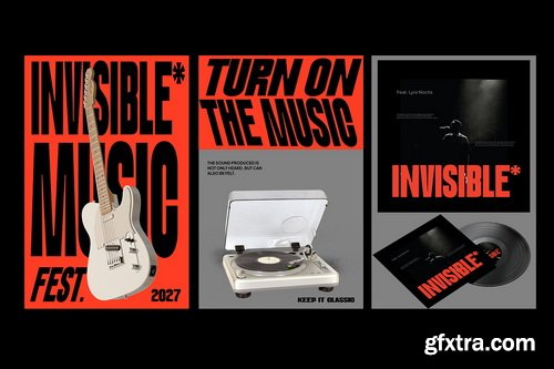
Rytual by Superior Type NEW, April 2026!
54xOTF, 1xTTF Variable €1620
Regular | Condensed | Extra Condensed | 18x3=54xOTF | 1xTTF Variable | RAR 11 MB | SALE PAGE
- The name came from a running. Same time, same route, whatever the weather, coffee after. A Rytual. The typeface follows the same logic: no single dramatic move, just one decision repeated consistently until the character accumulates. What started as a custom job for a friend grew into a full family, shaped by the rhythm that ran alongside it.
- Rytual is a grotesque built on clean, modern forms with a slightly narrow stance. Pointed terminals are cut away and replaced with sharp, rectangular endings, giving the letters a more constructed, precise quality throughout. The same logic carries into letters with fully or partially rectangular constructions, keeping the feeling consistent across the set. Narrow by nature, not by force. Stylistic alternates and three widths (Normal, Condensed, and ExtraCondensed) round out the system.

3D Bitmap Color Fonts Collection OTF, AI & PNG
20 Typefaces | Color OTF Fonts | PNG Letters | AI/SVG Vectors | +Previews | RAR 2.9 GB
Bakery | Bread | Cat | Cozy Winter | Fusion | Glass Marbles | Happy Birthday | Kids
Leo | Leopard | Neon | Neon Kit | Paint Splashes | Rainbow Pow | Sand
Sand Writing | Stone | Super Kids | Super Party | Sweet Honey

Verse Sans by Hubert Jocham 14 Fonts $500
14 Fonts | OTF/WoFF | +Previews | SALE PAGE
- The art director of Emotion, a women’s psychology magazine, asked me to design a copy typeface for them. Before I actually got the job I started to work on a serif. I wanted it to be feminine but still clear and modern. On one hand there are the floral round elements and on the other hand the angular serifs. In the composition I wanted the two extremes to work together. All the other elements had to be harmonized. The proportions needed to match the magazine’s requirements. The ascenders and descenders are short enough to work in narrow columns but long enough to work in small sizes. As you can imagine, the emotion-job never happened. In copy you should not get heavier than Heavy. Extrabold and Ultrabold work best in display.

Sophisto Font Family - 38 Fonts for $756
OTF | 34 Fonts | + Preview | 3.7 Mb RAR | SALE PAGE
- A successful collaboration between MRF and Psy/Ops Type Foundry. In search for a Sans Serif with a significant and strong character but still ”low-key” enough to be functional for most areas, Sophisto finally grew into an extensive family of 21 parts. Made carefully to fit both text- and display solutions. The buttons, images and patterns makes it even more complete as a family.

- Audit Sans is a contemporary sans serif typeface designed to be distinctive while maintaining a neutral personality. Its grotesque style is enriched by humanist details in the curves to give the whole type system a unique aesthetic. Created with legibility and versatility at its core, Audit Sans adapts perfectly across mediums. Whether in print: posters, packaging, editorial layouts, style magazines; or in digital environments such as websites and apps, it maintains a confident presence. Its flexible nature allows Audit Sans to perform equally well in formal and informal settings, scaling excellently from bold headlines, titles, and logos to clean, readable body text. Professional, reliable and elegant; it stands out in every situation. Audit sans includes OpenType features: - stylistic alternates for lowercase letters “a” and “l”, and uppercase “J” - discretionary ligature for “ff” - advanced kerning balanced with high precision Audit Sans features 372 glyphs and supports more than 100 languages.

- Pure Motif is a refined serif family that blends classic craftsmanship with contemporary artistry - designed for creators who crave sophistication, emotional impact, and timeless beauty in every letterform. Born from graceful contrasts, fluid curves, and sculpted terminals, Pure Motif elevates even the simplest word into a visual statement. Its voice is elegant yet daring, soft yet authoritative - making it the perfect typographic companion for premium brands, editorial storytelling, high-end packaging, and expressive lifestyle design. From delicate thin cuts to confident bold weights, Pure Motif’s versatility allows it to shift effortlessly between romantic, modern, luxurious, artisanal, editorial, and fashion-forward aesthetics.
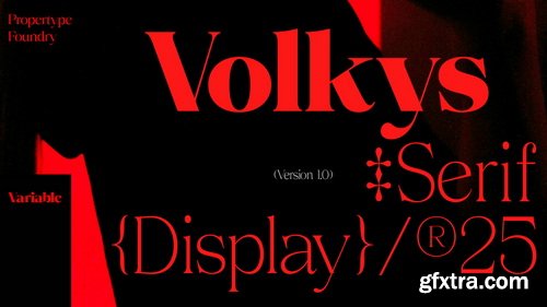
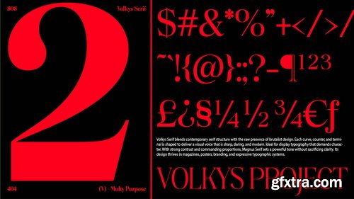
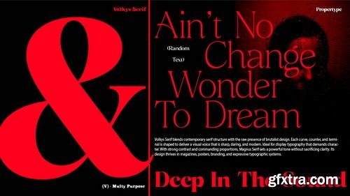
- Volkys Serif Font is a high contrast typeface inspired by transitional and contemporary typefaces. This typeface expands its usage by providing thicknesses ranging from thin to black. Natural curves, bulging stems, and slants, become more prominent as the letter thickness increases. While thinner thicknesses have lower contrast and optical correction to create a warm and soft look. Featuring beautiful italics, excellent weights, and extensive language support.
- Volkys Serif Font excels in display settings such as headlines, titles, branding projects, Logo designs, packaging, magazine headlines, advertisements, short or long texts
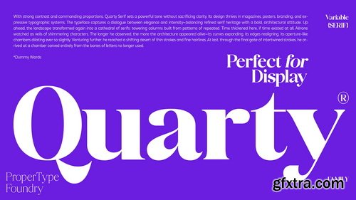
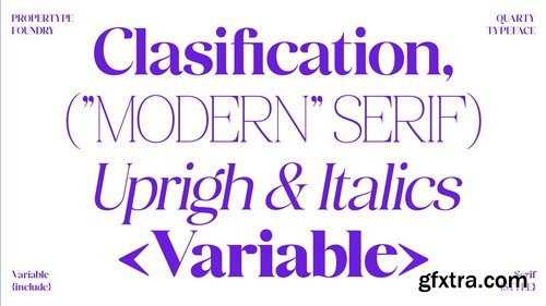
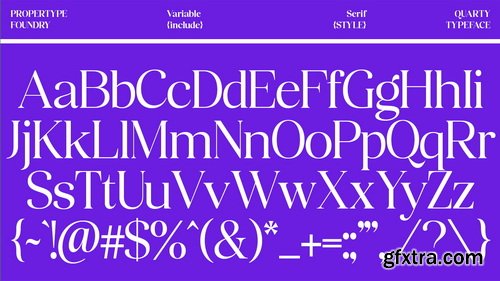
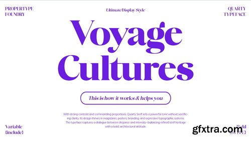
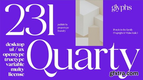
- Introducing Quarty Serif, a highly refined serif font that exudes an aura of elegance. Quarty's uniqueness lies in the harmonious blend of geometric shapes and graceful curved elements, resulting in a font with a singular and unique character. Embrace the sophistication of Quarty for all your typographic needs. Available in nine weights, from thin to extra bold, this font features a Latin-based language, OpenType features, including ligatures and variable fonts.

- Anna Glave - Romantic Serif & Script Font Duo Anna Glave is a refined romantic font duo that blends a modern high-contrast serif with a graceful handwritten script, designed to create elegant, emotional, and timeless typography. This duo is crafted for designers who want to elevate branding with a sense of luxury, nostalgia, and modern sophistication. Inspired by classic editorial typography and romantic calligraphy, Anna Glave delivers a perfect balance between structure and expression - making it ideal for both bold headlines and intimate handwritten accents.
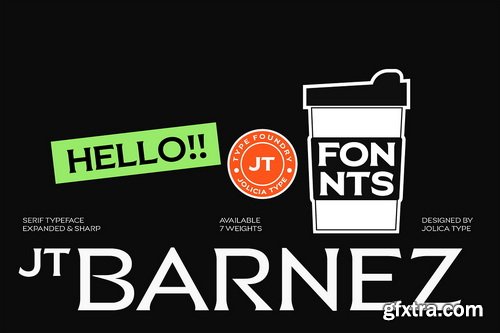
- JT Barnez is a refined hybrid typeface combining the subtle elegance of a serif with the clarity of a clean sans-serif. Designed with expanded proportions and precise, sharp detailing, JT Barnez delivers a bold visual presence while maintaining a modern, minimal, and effortless aesthetic.
- The serif elements are intentionally subtle almost invisible creating a smooth fusion that feels contemporary, stylish, and forward-thinking. Each character is shaped with crisp edges and thoughtful spacing, resulting in typography that feels confident, structured, and visually striking.
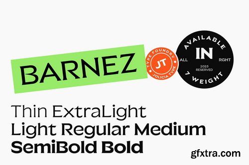
- JT Barney comes in 7 weights to support flexible design needs: Thin, Extra Light, Light, Regular, Medium, SemiBold, and Bold. From delicate editorial accents to strong typographic statements, JT Barnez adapts seamlessly across styles and scales.

- Ultion was conceived as a new approach to the traditional serif typefaces. Based on the transitional styles developed in the 17th century, this typeface introduces new forms inspired by the Cyrillic alphabet to reinforce the horizontal tension in the design and offer a unique and distinctive voice to any content. Whether used in headlines that highlight the finer details or in longer passages of text, it remains a strong, legible, and functional design while offering a particular style. With a range of weights and accompanying italics, it can adapt to a wide range of settings. Due to its high contrast that may affect legibility, a secondary set of weights labeled Text is equally included, which features a more balanced stroke and less pronounced contrast for a denser solution.

Blender Pro Font Family 9xOTF
OTF | 9 Fonts | +Preview | 1 Mb RAR | SALE PAGE
- Nik Thoenen, a member of the Vienna-based design collective RE-P.ORG is the author of the Blender, released under Gestalten Fonts in 2003. Over the years, the designer has developed and created expanded character sets for Blender Central European (including Latin Glyphs for Bosnian, Czech, Estonian, Hungarian, Latvian, Lithuanian, Polish, Romanian, Slovak and Slovenian) and Blender Cyrillic (Slavic languages including Belarusian, Bulgarian, Macedonian, Russian, Serbian and Ukrainian).
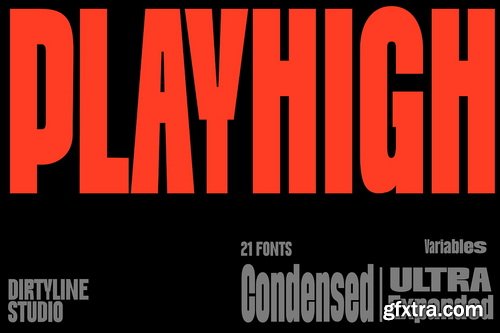
- DX Playhigh – The Ultimate Variable Display Font DX Playhigh is a bold and dynamic variable sans-serif display font designed to make a statement. Crafted by Dirtyline Studio, this font blends strength, versatility, and energy — perfect for designers who want their typography to stand tall and command attention. With 21 styles ranging from Condensed to Ultra Expanded, DX Playhigh gives you total creative freedom. Its Variable Font technology lets you seamlessly adjust the width and style to match your visual needs — whether you’re designing bold headlines, impactful posters, expressive logos, or energetic branding materials.
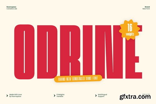
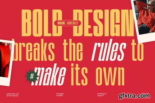
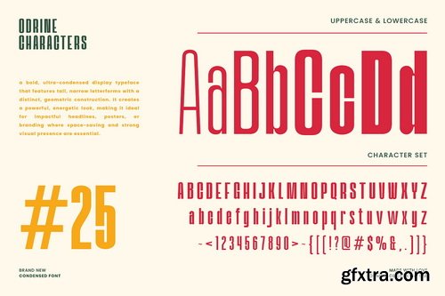
- Odrine is a condensed sans font that merges retro energy with modern clarity. It’s perfect for designers who love bold typography that stands out yet remains timeless. From logo marks to poster headlines, Odrine delivers a confident, stylish, and professional look that fits both print and digital projects.
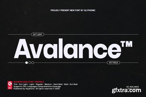
- GC Avalance – Neo Modern Typeface is a contemporary sans serif font family crafted for precision, balance, and versatility. With its clean geometric structure and smooth proportions, GC Avalance delivers a bold yet refined voice that adapts seamlessly across digital and print design. Designed for clarity in motion and stillness, it brings modern sophistication to any creative project.
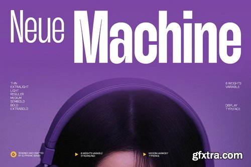
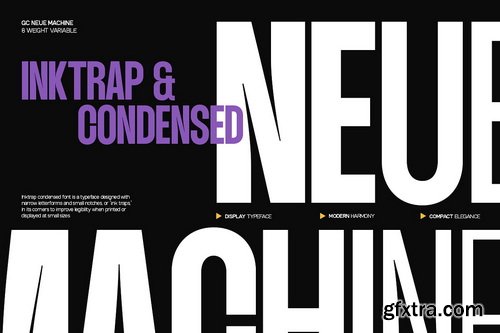
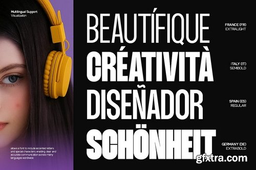
- GC Neue Machine — Modern Streamlined Precision is a condensed sans serif typeface built for versatility, balance, and impact. With tall proportions and clean geometry, it embodies a refined yet powerful visual rhythm that stands out across digital and print media. Designed to deliver clarity and modern elegance, it’s ideal for bold headlines, tech-inspired identities, editorial layouts, and futuristic branding concepts.
126,000 Royalty-Free 3D Model

Udemy Türkçe


Top Rated News
- CreativeLive Tutorial Collections
- Fasttracktutorials Course
- Chaos Cosmos Library
- MRMockup - Mockup Bundle
- Finding North Photography
- Sean Archer
- John Gress Photography
- Motion Science
- AwTeaches
- Learn Squared
- PhotoWhoa
- Houdini-Course
- Photigy
- August Dering Photography
- StudioGuti
- Creatoom
- Creature Art Teacher
- Creator Foundry
- Patreon Collections
- Udemy - Turkce
- BigFilms
- Jerry Ghionis
- ACIDBITE
- BigMediumSmall
- Globe Plants
- Unleashed Education
- The School of Photography
- Visual Education
- LeartesStudios - Cosmos
- Fxphd
- All Veer Fancy Collection!
- All OJO Images
- All ZZVe Vectors
- CGTrader 1 CGTrader 2


