

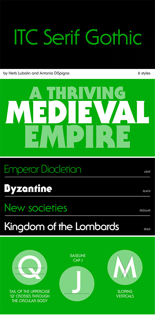
ITC Serif Gothic - 6 Styles Font Family
6 Fonts | OTF | + Previews | SALE PAGE $189
- ITC Serif Gothic® was one of the first typeface families released by ITC and was released as a two-weight display family in 1972. These were met with such popularity that four additional weights were added in 1974. While the first designs were a collaboration of Herb Lubalin and Antonio DiSpigna, the latter were just drawn by DiSpigna.
- The design grew out of hand lettering for one of Lubalin’s design studio clients. As the name implies, ITC Serif Gothic follows the pattern of “copperplate gothics,” in that its serif structure is essentially slightly pointed stroke endings rather than full serifs.
- While traditionally celebrated in editorial design, ITC Serif Gothic is now gaining prominence in podcast branding, magazine cover headlines, and luxury packaging, where its bold presence makes a statement of both sophistication and intrigue.
- ITC Serif Gothic’s versatility – from commanding magazine mastheads to memorable packaging – reflects its durability across decades and genres. It continues to prove its value in modern visual communication, offering a dynamic design that seamlessly marries heritage with high-impact modern applications.

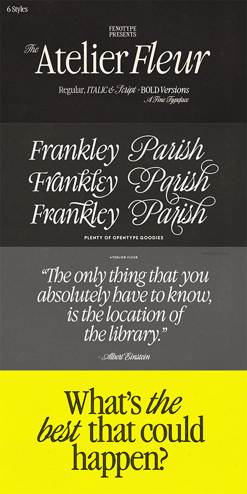
Atelier Fleur by Fenotype
6 Fonts | OTF | +Previews | SALE PAGE $39
- Atelier Fleur is a condensed serif type family inspired by Garamond. The family consists of Serif, Italic, and Script styles, each available in Regular and Bold weights. The type family is optimized for editorial and display use, performing particularly well in headlines, editorial highlights, branding and advertising. The Script style is designed to complement the serif styles harmoniously while remaining fully functional as a standalone display script. All styles provide extensive language coverage and include a comprehensive set of OpenType features. The Script and Italic styles offer a range of alternate characters accessible through Swash, Stylistic Alternates, Titling Alternates, and multiple Stylistic Sets. The Script style additionally contains decorative pen stroke elements, accessible via Stylistic Set 1 and mapped to numerals (0–9).
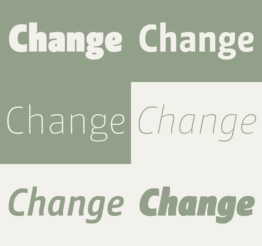
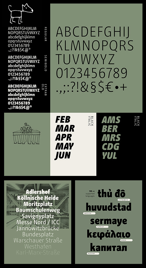
Change - 22 Styles Font Family OTF €299
22 Fonts | OTF | +Previews | PDF | RAR 29 MB | SALE PAGE
Unconventional typeface
with many peculiar details that embodies change!
- "What is special about the typeface is its humanity. The family was not stringently planned, it has grown and gone through several stages of development. Despite its clarity and functionality, it appears lively and unconventional. It is not what you expect, but always something different." is how Alessio Leonardi describes the temperament of his typeface.
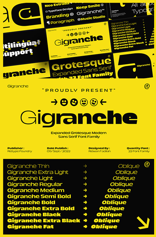
Gigranche - 22 Styles Font Family $150
22 Fonts | OTF | +Previews | RAR 2.3 MB | SALE PAGE
- Gigranche font family is Expanded Grotesque Modern sans serif and which is where this font is very strong and bold for digital manufacture/ printing industry. This font is inspired by streetwear (Urbanstreet) which relies on courage, art, and strength. The Gigranche font also comes with several symbols, fractional numbers and additional glyps from various languages (Multilingual Support).
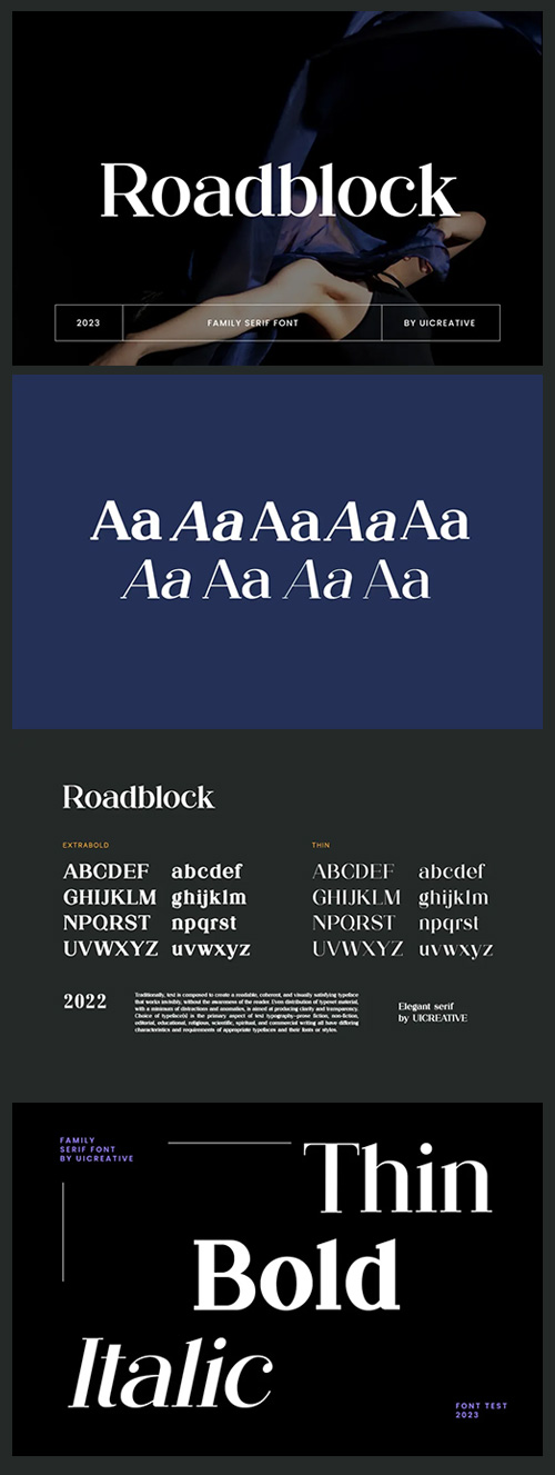
Roadblock Serif Font - 9 Styles $149
9 Fonts | OTF | TTF | +Previews | SALE PAGE
- Roadblock Serif Font. The modern display font feels beautiful classy, elegant, and stylish. This font is ideally suited for a wide variety of projects, such as signature, stationery, logo, wedding, typography quotes, magazine or book covers, website headers, branding, and more. Also, fashion-related branding or editorial design displays both masculine and feminine qualities.
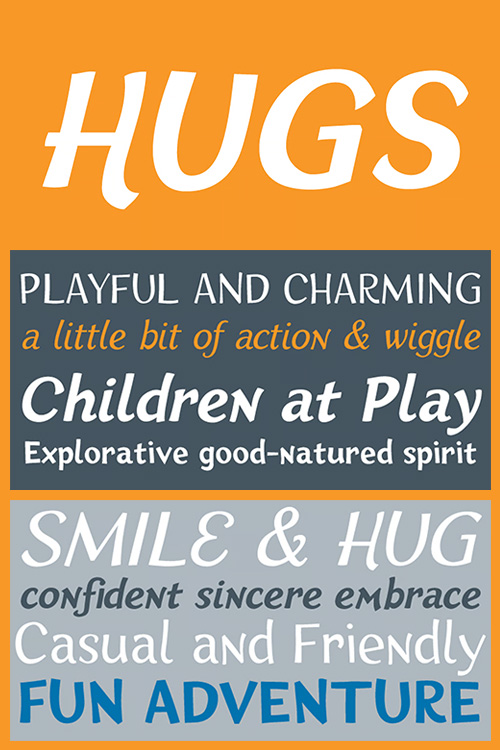
HUGS by Chank - 6 Styles $150
6 Fonts | OTF | Added Extra Bold Style | +Previews | SALE PAGE
- HUGS is a font inspired by children at play and explorative good-natured spirit. With a bit of a bounce and a whole lotta whimsy this headline font has a hand-drawn charm and a wiggly lightheartedness. Originally created for a great American diaper company for use in coupons and packaging, HUGS also translates nicely to the screens of modern devices.
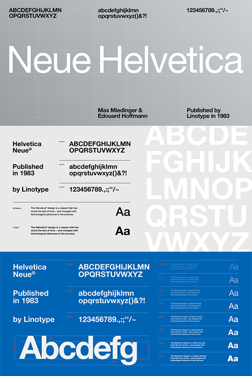
Neue Helvetica by Linotype - 59 Styles OTF Updated!
59 Fonts | OTF | +Previews | SALE PAGE $461
- This typeface, designed by Max Miedinger and other project members at the Haas’sche Schriftgiesserei, has become one of the most famous and popular typefaces in the world, thanks to the marketing strategy of Stempel and Linotype. It forms an integral part of many printers and operating systems. The original letterforms of Helvetica had to be modified for the Linotype system. Over the years, Helvetica was expanded to include many different weights, but these were not coordinated with each other.
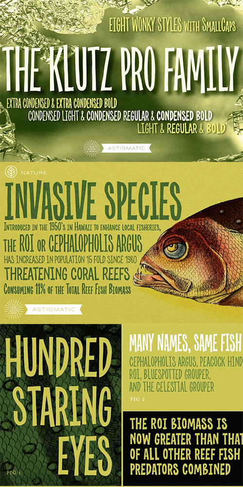
CM - Klutz Pro AOE Collection $88 1351062
8 Styles | OTF | +Previews | SALE PAGE
- The Klutz AOE Pro Collection was inspired by the plethora of naive hand drawn lettering becoming commonplace in modern advertising. What I hadn't seen was a family of hand drawn typefaces, in a range of widths and weights, with both alternate capitals as well as small caps character sets...and so Klutz Pro was born.
- The letterforms started with a few letters my daughter had drawn which I expanded on from there. Pulling from inspirations in retro cartoon titling and modern hand lettering playfulness, the full font was born, with weights and width to follow.
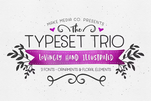
CM - The TypeSet Trio + Illustrations 5xOTF 1184041
5 Fonts | OTF | +Previews | SALE PAGE
- Introducing the TypeSet Trio! Feast your eyes on three, wildly versatile hand-drawn fonts - designed to give your work that coveted hand-lettered look. They work beautifully in a set, but I encourage you to use them independently too! (See previews for ideas). Use them to create everything from logos, to decorative packaging, to greeting cards and more! :)
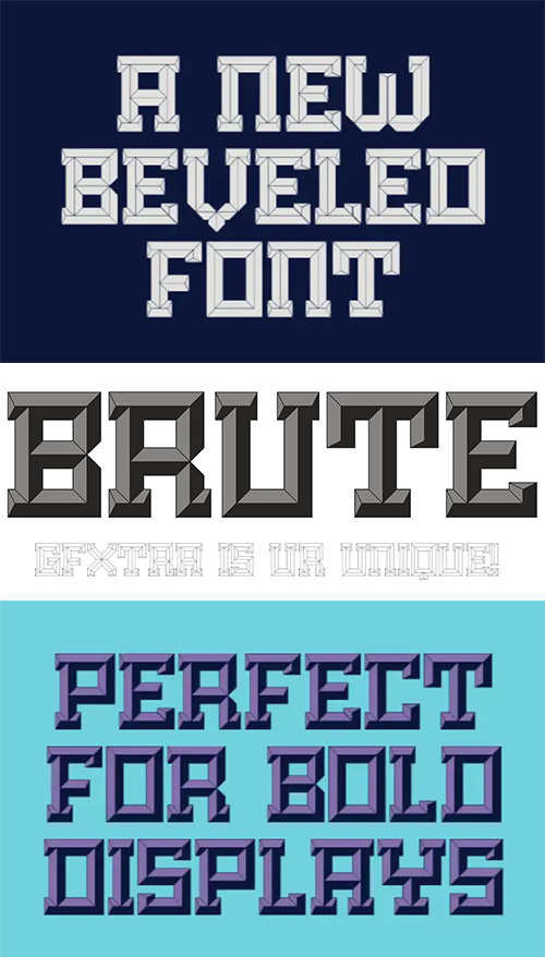
Brute - A New Kind of Beveled Display Typeset
7 Fonts | OTF | +Previews | RAR 1.6 MB | SALE PAGE
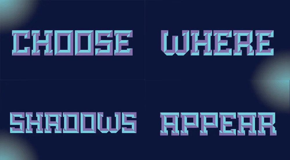
- Brute is a new kind of beveled display face based upon a modular grid-like system. Its precisely sharp edges convey a solid yet aggressive feel that add personality to any project. Unlike many beveled typefaces, Brute puts the lighting direction decisions in the designer's hands. To accomplish this, it comes with four different lighting styles that can be layered on top of the primary styles to create different solutions.
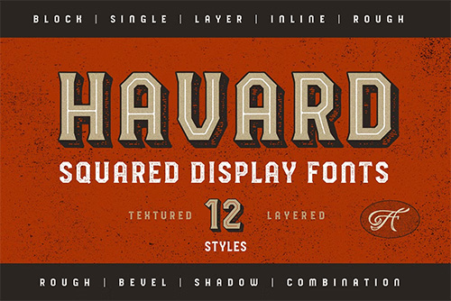
CM - HAVARD DISPLAY - SQUARED & LAYERED 4000742
- Started with a base of geometric shape, Havard is a Strong and Sturdy for a display fonts with a feels of industrial, college style, vintage look, sporty and athletic theme.
- Best use for this fonts are for headlines, display, logotype, clothing, or any short text. Havard includes 12 Style version, started with a regular, regular with inline, shadow, bevel. All of the style also have rough version. Since some of them are connected you can mix and match to use it for a layered fonts, just combine what you like as I created on a design sample above.
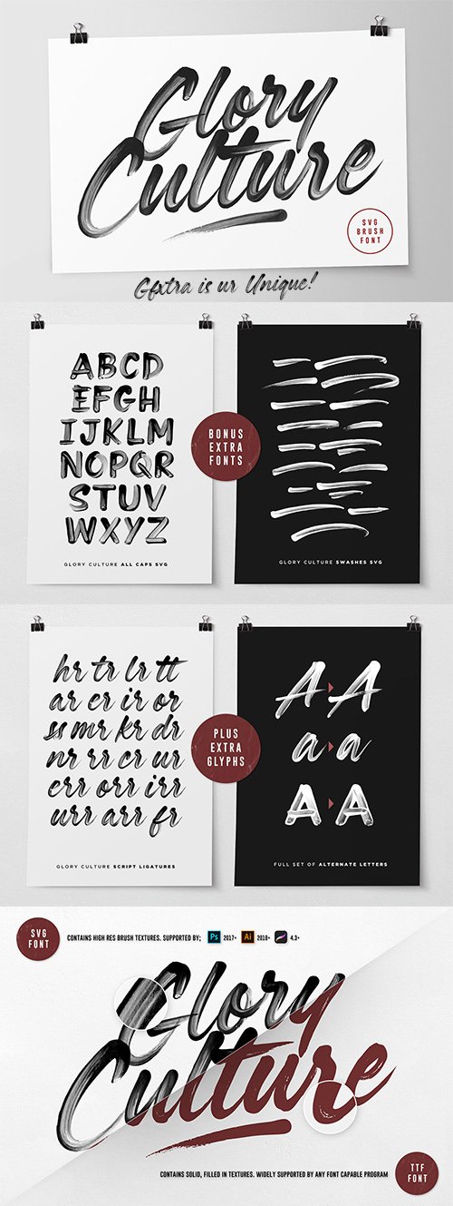
Glory Culture SVG Font + Extras by SetSail
4 Styles | SVG OTF | TTF | Web Fonts | +Previews | RAR 55 MB | SALE PAGE $24
- Introducing Glory Culture SVG Font; a fresh & modern brush script which maintains it’s original, hand-painted brush strokes – these brush details are completely built in to the font as a transparency, thanks to new Opentype-SVG font technology. Just simply type away and let the font do it’s magic! It creates unmissable authentic display text for social media posts, advertisements, posters, products packaging & more – and also includes bonus all-caps and swash fonts!
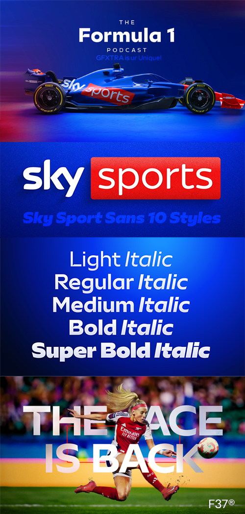
Sky Sports Sans - 10 Styles Font Family NEW!
10 Fonts | OTF | TTF | +Previews | RAR 20 MB | SALE PAGE
- Sky Sports needed a new, ownable typeface that could unify their sub-brands, improve brand consistency and bring a more welcoming tone to their typography. We were asked to create a flexible font family that could handle everything from high-impact headlines to dense tables of stats.
- Sky Sports is one of the most recognised names in global sports broadcasting. With millions of viewers across the UK and beyond, it covers a huge range of live events, highlights, analysis and breaking news across football, Formula 1, cricket, darts, boxing and many more.
- As the brand has grown, so has the need for a more unified visual voice. One that can speak with authority across all sports, channels and formats, while staying true to Sky’s values of being welcoming, entertaining and creative.
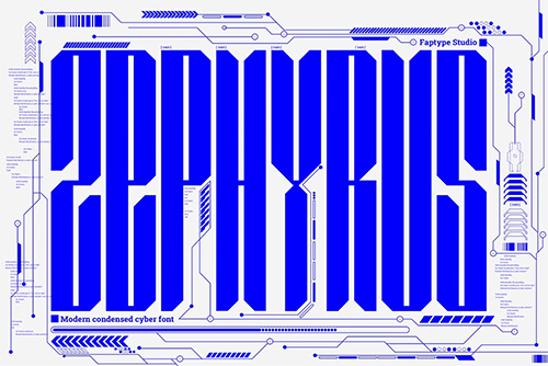
CM - Zephyrus - Modern Condensed Cyber 14491095
8 Fonts | OTF | TTF | WoFF | +Previews | SALE PAGE
- Introducing Zephyrus, our new condensed modern cyber font that's designed to take your designs to the next level! With its unique condensed squared feel, this font is perfect for anyone looking to add a modern and futuristic touch to their work.
- But we didn't stop there - we've also included a rounded version of Zephyrus, which softens the edges and provides a more approachable feel. This versatility means that you can use Zephyrus for a wide range of design projects, from logos and branding to websites and digital presentations.
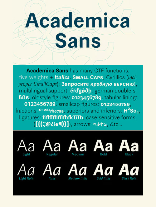
Academica Sans - 10 Styles Font Family
10 Fonts | OTF | TTF Web | +Previews | SALE PAGE $275
- Reliable scientific sans-serif. It has the same proportions as the famous serif Academica, so both fonts can be successfully combined. It is suitable for all types of literature, from educational to poetry, but also for corporate identities and websites. It has a calm and timeless character.
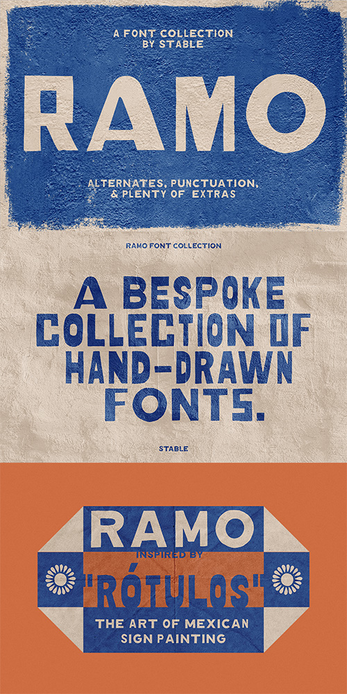
CM - Ramo Font Collection 5xOTF 7159223
4 Fonts + 1 Extra Flowers Font | +Previews | SALE PAGE $24
- Ramo is a bespoke collection of hand-drawn fonts inspired by “Rotulos”, the art of hand-painted signage in Mexico. This set includes 4 fonts with alternates, numerals, and punctuation. It also includes over 20 decorative dingbats inspired by Mexican talavera tile. Disfruten!
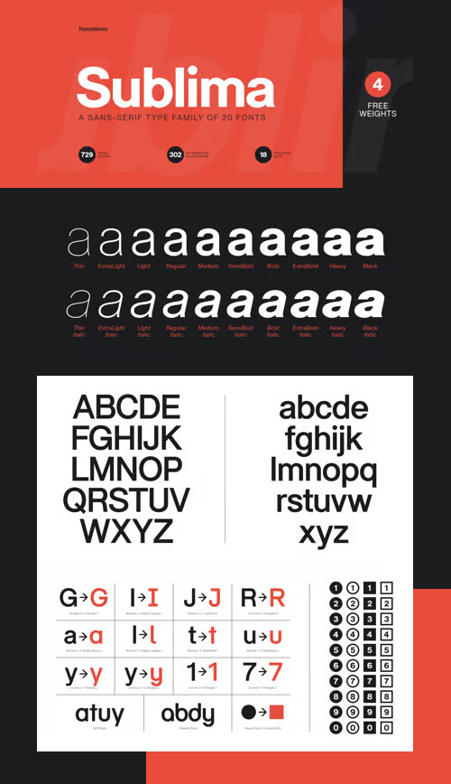
Sublima by Punchform - 20 Styles Font Family $180
20 Fonts | OTF | +Previews | SALE PAGE
- Sublima is meticulously designed to adapt its personality to any project. With 302 alternative characters and 18 stylistic sets, you get unlimited power to take your creativity to the next level. Sublima is the smartest choice for any creative project. With a single click, you can change its typographic personality and adapt it to your desired style. Choose between 3 predefined styles or create your own style by combining the hundreds of alternate characters available.
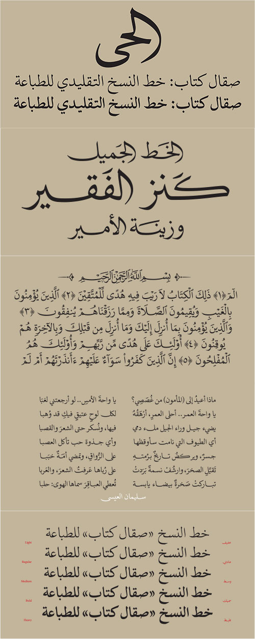
Sakkal Kitab - Arabic 5 Styles Font Family $399
5 Fonts | OTF | +Previews | SALE PAGE
- Sakkal Kitab is an exquisite traditional Naskh typeface that preserves the elegance and beauty of calligraphic Arabic. Sakkal Kitab, ‘kitab’ meaning ‘book’, is drawn in a contemporary fashion while managing to seamlessly marry heritage with present-day aesthetics. The calligraphic mastery and skill of the exemplar letterforms has been beautifully carried into the digital fonts with remarkable grace and aplomb.
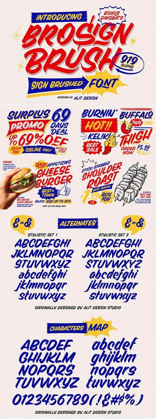
CM - Brosign Brush Typeface 287706156
OTF | WoFF | TTF | +Previews | SALE PAGE
Extensive Character Set with 919 Glyphs | Multiple Alternative Characters
Handcrafted Ligatures | PUA Unicode Access | Multilingual Support
Dingbats for Creative Embellishment
- Introducing BroSign Brush Typeface, a meticulously crafted vintage font inspired by the fluid, artistic strokes of traditional sign painting. Designed to evoke the classic charm of hand-lettered signs, this typeface brings the spontaneity and dynamism of brush strokes to your digital toolbox, offering a smooth and authentic feel that’s perfect for a wide range of creative projects. With BroSign Brush Typeface, you're not just choosing a font; you're embracing a rich visual tradition. Each letter is carefully designed to flow with the grace and spontaneity of a real brushstroke, making your text feel alive and authentic. Whether you're evoking nostalgia or creating something entirely fresh, this typeface offers the versatility and artistry to bring your vision to life.
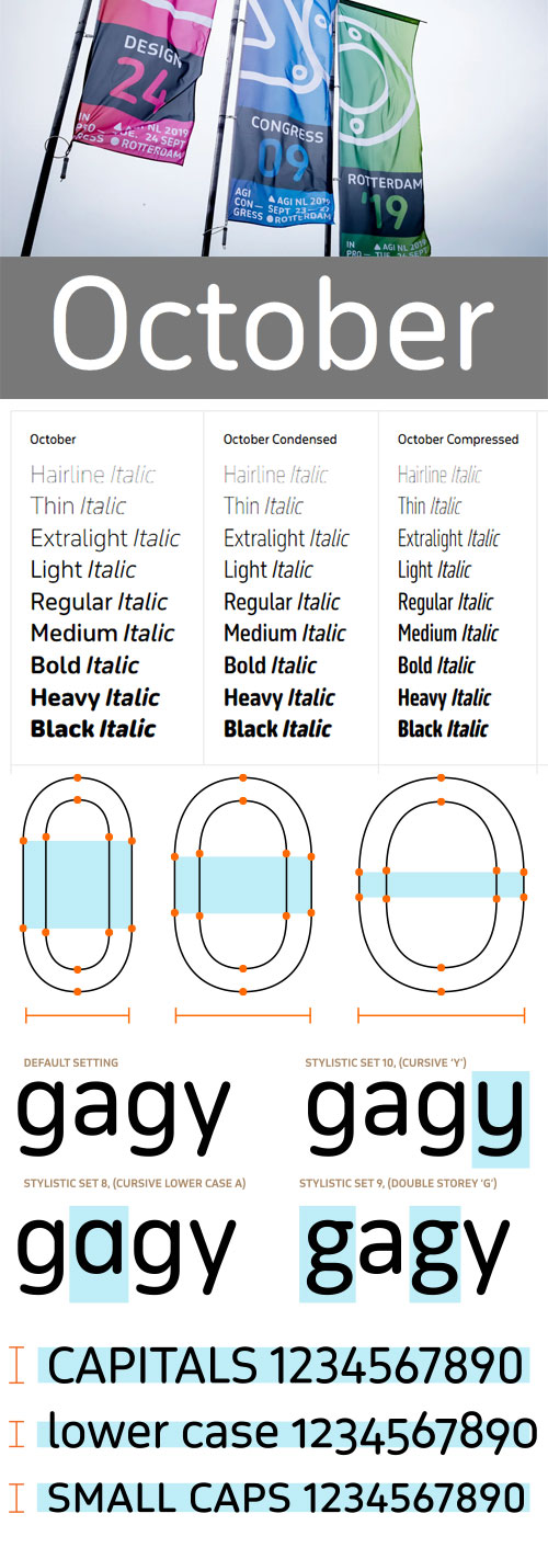
October Latin & October Pro - Multilingual
54 Styles, 2 Variable Fonts by Typotheque
54 OTF | 2 TTF Variable Fonts | +Previews | +PDF Manual | RAR 96 MB | SALE PAGE
- October is a warm, geometric typeface with soft corner terminals. At its core, it is a rational, utilitarian font family, but its rounded stroke endings lend it a friendlier character, useful for signage, branding, headlines and even editorial purposes.
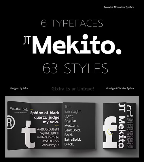
CM - JT Mekito - Geometric Modernism Font 92040524
63 Fonts | OTF | +Previews | Multilingual | RAR 4.32 MB | SALE PAGE $50
REGULAR+CONDANSED+EXTRA CONDENSED+SEMI CONDENSED
SEMI EXPANDED+ULTRA CONDENSED
- JT Mekito is a Modernism Geometric Sans serif designed by Laire in 2023 and released in early 2024, Inspired by Gothic and Geometry Sans serif styles, where we give a unique added touch to the letters f and t as well as to other letters to legible function at small sizes but still cool if used at large sizes too, and gives a mono style to our letter i so it still looks different and unique, We make it in 63 Weight Styles from Thin to Black where for each width we give Ultra Condensed, Extra Condensed, Semi Condensed, Regular, Condensed, Semi Expanded, Expanded widths. We hope that our users can freely explore our fonts, That's not enough, we also made it Variable, which is more flexible to change Total Glyph 485 covering 89 Languages
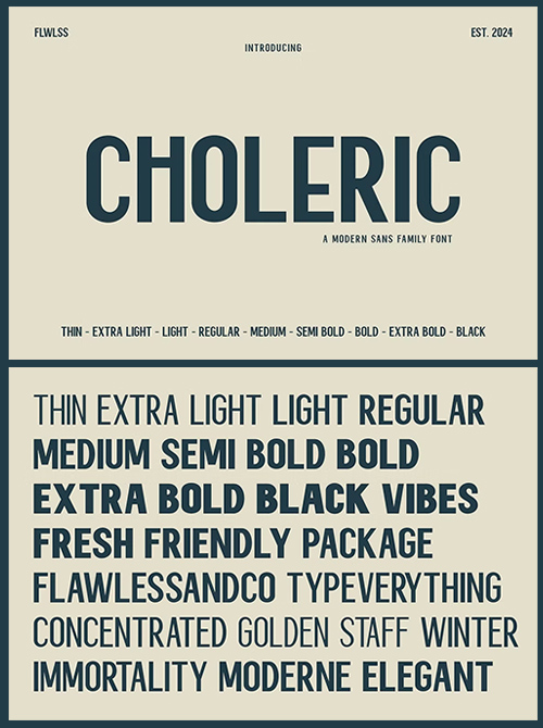
CM - Choleric Modern Sans Serif Family 92290387
9 Fonts | OTF | +previews | Multilingual | SALE PAGE $34
- Choleric - Modern Sans Serif Family, Font Family, Sans Serif Font, Family Sans Serif, Modern Font, Elegant Font, Branding Font, Logo Font, Magazine Font
- Choleric is a versatile modern sans serif font family consisting of various weights ranging from thin to black styles, including thin, extra light, light, regular, medium, semi-bold, bold, extra bold, and black. Each style within the Choleric family maintains a strong and assertive impression with balanced characters. Featuring clean and sans-serif designs, Choleric emphasizes clarity and precision in every letter across its diverse weight spectrum. Its sharp and proportional lines ensure readability and aesthetic appeal, making it suitable for a wide range of design applications, from elegant titles to body text and modern graphic designs that demand a bold and contemporary look.
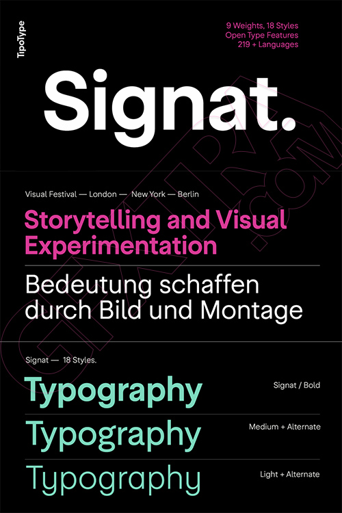
Signat - 18 Styles Font Family by TipoType NEW!
18 Fonts | OTF | TTF | +Previews | NEW! | SALE PAGE $99
- Signat emerges from a rigorous—yet never rigid—structural logic. Its construction is guided by precise optical criteria, where every curve, junction, and proportion is carefully calibrated to achieve seamless visual continuity. It is not a grotesque that seeks impact through eccentricity, but through consistency: a refined grotesque with a sense of distinction and elegance.
- It retains the clarity and legibility inherent to the genre while introducing a strategic neutrality that allows it to adapt without losing its identity. It conveys authority without harshness and presence without excess, drawing attention through balance rather than exaggerated contrast.
- Thanks to this optical and structural foundation, Signat performs naturally across institutional identities, technology and service environments, fashion and high-end editorial contexts, as well as brand systems that require continuity and control. At large scales, its personality becomes more expressive; in text, it maintains composure and clarity.
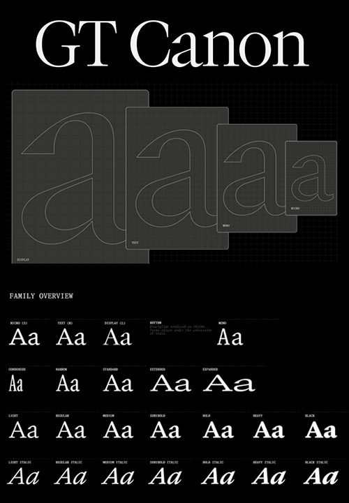
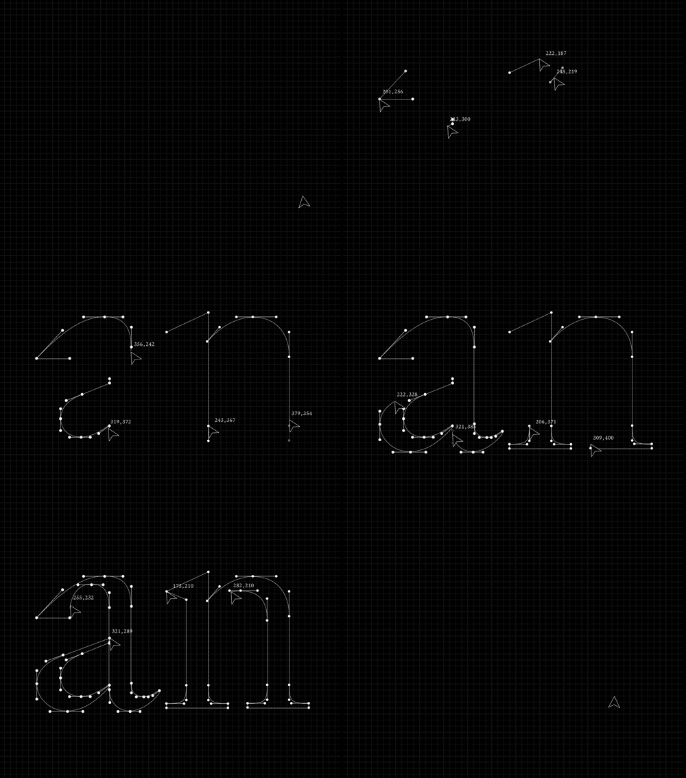
GT Canon - New!
2026's Biggest 224 Styles Font Family $1512
Designed by Grilli Type | Released in 2026 | Available in 224 styles
- GT Canon’s design is pragmatic but not static: movement and liveliness are embedded in the letterforms. It is our answer to what our digital times require of a serif today. It’s what a contemporary serif should be in both form and function. Like its sans serif sibling, GT Standard, it aims for modern functionality rather than stylistic reinvention.
126,000 Royalty-Free 3D Model
Udemy Türkçe


Top Rated News
- CreativeLive Tutorial Collections
- Fasttracktutorials Course
- Chaos Cosmos Library
- MRMockup - Mockup Bundle
- Finding North Photography
- Sean Archer
- John Gress Photography
- Motion Science
- AwTeaches
- Learn Squared
- PhotoWhoa
- Houdini-Course
- Photigy
- August Dering Photography
- StudioGuti
- Creatoom
- Creature Art Teacher
- Creator Foundry
- Patreon Collections
- Udemy - Turkce
- BigFilms
- Jerry Ghionis
- ACIDBITE
- BigMediumSmall
- Globe Plants
- Unleashed Education
- The School of Photography
- Visual Education
- LeartesStudios - Cosmos
- Fxphd
- All Veer Fancy Collection!
- All OJO Images
- All ZZVe Vectors
- CGTrader 1 CGTrader 2



















