
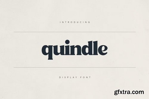
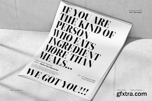
- Quindle is a bold display serif font that blends vintage charm with modern versatility. Designed for standout branding, packaging, headlines, and editorial use, Quindle features strong letterforms, high contrast strokes, and unique stylistic flourishes that give your text a distinct voice.
- Perfect for artisan brands, café menus, nostalgic labels, and poetic expressions, Quindle includes multilingual support, refined ligatures, and carefully crafted alternates. Whether you're crafting a handcrafted coffee brand or a timeless design statement, Quindle delivers character with clarity.


- In 2017, I worked on the Bona Nova research project to digitize and expand the Bona typeface designed by Andrzej Heidrich in 1971. The project was developed with further scripts and, in the meantime, together with Leszek Bielski and Andrzej Heidrich while working on a identity for the Polish Senate, we created several characters for a logotype based on Bona Nova in a sans serif version. After the death of Andrzej Heidrich and Leszek Bielski, I completely lost heart for developing the whole project. However, the idea of developing a Sans version inspired, on the one hand, by sketches for Bona and, on the other, by the works of Andrzej Heidrich, which Leszek Bielski and I collected during our research. Finally, after several years of work, Heidrich Sans was created – an elegant sans-serif typeface which explores the typographic heritage left by one of the most eminent contemporary graphic designers.


- As the new typeface evolved, one thing continued to stick out to me: Bodoni’s flexibility with the various italics drawn. So many variations, so many angles, so many use cases. For me, I struggled to settle on just one and ultimately took inspiration from 3 different italic variations at 8, 12, and 16 degrees. Each had its own speed to them. It was that connotation I set for the speed of the italics that ultimately influenced the name of the typeface, Overture. Each weight and optical size would be accompanied with three italics, at three speeds: Adagio, Andante, and Allegro. An homage of sorts to my love of classical music. As a unique bit of trivia, I almost exclusively listened to pieces by Debussy while working on this typeface—a fitting accompaniment, in my opinion.
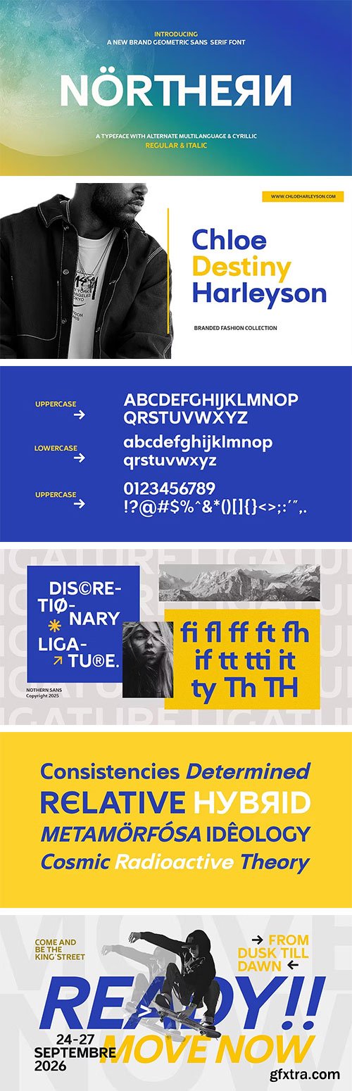
- Northern Sans is a modern sans-serif font with a clean, geometric, and functional design. Created to be bold yet flexible, this font combines balanced letterforms with subtle details that give it a professional and contemporary feel.

- Baru Sans is a geometric typeface that strikes a balance between the precision of geometric foundations featuring chopped terminals with distinctive 90º strokes to reinforce design aesthetics. Moreover, the italic version of the Baru Sans font embodies a humanist style inspired by handwriting. The term 'Baru' translates to 'new' or 'fresh,' reflecting the font's aim to set unprecedented design trends. With 9 weights, including upright italics and true italics, the total of 18 fonts offers flexibility for various applications in typographic design. These weights range from the precision of Thin weights to the impressive Super weights, making it suitable for use in extended columns of text, artful editorial layouts, or compelling motion graphics.

OTF
Survivor the font is a adventure, nature, and wilderness font able to cover many uses. Its founded in the jagged forms of rocks and natural wood while still holding to modern typographic forms. This font includes a vast amount of characters, as seen in the display image, including a few extra glyphs like 3 solid bars and 3 boxes which can be used and modified in your designs.https://creativemarket.com/thomas_ramey/489584-Survivor-Display-Font

CreativeMarket Waves CPC 717431
OTF
https://creativemarket.com/christopher.cacho/717431-Waves-CPC 10
Waves CPC is a pixel typeface family that is currently in progress. There are three members of the family so far and with more along the way. It started with wanting to create a simplified blackletter typeface and then a giant wave of ideas hit me when I thought of incorporating my pixel art experience. There is also a small web app that I made to randomize an acronym for C.H.I.P: http://www.christophercacho.com/wtchip
Waves CPC's name comes from the heart of 8bit music (chiptune), waveforms, and the giant waves that make up our Earth's oceans.
Purchase early at this low starting price and you'll receive all future font styles added to the family.
Family Members
Blackletter
Base, Shadow, &Inline layers
Uppercase & Lowercase characters
Numbers, symbols and punctuations
Extended Language support
Tiny & Tiny Slab
Same character set as Blackletter
Includes a regular and extended width styles
Upcoming members
Block
Narrow
Script
Icon
Ideas for Usage
Zine mastheads
Power metal band logo
Digital tombstones
Indie RPG
Retro gaming show title screens

- At Umami is where East meets West in typographic harmony. Conceived during a flight from Tokyo to Madrid, this rounded sans-serif was inspired by a plethora of visual provocations experienced in Japan. The result is a savoury and bold typeface that adds depth and dimension to your designs.
- At Umami comes in 18 styles — from Air to Super, including Retina, an optimized weight for high-density screens. It includes a wide set of alternates, symbols, arrows, and smart OpenType features. By purchasing the full family, you also get the variable fonts.

- Enorm is a modern, futuristically conceived neo-grotesque typeface that combines clarity and timelessness with current and emerging technologies. It is designed to serve as a typographic foundation for distinctive brand communication. Its large x-height enhances readability at smaller sizes and gives the typeface an open, generous appearance on both print and screen. Extensive OpenType features—such as ligatures, contextual alternates, and stylistic sets—are integrated across all styles. With broad Latin language support, Enorm offers high versatility for diverse typographic applications.
- Designed as a contemporary geometric typeface, it is particularly well-suited for text, logotypes, branding, editorial design, and corporate identities. Enorm is a related variant of Object.
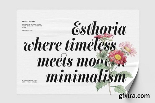
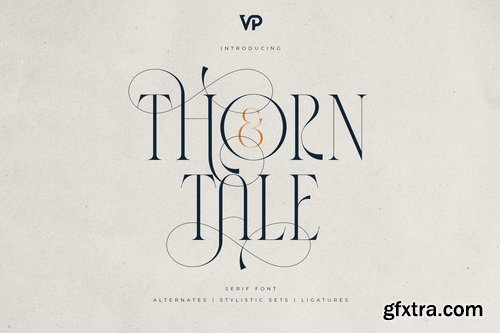
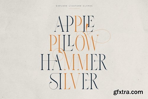
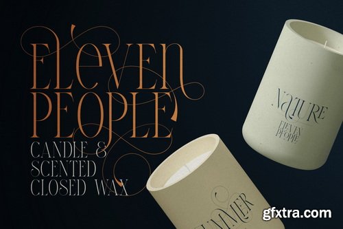
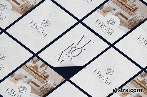
- Esthoria is a sophisticated, high-contrast serif typeface blending timeless elegance with modern minimalism comes optical choice in 6 styles, each with a true italic option, making it ideal for luxury branding, editorial design, and premium packaging.
- Inspired by the refined aesthetics of classic serifs like Didot and Bodoni, Esthoria embodies luxury, sophistication, and minimalist charm. Each character showcases crisp lines, sharp edges, and elegant curves, delivering a polished look with an unmistakably contemporary appeal.
- Complete with swashes, alternate and ligature Esthoria is perfect for luxury branding, elegant editorial layouts, high-end product packaging, fashion magazines, and sophisticated web designs. Its refined style and modern minimalism will elevate your design projects, capturing attention with its striking visual impact.


- Agneta is a contemporary take on the classic grotesque genre, rooted in the history of typography, but characterized by Guido Schneider’s personal, intuitive interpretation. Inspired by early sans-serif typeface, and sparked by distinctive letterforms found in old printed matter and a board game logo, Agneta strikes a delicate balance between clarity and personality.
- With its generous x-height, smooth curves, and subtle detailing, Agneta offers clarity without coldness. It’s distinctly modern, but with a touch of human warmth – a grotesque that doesn’t shout, but speaks with confidence and charm.
- The type family includes 10 finely balanced weights, each accompanied by a carefully drawn italic. This makes Agneta a versatile tool for a wide range of typographic needs.


- TG Pilgrima Office is a new sans serif digital typeface, evolved from the structural framework of TG Neuramatica. With a new identity, refined design details, and expanded OpenType features, it is built to meet the nuanced demands of contemporary design work. Carefully designed for clarity and a clean, modern aesthetic, TG Pilgrima Office performs reliably across a wide range of applications—whether in small point sizes, mid-scale layouts, or large display settings. Its versatility makes it well-suited for branding, editorial, and digital projects that prioritize consistency and visual harmony.
- TG Pilgrima Office includes 18 styles comprising uprights and italics, and supports a full Latin character set. It features variable font capability along with a comprehensive suite of OpenType enhancements such as ligatures, alternates, fractions, and more—carefully optimized for both print and digital environments. TG Pilgrima Office offers a balanced combination of precision and flexibility, giving designers a robust tool for thoughtful and adaptable typography.
126,000 Royalty-Free 3D Model

Udemy Türkçe


Top Rated News
- CreativeLive Tutorial Collections
- Fasttracktutorials Course
- Chaos Cosmos Library
- MRMockup - Mockup Bundle
- Finding North Photography
- Sean Archer
- John Gress Photography
- Motion Science
- AwTeaches
- Learn Squared
- PhotoWhoa
- Houdini-Course
- Photigy
- August Dering Photography
- StudioGuti
- Creatoom
- Creature Art Teacher
- Creator Foundry
- Patreon Collections
- Udemy - Turkce
- BigFilms
- Jerry Ghionis
- ACIDBITE
- BigMediumSmall
- Globe Plants
- Unleashed Education
- The School of Photography
- Visual Education
- LeartesStudios - Cosmos
- Fxphd
- All Veer Fancy Collection!
- All OJO Images
- All ZZVe Vectors
- CGTrader 1 CGTrader 2


