


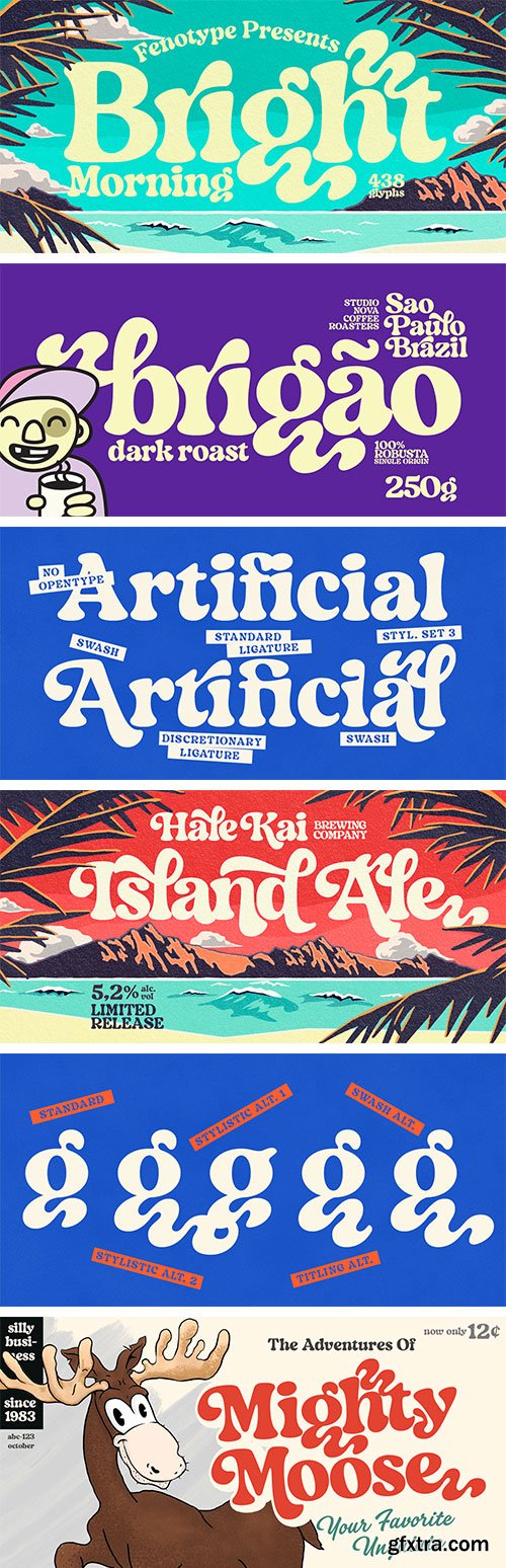
Wood Type Collection Font Family - 39 Font $390
39 OTF Fonts | 9.4 MB RAR | Sale Pages Wood Type Collection 1 Wood Type Collection 2
- WOOD TYPE COLLECTION from BORUTTA is a set of wonderful, warm and weathered hand made typefaces designed by Mateusz Machalski. The Inspiration for this collection comes from a wooden letter blocks and other old technologies used for printing.WTC supports 40 different languages and contains over 6000 glyphs. The Family consists of 5 typefaces in 10 different styles! (Regular & Italic)


Halcom - A Modern Geometric Sans-Serif $265 NEW!
16 OTF Fonts | Designer: Jonathan Hill | Design Date: Jul 10, 2015 | TURKISH SUPPORT
http://www.myfonts.com/fonts/northernblock/halcom/
![]()
![]()
![]()
![]()
![]()
![]()
![]()
![]()
![]()
![]()
![]()
A modern sans serif typeface inspired by the historic geometric’s of the 1920’s, specifically Futura. The design is not a simple pastiche of what went before this is much more than that. It is a close investigation to how Futura inspired other type designs like Avenir and helped push the boundary of what is a modern typeface of its generation. Overlaying perfect geometric shapes careful adjustment is made for each character and each corner to a point of balance between pure mathematics and optical correctness. The result is a distinctively modern geometric font family that is strikingly simple in design yet perfectly pleasing to the readers eye. Details include 550 characters with an alternative lowercase a, g and y, five variations of numerals, manually edited kerning and Opentype features.

http://r-typography.com/16_grifinito/
Grifinito is the compressed companion for Grifo and Grifito. The family has two optical sizes: M, for titles and L for larger headlines. Each of these have four weights from Light to Bold, with matching italics.


https://www.myfonts.com/fonts/artegra/artegra-sans/
Artegra Sans was designed between 2014 - 2017 by the Turkish type designer Ceyhun Birinci. The project started with the idea of making one of the most comprehensive typeface families in the world, while maintaining top quality in design. Artegra Sans does exactly that, offering quality in quantity in a total of 162 fonts. There are 9 weights along with their matching true italics in normal, condensed and extended widths. More than 1500 glyphs per font offers a wide range of language support from Latin to Cyrillic languages, as well as many Opentype features such as true small caps, stylistic alternates, ordinals, fractions, superscripts and subscripts. Separately created alternates and small caps versions of each font allows users to use these styles, even in software with no access to OpenType features. Each glyph was designed with the utmost care to meet the highest quality expectations, making Artegra Sans a unique typeface not only in magnitude but in usefulness and readability as well. It’s beautiful to look at and easy to read, thus can be used for both display and text purposes. It’s a perfect choice for branding, magazines, posters, advertising, web and mobile application design, packaging design and more.


http://www.myfonts.com/fonts/fenotype/goodwater/
Goodwater is an original collection of a Brush, three weights of a monoline Script and four weights of condensed Sans typeface. Goodwater also has a “Print” version with rugged outline and worn-out texture of each font.

126,000 Royalty-Free 3D Model

Udemy Türkçe


Top Rated News
- CreativeLive Tutorial Collections
- Fasttracktutorials Course
- Chaos Cosmos Library
- MRMockup - Mockup Bundle
- Finding North Photography
- Sean Archer
- John Gress Photography
- Motion Science
- AwTeaches
- Learn Squared
- PhotoWhoa
- Houdini-Course
- Photigy
- August Dering Photography
- StudioGuti
- Creatoom
- Creature Art Teacher
- Creator Foundry
- Patreon Collections
- Udemy - Turkce
- BigFilms
- Jerry Ghionis
- ACIDBITE
- BigMediumSmall
- Globe Plants
- Unleashed Education
- The School of Photography
- Visual Education
- LeartesStudios - Cosmos
- Fxphd
- All Veer Fancy Collection!
- All OJO Images
- All ZZVe Vectors
- CGTrader 1 CGTrader 2


