


- Prestino is an elegant reverse-contrast brush script - a modern style with a touch of nostalgy. Prestino fits well in contemporary designs, products, labels and any display use.
- Prestino is equipped with several OpenType features: Contextual Alternates help maintain smooth connections between certain character combinations and are automatically activated. Swash, Stylistic and Titling Alternates, as well as 7 Stylistic Sets offer a wide range of alternate characters. In addition, Prestino has a selection of ornamental swooshes and swirls, set in Swash and Stylistic Alternates, under characters 0-9, !”#€%&)+,-.

- Degitan is a high contrast typeface inspired by transitional and contemporary typefaces. The font expands its usage by providing weights ranging from thin to black. Natural curves, swollen stems and slants, grow in character as the font increases in weight. While thinner weights have lowered contrast and optical correction to create a warm and soft look. Featuring beautiful italics, excellent weights, and extensive language support.
- Degitan also comes in two versions of Variable Regular and Italic to make it easy for designers to explore and refine beautiful designs, revealing many visual tones and hidden secrets. Degitan excels in display settings such as headlines, titles, branding projects, Logo designs, packaging, magazine headlines, advertisements, short or long texts.


http://www.myfonts.com/fonts/positype/lust-pro-didone/
Confident and versatile, Lust Pro™ is an exercise in indulgence—an attempt to create something over the top and vastly useful. If Lust Pro seems both new and familiar, that’s because it is. The series unapologetically channels Herb Lubalin, but produced with a deliberate, contemporary twist. There is an intentional slyness infused in the letterforms—the extreme thick and thin lines flow effortlessly without becoming gratuitous. It’s always just enough, not too much. What makes the type series so appealing? The curves. When asked to describe the letterforms, most people unwittingly allude to the human form, using adjectives usually reserved for describing physical traits… creating all-too-familiar comparisons. Summerour has grown to accept this as unavoidable and reasonable given his acknowledgement of its influences and has provided nuances within the letterforms to accentuate that. Intended to be set large, the typeface boasts 3 widths and 5 weights and matching italics for both the Regular and Didone variants (that’s 60 fonts in total), making it perfect for editorial use and a highly flexible solution for any display need.
TTF | 30 Fonts | JPG Preview | 9.5 Mb RAR
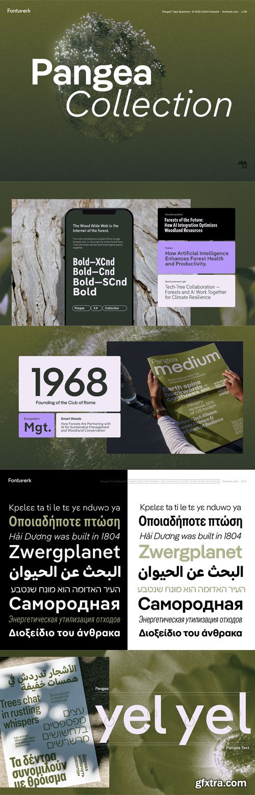
- For Christoph, the connection and connotation of the name was of great importance. Just like the primeval continent that the typeface is named after, Pangea is a symbol of not only the big (common) picture but of global cooperation. While Gergő Kókai from Hungary supported him in the design of the upright characters, he brought Tanya George from India and the Japan-based Gabriel Richter on board to work on the italics. He consulted with Irene Vlachou from Greece, Ilya Ruderman from Russia, Donny Truong from the USA and Paul Hanslow from Australia to ensure the quality of the Greek, Cyrillic, Vietnamese and African Latin characters. The spacing and the kerning of the font would not have been possible without Igino Marini from Italy and his superior iKern technology.
- Broad foreign language support is almost obligatory with such an omnicultural approach. From the beginning, European Latin, Cyrillic, Greek and Vietnamese language support have been included in Pangea as standard. The first language extension was Pangea Afrikan which supports all Latin-based African languages and some indigenous languages of North America and it was released a corresponding (subset) for free in the Base License towards the end of 2021!

- Epoha is geometrical sans-serif font family available in 3 widths and 4 weights. With rounded edges that soften design of the letters, Epoha delivers functionality on the first place – it is neutral, versatile, legible and easily applicable for any project.
- Equipped with extended Latin and Cyrillic language coverages, Epoha in widths and weights diversity allows use of typographical contrast in editorial use or branding, to package design, posters and websites.


- Ozana Pro is a bracketed serif font family adapted to the professional requirements of graphic designers, web designers and mobile app developers. Comprised of 24 styles including 12 styles designed especially for headlines and 12 styles for text and long paragraph design, Ozana Pro is a very versatile family of fonts that can be used in many projects such as editorial design, branding or corporate identity creation, design of posters or logos, the creation of websites or the development of mobile applications.
- This serif font family, with a resolutely modern aspect, also hides a unique typographic design since it has 2 distinct styles (Roman and Display) which have 2 different optical sizes in order to graphically differentiate the appearance of titles, subtitles and long paragraphs.
- With this design of glyphs differentiated by the optical size according to the styles, the titles have a very graphic aspect while the long texts have a more classic design in order to keep an optimal readability in all cases.


- Type design is about more than crafting beautiful letters. In your day-to-day business, you don’t need flashy and fashionable — you need fonts that will always get the job done, a typographic workhorse. Officer Sans is a beautifully crafted and highly functional all-rounder font family perfectly suited to the modern office environment and designed to the most exacting typographic standards. It looks great too!
- We designed Officer Sans to exacting standards so that the fonts work perfectly and seamlessly with modern office apps like MS Office, Excel, Pages, and Numbers. That means ensuring seamless functionality with features like Style Linking in MS Office, embedding the fonts within your documents, and optimizing or hinting all the fonts for optimal rendering on screen.


- Optrix is a refined serif typeface designed to bring sophistication and charm to your creative projects. With its high contrast strokes, elongated letterforms, and stylish curves, Optrix blends classic editorial flair with contemporary elegance—perfect for luxury branding, wedding stationery, high-end packaging, editorial design, and boutique visual identities.
- Crafted for designers seeking a balance of drama and readability, Optrix thrives in headlines, logos, and display text where elegance meets personality. Each character is thoughtfully designed to evoke emotion while maintaining a strong and confident presence.


https://www.myfonts.com/fonts/the-refinery/clarika/
- Clarika is a geometric sans serif type system consisting of eleven weights and two style variants; Clarika Geometric and Clarika Grotesque. As the name would imply, Clarika boasts incredible legibility at both body and display sizes.


- COMMERCIAL USE - Use this product for personal, commercial & client work. For further details see the 'Item Packs and Bundles' section of https://creativemarket.com/licenses
- The modern floral bundle of your dreams has arrived! Introducing the Floriana Creator Studio ????????? A HUGE pack of fonts, graphics and branding tools worth over $200 for only $35. Over 1000 elements included!
- For the lovers of florals and feminine designs, the studio provides you with endless possibilities to create breathtaking logos, patterns, prints and more for your store, blog, brand or clients. It’s a complete branding experience!
- Incorporate pretty flowers and a soft color palette into your social media, mixing in minimalist floral designs with your own photography. Make a statement with deeper hues of dusty rose and faded black with a metallic finish to amplify your design.
- You have a brand new collection of fonts which work wonderfully in artistic logos or to add a handwritten touch to Instagram quotes. Including pretty scripts, cute handwritten capitals and a sophisticated, dramatic serif.
126,000 Royalty-Free 3D Model

Udemy Türkçe


Top Rated News
- CreativeLive Tutorial Collections
- Fasttracktutorials Course
- Chaos Cosmos Library
- MRMockup - Mockup Bundle
- Finding North Photography
- Sean Archer
- John Gress Photography
- Motion Science
- AwTeaches
- Learn Squared
- PhotoWhoa
- Houdini-Course
- Photigy
- August Dering Photography
- StudioGuti
- Creatoom
- Creature Art Teacher
- Creator Foundry
- Patreon Collections
- Udemy - Turkce
- BigFilms
- Jerry Ghionis
- ACIDBITE
- BigMediumSmall
- Globe Plants
- Unleashed Education
- The School of Photography
- Visual Education
- LeartesStudios - Cosmos
- Fxphd
- All Veer Fancy Collection!
- All OJO Images
- All ZZVe Vectors
- CGTrader 1 CGTrader 2


