

Categories: GFXTRA Special » Special Fonts
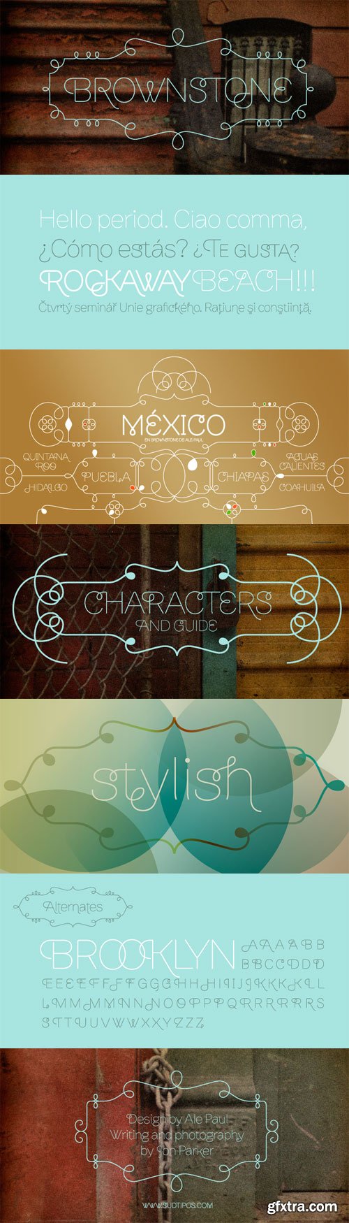
Brownstone Sans by Sudtipos
OTF | 3 Fonts | JPEG Preview | 3.4 Mb RAR
- One design sparks another. As Alejandro Paul experimented with the strokes and curves of the monoline script Business Penmanship, he discovered interesting new forms and shapes that didn't fit the Spencerian theme of that typeface. These forms simmered in Ale’s subconscious over the next three years, during which time he visited New York City, pored over rare type specimen books in the New York Public Library, and explored Brooklyn’s neighborhoods. Brownstone, the face born from these explorations, is an original 21st-century design, yet one subtly infused with historical and cultural references -- keen observers might spot influences from decorative typefaces of 19th-century foundries. And just as faces from that era were influenced by contemporary architecture, the frames included with Brownstone echo the ornate iron railings of Park Slope’s row houses. (There’s also a slight 1960s vibe to Brownstone, of novelty swash-sans photocompositing faces, that can be played up at your discretion.) Influences aside, Brownstone has broad appeal to modern audiences. A soft, monoline sans-serif, with elements of Swiss geometry (see the ‘k’ and ‘x’), its marriage of highly legible, draftsman-like letterforms with decorative swashes and ornaments reflects the old-meets-new aesthetic of the DIY craft culture seen in Brooklyn and other urban centers. It’s ornamental but unfussy, romantic but understated. Brownstone includes character sets for Latin-based languages, including Western and Eastern European, Baltic, Turkish, Maltese, Celtic and Welsh. Over 1500 glyphs, including small capitals, swash characters, alternates, and ligatures, in both Light and Thin weights. Ornamental frames are also included in both weights.

Categories: GFXTRA Special » Special Fonts
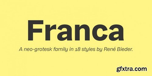
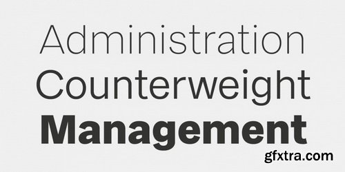
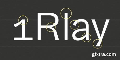
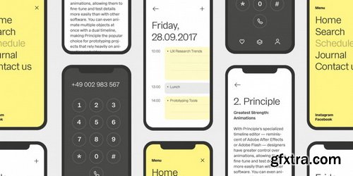
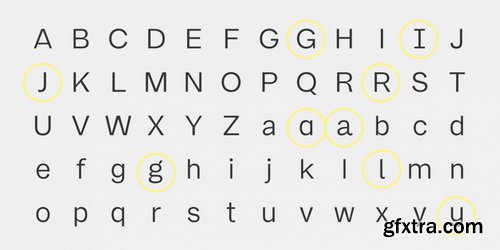
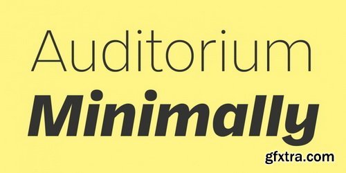
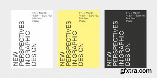
Franca Font Family | 18 x TTF
https://www.fontspring.com/fonts/rene-bieder/franca
- Franca is a neo-grotesk family in nine weights plus matching italics. The inspiration for the design came trough the constant interest in new interpretations of the classic grotesk model and a study of „neutral“ typefaces like Helvetica, Univers or Normal Grotesk. During the studies, additional attention was given to the American representatives of the genre, resulting in the initial impetus for a reinterpretation, combining both paths into one contemporary design.
Categories: GFXTRA Special » Special Fonts
Gilam Font Family | 18 x TTF
https://www.youworkforthem.com/font/T8952/gilam/
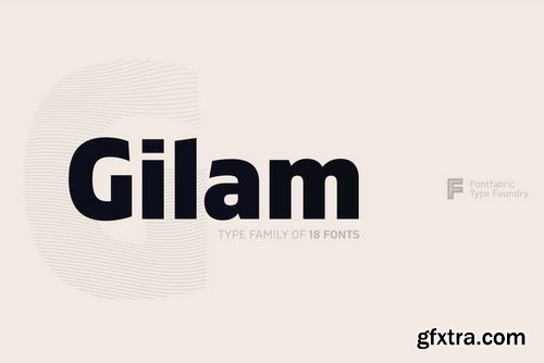
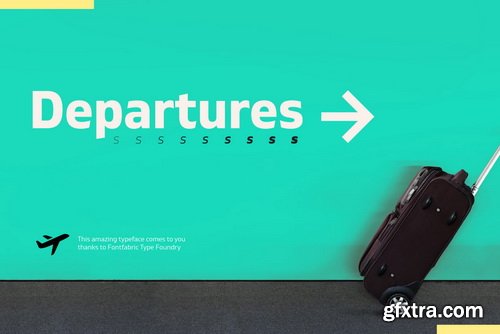
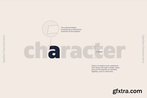
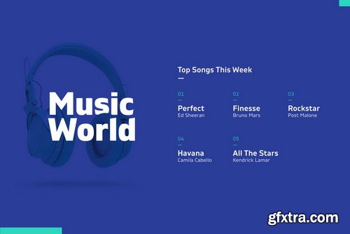
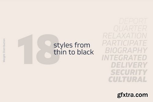
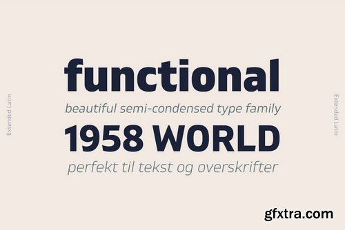
- Gilam is a sans serif font with semi-condensed proportions. The typeface was based on the famous DIN but combines its popular neo-grotesque look with characteristics, such as the pointed edges in the “W” and “M” as well as the outward cut terminals, which gives a distinctive look to the modern geometric typeface. The complete set of 9 weights plus italics gives to designers an absolute freedom to create. Perfect layouts with blocks of text, headlines, motion graphics, logos, apps, and websites are just part of the intended usage of this versatile typeface.
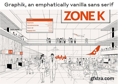
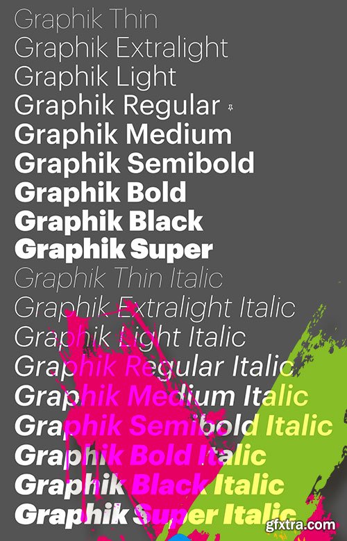
Graphik - Most Popular Commercial Typeface 18xOTF
OTF | 18 Fonts | JPEG Preview | 10.9 Mb RAR
- Graphik, a deliberately vanilla editorial workhorse, remains one of Commercial Type’s most popular families. This hybrid face offsets the round bowls typical of a geometric sans with the architecture and proportions of a European grotesk, without the baggage of more dogmatic, overused sans serifs mired in postwar modernism. Graphik’s low contrast, open counters, and compact descenders recommend it for use in tight settings like subheads, captions, labels, and running text; human touches like round dots and other details also make it ideal for larger, more impactful uses such as titles, covers, posters, and signage. Over time, the family has matured into an expansive collection of nine weights and eight widths, and has even branched out into a companion slab family: Produkt.
- The dominant trend of the mid twentieth century simple sans serifs still reverberates in visual culture. Graphik proves that it is still possible to create something refreshing inspired by this era. Taking cues from the less-known anonymous grotesques and geometric sans serifs, Graphik is perfectly suited for graphic and publication design. Originally designed for Schwartz’s own corporate identity, it was later finished for Conde Nast Portfolio and then expanded for Wallpaper* and later T, the New York Times Style Magazine.
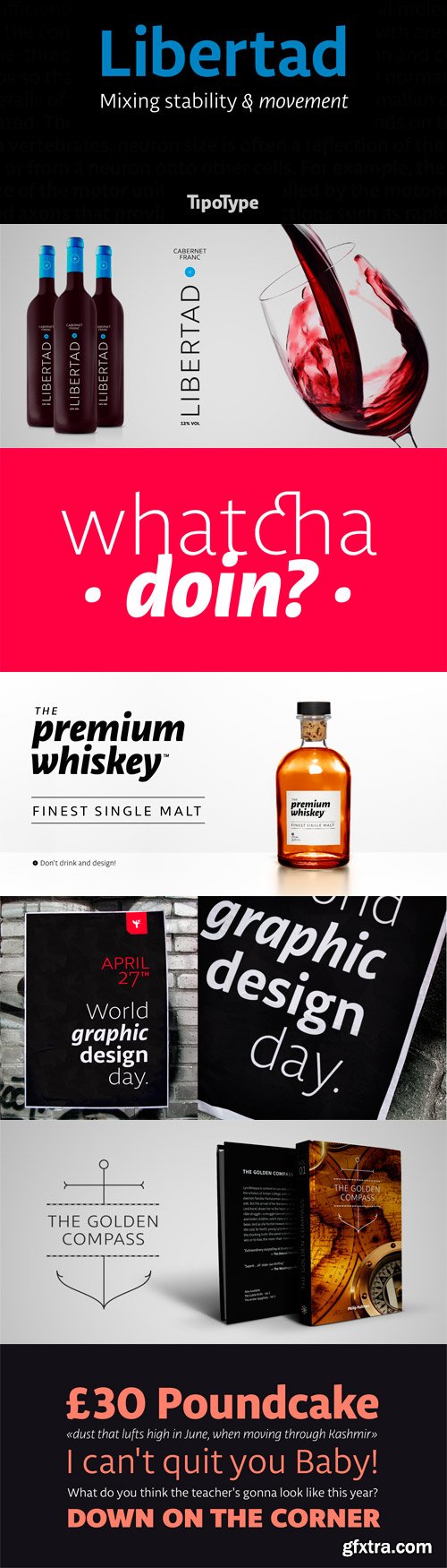
Libertad Sans-Serif Typeface Family by TipoType
OTF | 14 Fonts | JPEG Preview | 8.6 Mb RAR
- Design can do without images, but not without typefaces. Libertad is a sans-serif typeface that mixes humanist and grotesk models. It’s most interesting feature is the combination of balanced regulars with dynamic italics, which makes it a very versatile font for different uses. This typeface follows the Luc(as) de Groot’s Interpolation Theory, that’s why it has seven specially-calculated weights plus their matching italics, from thin to extra-bold. This allows it to be useful in big headlines and also small texts. It has more than 800 characters per weight and support for more than 70 languages.
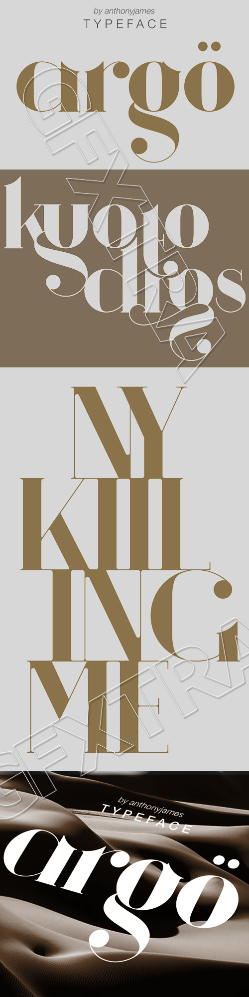
Argö - Art Deco Typeface by Antony James
Argo Font Family
TTF | 3 Fonts | 0.8 Mb RAR
- Argö is a serif typeface designed initially as an Art Deco display font, but with a few changes to traditional aesthetics. Horizontal lines have been replaced with Medieval themed ascenders to allow for more flow and versatility, incase the user intends to manipulate the typeface. Argö contains 180 characters including uppercase, lowercase, numbers, glyphs, ligatures and accents. Alternative letters with shorter descenders have been included, that are more appropriate when writing lines of text.
Categories: GFXTRA Special » Special Fonts
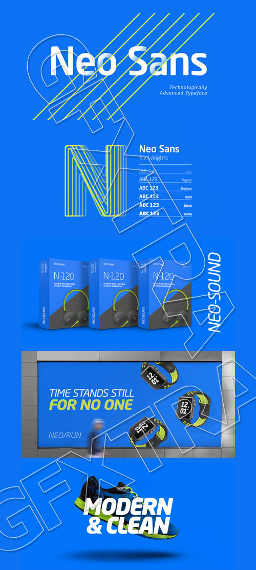
Neo Sans W1G & Monotype 12 Typefaces
OTF | 12 Fonts | JPEG Preview | 4.3 Mb RAR
Buy Neo Sans W1G Font Family
- The branding agency's client wanted an "ultra modern" typeface that was "futuristic without being gimmicky or ephemeral," according to the design brief. Designer Sebastian Lester took on this intriguing custom font assignment, but soon, a bureaucratic decision cancelled the project. "I was left with a sketchbook full of ideas and thought it would be a shame not to see what came of them," says Lester. He decided to finish the design on his own. Lester's research confirmed that the principal ingredient of an "ultra modern" typeface was simplicity of character structure: a carefully drawn, monoline form, open letter shapes and smooth, strong curves. To conceive a typeface that crossed the line from modern to futuristic, Lester decided to amplify these qualities. About a year after Lester's initial conceptual work, two highly functional and versatile typefaces emerged. These are Neo Sans and Neo Tech, designs Lester describes as "legible without being neutral, nuanced without being fussy, and expressive without being distracting." Both the Neo Sans and the more-minimalist Neo Tech families are available in six weights, ranging from Light to Ultra. Each has a companion italic, and Neo Tech offers a suite of alternate characters. While engineered to look modern as tomorrow, Neo Sans and Neo Tech display the functional and aesthetic excellence that earns them a place in the list of classic designs from the Monotype typeface library.
Categories: GFXTRA Special » Special Fonts
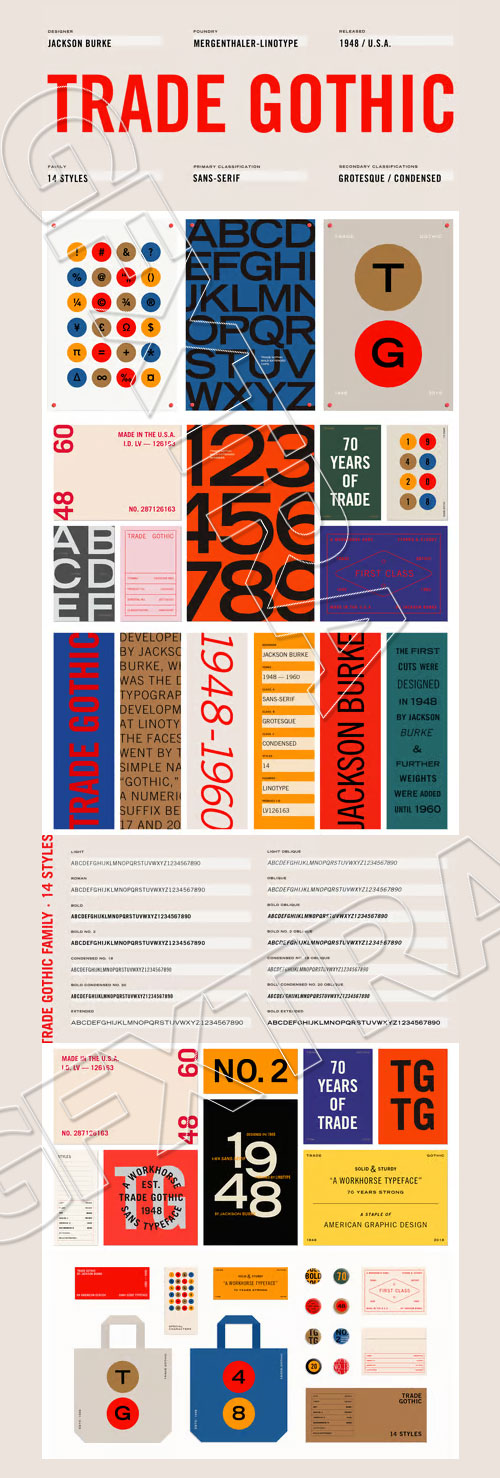
Trade Gothic Font Family
OTF | 14 Fonts | JPEG Preview | 5.2 Mb RAR
- Trade Gothic was designed by Jackson Burke between 1948 and 1960 for Linotype. In the nineteenth-century grotesque style, like News Gothic, Trade Gothic has a large x-height. Trade Gothic, with its condensed faces, is a classic design for newspaper work, particularly for headlines and classified advertising. The condensed versions increase the versatility of the typeface, particularly for setting headlines and subheads.
Categories: GFXTRA Special » Special Vectors

Shutterstock - Decorative Vintage Frames
55 EPS Vectors with JPG Previews | 58 MB RAR
Categories: GFXTRA Special » Special Fonts
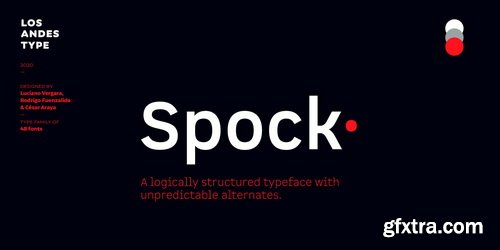
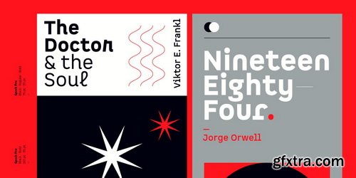
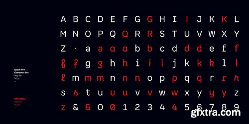
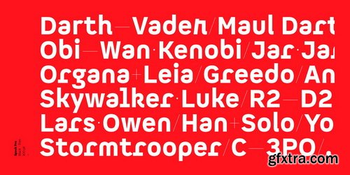
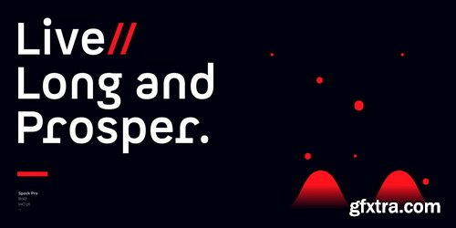
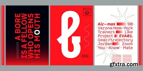
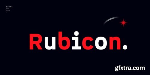
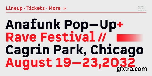
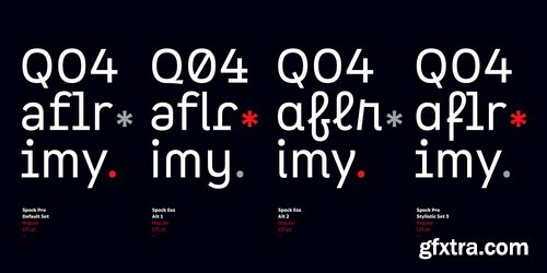
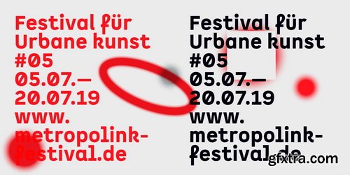
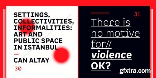
Spock Font Family
Spock has a neutral and clean structure but as we explore its OpenType features we will begin to discover a rich variety of alternates—even glyphs with pointed ears. All these combined elements provide a wide range of choices to meet different design needs.Each of the 4 sub-families consists of 6 weights and matching italics, making Spock a super family of 48 styles. The Pro family set contains 609 characters and it includes a generous number of alternates. The three other Essential sets are composed of alternative glyphs.
Categories: GFXTRA Special » Special Fonts
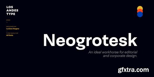
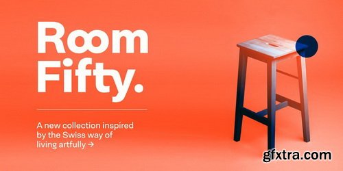
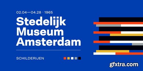

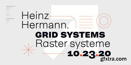
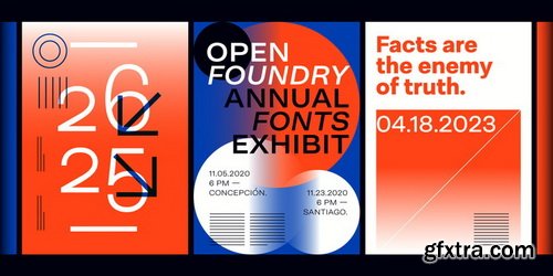
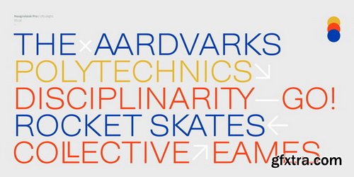
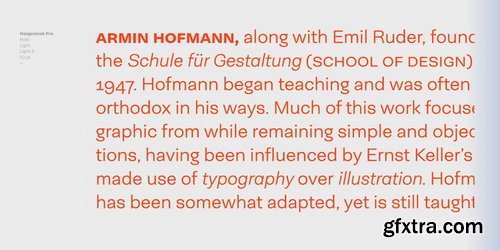
Neogrotesk Font Family
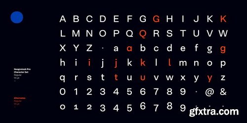
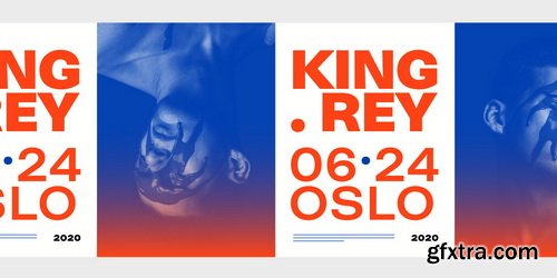
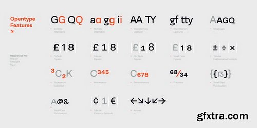
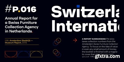
Neogrotesk is a versatile and functional workhorse typeface with a neutral look and Latin flavor. The font includes multiple typographic features such as alternates, ligatures, small caps, case-sensitive punctuation, arrows as well as lining, old style and tabular figures. Neogrotesk is the perfect choice for editorial, corporate and advertising design. This 40-style type comes in 5 weights with matching italics and contains 770 glyphs. The complete set consists of 4 sub-families: Essential, Essential Alt, Pro and Small Caps.
Categories: GFXTRA Special » Special Fonts
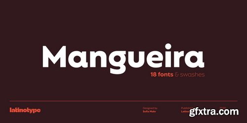
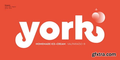
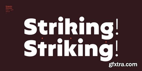
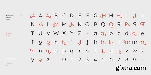
Mangueira Font Family
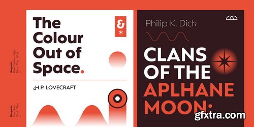
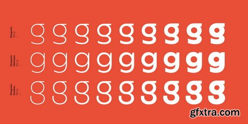
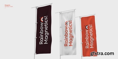
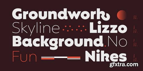
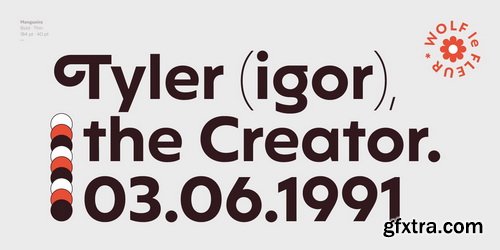
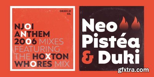
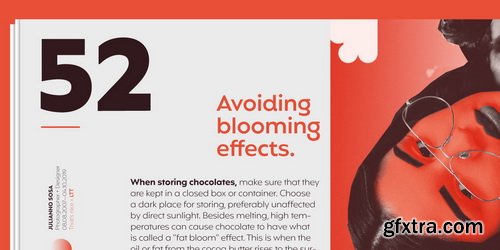
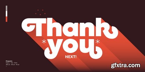
Mangueira is a sans-serif geometric typeface that is made up of 2 sub-families: one standard more contemporary family perfectly suited for display use and one alternative version for short blocks of text and more neutral titles. Each subfamily comes in 9 weights and includes swashes, which can be easily accessed from the OpenType menu.
Categories: GFXTRA Special » Special Fonts
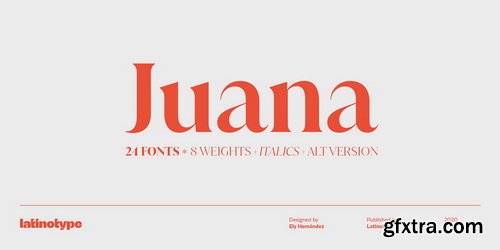
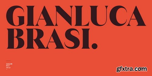
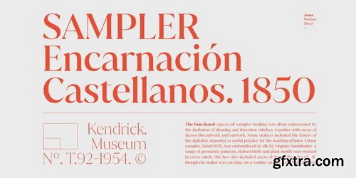
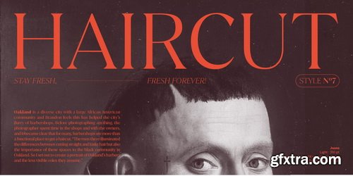
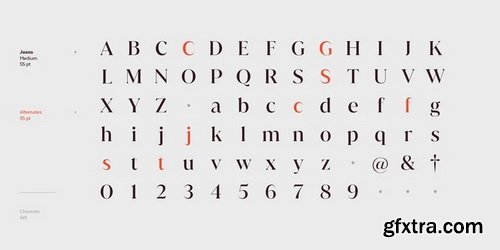
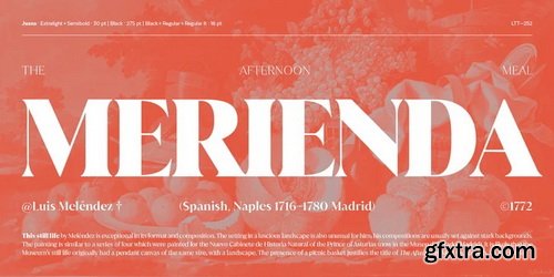
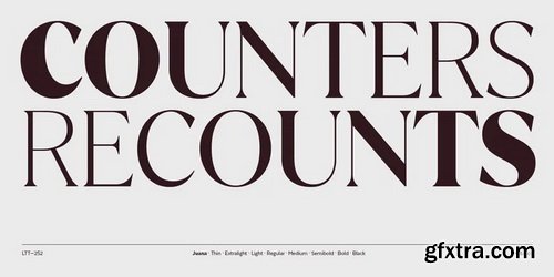
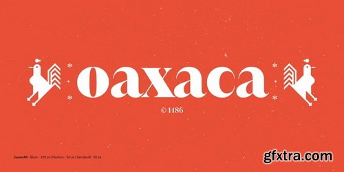
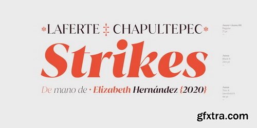
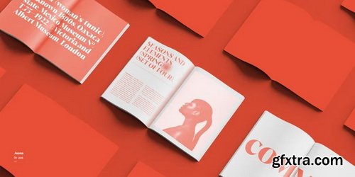
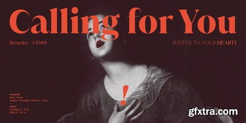
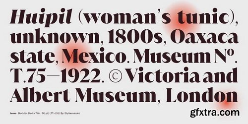
Juana Font Family
Juana is the result of a journey to self-discovery and part of a continuous exploration process. The font, based on Jazmín https://www.myfonts.com/fonts/latinotype/jazmin/ typeface, features a more developed design while still maintaining the essence of the original version.
Categories: GFXTRA Special » Special Fonts
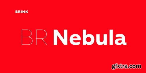
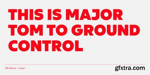
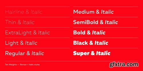
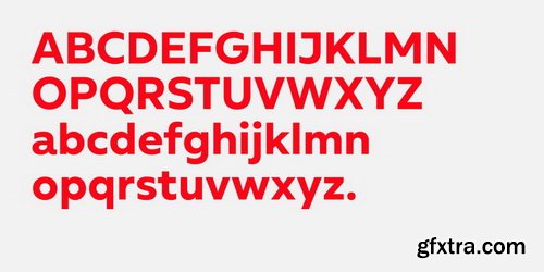
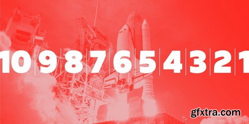
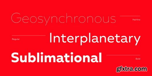
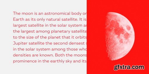
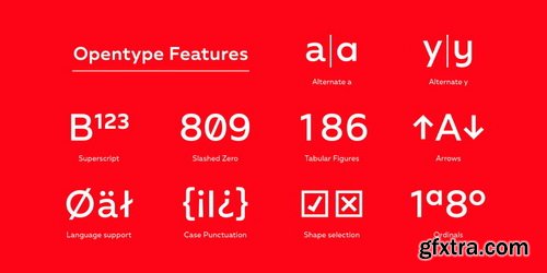
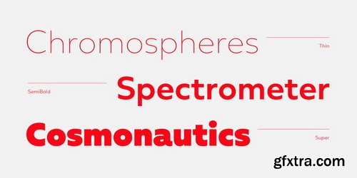
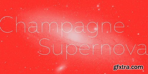
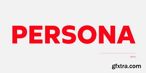
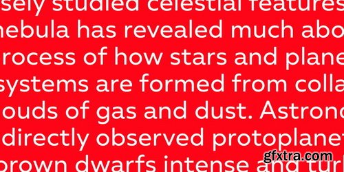
BR Nebula Font Family
BR Nebula is a geometric sans serif that builds on the foundations of early geometric designs such as Paul Renner’s Futura, and later works such as Avant Guarde. BR Nebula takes inspiration from these early explorations in sans serif design and re-imagines them for the modern age. Distinctive geometric letterforms have been refined and simplified with opened terminals to achieve a clear, legible and modern aesthetic.
Categories: GFXTRA Special » Special Fonts
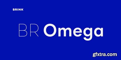
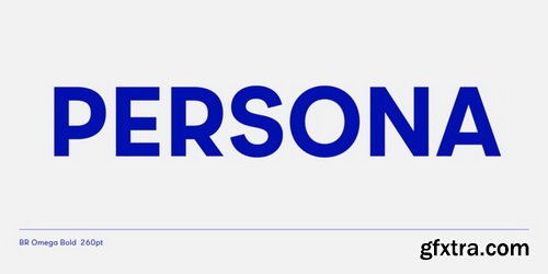
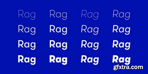
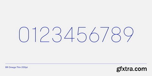
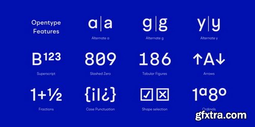
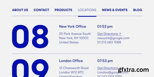
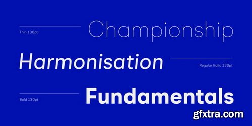
BR Omega Font Family
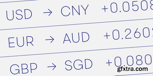
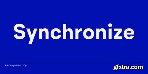
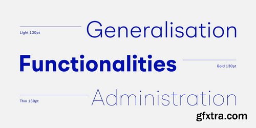
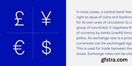
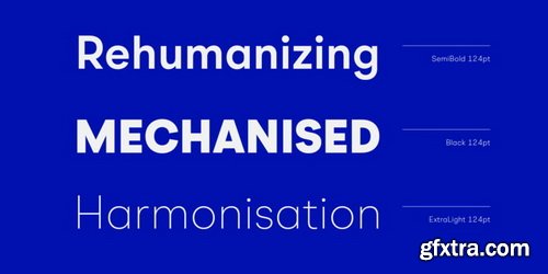
A highly functional geometric type family of 16 finely crafted styles. BR Omega is a clear and contemporary family. Accurately drawn and tested to transmit a clean and modern aesthetic. Slightly open apertures and well balanced letterforms result in a highly legible and versatile sans serif.BR Omega provides advanced typographic support with features such as case sensitive forms, fractions, slashed zeros and multiple figure sets.
Categories: GFXTRA Special » Special Fonts
BR Omny Font Family
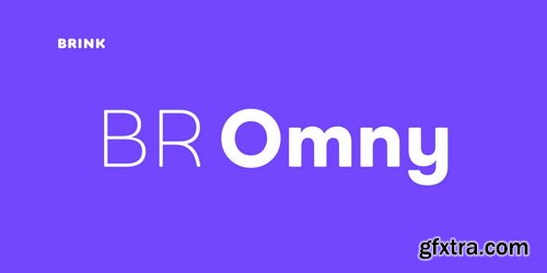
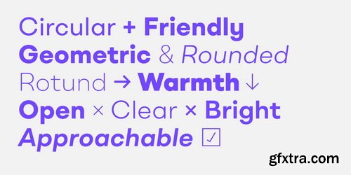
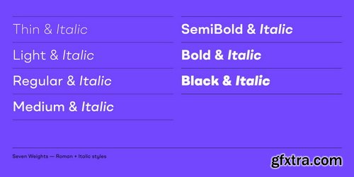
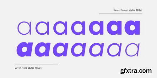
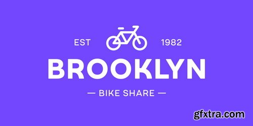
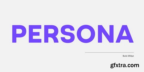
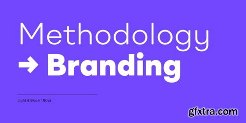
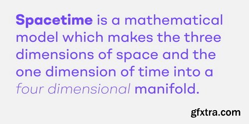
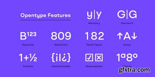
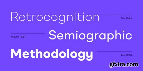
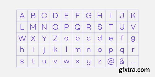
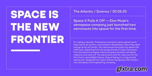
BR Omny is a rounded geometric sans serif, it is based on a softened geometric framework with a confident and friendly persona. The family contains 7 weights ranging from Thin to Black with corresponding italics. It supports an ‘Extended Latin’ character set that provides support for 200+ latin based languages.
Categories: GFXTRA Special » Special Fonts
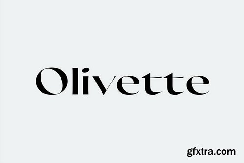
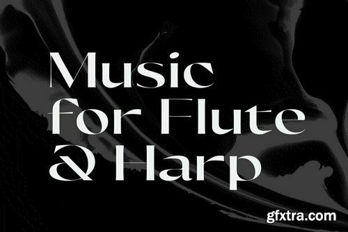
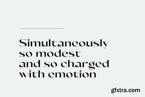
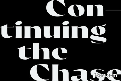
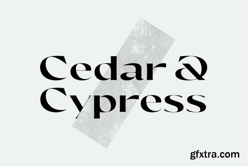
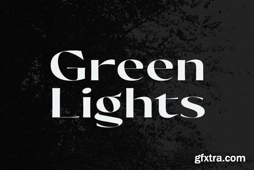
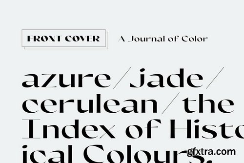
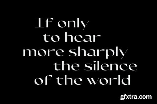
Olivette CF Font Family
With an extreme stroke contrast and wide, spacious construction, Olivette blends understated minimalism with elegance and expression. Olivette’s fine details shine at large sizes on screen and in print.
Categories: GFXTRA Special » Special Fonts
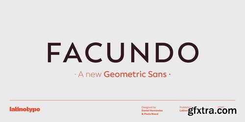
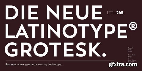
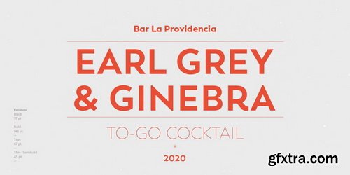
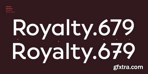
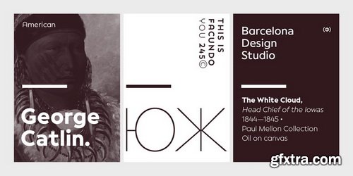
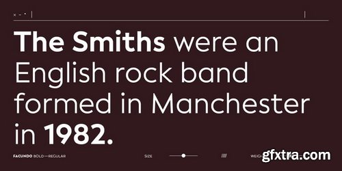
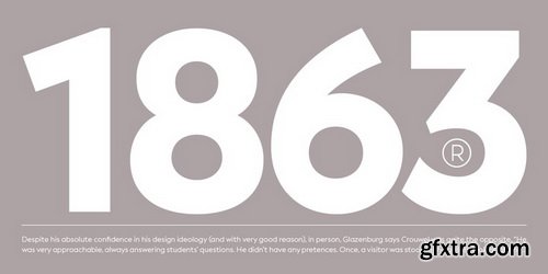
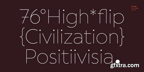
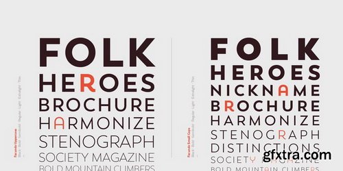
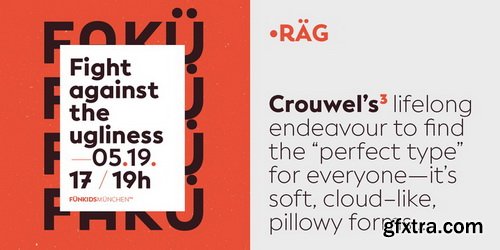
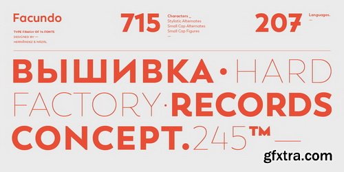
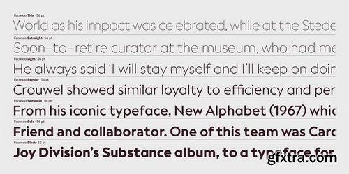
Facundo Font Family
Facundo may look familiar but has a modern and fresh feel, giving your designs a friendly, and at the same time, renewed and singular appearance.
Categories: GFXTRA Special » Special Fonts
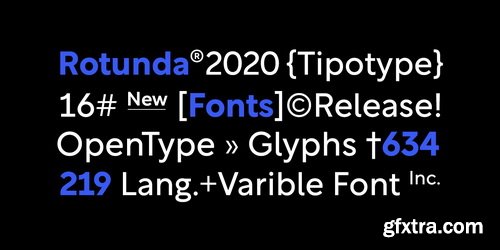
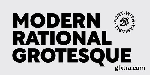
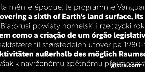
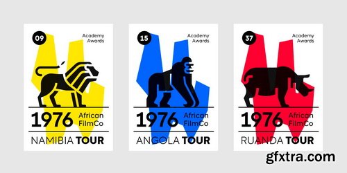
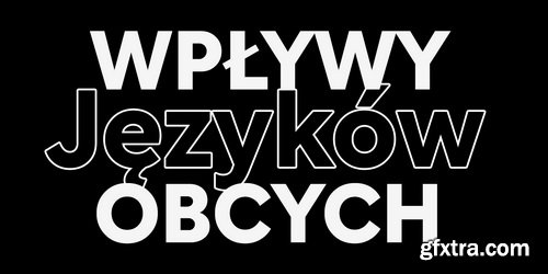
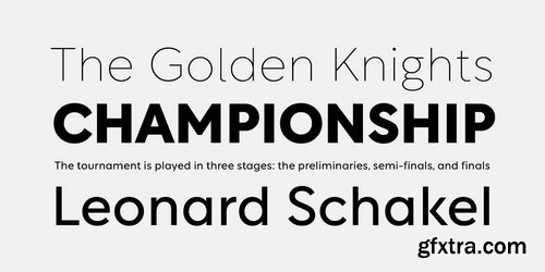
Rotunda Font Family
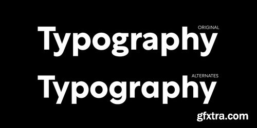
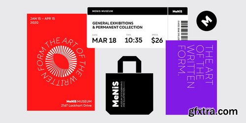
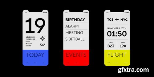
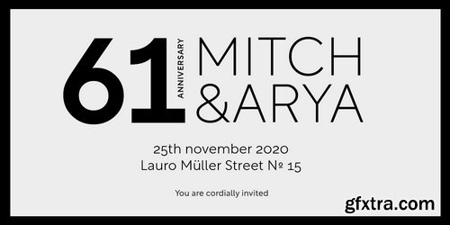
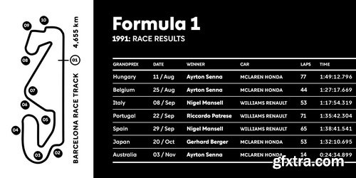
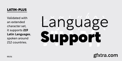
Rotunda blends the best of three worlds: it’s geometric, humanist and grotesque. But, far from being a tasteless hybrid, it has a strong personality and British undertones that turn it into a stylish and sober classic font face.Thanks to its ample character set and many variables, it stands as a versatile, all-terrain font. Strong and elegant, modern and classic, firm and humanistic. It truly is a 21st Century classic.It includes a very thorough coverage for a wide variety of Latin alphabet-based language families.
Categories: GFXTRA Special » Special Fonts
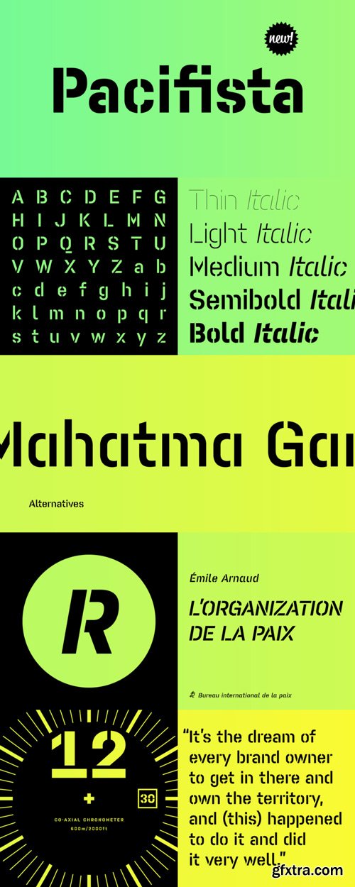
Pacifista Font Family $285 | 10 x TTF and OTF
http://www.myfonts.com/fonts/suitcase/pacifista/
Pacifista takes advantage of the well-tested structure of our constructed typefaces, the directness and simplicity of which are by far the best suited to stencils. Straight lines, regular arcs and purity of drawing facilitate maintaining the maximum possible legibility even in a typeface that is practically devoid of any joining of strokes
Categories: GFXTRA Special » Special Fonts
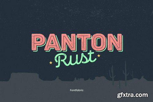
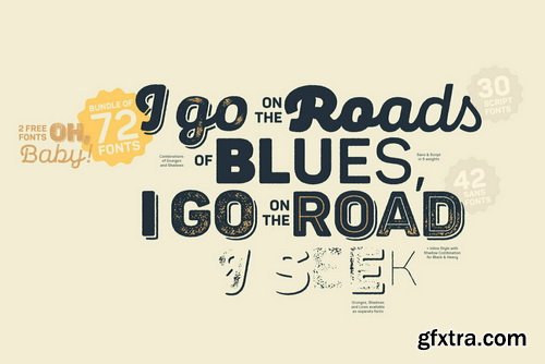
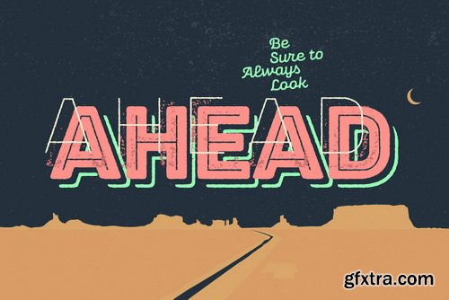

Panton Rust Font Family | 72 x TTF
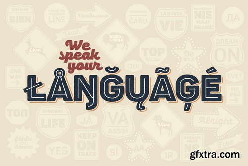
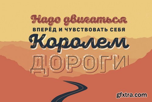
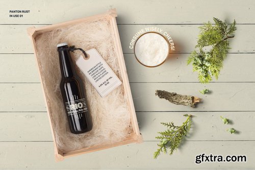
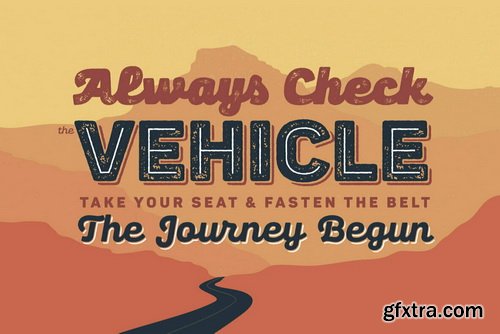
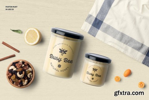
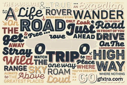
The long-awaited Rust Bundle addition to our Panton type family has arrived, featuring the headliner Panton Rust and its trusted partner Panton Script Rust. Start your engines and get ready for 72 fonts, grouped into five weights ranging from SemiBold to Heavy, and including multiple Base combinations with different Shadows and Grunge Textures. All of the above is also a part of the accompanying Panton Rust Script, whose natural flow is further emphasized with specifically adjusted Contextual Alternates. The list of OpenType features wouldn’t be complete without localizations, figures, fractions, superiors and inferiors, numerators and denominators, as well as tabular numerals for Panton Rust.
Categories: GFXTRA Special » Special Fonts
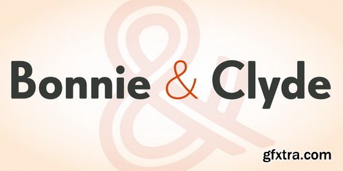
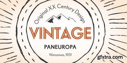
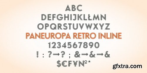
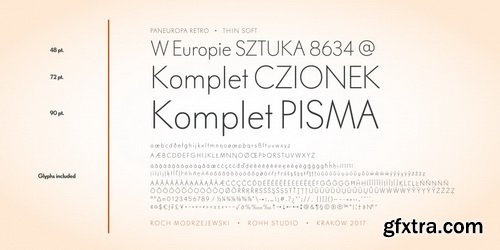
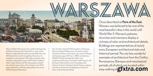
Paneuropa Retro Font Family | 36 x OTF & TTF
https://www.fontspring.com/fonts/rohh/paneuropa-retro
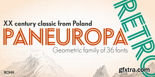
- Paneuropa Retro is a geometric, clean and versatile font family inspired by Paneuropa - XX-century Polish classic, made by Idzikowski foundry in Warsaw, 1931. Paneuropa was a reinterpretation of Paul Renner’s famous Futura - it was a bit narrower, with different proportions and letter endings. Paneuropa had completely different number and punctuation shapes than Futura. The family was extremely popular in Poland and was used for every kind of editorial use.
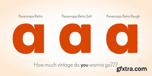
- Paneuropa Retro is a sibling to Paneuropa Nova (compeletely redrawn, modern version of the family with perfected letter forms, proportions and spacing, additional symbols, weights and italics).Retro family recreates the original typeface keeping its weights, as well as idiosyncrasies in letter shapes and spacing.
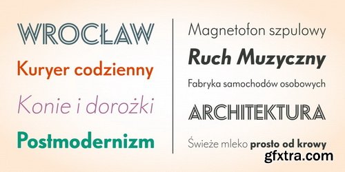
- Paneuropa Retro consists of 36 fonts - 5 weights + Inline style and their corresponding italics in three versions. It has extended support for latin languages, as well as broad number of OpenType features, such as case sensitive forms, fractions, superscript and subscript, ordinals, currencies and symbols.
Categories: GFXTRA Special » Special Fonts
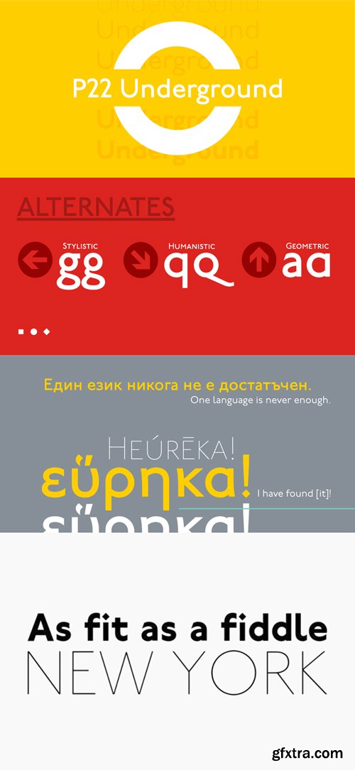
P22 Underground Font Family $299.95 | 77 x TTF and OTF
http://www.myfonts.com/fonts/p22/underground-basic/
Underground Pro expands on the historical design by Edward Johnston, licensed exclusively to P22 from the London Transport Museum. The overall design of Underground Pro is kept as intended by Johnston and remains within his system of proportions. Additional OpenType features, such as Small Caps and Petite Caps, are included in all 6 weights. A Titling option that mimics London Transport signage is offered in the medium weight. The addition of many Unicode ranges for unprecedented language support makes this the most expansive P22 font family ever. Each Pro font weight collectively contains over 5000 glyphs, covering most Latin based languages, with separate Greek (polytonic) and Cyrillic versions. The outlines of the original Regular and Bold have been subtly redrawn and expanded, they are now available as Medium and Heavy respectively.
Categories: GFXTRA Special » Special Fonts
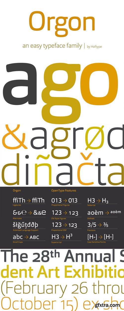
Orgon Font Family $198 | 16 x TTF and OTF
http://www.myfonts.com/fonts/hoftype/orgon/
Orgon, a new linear typeface family, fresh and easy but with a warm touch. It appears uncomplicated, unpretentious, but still distinctive.
Its quiet text flow allows smooth reading even for longer texts.
The Orgon family comprises 16 styles and is well suited for ambitious typography. It comes in OpenType format with extended language support. All weights contain ligatures, small caps, superior characters, proportional lining figures, tabular lining figures, proportional old style figures, lining old style figures, matching currency symbols, fraction- and scientific numerals and matching arrows. NeoSkola Bütün Kursları
Udemy Türkçe


Top Rated News
- TheBoudoirDivas All Tutorial
- 126,000 Royalty-Free 3D Models
- CreativeLive Tutorial Collections
- Fasttracktutorials Course
- Chaos Cosmos Library
- MRMockup - Mockup Bundle
- Finding North Photography
- Sean Archer
- John Gress Photography
- Motion Science
- AwTeaches
- Learn Squared
- PhotoWhoa
- Houdini-Course
- Photigy
- August Dering Photography
- StudioGuti
- Creatoom
- Creature Art Teacher
- Creator Foundry
- Patreon Collections
- Udemy - Turkce
- BigFilms
- Jerry Ghionis
- ACIDBITE
- BigMediumSmall
- Globe Plants
- Unleashed Education
- The School of Photography
- Visual Education
- LeartesStudios - Cosmos
- Fxphd
- All Veer Fancy Collection!
- All OJO Images
- All ZZVe Vectors
- CGTrader 1 CGTrader 2



















