


Ballinger Mono Font Family
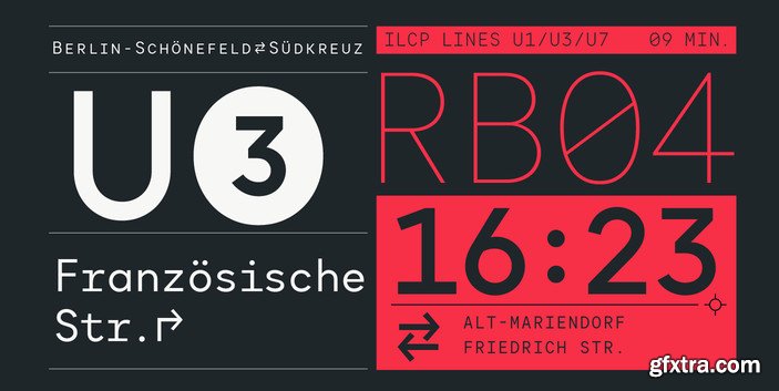
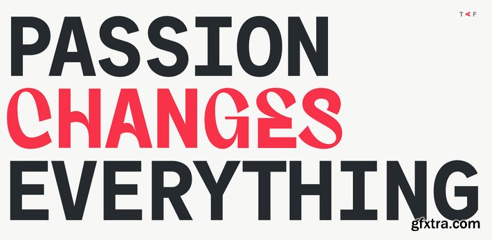
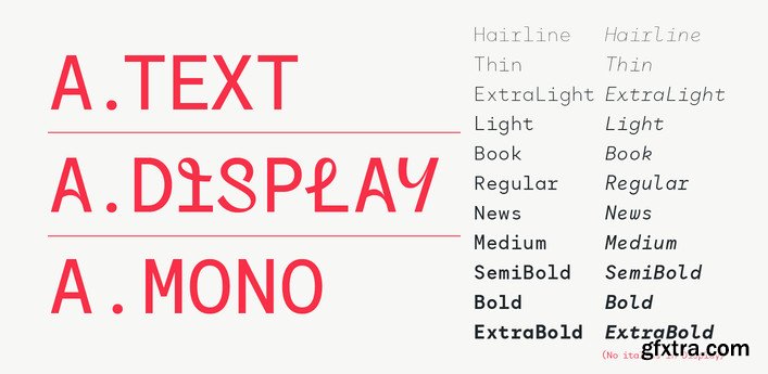
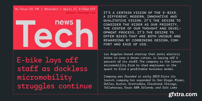
The addition of a monospaced version returns the Ballinger family to (some of) its roots: a 70s-era typewriter face called Candia, which Josef Müller-Brockmann designed for Olivetti.


Ballinger Condensed Font Family
Our Ballinger family continues to grow with the addition of 16 new narrow styles. Their shared DNA is visible in the generous counters and x-height, forthright forms, and air of cheery efficiency. And like their wider relatives, they have their roots in 19th Century jobbing faces. While the eight Condensed styles are designed for impact, we took care to balance them for continuous reading, making them ideal for applications where space is at a premium. In contrast, the radically smooshed X-Condensed weights are ideal for movie credits, legal disclaimers, and lists of side effects. Features include semi-oldstyle figures and case-sensitive punctuation and delimiters. Winner of an ICAD Gold Bell.
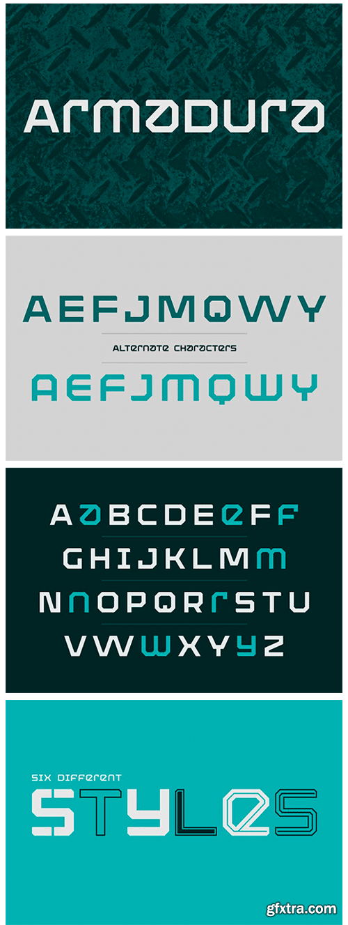
https://www.myfonts.com/fonts/graviton/armadura/
Armadura font family has been designed for Graviton Font Foundry by Pablo Balcells in 2012.
It is a display typeface with a geometric angular look. Armadura consists of 6 styles.

Migra Font Family 15xOTF
- Migra is a spiky serif typeface inspired by the features in migratory birds. Its weights span from an austere and elegant light cut to a hawkish and powerful black one. Packed with a set of even more gestural Italics and sundry special ligatures, this typeface is guaranteed to add sparkle and grace to any of your designs.

Tomato Grotesk Font Family in 9 Weights & 9 Matching Slanted
18xOTF | 3.5 MB
- Tomato Grotesk is a modern grotesk family with simple geometric shapes and accentuated contrast that give it a strong display like personality. High contrast, tight spacing and ink traps make it perfect for use in print and on screens in small sizes. When used in large dimensions these features make it an extremely cheerful, versatile typeface for a range of different uses.

Gimlet Superfamily 112 Styles
- Gimlet draws its inspiration from Georg Trump’s 1938 typeface, Schadow. At the behest of Nick Sherman, I reimagined the oddball serif as an energetic contemporary workhorse, complete with three optical sizes and a flexible set of widths tailored for responsive layouts. A multifaceted series that speaks with a singular voice, Gimlet is a rare find: a typeface that is as funky as it is functional.

Layla Pro Arabic Font Family
Layla pro Arabic typeface is a modern Arabic typeface designed by Ahmed Zaza. the design is inspired by the Kufi calligraphic style and influenced by the Naskh style. The result is a hybrid that combines modern proportions with Classic Arabic scripts. it’s suitable for branding, editorial, packaging, and advertising. Layla pro Arabic Features five weights from Light to Bold.

Titular - Designed for Use in Headings $239 NEW!
Designer: Latinotype Team | Design Date: Jul 14, 2015 | TURKISH SUPPORT
http://www.myfonts.com/fonts/latinotype/titular/


Titular is a condensed sans serif typeface, designed for use in headings and subheadings, in newspapers and magazines, you can also use in logos, brands and styles. Typography revives the spirit of the old Woodtypes, but with a modern flavor and the entire Latin American flavor. The family consists of two subfamilies, one normal and one alternative, as several of our typefaces, each subfamily has 7 weights and their respective italics. This typeface was designed by Bruno Jara and Latinotype Team.

https://www.myfonts.com/fonts/font-fabric/panton/
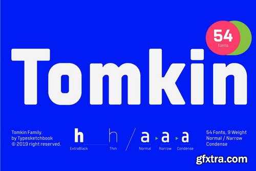
Panton has been expanded with Panton Narrow! It has 9 uprights and 9 matching italics ranging from Thin to Heavy. The Panton font family includes 54 fonts - 19 uprights with 19 matching italics and 16 icon sets as a bonus! It is characterized by excellent legibility in both web & print design areas, well-finished geometric designs, optimized kerning, excellent web-font performance and legibility etc. Inspired by the classic grotesque typefaces - Panton has his own unique style, expressed in perfectly softened geometric forms.
Dona Font Family
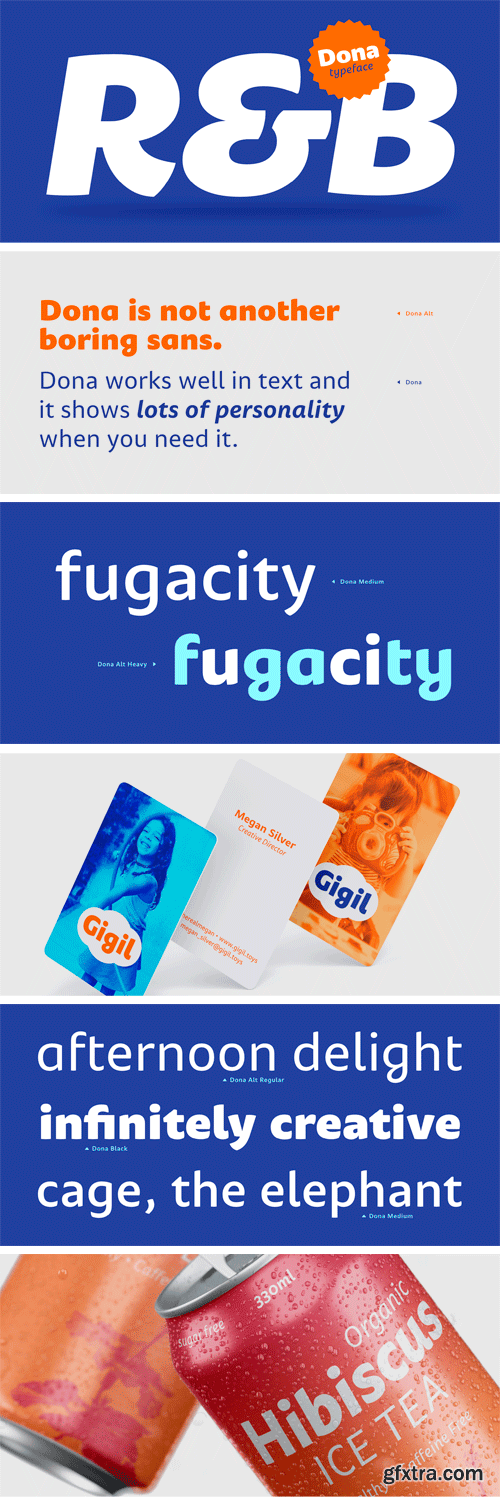
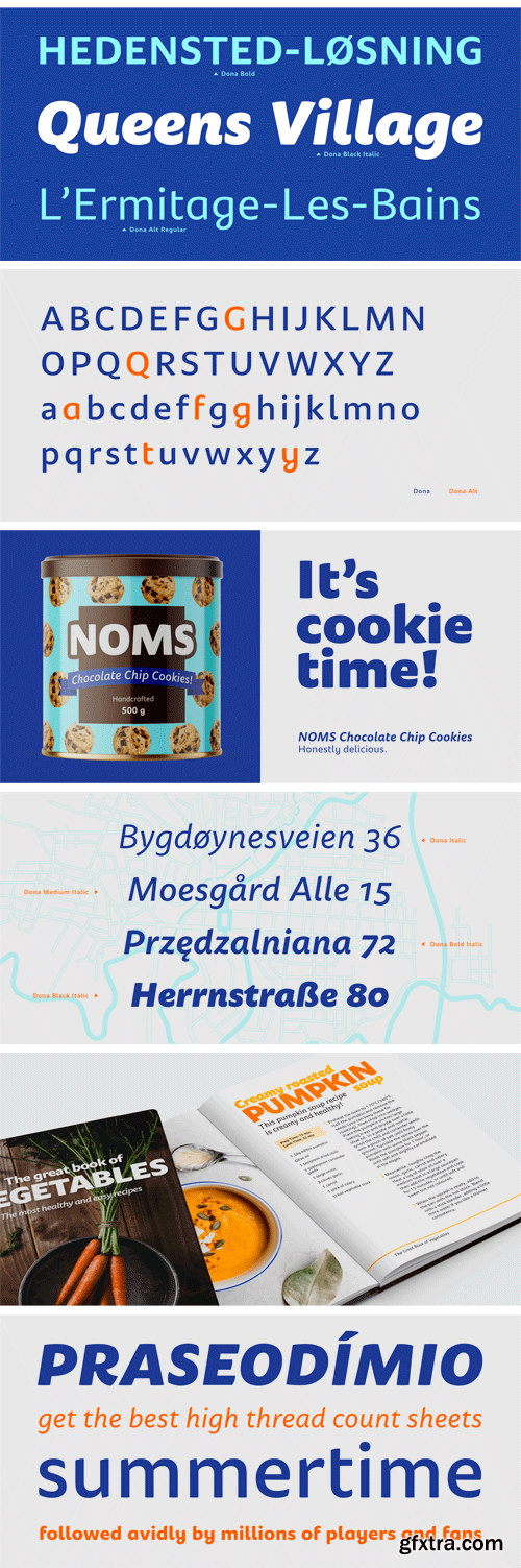
Dona is a non-boring sans serif. While very legible in text sizes, its friendly details really come to life on headlines, packaging and visual identities. To make it even more interesting, Dona Alt brings a different feeling with just a few different glyphs.
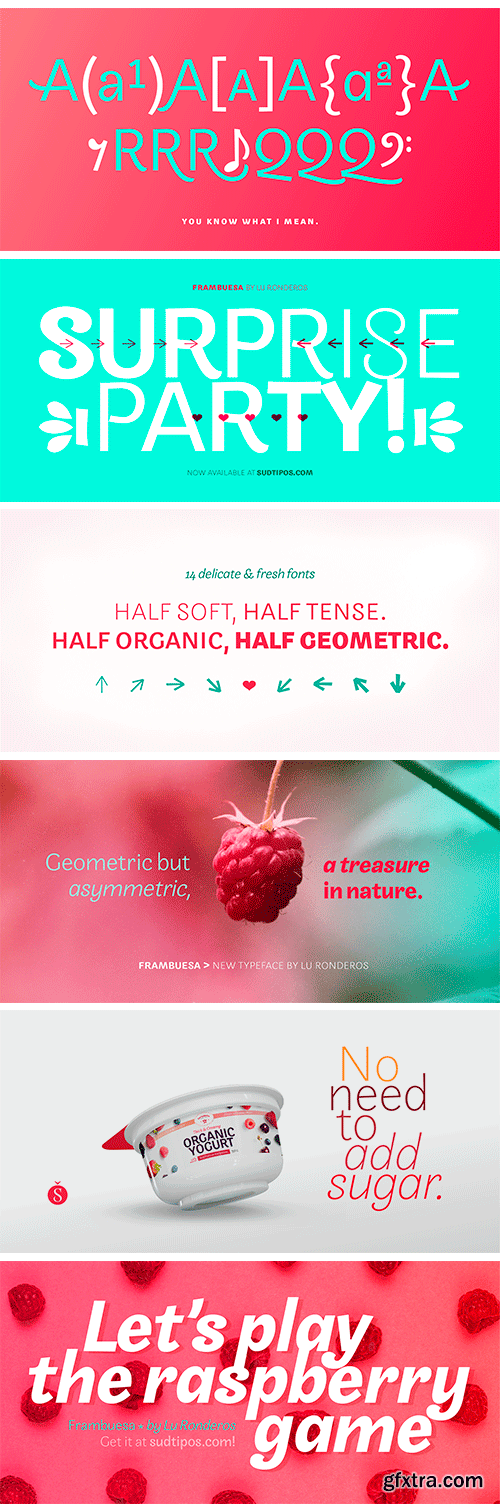
Frambuesa Font Family
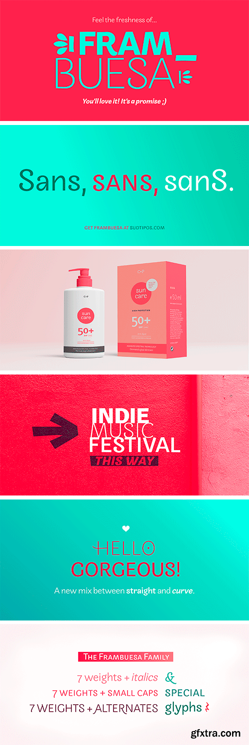
Frambuesa is a half humanist-half geometric sans serif typeface that merges decorative curves with straight lines looking for a perfect balance. As pairs of opposites define harmony in nature, organic versus geometric are the foundations to this new font. The result is a solid, somewhat romantic, nostalgic type program based on the rhythm of a natural melody.
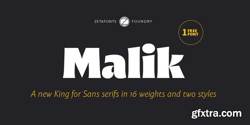


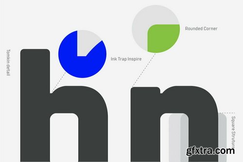
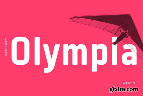
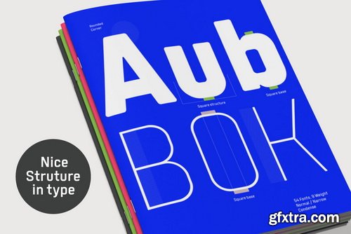
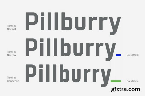
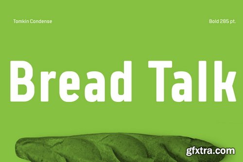
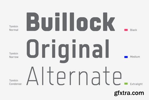

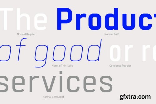
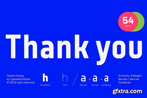

Tubqal Pro Font Family
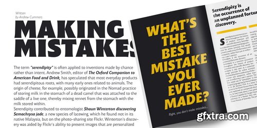
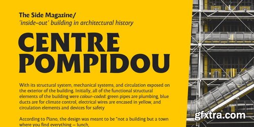
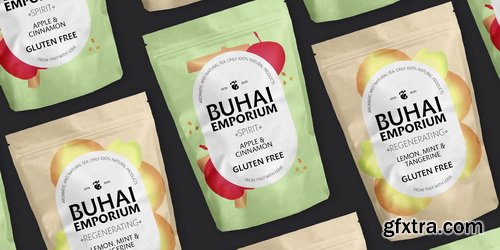
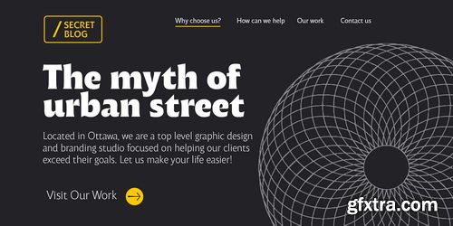
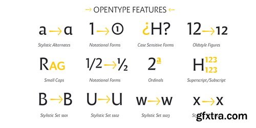
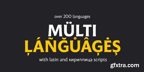
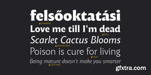
Tubqal Pro is a tri-script type family based on its previous Tubqal typeface commissioned by the Khatt Foundation as part of the Typographic Matchmaking in the Maghrib 3.0, the 3rd edition of the multi-script typographic research project of the Khatt Foundation. The goals of the Typographic Matchmaking projects are to nurture cultural dialogue and help develop local design skills. In this case, Tubqal, as a multi-script typeface includes Tifinagh, Maghribi-based Arabic and Latin in order to provide a real type cultural dialogue in the Maghrib region.
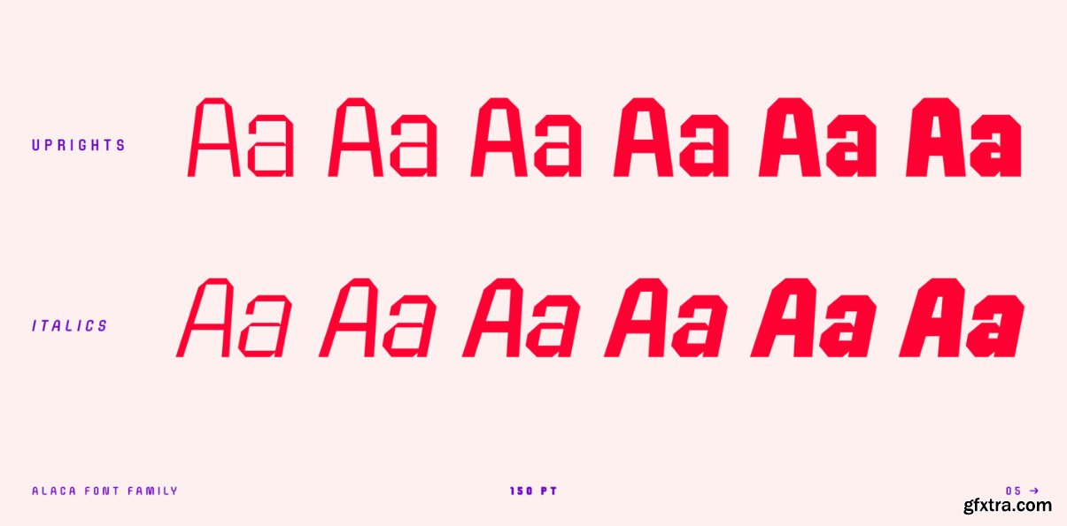
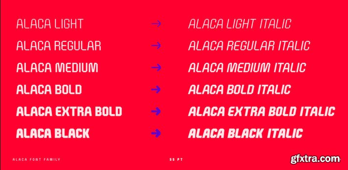
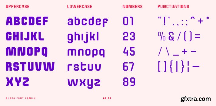
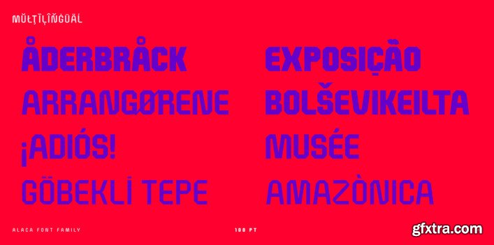
Pramukh Font Family
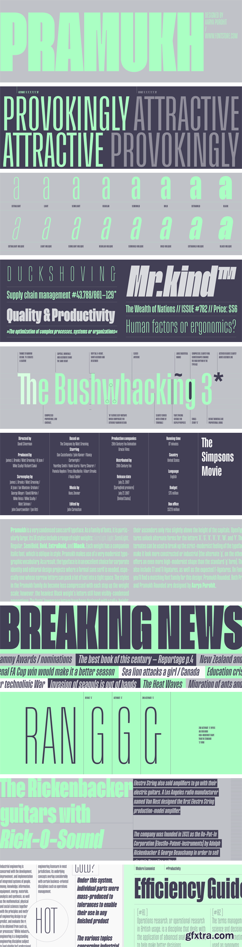
Pramukh is a very condensed sans serif typeface. As a family of fonts, it is particularly large; its 16 styles include a range of eight weights: ExtraLight, Light, SemiLight, Regular, SemiBold, Bold, ExtraBold, and Black. Each weight has a companion italic font, which is oblique in style. Pramukh makes use of a very modernist typographic vocabulary. As a result, the typeface is in an excellent choice for corporate identity and editorial design projects where a formal sans serif is needed, especially one whose narrow letters can pack a lot of text into a tight space.

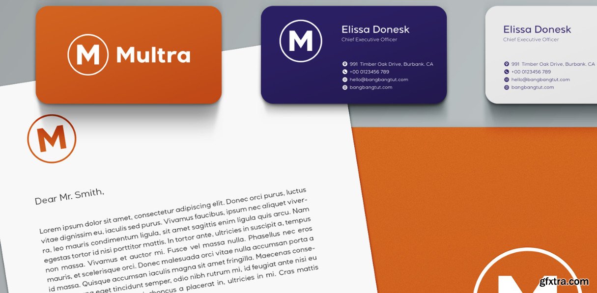
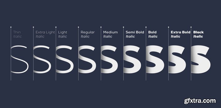
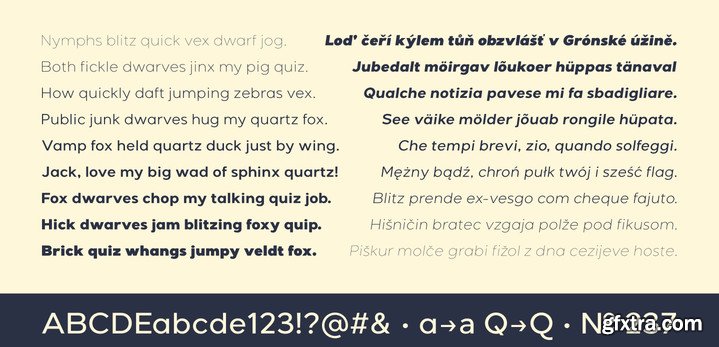

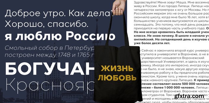
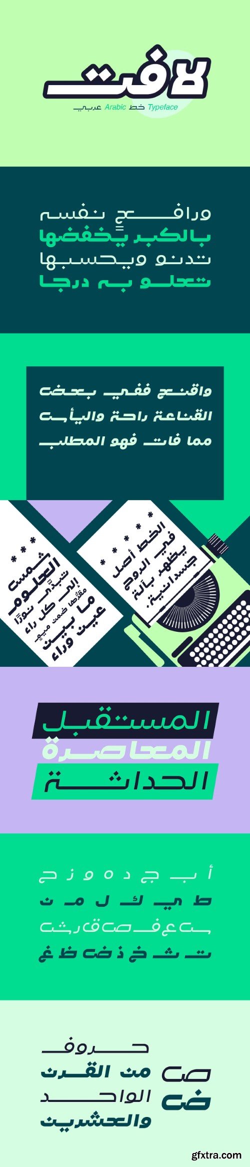
Lafet (which is the Arabic word for catchy) is an Arabic typeface that features a dynamic letterform design. Lafet's style reflects both modernity and simplicity. This typeface is suitable for design projects that may require energetic and powerful look. Lafet typeface consists of four styles (Regular, Bold, Regular Oblique and Bold Oblique).
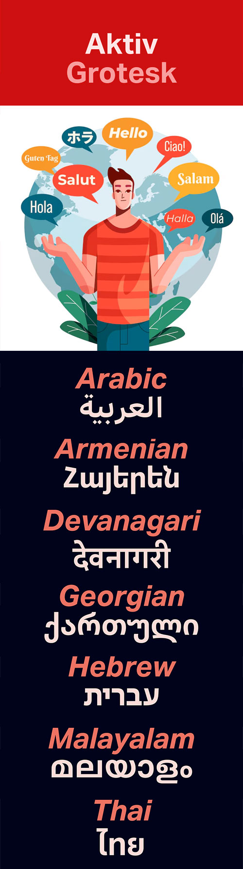
- Aktiv Grotesk is a condensed sans-serif typeface designed by Dalton Maag, first released in 2010. It is characterized by its versatility and functionality, making it suitable for a variety of branding exercises that require a diverse typographic palette. The font family includes multiple styles, such as Light, Regular, Medium, Bold, and their respective italics, amounting to a total of 24 styles available through platforms like Adobe Fonts. Aktiv Grotesk is noted for its clean lines and modern aesthetic, often described as a “Helvetica killer” due to its balance between neutrality and authority. The design aims to remove the quirks found in Helvetica while infusing a bit of warmth reminiscent of Univers. This makes it an excellent choice for projects that need to convey professionalism without being overly aggressive. Aktiv Grotesk is a modern, versatile typeface suitable for a wide range of design applications, from branding to web design, with a strong emphasis on clarity and professionalism.
NeoSkola Bütün Kursları
Udemy Türkçe


Top Rated News
- TheBoudoirDivas All Tutorial
- 126,000 Royalty-Free 3D Models
- CreativeLive Tutorial Collections
- Fasttracktutorials Course
- Chaos Cosmos Library
- MRMockup - Mockup Bundle
- Finding North Photography
- Sean Archer
- John Gress Photography
- Motion Science
- AwTeaches
- Learn Squared
- PhotoWhoa
- Houdini-Course
- Photigy
- August Dering Photography
- StudioGuti
- Creatoom
- Creature Art Teacher
- Creator Foundry
- Patreon Collections
- Udemy - Turkce
- BigFilms
- Jerry Ghionis
- ACIDBITE
- BigMediumSmall
- Globe Plants
- Unleashed Education
- The School of Photography
- Visual Education
- LeartesStudios - Cosmos
- Fxphd
- All Veer Fancy Collection!
- All OJO Images
- All ZZVe Vectors
- CGTrader 1 CGTrader 2



















