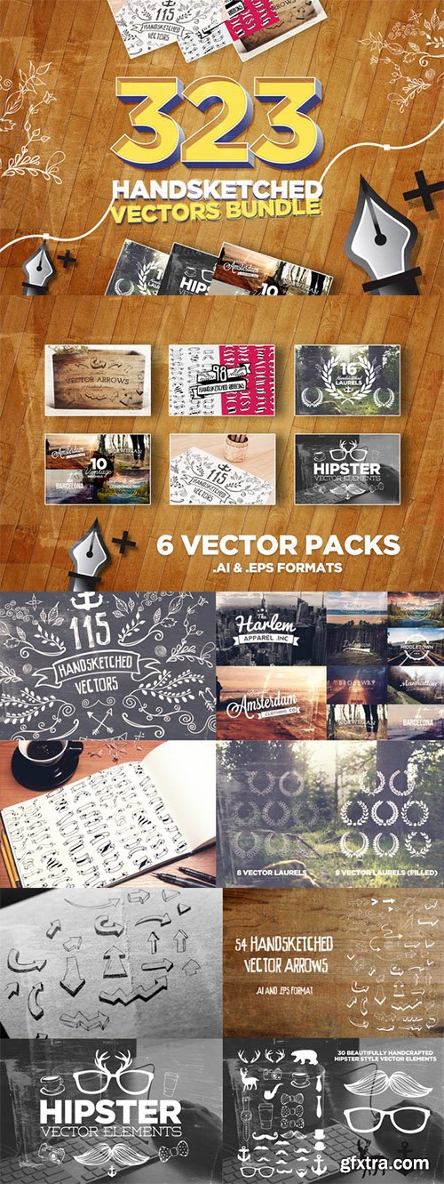
CM - 323 Handsketched Vectors Bundle 63088
AI | EPS | SALE PAGE
- Introducing the latest and greatest Layerform Bundle, this time in the form of ALL of our vector packs, all of which are based on Handsketched Drawings and imported and converted to vector artwork. In this amazing pack you will receive a total of 323 Handsketched Items ranging from vintage insignias to hipster vectors, ribbons, laurels, arrows and much more! Its quite possibly one of the only Vector Bundles you'll ever need, and offers some great variation.

CM - T-Shirt Design Collection Pack 1 1324560
EPS AI | +Previews | RAR 434 MB | SALE PAGE
- Looking to make your own T-shirts? This mega bundle of T-shirt designs contains 50 premium designs in vector format. Easily scale these illustrations to whatever size you need, as you choose from a wide variety of themes including animals, pin-up girls, inspirational messages and more. Choose what you'd like and whip up some fabulous T-shirts, hoodies and any other kind of apparel you can think of.
- Get your hands on 50 premium T-Shirt Designs in vector format.
- Scale images up or down to any size you require without losing an ounce of detail.
- Easily customize any of these designs using the original AI and EPS file formats (NOTE: some files come in PSD format).
- With just one simple click, change up the colors of your image.
- Images are perfect to work right onto T-shirts, hoodies or even mugs.
- Besides apparel, these vectors are perfect for a variety of promotional materials such as flyers, ads, posters and more.
- With an extended license, you can uses these vectors as many times as you'd like for as many personal or commercial projects as you'd like.
- These high-quality T-Shirt designs cover a wide range of themes including: inspirational messages, animals, cars, patriotic elements and more.

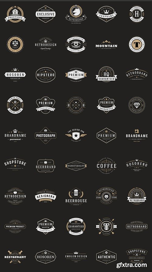
CM - 150 Retro Vintage Logotypes 208025
EPS | AI | JPG | Editable and resizable | Text is Editable | Logo Design | Insignia Design
Apparel Design | Typography Design | Poster Design | Labels & Badges | Stickers & Stamps | T-shirts
Big bundle of 150 Retro Vintage Insignias or Logotypes. SALE PAGE | 15 MB RAR
Volume 2. Vector design elements, business signs, logos, identity, labels, badges, stamps, t-shirts.

CM - Vectallic Magic Brush Revolution! 637042
- Strikingly beautiful, metallic paint stroke brushes for Adobe Illustrator CC — and you can even change the color right within the program. If you’re very familiar with Illustrator, you might think I’m joking, but think again! Introducing a completely new way to use Illustrator to paint like a pro — with creamy, dreamy fantasy paint stroke styles! I’ve been working on this revolutionary new brush system since the beginning of January! That’s over 3 months of TONS of trial and error, tweaking and perfecting, all so you can just have fun and CREATE! Not only that, I have created a HUGE library of my trademark tutorial videos to help you get the absolute MOST from your NEW favorite brush set!

Scrutiny 12.11.4 | macOS | 6 mb
Optimizing your website for search engines can improve your ranking in the search results pages and naturally bring more users to your site. Scrutiny is a website analysis tool that can help you check if there are any broken links on your website, create a sitemap, check for spelling errors, run SEO checks, and so on. Scrutiny comes with a sites manager where you can easily input the source URL for the website you want to start evaluating. The app automatically generates a thumbnail for the page and then enables you to configure the scanning rules.
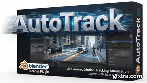
Blender 4.2 - 5.0
- Blender AutoTrack optimizes the workflow of creating visual effects by automating the labor-intensive process of tracking 2D objects and solving the problem of determining the camera position. It uses optimized logic to track markers forward and backward, filter incorrect trajectories, and iteratively solve the problem of determining the camera position to find the best possible reconstruction error.

CM - Vectallic Magic CS5+6 Vector Brushes 716836
- Huge Photoshop user, using Illustrator only selectively. But there are some incredible things you can only do in Illustrator, and these Vectallic Magic brushes are a great example of harnessing the best of Illustrator’s power to get beautiful DIRECTIONAL STROKES to add to your artwork! Even if you’re not a regular Illustrator user, what you can do with these brushes will totally lure you in for some fun!

TextSoap 9.7.1 | macOS | 28 mb
TextSoap can automatically remove unwanted characters, fix up messed up carriage returns, and do pretty much anything else that we can think of to text. Save time and effort. Be more productive. Stop manually fixing text documents and emails. Let TextSoap help you automate away all that tediousness. And do it all from within your favorite app using TextSoap Menu. Enable it in preferences and access TextSoap in most apps that support standard copy and paste.

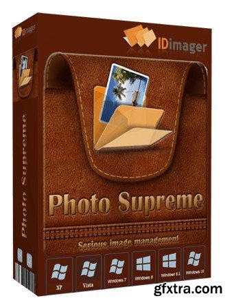
Do you own a digital camera or do you have a large collection of images to manage? Then in no time finding that one image you're looking for becomes a chore. But Photo Supreme can change all that. Photo Supreme's integrated cataloging and management features will help you quickly find and work with your desired image.
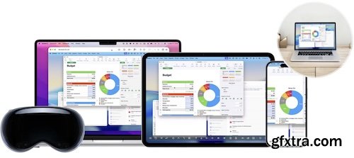
Effortlessly control your computer from your Mac with ease. Screens allows you to connect and control your computer as if you were sitting right in front of it, making tasks effortless with intuitive controls.
Resolume Arena Media Server. Arena has everything Avenue has, plus advanced options for projection mapping and blending projectors. Control it from a lighting desk and sync to the DJ via SMPTE timecode.

With +10,000,000 Downloads, Photo Pos Pro became one of the most popular photo editors around the world! Version 4 has free and premium photo editing features offers users a wide variety of possibilities in the fields of Image Enhancing and Image Editing and in the field of Computer Graphics Design. Using the editor you can perform various tasks, from simple basic tasks to complex tasks; you can edit existing images, create new works based on existing images, create new works from scratch and more.
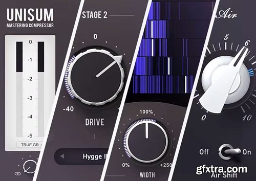
Tone Projects Bundle v2026.03
macOS | 252 MB
Bundle consisting of Unisum Mastering Compressor, Kelvin Tone Shaper, Basslane Pro, and Michelangelo.

Sugar Bytes Sugar Bundle 2025
macOS | 2.3 GB
The Sugar Bundle contains all current plug-ins and entitles you to discounts on future releases.

Sugar Bytes Sugar Bundle 2025
Windows | 634 MB
The Sugar Bundle contains all current plug-ins and entitles you to discounts on future releases.
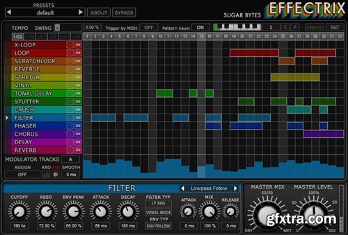
Sugar Bytes Effectrix v1.4.8
macOS | 19 MB
Effectrix is a professional multi-effect sequencer, a game-changer in the way contemporary music is made. By painting colored blocks across a sequencer, quite simply, your tracks metamorphose into fireworks. Looping, Scratching, Reverse & Stretching – in real-time and on-the-fly.

Sugar Bytes Effectrix v1.4.8
Windows | 6.41 MB
Effectrix is a professional multi-effect sequencer, a game-changer in the way contemporary music is made. By painting colored blocks across a sequencer, quite simply, your tracks metamorphose into fireworks. Looping, Scratching, Reverse & Stretching – in real-time and on-the-fly.
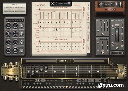
Sugar Bytes Guitarist Library AG v1.0.0
macOS | 2.84 GB
Guitarist is a virtual guitar that's designed to emulate rhythm parts played on an electric guitar. The actual guitar player has been transformed into a step sequencer system with a huge level of customisation when it comes to chords or fingering patterns and a detailed control over authentic nuance and expression.

Sugar Bytes Guitarist Library AG v1.0.0
Windows | 1.12 GB
Guitarist is a virtual guitar that's designed to emulate rhythm parts played on an electric guitar. The actual guitar player has been transformed into a step sequencer system with a huge level of customisation when it comes to chords or fingering patterns and a detailed control over authentic nuance and expression.

Sugar Bytes Guitarist Library v1.0.4
macOS | 790 MB
We proudly present the complete electric guitar solution for Mac and PC. Absolutely convincing guitar riffs, combined with amps, wah pedals and effects. The actual guitar player has been transformed into a step sequencer system that allows control about playing styles, chord progressions and song structures. Guitarist can be played live as well, with just two fingers you can combine chords and patterns easily. You can choose from factory chords or just create your own chords on the fingerboard. The Action Section allows you to tweak the sequence in realtime and apply timestretch, looper or other crazy effects. Guitar players, keyboarders, producers, Guitarist is the new solution when guitar tracks are needed.

Sugar Bytes Guitarist Library v1.0.4
Windows | 420 MB
We proudly present the complete electric guitar solution for Mac and PC. Absolutely convincing guitar riffs, combined with amps, wah pedals and effects. The actual guitar player has been transformed into a step sequencer system that allows control about playing styles, chord progressions and song structures. Guitarist can be played live as well, with just two fingers you can combine chords and patterns easily. You can choose from factory chords or just create your own chords on the fingerboard. The Action Section allows you to tweak the sequence in realtime and apply timestretch, looper or other crazy effects. Guitar players, keyboarders, producers, Guitarist is the new solution when guitar tracks are needed.
Top Rated News
- CreativeLive Tutorial Collections
- Fasttracktutorials Course
- Chaos Cosmos Library
- MRMockup - Mockup Bundle
- Finding North Photography
- Sean Archer
- John Gress Photography
- Motion Science
- AwTeaches
- Learn Squared
- PhotoWhoa
- Houdini-Course
- Photigy
- August Dering Photography
- StudioGuti
- Creatoom
- Creature Art Teacher
- Creator Foundry
- Patreon Collections
- Udemy - Turkce
- BigFilms
- Jerry Ghionis
- ACIDBITE
- BigMediumSmall
- Globe Plants
- Unleashed Education
- The School of Photography
- Visual Education
- LeartesStudios - Cosmos
- Fxphd
- All Veer Fancy Collection!
- All OJO Images
- All ZZVe Vectors
- CGTrader 1 CGTrader 2


