
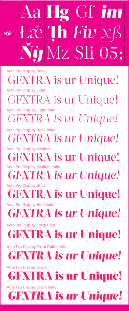
Acta Display Font Family - 12 Fonts for $295
OTF/TTF/WoFF | 12 Fonts | +Preview | SALE PAGE
- First designed for chilean newspaper La Tercera in 2010, Acta family is a clean and fresh type system, while enough conservative for newspaper setting. The complete Acta Type System contains Acta and Acta Display both with six weights with matching italics; Acta Symbols with an amazing collection of symbols specially designed for newspapers and magazines and Acta Poster, a heavyweight version, elegant and eye catching in three styles with plenty of ligatures and alternates.
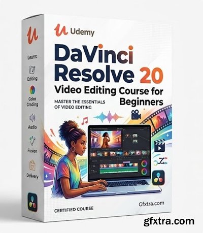
Level: All Levels | Genre: eLearning | Language: English | Duration: 27 Lectures ( 1h 36m ) | Size: 2.1 GB
https://www.udemy.com/course/davinci-resolve-video-editing-course
This complete DaVinci Resolve 20 video editing tutorial shows you how to edit your first video from start to finish!
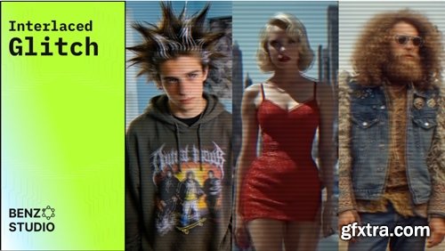
https://aescripts.com/interlaced-glitch/
Interlaced Glitch is a plugin for Adobe After Effects that recreates the authentic look of footage recorded on old analog and early digital video cameras.
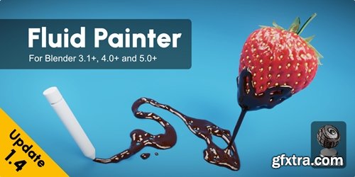
https://superhivemarket.com/products/fluid-painter
Blender 3.1 - 5.0
- Imagine effortlessly painting fluids over any surface in your 3D designs. No more tedious workarounds or clunky interfaces – just pure, seamless creativity. That's the power of the Fluid Painter Add-on for Blender. As a 3D artist myself, I was frustrated by the limitations of existing methods. That's why I set out to create a product that would make it easier to work with fluids in 3D design. I tested it myself, and with the help of other 3D professionals, to ensure it was easy to use, flexible, and powerful. And now, I'm excited to share it with you. With Fluid Painter, you'll be able to turn your vision into reality and take your designs to the next level. So go ahead, unleash your creativity and make a splash with Fluid Painter!
https://www.vertexschool.com/creating-cinematic-environments-in-ue5
In this course you will learn how to build a high quality cinematic style environment from start to finish using Unreal Engine 5.
![]()
Aescripts - BlenderAe2 v2.2.0
https://aescripts.com/blenderae/
After Effects 2020 - 2026
Blender 5.0 - 3.0
- Seamlessly transfer 3D data and objects between Blender and After Effects in both directions. Save time and streamline your workflow by effortlessly integrating your Blender creations into After Effects!

Festivo Letters Font Family - 19 Fonts for $95
OTF | 19 Fonts | +Preview | 7.2 Mb RAR | SALE PAGE
- Festivo Font Family is a handmade layered font which includes several textures, shadows. Different font types can be created using various combinations of Festivo Fonts and colors. All fonts of Festivo letters are created as hand-drawn design based on F.L. NO:8 Font’s Letters. The fonts No:16, No:17 and No:19 have the same metric and kerning structure than the other Festivo Fonts except No:18. So each one of these 3 fonts are a layer. But they can also be use as wide spaced fonts. No:18 is specific with its metric and kerning structure which was formed by No:17 but No:18 is its bold version. It was designed as a supplemental font. The fonts No:12 and No:15 can be used as shadows. This font family also includes a few ornaments. For your convenience, the files of the fonts were termed by their numbers. The various possibilities of the Festivo Font Family allows you to create a lot of great works such as posters, magazines, printings, t-shirts etc.
https://aescripts.com/layerstash/
- Save any After Effects layer with all its properties and load it into any project in one click. Text layers, shape layers, adjustment layers, precomps — all with keyframes, effects, and expressions preserved. Organize by client with profiles. Stop rebuilding. Start reusing.

Progressiva Font Family - 11 Fonts for $120
OTF | 11 Fonts | +Previews | 3.3 Mb RAR | SALE PAGE
- Progressiva is a sans serif type family for text and display usage. With some unique playful forms and a little bit condensed structure, the family is ideal for texts that require some personality and titles with great visual presence. Progressiva family is composed by 11 roman styles, from Thin to UltraBlack, giving a lot of space for visual variance. Each font includes some standard and discretionary ligatures as well as some alternative letterforms included in stylistic alternates and stylistic sets OpenType features. It’s suitable for magazines, posters, packaging, advertising, signage systems, corporate material and so on.
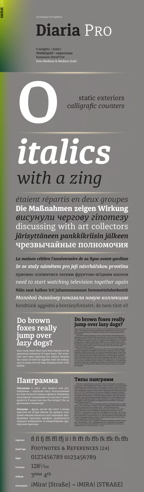
Diaria Pro - A Newspaper Text Typeface 12 Fonts $245
OTF | 12 Fonts | +Preview | SALE PAGE
- Diaria started as a project in Typeface Architecture for Master in Advanced Typograghy at EINA, Centre Universitari de Disseny i Art de Barcelona, a course tutored by Laura Meseguer and Íñigo Jerez Quintana. Later it has developed into Diaria Pro, an extensive typeface including Cyrillic script, small caps, and various OpenType features. Diaria Pro is a low-contrast serif typeface designed as a primary text face for the newspapers. Its large x-height and static exteriors allow comfortable reading in narrow columns, and calligrafic counters as well as dynamic serifs add humanist detail to overall perception and incline contrast axis without affecting interletter counterforms. Besides extensive language support, Diaria Pro includes various OpenType features: ligatures, discretionary ligatures, small caps, 6 sets of digits, superiors, inferiors, fractions, ordinals, upper-case punctuation, and some language-specific features.

Halogen Pro Font Family 19xOTF $260
14 Halogen Pro, 5 Halogen Flare Fonts | OTF | 3.7 Mb RAR | SALE PAGE
- Who doesn't want or need an expansive contemporary extended sans that has a sense of style and swagger… what if it had a lowercase, small caps and various numeral options… how could you say no? This was the foundational argument I made for myself when I drew the initial alphabet on my birthday last year (something I do each year, draw a new font, kind of a fun OCD thing). I wanted to see a wide, utilitarian sans that had more to it than just a basic character set and didn't resemble standard geometric models. As I continued sketching, the letterforms were being influenced more by my ‘lettering tendencies’ than the normal mechanical trappings of drawing flat, wide letters. The letters have retained aspects of letters created by hand — stresses, modulation, naturally ending terminals. Truncation and quick clipping of strokes became antithetical to the letterforms I drew, so I continued this once I brought the design into the computer. I kept it precise and dependable, but made every attempt to keep a conscientiously crafted typeface and not let it devolve into a grid-based drone. As such, it works just as well looking back in time as much as it does assuming a lead role in a sci-fi movie.
126,000 Royalty-Free 3D Model

Udemy Türkçe


Top Rated News
- CreativeLive Tutorial Collections
- Fasttracktutorials Course
- Chaos Cosmos Library
- MRMockup - Mockup Bundle
- Finding North Photography
- Sean Archer
- John Gress Photography
- Motion Science
- AwTeaches
- Learn Squared
- PhotoWhoa
- Houdini-Course
- Photigy
- August Dering Photography
- StudioGuti
- Creatoom
- Creature Art Teacher
- Creator Foundry
- Patreon Collections
- Udemy - Turkce
- BigFilms
- Jerry Ghionis
- ACIDBITE
- BigMediumSmall
- Globe Plants
- Unleashed Education
- The School of Photography
- Visual Education
- LeartesStudios - Cosmos
- Fxphd
- All Veer Fancy Collection!
- All OJO Images
- All ZZVe Vectors
- CGTrader 1 CGTrader 2


