


5 EPS with JPG Previews | RAR 11.6 MB

Titular - Designed for Use in Headings $239 NEW!
Designer: Latinotype Team | Design Date: Jul 14, 2015 | TURKISH SUPPORT
http://www.myfonts.com/fonts/latinotype/titular/
![]()
![]()
![]()
![]()
![]()
![]()
![]()
![]()
![]()
![]()
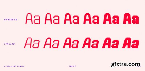
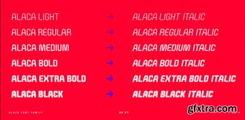
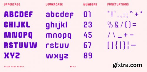
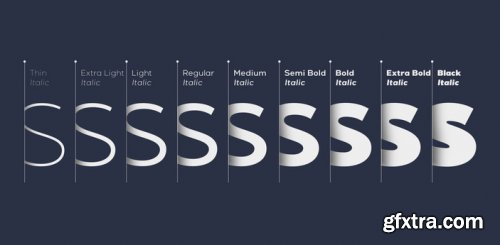
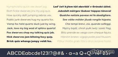
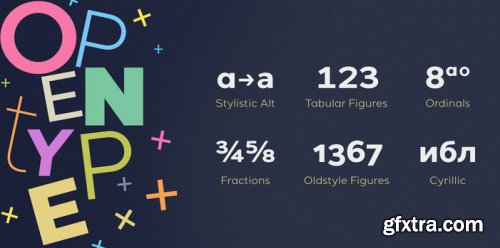
Titular is a condensed sans serif typeface, designed for use in headings and subheadings, in newspapers and magazines, you can also use in logos, brands and styles. Typography revives the spirit of the old Woodtypes, but with a modern flavor and the entire Latin American flavor. The family consists of two subfamilies, one normal and one alternative, as several of our typefaces, each subfamily has 7 weights and their respective italics. This typeface was designed by Bruno Jara and Latinotype Team.

https://www.myfonts.com/fonts/font-fabric/panton/
Panton has been expanded with Panton Narrow! It has 9 uprights and 9 matching italics ranging from Thin to Heavy. The Panton font family includes 54 fonts - 19 uprights with 19 matching italics and 16 icon sets as a bonus! It is characterized by excellent legibility in both web & print design areas, well-finished geometric designs, optimized kerning, excellent web-font performance and legibility etc. Inspired by the classic grotesque typefaces - Panton has his own unique style, expressed in perfectly softened geometric forms.
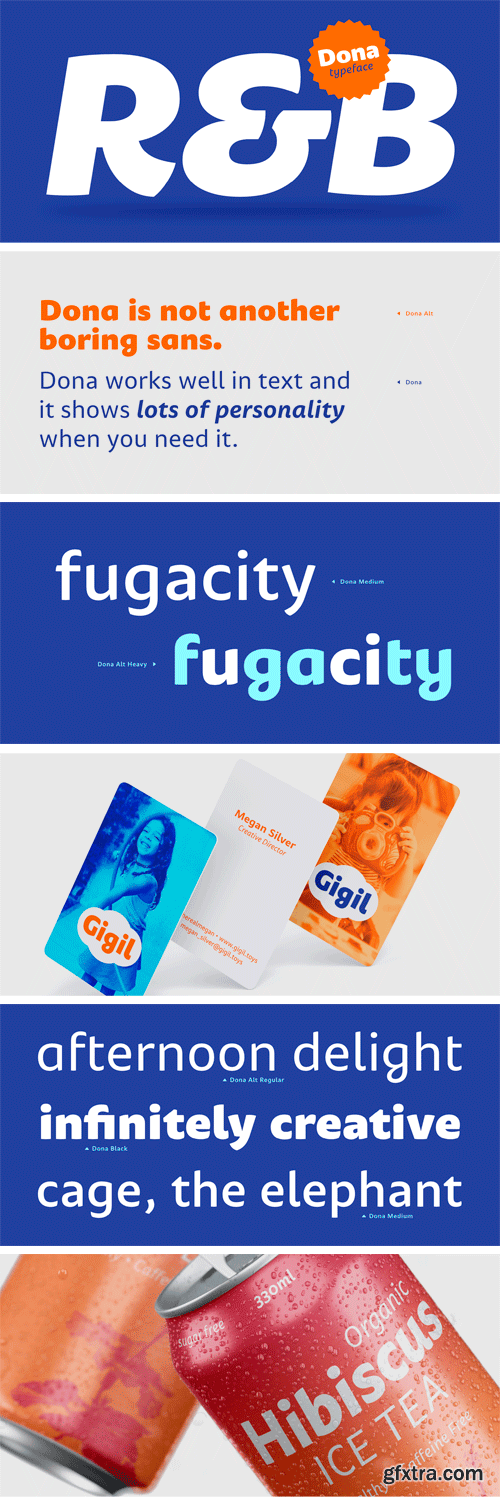

Dona Font Family
Dona is a non-boring sans serif. While very legible in text sizes, its friendly details really come to life on headlines, packaging and visual identities. To make it even more interesting, Dona Alt brings a different feeling with just a few different glyphs.
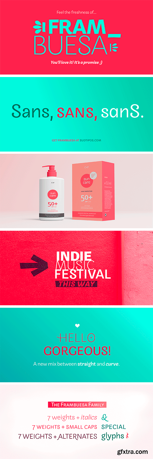

Frambuesa Font Family
Frambuesa is a half humanist-half geometric sans serif typeface that merges decorative curves with straight lines looking for a perfect balance. As pairs of opposites define harmony in nature, organic versus geometric are the foundations to this new font. The result is a solid, somewhat romantic, nostalgic type program based on the rhythm of a natural melody.

Tubqal Pro Font Family
Tubqal Pro is a tri-script type family based on its previous Tubqal typeface commissioned by the Khatt Foundation as part of the Typographic Matchmaking in the Maghrib 3.0, the 3rd edition of the multi-script typographic research project of the Khatt Foundation. The goals of the Typographic Matchmaking projects are to nurture cultural dialogue and help develop local design skills. In this case, Tubqal, as a multi-script typeface includes Tifinagh, Maghribi-based Arabic and Latin in order to provide a real type cultural dialogue in the Maghrib region.

Pramukh Font Family
Pramukh is a very condensed sans serif typeface. As a family of fonts, it is particularly large; its 16 styles include a range of eight weights: ExtraLight, Light, SemiLight, Regular, SemiBold, Bold, ExtraBold, and Black. Each weight has a companion italic font, which is oblique in style. Pramukh makes use of a very modernist typographic vocabulary. As a result, the typeface is in an excellent choice for corporate identity and editorial design projects where a formal sans serif is needed, especially one whose narrow letters can pack a lot of text into a tight space.


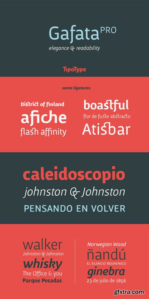

Analoga Sans Font Family
Analoga Sans was developed by Fernando Pérez while studying a Typographical Design masters at the Gestalt Studies Center in Mexico. Inspired by grotesque sans-serif shapes and the fluidity from humanist typefaces, this family seeks to reconcile both worlds in a proposal that is defined by typography blocks.

https://www.myfonts.com/collections/fazon-font-tour-de-force
Compact and condensed, Fazon font family belongs to design inspired by vintage typefaces. It is available in 7 weights – from Light to Black. Contrast in letter design gets higher as weights get thicker which assigns dose of display elements in heavier weights of Fazon. Contains 5 stylistic sets (4 for uppercase and 1 for lowercase letters) and fractions. Fazon covers extended Latin character map. Ideal usage: packages and labels, posters, titles, websites.

Etrusco Now Font Family
https://www.myfonts.com/collections/etrusco-now-font-italian-type
Etrusco Now is the revival of a lead typeface originally cast in lead by Italian foundry Nebiolo in the early 1920s. Heavily inspired by the design of the Medium weight of Schelter & Giesecke's Grotesk, Etrusco was, like Cairoli, an early precursor of the modernist grotesque superfamilies: a solid, multi-purpose "work-horse" typeface family that could solve a wide range of design problems with its range of widths and weights.

Pro EDU - Master Collection – 200 Cinematic Portrait Photoshop Overlays v2
CREATE A CINEMATIC LOOK FOR YOUR IMAGE IN SECONDS
Portrait Photographers and retouchers are always in search of new tools to elevate their images and speed up their workflow. These new 200 Cinematic Portrait Overlays for retouching are an accessible means for any photographer or post-production artist to explore new possibilities with their images in post production.
All 200 Creative Overlays were captured practically using a variety of high-end lenses, developed, and formatted for the most versatility and realistic aesthetic possible. Compatible with all versions of Photoshop or any other photo-editing software with layers and blend modes.
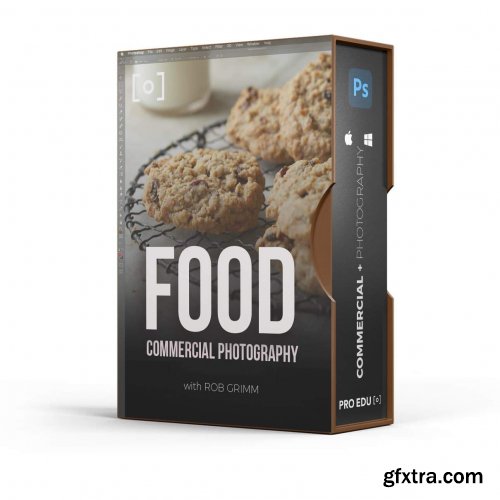
PROEDU - Food Photography & Retouching
This is the most comprehensive tutorial on food photography available. The 17 hours of content will guide you through gear selection, understanding shape & form, creating a sense of place & time, basic food styling techniques, in-studio portfolio work, and location assignments, along with marketing and pricing strategies for food photography. The documentary serves as a guide for the entire process involved with the business and is filled with industry standard best practices. This photography course is a comprehensive exploration of the necessary steps for building a compelling food photography portfolio, improving food styling skills, understanding the complexities of composition, crafting light to meet your vision, and understanding how to best attract new clients and win bigger jobs.
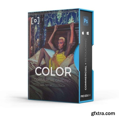
PROEDU - Commercial Color Grading In Photoshop
PUSH YOUR IMAGES FURTHER WITH COMMERCIAL COLOR If you're a photographer or video editor, chances are you've been asked to color grade an image. But if you don't have a background in design, it can be hard to know where to start. In this course, pro colorist Sef McCullough will show you how to use Adobe Photoshop's powerful tools for grading images like the pros do. The techniques he'll teach come from his years of experience working on campaigns for Nike and Adidas. You'll learn how to create cohesive image families using palettes; how to audit your colors using curves; how to fix common problems like skin tones; and much more. With this course, you'll be able take any photo and turn it into something beautiful that looks good in print or on screen – without relying on filters or packs! So why wait? Join Sef today and get started improving your commercial color grading skills.

After Effects Version : CC | Files Included : After Effects Project Files | Length : 0:20 | Resolution : 1920x1080
Top Rated News
- CreativeLive Tutorial Collections
- Fasttracktutorials Course
- Chaos Cosmos Library
- MRMockup - Mockup Bundle
- Finding North Photography
- Sean Archer
- John Gress Photography
- Motion Science
- AwTeaches
- Learn Squared
- PhotoWhoa
- Houdini-Course
- Photigy
- August Dering Photography
- StudioGuti
- Creatoom
- Creature Art Teacher
- Creator Foundry
- Patreon Collections
- Udemy - Turkce
- BigFilms
- Jerry Ghionis
- ACIDBITE
- BigMediumSmall
- Globe Plants
- Unleashed Education
- The School of Photography
- Visual Education
- LeartesStudios - Cosmos
- Fxphd
- All Veer Fancy Collection!
- All OJO Images
- All ZZVe Vectors
- CGTrader 1 CGTrader 2


