

JLS Data Gothic
Retro Visionaries in Your Faces $25
4 OTF Font Files | Designer: James L Stirling | TURKISH SUPPORT | SALE PAGE
![]()
![]()
![]()
![]()
![]()
![]()
![]()
![]()
![]()
![]()
![]()
![]()
![]()
- Everyone remembers their first. JLS Space was my first. It was the first computer format font that I created. The font was inspired by the sci-fi movie posters, book covers and comic books of my childhood. The first crude letterforms were conjured in an all-night marathon session with no sketches and no planning. A simple character set, it consisted of upper case, lower case, numbers and basic punctuation. But, the project was little more than an interesting exercise, and JLS Space faded into digital limbo. This unfortunate font was ignored and lost for fifteen years. Mike Adkins, my co-conspirator, found and rescued the font file from the depths of a failing hard drive. He sent the file to me as a curiosity - a glimpse back at our humble beginnings. I started puttering around with it on a whim. Without really trying, Data Gothic began to form. The interesting letter forms in Data and Space Gothic struck a chord, and I was inspired to complete the project almost twenty years after it was started. JLS Space Gothic was inspired by the OCR and MICR fonts of the science fiction genre. Today, its character will enhance terms like Computer Diagnostic or Space Age Polymer. Posters, titles and displays will boldly blast off into the market place with these cybernetic letterforms. If Space Gothic is retro and seems limited in its genre, Data Gothic is contemporary with a broad spectrum of uses. This futuristic gothic doesn't sacrifice legibility for style. As a screen font, JLS Data Gothic is excellent for technical specifications, on screen dialogue, labeling, etc. In print, Data Gothic is a great font for text in manuals, schematics, maps and diagrams. To honor Sputnik, Man’s first voyager into space, Space Gothic and Data Gothic include Cyrillic.

FF Cocon $542 13 Fonts
Ideally suited for advertising and packaging
- Evert Bloemsma (1958–2005) described FF Cocon as a “serious typeface.” Despite first impressions, this is a description that holds up well. Since its release in 2001, FF Cocon has been used in an astounding variety of design applications. In large sizes, FF Cocon works as a display face, with beautiful details. In small sizes, it remains surprisingly readable.
- We all know the small spurs of the lowercase letters a, b, d, g, h, m, n, p, q, r and u. They are relics of the hand-written word where a round form is attached to a straight line. In the first sketches for FF Cocoon, Bloemsma made an attempt to erase every trace of handwriting; even “normal,” neutral sans serif typefaces still retain elements in their letterforms like this. Bloemsma wanted none of it. Although this was a difficult starting point for a typeface, it proved successful. Bloemsma’s design is a family of rounded yet rather asymmetrical forms with details that might be reminiscent of brush-strokes, but were not made with a brush in hand. In spite of its claim to seriousness, FF Cocon is a family of seductive, voluptuous fonts.

Old French School
Handwriten Old School Font Family $40
4 fonts | OTF/TTF/WoFF | Preview | SALE PAGE

ASM - Energetic Monospaced
with Extreme Legibility $156
8 OTF Fonts | Designer: Inigo Jerez | SALE PAGE
- The initials ASM represent the acronym of the Santa Monica Arts cultural center located in Barcelona, Spain, where this typeface, with the same name, has served as the custom corporate typeface since 2008 till today (2013). ASM is an energetic monospaced with extreme legibility consisting of two original weights, with an underlined version – used on some of corporate applications – all with their corresponding italics.


Stabia - Multi-purpose Typeface
with Large Wedge-Angular Serifs $230
10 OTF Font Files | Designers: Olcar Alcaide | TURKISH SUPPORT | SALE PAGE
![]()
![]()
![]()
![]()
![]()
![]()
![]()
![]()
![]()
![]()
![]()
![]()
- Stabia is a multi-purpose typeface with large wedge-angular serifs. It is delicate and highly readable at very small sizes but reveals all its strength and personality when used at big sizes. The contrast of the sharped serifs provides a fresh and very contemporary look. The family has 5 weights, ranging from Light to Black (including italics) and is ideally suited for advertising and packaging, book text, editorial and publishing, logo and branding, small text as well as web and epub. Stabia provides advanced typographical support with features such as ligatures, small capitals, alternate characters, case-sensitive forms, fractions, and super- and subscript characters. It comes with a complete range of figure set options – oldstyle and lining figures, each in tabular and proportional widths. As well as Latin-based, the typeface family also supports Central European languages. Stabiae was an ancient Roman town, located close to the modern town of Castellammare di Stabia approximately 4.5 km southwest of Pompeii. According to the account written by his nephew, Pliny the Elder was at the other side of the bay in Misenum when the Mount Vesuvius eruption started. He travelled by galley ship across the bay, partly to observe the eruption more closely, and partly to rescue people from the coast near the volcano. Pliny died at Stabiae the following day, probably during the arrival of the sixth and largest pyroclastic surge of the eruption caused by the collapse of the eruption plume.
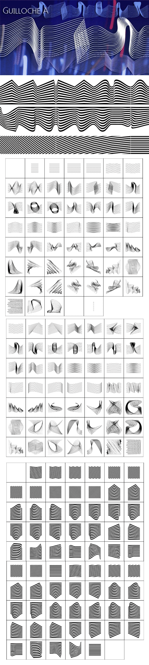
Guilloche A & B Fonts 2xOTF $104
2 Fonts | OTF/TTF | WoFF | Guilloche A + Guilloche B
- Guilloches were – in the old days – used to make the falsification of banknotes more difficult. The engraving of these intricate lines was done by a highly specialized mechanical machine, which was operated by an equally highly specialized engraving artist. Once the settings for a specific curve were changed back to zero it was very difficult, if not impossible to set them back to the old design. I have designed a useful set of Guilloches that join to form ribbons that create a kind of op-art 3d effect. Under the keys A-U and a-u you find joining pieces. Under the keys V-Z and v-z I placed start- and endpieces. 0-4 are different lenght straight extensions and 5-9 are not quite so straight extensions. All other keys are corner pieces that can be used as stand-alones or put in rows to make for superb decoration. With a little bit of experimentation and maybe colored overlays you can achieve super-phantastic designs. Your elegant type designer Gert Wiescher.
- »Guilloche B« is a set of graphics that join with each other to form very sophisticated, op-art-like borders. Try them on lots of different assignments, they form very surprising bands or patterns.


Solitas Font Family 42 Fonts $1008
You request perfection--that ideal equilibrium of compact dimensions and geometric underpinnings that leaves you with pure, clean lines of a highly legible sans.
We give you Solitas, a 7-weight sans-serif from Jeremy Dooley. Made of 42 fonts, from the slender thin to the powerful bold and their matching italics, this typeface family features typographic options including ligatures, fractions, alternate unicase, upright italics, and titling caps. Coupled with its pure design and style, this makes Solitas a successful workhorse typeface.
The result of simplification and reduction, Solitas is well-suited for the headlines and shorter texts of promotions, packaging, editorials and branding, both in print and on your website.
That’s it. It’s that clean, that simple, and possibly that perfect for your next layout. Get it today.[/center]
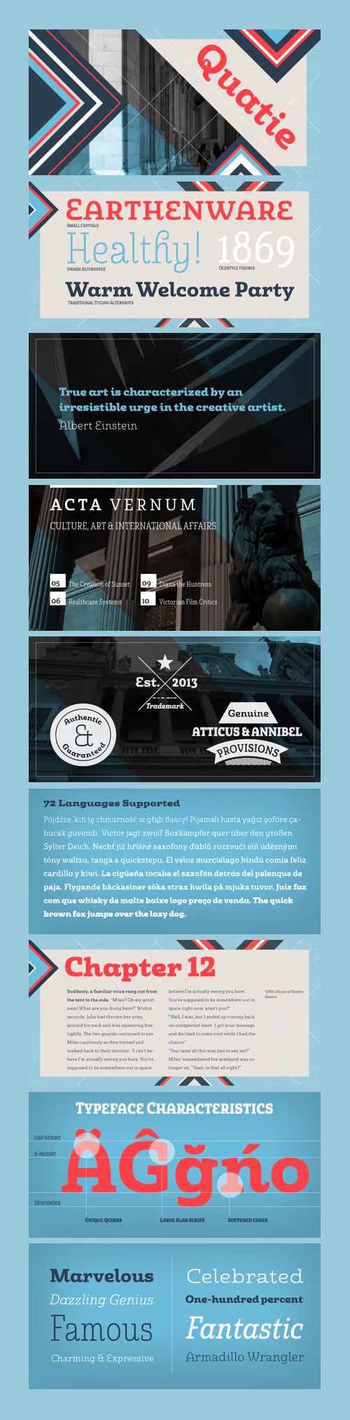
Quatie Font Family - 48 Fonts $1152
OTF | WOFF | 5.1 MB RAR | SALE PAGE
- Originally a conceptual approach from the Chatype project of Jeremy Dooley and Robbie de Villiers, Quatie has been restructured to add a new industrial element to Insigne’s offerings. Like the Official Font of Chattanooga, Tennessee, Quatie definitely carries a contemporary, hipster feel. Quatie similarly draws much of its inspiration from the industrial brawn of the railroad and the unique characteristics of Cherokee letterforms, giving it an atypical form not usually found in an industrial slab.While the Quatie concept was originally set aside for the more technological look of Chatype’s final image, Jeremy revived this face from its dormant state and refined it for its commercial release in 2013. This bracketed slab with its slightly rounded, soft edges adds a warm, retro, industrial element to Insigne’s offerings. The resulting quirky, ‘hipster’ vibe of Quatie lends its voice to give an unparalleled edge to your designs.

My Way - Wild & Anarchic OTF $18
OTF/TTF | WOFF | +Previews | SALE PAGE
- MY WAY belongs to fonts which contain “aesthetic of ugly”. This is a font with a good balance of rhythm and contrast. It’s aim is casual, wild and anarchic layout. Because of the spontaneity which this font contains, you cand find plenty of Standard and Discretionary Ligatures, just to avoid frequent repetition of letters. If you find single repeating glyphs, you can change that by toggling between Stylistic Alternates, if you want. There are ligatures created for Cyrillic too.MY WAY is perfect choice for all dirty, naturally and wild, but authentically beautiful things as Blues, Jazz, Punk.

CM - D Hanna Soft 250912
20 Fonts | OTF/TTF | SALE PAGE
- D Hanna Soft is a sans serif type family of 9 weights plus matching italics. It is inspired by the geometric style sans serif faces with a mix of rounded shapes and a little bit of black in some corners. The medium weights serve very well in body text, while the thinner and bolder styles make an excellent choice for headlines .
- D Hanna Soft is equipped with a complete set of opentype features including alternative glyphs, fractions, ligatures and many more. It is perfectly suited for highlighting lettering, magazines, web, interaction design, advertising and logotypes.

Metropolis Font Family
18 Free Fonts | OTF/TTF | +Web Fonts | +Previews | RAR 1.9 MB

United Sans Typeface by Housefonts
35 Fonts | OTF | SALE PAGE
- Like most military actions, United started out as a simple typographical incursion that became entrenched in the House Industries quagmire of creative projects. After we used early versions in a clothing company logo, the family drew national attention as it was selected to appear in the Smithsonian’s Cooper-Hewitt National Design Museum 2003 Triennial show. Tal Leming toiled for the next three years to build on the original concept and develop one of the most extensive font families available anywhere. United boasts three different styles, each with seven weights and five widths for a total of 105 fonts for the entire collection.

Augustino - Fancy & Friendly
2 Fonts | OTF/TTF | AI Vector Ligeratures & Symbols | RAR 8.1 MB

Freestyle Decorated 633 Fonts Bundle
FREESTYLE | BRUSH | GRUNGE | DECORATED | HANDWRITE | OTF | TTF | 32 MB

RetroSupply - Lettering Library | Mega Bundle $197
117 Rare Vintage Lettering Books | PDF | RAR 4.5 GB | SALE PAGE
- Get 117 Rare Vintage Lettering Book PDFs for Only $197! Note: This is not a font collection. It is a massive digital collection of rare vintage lettering and sign painting books. When you purchase you will receive a massive collection of PDF books of these rare books. These books are for practice and educational purposes. This library of lettering book PDF's is a large download. As a result when you purchase you'll receive a PDF with a link that will instantly let you download all your books.
- The Lettering Library is a PDF Collection
- This is a collection of 117 PDFs created from Jason's collection of authentic vintage lettering books. You are not buying physical books. (Which is actually good because it would take up a ton of space).
- Note: The discounted price is based on the cost of these books if you were to purchase them individually from Lettering Library.

Moho Script - Decorative Modern Geometric $124
6 Fonts | OTF/WOFF | 43.3 MB | Sale Page
- Moho Script introduces a decorative modern geometric of Japanese, sometimes german flavor for an unconventional script. It breaks the mold of the usual fonts to create a new visual impact of absolute contemporaneity with a retro touch. Moho Script, as all typefaces of this extended family, comes in five weights and an inline style, and it’s been provided with a complete set of glyphs for languages ??of the Eastern and Western Europe. With the OpenType feature Swash you can make words with letter “t” that overlap to achieve what no meet in others typefaces. Moho Script is a perfect font for headlines display, menus, deals, logos, labels, outdoor advertising and publishing design, great for architecture, fashion, music, aviation and social affairs.

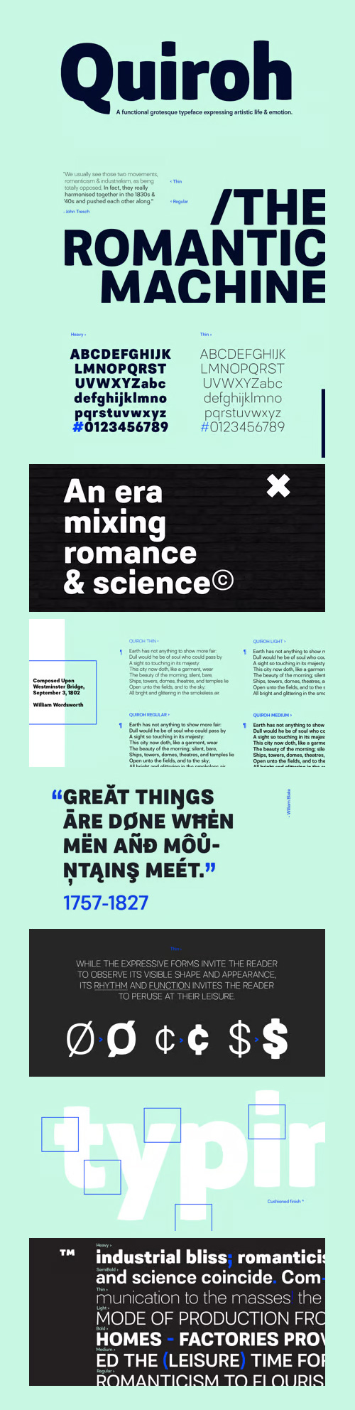
Quiroh Font Family 7 Fonts $160
7 Fonts | OTF | Preview | SALE PAGE
- Quiroh is a functional typeface that expresses both artistic life and emotion. Taking its inspiration from the industrial revolution of the 19th Century where romance and science coincided. With a cushioned finish and designed according to traditional conventions, the sentiment is equally as important as the reason, resulting in a very pleasurable read. Quiroh includes both heavy display weights and lighter weights for small copy, it’s a perfect tool for communicating to the masses. Tall ascenders and descenders give the typeface a distinctive look with an elegant feel, and while these expressive forms invite the reader to observe its visible shape and appearance, its rhythm and function invites the reader to peruse at their leisure.


General - 5 Light Weights - 5 Fonts $99
5 Fonts | OTF | Previews | SALE PAGE | SALE PAGE 2
- It’s all about these subtle nuances that make a neutral sans typeface different. Pure geometry with a human touch is a recipe that works in every generation. Inspired by classical fonts from the early 20th century, General rides the line between traditional and modern styles. With its 5 light weights, the General family is a strong tool for a clean design.

Intropol - Modern Journalistic Style 12 Fonts $169
12 Fonts | OTF/TTF/WoFF | SALE PAGE
- A modern journalistic style typeface. The subtle condensed characters create great economy of space best suited to brochure, editorial and magazine layouts. Also using the contrasting weights you can add great dimension across headline and body copy. Details include 6 weights with italics, an extended European character set, manually edited kerning and Euro symbol.

Nitti - A Monospaced Type Family 10 Fonts €440
- Nitti is a monospaced typeface family in five weights that has its roots in the first sans-serif designs of the 19th century — the Grotesques. Originally a British invention, Grotesques gained massive popularity in mainland Europe and also became widespread in early 20th century USA where they were commonly referred to as ‘Gothic’. The quirky and often idiosyncratic shapes of these early English sans-serifs lend them the humanity and warmth still appreciated among many graphic designers today.
- Nitti is named after Francesco Raffaele Nitto, better known as Frank ‘The Enforcer’ Nitti, one of the henchmen of Al Capone. The family is part of a bigger collection of Grotesque-inspired typefaces that also includes a poster version called Stanley and a proportional version called Nitti Grotesk.
- Nitti has an very extensive character-set with Latin, Greek, Cyrillic glyphs that cover all European languages and Asian languages that use the Cyrillic script, plus Hebrew.

126,000 Royalty-Free 3D Model

Udemy Türkçe


Top Rated News
- CreativeLive Tutorial Collections
- Fasttracktutorials Course
- Chaos Cosmos Library
- MRMockup - Mockup Bundle
- Finding North Photography
- Sean Archer
- John Gress Photography
- Motion Science
- AwTeaches
- Learn Squared
- PhotoWhoa
- Houdini-Course
- Photigy
- August Dering Photography
- StudioGuti
- Creatoom
- Creature Art Teacher
- Creator Foundry
- Patreon Collections
- Udemy - Turkce
- BigFilms
- Jerry Ghionis
- ACIDBITE
- BigMediumSmall
- Globe Plants
- Unleashed Education
- The School of Photography
- Visual Education
- LeartesStudios - Cosmos
- Fxphd
- All Veer Fancy Collection!
- All OJO Images
- All ZZVe Vectors
- CGTrader 1 CGTrader 2


