
Categories: GFXTRA Special » Special Fonts


Myfonts - TA Sonatina Font Family
TA Sonatina is a versatile display typeface that bridges cultures and alphabets with an elegant, modern rhythm. Inspired by the universal language of music and the bold contrasts of architectural forms, this font harmonizes precision with playfulness, creating a timeless typographic experience.The standout feature of TA Sonatina lies in its blend of structured geometry and fluid curves, offering a perfect balance of sharp edges and soft contours. Its multilingual support includes Latin, Cyrillic, Armenian, Greek, Hebrew, and Georgian scripts, celebrating typographic diversity with seamless integration.
Categories: GFXTRA Special » Special Fonts


Regan Script Typeface OTF
- Hello everyone, we present a new font Regan Script Font is a beautiful writing theme with a charming curve and a very shaky bottom line It has a perfectly paired free marker font, and a bunch of very practical Swash bonuses Ideal for logos, handwritten quotes, product packaging, headers, posters, merchandise, social media & greeting cards.
OTF | TTF
Categories: GFXTRA Special » Special Fonts


Mena Grotesk Font Family | 20 x TTF & OTF
Mena Grotesk is a Neo-grotesk typography made in the Chilean way. Gifted with a more humanist proportion, with sharper inner curves and softer outer curves, Mena Grotesk counts with the character to stand out in big sizes and enough control to not distract the reader: it is a typeface to be seen and to be read. Mena Grotesk is a full time worker font, a “handyman”, as my people.
Categories: GFXTRA Special » Special Fonts


Quiche Font Family | 52 x TTF & OTF
https://www.youworkforthem.com/font/T9207/quiche/
Quiche is a high-contrast, sans serif typeface featuring ball terminals and angled stems. This 52 font superfamily is a complete branding suite. The 4 subfamilies—Display, Fine, Stencil, and Text—were created to work harmoniously together based on the need. With weights ranging from thin to black and matching italics, there are a variety of applications that the fonts can be used for: print, web, branding, advertising, magazines, products, packaging, labels, etc.
Categories: GFXTRA Special » Special Fonts


Novera Font Family
The Novera family is a sharp geometric sans in ten weights plus matching italics, available in two versions – Modern and Classic. It has a contemporary, approachable and multifunctional yet characteristic design, that comes with an extensive glyphs set of 1000+ glyphs per font, meeting all typographic demands.
Categories: GFXTRA Special » Special Fonts


Kalpazan Font Family | 5 x TTF & OTF
Kalpazan is an elegant high end sans serif typeface with multilingual support and light, regular, semibold, bold, extrabold fonts . It's a very versatile font that works great in large and small sizes. Kalpazan is perfect for branding projects, home-ware designs, product packaging, wedding invitations, magazine headers - or simply as a stylish text overlay to any background image.
Categories: GFXTRA Special » Special Fonts


Geraldton Font Family
Geraldton is a warm and friendly geometric sans-serif typeface in 8 weights with matching italics. Its low x-height and sharp angles are inspired by geometric types of 1920s and 1930s completed with a slight modern humanist touch.
Categories: GFXTRA Special » Special Fonts


Cena Font Family | 12 x TTF & OTF
Cena is a dynamic humanist sans serif family. It comes in 6 weights with matching italics.The idea behind this typeface was to create a relatively condensed typeface. It’s just on the verge of being condensed in order to allow you to save some space when using columns and headlines.
Categories: GFXTRA Special » Special Fonts


Bunday Clean Font Family | 34 x TTF
Bunday Clean is a minimalistic and friendly font family with different moods. It drops all "unnecessaries“ like spurs and ears and it appears crisp and contemporary with a little squarish touch. Like the other members of the Bunday superfamily, Bunday Sans and Bunday Slab, Bunday Clean provides a second set of styles with characters, that refer to handwritten forms: the "uprights“. These curvy styles give words a distinct look (presence) and a great appeal especially in display applications and logotype design.It ships with 9 standard, 9 upright and corresponding italic styles from a considerable thin “Hair” to a pretty fat “Heavy” weight. It supports at least 99 languages and provides OpenType features for ligatures, alternative glyphs, localized forms and many.
Categories: GFXTRA Special » Special Fonts


FF Kievit Slab Font Family - 18 Fonts for $659
OTF + TTF | 18 Fonts | 1.4 Mb RAR
- American type designer Michael Abbink and Dutch type designer Paul van der Laan created this slab FontFont in 2013. The family has 18 weights, ranging from Thin to Black (including italics) and is ideally suited for advertising and packaging, book text, logo, branding, small text, wayfinding and signage as well as web and screen design. FF Kievit provides advanced typographical support with features such as ligatures, small capitals, alternate characters, case-sensitive forms, fractions, and super- and subscript characters. It comes with a complete range of figure set options – oldstyle and lining figures, each in tabular and proportional widths.
Categories: GFXTRA Special » Special Fonts


PGF Now Font Family
Geometric Sans with Humanistic proportions Typeface (Roman a.k.a. ‘Capitalis Monumentalis’), Inspired on vintage minimalism, with a subtle Art Déco air, where the configuration of the basic and open shape (long ascenders/descenders and a moderate ‘x’ height) star a crisp and luminous look, manufactured under an analytical and handmade process as used to be in ancient times.
Categories: GFXTRA Special » Special Fonts


Artegra Soft Font Family
Artegra Soft is the round cornered addition to the Artegra superfamily. It's based on the perfectionist geometric forms of Artegra Sans, all the glyphs are softened with round corners with manual corrections to the soft edges. The family has 54 fonts in condensed, normal and extended widths, 9 weights per width with matching true italics to achieve the upmost versatility. With more than a thousand glyphs per font, it supports more than a hundred languages including the Cyrillic and Greek languages.
Categories: GFXTRA Special » Special Fonts


Causten Font Family
Causten is a geometric sans serif font family with maintains rationality in designing each form. With use the sharpness of the eyes, and remain logical, so that balance is maintained in each form. So, it will get a clean, neat, and perfect shape.
Categories: GFXTRA Special » Special Fonts


Bogue Font Family
Bogue is a soft serif type family of 8 weights and matching italics. The soft forms gives it a friendly and approachable character with a hint of retro feeling. Bogue comes with a lots of stylistic alternates that makes it very versatile in various uses like logos, editorial design, branding, web design, package design and much more. You can use it to create short powerful phrases and headlines and also use it in longer text like lead paragraphs and body texts. So if you are looking for a versatile soft serif font with a friendly character you have found it!
Categories: GFXTRA Special » Special Fonts


Galeana Font Family
Galeana is a flat-sided sans serif typeface that features a closed aperture. The font is a reinterpretation of Latin American-flavored typefaces used for European editorial designs such as Plastique and Zembla magazines. This superfamily consists of 4 sub-families: Compressed, Condensed, Standard and Extended. The heaviest and narrowest variants—created at the early stage of the design process—resemble the slender trunks of the Galenas (African tulip trees). The other variants have an extended width, which evokes the broad crown shape of these trees. Galeana comes in 48 styles and contains 417 glyphs that support over 200 Latin-based languages. The font performs well for mid-length text and it is the perfect choice for headlines, editorial design, brand identity design, advertising, social media and use on Tv.
Categories: GFXTRA Special » Special Fonts
")
")
")
")
")
")
")
")
")
Faktum Font Family (Update) | 40 x OTF
Faktum is an exploration into the geometric sans genre, inspired by Mid-century modern architecture and interior design. It is available in 40 styles, combining clear lines, organic curves and geometric shapes into one contemporary design.
Categories: GFXTRA Special » Special Fonts


Bw Aleta Font Family | 36 x TTF & OTF
Designed by Alberto Romanos, Bw Aleta is a multi-purpose geometric sans with humanist traits. Its wide proportions, straight-forward drawing and obvious modulation on selected areas, all build towards a contemporary & sharp personality. Bw Aleta is deployed as two distinct subfamilies: No. 10 is the quirkier sibling celebrating all its angles, while No. 20 presents a slightly quieter feel.
Categories: GFXTRA Special » Special Fonts

Brownstone Sans by Sudtipos
OTF | 3 Fonts | JPEG Preview | 3.4 Mb RAR
- One design sparks another. As Alejandro Paul experimented with the strokes and curves of the monoline script Business Penmanship, he discovered interesting new forms and shapes that didn't fit the Spencerian theme of that typeface. These forms simmered in Ale’s subconscious over the next three years, during which time he visited New York City, pored over rare type specimen books in the New York Public Library, and explored Brooklyn’s neighborhoods. Brownstone, the face born from these explorations, is an original 21st-century design, yet one subtly infused with historical and cultural references -- keen observers might spot influences from decorative typefaces of 19th-century foundries. And just as faces from that era were influenced by contemporary architecture, the frames included with Brownstone echo the ornate iron railings of Park Slope’s row houses. (There’s also a slight 1960s vibe to Brownstone, of novelty swash-sans photocompositing faces, that can be played up at your discretion.) Influences aside, Brownstone has broad appeal to modern audiences. A soft, monoline sans-serif, with elements of Swiss geometry (see the ‘k’ and ‘x’), its marriage of highly legible, draftsman-like letterforms with decorative swashes and ornaments reflects the old-meets-new aesthetic of the DIY craft culture seen in Brooklyn and other urban centers. It’s ornamental but unfussy, romantic but understated. Brownstone includes character sets for Latin-based languages, including Western and Eastern European, Baltic, Turkish, Maltese, Celtic and Welsh. Over 1500 glyphs, including small capitals, swash characters, alternates, and ligatures, in both Light and Thin weights. Ornamental frames are also included in both weights.
Categories: GFXTRA Special » Special Fonts


Franca Font Family | 18 x TTF
https://www.fontspring.com/fonts/rene-bieder/franca
- Franca is a neo-grotesk family in nine weights plus matching italics. The inspiration for the design came trough the constant interest in new interpretations of the classic grotesk model and a study of „neutral“ typefaces like Helvetica, Univers or Normal Grotesk. During the studies, additional attention was given to the American representatives of the genre, resulting in the initial impetus for a reinterpretation, combining both paths into one contemporary design.
Categories: GFXTRA Special » Special Fonts


Gilam Font Family | 18 x TTF
https://www.youworkforthem.com/font/T8952/gilam/
- Gilam is a sans serif font with semi-condensed proportions. The typeface was based on the famous DIN but combines its popular neo-grotesque look with characteristics, such as the pointed edges in the “W” and “M” as well as the outward cut terminals, which gives a distinctive look to the modern geometric typeface. The complete set of 9 weights plus italics gives to designers an absolute freedom to create. Perfect layouts with blocks of text, headlines, motion graphics, logos, apps, and websites are just part of the intended usage of this versatile typeface.
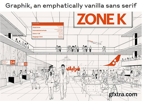
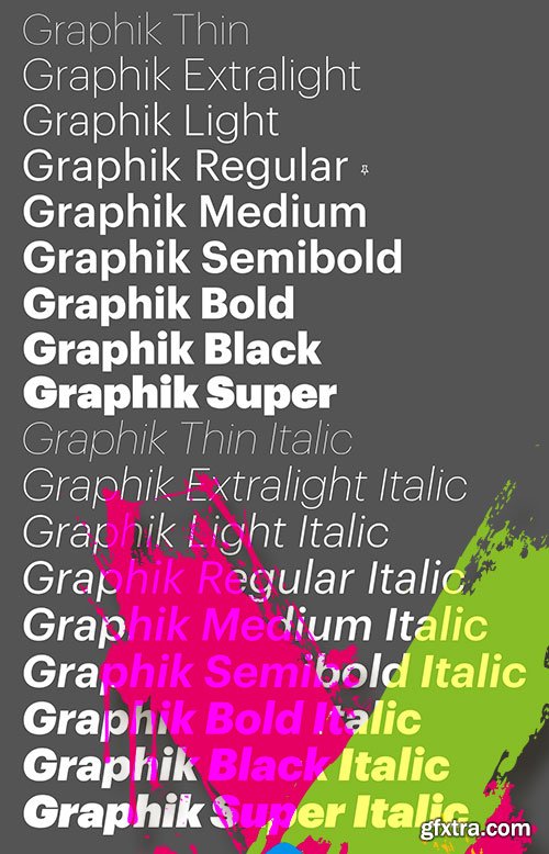
Graphik - Most Popular Commercial Typeface 18xOTF
OTF | 18 Fonts | JPEG Preview | 10.9 Mb RAR
- Graphik, a deliberately vanilla editorial workhorse, remains one of Commercial Type’s most popular families. This hybrid face offsets the round bowls typical of a geometric sans with the architecture and proportions of a European grotesk, without the baggage of more dogmatic, overused sans serifs mired in postwar modernism. Graphik’s low contrast, open counters, and compact descenders recommend it for use in tight settings like subheads, captions, labels, and running text; human touches like round dots and other details also make it ideal for larger, more impactful uses such as titles, covers, posters, and signage. Over time, the family has matured into an expansive collection of nine weights and eight widths, and has even branched out into a companion slab family: Produkt.
- The dominant trend of the mid twentieth century simple sans serifs still reverberates in visual culture. Graphik proves that it is still possible to create something refreshing inspired by this era. Taking cues from the less-known anonymous grotesques and geometric sans serifs, Graphik is perfectly suited for graphic and publication design. Originally designed for Schwartz’s own corporate identity, it was later finished for Conde Nast Portfolio and then expanded for Wallpaper* and later T, the New York Times Style Magazine.

Libertad Sans-Serif Typeface Family by TipoType
OTF | 14 Fonts | JPEG Preview | 8.6 Mb RAR
- Design can do without images, but not without typefaces. Libertad is a sans-serif typeface that mixes humanist and grotesk models. It’s most interesting feature is the combination of balanced regulars with dynamic italics, which makes it a very versatile font for different uses. This typeface follows the Luc(as) de Groot’s Interpolation Theory, that’s why it has seven specially-calculated weights plus their matching italics, from thin to extra-bold. This allows it to be useful in big headlines and also small texts. It has more than 800 characters per weight and support for more than 70 languages.
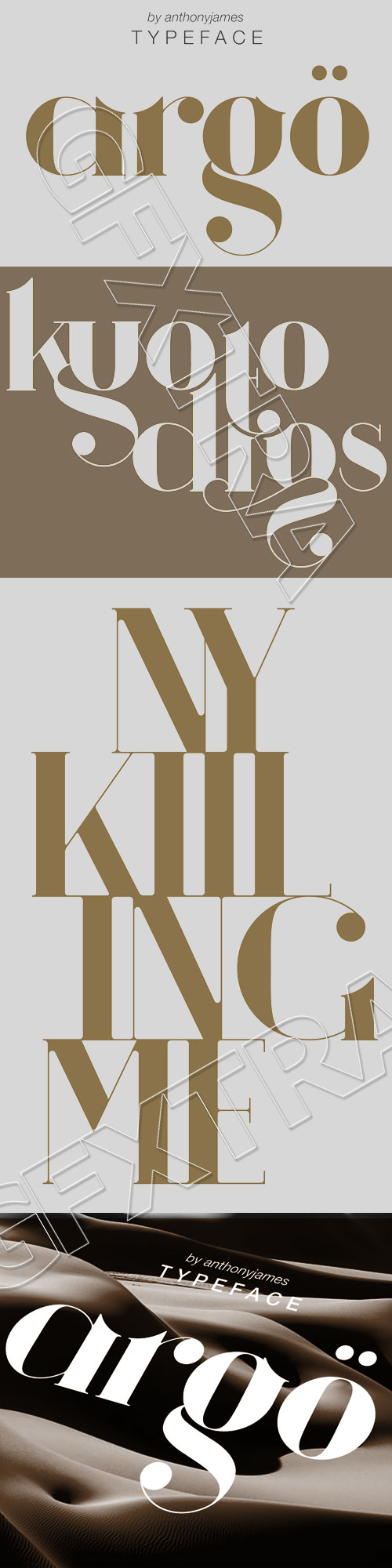
Argö - Art Deco Typeface by Antony James
Argo Font Family
TTF | 3 Fonts | 0.8 Mb RAR
- Argö is a serif typeface designed initially as an Art Deco display font, but with a few changes to traditional aesthetics. Horizontal lines have been replaced with Medieval themed ascenders to allow for more flow and versatility, incase the user intends to manipulate the typeface. Argö contains 180 characters including uppercase, lowercase, numbers, glyphs, ligatures and accents. Alternative letters with shorter descenders have been included, that are more appropriate when writing lines of text.
Categories: GFXTRA Special » Special Fonts
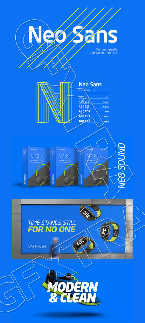
Neo Sans W1G & Monotype 12 Typefaces
OTF | 12 Fonts | JPEG Preview | 4.3 Mb RAR
Buy Neo Sans W1G Font Family
- The branding agency's client wanted an "ultra modern" typeface that was "futuristic without being gimmicky or ephemeral," according to the design brief. Designer Sebastian Lester took on this intriguing custom font assignment, but soon, a bureaucratic decision cancelled the project. "I was left with a sketchbook full of ideas and thought it would be a shame not to see what came of them," says Lester. He decided to finish the design on his own. Lester's research confirmed that the principal ingredient of an "ultra modern" typeface was simplicity of character structure: a carefully drawn, monoline form, open letter shapes and smooth, strong curves. To conceive a typeface that crossed the line from modern to futuristic, Lester decided to amplify these qualities. About a year after Lester's initial conceptual work, two highly functional and versatile typefaces emerged. These are Neo Sans and Neo Tech, designs Lester describes as "legible without being neutral, nuanced without being fussy, and expressive without being distracting." Both the Neo Sans and the more-minimalist Neo Tech families are available in six weights, ranging from Light to Ultra. Each has a companion italic, and Neo Tech offers a suite of alternate characters. While engineered to look modern as tomorrow, Neo Sans and Neo Tech display the functional and aesthetic excellence that earns them a place in the list of classic designs from the Monotype typeface library.
126,000 Royalty-Free 3D Model

Udemy Türkçe


Top Rated News
- CreativeLive Tutorial Collections
- Fasttracktutorials Course
- Chaos Cosmos Library
- MRMockup - Mockup Bundle
- Finding North Photography
- Sean Archer
- John Gress Photography
- Motion Science
- AwTeaches
- Learn Squared
- PhotoWhoa
- Houdini-Course
- Photigy
- August Dering Photography
- StudioGuti
- Creatoom
- Creature Art Teacher
- Creator Foundry
- Patreon Collections
- Udemy - Turkce
- BigFilms
- Jerry Ghionis
- ACIDBITE
- BigMediumSmall
- Globe Plants
- Unleashed Education
- The School of Photography
- Visual Education
- LeartesStudios - Cosmos
- Fxphd
- All Veer Fancy Collection!
- All OJO Images
- All ZZVe Vectors
- CGTrader 1 CGTrader 2


