
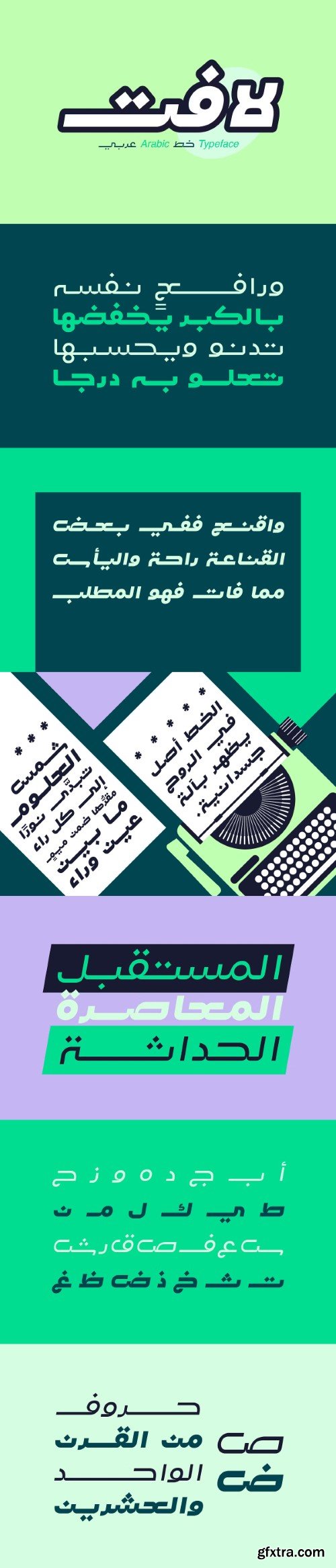
Lafet (which is the Arabic word for catchy) is an Arabic typeface that features a dynamic letterform design. Lafet's style reflects both modernity and simplicity. This typeface is suitable for design projects that may require energetic and powerful look. Lafet typeface consists of four styles (Regular, Bold, Regular Oblique and Bold Oblique).

- Aktiv Grotesk is a condensed sans-serif typeface designed by Dalton Maag, first released in 2010. It is characterized by its versatility and functionality, making it suitable for a variety of branding exercises that require a diverse typographic palette. The font family includes multiple styles, such as Light, Regular, Medium, Bold, and their respective italics, amounting to a total of 24 styles available through platforms like Adobe Fonts. Aktiv Grotesk is noted for its clean lines and modern aesthetic, often described as a “Helvetica killer” due to its balance between neutrality and authority. The design aims to remove the quirks found in Helvetica while infusing a bit of warmth reminiscent of Univers. This makes it an excellent choice for projects that need to convey professionalism without being overly aggressive. Aktiv Grotesk is a modern, versatile typeface suitable for a wide range of design applications, from branding to web design, with a strong emphasis on clarity and professionalism.


Analoga Sans Font Family
Analoga Sans was developed by Fernando Pérez while studying a Typographical Design masters at the Gestalt Studies Center in Mexico. Inspired by grotesque sans-serif shapes and the fluidity from humanist typefaces, this family seeks to reconcile both worlds in a proposal that is defined by typography blocks.


https://www.myfonts.com/collections/fazon-font-tour-de-force
Compact and condensed, Fazon font family belongs to design inspired by vintage typefaces. It is available in 7 weights – from Light to Black. Contrast in letter design gets higher as weights get thicker which assigns dose of display elements in heavier weights of Fazon. Contains 5 stylistic sets (4 for uppercase and 1 for lowercase letters) and fractions. Fazon covers extended Latin character map. Ideal usage: packages and labels, posters, titles, websites.

Etrusco Now Font Family
https://www.myfonts.com/collections/etrusco-now-font-italian-type
Etrusco Now is the revival of a lead typeface originally cast in lead by Italian foundry Nebiolo in the early 1920s. Heavily inspired by the design of the Medium weight of Schelter & Giesecke's Grotesk, Etrusco was, like Cairoli, an early precursor of the modernist grotesque superfamilies: a solid, multi-purpose "work-horse" typeface family that could solve a wide range of design problems with its range of widths and weights.


126,000 Royalty-Free 3D Model

Udemy Türkçe


Top Rated News
- CreativeLive Tutorial Collections
- Fasttracktutorials Course
- Chaos Cosmos Library
- MRMockup - Mockup Bundle
- Finding North Photography
- Sean Archer
- John Gress Photography
- Motion Science
- AwTeaches
- Learn Squared
- PhotoWhoa
- Houdini-Course
- Photigy
- August Dering Photography
- StudioGuti
- Creatoom
- Creature Art Teacher
- Creator Foundry
- Patreon Collections
- Udemy - Turkce
- BigFilms
- Jerry Ghionis
- ACIDBITE
- BigMediumSmall
- Globe Plants
- Unleashed Education
- The School of Photography
- Visual Education
- LeartesStudios - Cosmos
- Fxphd
- All Veer Fancy Collection!
- All OJO Images
- All ZZVe Vectors
- CGTrader 1 CGTrader 2


