
Rekall Font Family
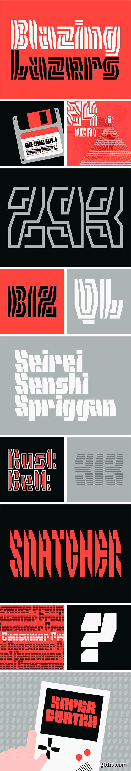
This is not a typeface that is legible in big and small. Rekall by Shiva Nallaperumal is the forceful display family that is putting decipherability to a test.
The design started as a logotype and typeface for a high-fashion streetwear brand. Fitting the spirit of the clothing, Nallaperumal wanted to create letters that are both aggressive and street-smart. He decided on futuristic stencil elements with sharp features that form the underlying logic of the design rather than the usual method of designing letterforms first and then “cutting” into them. Taking all liberties that come with designing a reckless display typeface, Nallaperumal increased the aggressiveness in the spiky, compressed Light weight, making it even harder to read, while the Heavy stretches out into chunky blocks. The amount of white space within and between the letters stays the same across all five weights/widths. This and the consistent x-height makes it easy to use a combination of several styles in the same word or line enabling very animated settings. (Predictably, Rekall will be available as a variable font in the future.) Five decorated styles, from the outline stencil Factory to the radient, striped Techno or Infra, round out the striking palette and cry out for being used on posters, record sleeves, t-shirts and boards.

126,000 Royalty-Free 3D Model

Udemy Türkçe


Top Rated News
- CreativeLive Tutorial Collections
- Fasttracktutorials Course
- Chaos Cosmos Library
- MRMockup - Mockup Bundle
- Finding North Photography
- Sean Archer
- John Gress Photography
- Motion Science
- AwTeaches
- Learn Squared
- PhotoWhoa
- Houdini-Course
- Photigy
- August Dering Photography
- StudioGuti
- Creatoom
- Creature Art Teacher
- Creator Foundry
- Patreon Collections
- Udemy - Turkce
- BigFilms
- Jerry Ghionis
- ACIDBITE
- BigMediumSmall
- Globe Plants
- Unleashed Education
- The School of Photography
- Visual Education
- LeartesStudios - Cosmos
- Fxphd
- All Veer Fancy Collection!
- All OJO Images
- All ZZVe Vectors
- CGTrader 1 CGTrader 2


