
Raisonne Pro Font Family
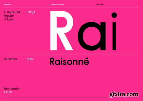
Raisonné is a geometric sans-serif type initially designed in and around the summer of 2010 and subsequently expanded upon, first in 2012 and again in 2018. After several years of internal and external customisations, assorted expansion inquiries, and miscellaneous bouts of sketching, its original single weight—Demibold—is now complemented by Light and Regular weights in tandem with corresponding obliques and an expanded character set.
Raisonné was initially conceived as a single font, replete with idiosyncracies, that would comprise the written portions of a comprehensive catalogue raisonné: an output required of each Graphic Design MFA candidate at the Yale School of Art. The typeface is parodic-serious, intended to be blunt, candid, and affable all at the same time. It outwardly pays homage to noteworthy precedents, among them Rudolf Koch’s Kabel (1927) & Victor Caruso’s later redrawing for ITC (1976), Joseph Churchward’s Crossbred (1970s), Paul Renner’s Futura (also 1927), and Herb Lubalin’s Avant Garde (1968). Raisonné is available in three weights (Light, Regular, and Demibold) with corresponding obliques. It is licensed in both Standard (‘STD’) and Professional (‘PRO’) versions. The latter contains additional Latin language support, a multitude of stylistic alternates, and several supplementary marks and symbols. 

126,000 Royalty-Free 3D Model

Udemy Türkçe


Top Rated News
- CreativeLive Tutorial Collections
- Fasttracktutorials Course
- Chaos Cosmos Library
- MRMockup - Mockup Bundle
- Finding North Photography
- Sean Archer
- John Gress Photography
- Motion Science
- AwTeaches
- Learn Squared
- PhotoWhoa
- Houdini-Course
- Photigy
- August Dering Photography
- StudioGuti
- Creatoom
- Creature Art Teacher
- Creator Foundry
- Patreon Collections
- Udemy - Turkce
- BigFilms
- Jerry Ghionis
- ACIDBITE
- BigMediumSmall
- Globe Plants
- Unleashed Education
- The School of Photography
- Visual Education
- LeartesStudios - Cosmos
- Fxphd
- All Veer Fancy Collection!
- All OJO Images
- All ZZVe Vectors
- CGTrader 1 CGTrader 2


