
Sanomat Font Family
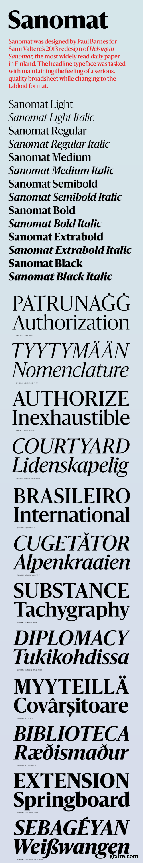
Sanomat was drawn by Paul Barnes as the primary headline typeface for Sami Valtere’s 2013 redesign of the Helsingin Sanomat, the most widely read quality national daily newspaper in Finland. The redesign shifted the paper’s format from a large-scale broadsheet to the much smaller tabloid size. The tabloid is laid out on a strict grid of square elements, and Sanomat was designed to play against this, with its organic form bringing life and warmth to the precise underlying page structure.
Sanomat is an unusual hybrid: a serif face with flared sans terminals, influenced by ‘serifless romans’ like Optima and Albertus. This almost inscriptional quality helps the typeface look serious and decidedly upscale—very important traits in maintaining the feel of a quality broadsheet in the tabloid format. The gentle curves and humanist sentiment are designed to echo Finnish twentieth century architecture and design. Though Sanomat was originally drawn for editorial design, its distinctive personality adapts easily to other environments. For example, its elegance feels appropriate to fashion and beauty, and its warmth can breathe life into otherwise sterile layouts on screen. 

126,000 Royalty-Free 3D Model

Udemy Türkçe


Top Rated News
- CreativeLive Tutorial Collections
- Fasttracktutorials Course
- Chaos Cosmos Library
- MRMockup - Mockup Bundle
- Finding North Photography
- Sean Archer
- John Gress Photography
- Motion Science
- AwTeaches
- Learn Squared
- PhotoWhoa
- Houdini-Course
- Photigy
- August Dering Photography
- StudioGuti
- Creatoom
- Creature Art Teacher
- Creator Foundry
- Patreon Collections
- Udemy - Turkce
- BigFilms
- Jerry Ghionis
- ACIDBITE
- BigMediumSmall
- Globe Plants
- Unleashed Education
- The School of Photography
- Visual Education
- LeartesStudios - Cosmos
- Fxphd
- All Veer Fancy Collection!
- All OJO Images
- All ZZVe Vectors
- CGTrader 1 CGTrader 2


