
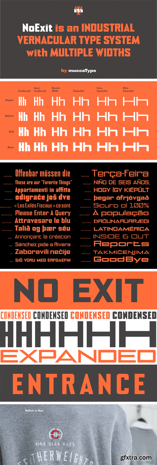
NoExit Font Family
Sometimes a simple site becomes the source of a complex system. In our first site visit after being hired to design the branding of the yet-to-be Chicago Athletic Association Hotel, we stumbled on an old “STAIRWAY” sign whose pointed uppercase letter "A" stood out against the mechanic aspect of the rest of the letters.
That discrepancy was love at first sight. In a very short time we developed a type system that felt mechanically efficient while being slightly naïve at the same time. NoExit is a no-nonsense typeface with a few quirks to break the sturdiness of the rigid orthogonal system that now is the main typeface of the Hotel. To avoid the dull predictability of square geometric typefaces, we drew the uppercase A, W, V and Y with unexpected triangular shapes devised to break the all-orthogonal geometry of the fonts''s texture. The extended weights and widths family makes it the perfect choice for any design that requires precision and authority. From magazine titles to street signage, this font will support any test that needs strength and straightforwardness. 

126,000 Royalty-Free 3D Model

Udemy Türkçe


Top Rated News
- CreativeLive Tutorial Collections
- Fasttracktutorials Course
- Chaos Cosmos Library
- MRMockup - Mockup Bundle
- Finding North Photography
- Sean Archer
- John Gress Photography
- Motion Science
- AwTeaches
- Learn Squared
- PhotoWhoa
- Houdini-Course
- Photigy
- August Dering Photography
- StudioGuti
- Creatoom
- Creature Art Teacher
- Creator Foundry
- Patreon Collections
- Udemy - Turkce
- BigFilms
- Jerry Ghionis
- ACIDBITE
- BigMediumSmall
- Globe Plants
- Unleashed Education
- The School of Photography
- Visual Education
- LeartesStudios - Cosmos
- Fxphd
- All Veer Fancy Collection!
- All OJO Images
- All ZZVe Vectors
- CGTrader 1 CGTrader 2


