
Categories: GFXTRA Special » Special Fonts
https://www.boldmonday.com/typeface/bilo/
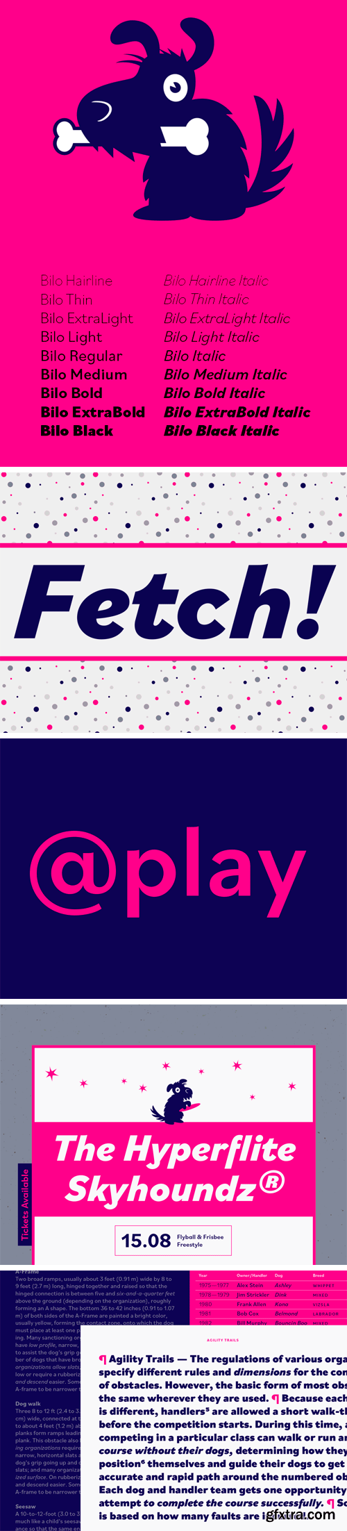
Bilo is a grotesque in the literal sense of the term, some may say. Pieter van Rosmalen challenges many of the common design practices that aim for smooth curves and harmoniously progressing rounds. The ‘o’ or ‘e’ in the bolder styles, for instance, are not circular but rather oblong, egg-shaped ovals. In lighter styles, the sharp curves are also visible at the top and bottom of round characters giving Bilo an unusual and charming feel.


126,000 Royalty-Free 3D Model

Udemy Türkçe


Top Rated News
- CreativeLive Tutorial Collections
- Fasttracktutorials Course
- Chaos Cosmos Library
- MRMockup - Mockup Bundle
- Finding North Photography
- Sean Archer
- John Gress Photography
- Motion Science
- AwTeaches
- Learn Squared
- PhotoWhoa
- Houdini-Course
- Photigy
- August Dering Photography
- StudioGuti
- Creatoom
- Creature Art Teacher
- Creator Foundry
- Patreon Collections
- Udemy - Turkce
- BigFilms
- Jerry Ghionis
- ACIDBITE
- BigMediumSmall
- Globe Plants
- Unleashed Education
- The School of Photography
- Visual Education
- LeartesStudios - Cosmos
- Fxphd
- All Veer Fancy Collection!
- All OJO Images
- All ZZVe Vectors
- CGTrader 1 CGTrader 2


