https://www.myfonts.com/fonts/fontfont/dora-display/
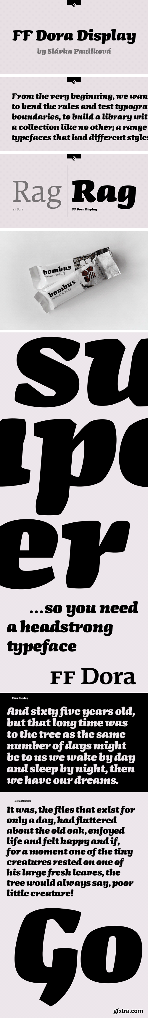
FF Dora Display is the Display version of FF Dora. It provides advanced typographical support with features such as ligatures, small capitals, alternate characters, case-sensitive forms, fractions, and super- and subscript characters. It comes with a complete range of figure set options – oldstyle and lining figures, each in tabular and proportional widths.
https://www.myfonts.com/fonts/paratype/romanovsky/
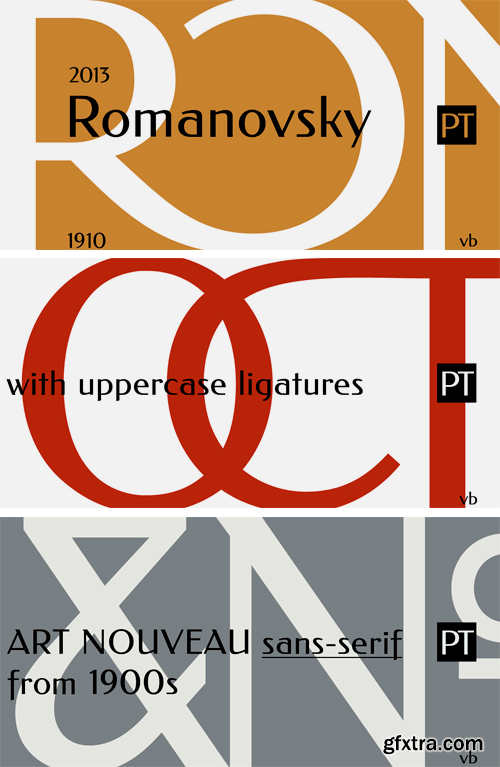
Romanovsky is the font developed on the base of samples from the catalogue of Osip Lehman foundry in Sankt Petersburg. Original Latin design that was used for Romanovsky can be found in Feder Grotesk by Jacob Erbar. The current digital font is not a scanned version of Lehman’s samples but a newly drawn typeface that differs from the original in many details. Romanovsky is a sans serif typeface with narrow proportions and noticeable contrast. It will be good for headings and display matters. Character set covers languages of Western and Central Europe and Cyrillic-based languages. It also contains around 20 ligatures of uppercase letters for the most frequent combinations. Designed by Vasily Biryukov. The bold weight was developed together with Olexiy Volochay. Released by ParaType in 2013.
https://www.myfonts.com/fonts/scholtz/arabesque/
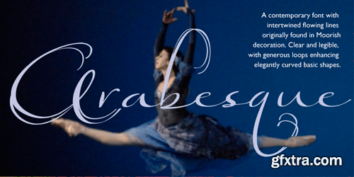
Arabesque is a romantic, ornamental font, in which intertwining, flowing lines and generous loops enhance the beauty of the basic shapes. Arabesque successfully combines legibility with a decorative, sumptuous style. In its European interpretation it was also called “Moresque”.
The font “Ability” was the origin of Arabesque, however, numerous, subtle changes set it apart. Arabesque, is characterised by a small x-height and relatively large ascenders and descenders (loops). The loops are created out of two or three delicate, intertwined lines that contrast with the much less expansive bowls and shapes of the lowercase letters. The capitals, more complex and composed of intertwined lines, echo the elegance of the loops on the lowercase letters. As a result of these changes “Arabesque” is both more readable, controlled and extravagant than “Ability”.
Suggestions for use:
- wedding stationery
- greeting cards
- valentines day media
- beauty products media
- lingerie tags
- women’s magazine pages
- classical music media
- award certificates
- magazine pages
The font is fully professional: carefully letterspaced and kerned. It contains over 235 characters - (upper and lower case characters, punctuation, numerals, symbols and accented characters are present). It has all the accented characters used in the major European languages. Arabesque works well in Application packages such as Microsoft Word that do not support professional kerning.
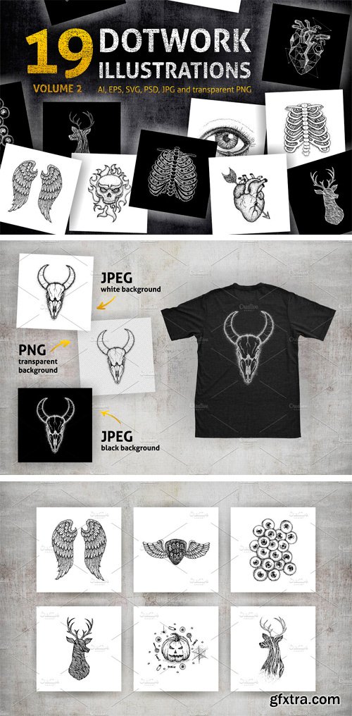
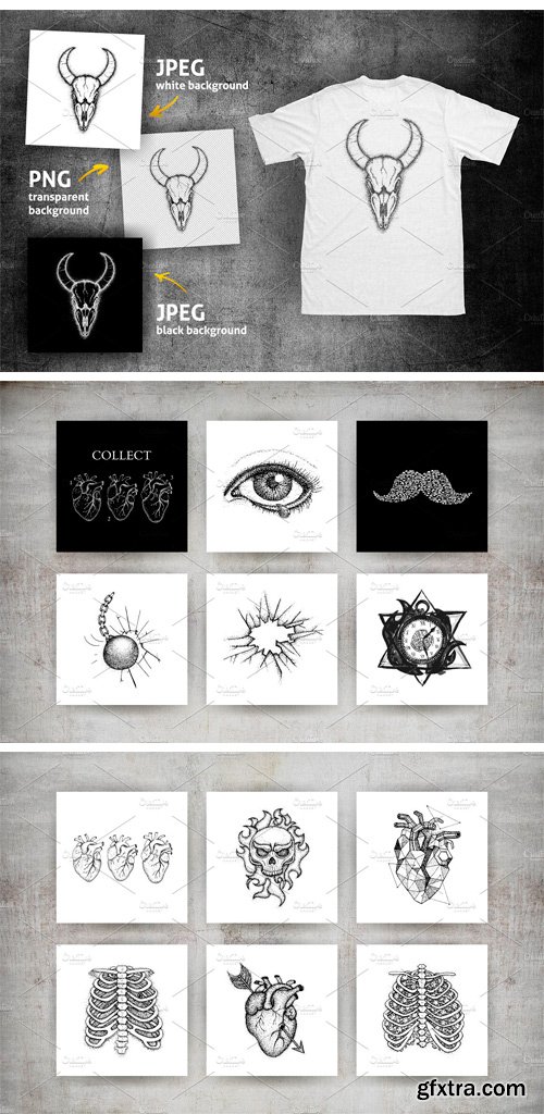
CM 1621986 - Dotwork Sketches Volume 2
Big bundle of hand drawn Dotwork Sketches. Traced vector illustrations in trendy hipster themes. Good choice to use in modern prints, posters, postcards, T-shirts, tattoo sketch etc. Bundle includes 19 Dotwork Sketches with different stipple illustrations over black and white backgrounds.
100% traced vector file format, all path are closed:
• AI 10;
• EPS 10;
• SVG;
high resolution 5000x5000 px raster file format:
• PNG over transparent background;
• JPG over white background;
• JPG over black background;
• layered PSD.
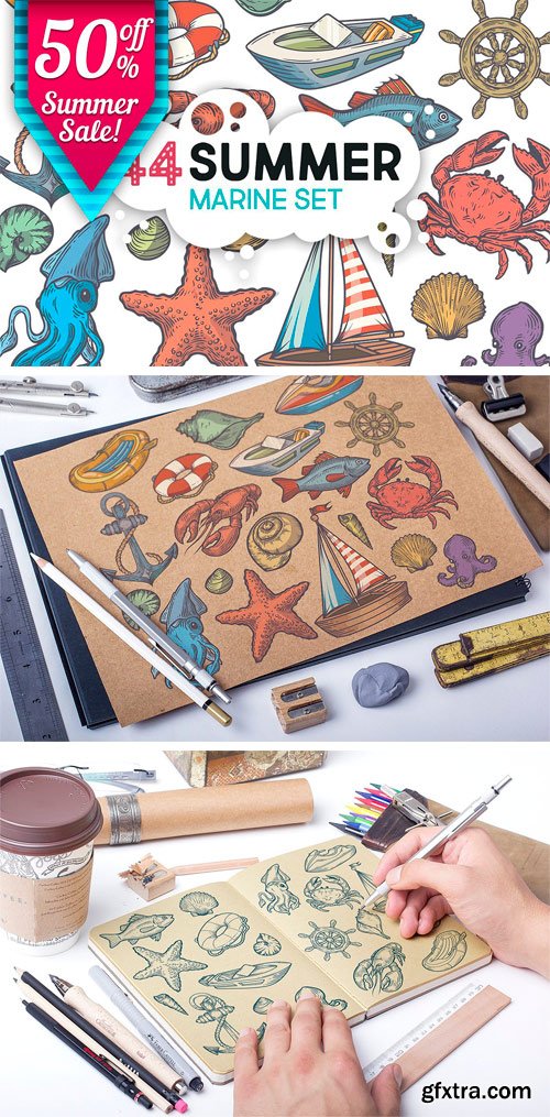
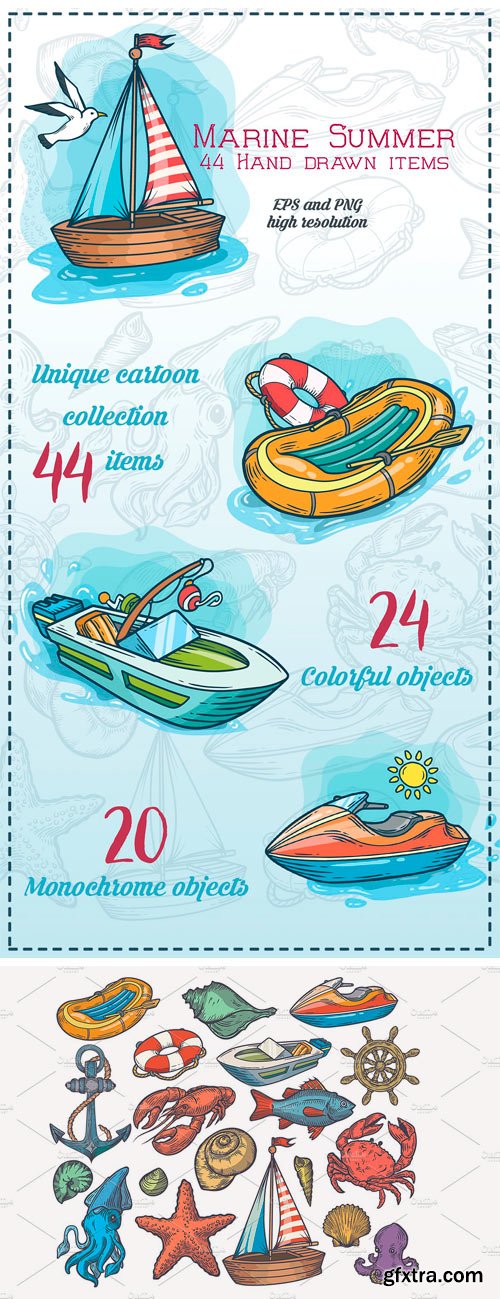
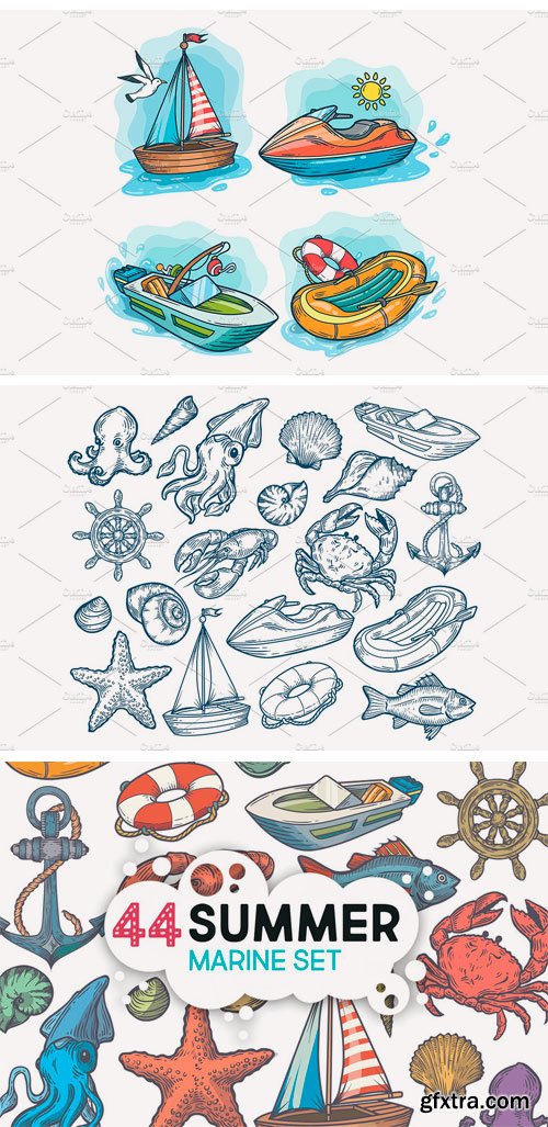
CM 1643073 - Summer Marine Hand Drawn Set
Ships, starfish, anchor, fish , crab, mussels, oysters, prawn, shrimp, squid, lobster, cancer, omar, octopus, clam sketch vector set. Hand drawn engraved illustration. Marine Healthy seafood. Marine transportation.
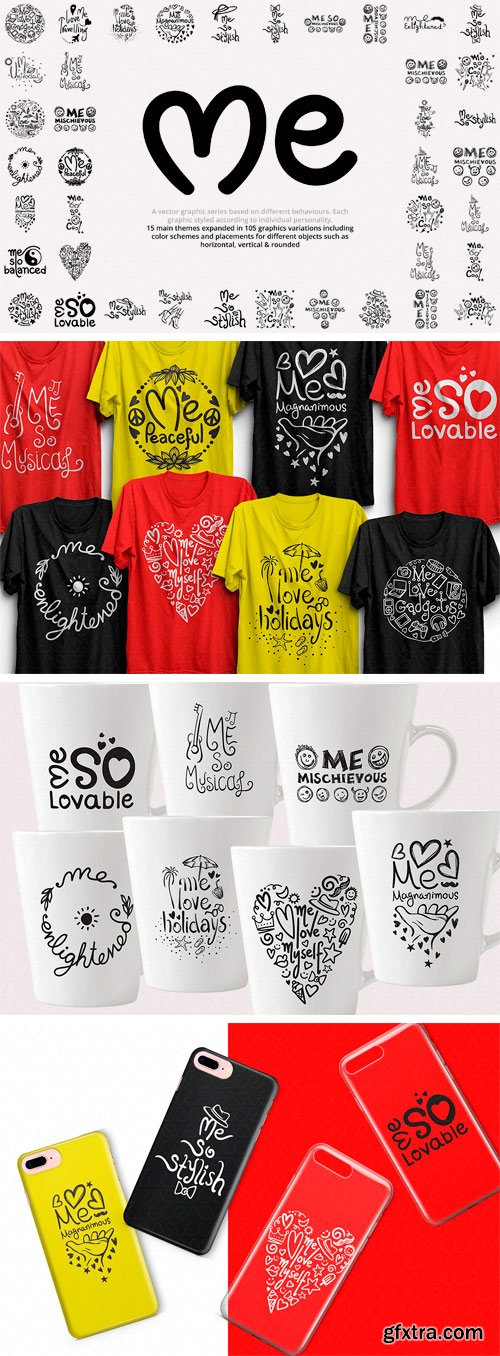
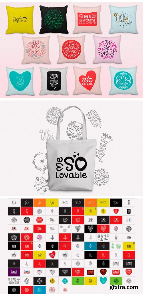
CM 1603562 - "Me" Graphics Series Vector Bundle
Vector graphic handwritten / calligraphic design composition series based on different behaviours of individuals. Each graphic styled according to individual personality. 15 main themes expanded in 105 graphics variations including color schemes and placements for different objects such as horizontal, vertical & rounded. These graphics are best suitable for the printed products like, 3d/2d/UV mobile phone cases, sublimation T-shirts, mugs, pillows, tote bags, stickers etc.
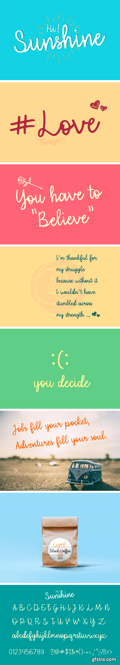
CM 1583183 - Hi Sunshine | Script Font
Hi Sunshine is cute and can be used on cards, posters, merchandise, book covers, websites, packaging, and basically anywhere you like. The overall feel of the font is simple and warm, elegant and informal and it is perfect if you want to convey a sense of friendliness and style.
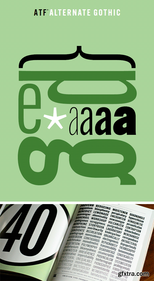
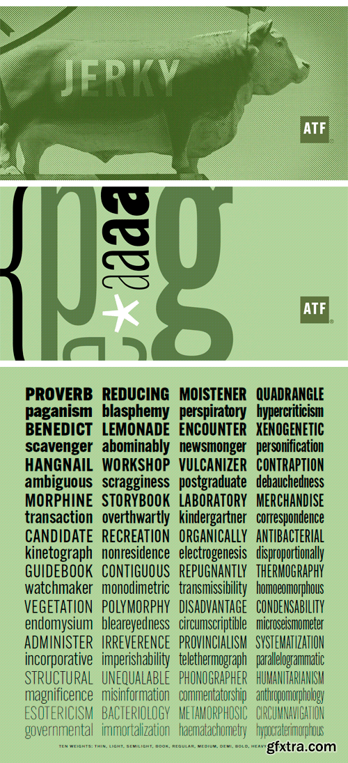
http://www.myfonts.com/fonts/tb-atf/alt-gothic-atf/
ATF Alternate Gothic is a new, significant digital expansion of Morris Fuller Benton’s classic 1903 type design. Originally available in one bold weight, the metal typeface came in three slightly different widths for flexibility in copy-fitting layouts. ATF Alternate Gothic has impact at any size. Its letterforms are instantly familiar: Benton’s original metal type family was used throughout the 20th century in newspapers, magazines, and advertising, providing “strong and effective display” in a compact space. Monotype issued its own metal version for machine typesetting, and Alternate Gothic likely served as inspiration for Linotype’s ubiquitous Trade Gothic® Bold and Bold Condensed. ATF Alternate Gothic expands on the characteristics that perhaps made Trade Gothic so popular, providing a wider range of weights and widths to address the needs of today’s designers and technologies. The space-saving clarity of ATF Alternate Gothic brings readability to the world of advertising typefaces. With its finely graded range of ten weights, with four widths of each weight (40 fonts total), this extensive type family can be used to pack a lot into a narrow space, and the range makes it easy to create variations of an advertisement or announcement for different formats and media. The tall x-height and narrow proportions, combined with a relatively low waist and springy, tension-filled forms, make ATF Alternate Gothic strong and effective in display. All ten weights have been carefully spaced for readability, caps and lowercase work well together, while attention-grabbing all-caps settings are clear and never crowded, no matter how narrow.
http://www.fontsmith.com/fonts/fs-joey
FS Joey was the offspring of a project with Rudd Studio to develop a logotype for an online streaming TV service, in 2008. While under wraps, the secret project was code-named Kangaroo. The logotype led to a second project, to design a corporate typeface for the service. It was the first big project Fernando Mello had worked on with Jason Smith. “Like any designer who just joined a team, I was very excited about it, drawing and sketching lots of ideas. I remember Jason and I experimenting with lots of possibilities, for both the logo and the typeface.”
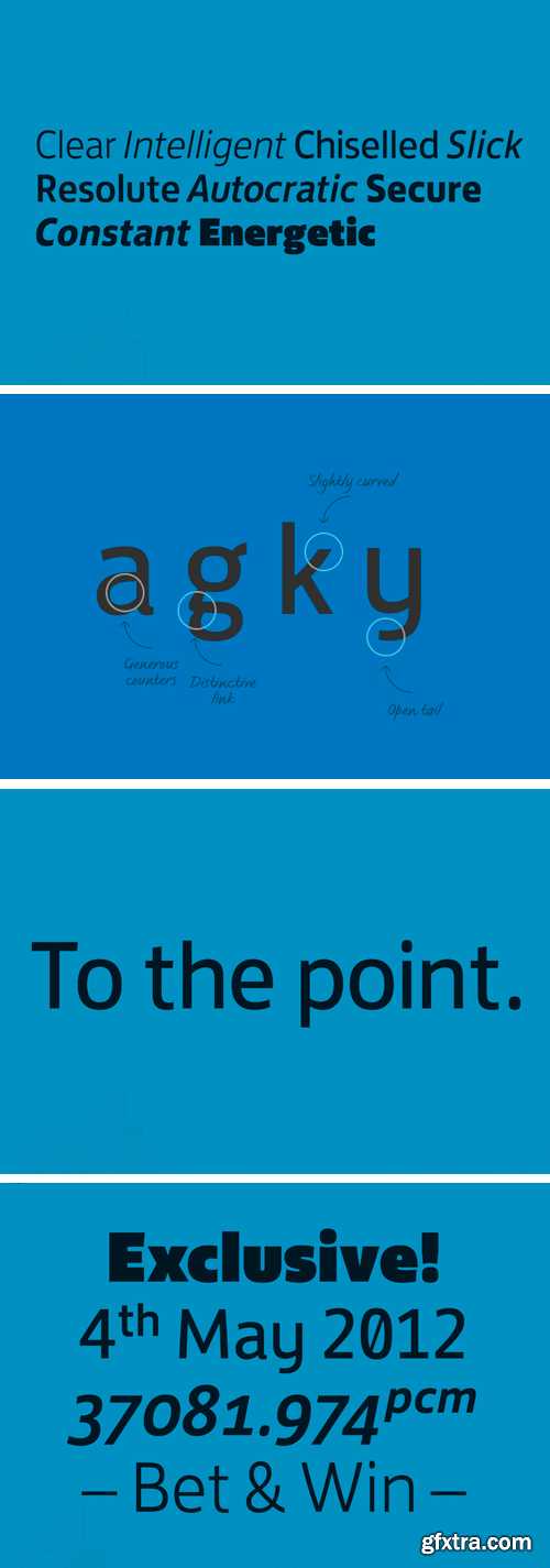
http://www.fontsmith.com/fonts/fs-jack
It was a forensic examination by Jason Smith of his existing designs that laid the groundwork for FS Jack. Jason made a list of unique characteristics that would give the sans serif font its typographic thumbprint, which included an unusually large x-height and slightly off-the-wall letters like the lower-case “a”, “g”, “k” and “y”. “I wanted to make something that was slightly uncomfortable,” says Jason, “and in doing so simplify the quirkiness down to a few letters.” Fernando Mello did “the rest of the cooking”, filling the design out and making the additional weights.
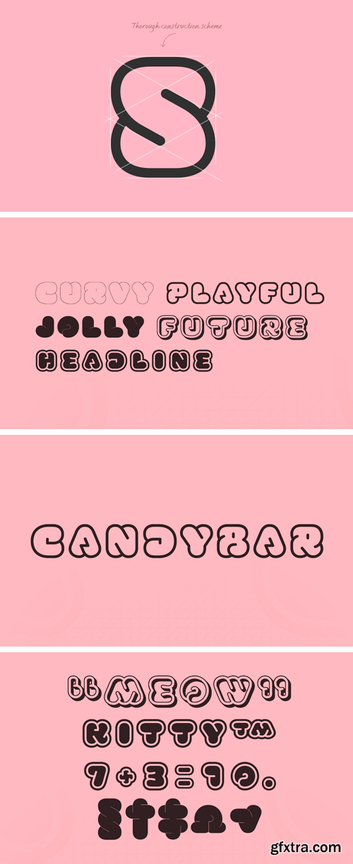
http://www.fontsmith.com/fonts/fs-kitty
FS Kitty is the type equivalent of Bagpuss: plump, cute, cuddly and not fond of exercise. So don’t go giving it a run-out on body copy; FS Kitty is an all-caps font made for showing off in posters and headlines, and on products, point-of sale and especially sweets.
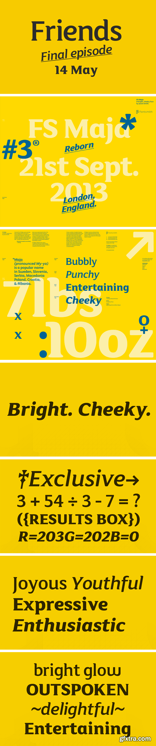
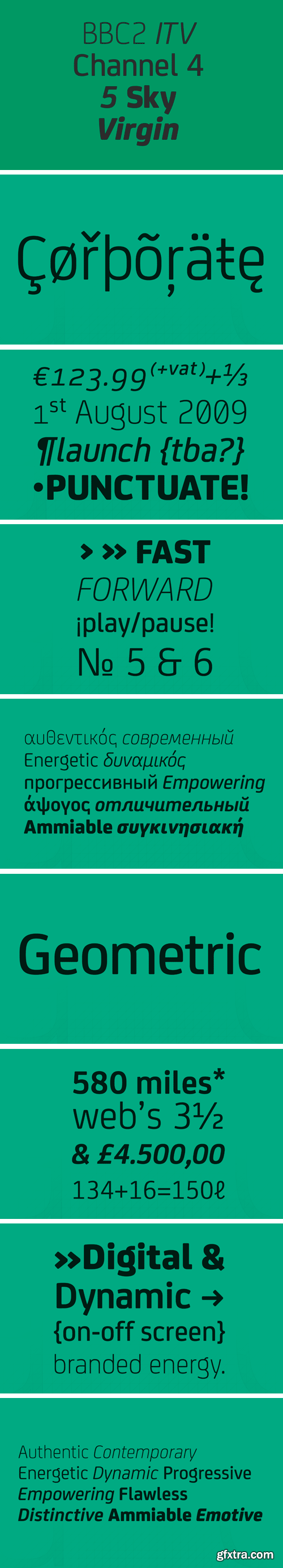
http://www.fontsmith.com/fonts/fs-maja
Fontsmith received a brief to develop a font that would form part of the broadcast identity for the UK’s first digital Freeview channel – E4. It needed to work seamlessly in text and display, both in print and on-screen, and please the eye of the target audience, 18-34-year-olds. So, young, fresh and informal.
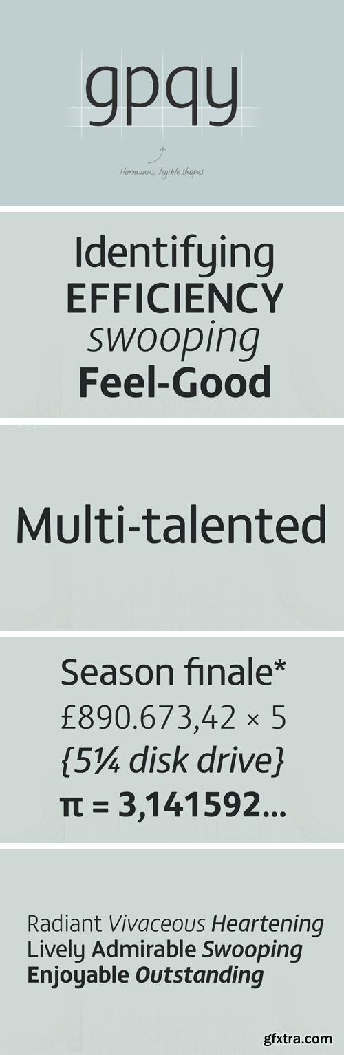
http://www.fontsmith.com/fonts/fs-matthew
For not the first time, Fontsmith was commissioned to develop a font for one of the UK’s terrestrial TV channels. The product was a clearly-defined three-weight family. When italics were added, it became FS Matthew, a clean, stylish, structured sans serif with swooping, open curves and a bright, lively personality.
SermonBox - Seasonal Collection

SermonBox - The Series Pack Collection
Top Rated News


Would you like to be a Author?


