Citix Font
TTF
https://www.fontspring.com/fonts/eurotypo/citix
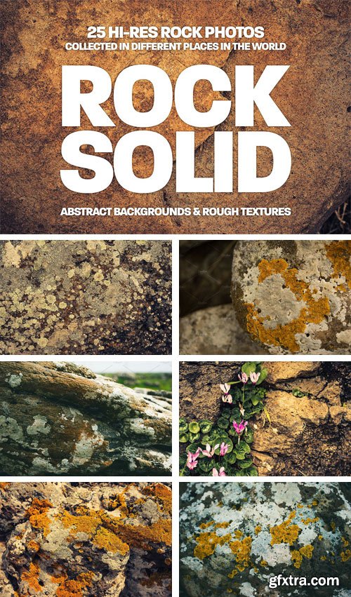
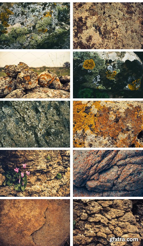
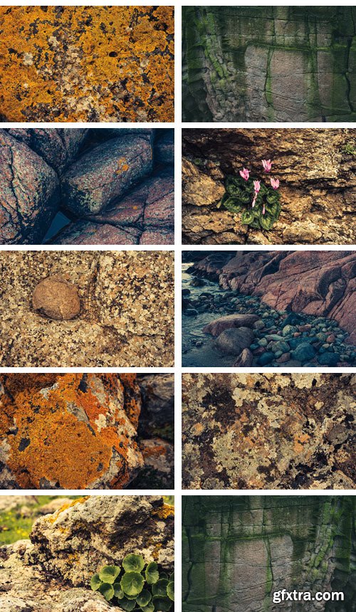
CM - Rock Solid - Rock & Stone Collection 1865062
A collection of hi-res rock and stone backgrounds/textures collected in different places in the world (Israel, Norway and the Netherlands). Mostly covered with moss and lichen they create abstract, colorful backgrounds. Some images also include plants, flowers and water.


CM - 10 Multi-pages Brochure - Big Bundle 1868558
This Mega Brochure Bundle included 10 unique,Clean and Professional Editable Corporate Multipages Brochure.
FEATURES
• 300 DPI Print Ready!
• CMYK Color mode
• Fully Editable
• High Resolution
• Use google fonts
• Everything pretty straight forward
• A4 International size 8.27 x 11.69 inc
• Use 0.25 Bleed
IN THE MAIN FILE WHAT INCLUDED FOR YOU?
• Adobe Illustrator .Ai Format File Included
• Help File
• How to place image .PDF
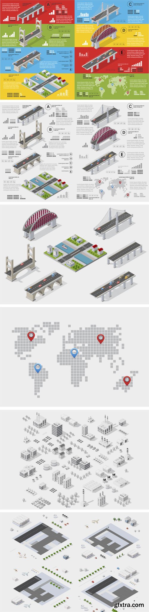
CM - Infographics of Bridges 1867969
Infographics of bridges in the field of industrial construction and heavy industry. Template for presentation and design. Total eventually you get .zip file download will contain:
• 6 x .jpg files (300dpi , 7000*4700px colorful design)
• 6 x .ai files ( colorful design)
• 6 x .eps files ( colorful design)
• 6 x .SVG files ( colorful design)
• Set of vector elements that may be needed creative designers.
• Scalable vector files suitable for print and web projects.
• All colors can be edited.
• You can simply edit colors in the supplied files.
• Set of vector elements include various types, sizes and colors of vector, raster objects.
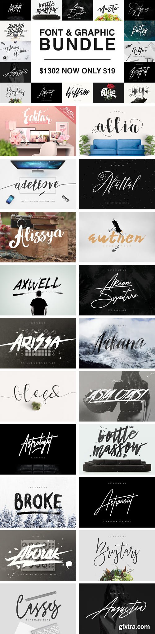
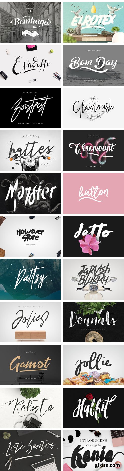
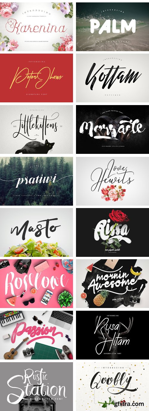
CM - Font & Graphic Bundle | 123 Fonts 1883029
Wow!! I just bundle all my items only in Creative Market, the normal price is $1,302! Download now and you can use all my fonts and graphics to make unlimited products for sale. 123 Total Fonts & FREE hundreds Mockups and Graphics. Font & Graphic Bundle Available in Three Files. You can see the description in the main files for the download Mockups & Graphics.
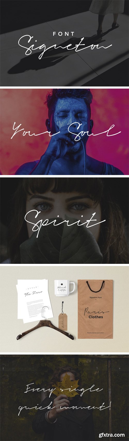
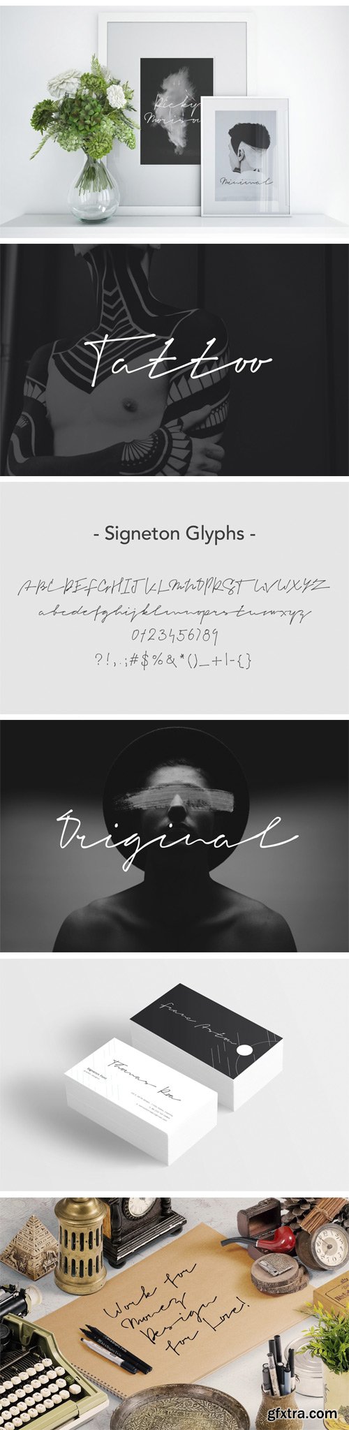
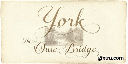
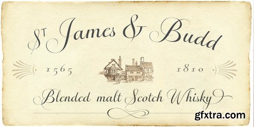
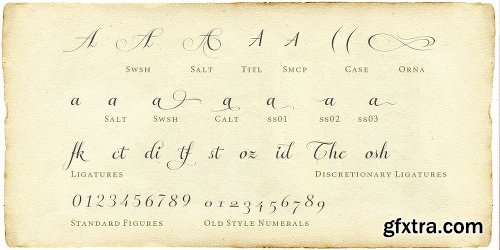
GR - Signeton | Font Script Signature 20102473
Give your designs an authentic handcrafted feel. “Signeton” is perfectly suited to signature, stationery, logo, typography quotes, magazine or book cover, website header, clothing, branding, packaging design and more. A handwritten script font containing upper and lowercase characters, numerals and a large range of punctuation.
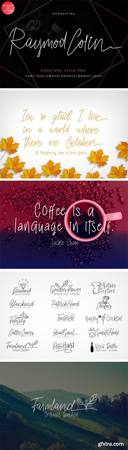
CM - Raymod Colin Font Duo 1884458
Raymod Colin Font is a hand lettering typeface, with authentic Clean and bold imperfections, and a very bouncy baseline It has a perfectly paired complimentary marker font , and a super handy set of bonus Swash. Ideal for logos, handwritten quotes, product packaging, header, poster, merchandise, social media & greeting cards.
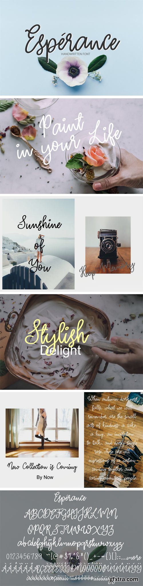
CM - Esperance | Handwritten Font 1882626
Esperance it's handwritten script font. This font a perfect for every project, wedding invitation or your blog. Also with their help, you can create a logo or beautiful frame for your home. Or just use for your small business, book covers, stationery and more. These fonts have multilingual support check it, to be sure, that it supports your language, type it into the box below.
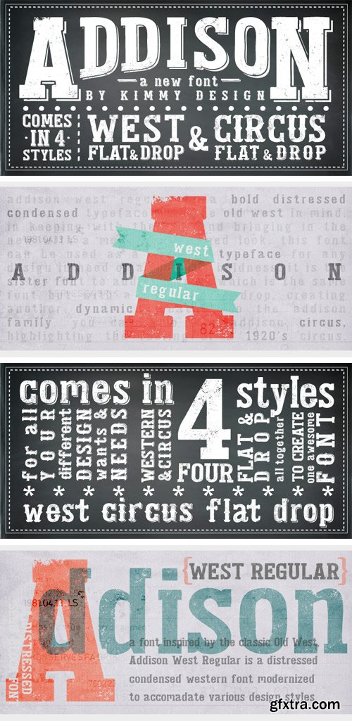
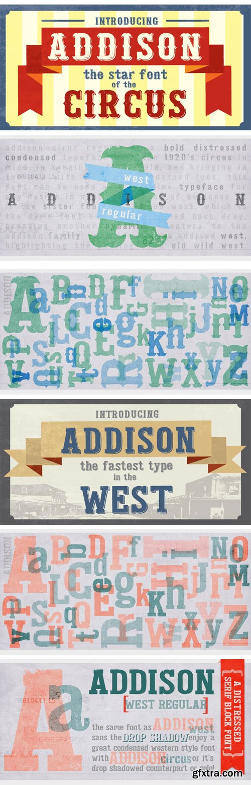
https://www.myfonts.com/fonts/kimmy/addison/
Addison is a typeface that brings together modern western styles with a rustic texture. Between Addison West, with thick block serifs, and Circus, a more decorative face, the two would bring an authentic and unique style to any artwork. The bold faces make a stand and standout for any design concept.
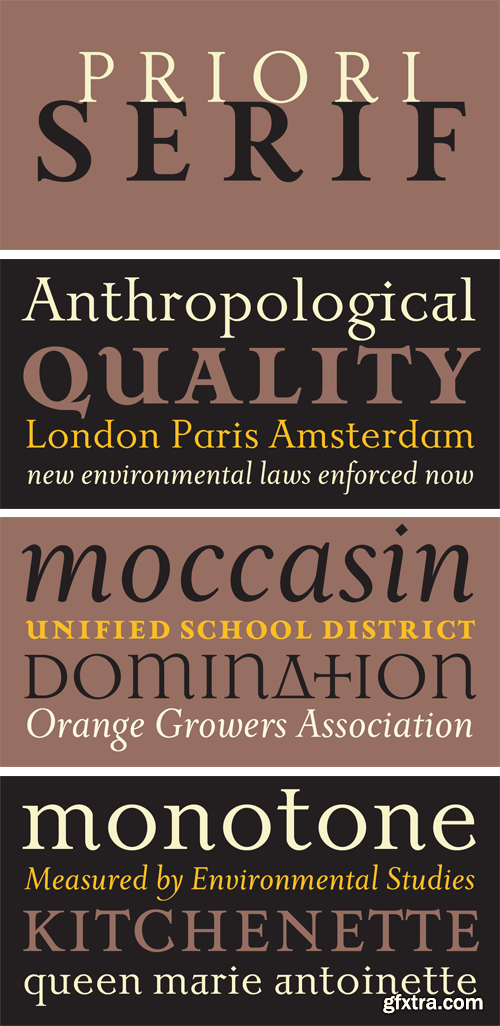
https://www.myfonts.com/fonts/emigre/priori-serif-ot/
After the popular successes of Exocet and Mason, Emigre has once again teamed up with Jonathan Barnbrook to bring you his latest venture into type land. Priori is a logical progression from Mason, a typeface he designed around ten years ago. Where Mason was designed purely for display purposes and featured only caps, Priori includes lower case, companion serif and sans serif versions, alternates and, according to its creator, is shooting for text face status - a bold claim from a designer who loves to wear his influences on his sleeve and who has little use for typography that aspires to be “neutral” or “transparent.” Like many of Barnbrook’s typeface designs, Priori is based on his interest in British typography of the early 20th century. It is inspired by the work of famous British typographers, such as Eric Gill and Edward Johnston. But it also embraces all of the signage and lettering that Barnbrook observes in the streets, cathedrals, and public buildings of his London neighborhood. This mixing of native influences with a contemporary pop culture intent is what gives Barnbrook’s types a distinct and unique flavor. Like its creator, Priori is a one of a kind.

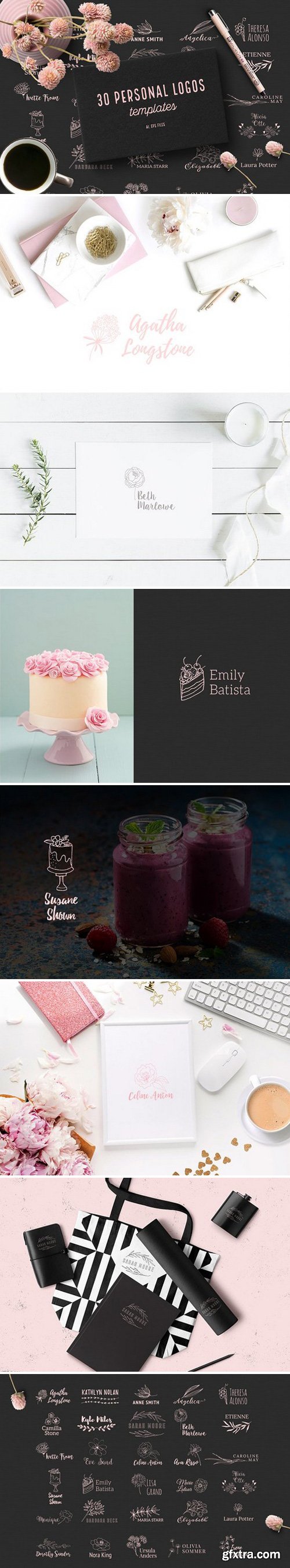
- AI and EPS files with 30 logos
- free fonts used, links in Font file

Monolite is a geometric sans serif display typeface. This geometric typeface is not to be messed with; its clear-cut edges and modern styling gives Monolite the attitude it needs to leave a lasting impression.
OTF | 1 Font | JPEG Preview | 5 Mb RAR


OTF | WOFF | 32 MB
Sale Page
Meet Veronia! An elegant, handwritten mono-line font family designed by Cindy Kinash and Callie Hegstrom. Available in four weights, with floral elements and decorative alternate letters. Veronia is perfect for stationery, greeting cards, invitations, magazines and websites and more.


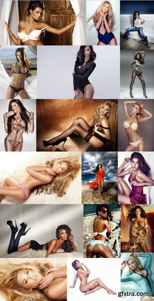
Shutterstock - Women Collection Vol.26


- We created a serif version of our popular Werk Sans Serif that will greatly enhance the Work family of fonts. Like Werk Sans Serif, WerkSerif is a sturdy, well-tuned font that is a true “werkhorse” with plenty of character without being overbearing.
- WerkSerif is an ideal choice for corporate branding offering a complete typographic solution with the sans and serif range of fonts — also a prime choice for distinctive and dynamic logotype use.WerkSerif comes in a range of offerings from Light to Regular, to bold and Black with matching Italics.
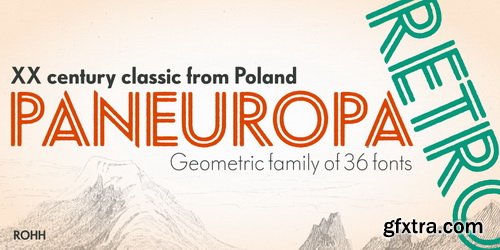
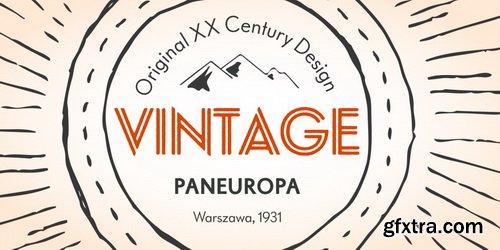
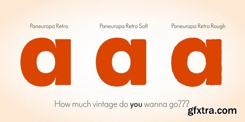
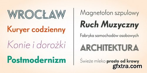
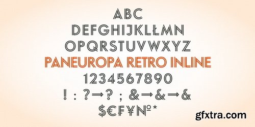
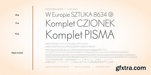
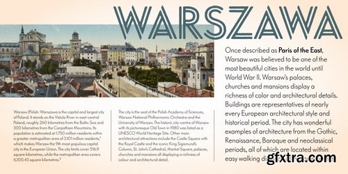
- Paneuropa Retro is a geometric, clean and versatile font family inspired by Paneuropa - XX-century Polish classic, made by Idzikowski foundry in Warsaw, 1931. Paneuropa was a reinterpretation of Paul Renner’s famous Futura - it was a bit narrower, with different proportions and letter endings. Paneuropa had completely different number and punctuation shapes than Futura. The family was extremely popular in Poland and was used for every kind of editorial use.
- Paneuropa Retro is a sibling to Paneuropa Nova (compeletely redrawn, modern version of the family with perfected letter forms, proportions and spacing, additional symbols, weights and italics).Retro family recreates the original typeface keeping its weights, as well as idiosyncrasies in letter shapes and spacing.
- Paneuropa Retro consists of 36 fonts - 5 weights + Inline style and their corresponding italics in three versions. It has extended support for latin languages, as well as broad number of OpenType features, such as case sensitive forms, fractions, superscript and subscript, ordinals, currencies and symbols.

Shutterstock - Women Collection Vol.25
SermonBox - Seasonal Collection

SermonBox - The Series Pack Collection
Top Rated News


Would you like to be a Author?


