
Learning Graphic Design: Set Perfect Text
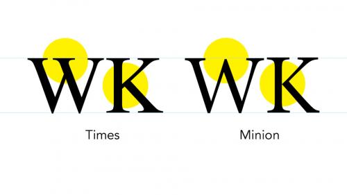
When type is the star of your design, you want to make sure to set it perfectly. lynda.com's Before & After guru John McWade shows us what good type looks like. He walks through choosing the right typeface and styling type—without using the automatic settings on which many designers rely. Instead, he counsels us to really see type and then adjust the letterforms so they are balanced and beautiful.


Related Posts
Information
Members of Guests cannot leave comments.
126,000 Royalty-Free 3D Model

Udemy Türkçe


Top Rated News
- CreativeLive Tutorial Collections
- Fasttracktutorials Course
- Chaos Cosmos Library
- MRMockup - Mockup Bundle
- Finding North Photography
- Sean Archer
- John Gress Photography
- Motion Science
- AwTeaches
- Learn Squared
- PhotoWhoa
- Houdini-Course
- Photigy
- August Dering Photography
- StudioGuti
- Creatoom
- Creature Art Teacher
- Creator Foundry
- Patreon Collections
- Udemy - Turkce
- BigFilms
- Jerry Ghionis
- ACIDBITE
- BigMediumSmall
- Globe Plants
- Unleashed Education
- The School of Photography
- Visual Education
- LeartesStudios - Cosmos
- Fxphd
- All Veer Fancy Collection!
- All OJO Images
- All ZZVe Vectors
- CGTrader 1 CGTrader 2


