
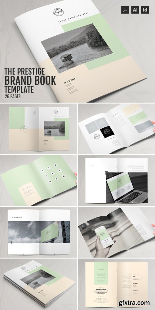
CM 530845 - The Prestige - Brand Manual Template
THE PRESTIGE : A magnificent 26 page brand manual template with a exquisite selection of colors and over the top design. Perfect for presenting your brand guidelines in an attractive yet professional manner. Featuring Adobe Indesign's colors swatches and character styles that let you add your brand colors and text on the fly.
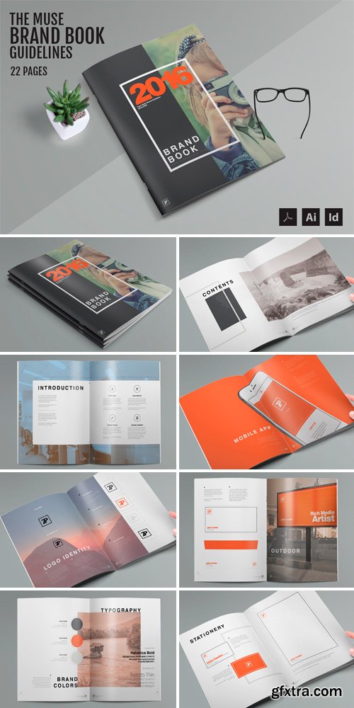
CM 530396 - The Muse - Brand Guide Template
THE MUSE : Get inspired by this gorgeous print ready US Letter size brand guide template with an attractive design. It lets you showcase your brand's logo designs and colors with style and finesse. Plus, you can fully customize the colors and text of this brand guidelines template in an instant using Color Swatch and paragraph style feature of Abode Indesign.
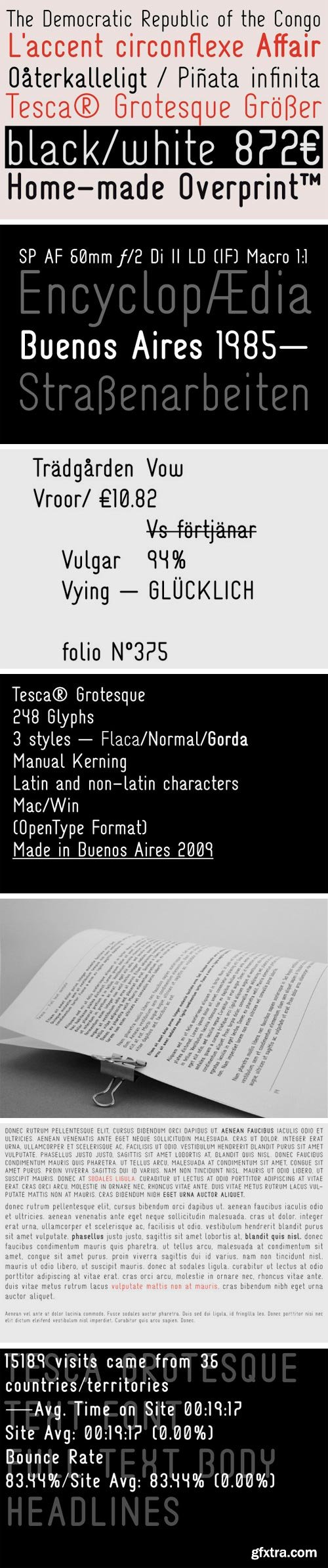
https://www.youworkforthem.com/font/T0279/tesca-grotesque
Tesca is a condensed modern grotesque typeface. Tesca is great for uses such as headlines or text body. Features Latin and non-latin glyphs.
OTF | 3 Fonts | JPG Preview | 1 Mb RAR

http://www.myfonts.com/fonts/fontmesa/black-rose/
Black Rose is the plain version of an old Bruce Type Foundry font called “Black Ornamented” created in 1873.
TTF | 1 Font | JPG Preview | 1 Mb RAR

http://www.myfonts.com/fonts/mawns/enlighten/
TTF | 1 Font | JPG Preview | 1 Mb RAR

http://www.myfonts.com/fonts/mawns/funkygraphy/
TTF | 2 Fonts | JPG Preview | 1 Mb RAR

http://www.myfonts.com/fonts/hanoded/wayang/
Wayang font was named after the beautiful shadow puppets from Indonesia. The font was hand made, using a bamboo pen and Chinese ink on rough, eco-friendly Italian paper. Wayang is spiky, ultra-thin, yet extremely legible. It comes with extensive language support.
OTF | 2 Fonts | JPG Preview | 1 Mb RAR

El Niño Font
Summer snow and Winter heatwaves, here it comes friends . .
It’s El Niño! Enjoy this wide distressed handwritten number sure to mix it up!
OTF | TTF | JPG Preview | 1 Mb RAR | SALE PAGE
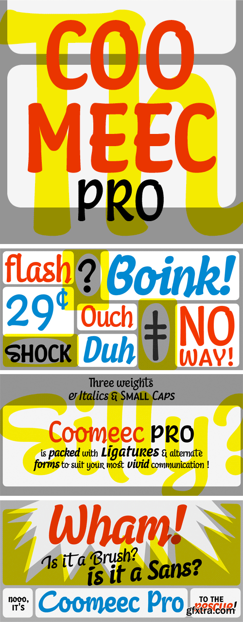
http://www.myfonts.com/fonts/linotype/coomeec-pro/
OTF | 4 Fonts | JPG Preview | 1 Mb RAR

http://www.myfonts.com/fonts/mawns/top-comic/
OTF | 1 Font | JPG Preview | 1 Mb RAR
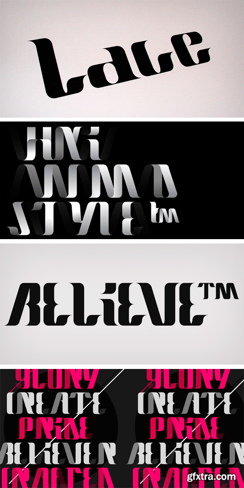
http://www.hypefortype.com/exclusive-faces/lace.html
OTF | 1 Font | JPG Preview | 1 Mb RAR

http://www.myfonts.com/fonts/madtype/brauhaus/
I enjoy and am inspired by many blackletter designs, but find that their uppercase characters are generally too complex to be very usable. I also found that very few, if any were designed with perfect 45 degree angles. I set out to design a textura blackletter with unique features and a usable uppercase. What resulted is an interesting, yet usable, geometric design with unusual features that make it stand out from existing texturas.
OTF | 3 Fonts | JPG Preview | 1 Mb RAR

http://www.myfonts.com/fonts/fontdiner/coffee-shop/
Don't let fashionable High Society types bring you down, head to the Coffee Shop where you can indulge in a Java-induced getaway for one thin dime!
TTF | 1 Font | JPG Preview | 1 Mb RAR

http://www.myfonts.com/fonts/fontdiner/automatic/
Grab a nickel and head to the Horn & Hardart Automat for a delightful cafeteria-style meal and enjoy modern living surrounded in this 1930s Art Deco style sans-serif!
TTF | 1 Font | JPG Preview | 1 Mb RAR

http://www.myfonts.com/fonts/corradine/alberto/
Based on the handwriting of Alberto Corradine, Manuel Corradine’s father.
OTF | 1 Fonts | JPG Preview | 1 Mb RAR

http://www.myfonts.com/fonts/bomparte/emerge/
Emerge BF was inspired by Admiral, c.1900, from the Keystone Type Foundry. Its relatively condensed proportions allow for a close fit in a distinctive, yet highly legible form. It’s a great choice for headlines and text settings (where it shows a beautifully crisp, typographic color) on book covers, magazine advertisements, posters and so forth.
OTF | 1 Font | JPG Preview | 1 Mb RAR

http://www.myfonts.com/fonts/sparkytype/tarnation/
TTF | 1 Font | JPG Preview | 1 Mb RAR

http://www.myfonts.com/fonts/letraset/oberon/
The fashion conscious will undoubtedly detect a touch of the '70s about Oberon with its free-flowing initial capitals and casual, script-like lowercase. British designer Phill Grimshaw has enhanced its appeal with a contour design in the letterforms and a wealth of alternative lowercase letters to choose from.
OTF | 1 Font | JPG Preview | 1 Mb RAR
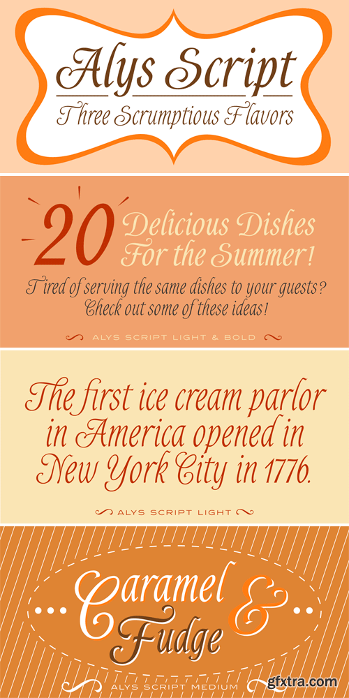
http://www.myfonts.com/fonts/redrooster/alys-rr/
TTF | 2 Fonts | JPG Preview | 1 Mb RAR
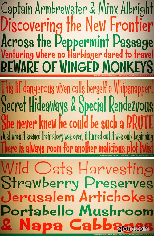
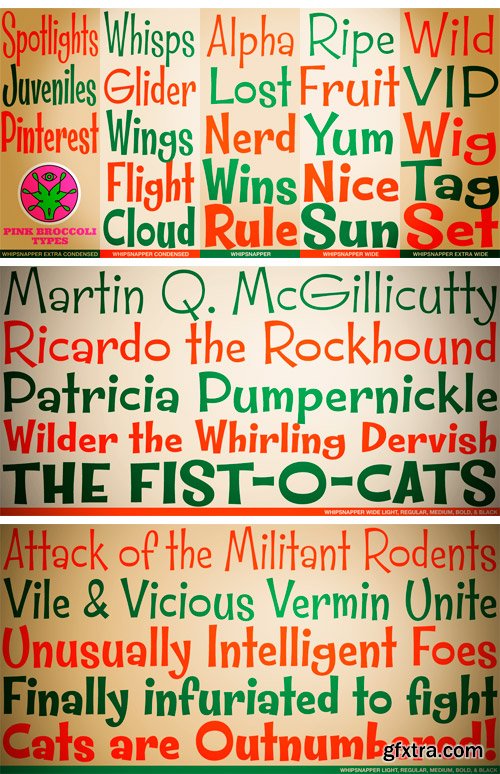
http://www.myfonts.com/fonts/pink-broccoli/whipsnapper/
A wild at heart offbeat sansserif family inspired not by any single pulp or vintage source but a varied collection of influences. Just an all-around fun typeface with the widths and weights to offer a wide variety of uses.
TTF | 23 Fonts | JPG Preview | 6.4 Mb RAR

http://www.myfonts.com/fonts/prop-a-ganda/pag-october/
Inspired by retro lettering on propaganda posters from the 30s to 50s. This is perfect font for your retrospective project.
OTF | 1 Font | JPG Preview | 1 Mb RAR
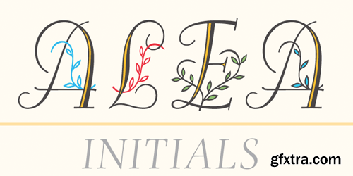
http://www.myfonts.com/fonts/astype/alea/
Alea is based on the drawings of Maria Balle. The floral, organic look of these bastard script initials will play well together with nearly all Didone designs and will give them a special note. Alea works perfectly with the Adana fonts also available from astype. The Opentype features Superior, Inferior & Numerator will activate the filling objects. Use these features on a new layer and choose your color to get up to three color layers.
OTF | 1 Font | JPG Preview | 1 Mb RAR
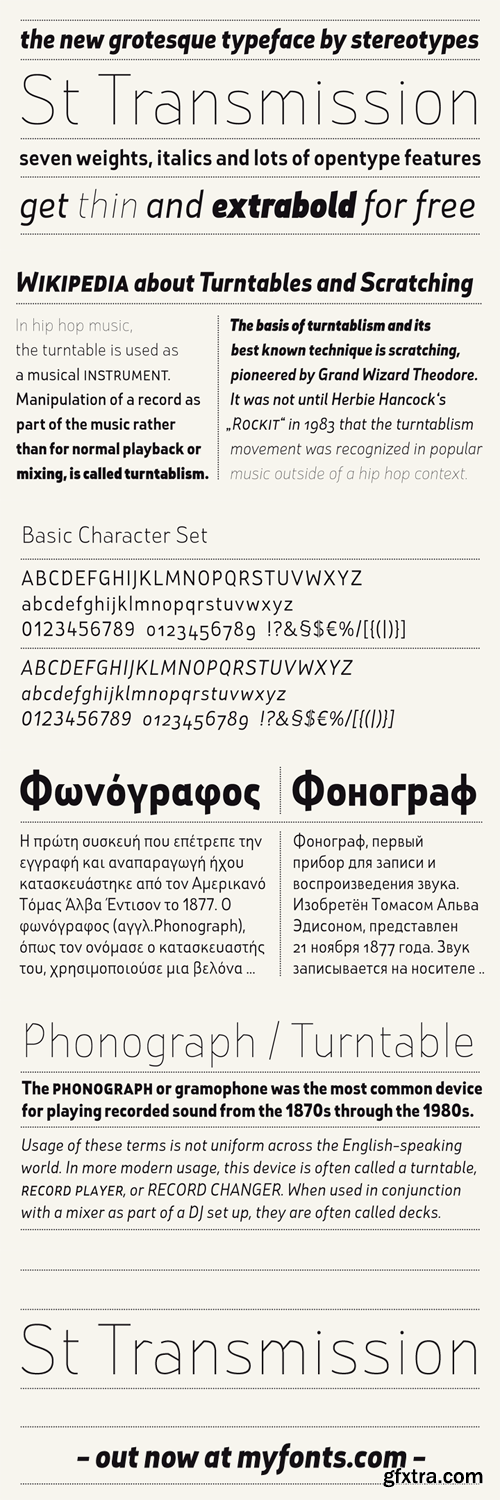
St Transmission was one of the first ambitious projects for Stereotypes. Building a complete family with a lot of weights along with the italics. Transmission supports extended Latin character set, plus Cyrillic and Greek.
OTF | 14 Fonts | JPEG Preview | 3 Mb RAR
126,000 Royalty-Free 3D Model

Udemy Türkçe


Top Rated News
- CreativeLive Tutorial Collections
- Fasttracktutorials Course
- Chaos Cosmos Library
- MRMockup - Mockup Bundle
- Finding North Photography
- Sean Archer
- John Gress Photography
- Motion Science
- AwTeaches
- Learn Squared
- PhotoWhoa
- Houdini-Course
- Photigy
- August Dering Photography
- StudioGuti
- Creatoom
- Creature Art Teacher
- Creator Foundry
- Patreon Collections
- Udemy - Turkce
- BigFilms
- Jerry Ghionis
- ACIDBITE
- BigMediumSmall
- Globe Plants
- Unleashed Education
- The School of Photography
- Visual Education
- LeartesStudios - Cosmos
- Fxphd
- All Veer Fancy Collection!
- All OJO Images
- All ZZVe Vectors
- CGTrader 1 CGTrader 2


