
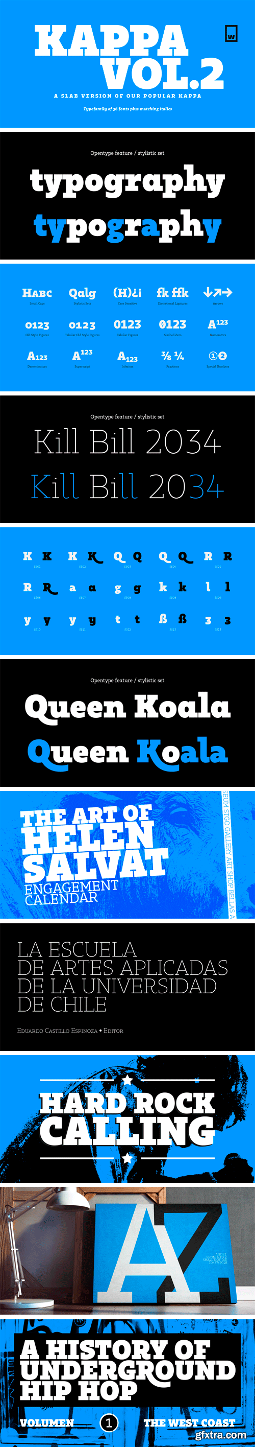
https://www.myfonts.com/fonts/without-foundry/kappa-vol2/
Kappa Vol.2 is the serif version of our popular Kappa. Just as Kappa sans, this font has a slight narrowed structure and a prominent ascender height, therefore this font is suitable for a large range of platforms. Moreover, due to its serif Kappa Vol.2’s level of legibility is more accurate, so when you use it alongside Kappa sans the results will be extremely effective.
https://thehungryjpeg.com/bundle/3465638-the-nursery-art-fonts-bundle/
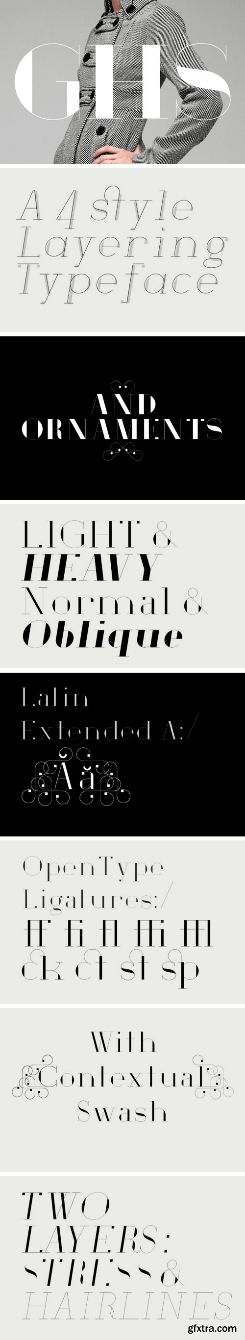
https://www.myfonts.com/fonts/houseofburvo/ghs/
GHS is an original font from HouseOfBurvo, designed and made by Matthew Burvill. GHS stands for Geometric Hairline Serif, it is a serif typeface that is geometric in structure, it has strong vertical stress and its stroke is hairline thin. This gives it a fashionable, stylish appearance for headlines and display.
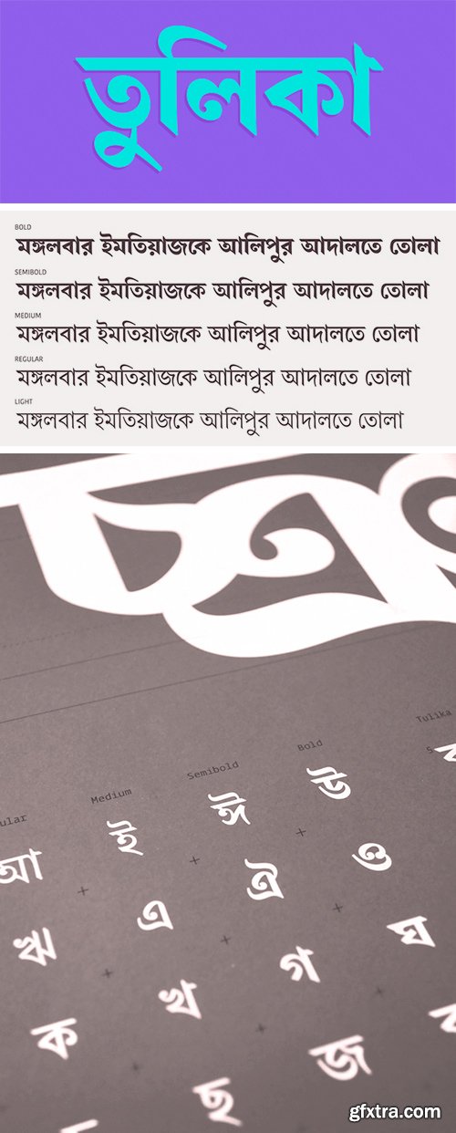
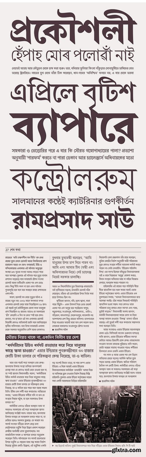
Tulika Bengali Font Family
Tulika is a text typeface inspired by traditional Bengali calligraphy. It features distinctive, sinuous shapes and a high contrast between thick and thin strokes. Tulika is a set of Unicode fonts suitable for setting books, magazines, newspapers and any other material which can benefit from its five weights and high legibility at small point sizes.
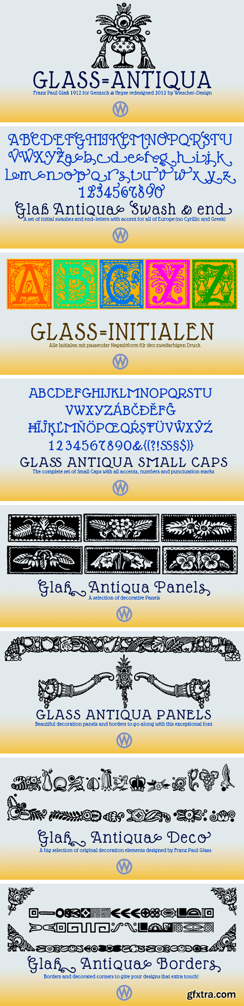
https://www.myfonts.com/fonts/wiescherdesign/glass-light/
Glass Light was designed in 1912 by Franz Paul Glass for the Genzsch & Heyse foundry. The font is stylewise related to the “Lo types” of the same period. Glass designed a lot of decorative elements to go along with the font. I added Swashes, endletters and smallcaps to the set to make it complete. Since this type of font will probably not be used by many professionals, I did not put all the letters into one big OTF-version since most people don't have OTF-savy software. These fonts can and should be mixed for optimal results.
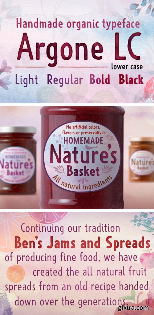
https://www.myfonts.com/fonts/deepak-dogra/Argone-LC/
Argone LC is a handmade organic typeface family. It is a variant of Argone typeface, but has lower case letters. It comes in four weights– light, regular, bold and black, which is a feature not seen much in handmade typefaces. This makes Argone LC a versatile and flexible type family. There is also a version of Argone LC which only has upper case letters – Argone.
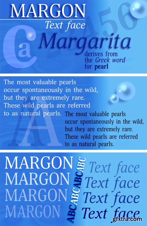
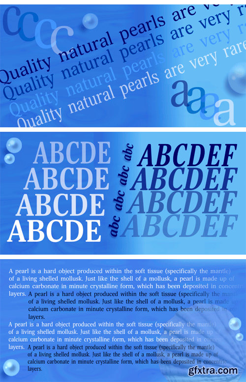
https://www.myfonts.com/fonts/paratype/margon/
Margon is a serif font family with a temperate design -- small serifs, moderate contrast, tiny roundings on the corners make it calm and serene.
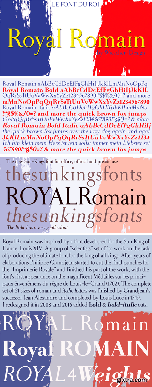
https://www.myfonts.com/fonts/wiescherdesign/royal-romain/
Royal Romain was inspired by a font developed for the Sun King of France, Louis XIV. A group of “scientists” set off to work on the task of producing the ultimate font for the king of all kings. After years of elaborations Philippe Grandjean then started to cut the final punches for the “Imprimerie Royale” and finished his part of the work, with the font’s first appearance in the magnificent Médailles sur les principaux énvenémens du règne de Louis-le-Grand (1702). The complete set of 21 sizes of roman and italic letters was finished by Grandjean’s successor Jean Alexandre and completed by Louis Luce in 1745.
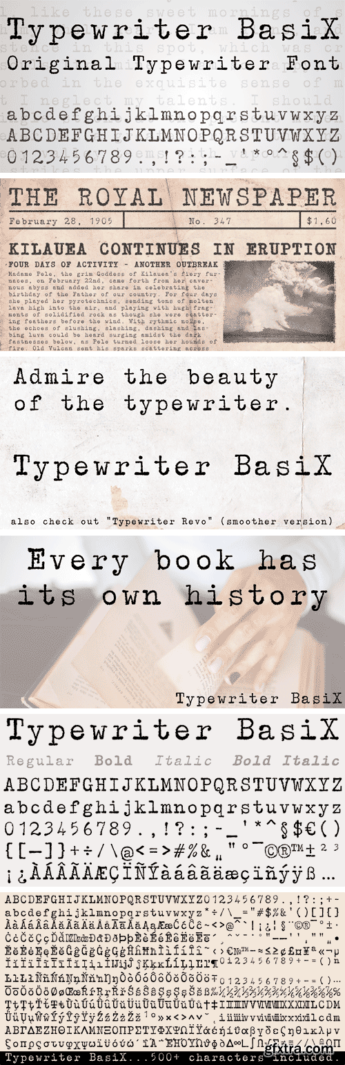
https://www.myfonts.com/fonts/matthias-luh/typewriter-basix/
I found an old typewriter and well... Typewriter BasiX is the result. Enjoy this rough retro looking design to use for your digital or print project and also check out Typewriter Revo, the clean version of Typewriter BasiX.
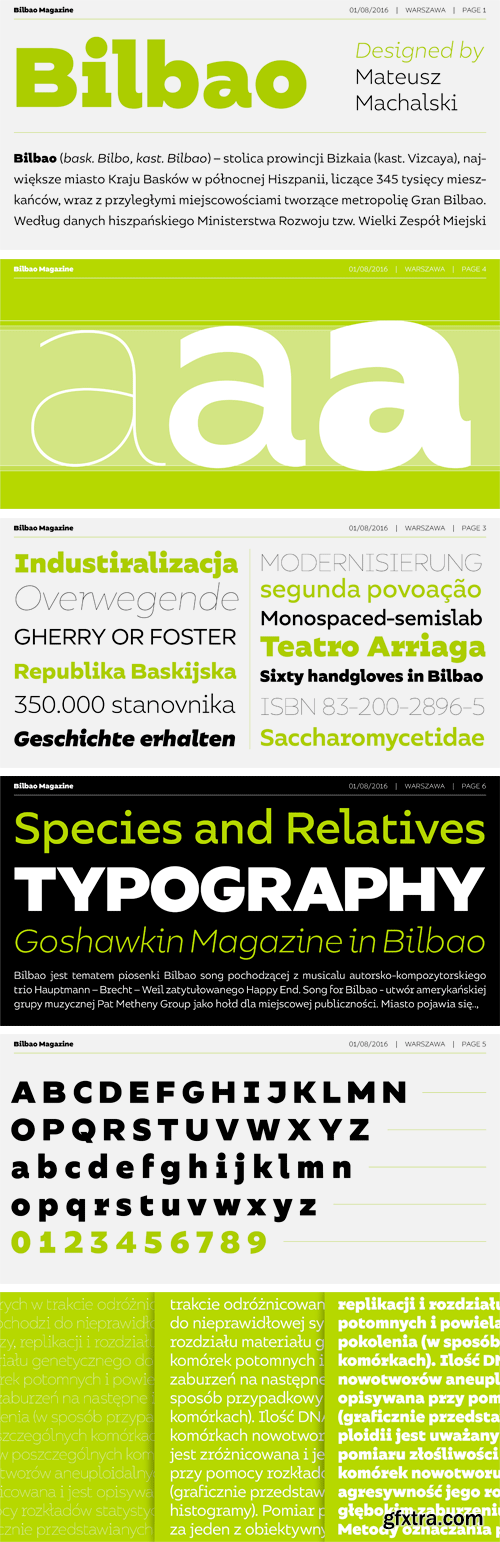
https://www.myfonts.com/fonts/borutta/bilbao/
Bilbao is a hybrid between sans, slab and mono fonts with geometric details. This typeface is defined by multiple features, which give it a friendly feeling. Bilbao is perfect for branding and display purposes. The entire family consist of 18 styles with italics from Thin to Bold.
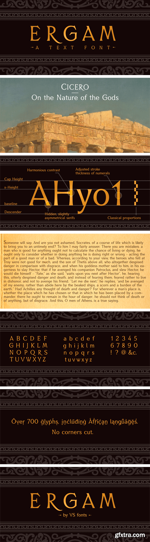
https://www.myfonts.com/fonts/vsf/ergam/
Ergam is a text font that goes even further than the average language support. Designed with great attention to detail and without cutting corners, it should serve you as a robust workhorse with a touch of elegance.
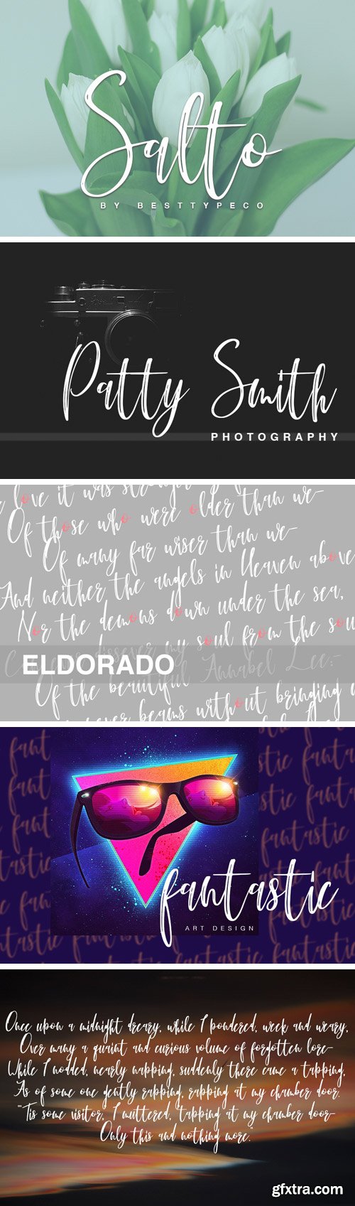
https://fontbundles.net/besttypeco/56111-salto
Salto - a new fresh handmade calligraphy font. Very suitable for greeting cards, branding materials, business cards, quotes, posters, and more!This font are perfect for wedding postcard. Or you can create perfect and unique design of your logo, blog, stationery, marketing, magazines and more :)
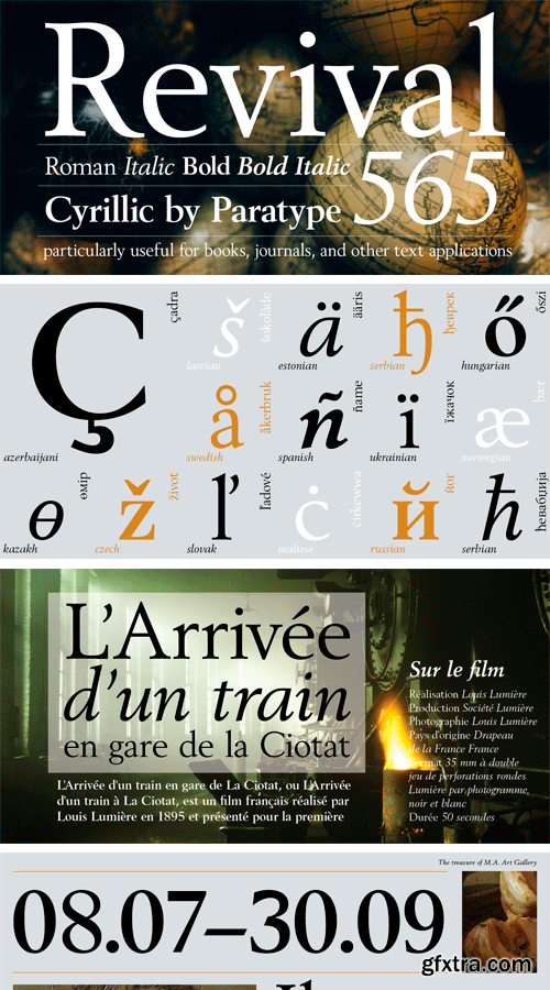

https://www.myfonts.com/fonts/paratype/revival-565/
Revival 565 is the Bitstream version of type Berling. The face was created by Karl-Erik Forsberg for the Swedish Berling foundry in 1951, with other weights added in 1958. The design is an old style roman, particularly useful for books, journals, and other text applications. Despite the fact that it has higher contrast than most old style typefaces, Berling has the classic features of old style romans with its small x-height, and ascenders that exceed the height of the capital letters. Berling is good for text settings as well as display work. Cyrillic version was developed for ParaType by Manvel Shmavonyan in 2008.
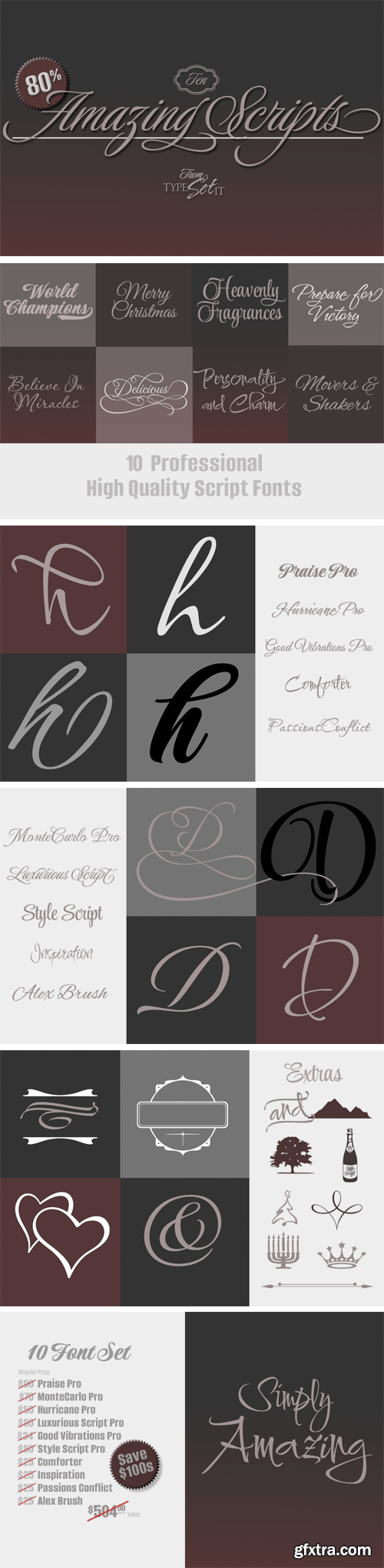
https://fontbundles.net/typesetit/36937-10-amazing-scripts-save-over-500
It's Absolutely Amazing! You can save a ridiculous amount of money on these powerful, high quality, professional script fonts. Rob Leuschke has been consistently creating specialized script typefaces for nearly 3 decades. His TypeSETit font foundry boasts distinctive font designs that have been some of the best selling work around. In this exclusive bundle, 10 of Rob's most popular fonts feature a diverse variety of the most professional script styles.
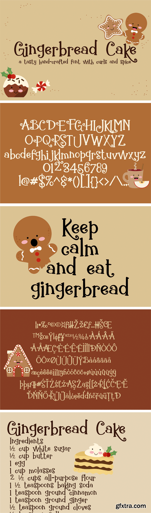
https://fontbundles.net/illustration-ink/113017-zp-gingerbread-cake
This hand-crafted font is sporting curls and spice. Don't let it's name fool you...it's good any time of the year!

https://www.myfonts.com/fonts/storm/regula/
Regula is a Baroque alphabet taken over from a historical model including the latter’s inaccuracies and uneven letter edges. It reminds one of the character of letterpress, but if we were to be consistent, the letters which repeat themselves should also differ from each other, which is not possible in the case of digital setting. It is named after the secular monastic order Regula Pragensis, in honour of the inspiration which emanates from every moment spent in the presence of the members of this order with a glass of some good beverage.
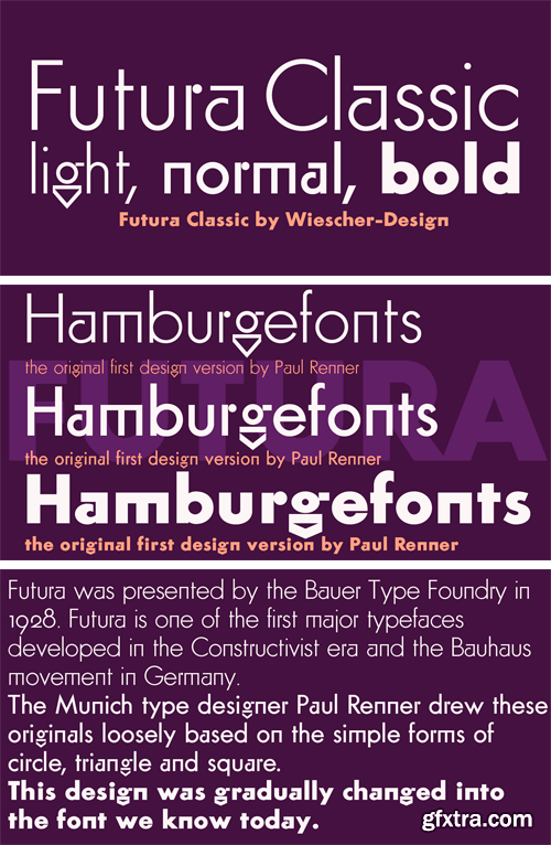
https://www.myfonts.com/fonts/wiescherdesign/futura-classic/
FuturaClassic is a recut of Paul Renners original Futura. This version was what Mr. Renner wanted the Futura to look like. He had to change his very stringent design because the market wanted a more pleasing typeface. I think the original design is worth saving because it is much more typical and has a personal and distinguished touch. I have also designed Geometra Rounded with rounded endings that looks more interesting than your usual DIN type.
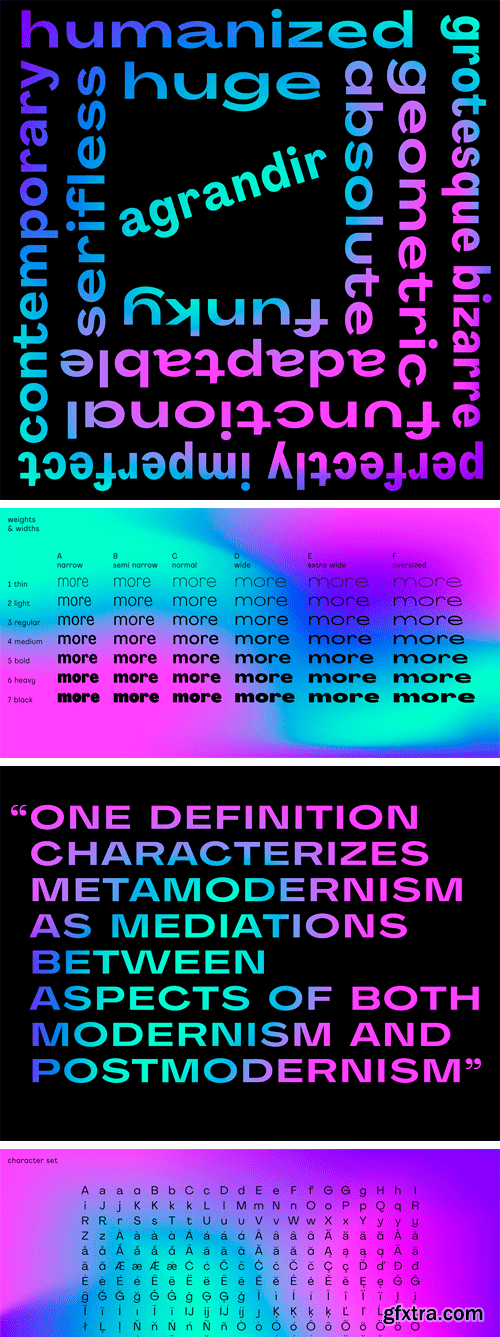
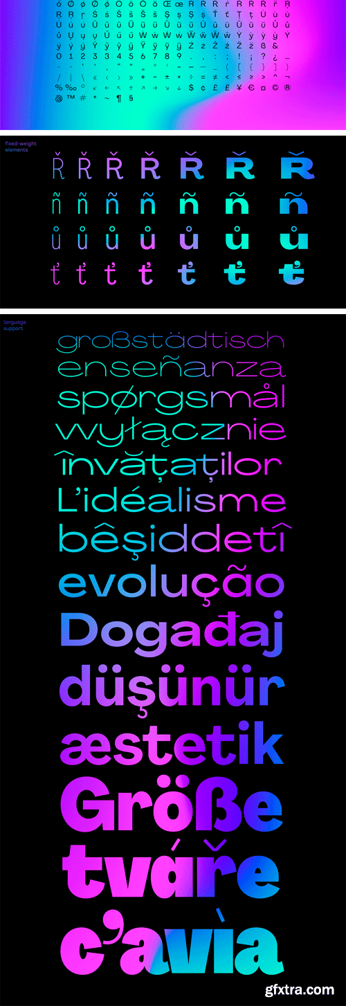
Agrandir Font Family
Agrandir is a contemporary serifless type family based on geometric yet humanized and imperfected shapes. The typeface consist of 42 fonts: 7 weights × 6 widths, from very thin and narrow to extremely black and oversizely wide. There’s a fairly good number of OpenType stylistic alternatives in Agrandir, which can be turned on individually or as style sets: Default (Mixed), Grotesk, Humanist and Geometric.
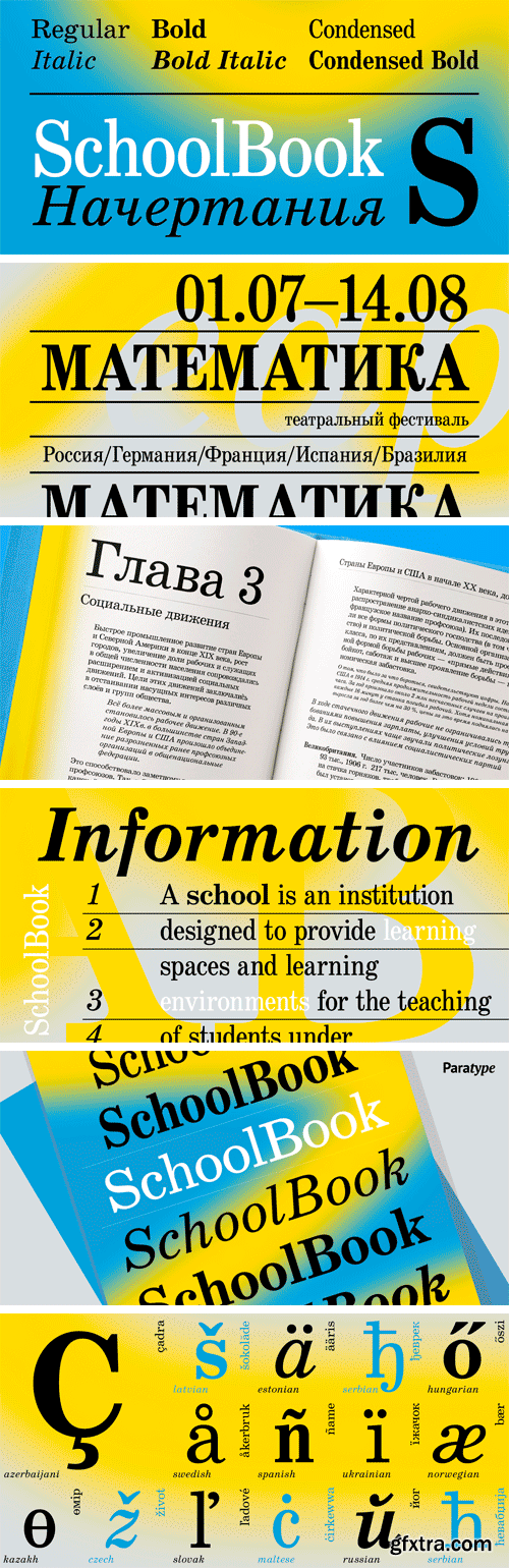
https://www.myfonts.com/fonts/paratype/school-book/
The typeface was designed at the Polygraphmash type design bureau in 1949-61 (project manager Elena Tsaregorodtseva). Based on Shkolnaya (‘School’) typeface, 1939 (project manager Evgeny Chernevsky), a version of Century Schoolbook of American Type Founders, 1915-1923 by Morris F.Benton. The low-contrast text typeface of the Ionic-Legibility group, it is designed expressly for schoolbooks and children books.
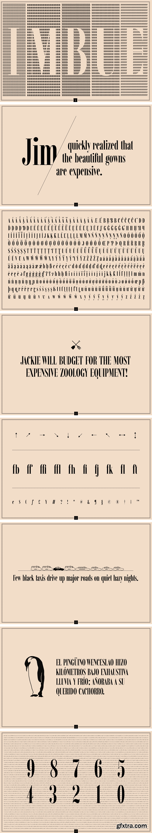
https://www.youworkforthem.com/font/T6740/imbue/
Imbue is a new take on a condensed Didone. It's characters are elegant and memorable, and most importantly, capable of getting attention at large and small sizes. It was designed in the June/July 2016.
https://www.myfonts.com/fonts/paratype/ariergard/
Type family of three weights was designed by Oleg Karpinsky in 2000-2001 and licensed by ParaType. It’s characterized by sharp geometrical letterforms and includes antique Cyrillic letter shapes: N has a diagonal stroke, uppercase Ó and × are equilateral. Both lc ã and ò have ascenders. For use in advertising and display typography.
https://www.myfonts.com/fonts/paratype/ariergard-rondo/
AriergardRondo is supplemental to Ariergard by the same author. It differs with sharp geometrical letterforms and with circular shapes of round letters. The face includes antique Cyrillic letter shapes: N has diagonal stroke, uppercase Y and Ч are equilateral. Both lc г and т have ascenders. For use in advertising and display typography.
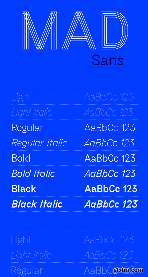
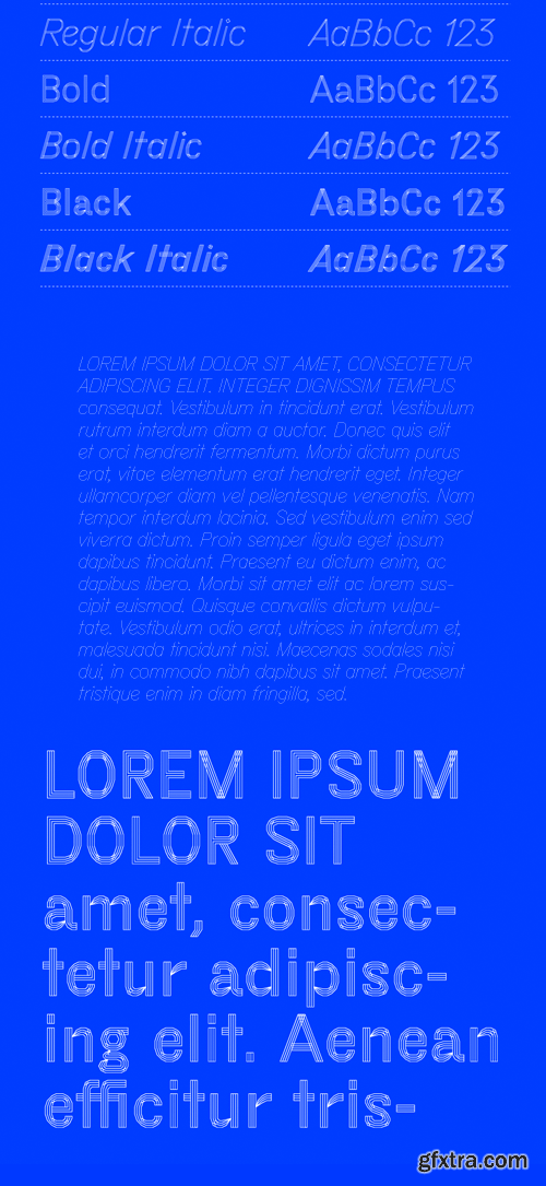
MAD Sans Font Family
MAD Sans is the blue collar workhorse of the MAD font family. It was built up from skeleton forms of found AutoCAD material, which became the structure of the Light weights. The family was then expanded with Regular and Bold weights with matching Italics using the Light weights as a framework for the expansion.
126,000 Royalty-Free 3D Model

Udemy Türkçe


Top Rated News
- CreativeLive Tutorial Collections
- Fasttracktutorials Course
- Chaos Cosmos Library
- MRMockup - Mockup Bundle
- Finding North Photography
- Sean Archer
- John Gress Photography
- Motion Science
- AwTeaches
- Learn Squared
- PhotoWhoa
- Houdini-Course
- Photigy
- August Dering Photography
- StudioGuti
- Creatoom
- Creature Art Teacher
- Creator Foundry
- Patreon Collections
- Udemy - Turkce
- BigFilms
- Jerry Ghionis
- ACIDBITE
- BigMediumSmall
- Globe Plants
- Unleashed Education
- The School of Photography
- Visual Education
- LeartesStudios - Cosmos
- Fxphd
- All Veer Fancy Collection!
- All OJO Images
- All ZZVe Vectors
- CGTrader 1 CGTrader 2


