
https://www.myfonts.com/fonts/tdf/stropha/
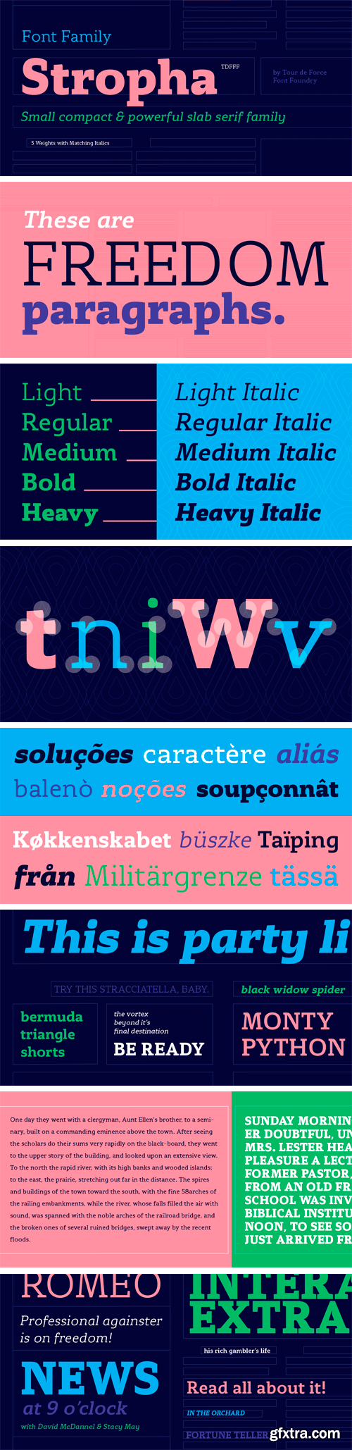
Stropha is compact slab serif font family that comes with matching Italics. With distinctive differences between letter stems and with five weights only, Stropha is imagined as small, but “all you really need” family. It’s original, with characteristic serifs, with deep ink traps, curvy top diagonal endings and gentle curvy touches in details. Contains Extended Latin character set. Fully applicable in any situation, from branding and editorial design to webfont usage.
https://www.myfonts.com/fonts/akufadhl/kertayasa/
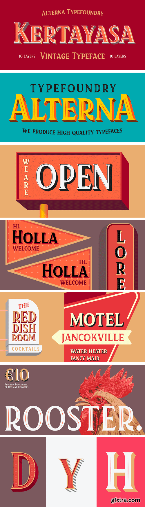
Kertayasa is a layered typeface inspired by an old signage and vintage letter painting. It consists of 10 layers, a wide support of latin languages, and some alternates. You will imbue beautifully vintage display typography in anything – including editorial and packaging – which you might create.
https://www.myfonts.com/fonts/paratype/lehmann-egyptian/
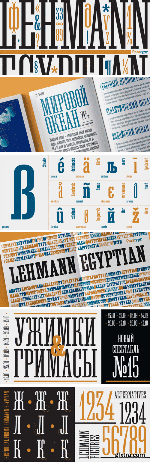
Lehmann Egyptian is a font of three styles, based on the pre-revolutionary hand set fonts by Berthold and Lehmann type foundries in St. Petersburg. Designed mainly for display typography, the font works well in small texts too. There’s also a quite useful bonus — a stylistic set of historical forms. Lehmann Egyptian was designed by Albert Kapitonov in cooperation with Dmitry Kirsanov and released by ParaType in 2018.
https://www.myfonts.com/fonts/ilham-herry/bilcase/
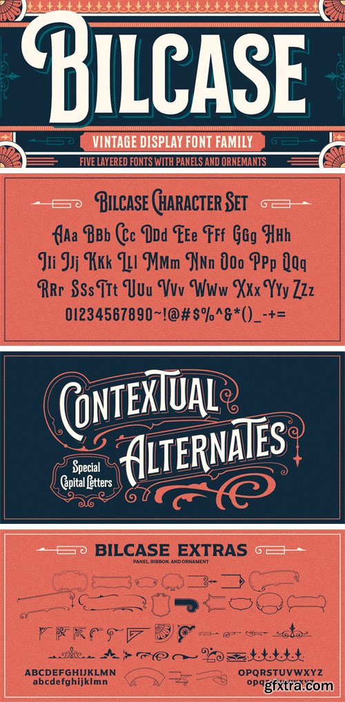
Bilcase font family is layered condensed font family come from vintage logo, labels, packages, and signage. this collection of styles with 5 layer and vintage scrolls, panels, and ornament possible to combination and option to create label designs, headlines, logotypes, signage, posters, greeting cards, letterhead, t-shirt and many more application. This font family is available in 2 style.
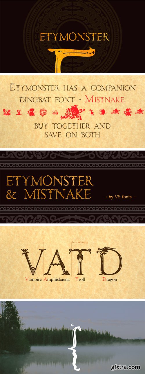
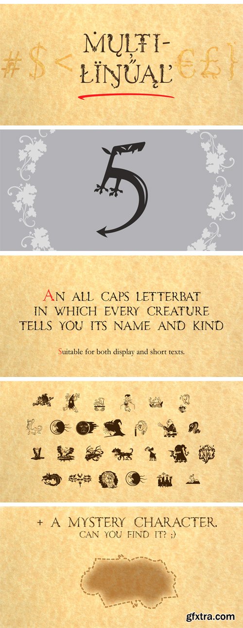
https://www.myfonts.com/fonts/vsf/etymonster/
Etymonster and Mistnake are Halloween fonts. The first is a letterbat with wide character support and the second a more limited dingbat.
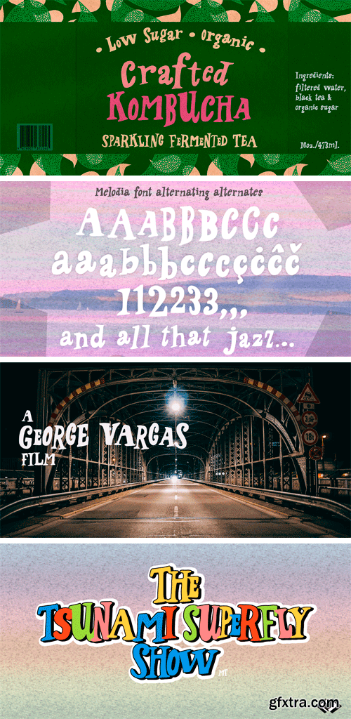
https://www.myfonts.com/fonts/pintassilgo/melodia/
This one may look rather strange at a first sight, but it has the true power of coolify written pieces. (Please don’t use it to say “Attorneys’s Conference”, nor “Annual Statement of Accounts”, unless you mean them to be cool, which is very unlikely.) Melodia has 3 glyph drawings for each uppercase letter, 3 more for each lowercase and 2 for the numerals. There are even alternates for punctuation, go figure: there are 3 commas and 3 periods. Surprising. To activate the automatic cycling of all these alternates, simply turn on the Contextual Alternates feature in your application. And it doesn’t hurt to remind: use it only on cool stuff.
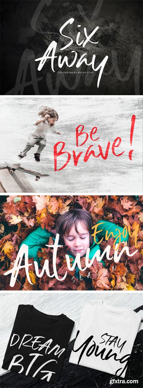
Six Away - The Handmade Brush Font
Hi Everyone, we will introduce Six Away-The Handmade Brush Font with a shape that is not monotonous. This font has its own style and can be assembled into a natural word. Six Away is made with a quick stroke of the brush pen, so that it looks original and can be used for all your project needs. Each glyph has its own uniqueness and when meeting with others will provide a dynamic and pleasing proximity. This font can be used at any time and any project. You can see in the presentation picture above, Six Away looks natural in some examples of design project.
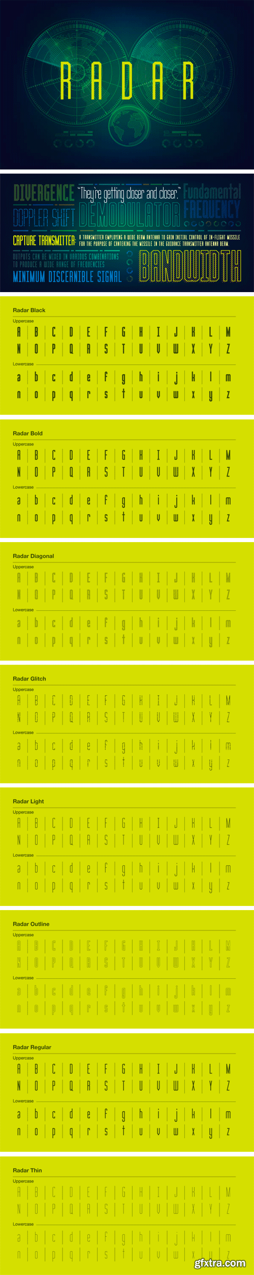
Radar Font Family
Radar is our biggest font set to date. This condensed display type comes with eight weights, including regular, thin, light, bold, glitch, diagonal and outline.
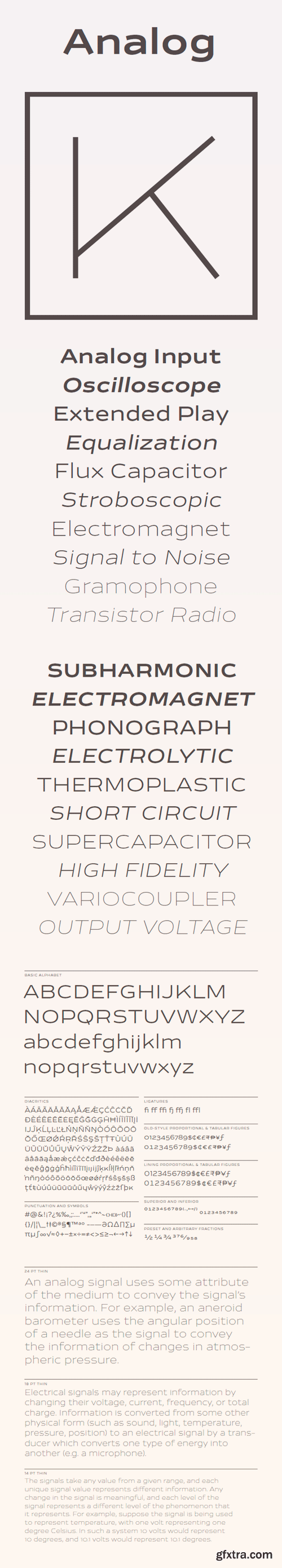
Analog Font Family
This new take on industrial sans serifs embodies the spirit of the solid state electronics revolution. Its energetic, generously wide proportions are balanced by confident, efficient strokes with minimal contrast.
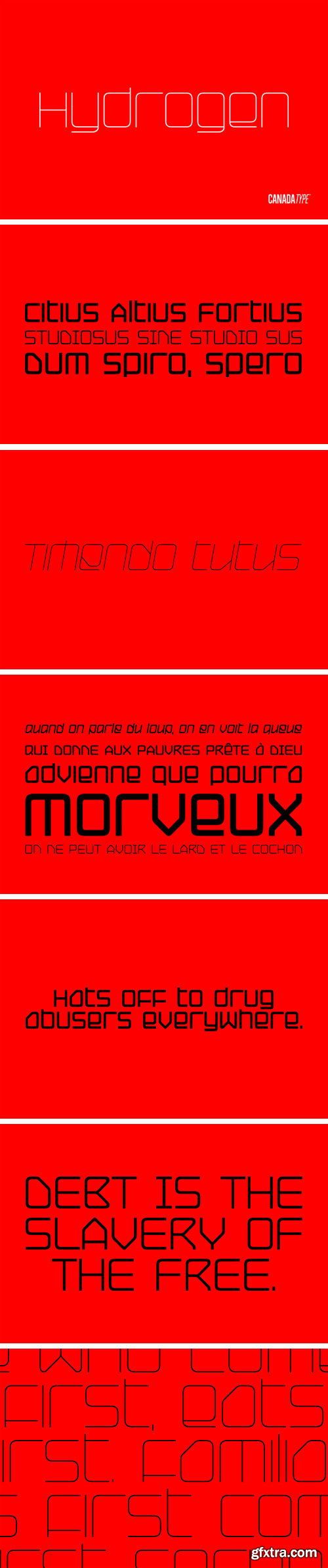
Hydrogen Font Family
Hydrogen is a clean geometric unicase family that expresses the mechanics, expansive technologies and conflicted ethics of the rapidly changing 21st century. Coupled with the right measure of Oxygen, Hydrogen becomes water, the ace of elements - rhythmic, dynamic, ever-flowing, and understood by everyone. Hydrogen comes in three weights and corresponding italics.
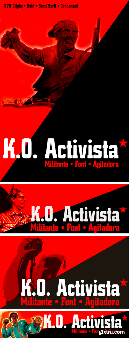
KO Activista Font Family
Campaigner KO * is a militant typography, stirring, contestation , semi-serif, bold and condensada.Esta source is inspired by old posters from the Spanish civil war, pure typographic constructivism, ideal for large labels or advertising propaganda and headlines.
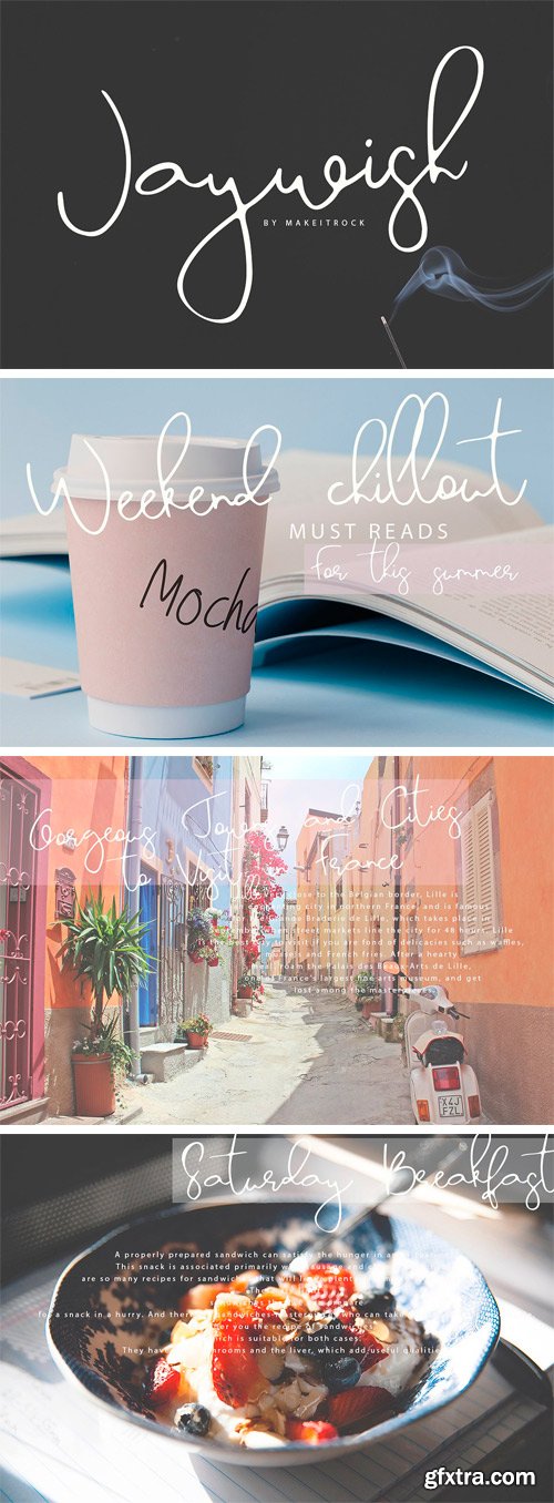
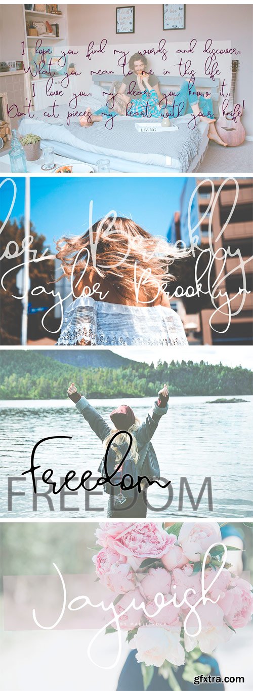
https://creativemarket.com/Makeitrock/2742019-Jaywish-A-classy-script
This handwritten script has been attentively written, with gentle curves to produce a font thats completely distinctive and original. Perfect for adding a elegant and unique touch to your lettering projects and branding. Also with their help, you can create a Wedding lettering or beautiful frame for your home. Or just use for your small business, book covers, stationery, marketing, magazines and more.
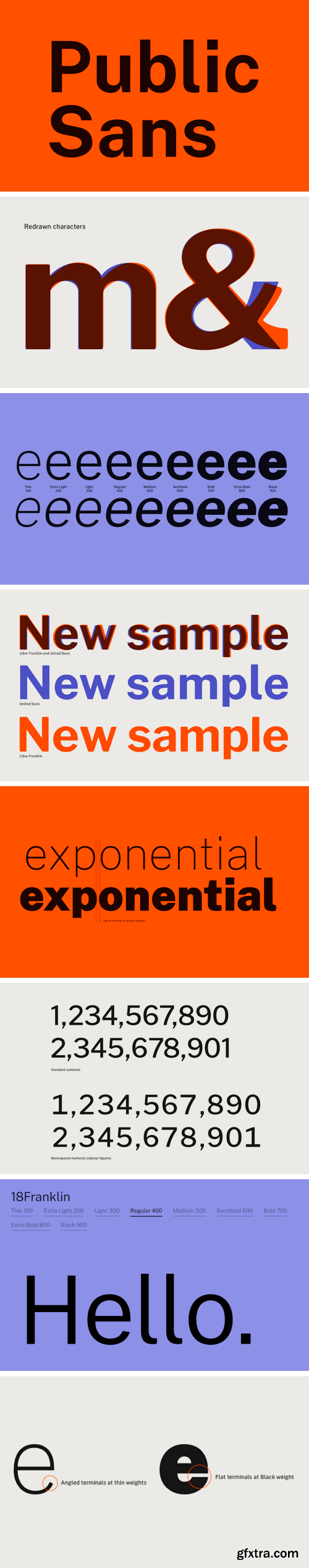
Public Sans Font Family
Public Sans is a typeface based on Libre Franklin. Public Sans has many similarities with its parent, but differs enough in its particulars that its effect is distinct. Public Sans comes with 18 fonts, including weights from Thin to Black and matched Italics, contains full set of glyphs.
Mayfair Font
The long awaited and much requested revival of Robert Hunter Middleton's very popular classic is finally here. Mayfair Cursive was an instant hit for Middleton in 1932, and it went on being used widely until late into the 1970s, in spite of it never having crossed over to film type technology.
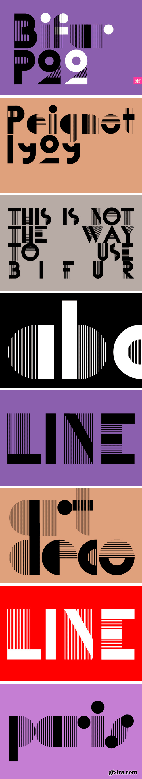
P22 Bifur Font Family
Bifur was originally designed by poster artist A.M. Cassandre. This Art Deco type design was issued by the French foundry Deberny & Peignot in 1929. Even upon it's original release and promotion, suggestions on how not to use Bifur were presented. As with most highly decorative display faces, the use should be selective and used sparingly. Of course the layout of "THIS IS NOT THE WAY TO USE BIFUR" in repeated paragraph form has become a famous design and appears in many surveys of design history.
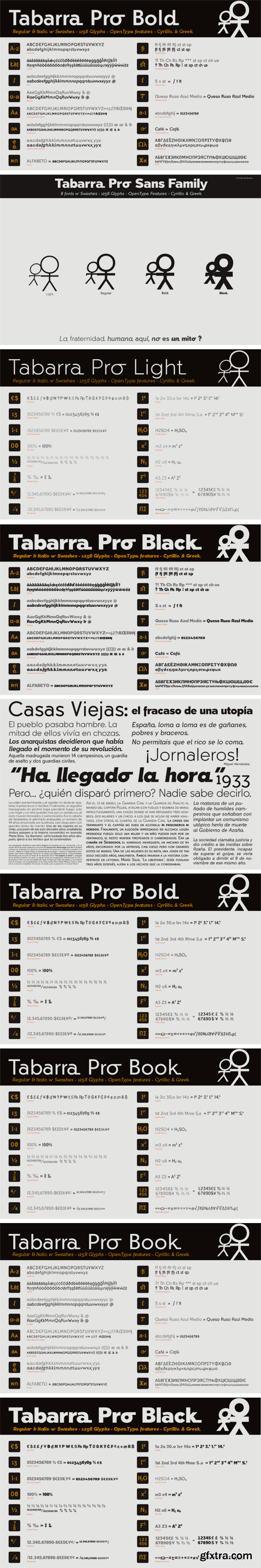
Tabarra Sans Pro Full Family
Tabarra Pro is a new typographic project, is a family of 32 fonts in 4 types: Regular, Narrow, Round and SemiSerif and 4 weights: Light, Book, Bold and Black versions with corresponding italics and swashes in all versions.
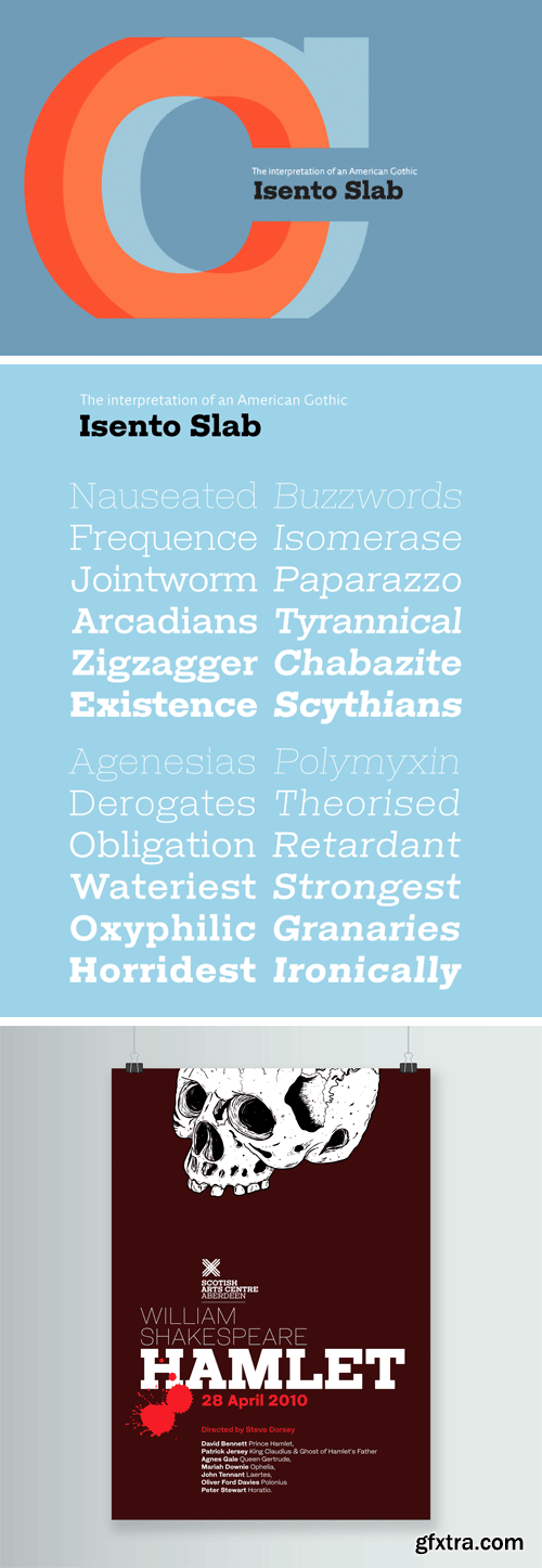
Isento Slab Font Family
We always wanted to design a gothic typeface. Our most similar typefaces are Rude and Firme, but Rude has some very delicate curves specially visible in the vertical strokes and Firme introduces a type family with reasonably big ascenders and descenders. On the other hand Isento has a much more straightforward approach to the particular genre.
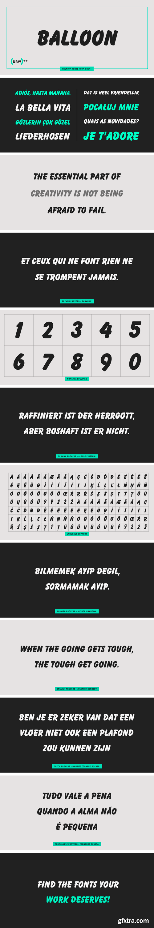
URW Balloon Font Family
Originally designed by Max R. Kaufmann in 1908, Balloon is a linear script font released and updated by URW in 1995.
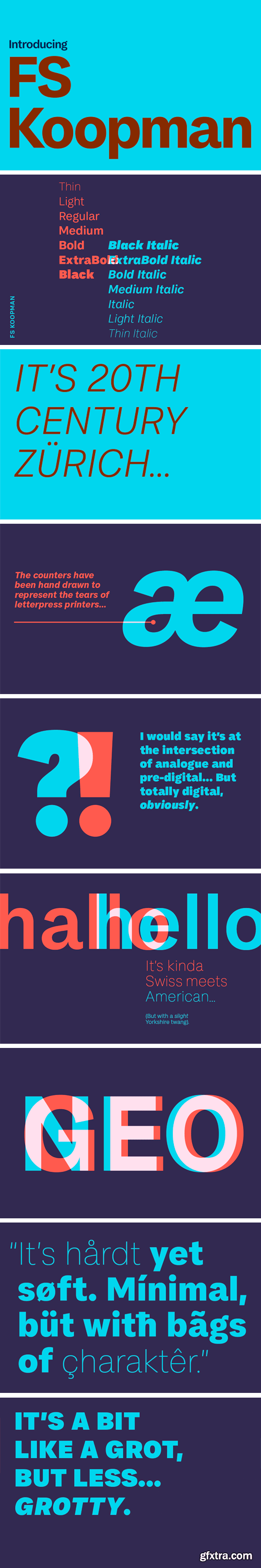
FS Koopman Font Family
The hardworking FS Koopman is a crossbred workhorse which draws inspiration from Swiss and Germanic grotesks, American gothics and early British grotesques, but refuses to fit neatly into any of these categories. Its neither one nor the other, but all of the above. Fontsmith designers Andy Lethbridge and Stuart de Rozario decided to take the characteristics they admired from each category and distill them down into one functional family.
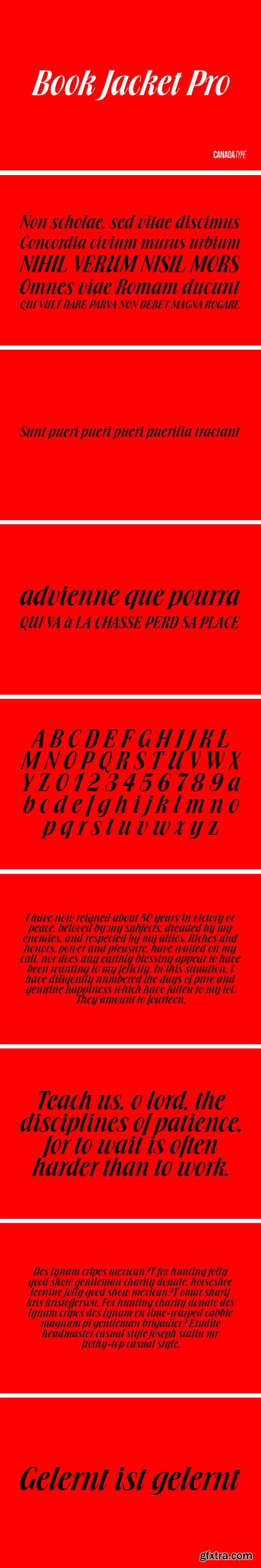
Book Jacket Pro Font
Book Jacket is arguably the most famous of all typefaces done in the Typositor era. Designed by Ursula Suess over an entire year, and published in 1972, Book Jacket became an instant success story that lasted well into the 1980s (even though it was copied by Phil Martin who published it under the name Bagatelle shortly after its release). Almost 40 years later, Ursula Suess and Canada Type consolidate their talents to bring you a revised, improved and expanded digital version of this film type classic, including small caps, additional swashes and new alternative forms, all in one dynamic Pro font loaded with over 735 characters and programmed features for advanced typography.
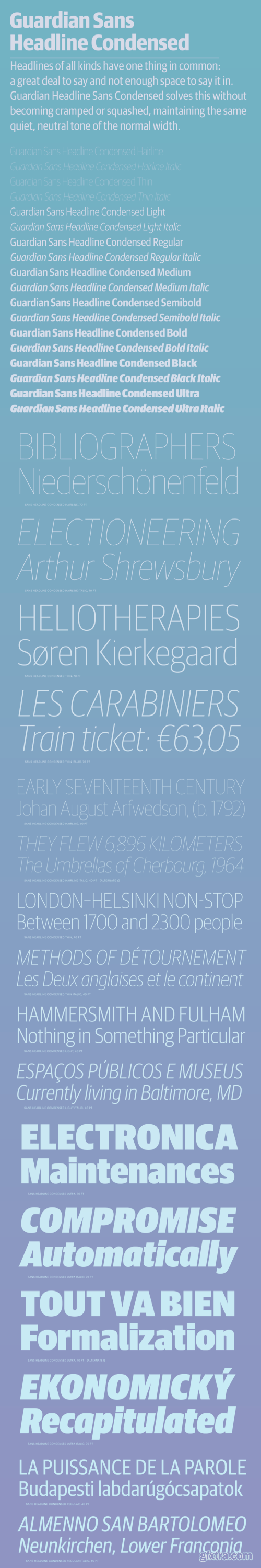
Guardian Sans Headline Condensed Font Family
Headlines of all kinds have one thing in common: usually a lot to say with not enough space to say it in. Guardian Headline Sans Condensed solves this without looking cramped or squashed, keeping the same quiet, neutral tone of the normal width.
Feisar Express Font Family
Feisar Express is a ‘retro-futuristic’ inline script for expressive display typography with a technical touch. Related to the Feisar family, the series started as an exploration of what can be done with current font technology. Feisar Express is available in two different connecting inline styles — One and Two — each with three different variants for top, bottom and alternating connections called Uptown, Downtown and Crosstown.
126,000 Royalty-Free 3D Model

Udemy Türkçe


Top Rated News
- CreativeLive Tutorial Collections
- Fasttracktutorials Course
- Chaos Cosmos Library
- MRMockup - Mockup Bundle
- Finding North Photography
- Sean Archer
- John Gress Photography
- Motion Science
- AwTeaches
- Learn Squared
- PhotoWhoa
- Houdini-Course
- Photigy
- August Dering Photography
- StudioGuti
- Creatoom
- Creature Art Teacher
- Creator Foundry
- Patreon Collections
- Udemy - Turkce
- BigFilms
- Jerry Ghionis
- ACIDBITE
- BigMediumSmall
- Globe Plants
- Unleashed Education
- The School of Photography
- Visual Education
- LeartesStudios - Cosmos
- Fxphd
- All Veer Fancy Collection!
- All OJO Images
- All ZZVe Vectors
- CGTrader 1 CGTrader 2


