
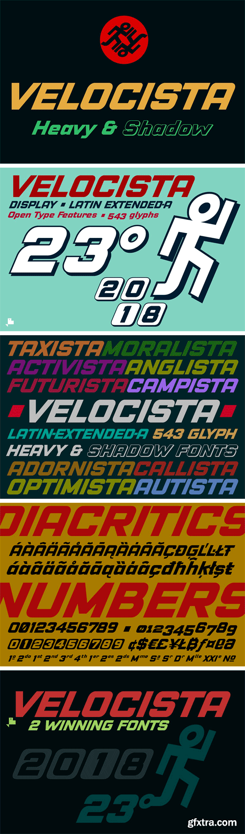
https://creativemarket.com/deFharo/2748690-Velocista-Display-2-fonts
Velocista is a modern typography display of geometric construction without serifs and inclined 23 ° to use in titles where rotundity is required in the written message. Includes the Bitcoin symbol: b#
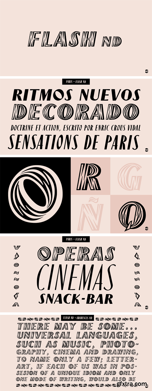
https://www.myfonts.com/fonts/neufville/flash-nd/
Flash ND is part of Neufville Digital’s GRAFÍA LATINA Collection. A display typeface containing capitals, lining figures and punctuation. It is a typical headline and poster font. The typeface design is based upon the elements ‘light’ and ‘shadow’ producing a powerful contrast with a special harmony, giving an impression of a third dimension.
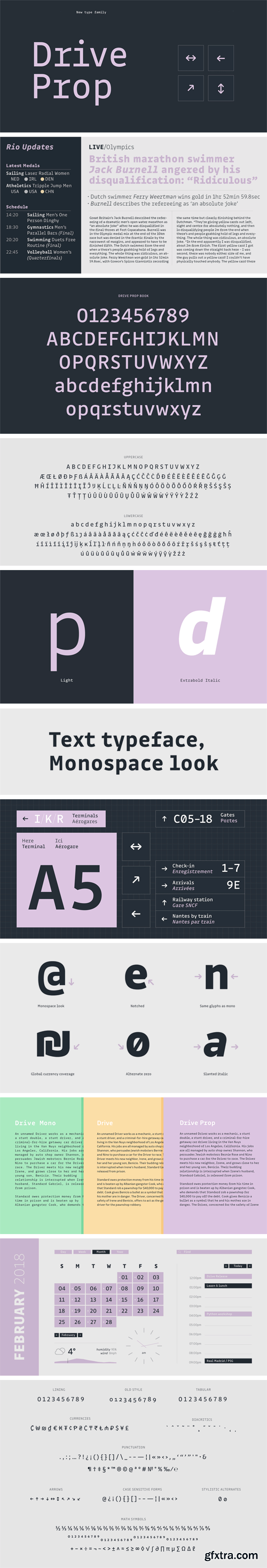
DriveProp Font Family
Because monospaced typefaces may be hard to read on the long run, we created a Proportional version of Drive Mono, tuned for running text. Both families share a lot of common glyphs, but wider letters like ‘m’ or ‘w’ were adapted for a better reading experience.
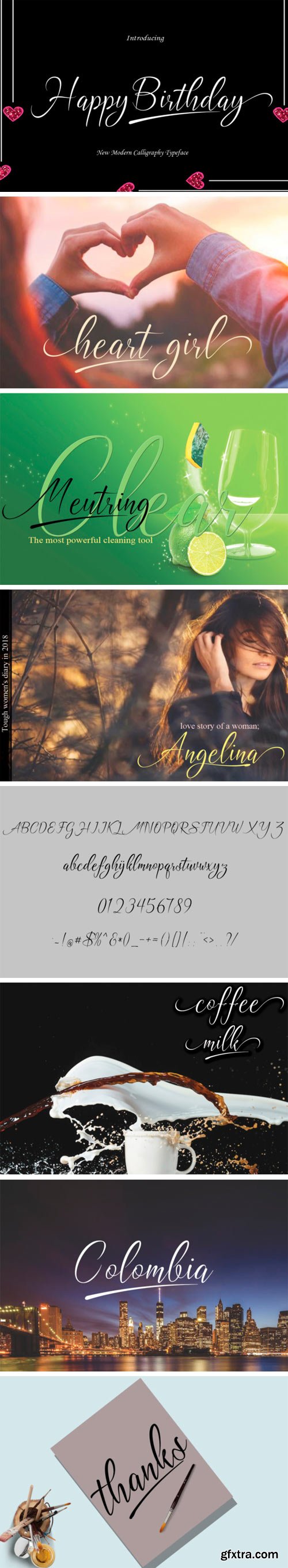
https://www.creativefabrica.com/product/happy-birthday-6/
Happy Birthday is a modern calligraphy font. It has a modern and unique feel and a natural writing style.
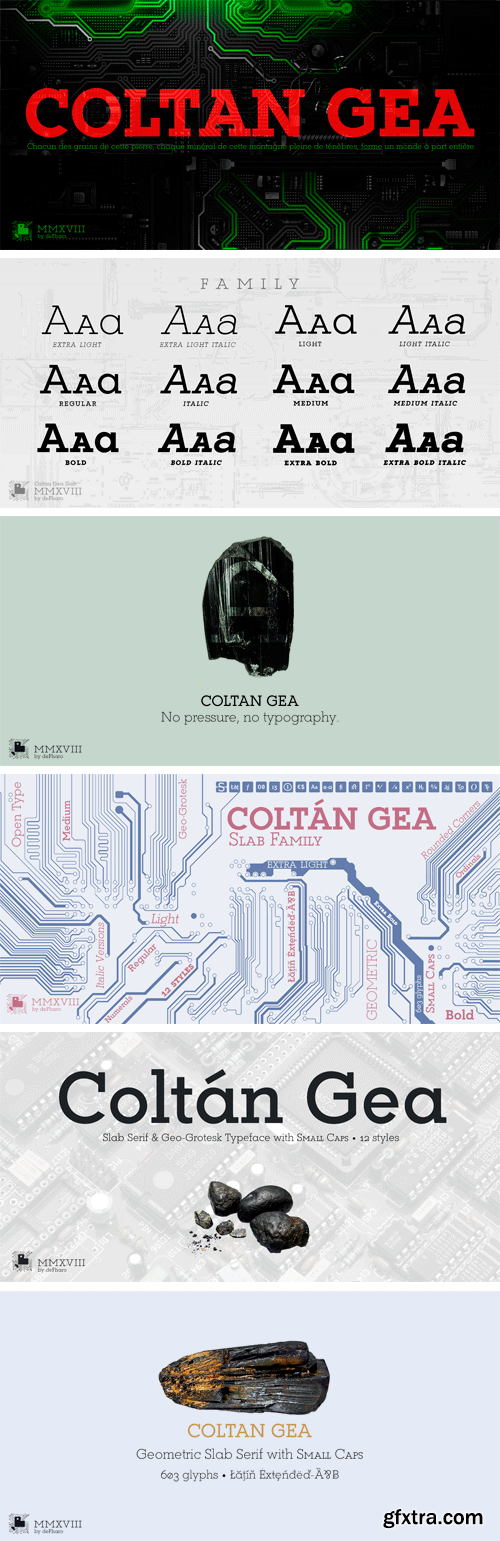
Coltan Gea Slab Font Family
Coltan is a typeface family Gea Slab Serif with 6 pesos more Italics versions include all caps letters and symbols of the main criptomonedas.
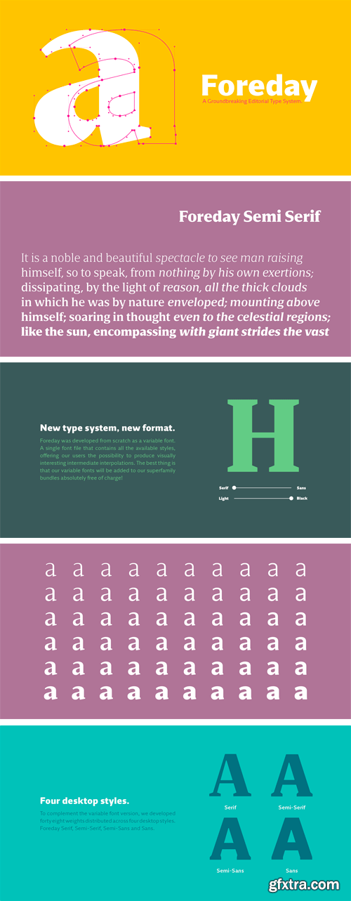
Foreday Semi Serif Font Family
The end of the design space we used for centuries is just around the corner and, as a discipline, the survival of type design, will clearly depend on how we will face the upcoming problematics.
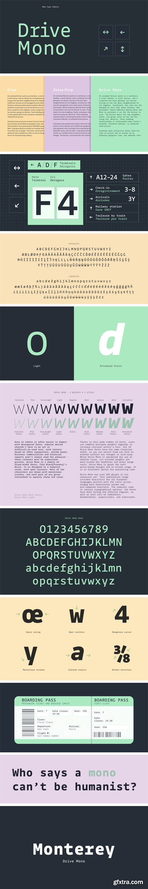
Drive Mono Font Family
Drive Mono includes nine weights, ranging from a very thin Hairline weight through a heavy Extrabold. Every weight has corresponding upright and italic fonts. Thanks to this wide number of fonts, users can combine multiple weights together to increase contrast within a text.
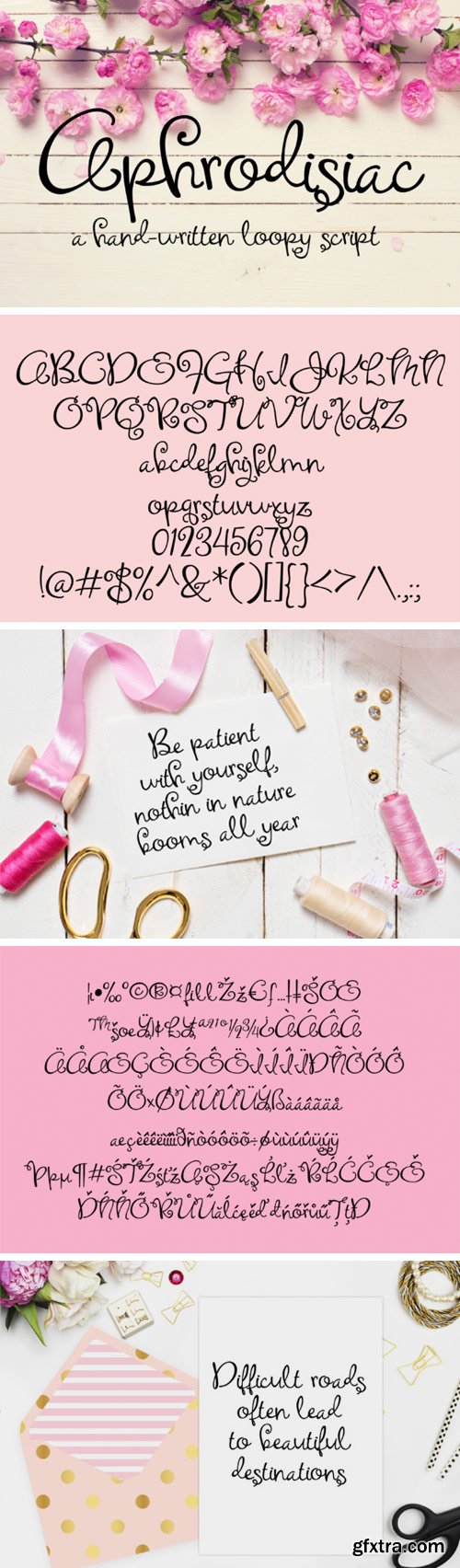
https://www.creativefabrica.com/product/aphrodisiac/
Aphrodisiac is a hand-written script with loopy and curly ascenders and desenders.
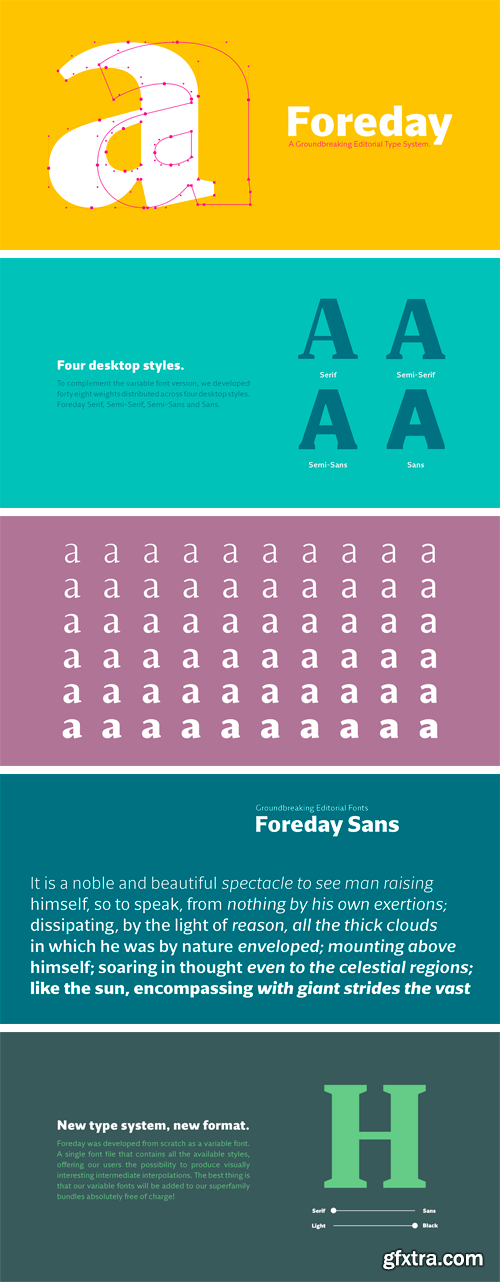
Foreday Sans Font Family
The end of the design space we used for centuries is just around the corner and, as a discipline, the survival of type design, will clearly depend on how we will face the upcoming problematics.
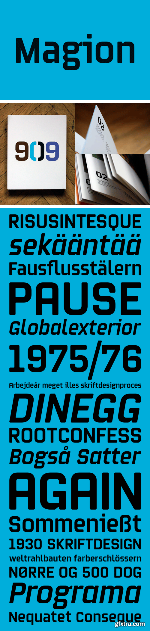
Magion Font Family
A geometrically constructed font with a surprising number of uses. In a rectangular typeface, the closed shaped of capitals alternate with wide open lowercase letters, with an occasional hint of calligraphy-inspired letter details to make things more interesting. Extremely lowered capitals and shortened strokes will fulfil the highest requirements for a modern look and cost effectiveness. The font also contains a number of details typical for our alphabets, which serve to somewhat humanise the overall expression and improve text legibility.
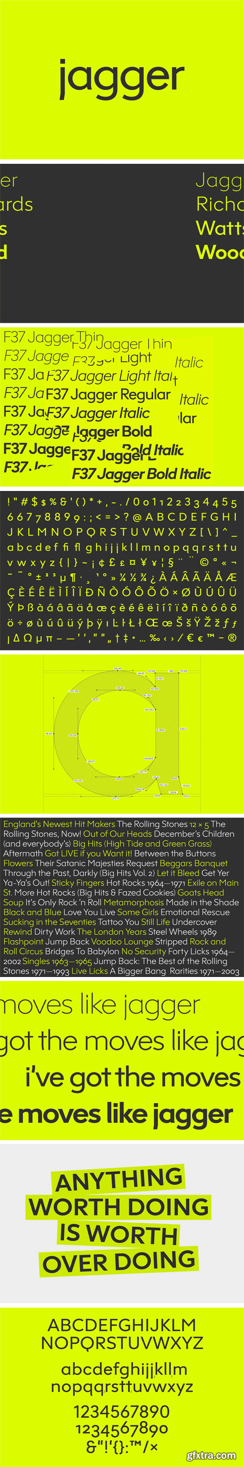
https://www.hypefortype.com/f37-jagger-19.html
We took inspiration for F37 Jagger from Edward Johnston's London Underground font. The clean curved lines and simple form of this sans serif typeface takes on an accessible and unassuming quality. And that was precisely the outcome we wanted to achieve when we set out to develop F37 Jagger. Johnston’s contrast between the bulbous circular arcs and distinct straight edges in his letterforms is what inspired the shape and structure in F37 Jagger. The family's 8 fonts are a perfect marriage of clean lines with carefully considered spacing, and a little kick tail for good measure.
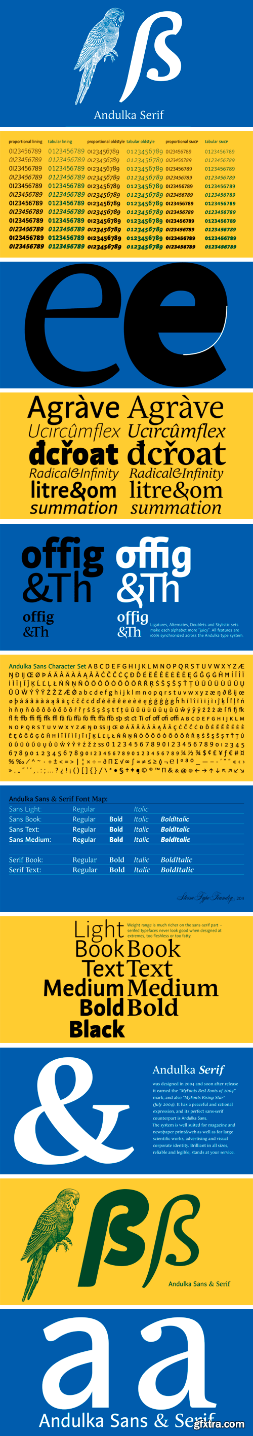
Andulka Serif Font Family
A universal typeface for books, magazines and newspapers must be economizing, quiet, strong in drawing, but original and peaceful at the same time. Type “for all weather” must resist also many difficulties of printing on different surfaces. Therefore, the basic design “Text” is slightly darker and legible from 6 point size even in dimmeness, whereas “Book” reduces the effect of running ink and saves toner cartridge.
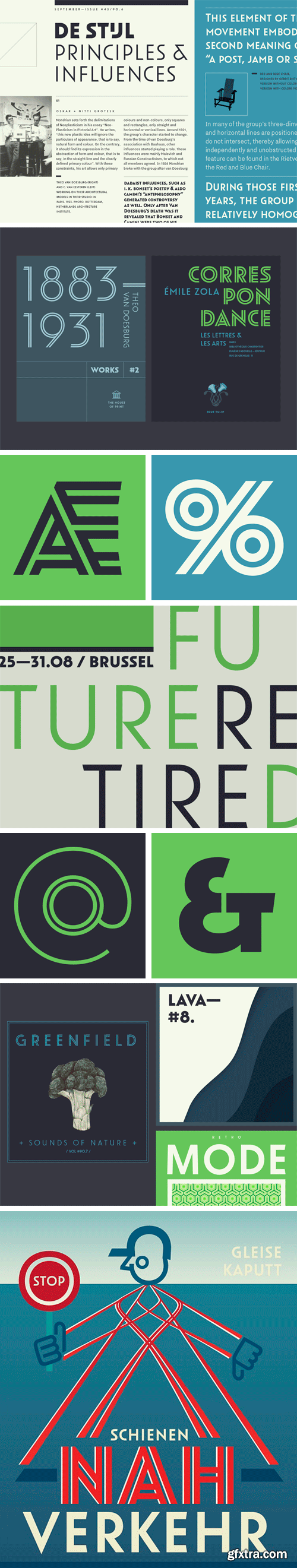
Oskar Font Family
Oskar is a all-caps type series inspired by Dutch architectural and commercial letterings from the early 20th century, particularly those painted on walls and shopfronts or executed in metal. This style of letters did not exist as printing type but was cultivated by sign painters, draftsmen and architects, and passed on in lettering manuals.
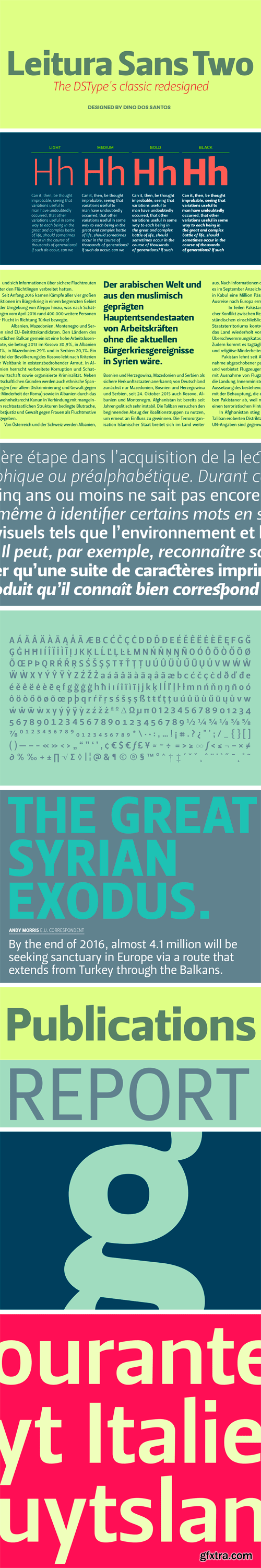
Leitura Sans Two Font Family
Leitura Two is a redesigned and improved version of Leitura Type System and was specially designed for editorial purposes.
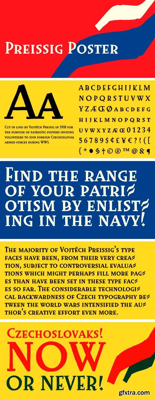
Preissig Poster Font
Cut in lino by Vojt?ch Preisig in 1918 for the purpose of patriotic posters inviting volunteers to join foreign Czechoslovak armed forces during WW1.
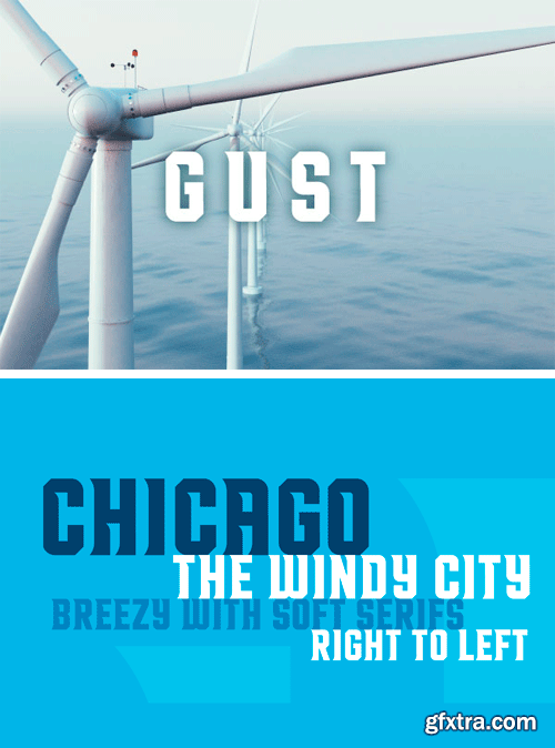
Gust Font
Condensed and windswept left to right. Gust is a modern take on traditional athletic block type with just the right amount of detail to keep it fresh and interesting.
Nitti Grotesk Font Family
Nitti Grotesk is the proportional companion to Nitti and part of a larger collection of Grotesque-inspired typefaces by Pieter van Rosmalen. The series originates in his sans-serif called Capone, which evolved into the display family Stanley, and a monospaced version that became Nitti, named after Francesco Raffaele Nitto, one of Al Capone’s henchmen.
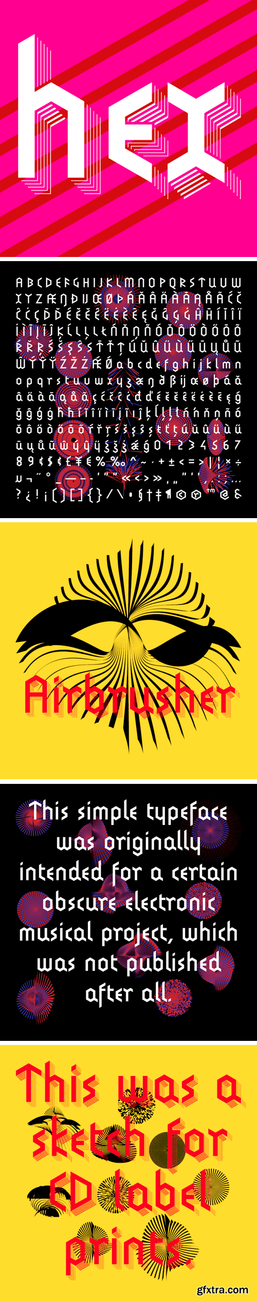
Hexenrunen Font Family
This simple typeface was originally intended for a certain obscure electronic musical project, which was not published after all.
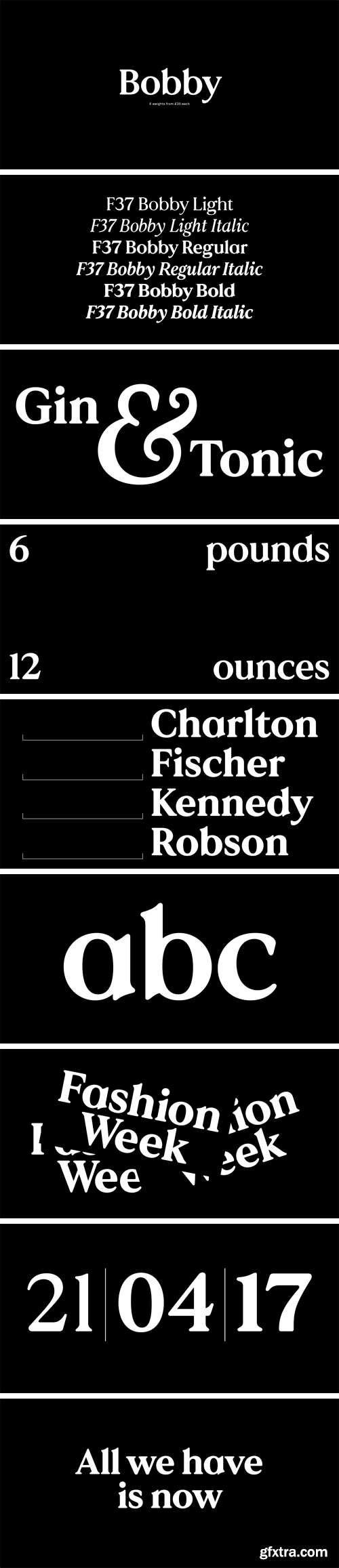
https://www.hypefortype.com/recently-added/f37-bobby-font.html
F37 Bobby is a contemporary geometric serif. The design was influenced by the popular, warm serifs from the 1970s. The family comes in 6 weights with matching true italics.
126,000 Royalty-Free 3D Model

Udemy Türkçe


Top Rated News
- CreativeLive Tutorial Collections
- Fasttracktutorials Course
- Chaos Cosmos Library
- MRMockup - Mockup Bundle
- Finding North Photography
- Sean Archer
- John Gress Photography
- Motion Science
- AwTeaches
- Learn Squared
- PhotoWhoa
- Houdini-Course
- Photigy
- August Dering Photography
- StudioGuti
- Creatoom
- Creature Art Teacher
- Creator Foundry
- Patreon Collections
- Udemy - Turkce
- BigFilms
- Jerry Ghionis
- ACIDBITE
- BigMediumSmall
- Globe Plants
- Unleashed Education
- The School of Photography
- Visual Education
- LeartesStudios - Cosmos
- Fxphd
- All Veer Fancy Collection!
- All OJO Images
- All ZZVe Vectors
- CGTrader 1 CGTrader 2


