
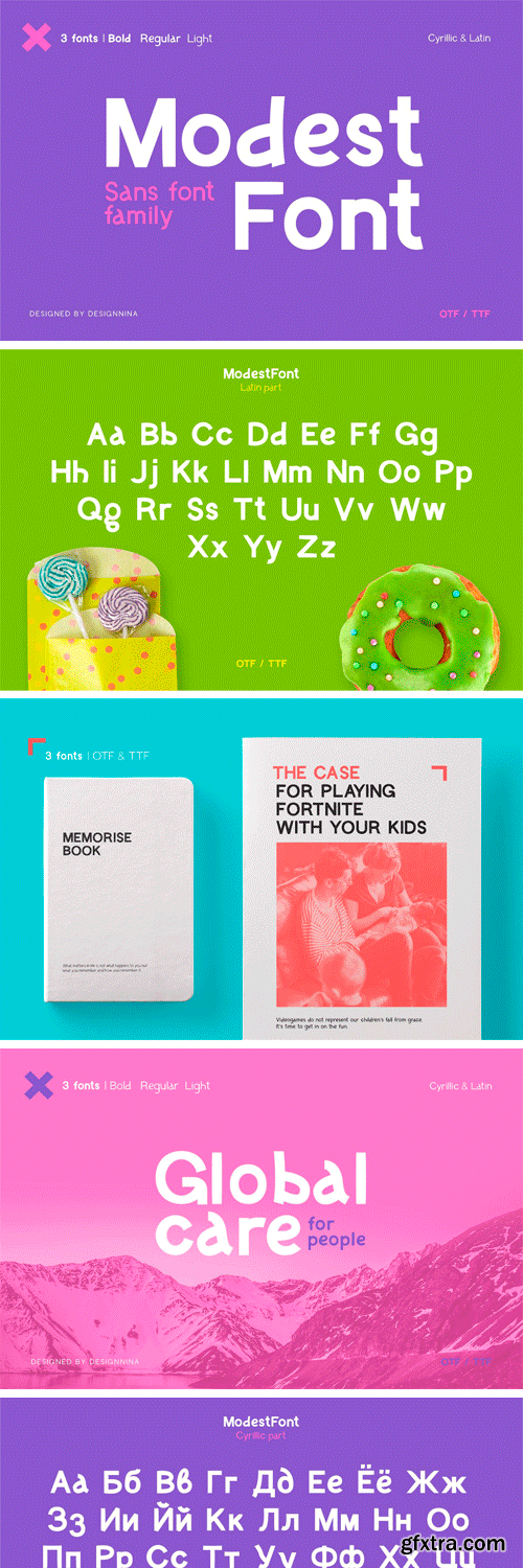
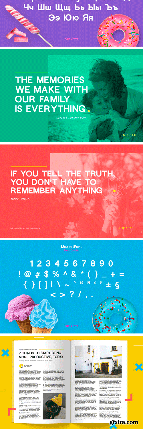
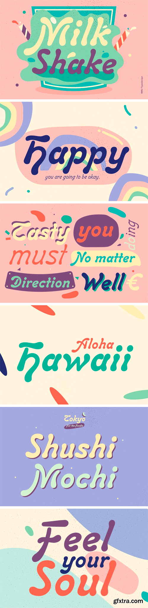
CM - ModestFont — Sans Font 2951893
Our adult everyday life is sometimes so dull and sad. Sometimes, we don’t have enough children's spontaneity and informality. Therefore I offer this wonderful ModestFont for you in three weights and obliques, which is readable at any sizes. This font is ideal for writing massive paragraphs, for printing, for creating advertising, as well as for use in the web industry.
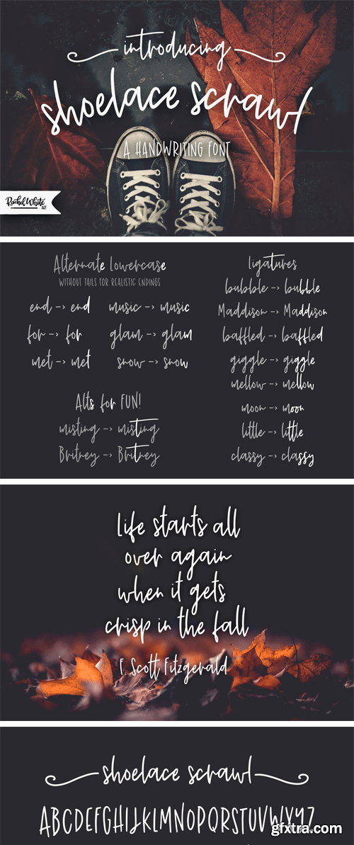
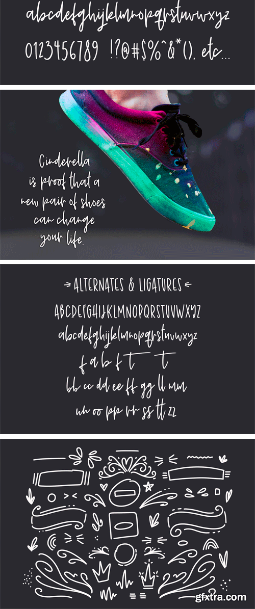
https://fontbundles.net/rachelwhiteart/150155-shoelace-scrawl-a-handwriting-font
I'm so happy to show you my new font! Shoelace Scrawl is a casual handwriting font. It has lots of fun extras, smooth lines, and a set of playful doodles.
Carlsbad Font Family
The Carlsbad font family is a bringing together of Regina Cursiv and Hansa Cursiv which bothhad been released by H. Berthold Messinglinienfabrik und Schriftgiesserei around 1895.Both these beautiful Art Nouveau italic fonts come with the following swash alternatives: D, E, G,H, K, S, T, h, k, m, n, s, and z.
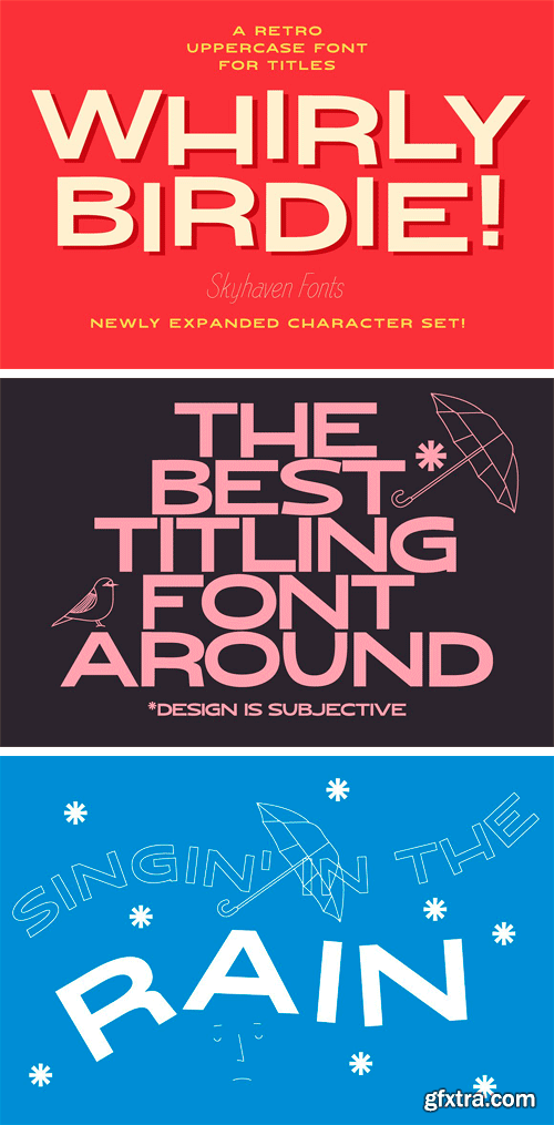
https://creativemarket.com/skyhaven/53285-Whirly-Birdie
Until this font is fully developed- I'm putting up the first 26 characters for sale! This is an absolute steal if basic letters are all you need. You're not going to be typing paragraphs with this font, after all. This font is much too bold.
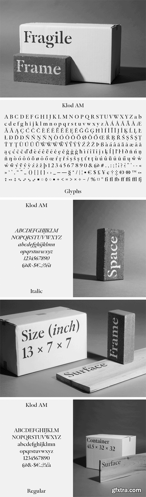
Klod Typeface
The Klod typeface is a stencil typeface constructed on the bases of the Garamond style. This typeface is based on research realized with Anton Haesendonck and Xavier Lecuyer in 2015.
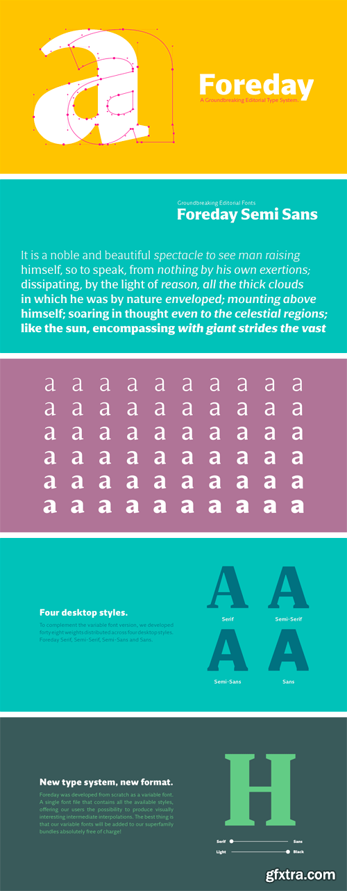
Foreday Semi Sans Font Family
The end of the design space we used for centuries is just around the corner and, as a discipline, the survival of type design, will clearly depend on how we will face the upcoming problematics. This typeface is our first attempt to respond to the problematics of the upcoming digital publications.
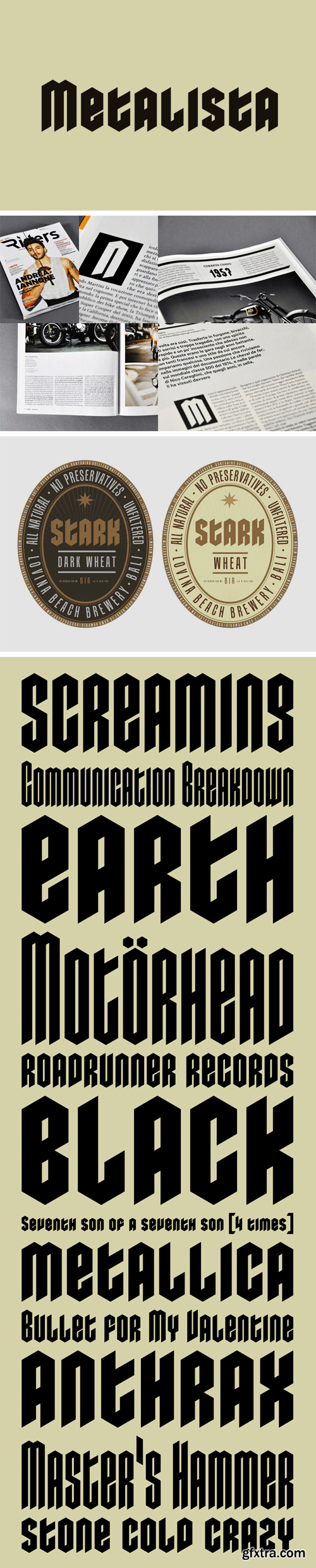
Metalista Font Family
The Metalista font was created as a sign of undying admiration for the persistence of heavy metal culture. The angled font of almost fixed width proportions combines capitals with small letters for more variety and better definition of individual letters. Stressing the horizontal strokes subdued the historical Gothic character and emphasized a more modern signature, which is far different from the majority of current attempts at a modern adaptation of Fraktur fonts.
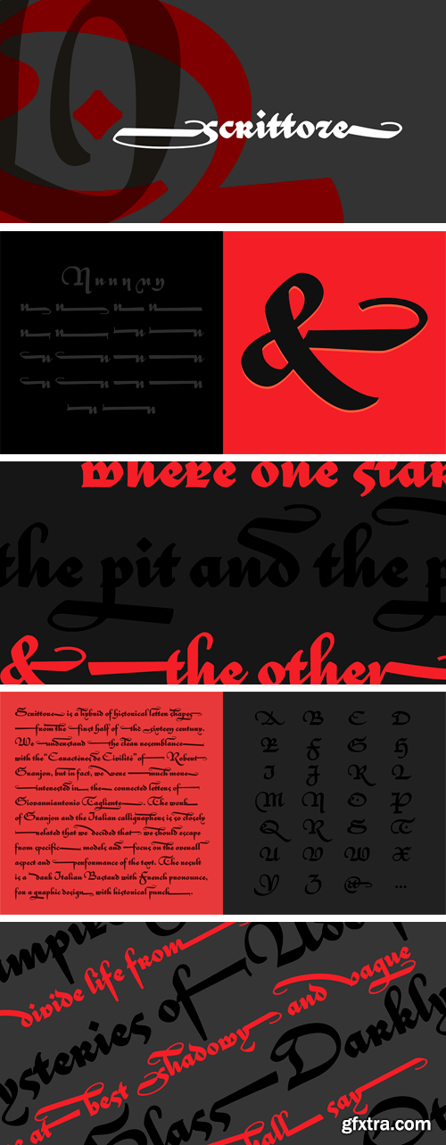
Scrittore Font
Scrittore is a hybrid of historical letter shapes from the first half of the sixteen century. We understand the clear resemblance with the “Caractéres de Civilité” of Robert Granjon, but in fact, we were much more interested in the connected letters from the specimens found in the work of Giovanniantonio Tagliente, presented in the book “Lo presente libro insegna la vera arte delo excellente scrivere de diverse sorti de litere le quali se fano per geometrica ragione” from 1531.
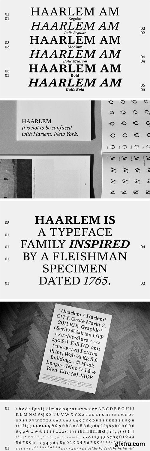
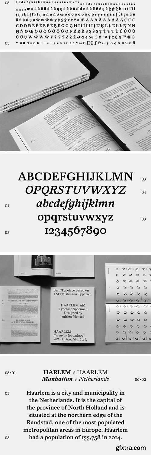
Haarlem AM Typeface
Haarlem AM typeface is a serif family based on the specimen : Origines Typographicae, Meerman Fleishman, 1765, from the Enschedé font foundry. The firm of Joh. Enschede en Zonen was established in Haarlem (Netherlands) in 1703. It is widely recognized as one of Holland’s finest printing houses. Enschedé prints banknotes and stamps for the Dutch government, fine art catalogues, and commercial high-quality work.
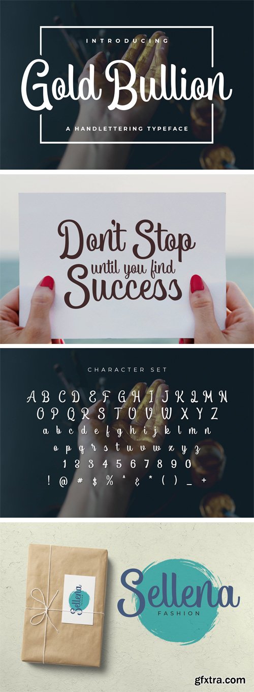
https://fontbundles.net/font-bundles-store/140768-gold-bullion
Gold Bullion is a thick script font, great for crafts.
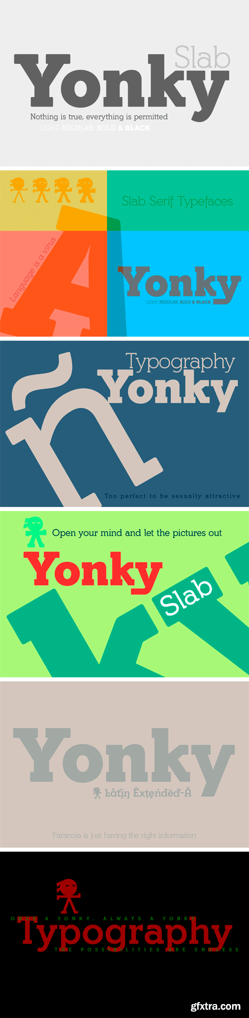
Yonky Slab Font Family
Yonky Slab is a family of 8 fonts neo-grotesque style presented in four weights: Light, Regular, Bold and Black versions plus corresponding italicized true. They are inheritors of Egyptian types emerged at the beginning of S. XIX sources.
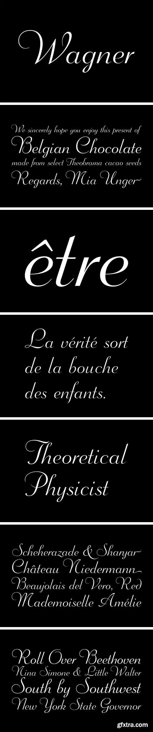
Wagner Script Font Family
This gem of a script was what metal era typographers called a continental face, which essentially meant an old, most likely uncredited, metal face that was common to many European foundries. This particular one ran the rounds in the first half of the twentieth century under the names Donatello, Aigrette, Troubadour, Hertha, Butterfly and Gracia. A little research reveals its true origin to be circa 1926 at the Wagner.
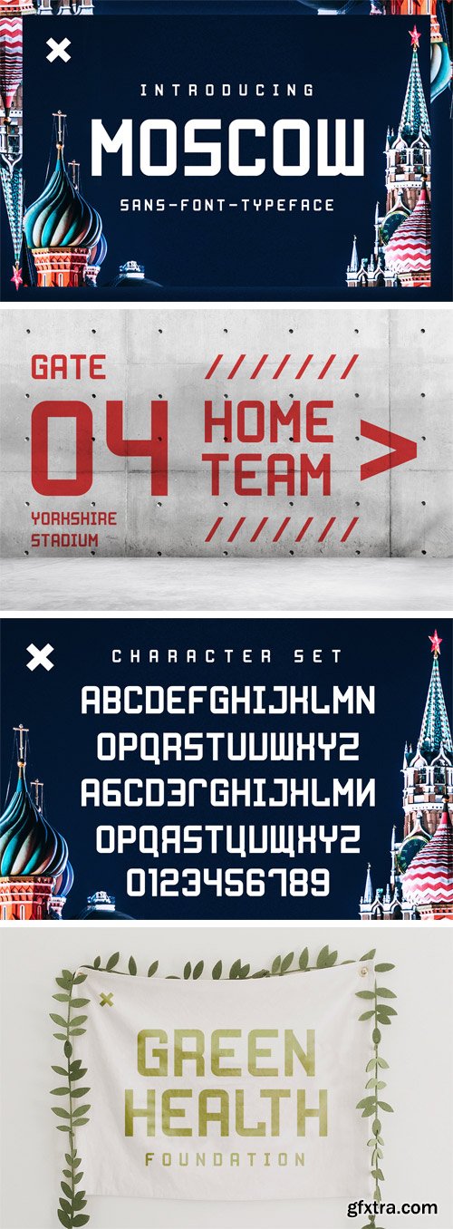
Fontbundles - Moscow 136095
Moscow is a unique display font.
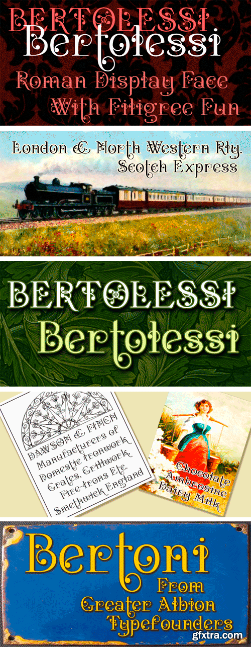
https://www.myfonts.com/fonts/gatf/bertolessi/
Bertolessi is a Roman face made fun, with a healthy dose of filigree curves thrown into the mix. It’s an ideal compliment to our extensive Bertoni family, but can be used anywhere a bit of humour and flair is required. Get with the curls!
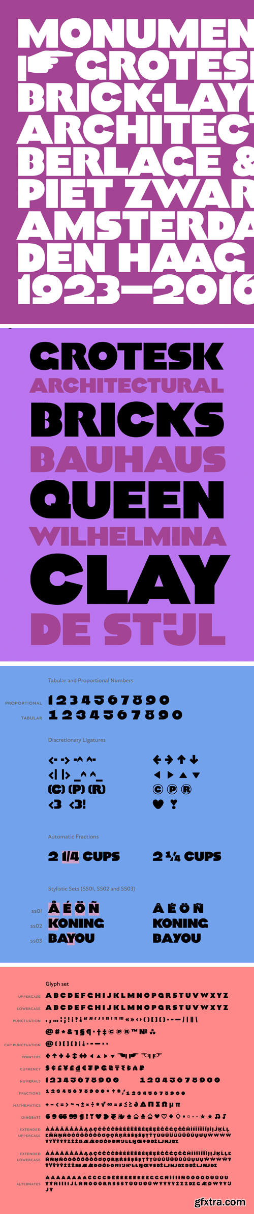
Monumental Grotesk Font
Monumental Grotesk is a true The Hague typeface: its stone-carved forms grace a few buildings and a monument in the government quarters. It’s based on the work of graphic designer Piet Zwart, a Dutch Bauhaus proponent.
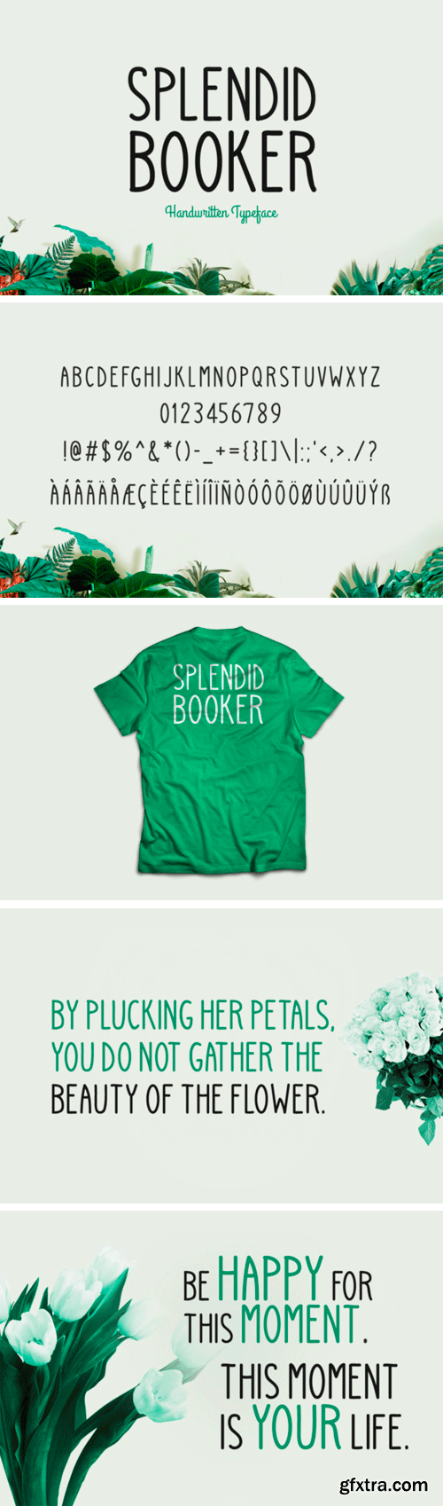
https://www.creativefabrica.com/product/splendid-booker/
Splendig Booker, a handwritten type with a soft touch. Perfect for multiple styles of projects. Includes multilingual support.
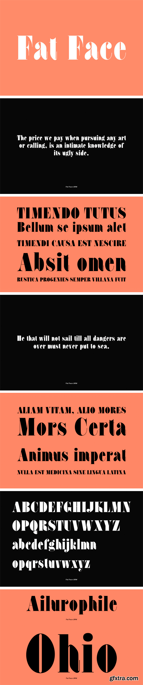
Fat Face Font
Fat Face is a fashionable and elegant serif font designed by Phil Martin in 1971. Fat Face contains West, East, Turkish, Baltic, Romanian language support.
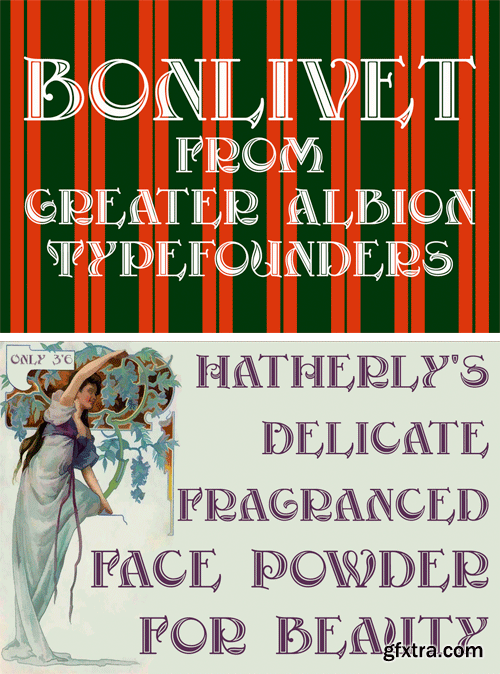
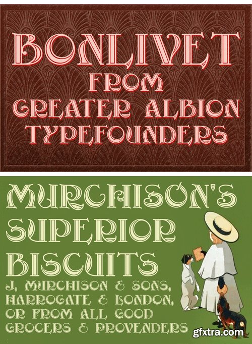
https://fontbundles.net/greater-albion-typefounders/10294-bonlivet
Bonlivet is an all capitals display face, which starts from Roman letter forms and pushes them into wild decorative extravagance. There is a somewhat early 20th century feel to this, but really it’s just a bit of good fun, with a hint of elegance thrown in.
Nitti Typewriter Font Family
Nitti Typewriter, a relative of our Nitti series, is a playful nod to the aesthetics of typewriters in five flavours: Normal, Open, Underlined, Corrected, and Cameo. The family is based on monospaced Nitti and has its roots in the first sans-serif designs of the 19th century — the Grotesques.
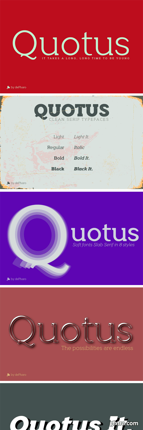
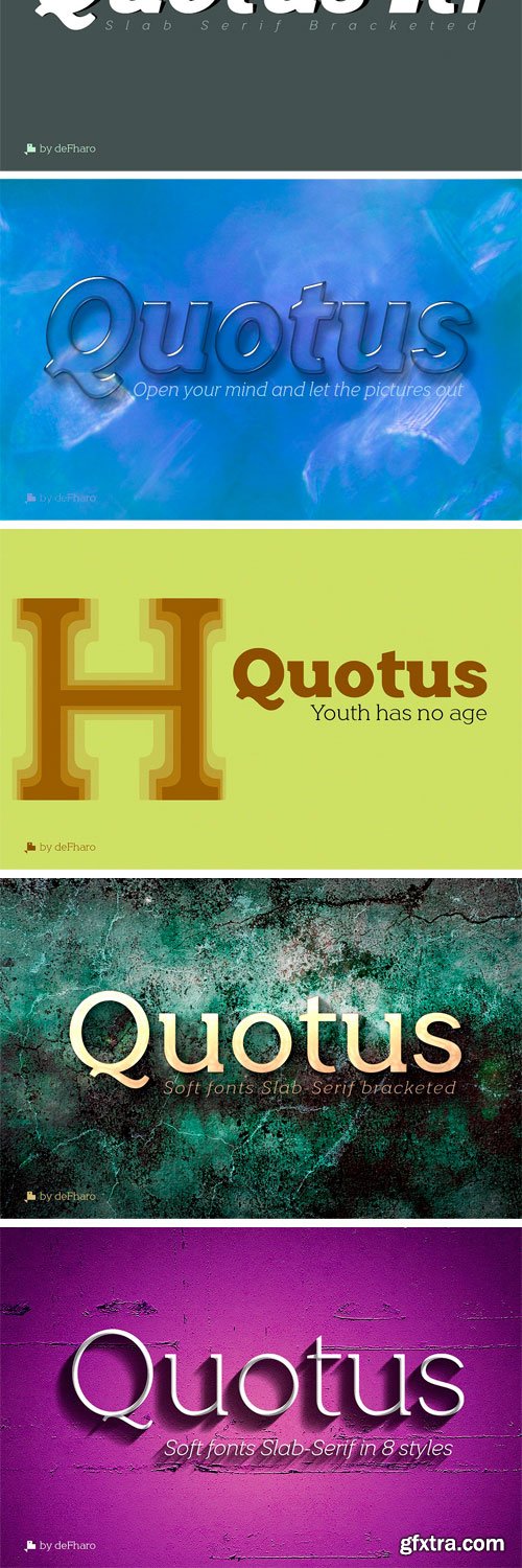
https://creativemarket.com/deFharo/2889133-Quotus-Slab-Bracketed-8-fonts
Quotus is a new typographic family with slab serifs bracketed. There are 8 styles (Light, Regular, Bold, Black + Italics) The metric and configuration of the kerning has been exhaustive for maximum balance and readability. Italic versions have their own stylized lowercase letters with an inclination of 13 degrees. All fonts have advanced Open Type functions and the Bitcoin symbol (b#).
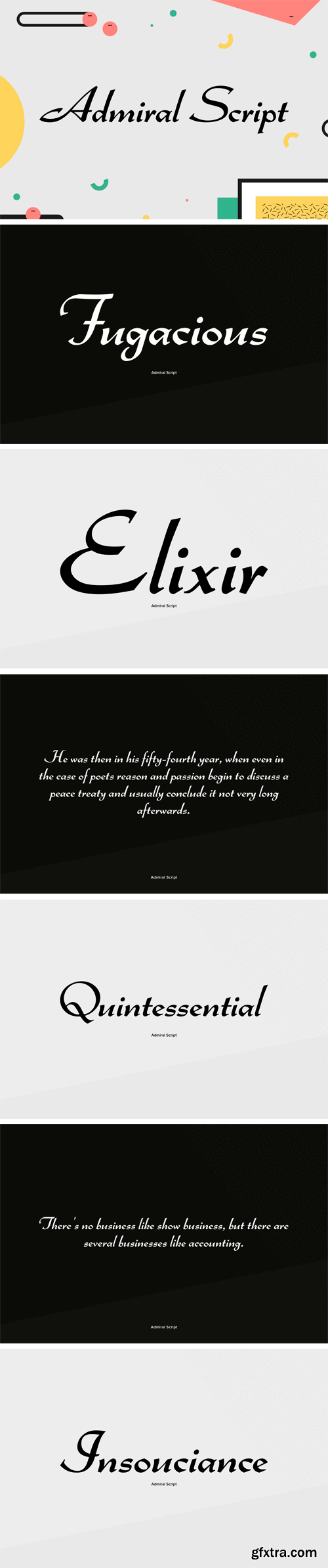
Admiral Script Font
Admiral Script is a spirited unconnected script typeface originally designed by Robert H. Middleton for Ludlow in 1953. Its lower case characters are quite small adding the impression of a precisely, carefully written pen lettering. Based on artwork taken from old specimen books, Ralph M. Unger redesigned this beautiful script typeface in 2005 for profonts, completed the character set to current standards and digitally remastered it.
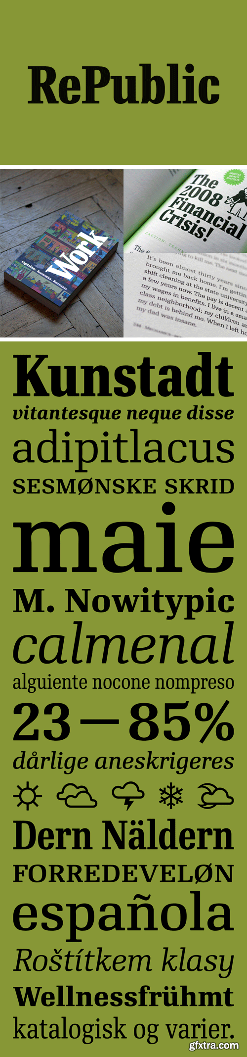
RePublic Font Family
In 1955 the Czech State Department of Culture, which was then in charge of all the publishing houses, organised a competition amongst printing houses and generally all book businesses for the design a newspaper typeface.
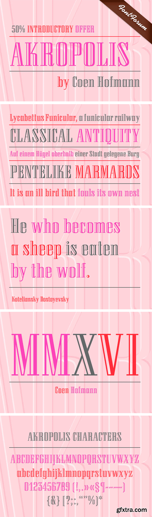
https://creativemarket.com/URW/895879-URW-Akropolis
The design of this display face is based on the hot metal typeface Acropolis, issued by the German type foundry Ludwig Wagner in Leipzig in 1940. To further increase its usefulness a Cyrillic was added to it: URW Akropolis, redrawn and digitally remastered by Coen Hofmann for the URW Font Forum, is a true display design that should not be set below 48 point if you want to preserve it’s fine details like the open triangular sections, e.g. in L, G, S, T etc. and gain the full typographic splendidness of this beautiful typeface.
126,000 Royalty-Free 3D Model

Udemy Türkçe


Top Rated News
- CreativeLive Tutorial Collections
- Fasttracktutorials Course
- Chaos Cosmos Library
- MRMockup - Mockup Bundle
- Finding North Photography
- Sean Archer
- John Gress Photography
- Motion Science
- AwTeaches
- Learn Squared
- PhotoWhoa
- Houdini-Course
- Photigy
- August Dering Photography
- StudioGuti
- Creatoom
- Creature Art Teacher
- Creator Foundry
- Patreon Collections
- Udemy - Turkce
- BigFilms
- Jerry Ghionis
- ACIDBITE
- BigMediumSmall
- Globe Plants
- Unleashed Education
- The School of Photography
- Visual Education
- LeartesStudios - Cosmos
- Fxphd
- All Veer Fancy Collection!
- All OJO Images
- All ZZVe Vectors
- CGTrader 1 CGTrader 2


