
https://www.myfonts.com/fonts/aleksandrs-golubovs/another-grotesk/
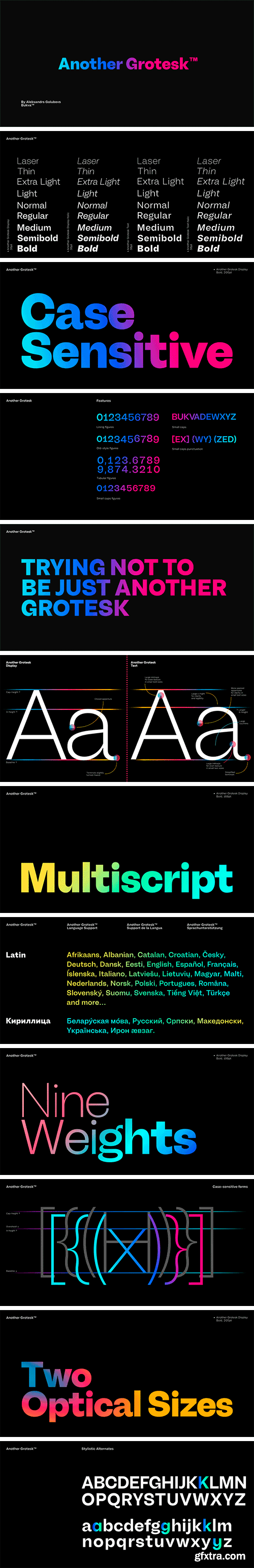
Another Grotesk is a contemporary typeface that was inspired by the early grotesques. Upon closer inspection you will notice the terminals of some of the characters are slightly turned inwards, this detail gives Another Grotesk its distinctive and friendly personality. Another Grotesk is functional and has been crafted with a great attention to detail. It is available in 9 weights and two optical sizes with matching italics which adds up to 36 styles.
https://creativemarket.com/MoonBandit/6871797-MBF-Amoniac-future-geometric-font
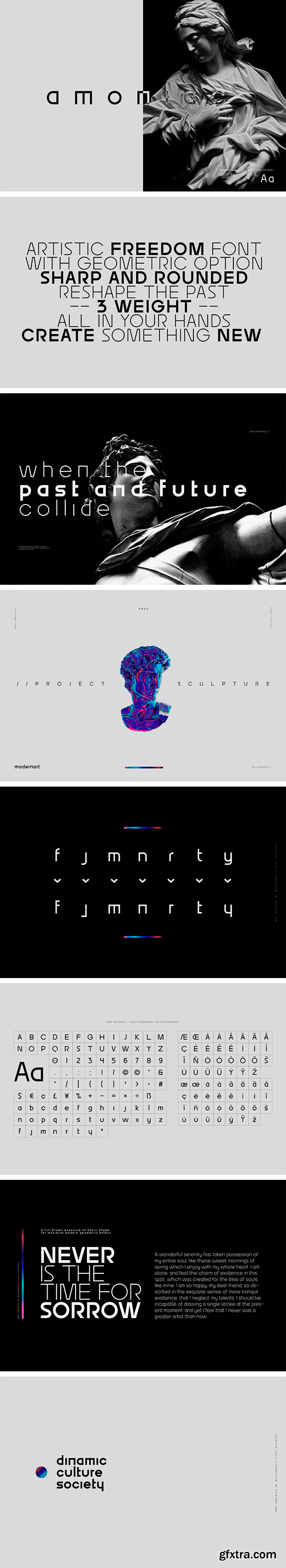
Amoniac is a geometric modern minimalist sans serif display font. A fusion of artistic old world and the future, creating a unique contrast of new style. This typeface consist of 3 weight with optional alternate glyph. Pick your own style, rounded or sharp. perfect usage includes logo, poster, display, headline, t-shirt design and many more.
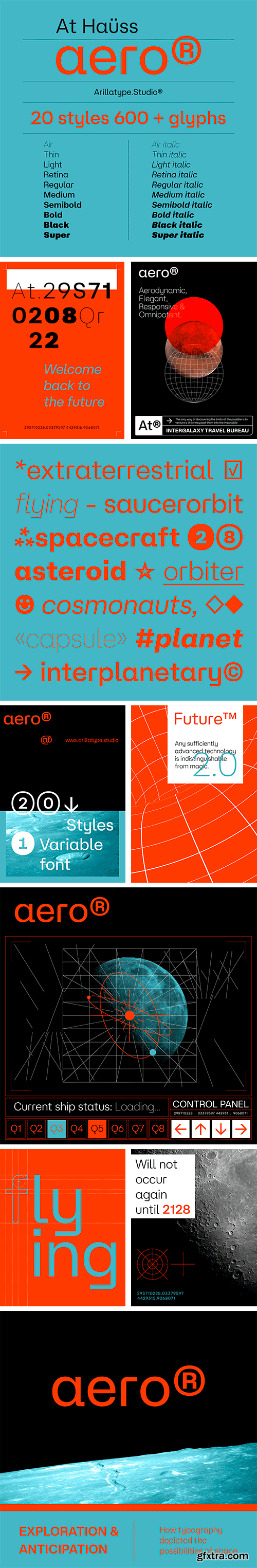
At Hauss Aero Font Family
At Haüss Aero is where the Streamline Moderne movement meets grotesque typefaces. Inspired by aerodynamic design, this architecture and design style from the 1930s permeates At Haüss resulting in a device of Art Déco modernism and elegance. Curving forms and sharp lines coexist in a pure typographic sphere conceived for unique voices. It is presented in twenty styles — starting with the delicate Air, crossing paths with the optimised for high-density screens Retina, and arriving at the robust Super.


https://creativemarket.com/nathatype/7225475-Renneal
Renneal is an uppercase font that comes in duo (serif and display) version. The unique strokes/curves at the particular part of the character give the serif style artistic vibes. On the other hand, the display version expresses more simple and clean looks than the serif. Overall, Renneal designed to be easy to read and works best in header/title text.


https://creativemarket.com/saridezra/7218883-Soft-Aura-Minimalist-Sans-Family
Soft Aura is a minimalist and simple sans family that have four fonts in total. You will get the regular, italic, bold, and bold italic in the package. You can use this font for any purpose, suitable for contrast logotype and branding. Combine the style fonts, italic and bold in one word to get stylish contrast look. This font also support multi language.


https://www.myfonts.com/fonts/brenners-template/priego/
Here are Modern Sans created with a bit of playfulness and clear grotesque. However, clear visibility and balanced contrast, are the main features of all glyphs. This modern Sans font family is designed to complement each other with balanced stem consistency and resisting Alternates. If you want to meet a grotesque with a different feel, try using these Alternates.


https://www.myfonts.com/fonts/latinotype/seriguela/
Seriguela is an ultra condensed sans serif typeface with a unique personality. It comes in normal and display versions, each with 9 weights, as well as italics and reverse italics totaling 54 fonts. Seriguela is flavor in motion and each part of its system works together to captivate you, combining emotion and usability, allowing you to create attractive and unique designs. Seriguela followed a very distinctive recipe to design its alphabet: it started with a grotesque base and applied movement and joy in a very original way. The blacker and more contrasted, the tastier.


https://www.myfonts.com/fonts/without-foundry/hardbop/
Hardbop is a typographic system inspired by jazz, especially the style it's named after "Hardbop". It's also inspired by the prolific graphic work of Reid Miles for the covers of Blue Notes Records in the '50s, Japanese jazz album covers of the '70s and condensed and grotesque hand painted signs. Hardbop also references classic fonts such as Impact, Bebas, Din, Frontage and TT Trailers, the latter in the exaggeration of certain characteristics such as counterforms and endings. Hardbop design works for titles and wide spaces and was specially designed for covers and posters, where its intention is not to go unnoticed. Although it is a small family, it allows game possibilities with a wide set of characters.


https://www.myfonts.com/fonts/kimmy/bakewell/
Bakewell is the 4th typeface of the Winslow Type System. It's a low contrast sans-serif with ball terminals and a sweet disposition. The typeface includes a wide range of styles, widths and weights that make it a great addition to any type collection. From Narrow to Wide and Hairline to Bold, the font family offers extended optionality. Packed with Opentype Features, users can create one-of-a-kind designs perfectly tailored to their specific needs!


https://www.myfonts.com/fonts/latinotype/texta-pro/
Because all good things can get better. Texta was born in 2014, a collaborative project of the study of humanist models from Edward Johnston to Adrian Frutiger. Texta Pro is a contemporary and rational sans, almost invisible, but not quite. It is a workhorse for any type of project. New design of symbols such as Section, Partialdiff, Dagger, approxequal, among others. Expansion of monetary signs (Bitcoin, Peso, Franc, etc.) Basic ligatures fi, fl. Includes Cyrillic.


https://creativemarket.com/webhance/7015661-Blandit-Display-Logo-Font-family
Blandit is a Display font family for design of minimalistic logos. The fonts are very much suitable for creating wordmarks, titles, taglines,Film Posters, headlines, Block letter, Subheading, Logo Designs, Big Banners. Classic & Decorative Typography Web Designs.


https://creativemarket.com/alitdesign/7069583-Mongek-Typeface
Mongek Typeface is designed with a modern concept that is simple and dynamic. The serif style adopted by the Mongek font is a 2022 style font, has a unique swash alternative, has a large selection of ligatures. In addition. Serif typefaces such as “Mongek typeface” are very easy to apply to any design, especially those with an elegant and smooth concept, besides that this font is very easy to use both in design and non-design programs because everything changes and glyphs are supported by Unicode (PUA). The Mongek typeface contains 603 glyphs with many unique and interesting alternative options. Plus, there's a cool serif font family for header and description text from Thin to heavy.


https://creativemarket.com/Graphicxell/7198281-Morgina-Ligature-Typeface
Morgina inspired by the famous minimalist logo perfect for the purposes of designing templates, brochures, videos, advertising branding, logos, invitation, layout design, elegant crafting, beauty design and more.
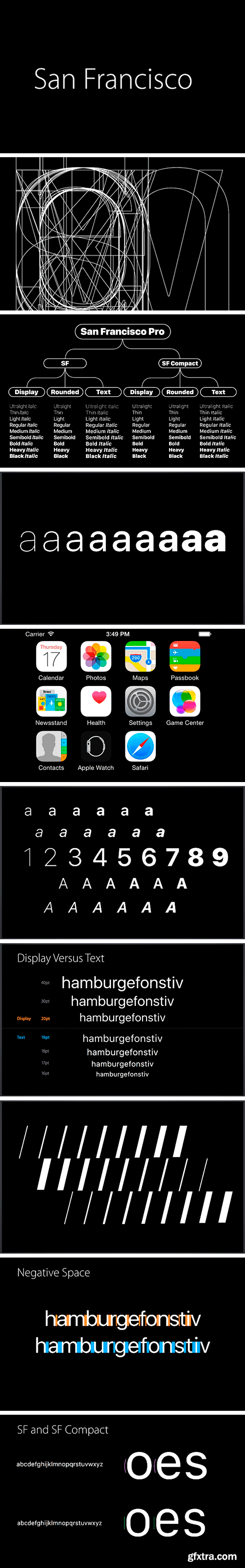
San Francisco Pro Font Family
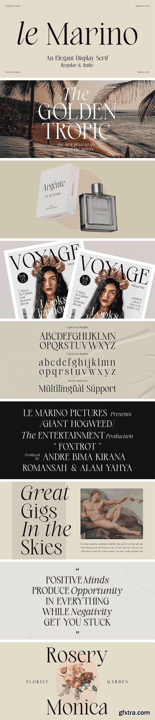
https://www.myfonts.com/fonts/letteralle/le-marino/
Introducing, le Marino! a stylish font that is luxury and modern. the combination of regular and italic version adds to the appeal and usability. le Marnino is a versatile font, perfect for editorial projects, Logo design, Wedding, Clothing Branding, product packaging, magazine headers, or simply as a stylish text overlay to any background image.
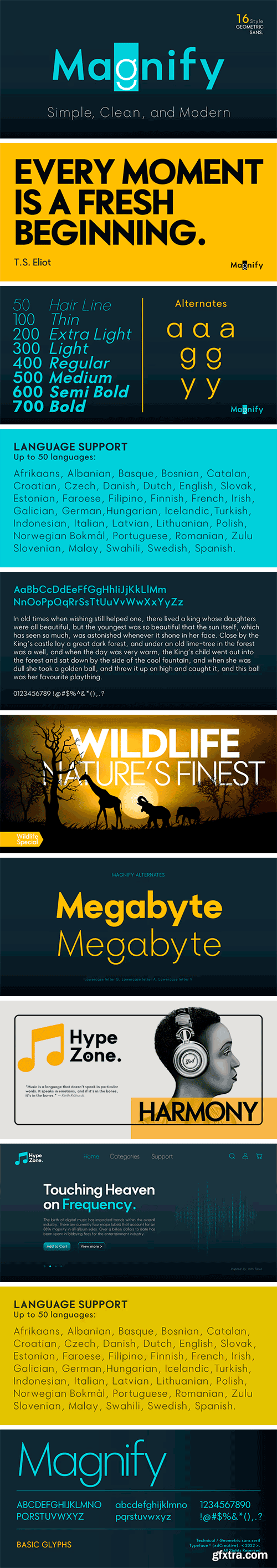
https://www.myfonts.com/fonts/xdcreative/magnify/
Geometric sans serif is one of my favorite fonts because it's so, simple, clean and modern, and a long time I've been dreaming of making this type, inspired by many media and especially "Futura, 1927" ( by Early Bauer) I created "Magnify" Geometric sans. The structure and element shape of Magnify is not really perfectly circle, but slightly oval it can be seen in the uppercase letters O, G, C, Q and in the lowercase letters o, a, c, e. Magnify has 8 weights, - from Hairline to Bold and Matching Oblique. Magnify also has special alternate characters in letters a, g, y and o. it is to give a different look to a paragraph, headline or your display design.


https://creativemarket.com/VintageVoyage/5079755-London-Oatmeal-•-Stylish-Duo
Glad to introduce you a new stylish font duo - London Oatmeal. Elegant modern art-deco inspired sans with a lot of ligatures with retro look stylish brush script. It's nice font pair for use it in blogs, posters, magazines, logo’s or greeting/wedding cards. The sans has caps lowercase, so you can combine them in many ways. More than 100 open type features as alternates, fina’s, swashes and ligatures.


https://creativemarket.com/VintageVoyage/5421973-Minorica-Handwritten-Collection
Hey folks! Glad to introduce you a new MINORICA handwritten collection to imitate a hand lettering style! A complete font kit with graphics give you a fantastic result. A roughen pencil written letters with the same rustic shapes and decorate doodle elements looks very authentically! Play with styles, use the stroke style with inlines, or just a regular.


At Gambit Font Family
At Gambit is a sophisticated paradox. It feels sharp and confident whilst remaining graceful and delicate thanks to its high contrast structure and suave angular wedge serifs. At Gambit manoeuvres through elegant territories but is full of brave gestures and exquisite moves. It is a wonderful maze of finely tuned details and meticulously crafted shapes. At Gambit is always prepared for the perfect typographic checkmate. This typeface is optimised for top-quality performance in branding and editorial design. At Gambit comes in five hand-crafted weights with nimble matching italics, a suite of chess and typographic symbols and several sets of numerals.


At Slam XXXCnd Font Family
At Slam is a banger of a typeface! Inspired by the world of basketball, this font is an exuberant ode to rhythm and beat. It’s full of the attitude and personality of street courts and players. The XXXCnd sub-family presents the tightest use of space; exxxtra condensed and exxxtra charismatic — as a buzzer beater! The At Slam XXXCnd family contains 30 styles with 10 Roman weights, plus 10 Slanted and 10 Backslant cuts. The fonts include an Old-school set of alternates for a vintage vibe, and a joyful OpenType feature of circled numerals. A variable font is also


https://creativemarket.com/Mastertype/7163699-Glamour-Elengant-Script
Glamor Script is one of the Elegant script fonts that comes with a very beautiful character change, a kind of classic copper decorative script with a modern touch, designed with high detail to present an elegant style.
Valizas Font Family
The typeface Valizas is the cousin of Recife. Her concept is all about adding extra spaces in counters like in the lowercase-a.After publishing Recife, I always like to make this concept work in a grotesk typeface. And here we are some five years later; this is Valizas!This sanserif family thrives with a unique and cheerful expression. Valizas has a large x-height which, makes her personality even pop more.


https://www.myfonts.com/fonts/kaligra-co/kelly/
Kelly is Sans serif Version of Mikela Typeface. It is a Bold Minimalist Elegant Modern vintage font with beautiful ligatures, tons of special alternative glyphs, ornament and multilingual support. It's a very versatile font that works great in large and small sizes. Perfect for branding projects, Logo design, Clothing Branding, product packaging, magazine headers, or simply as a stylish text overlay to any background image.
126,000 Royalty-Free 3D Model

Udemy Türkçe


Top Rated News
- CreativeLive Tutorial Collections
- Fasttracktutorials Course
- Chaos Cosmos Library
- MRMockup - Mockup Bundle
- Finding North Photography
- Sean Archer
- John Gress Photography
- Motion Science
- AwTeaches
- Learn Squared
- PhotoWhoa
- Houdini-Course
- Photigy
- August Dering Photography
- StudioGuti
- Creatoom
- Creature Art Teacher
- Creator Foundry
- Patreon Collections
- Udemy - Turkce
- BigFilms
- Jerry Ghionis
- ACIDBITE
- BigMediumSmall
- Globe Plants
- Unleashed Education
- The School of Photography
- Visual Education
- LeartesStudios - Cosmos
- Fxphd
- All Veer Fancy Collection!
- All OJO Images
- All ZZVe Vectors
- CGTrader 1 CGTrader 2


