


https://www.myfonts.com/collections/gilway-font-art-grootfontein
Gilway is a playful, rounded display with tons of personality. This versatile typeface is inspired by the earliest examples of rounded types from the 19th century, such as Caslon Rounded (1836) and Schmale Runde Grotesk (1885). Gilway has a distinctive hand-lettered feel because of its subtle variances, which make it powerful and impactful yet incredibly friendly. Layered options allow you to combine the various styles, and a unique Opentype feature makes your letters dance! Gilway’s design is suited for a wide range of uses, including headlines, displays, packaging and logotypes.
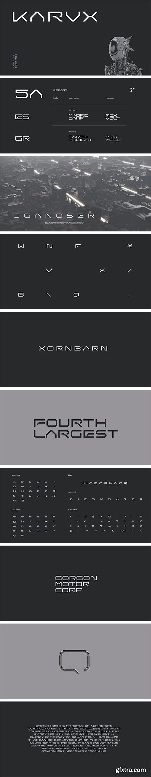
https://www.myfonts.com/collections/karvx-font-baqoos
Karvx is an arithmetic explication tech sans apt for headline, editorial, branding, packaging, printed materials and typographic applications. 200+ glyphs with ligatures and fractions.


https://www.myfonts.com/collections/ghaith-sans-font-ali-almeethali
Ghaith Font is Arabic and Latin and the sub-languages from them are inspired by the Naskh script with a semi-rigid base characterized by many variable and compound characters, as well as high flexibility. Ghaith Font is considered a typographical font for the clarity of its typefaces in all types and sizes of printing. It is also used for broad headings, logos, and various fields.
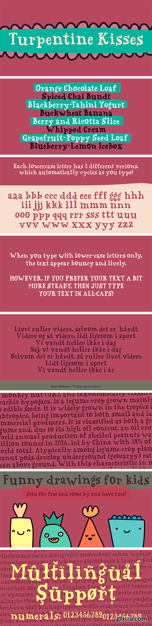
https://www.myfonts.com/collections/turpentine-kisses-font-bogstav
Based loosely on Clarendon, Turpentine Kisses breaks all the rules of the classic serif fonts. It's jumpy and bouncy with a clear handmade look. It's playful yet legible, and full of personality. I've added 3 different versions of each lowercase letter, and they automatically cycle as you type. Or you can just select the one you prefer from the glyph menu.
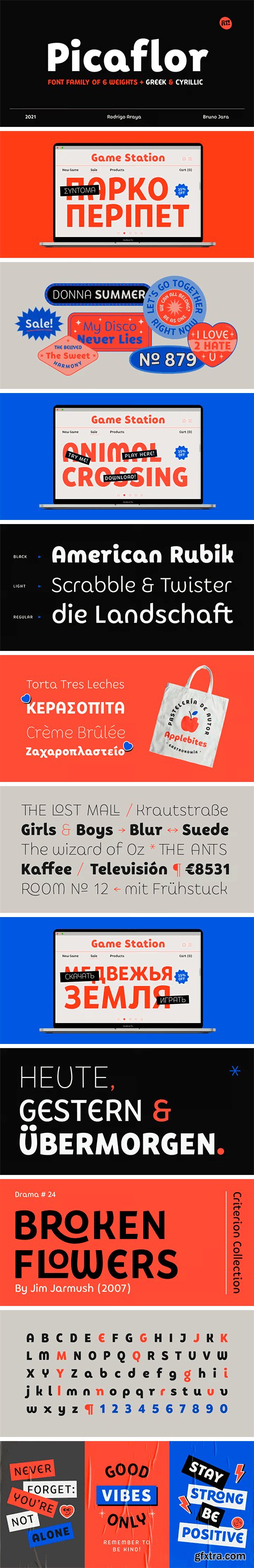
https://www.myfonts.com/collections/picaflor-font-rodrigotypo
Picaflor is a sans typeface family perfect for titles, it contains 6 weights from thin to Black in addition to Greek and cyrillic alphabet with many alternatives from ligatures and letters, enjoy it!
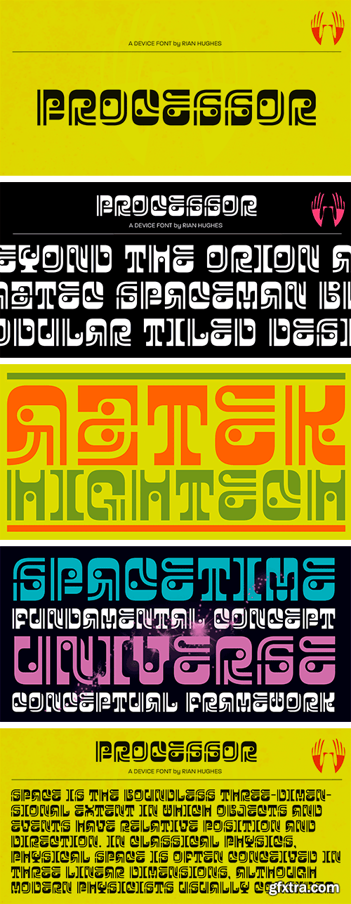
https://www.myfonts.com/collections/processor-font-device
An unusual modular geometric font that lies somewhere between Aztec and Futurism. An attention grabber that is best used big.


https://www.re-type.com/fonts/superblue/
SuperBlue is a casual, cheerful sans serif family designed by Seán Donohoe, a Danish type designer and sign painter. Seán crafted the first version of the family during his time in the TypeMedia master’s program in type design at the Royal School of Art (KABK) in The Hague. While making initial sketches, he took advantage of his sign-painting skills, using two flat brushes to define SuperBlue’s basic forms.
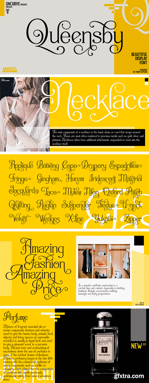
https://www.myfonts.com/collections/queensby-font-uncurve
Queensby is a unique modern serif font with tons of alternates, to use in such place as headlines. You can mix and match to find something different. Queensby is perfect for advertising, magazines, editorial, posters, branding, logo type, headers, titles, packaging, displays and more.
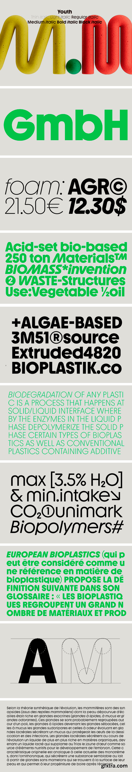
https://www.allcapstype.com/typefaces/youth
Youth might have skipped class once or twice – but it has learned a lot from the ‘Bauhaus’ genre of the phototypesetting era. The style has been reimagined with dynamic rounded corners and lively proportions, creating an unprecedented energy in bold cuts. Youth is systematic in appearance but not modular in construction. Instead, optically corrected curves create a contemporary balance that improves upon the style of its film-based ancestors. A distinctively high x-height facilitates use in headlines and lead paragraphs, while unexpected turns in drawing give the font a distinct character. As a shout out to Herb Lubalin,¹ David L Burke² and other designers from the phototypesetting/Letraset years of the late 60s and 70s, Youth has multiple stylistic sets, including one featuring lightweight, contrasting diacritics, as well as a wide range of alternative characters (both kinetic and geometric) that give the typeface extra universality for branding and identity projects.


https://www.myfonts.com/collections/tritone-font-champagne-design
Tritone is a serif old style typeface display. The design is inspired by the Art Noveau style, which taken from the facade of a bathing establishment and reinterpreted it. The beauty of the font lies in it is classic and unique shapes and forms that characterise it, and for this comprises only two weights, for the dedication to the forms. The font expresses beauty and tradition, but in a lyrical context it can express the power of opera, because of it is powerful and elegant design.


https://ephemerafonts.com/products/efco-drippy
Starting from the archive of vintage educational lettering books, posters, and decorative stuff of visual trends back in the day, Drippy was born based on that particular reference. To fill the gap between classic historical ambiance and the pop modern retro vibes. The swashy touch on each letter is tailored to make Drippy more remarkable in the industry. Stand out from the crowd, and be the best version of your vision statement. Undoubtedly a perfect pair for your logotype, branding project, label design, sign painting, and a very wide of advertising needs.
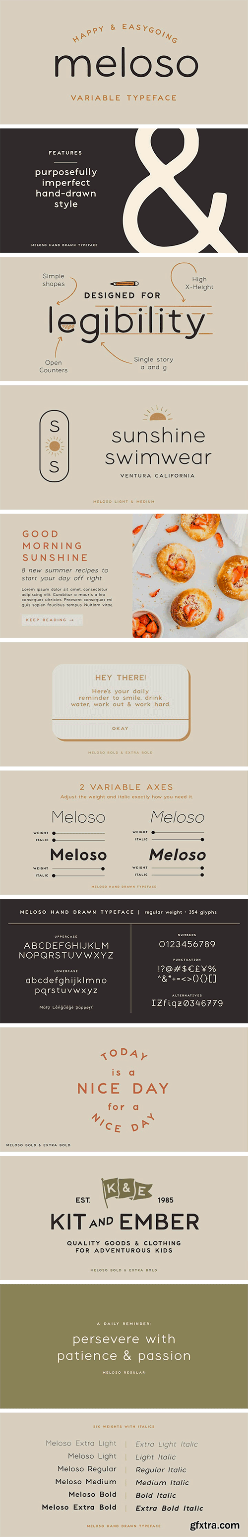
https://www.myfonts.com/collections/meloso-font-mini-press
Meloso is an easygoing typeface. It has a playful and organic feel that has its own hand-drawn charm while still being incredibly legible due to its simple shapes and high x-height. It has the unique ability to stand alone as a title text or work in small paragraph form. It's the perfect way to bring the friendly feel of an "imperfect" and slightly rounded font into your next project. Meloso is a variable font with 6 set weights. If you're using a program that supports variable fonts, you'll be able to choose any point between the "Extra Thin" and "Extra Bold" weights to get the perfect thickness and adjust the italic to the angle you need. You can also use the standard OTF files to have the 6 set weights.


https://www.myfonts.com/collections/everflow-font-andrejs-kirma
Everflow is the third typeface family by Andrejs Kirma. Coming from the background of creating a large amount of geometric icons, he set the goal of creating geometric typefaces in a variety of styles and consequently exploring new opportunities in typeface design. A modern, geometric serif typeface in seven weights Everflow was created to serve the modern designer that appreciates precision, versatility and simplicity.
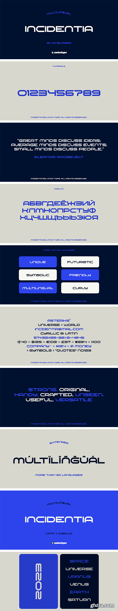
https://www.myfonts.com/collections/incidentia-font-umka-type
Incidentia - A Display Font : Incidentia is a carefully crafted display font. It has Extended Latin and Cyrillic characters. It is created for poster, web, brand and social media designs.


https://www.myfonts.com/collections/modulus-pro-font-arkitype
Modulus Pro, the extensive update to Modulus. This update was built around the original Modulus Font. This rounded sans-serif has a larger glyph set which covers many languages. Modulus Pro now comes in 8 weights from Extra-Light to Black. This updated version was designed with the designer in mind, you have many stylistic alternates to get creative with and make some really cool customised typography. A large range of examples have been designed to show just how versatile and creative you can get with this font family. It's fun but has a cool, edginess to it at the same time. Modulus Pro is not just another rounded sans-serif, you are going to want this in your font list.
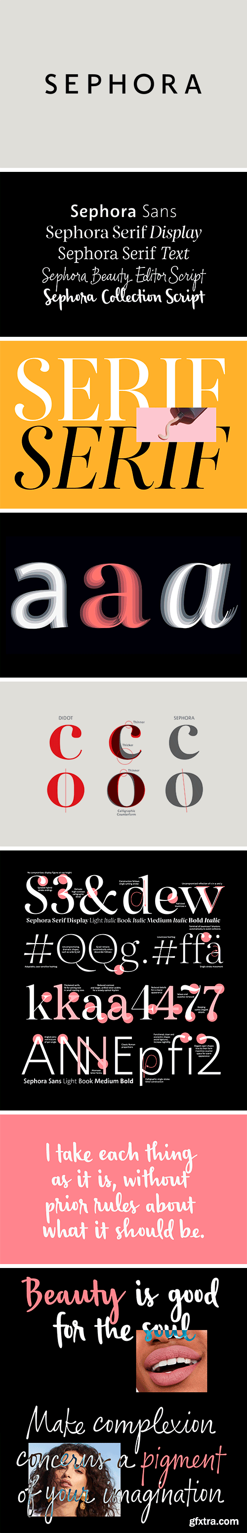
https://schriftlabor.at/custom/sephora/
The world’s largest beauty retailer, Sephora, uses their custom typeface system for their global branding on their printed materials, their shop fronts, their website and their mobile apps. In collaboration with New York-based agency Mucca, the team at Schriftlabor created a typeface superfamily consisting of two serif and one sans-serif family, plus two unique handwriting fonts.
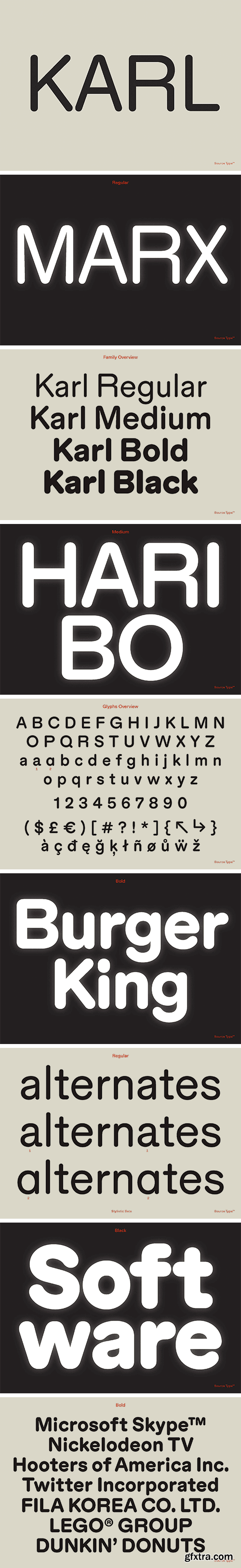
https://www.sourcetype.com/typefaces/333/karl
The history of rounded type is strange and diverse, from baked bread letterforms to bubbly corporate tech logos. While today rounded type might be a stylistic genre, it’s interesting to understand its evolution as a product of technological or production constraints. Take, for example, wood type where it was easier to mill curved forms as opposed to right angles. Or highway signage, where text would appear blurred from backlighting, making words look different in the day versus the night.
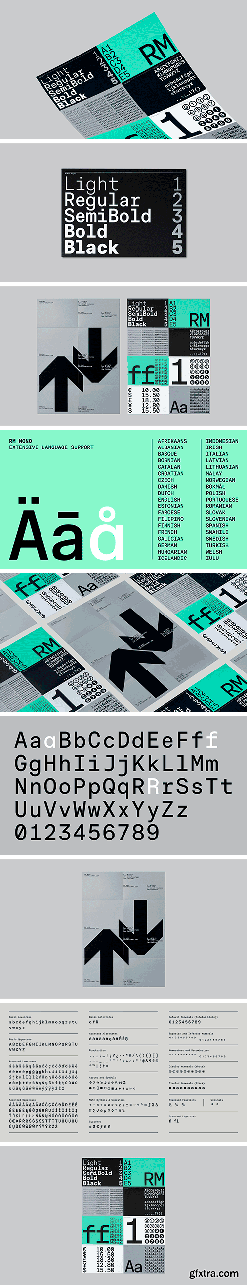
https://cotypefoundry.com/our-fonts/rm-mono/
RM Mono is the monospaced version of RM Neue. Each character in RM Mono fits in a box of the same width (600 units). While developing RM Mono, we also took the time to update RM Neue with a few new glyphs, tighter tracking, better kerning, and an overall facelift.
https://www.myfonts.com/collections/otostrada-mf-font-masterfont
Legible yet elegant font family with a variety of weights.
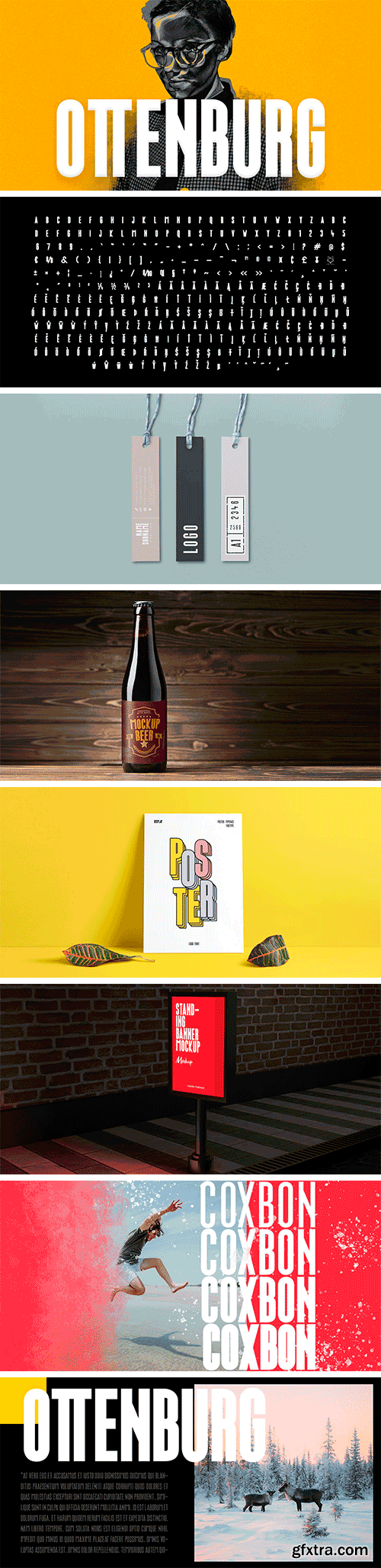
https://www.myfonts.com/collections/ottenburg-display-font-foxtype
Ottenburg Display is a Brand New Elegant Typeface with a powerful font family. It has a dependable and uncompromising style, with controlled letterforms and modern touches. It looks amazing in logos, magazines, and movies . Ottenburg Font would be perfect for branding, headlines, Captions, paragraph, and posters . The various weights allow you to experiment with a wide range of applications. It's created to make an impression without sacrificing its beauty and readability. It's shown a clean, minimalist, warmth, quirky, yet still purposed to be versatile.


https://www.myfonts.com/collections/goldshine-font-uncurve
If you like old style type, ephemera or victorian era, you must be collect this font , its combination of old and modern touch ,it so adaptable and thats make an eye catching design. This unique and classic font for signage, label, poster, gold leaf, sign painting, branding and the other graphic design made. Gold shine inspired of vintage advertising and sign shop around the world.


https://www.myfonts.com/collections/offhand-brush-font-pintassilgoprints
Offhand Brush is a fast and spontaneous brush font with quite a messy feel, a great option for book covers, packaging projects, album art, web titles, and even small chunks of text. It looks messy, but don't get it wrong: on the inside, it's a laborious piece of work, with four alternates for each Latin letter and two for numerals, as well as two options for Cyrillic and Greek letters.


https://www.youworkforthem.com/font/T15153/vifellia/
Vifellia is a versatile and unique serif typeface, a result of half side curved serif and half side straight serif experiment. Vifellia has a unique style with stylistic, alternates, ligatures and supports multilingual languages. Create unique & beautiful logotype, use it as an elegant solution for your next magazine layout, or choose Vifellia for any graphics that require a sleek look with a elegant flair.


https://www.myfonts.com/collections/notes-and-quotes-font-ana-s-fonts
Notes And Quotes is a font duo that includes a bold typewriter font and a casual script font. The contrast between the fonts makes it a striking pair, perfect for logotype design, modern branding and packaging, quotes and social media posts.
126,000 Royalty-Free 3D Model

Udemy Türkçe


Top Rated News
- CreativeLive Tutorial Collections
- Fasttracktutorials Course
- Chaos Cosmos Library
- MRMockup - Mockup Bundle
- Finding North Photography
- Sean Archer
- John Gress Photography
- Motion Science
- AwTeaches
- Learn Squared
- PhotoWhoa
- Houdini-Course
- Photigy
- August Dering Photography
- StudioGuti
- Creatoom
- Creature Art Teacher
- Creator Foundry
- Patreon Collections
- Udemy - Turkce
- BigFilms
- Jerry Ghionis
- ACIDBITE
- BigMediumSmall
- Globe Plants
- Unleashed Education
- The School of Photography
- Visual Education
- LeartesStudios - Cosmos
- Fxphd
- All Veer Fancy Collection!
- All OJO Images
- All ZZVe Vectors
- CGTrader 1 CGTrader 2


