
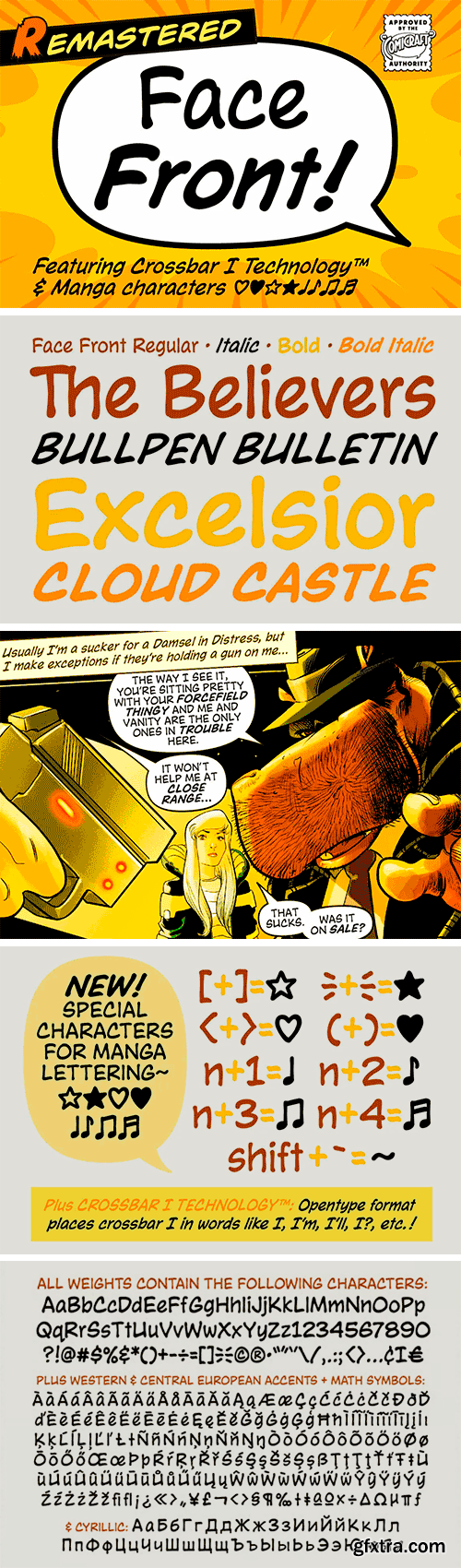
https://www.youworkforthem.com/font/T13029/face-front
Face Front, True Believers, this is the one you’ve been waiting For! Earth’s Mightiest super team of upper and lowercase letters was Assembled for the pages of Marvel Comics' The Avengers.
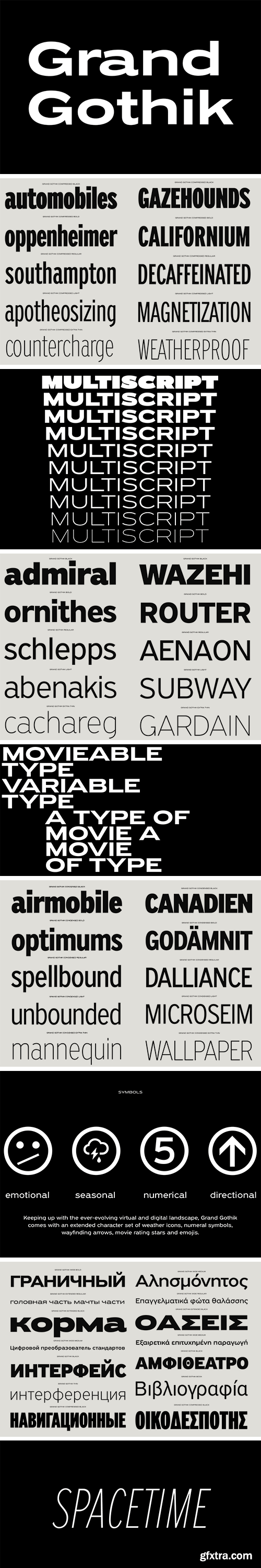
https://parachutefonts.com/typeface/Grand-Gothik
Grand Gothik is a postmodern, multiscript, multifaceted and variable type system which pays homage to the development of grotesque/gothic typefaces over the years. Taking late 19th and early 20th century European and American grotesques as a starting point, it traces this typeface genre up to mid-century movie theater marquees, new wave cinematography, American highway signage and telephone directories, adding some historical references for good measure. Originally designed in 2017 as a bespoke typeface for a bilingual, black and white magazine on surfers, waves and landscapes, it was later reimagined and redesigned leading to the release of its commercial version. The name reflects Grand Gothik’s versatility as a fully functional variable font and its depiction of a vast array of gothic styles found in American and European grotesques. Designed with 3 stylistic alternates, each variation of Grand Gothik depicts a specific period and style: from the less calculated appearance of late 19th century grotesques all the way to their gracefully-shaped contemporary counterparts. The Grand Gothik type system comes with a wide range of styles/weights and supports an extended array of languages and scripts such as Latin, Greek and Cyrillic. Keeping up with the ever-evolving virtual and digital landscape, Grand Gothik comes with an extended character set of weather icons, numeral symbols, wayfinding arrows, movie rating stars and emojis. Also, a Bitcoin symbol was designed as part of its character set in its newly introduced unicode position, rendering Grand Gothik a truly functional modern typeface.
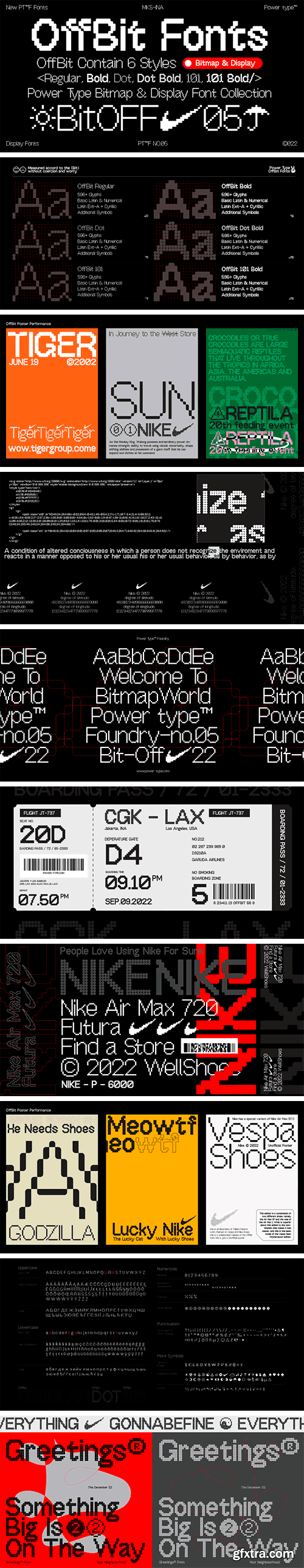
https://www.myfonts.com/collections/offbit-font-power-type
OffBit is a font type derived from Bitmap with various variations from each box. The term bitmap comes from computer programming terminology, which means simply a bit map, a spatially mapped array of bits. Now, together with PowerType, it usually refers to a similar concept of an array of pixels that are mapped spatially and into various shapes such as dots and other models. This font matches the theme of computing, graphic design, posters or other media, all of which can be combined.


https://creativemarket.com/kereatype/7012712-Ethereal-Elegant-Serif-Family
New Modern Elegant Serif Family Ethereal by Kereatype Ethereal is a Serif Family font with 9 Weight is a fashionable and modern elegant serif font with some sexy stylish extras :)


https://www.myfonts.com/collections/pt-nature-font-paratype
PT Nature by Paratype is a collection of scripts based on handwriting of real people. Text set in PT Nature looks genuine and human. The fonts are a great fit for advertisement and packaging designs as well as for informal communications. PT Nature was created by Gennady Fridman and Isabella Chaeva with help from the Paratype design team.


https://www.myfonts.com/collections/freitag-display-font-zetafonts
Probably as a reaction to the pragmatism of modernist design, the seventies saw an explosion of buoyant, vivacious typography. Psychedelia fueled a return to the melting, lush shapes of Art Nouveau while Pop culture embraced the usage of funky, joyful lettering for advertising, product design and tv titling. New low-cost technologies like photo-lettering and rub-on transfer required new fonts to be expressive rather than legible, pushing designers to produce, bubbly, high-spirited masterpieces, where geometric excess and calligraphic inventions melted joyfully.


https://www.myfonts.com/collections/cooperative-font-hafontia
Cooperative is a retro style poster font in Hebrew and Latin. Is based on a printed example of a vintage handmade wood type from the 1950's. This sans serif font is available in both regular and bold versions, with a dirty and grungy styles as well in regular and bold.


https://ephemerafonts.com/products/efco-stamp-numbering-1
Inspired by date and numbering stamps, there once was manufactured rotary band stamps with glitched number and configurations that were used for various identification purposes. This font replicates the characteristic used on these devices.
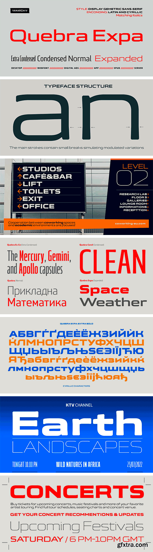
https://www.myfonts.com/collections/quebra-expa-font-vanarchiv
Quebra Expa (Expanded) is an extend display sans-serif font family, available with four widths (Extra Condensed, Condensed, Normal and Expanded) and ten weights, italics versions are available. The main strokes contain small breaks simulating modulated variations on the letterforms, these details are more present on large body sizes. All font versions contain Latin and Cyrillic encoding characters and also ligatures, case-sensitive forms, fractions, oldstyle and finally tabular figures.


https://www.fontfabric.com/fonts/muller-next/
Muller Next – the type system that will take you to the next level. As you can tell by the name, the system derived from our bestselling and very-much-loved typeface – Muller. But the font’s story doesn’t end here. The very first sketches of the author Radomir Tinkov appeared more than 10 years ago. Needless to say, the perfect geometry of Muller stood the test of time and continues to be relevant even today. So we thought – how can we make it even better?


https://creativemarket.com/ngene/6614524-Sego-Serif-Font
Sego vintage style serif font with an elegant and modern touch, this font is amazing of different character characters. This font has several alternatives available in it, suitable for creating logo designs, badges, web fonts, magazines and others. With a very strong font character, it will make your design different and more attractive.


https://www.myfonts.com/collections/tt-cometus-font-typetype
TT Cometus is an expressive typeface that captivates from the first time you read a text set in it. Despite its massiveness, the typeface is malleable and dynamic, like a comet piercing the space in order to achieve the only goal - to capture the attention of the viewer.


https://www.creativefabrica.com/product/brulle/
Brullee is a sweet and stunning script with incredible letters. Use it to turn any design project into a true standout!
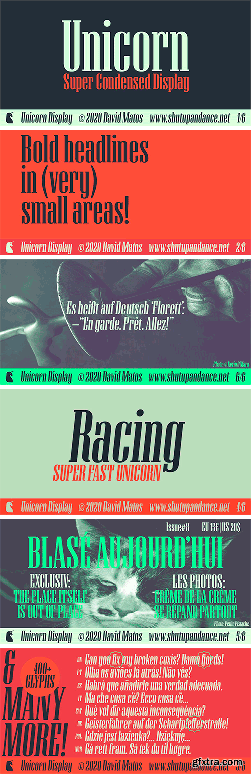
https://www.myfonts.com/collections/unicorn-font-david-matos
Unicorn is a super-condensed Display font with a subtle dramatic flair that works especially well in titles, headers and editorial design. It was firstly inspired by a lowercase set seen on a furniture ad in Domus (the architecture magazine) #192, from 1943. For maximum drama, use with a bright & smart colour palette. Appointed by the Unicorn. Of course.


https://www.fontspring.com/fonts/zetafonts/freitag
Probably as a reaction to the pragmatism of modernist design, the seventies saw an explosion of buoyant, vivacious typography. Psychedelia fueled a return to the melting, lush shapes of Art Nouveau while Pop culture embraced the usage of funky, joyful lettering for advertising, product design and tv titling. New low-cost technologies like photo-lettering and rub-on transfer required new fonts to be expressive rather than legible, pushing designers to produce, bubbly, high-spirited masterpieces, where geometric excess and calligraphic inventions melted joyfully.
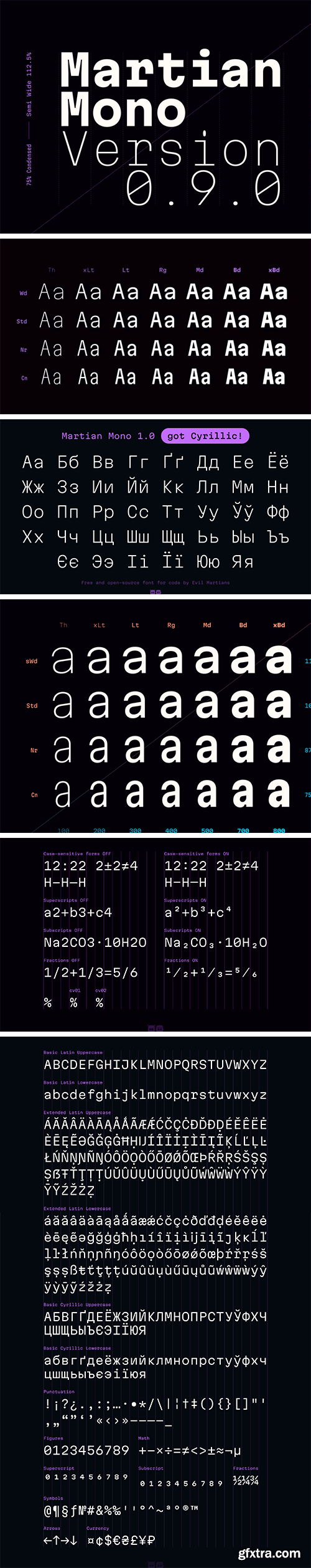
Martian Mono Font Family
Martian Mono is a monospaced version of the Martian Grotesk font for code style design. It inherits Grotesk’s brutal and eye-catching aesthetics as well as all of its benefits—metrics equilibrium, readability and intelligibility, and convenience for web developers and designers who believe in a systematic approach to design.


https://www.myfonts.com/collections/thermal-shock-font-hanoded
Thermal Shock font is a very nice, handmade brush font. If you ever bought any brush fonts of mine, you will know that I almost always use Chinese ink and cheap brushes to create 'the look'. It is always a bit of a surprise how a Chinese ink brush font turns out: I created one the other day and it looked horrible, so it was banned.. Thermal Shock turned out to be a looker. Thermal Shock comes with one set of alternate glyphs, extensive language support (including Greek and Vietnamese) and a guarantee it won't crack in super hot designs.


https://www.myfonts.com/collections/geogrotesque-condensed-font-emtype-foundry
The popular Geogrotesque family becomes an extended system with the inclusion of three new members to the family; Geogrotesque Condensed, Geogrotesque Compressed and Geogrotesque Extra Compressed. The condensed series keep the spirit of the original one, and give way to a superfamily up to 56 styles. This new system fluidly varies between widths, ranging from the original width to a 55% of it in the narrower one. As their original partner, the new fonts are great headline families for publications, but will also work in text of intermediate length and point size. The Geogrotesque superfamily offers now one font for each design need. It is available in Open Type format and includes Ligatures, Tabular Figures, Fractions, Numerators, Denominators, Superiors and Inferiors. All of them with support for Central and Eastern European languages. This type family consists of 42 styles, 7 weights plus italics in 3 widths.


https://www.myfonts.com/collections/potenciarte-font-nasir-udin
Potenciarte is an all-caps display typeface inspired by the facade of old buildings from the era of Nederlandsch-Indie (1900’s) in Surabaya, where Art Deco & Art Nouveau typographic styles were widely used.


https://creativemarket.com/maulanacreative/5364035-Pollyester-Blackletter-Typeface-Font
Pollyester Blackletter Font is a handmade Modern Victorian handlettering, which is combining modern and classic typography with some awesome alternates. Yes we back to early 1800s, bring classic touch on this decade.


https://www.myfonts.com/collections/celesse-font-sweetest-goods
Celesse - A classic serif font, perfect for creating bold & gorgeous designs. Pour yourself a glass of your finest wine and get classy with Celesse. This font is great for designing elegant logos, quotes, magazine covers, wedding cards, invitations, and brandings. Its stark contrasting lines are best used in headlines and projects with big type. Celesse adds timeless beauty, heavenly curves and a classic appearance to any project.
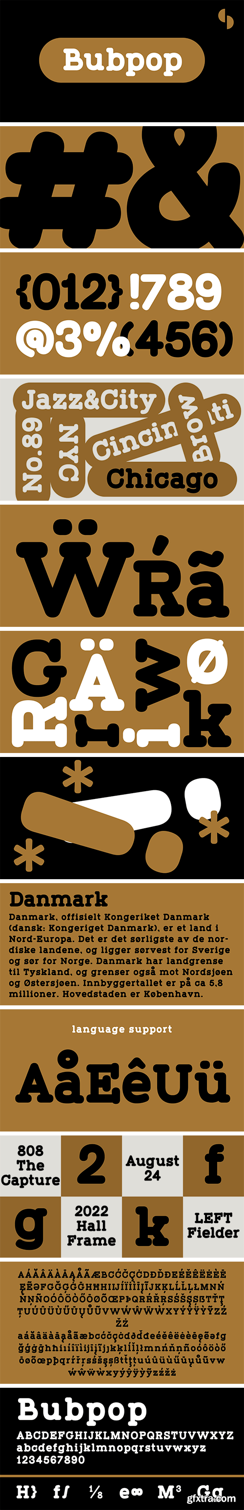
https://www.myfonts.com/collections/bubpop-font-samuel-design
The name of this font is Bubpop. The features of the serif body are combined with the non-sans-serif body. Structuring and reconstructing the serif font, we get a very modern font effect. The font effect is not only rounded, but also has clever ideas and solemn details. This treatment makes this font more widely used and remains different.
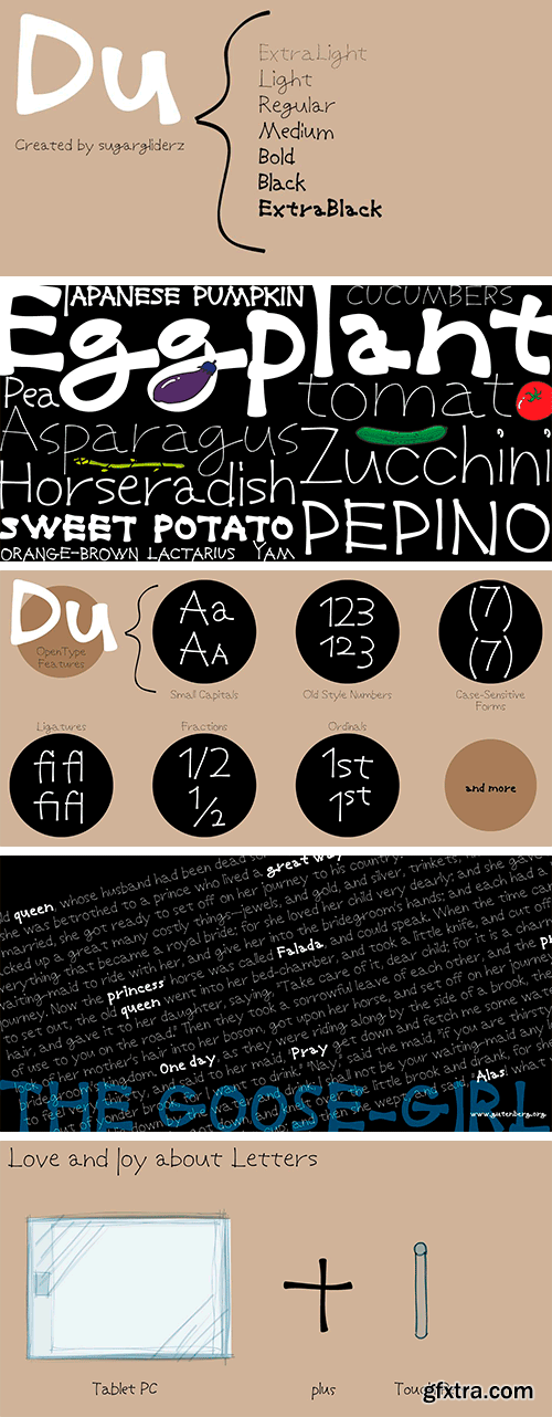
https://www.myfonts.com/collections/du-font-sugargliderz
Du is a self hommage to Uncertain Felttip. Uncertain, made in 2008, is a typeface which reproduced faithfully the style in which I am writing on copy paper, usually using the felt-tip pen. This time, I wrote the new family by the same method but using the tablet PC and the touch pen. Although, as for some characters, Uncertain differs in a form, it is the result of reflecting my hand writing. I wrote all the characters. If it is original, all the characters diverted and composed, for example, characters, such as Aacute and Agrave, are written. Different specification from Uncertain is family composition. Although Uncertain had only 3 weight, 7 weight were designed for Du. This way a user can choose his favorite weight because the variation of weights increased.
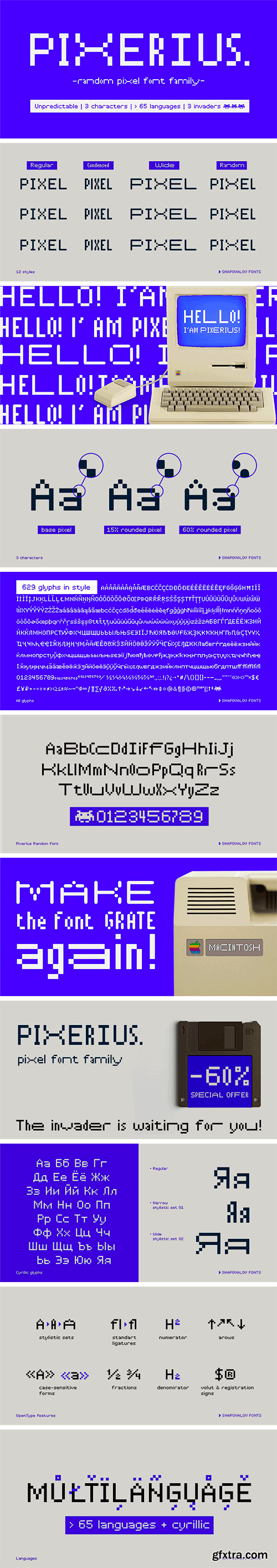
https://www.myfonts.com/collections/pixerius-random-font-shapovalov-fonts
Pixerius is a family of pixel fonts containing 3 characters in width and 12 styles, from square shapes to very rounded ones. There is also a tracing mixing letters of different widths in a random order. The font is suitable for logos, large headlines, posters and signs. It combines the classic retro character of 8-bit games and the playful character of a random set. Pixerius contains extended Latin, Cyrillic, ligatures and space invaders. It contains OpenType features: liga, numr, dnom, calt, ss01, ss02. The font is also case sensitive, has fractions, currency signs including the ruble sign.
126,000 Royalty-Free 3D Model

Udemy Türkçe


Top Rated News
- CreativeLive Tutorial Collections
- Fasttracktutorials Course
- Chaos Cosmos Library
- MRMockup - Mockup Bundle
- Finding North Photography
- Sean Archer
- John Gress Photography
- Motion Science
- AwTeaches
- Learn Squared
- PhotoWhoa
- Houdini-Course
- Photigy
- August Dering Photography
- StudioGuti
- Creatoom
- Creature Art Teacher
- Creator Foundry
- Patreon Collections
- Udemy - Turkce
- BigFilms
- Jerry Ghionis
- ACIDBITE
- BigMediumSmall
- Globe Plants
- Unleashed Education
- The School of Photography
- Visual Education
- LeartesStudios - Cosmos
- Fxphd
- All Veer Fancy Collection!
- All OJO Images
- All ZZVe Vectors
- CGTrader 1 CGTrader 2


