
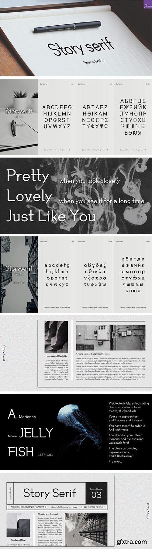
https://www.myfonts.com/collections/hustoryserif-font-heummdesign
HU Storyserif is a textual font in the form of a slab serif and contains a concise and neat feeling through the round conclusion of straight lines and lines. It is a typeface designed to contain a distinctive feeling by adding a round topknot, not a typical square topknot of slab serif, and a gothic solidity through a straight straight line.


https://www.myfonts.com/collections/golden-decades-font-dharma-type
Back to the basics. In the last ten years, type design has been confronting chaotic scene. The font market is flooded with a mixture of wheat and chaff and typography becomes increasingly complex. But one golden straight path exists. The path began from the industrial revolution, passing through swiss style, now we walk along the path as a matter of course. It is sans-serif.
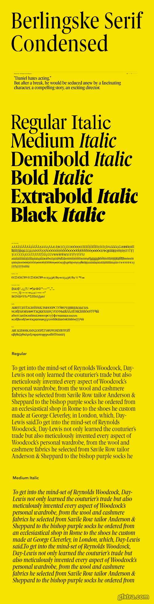
https://playtype.com/typefaces/berlingske-serif-condensed/
Berlingske Serif Condensed is designed with an elegant vertical look and performs optimally under conditions of limited space. The readability is sharp and clear even in smaller sizes. This condensed style takes up less space than a regular style and is, therefore, an excellent choice when space is at a premium. Berlingske Serif Condensed also contains multiple figures, proportional lining and proportional old styles - as well as small caps and small caps numbers to widen its use.


https://www.myfonts.com/collections/pounder-font-cozyfonts
Pounder Fonts were designed by Tom Nikosey / CozyFonts Foundry. This font, as all my fonts started with pencil sketches based on the letter O. Once I arrived at the comfortable shape I worked out the C, G, & Q. The H, M, T matched the visual weight and so I moved on to E & S. As the E & S are 2 of the most repeated characters in fonts' I wanted a little bit extra here. The font is obviously heavy weighted yet very legible and almost architectural in presence. There are flashes of Art Deco yet futuristic style. After sketching the feel of this font I was excited by the possibility of the numerals styling. I can see these used for many applications. Why the title Pounder? Why not it seems to fit.


https://blazetype.eu/typefaces/nuances-serif
Nuances Serif is a very rich Serif family, with a highly expressive and resolutely modern design. Born from personal research on typographic design and aesthetic detail, Nuances is a sharp serif font family with strong contrast and generous curves. With a particular attention to the design of each glyph, this font family is meant to be used in large sizes. This typeface is to be experienced, shown, read and seen through its elegant shapes, and its confident design.


https://www.myfonts.com/collections/crayonize-font-pintassilgoprints
Crayonize is a casual handwritten font with a fresh crayon look, available in two weights. Both styles are all-caps with two options for each letter and numeral, for a natural, organic hand-lettered feel. Contextual alternates feature is included, making it easy to cycle the alternates. Crayonize is excellent for display purposes and small chunks of text: packaging, books, apparel, editorial, greetings cards, opening titles, screens, the list has no end. Give it a try, have fun, and keep on creating!


https://fontbundles.net/creatypestudio/1617952-punchline-poster-display
Punchline is a fun poster display typeface made with love, resulting in a font that looks unique and fun. This font is very suitable for products that prioritize a sense of fun and cute. This font makes all your big products look different and awesome. Punchline is perfect for branding projects, logo, wedding designs, social media posts, advertisements, product packaging, product designs, label, photography, watermark, invitation, stationery and any projects that need handwriting taste.


https://fontbundles.net/liart3535/2370979-gironte
Meet our newest product, we call this product GIRONTE font. GIRONTE font are cute typeface font. Whit a uniqe touch and assertive. GIRONTE font is very nice to use on: fashion magazine, logos, photography, landing page, flayer.


https://fontbundles.net/bb-type-studios/2575765-graphic-pen
Graphic Pen is a squiggly line and fun display font. From handwriting stroke lines to natural eco themes for headlines, stickers, and T-shirts sublimation, this font will definitely elevate any creation.


https://fontbundles.net/liart3535/2370983-thibero
Meet our newest product, we call this product Thibero font. Thibero font are cute typeface font. Whit a uniqe touch and assertive. Thibero font is very nice to use on: fashion magazine, logos, photography, landing page, fliyer.
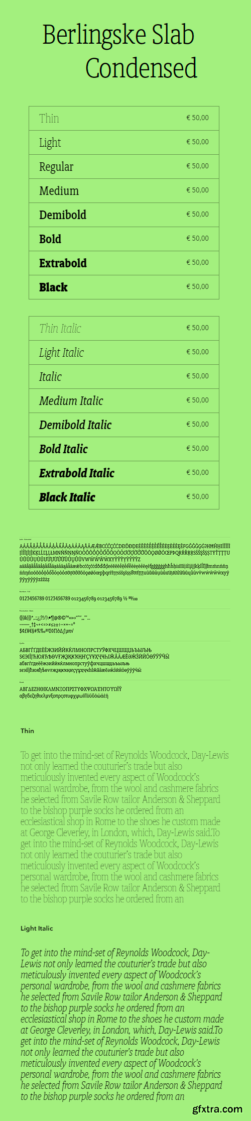
https://playtype.com/typefaces/berlingske-slab-condensed/
Berlingske Slab Condensed has a robust look that in combination with its vertical proportions gives it a forceful expression. The hairlines have been thickened and proportioned to provide it with a balanced look, while the serifs are attached directly to the stroke and are similar in weight to the horizontal strokes of the letters. The condensed style performs optimally under conditions with limited space which makes it very suitable for small sizes.
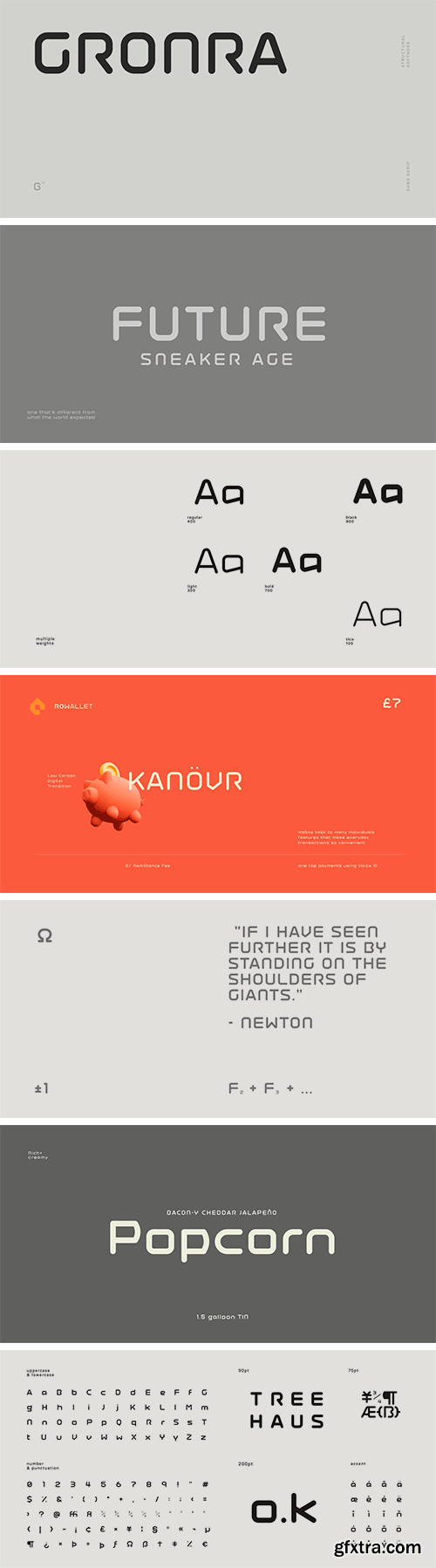
https://www.myfonts.com/collections/gronra-font-baqoos
Gronra is a structural softness linear sans apt for headline, editorial, branding, packaging, printed materials and typographic applications. 200+ glyphs with ligatures and fractions provided in opentype .otf format.
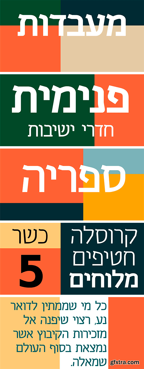
https://www.myfonts.com/collections/celeb-mf-font-masterfont
This happy font family derives its geometric shapes from old Hebrew typefaces with added a modern twist. Suitable for any point size with a variety of 4 weights.
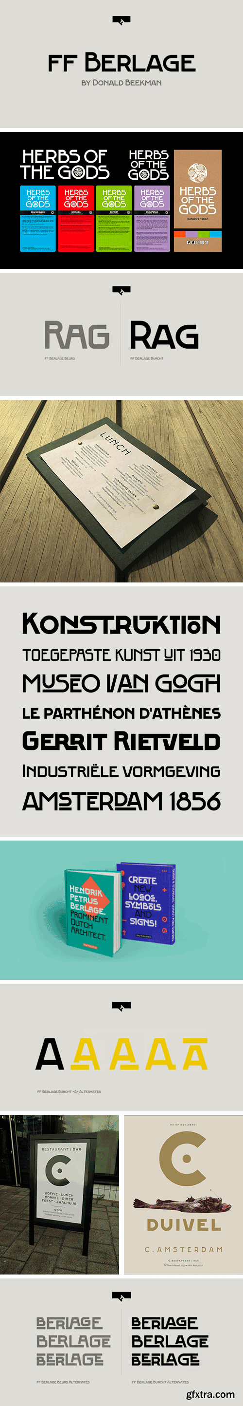
https://www.myfonts.com/collections/ff-berlage-burcht-font-fontfont
FF Berlage started as a research project about the typography of the prominent Dutch architect Hendrik Pieter Berlage (1856 1935). Donald Beekman based the design on a great number of sources, but mainly lettering found in two of Berlage s most quintessential buildings, the Amsterdam Commodities Exchange building (called Beurs van Berlage), and the ANDB building for the Amsterdam diamond cutters union (called De Burcht). Berlage is considered the father of modern architecture in The Netherlands due to his revolutionary theories on architecture and design, that would greatly influence many Dutch architect groups, like the Amsterdam School and De Stijl.
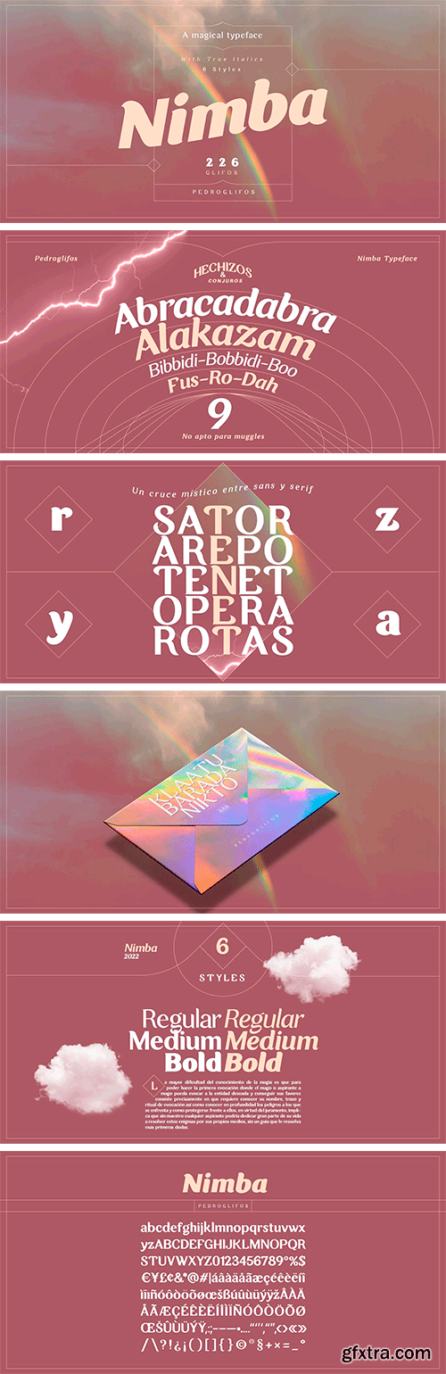
https://www.myfonts.com/collections/nimba-font-pedroglifos
Inspired by the magic in the clouds, this part paintbrush, part san serif, Nimba is a hybrid display typeface that brings swiftness and joy to any project. Ideal for projects that require a sans type without sacrificing personality. This family contains true italic members, providing a stronger sense of motion and speed. Elegant, yet Vivid, this typeface will make your project stand out from the sans dominated design world.


https://www.creativefabrica.com/product/blossom-34/
Introducing Blossom, the chic and elegant sans-serif font that will elevate your designs to the next level. With its delicate lines and sophisticated curves, Blossom is perfect for luxury branding, editorial layouts, and high-end product packaging. With over 520 glyphs, Blossom offers a wide range of options for customization and creative expression. Plus, with multi-lingual support, this font is perfect for designers who work with clients worldwide. Blossom is the ultimate choice for designers who value both style and versatility. Download it now and watch your designs bloom!
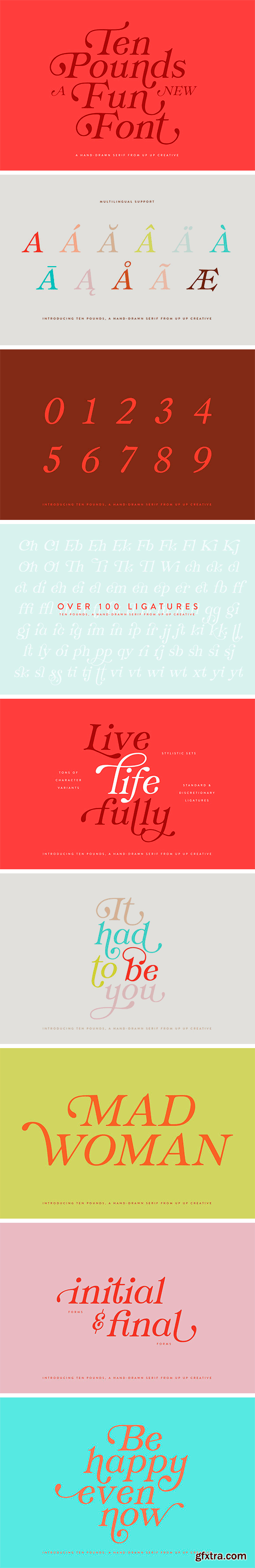
https://creativemarket.com/upupcreative/6082043-Ten-Pounds-A-Hand-Drawn-Font
Introducing Ten Pounds, a fun, hand-drawn serif font with tons of character (and tons of characters!). Ten Pounds is perfect for branding, poster design, t-shirts, invitations, design for children, and editorial design. It comes with more than 1300 glyphs, including more than 100 ligatures. OpenType features include stylistic sets, character variants, initial and final forms, and multilingual support (including multiple currency symbols). The OpenType features can be very easily accessed by using OpenType-savvy programs such as Adobe Illustrator and Adobe InDesign. (To access these awesome features in Microsoft Word, you'll need to get comfortable with the advanced tab of Word's font menu.


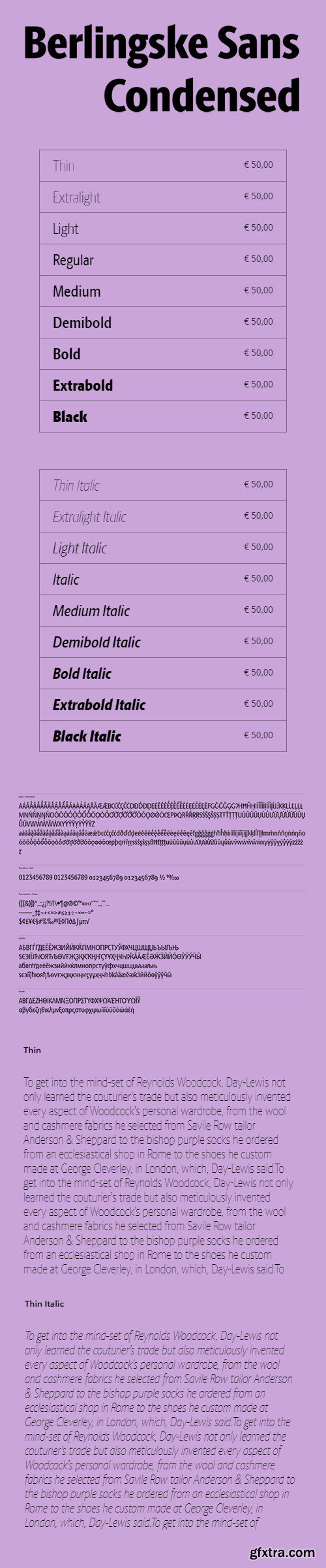
https://playtype.com/typefaces/berlingske-sans-condensed/
Berlingske Sans Condensed has a cool and modern look with vertical proportions and a loose and open expression. The removed serifs upgrade the readability in smaller sizes and gives it a clean and look. It is designed specifically to perform optimally when space is limited, taking up less space compared to a regular style.
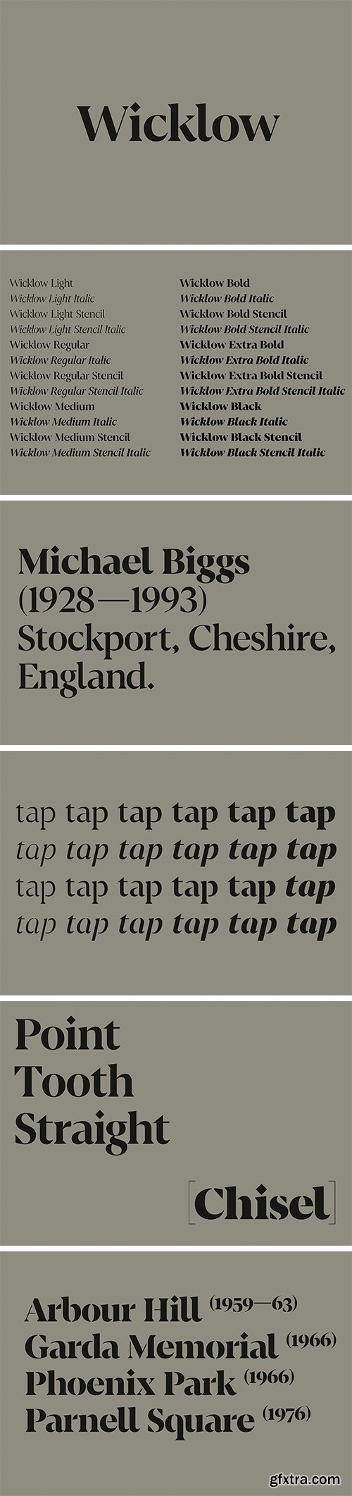
https://www.f37foundry.com/fonts/f37-wicklow
Set in stone — F37 Wicklow takes inspiration from Gaelic letter carvings by the remarkable sculptor Michael Biggs. The starting point for F37 Wicklow is Irish sculptor Michael Biggs’ intricate letter carvings on the Arbour Hill Memorial in Dublin. Biggs’ ‘Gaelic Alphabet’ mixes wonderful geometric shapes and F37 Wicklow reflects this by combining sharp, triangular serifs and diamond tittles with circular forms. It’s a typeface driven by visual contrast. Biggs used slightly different letterforms to distinguish the Gaelic and English texts on the memorial. We’ve mixed things up a bit, transferring some of the pleasing shapes from the Irish Uncial alphabet to our Roman alphabet — for example the curved ‘bay’ (b) and ‘ell’ (l). The graphic, triangular serifs make F37 Wicklow a great choice for branding as well as newspaper and editorial headlines. All the weights come with matching true italics and stencil weights.
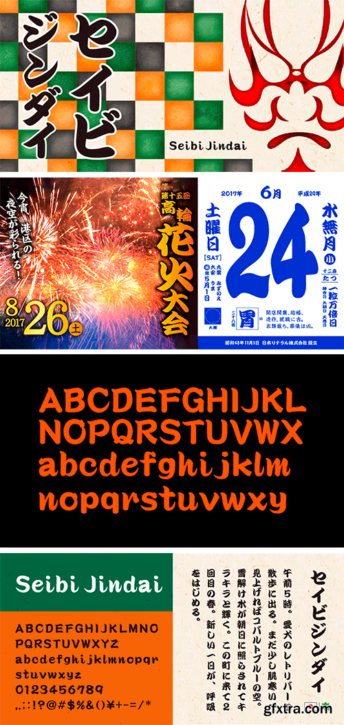
https://www.myfonts.com/collections/seibi-jindai-font-nihon-literal
It is a font based on characters called "Kanteiryu," which were used in the Edo period for signboards and the rankings of actors in stage performances such askabukiandjoruri. While inheriting the culture of "Kanteiryu," the "NewKanteiryu" font is easy to read and is arranged in a modern style, maintaining its decorative nature. You can enjoy the movements of calligraphy-like brush strokes in both vertical and horizontal typesetting.
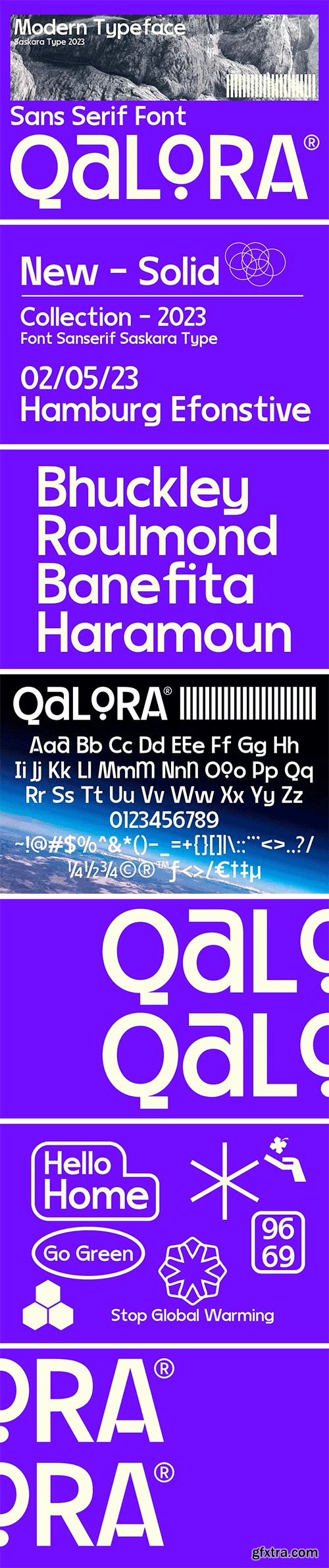
https://elements.envato.com/qalora-KT6ML6H
Qalora is a stylish Sanserif font with a modern touch that is powerful and dynamic. This font is suitable for printing logos, labels, flyers, brochures, signage, books, pubs, barbershops, cards, posters, handmade brands, anything related to modern style, vintage style, etc.
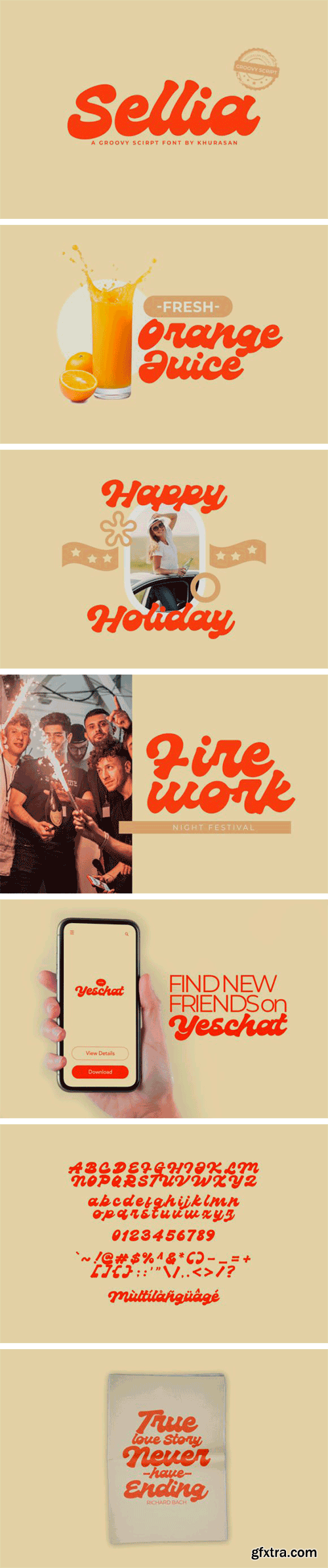
https://www.creativefabrica.com/product/sellia-2/
Sellia is a fun groovy script font perfect for posters, logos, magazines, book covers, banners, and many more! Get this amazing typeface, and use it to create lovely designs! Get this amazing font, and use it to create lovely designs. It can easily be matched to an incredibly large set of projects, so add it to your creative ideas and notice how it makes them stand out!
126,000 Royalty-Free 3D Model

Udemy Türkçe


Top Rated News
- CreativeLive Tutorial Collections
- Fasttracktutorials Course
- Chaos Cosmos Library
- MRMockup - Mockup Bundle
- Finding North Photography
- Sean Archer
- John Gress Photography
- Motion Science
- AwTeaches
- Learn Squared
- PhotoWhoa
- Houdini-Course
- Photigy
- August Dering Photography
- StudioGuti
- Creatoom
- Creature Art Teacher
- Creator Foundry
- Patreon Collections
- Udemy - Turkce
- BigFilms
- Jerry Ghionis
- ACIDBITE
- BigMediumSmall
- Globe Plants
- Unleashed Education
- The School of Photography
- Visual Education
- LeartesStudios - Cosmos
- Fxphd
- All Veer Fancy Collection!
- All OJO Images
- All ZZVe Vectors
- CGTrader 1 CGTrader 2


