

Maxwell Sans Font Family
20 OTF Files | 0.9 MB | Sale PaGe
Maxwell is a clean condensed san serif typeface inspired by similar retro fonts from the 1950’s.
It comes in regular and small caps versions, includes stylistic alternatives and
via the glyph panel you can access scientific inferiors, fractions, oldstyle numerals,
Cyrillic, Greek, Latin and other Western and Central European languages.
It can be used as a headline font or paragraph text.

Arame Font Family
OTF | 8 Fonts | JPG Previews | 6.3 Mb RAR | SALE PAGE
This font with the technical feel of movies and games,
was featured in Iron Man Avengers, Halo 4 and Game Reaktor Magazine.
Version 1.2 features Cyrillic, arrows and reorganized family
(Monospaced in all variations) and a new weight.
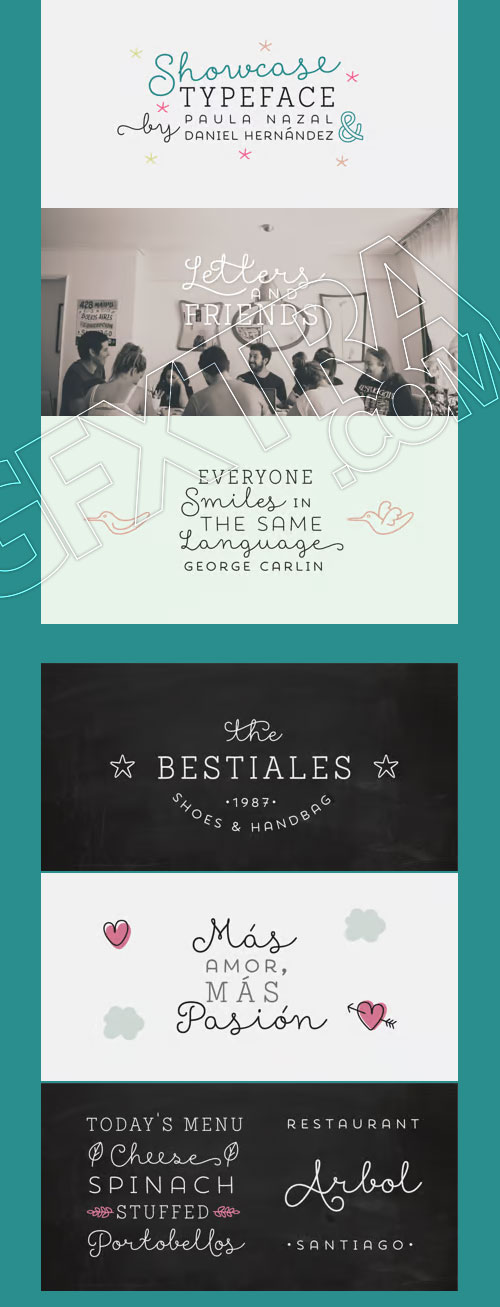
Showcase - Script, Sans, Slab, Sans Mini & Ornaments
OTF/TTF/WOFF | 8 Typefaces | JPG Previews | 4.7 Mb RAR | SALE PAGE
- Showcase, the new typeface of Daniel Hernandez and Paula Nazal is a handmade font consisting of a set of types that are composed of four styles, one script, one sans, a slab, sans mini and finally a set of ornaments and dingbats, all made to work together in the same language. It’s inspired by a pen that writes different typefaces and ornaments, and casually reaches into a harmonious family. Showcase is very easy to use and allows great versatility, can be used both in a magazine as a restaurant, through windows, cafes, and really anyway you can think of!

Number Five - Smooth & Rough 2xOTF
2 OTF Fıles | JPG Preview | 9 MB
- Number Five is pure Americana, suitable for titling, display, logo, signage, and editorial work. Its two versions, Smooth and Rough, are constructed similarly, yet imbued with distinct feelings and uses.The 1940s and 1950s in America have taken on a mythology of their own, imagined by some as an idyllic time when the daily life, dreams, and sensibilities of a nation were stable, solid, unchanging. Yet this was when the same mothers who sewed their children’s names onto collars for summer camp using needle and thread and who picked berries at roadside fruit stands to lay up ruby and purple jams for the winter, also read books about scientific parenting, squeezed high-end appliances out of slim budgets, and dreamed of Jetson homes.What we now treasure as “retro” was a time of powerful transformation, as the extraordinary beauty of the handmade past slipped slowly toward the outmoded, and as a nation we became restless for a manufactured perfection. How perfect, indeed, that we'd soon be watching as one while one of our own stepped onto the surface of the moon.
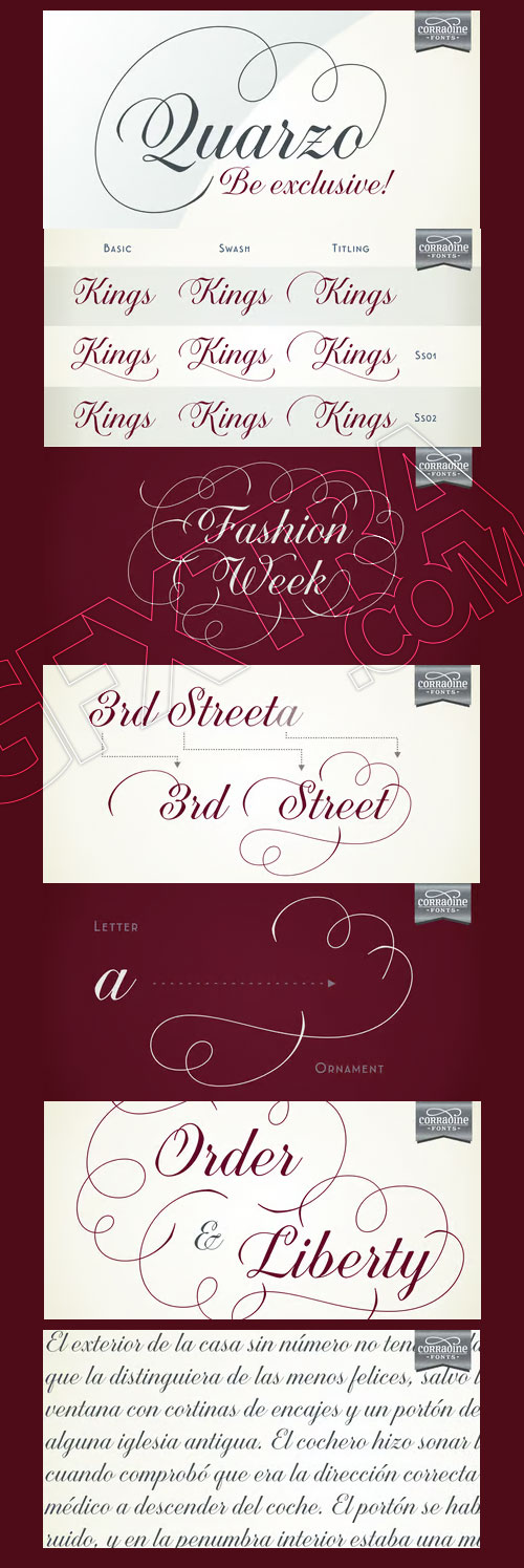
Quarzo - Impressive Variety of Ccurves
OTF | 1 Font | JPG Preview | 4,3 Mb RAR | SALE PAGE
- This script font is inspired by the flexible nib to create a concatenation of refinement with character mixing the contrasted strokes with pronounced but rounded angles. This angles along with the inktraps give the font a better performance when printing. Texts will have a very even rhythm due to its consistency on the stroke’s angle and spacing. The words can receive a dramatic touch by using the wide range of glyphs with curly and refined ornamentation. There are lots of caps and number variants dressed up with a variety of swashes. Also, two sets of versatile ornaments will be found: a first set of ending flourishes that match with any lowercase letter and a second set of independent flourishes to be placed around the words. Quarzo will give a great sophistication level to invitations, cards, tags, menus, advertising and packaging. Its character map covers Western and Central European characters.


- Core Escher is an optical illusion type family which has two sub-families: Core Escher A and B. Core Escher A has impossible shapes inspired by the optical illusion works of artist M.C. Escher. The letterforms in this type family are structurally twisted and complicated but it looks simple because of its simple strokes. And for easy color variations, it split into two fonts, Core Escher A Left and Right.Core Escher B has a different kind of optical illusion. The letters of Core Escher B look like three dimentions by just putting thin lines on bold letters. Also B has two sub-families that have different viewpoints.Core Escher Family supports complete Basic Latin, Cyrillic, Central European, Turkish, Baltic character sets. Each font includes proportional figures, tabular figures, numerators, denominators, superscript, scientific inferiors, subscript, fractions and case features.

CA Viva Las Vegas - A Light Bulb Style
TURKISH SUPPORT | TTF | 8 Fonts | JPEG Preview | 4.3 Mb RAR | SALE PAGE
![]()
![]()
![]()
![]()
![]()
![]()
![]()
![]()
![]()
![]()
![]()
![]()
![]()
- CA Viva Las Vegas is a fine light bulb font inspired by signage of concert halls of the 70s when Elvis was playing in Las Vegas. Two different styles (NIGHT and DAY) and 4 weights (Ultra Light, Thin, Light, Regular) based on a layered system give endless design possibilities by using combinations of fonts and colors. CA Viva Las Vegas has an extensive character-set including Russian Cyrillic plus the Turkish Lira sign. It’s best used in big font sizes.

Nexa Slab Font Family
OTF | 24 Fonts | JPEG Preview | 9.5 Mb RAR | SALE PAGE
- Nexa Slab is a geometric slab serif font whose design is based on the already popular best-seller Nexa. The font family contains 3 basic forms: italics, obliques and uprights, each of which has 8 different weights. This visual richness makes it the ideal slab serif font family for the web as well as for print, for motion graphics, logos, t-shirts and so on. It is also great for headings, fitting nicely with both small and large typesetting text blocks. Nexa Slab draws from the rich traditions of the classic Neo-Grotesque slab serif fonts such as Lubalin Graph, Rockwell and Memphis, which conceal the richness of typesetting text in its crucial advertising function. Just like these fonts, it’s design is subject to rational, carefully thought-out, thick and thin bars with a low contrast between them. The letters are characterized by the strict geometry and square proportions of the original, extra-fortified by suitably balanced slab serifs. Nexa Slab is serious without being rigid and inflexible, finished and lacking in nothing, systematic without being monotonous, and though it may seem at first glance to be more suitable for short, direct messages; in the hands of a master designer... it can build and create exquisite and harmonic designs.

Sharp Sans No.2 Font Family
OTF | 20 Fonts | + JPG Preview | SALE PAGE
- The Sharp Sans superfamilies are geometric sans serif typefaces that inject some much needed humanism into the Futura model. Designed by Lucas Sharp ?of Sharp Type Co in 2011, Sharp Sans Display No. 1 has angled terminals while Sharp Sans No. 2 has 90º degree terminals. With its sheared terminals and true italics (in Sharp Sans Display No.1), Sharp Sans combines the appealing typographic compensation of the grotesque, with the plump circular bowls of the geometric. The result is a typeface suited for both text & display use that breathes life into the genre of the geometric sans. While Sharp Sans Display No.1 ends its round monolines with diagonally sheared terminals, Sharp Sans Display No. 2 shears those terminals on a 90 degree angle. This small distinction became the basis for a plethora of exploration on either end. The most distinct aspect of No. 1 is its whimsical, almost slab-like true italics, which in turn give way to a full set of swash capitals in all italic weights. Sharp Sans Display No. 2, being the more geometric of Superset pair, has a more traditional oblique for its italic, as well as alternative reductionist Herbert Bayer-inspired lowercase.
- Sharp Sans Display No. 2 also has the first truly fluid OpenType homage to the famous Avant Garde interlocking capital style created out of an intelligent system of ligatures & contextual alternates which do not interfere with tracking (I suggest you track them in). The newest iteration of Sharp Sans was conceived for the Hillary Clinton 2016 campaign. Michael Beirut and the Pentagram team chose Sharp Sans Display No.1 as the main typeface of the campaign identity, but such a monumental project required a sturdier and more utilitarian typeface. The new Sharp Sans is completely redrawn and shaped by the rigorous typographic demands of modern visual communications. What sets the new Sharp Sans apart is a raised x-height, and newly opened counters that make it optimal for both text and display layouts; a new, more versatile approach, of which the two Display versions were not previously designed for. We call the new Sharp Sans our "use it for everything" font. While we stand by that statement, the originals do make for a compelling display counterpart.

Sharp Sans Font Family
OTF | 20 Fonts | JPEG Preview | 3.6 Mb RAR | SALE PAGE
- Lucas Sharp’s first release through Village debuts in the Incubator. Sharp Sans injects some much needed humanism into the Futura model. With its sheered terminals and true italics, Sharp Sans combines the appealing typographic compensation of the grotesque, with the plump circular bowls of the geometric. The result is a typeface suited for both text and display use that breaths life into the genre of the geometric sans.

OTF & WOFF Font Files | Designer: Alissa Mazzenga | SALE PAGE
- Feast is a calligraphy style font designed by Alissa Mazzenga. Her hand-sculpted letterforms emanate a powerful, yet delicate presence. Their magic resides in the ethereal movement of fluid wisps of ink, forming soft arched lines and design that stands alone.
")
Yellow Design Studio's Gist Font Family
- Gist from Yellow Design Studio is an inline slab serif with a retro yet modern vibe. It’s a collision between monoline slab and indie script. With 627 glyphs per weight, it’s highly customizable…either keep it simple with the base character set or use ligatures, alternates and swashes for extra flair. All-caps typesettings have an especially retro edge. Also included are line layers for adding color to the inline areas.

Yellow Design - Gist Rough Font Family
38 OTF | 47 MB
Sale Page
- Gist Rough from Yellow Design Studio is the letterpress version of Gist. It’s warm and weathered with a retro yet modern vibe. Every weight includes 3 versions with varying levels of texture which can be used individually or mixed to taste. It has highly detailed texture and looks great even at very large sizes.
- With 627 glyphs per weight, Gist Rough is highly customizable…either keep it simple with the base character set or use ligatures, alternates and swashes for extra flair. All-caps typesettings have an especially retro edge. Also included are line layers for adding color to the inline areas.


Only You - Romantic Font Family
The Special Encounter Between Uppercase and Lowercase Letters
16 OTF | Typefaces & Ornaments | 0.7 MB | Sale PaGe
- Only You is handmade, and specially romantic. It was made to brighten your projects, turning everything more beautiful. The special encounter between uppercase letters and lowercase letters is perfect. Only You is unicase, with 888 glyphs, and what’s better: it has one special alternative for all letters as uppercase, and that creates an infinity of combinations.Only You is brilliant, gorgeous, and multilingual - it also includes the Cyrillic version! It has more than 200 ligatures, several alternates and swashes. You can also obtain an unlimited number of possibilities in your layout - there are several possibilities for starting and finishing a word. Do you want some more? You should take a look at Only You Icons with more than 300 options between icons, ribbons and frames that will make your project very attractive and romantic.

Steelfish Font Family
Steelfish is a condensed headline font family I created in in 2001.
The original cut included regular, bold & outline styles.
Steelfish was okay but it was in need of a good tuneup to perform well as
a web headliner in the 2010’s. After rebuilding it, I expanded it into seven weights with italics.
The weight of the original Steelfish Bold looks more like the new Steelfish Extra-Bold;
keep that in mind if you're replacing the old one.


Maax Rounded Font Family- 6 Fonts $840
OTF | 638 KB | Sale Page
- This typeface is based on the Maax, designed by Damien Gautier in 2012. It is a typeface with more convivial, naturally rounded terminations. Like the Maax, this typeface contains a number of sets of characters that give each one a rhythm and a particular colour to text. The Maax Rounded is available in 3 weights and their italics: regular and italic, medium and medium italic, bold and bold italic. With the efficient and precious help of Roxane Gataud and Corentin Moyer.

Abdo Line Arabic, Persian, Urdu Naskh Font Family
6 OTF with WebFonts | Designer: Abdulsamie Rajab | SALE PAGE
- Abdo Line is a simple Naskh font for books and magazines. Accurate design and clarity of reading and writing space-saving, it comes in sixth weights: Thin, Light, Regular, Bold, Heavy and Black. This is an OpenType Font supporting Arabic, Persian, Urdu Languages and compatible with the various operation systems and modern software. This font also contains many of Stylistic Sets, Ligatures and Justification Alternatives.
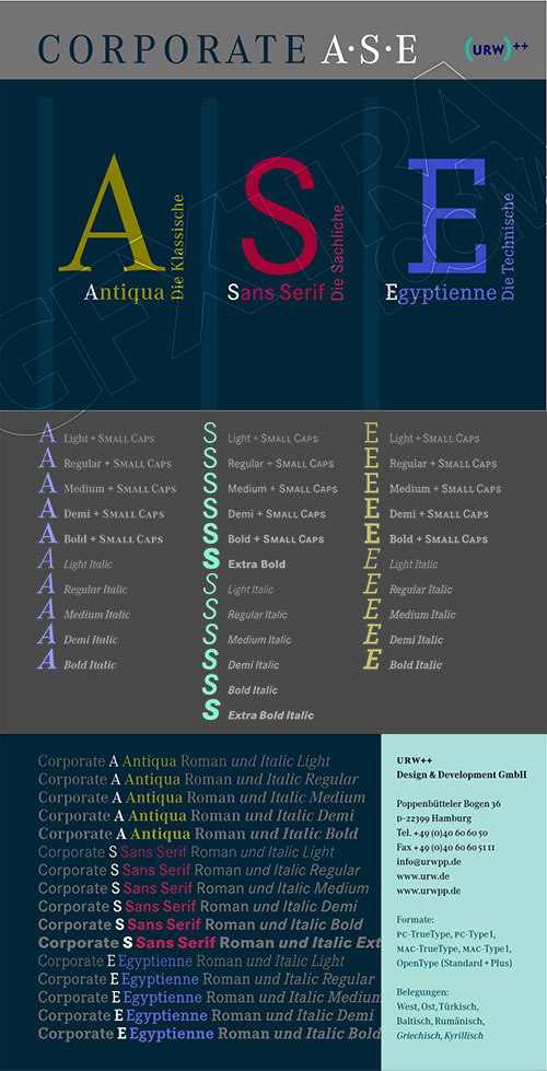
Corporate Bundle - Antiqua, Sans Serif & Egyptienne Trilogy
53 OTF Files | 2.1 MB | Sale Page 1 Sale Page 2 Sale Page 3
- The Corporate ASE typeface trilogy was designed by Prof. Kurt Weidemann, a well-known German designer and typographer, from 1985 until 1990.This superb trilogy consisting of the Corporate A (Antiqua), Corporte S (Sans Serif), and Corporate E (Egyptian) is a design program of classical quality, perfectly in tune with each other. Weidemann says: “My ASE trilogy, quite like triplets, is in perfect harmony and covers all needs of modern typography!”Initially exclusively designed for DaimlerChrysler as a corporate font, the ASE trilogy may be now licensed and used without restriction. URW++ digitized the ASE for DaimlerChrysler and Prof. Weidemann and is the exclusive licencing agent for this outstanding and extremely popular typeface program.Meanwhile, URW++ enhanced the Corporate ASE family in regular, bold, italic, and bold italic by Greek, Cyrillic, and all additional Latin characters to cover Eastern Europe including the Baltic Rim, Romania and Turkey. Corporate ASE in regular, bold, italic, and bold italic is now available in the WGL 4 character complement.


OTF | WOFF
Based on the popular Sofia Pro typeface, Sofia Rough is a multifaceted font family with differents eroded variations. Sofia Rough contains sixteen fonts and two eroded sub families. With Sofia Rough Black for uppercase and Sofia Rough Script for lowercase you can create many variations. It has also several layers like shadows, inline or outline to create unique design. Sofia Rough contains also more than 80 extra graphics such as catchwords, ornaments, emblems, decorative lines, stars and many more.
Sale Page

Sofia Pro Font Family
OTF | 16 Fonts | JPEG Preview | 4.2 Mb RAR | SALE PAGE
- Redesigned in 2012 by Olivier Gourvat, this typeface now supports a wide range of languages with more than 500 glyphs. This new version also has more OpenType features including case-sensitive forms, small caps, contextual alternatives, stylistic alternates, fractions, proportional and tabular figures. With its 16 fonts, Sofia is an ideal font family for text, branding, signage, print and web design creation.

Affair - A Real Script
OTF | 1 Font | JPEG Preview | 5.4 Mb RAR | SALE PAGE
- Type designers are crazy people. Not crazy in the sense that they think we are Napoleon, but in the sense that the sky can be falling, wars tearing the world apart, disasters splitting the very ground we walk on, plagues circling continents to pick victims randomly, yet we will still perform our ever optimistic task of making some little spot of the world more appealing to the human eye. We ought to be proud of ourselves, I believe. Optimism is hard to come by these days. Regardless of our own personal reasons for doing what we do, the very thing we do is in itself an act of optimism and belief in the inherent beauty that exists within humanity.

Faddish Font Family
- Faddish was created as a mix between a sans serif style and the high contrast didots. The resulting design is a contempory, condensed sans serif with a very high stroke contrast. Principally created for a fashion logo, Faddish is well suited for use in large point sizes but also works for small amounts of running text.
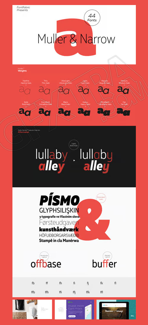
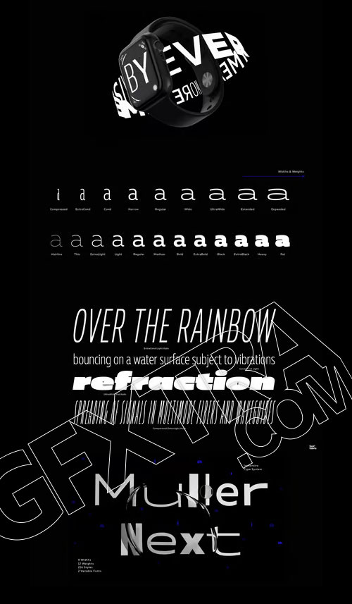
Muller Font Family 20xOTF + 32xOTF Next + 6xOTF Narrow
58 OTF Files | Sale Page
The very first sketches of Muller were made about four years ago.
- In the process they changed to the point where they had nothing in common with the original idea. As it is with most work we do, when we seek perfection, changes are inevitable.It was specifically designed with a wider structure for better appearance in small sizes and the extra attention to the detail was needed for the big sizes. We managed to find the right balance for the perfect universal font family.The family consists of 20 weights, raging from Thin to Heavy with matching Italics. This font family is suited for everything, raging from advertising, packaging, editorial and branding, to web and screen projects.Muller comes with a complete range of figure options, including proportional and old style figures, each in its tabular version. It also includes advanced typographic features such as ligatures, fractions, alternate characters, case-sensitive forms, superscripts and subscripts.
126,000 Royalty-Free 3D Model

Udemy Türkçe


Top Rated News
- CreativeLive Tutorial Collections
- Fasttracktutorials Course
- Chaos Cosmos Library
- MRMockup - Mockup Bundle
- Finding North Photography
- Sean Archer
- John Gress Photography
- Motion Science
- AwTeaches
- Learn Squared
- PhotoWhoa
- Houdini-Course
- Photigy
- August Dering Photography
- StudioGuti
- Creatoom
- Creature Art Teacher
- Creator Foundry
- Patreon Collections
- Udemy - Turkce
- BigFilms
- Jerry Ghionis
- ACIDBITE
- BigMediumSmall
- Globe Plants
- Unleashed Education
- The School of Photography
- Visual Education
- LeartesStudios - Cosmos
- Fxphd
- All Veer Fancy Collection!
- All OJO Images
- All ZZVe Vectors
- CGTrader 1 CGTrader 2


