
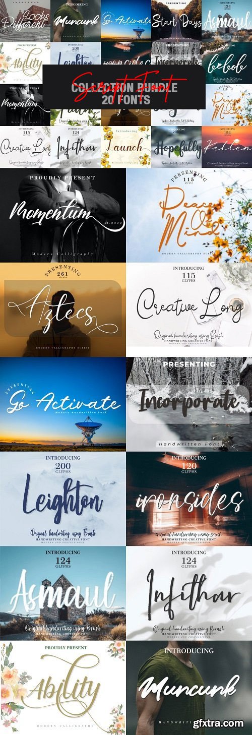
CM - Script Font Collection Bundle - 20 Fonts
This bundle gathers 20 stunning fonts for you to use in your upcoming projects.
Ability-27030719 | Asmaul-32487402 | Aztecs-27775834 | Bebob-41418055
Creative-Long-47162385 | Faith-33343101 | Go-Activate-28601100 | Hopefully-37270043
Incorporate-29243447 | Infithar-32886457 | Ironsides-32094234
Kellen-34798812 | Launch-26677431 | Legend-38040032
Leighton-31606025 | Looks-Different-25822880 | Momentum-27354481
Muncuk-28207262 | Peace-Of-Mind-42265313 | Start-Days-28937884


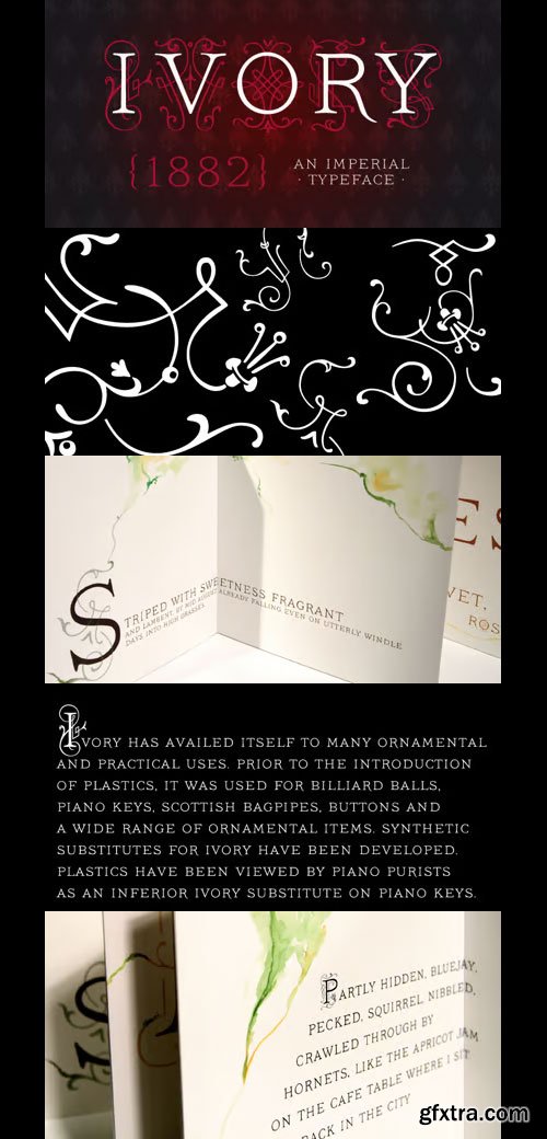
Ivory Font Family
OTF | 3 Fonts | JPEG Preview | 4.2 Mb RAR | Ivory Font Family
- Ivory is inspired by a beautiful typeface used in an illustrated compendium about pomology from 1882. We separated the elegant “Swashes” from the letters – use it together with “NoSwashes” to get two-colored initials. Please note that the kerning of NoSwashes works only together with Swashes. To achieve the two tone effect shown in the samples, you need to use an application that supports layers. For example, Adobe Illustrator, Adobe InDesign, Adobe PhotoShop, CorelDRAW, and Quark. Some of the preview images where made by Arina Karen Renata Palilingan.


Weingut Font Family
4 OTF | 0.3 MB | Sale Page
- Blossoms, leaves, buds and tendrils create fragile objects of words and letters.Weingut Script Flourish is a decorative display font with high contrasts, perfectly drawn to the tiniest details. The font is trimmed to fairly large font sizes and is highly suitable for chapter titles or book jackets as well as Headlines, Invitations and wine labels :), although also impressing with an astounding legibility in small typesettings. Inspired by the hand drawn Blätterschrift from the 19th century Mettenleiter’s Schriftenmagazin, its basic structure is related to the English Script. The creative process started in summer 2009 and after 600 hours of work, over a 2 year period, Weingut now unfolds to reveal all its charms.Design with bicoloured capitals:In Weingut Script and Weingut Flourish, leaves and letters are available separately. You can stack them and apply different colours to the foreground and background.Decoration and patterns:Weingut Swashes and Ornaments offers extra decorative elements in a separate font. Leaves, flourishes and borders available on their own or merged to ornaments.The Weingut Family – noticable bouquet, beautiful structure with full fruit and a long finish.Please make sure to use an application that supports the layering of text (two-coloured capitals) and OpenType features (contextual alternates). Be aware if you intend to combine Weingut Script Flourish and Weingut Flourish that these two do not go together. The floral outlines differ slightly and inaccurate overlaps will be the end result.


Crafty Fonts Bundle - 21 Premium Fonts
24 TTF | 25 OTF | WOFF | WOFF2 | 14 MB


CF - The Magical Fonts Bundle - 20 Premium Fonts Worth
22 OTF | 21 MB | SALE PAGE
This font collection includes beautiful decorative fonts perfect for your upcoming crafting projects!
Create unique posters, labels, tumbler wraps, t-shirt prints, mugs, stationery, logos, and much more!
Most of these fonts are PUA encoded, which means you can access all of the special characters with ease.

Anglethings | Arakunda | Aurelia | Axmiqrichard | Babytropical | Bakeddonuts | Barndance | Behumble | Besthealing | Bezares | Blackcrown | Blackfire | Blackoctopus | Bodycharms | Brownrockis | Cameliascript | Chunkyspinach | Citytour | Coupleheart | Courtesy | Creativekids | Crispycake | Delaoqord | Drawingbooks | Ecalyars | Forester | Freakytricky | Gardenwood | Ghostchilds | Halloweenschool | Hearken | Homelands | Huntingwedding | Karibella | Koskaesko | Letsstudy | Listingpacks | Loveandbeach | Markerland | Matchabubbles | Micewalk | Micewalkslab | Molabrista | Monogram | Monogramcarnaval | Nicelooking | Plantfactory | Posterlinear | Potatorecipes | Pottionwizard | Practicesketch | Presentcheerup | Puccerylove | Pumpkinhollowens | Radishandgarlick | Reasonably | Relicisland | Relickisland | Remingthonmalvine | Rollssling | Royalbeans | Royalparadise | Skinny | Strangeofstory | Thewitchers | Thinandglowing | Thinkergloves | Truffle | Vaniekarabinyalove | Yuliakhaira

WeGraphics - Handsard - A Sketch Style OTF
Hansard is a clean but sketchy font face. It is readable even at a smaller size.
The font features 95 glyphs with all web formats included, as well as, demo html/css.
TTF/OTF | 1.01 Mb | SALE PAGE
Oscar - Dutch Architectural Lettering
OTF | 12 Fonts | JPG Preview | 3.7 Mb RAR | SALE PAGE
- Oskar is a all-caps type series inspired by Dutch architectural and commercial letterings from the early 20th century, particularly those painted on walls and shopfronts or executed in metal. This style of letters did not exist as printing type but was cultivated by sign painters, draftsmen and architects, and passed on in lettering manuals. A first version of Oskar was initially drawn in 2002 for the lettering of a heritage-protected school in The Hague, designed by architect Jan Duiker in 1929. Since then, the family has been expanded into multiple styles and weights. Oskar is available in two ‘flavours’ — One and Two — each in three weights, and each weight accompanied by an inline variant. Oskar One stands firmly in the tradition of Dutch 1920s lettering, with pointy apices and expressive, less conventional letterforms. Oskar Two is more tamed and regular, closer to classical geometric sans-serifs yet still exuding its relation to the Art Deco style. The carefully drawn (and manually hinted) inline styles highlight Oskar’s qualities as a versatile display and titling face, on screens as well as on facades.

Macula - Three-Dimensional Letterforms
OTF | 5 Fonts | JPG Preview | 4.1 Mb RAR | SALE PAGE
http://www.boldmonday.com/en/macula/
- Macula can be described as the ‘impossible typeface’, since its design is based on the concept of impossible objects. This optical illusion was explored into great detail in the 1930’s by the Swedish artist Oscar Reutersvärd, and simultaneously made very famous by Dutch artist M.C. Escher. Macula comes in five styles, some are great to use just by themselves and some are specifically meant for use in layers. By stacking different styles of Macula on top of each other, beautiful multi-coloured typography becomes possible.

Courtesy Script Pro
OTF | 1 Font | JPEG Preview | 1 Mb RAR | SALE PAGE
- As in Victorian times, the precious, hand-lettered look of custom stationery is back in vogue. Enter Courtesy Script, an original creation by Alejandro Paul. Courtesy captures the elegance and propriety of finely practiced Spencerian penmanship, in particular the Zanerian school. Its lowercase is notably understated, a simple monoline with very wide connections that ease readability. In the capitals, Courtesy adds variety in both the weight of the strokes, and in degrees of flourish — from merely fancy to over-the-top engrossery. Based on an alphabet found in a 19th-century penmanship journal, Ale created hundreds of additional, stylistically complementary letterforms. Alternate capitals and lowercase letters, swashed lowercase forms, and ending and ornamental swashes; numerals, punctuation, and non-English and accented characters. With virtually endless ways to customize its use, Courtesy helps designers create fluid, signature looks on stationery and invitations, book covers, fashion layouts, and packaging.


Horizontes Script Font Family
OTF | 2 Fonts | JPEG Preview | 4.5 Mb RAR | Horizontes Script Font Family
- Horizontes Script is the result of Panco’s personal experimental calligraphy project. Designed with the goal of finding a balance between spontaneity, elegance and beauty, his first typography was born and inspired on the horizon´s blue line from the city he was born. Relaxed, energic and very natural. With different alternatives of proportion, a wide range of ligatures, initial letters, terminals, floritures, Horizontes Script comes in two weight for large and small formats. “Horizontes Script” results in an ideal font for titles and short texts that find something else to show more than just words. A casual and harmonious font with strong personality. Great for projects that need to connote class and style without being too formal. Ideal for design that need to transmit warmth and humanity feel to be applied on invitations, labels, poetry, songs or thoughts. Created by Panco Sassano, under the supervision of the experienced typographer Ale Paul – in a duo work - “Horizontes Script” is the latest typeface by Sudtipos.

Arbordale Font Family
OTF | 2 Fonts | 590 KB | Sale Page
- A calligraphic script with roots in the midwest, Arbordale™ intends to be elegant yet straightforward. OpenType users benefit from an array of alternate glyphs for lowercase characters including optional non-connecting (contextual alternate) characters for word endings. Other features include crossbar ligatures for common letter pairings, case-sensitive quotes and smart apostrophes. Arbordale Pro extends the character set to support Eastern European and Baltic languages.
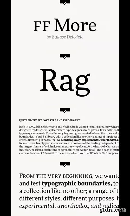
FF More Font Family - 30 Fonts 859€
30 OTF | 27 MB | Sale Page
- The family has 30 weights, ranging from Light to Black in Condensed, Normal and Wide (including italics) and is ideally suited for advertising and packaging, book text, editorial and publishing, logo, branding and creative industries as well as small text.FF More provides advanced typographical support with features such as ligatures, small capitals, alternate characters, case-sensitive forms, fractions, and super- and subscript characters.It comes with a complete range of figure set options – oldstyle and lining figures, each in tabular and proportional widths. As well as Latin-based languages, the typeface family also supports the Cyrillic writing system.


Catalina Italics Font Family - 34 Fonts 340$
OTF | WOFF | 13.7 MB | Sale Page
- Earlier this year I visited a bakery in Newport Beach, CA and fell in love with the organic design and typography of the place. Hand-drawn menus, table cards, chalkboards, and wall quotes surrounded the charming spot. It inspired me to create a new font family based on the combination of hand drawn fonts. Included in this package are 5 font families, with 2 graphic ornament fonts. Each font family contains at least a light, medium and bold.Here is a breakdown of what’s cookin' at Catalina’s Bakery:Catalina Anacapa: Tall and skinny, this font comes in 3 weights for both sans and slab serif styles. It includes contextual alternatives (giving 3 versions of each letter), stylistic alternatives for select letters (A, K, P, Q, R, Y) and also includes Small Caps.Catalina Avalon: Based off Anacapa, this sub family has a high contrasting line weight. It comes in light, regular and bold as well as an inline alternative for both sans and slab serif styles. Avalon also includes opentype features such as contextual alternatives (giving 3 versions of each letter), stylistic alternatives for select letters (A, K, P, Q, R, Y) and small caps for each letter.Catalina Clemente: In a more standard width, Clemente is one of the two sub families that can be used for paragraph text as well as headlines. It’s organically geometric in style and comes in ALL CAPS and lowercase, includes upright and custom italics, and has the opentype feature giving 3 versions of each letter.Catalina Script: A great compliment with the display sub-families, Catalina Script rounds out the package with a hand-drawn cursive flair. It includes contextual alternatives (giving 2 variations to each letter) as well as stylistic alternatives for many of the capital and lowercase letters. It has special ligatures for some letter combinations, and titling alternatives for all the capital letters.Catalina Typewriter: The second of the paragraph text sub-families, this typewriter inspired hand-drawn font family works great as either a display or paragraph text. It has contextual alternatives with 3 versions of each letter, and comes in both upright and custom italics versions.Catalina Extras! These two fonts go perfectly with the Catalina Family. They includes borders, frames, arrows, banners, flourishes and more. Catalina Flourish has all of it’s options in a light and bold style, to use the light version type all lowercase letters, then to make something bold, used it’s uppercase (or shift+) characters. For a breakdown of graphic/letter correlation, see the breakdown PDF.All of Catalina was drawn by the same hand, using the same ink and technique. While they contrast in their type styles, they work together perfectly to create one cohesive font family.

Hand Shop Pack Font Family
OTF | TTF | 8.67 MB | SALE PAGE
- We’re really excited to unveil our all-new line of ‘HAND SHOP FONTS’. As the name suggests, these are fonts that have a hand-made or hand-typography feel reminiscent of shop signboards from the past with an attentive focus by the shop owners, always looking to discover exciting and unique ways to promote their products or services.
- While for decades typography has strived hard for perfection, one of the routes taken by the typography world as a whole has been to eliminate any form of ‘human imperfection’ in the typesets, but what about the times when you DO want to send across emotions of a personal human touch through your fonts?We did a step back...these fonts will give your shop-signs a personal touch, telling your buyers that they will get personalized attention, be it through an online or an offline business…We hope you love them as much as we do.![/center]
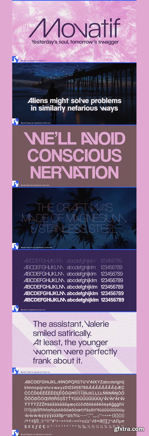
Movatif Font Family
OTF | TTF | 584 KB | Sale Page
- Movatif is a 7-weight, mashed up 20th Century sans, with ideas from a variety of fonts from that Century. OpenType savvy applications automatically swap certain letters to add more visual interest and completely freak people right out. So, let’s say you use M and A together, they’ll likely snap together in a cool or at least somewhat interesting kind of way. Familiar parts interact in a unique way that will give your design a customized look and kind of a bleak 1970’s malaise. . . also a bit of hipster twerpiness. For best effect: juxtapose with images of fixies, unicorns, Phil Collins, man-purses and red VHS tapes.

126,000 Royalty-Free 3D Model

Udemy Türkçe


Top Rated News
- CreativeLive Tutorial Collections
- Fasttracktutorials Course
- Chaos Cosmos Library
- MRMockup - Mockup Bundle
- Finding North Photography
- Sean Archer
- John Gress Photography
- Motion Science
- AwTeaches
- Learn Squared
- PhotoWhoa
- Houdini-Course
- Photigy
- August Dering Photography
- StudioGuti
- Creatoom
- Creature Art Teacher
- Creator Foundry
- Patreon Collections
- Udemy - Turkce
- BigFilms
- Jerry Ghionis
- ACIDBITE
- BigMediumSmall
- Globe Plants
- Unleashed Education
- The School of Photography
- Visual Education
- LeartesStudios - Cosmos
- Fxphd
- All Veer Fancy Collection!
- All OJO Images
- All ZZVe Vectors
- CGTrader 1 CGTrader 2


