

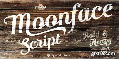
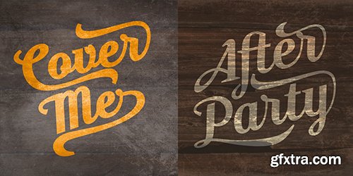
Moonface Script Fonts 2 Fonts
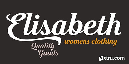
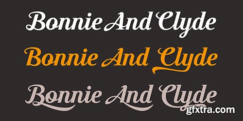
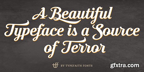
- Moonface Script is a flowing script with lovely swashes. It is based on the 20th Century Packaging typography. Moonface Script is a characteristic font with a retro feel. It contains a full set of ligatures, alternatives, swashes and special characters to end

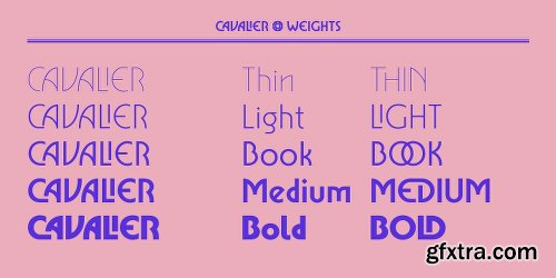
Cavalier Font Family - 5 Fonts $99
5 Fonts | OTF | SALE PAGE
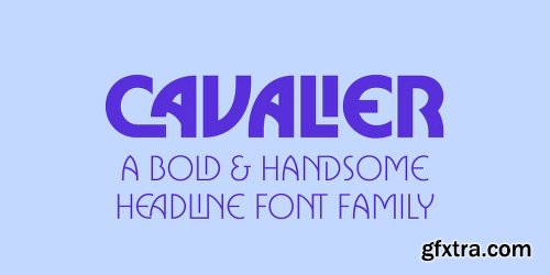
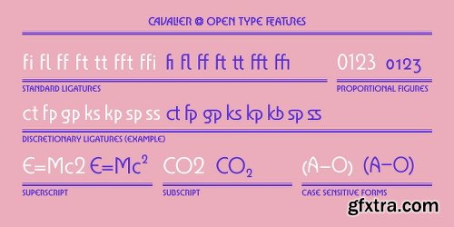
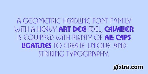
- Cavalier is a bold and extravagant headline typeface. Drawing inspiration from the iconic Lubalin classic, ITC Serif, Cavalier maintains in its design an approach more geometric and slightly cleaner. Equipped with plenty over 100 discretionary ligatures, Cavalier makes for a striking headline font, yet capable of legibility even in longer texts.
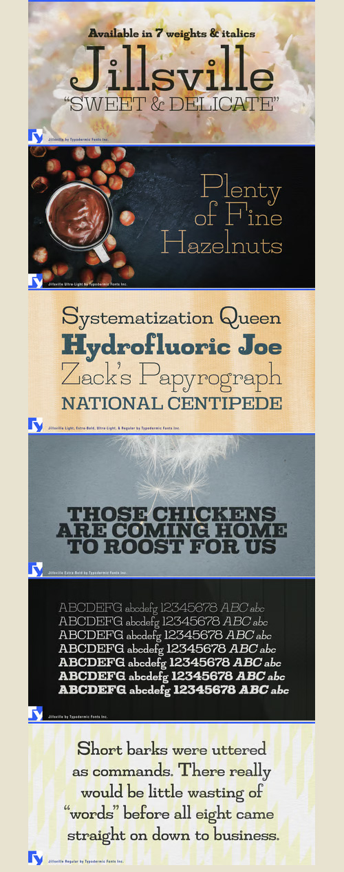
Jillsville Font Family - 4 Font $120
4 Fonts | OTF/TTF | SALE PAGE
- Jillsville is a sweet, delicate font with a fine lines and feminine overtones. She’s light and lithe, but “she ain’t no wallflower.” Reminiscent of a typewriter font, but proportionally spaced, Jillsville is ideal for oversized headlines and photographic overlays where a heavier font would look obese.
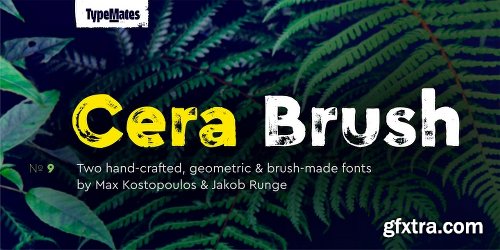
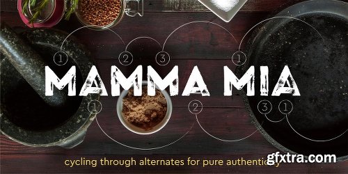
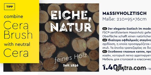
Cera Brush Font Family - 2 Fonts $64
- Cera Brush is the handmade display companion to clean multi-script Cera and Cera Stencil.
- Focused on the extremes, black and thin weights, Cera Brush was carefully drawn by hand in various glyph variants. To keep the analog diversified feeling of custom lettered text, activated opentype feature for ligatures will ensure a thoughtful mix of letters, numbers and interpunction.
- Even though being a display typeface, both weights of Cera Brush include various typographical features like tabular figures or fractions, a wide Latin language support plus useful symbols. Adding contextual alternates, Cera Brush contains more than 1.300 glyphs per weight.
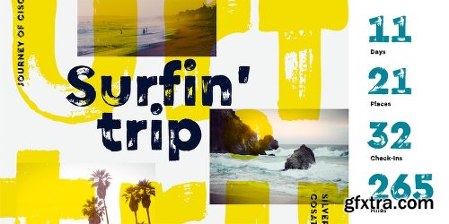
- As high-res details ensure Cera Brush working in huge point sizes quite well, the typeface is predestined for authentic headlines about cooking, organic food and beverage or any other topic that requires a hand-crafted design.
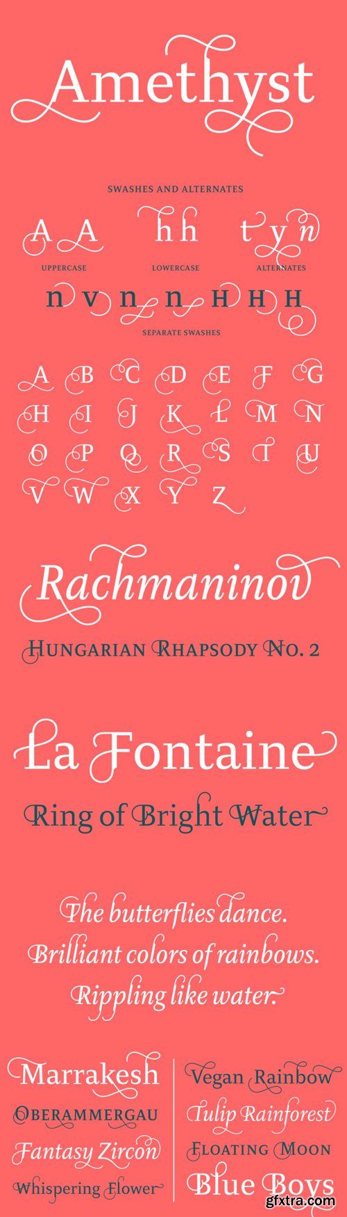
Diogenes Decorative - 35 Fonts Family $199
35 Fonts | TTF/OTF | SALE PAGE
- Diogenes Decorative is the swashy sister of Diogenes, an elegant and crisp text typeface. It comes in 5 weights, each containing 7 different fonts with lots of swash characters, alternates and separate swashes which fit on different characters. Diogenes Decorative can be used independently or in combination with Diogenes, e.g. for initials or headlines.
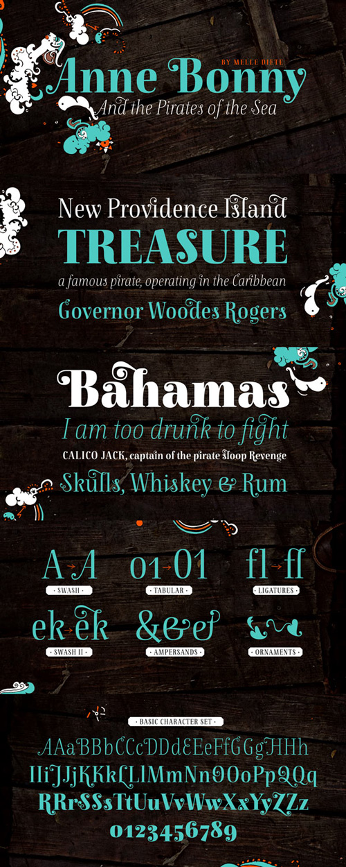
Anne Bonny Font Family 14 Fonts $394
14 Fonts | TTF/OTF | SALE PAGE
Anne Bonny is the comrade of Mary Read Type.
It has the same proportions and nearly the same OpenType-Features.
It is a Bodoni-inspired typeface with a sweet and female touch.
You can choose between the swashes-feature, initials, final letters,
many ligatures and ornaments. Highly legible.
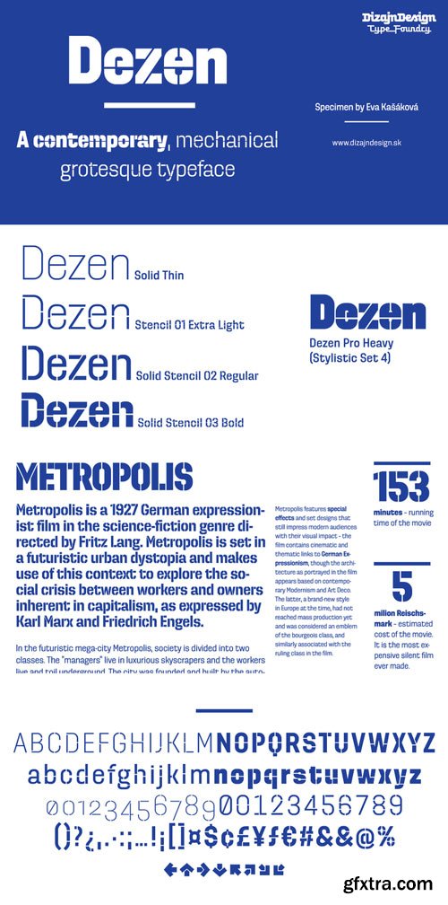
Dezen Stencil 01 & 02 Font Family 16xOTF 338$
- Dezen is a contemporary, mechanical grotesque typeface. Its letters were first constructed from individual modules and then optically refined to enhance its rhythm. Its tight letter spacing and narrow proportions make the typeface particularly well suited for display sizes and headlines. ?When you add spacing, font can be used for shorter amount of text, ?bigger than 12 points. The Dezen type family consists of a wide variety of styles – solid and stencil. The Dezen Pro subfamily combines all 4 styles (Solid, Stencil 01, ?Stencil 02, Stencil 03) in a specific sequence, which originates a “pattern” for the alphabet (or dezen, in Slovak).
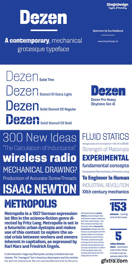
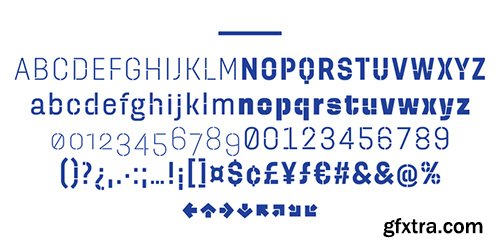
Dezen Pro - 8 Fonts $189
Mechanical Grotesque Typeface
8 Fonts | OTF/TTF | WoFF/WoFF2/EOT | StyleSheet | 3.58 MB RAR | SALE PAGE
- Dezen is a contemporary, mechanical grotesque typeface. Its letters were first constructed from individual modules and then optically refined to enhance its rhythm. Its tight letter spacing and narrow proportions make the typeface particularly well suited for display sizes and headlines. ?When you add spacing, font can be used for shorter amount of text, ?bigger than 12 points.The Dezen type family consists of a wide variety of styles – solid and stencil. The Dezen Pro subfamily combines all 4 styles (Solid, Stencil 01, ?Stencil 02, Stencil 03) in a specific sequence, which originates a “pattern” for the alphabet (or dezen, in Slovak).
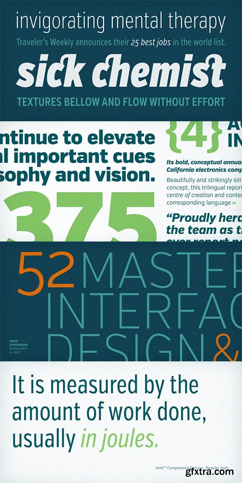
Verb Font Family - 72 Fonts $1440
72 Fonts | OTF/TTF/WoFF | RAR 5.8 MB | SALE PAGE
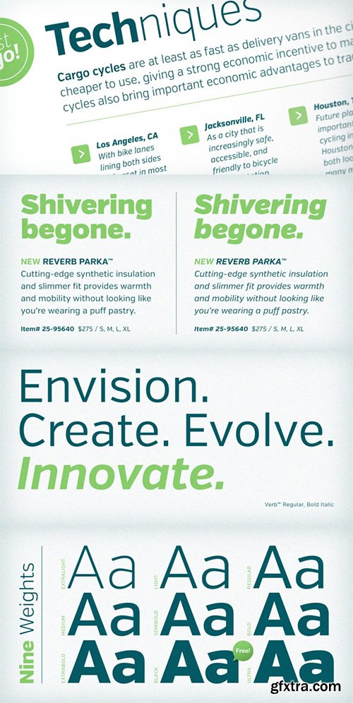
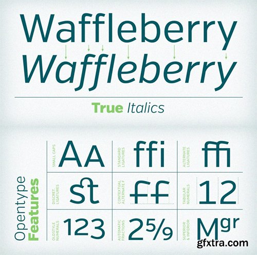
- Verb from Yellow Design Studio is a 72-font sans-serif superfamily that’s confident, friendly and energetic. At text sizes it’s highly legible, while at larger sizes it reveals lively shapes and personality. It has four subfamilies including Regular, Condensed, Extra Condensed, and Compressed, each with nine weights from ExtraLight to Ultra . With over 800 glyphs, Verb offers a full complement of professional typographic features and extensive language support.
Sean Henrich ATF - 12 Fonts $306
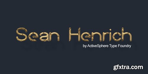
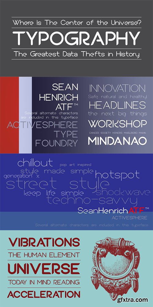
- Sean Henrich ATF is a sharp, rounded geometric display font and works best in text and display applications, such as headline, posters, signage, magazine, product branding, corporate branding, logos and titles. Several alternate characters are included in this typeface.Sean Henrich ATF font has six weights; ultra light, extra light, light, regular, bold and extra bold, each available in italic, making a total of twelve styles. Each style has a full upper and lower-case, accents, punctuation and a selection of monetary symbols. Currently Available for PC, in Open Type, PostScript or TrueType.
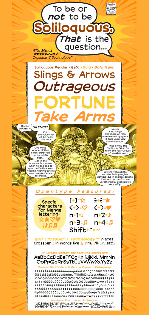
Soliloquous Font Family - 4 Font $139
4 Fonts | OTF/TTF/WoFF | +Previews | 1.34 MB RAR | SALE PAGE
- Talking to yourself out loud? Jabbering? Muttering? Wittering away on some flight of fancy?Why not? Why wait to get compliments from someone else? If you deserve them, pat yourself on the back, give yourself a good pep talk! Create a dialogue with yourself so that you can hear what you're thinking! Whether you’re living on your own or living with others, you’re always living with yourself and you can always be there FOR yourself with a cheerful word of wisdom or two hundred. So, help yourself yourself with Soliloquous! You won't feel alone without it.But please, remember to be respectful and try not to hurt your own feelings. And shut up when you hear yourself tell yourself that’s enough.
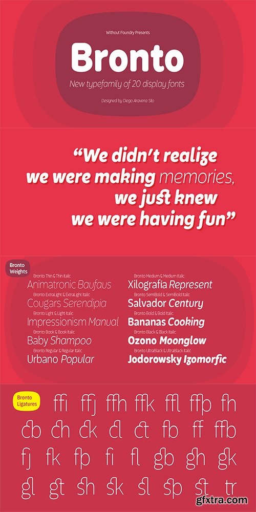
Bronto Font Family - 20 Fonts $159
20 Fonts | OTF/TTF | EOT/WoFF/WoFF2 | 4 MB RAR | StyleSheet | SALE PAGE
- Bronto is a typeface that mutated many times: it went from being morphologically conventional, to have soft features, to finally have some inverted contrasts that made it more dynamical; but all this without losing sight of the meaning of a typefamily, and the aim pursued by this work: Bronto doesn’t behave as a piece of art, but as a tool. In some weights, this typeface possesses fluffy characteristics and is boldly bighead, while in other versions is slightly contrasted and controlled; this in order to maintain the essential features of the typefamily along the versatility and usability of the 20 variations that composed it. Bronto it’s inspired in neo humanists typographies of the 20th century, and in Chilean lettering. This kind of work was made by the spontaneity of the paintbrush, which gave an inverted contrast to some characters. This typeface has plenty of OpenType features, specially an extensive set of ligatures in all weights. Bronto is well suited for motion graphics, letterings, web, advertisings, magazines and books.
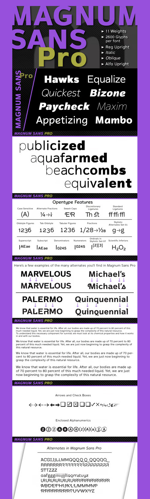
Magnum Sans Pro - 43 Fonts $495
- Magnum Sans Pro is a strong neutral sans serif consisting of eleven weights with true Italic, Oblique and an alt upright set called Alfa. The definition of Magnum is a large wine bottle that’s twice the capacity of one 750ml bottle, today the name is used in any product offering double the capacity, Magnum Sans achieves this by offering two slanted and two upright versions plus a standard and pro set.
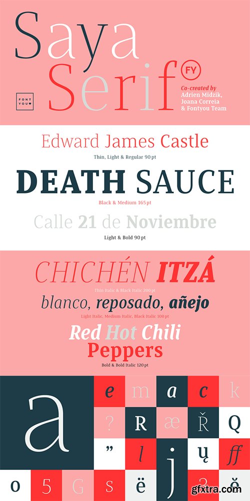
Saya Serif FY Font Family - 12 Fonts $600
12 Fonts | OTF | WOFF | SALE PAGE
- Here comes the serif! After her big sisters version, Saya Sans and Saya Semi Sans, meet Saya Serif! With its lightly condensed letterforms and its elegant sharped serifs, this font family is both suitable for text and display use. It’s elegant style and well balanced shapes afford a unified structure in small size and elegant shapes in larger sizes.
- Mix it with the Sans and SemiSans versions to create beautiful magazines designs, deli packagings or serious logotypes.Saya Serif FY comes out with 6 weights from thin to black in roman and delicate italic.Saya Serif FY was created by Joana Correia, Adrien Midzic and Fontyou team on fontyou.com, the first collaborative type foundry.
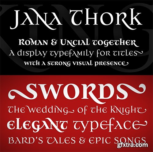
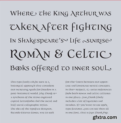
Jana Thork Font Family - 8 Fonts $240
- This type family can be seen as a historical approach that considers our increasing needs for freedom in a post-historical world. Jana Thork is a synthesis of the stone engraved capital letterforms and the uncial and half-uncial calligraphic styles.The idea of the typeface designer, Ricardo Esteves Gomes, was to seek the limits between our uppercase and lowercase mental concepts. In this respect, it unites references from both Roman and Celtic cultures in one place.The Jana Thork family includes more than 120 extras including ligatures and swashes. If you want to use open type features you can see them all (ligatures, swashes and fractions) in one font file, that is Jana Thork Pro.This family can be useful to compose titles, short texts and letterings that need to look attractive to the eye.The family now also includes Jana Thork Bold versions and Jana Thork Pro Bold - a complement to this font family that can be used in graphic designs that need more complex hierarchic relations or greater visual impact.
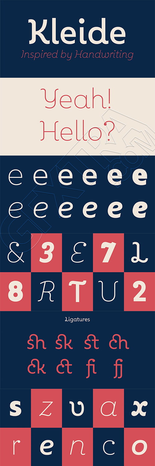
Kleide Font Family - 12 Fonts $420
12 Fonts | OTF/TTF/WoFF | +Previews | SALE PAGE
- Kleide is an elegant font inspired by handwriting. The Kleide family includes 6 weights, from Thin to Black, with their corresponding italics. This elegant family includes OpenType Features such as Proportional Figure, Tabular Figures, Numerator, Superscript, Denominators, Scientific Inferiors, Subscript, Ordinals, Fractions and a lot of ligatures.The fonts have extended characters set to support Central, Eastern and Western European languages. Kleide is perfectly suitable for cool & fresh work.
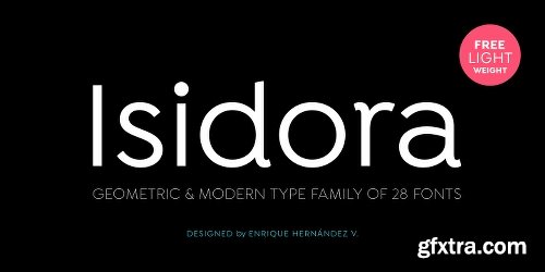
Isidora Font Family 28 Fonts $999
28 Fonts | OTF/TTF | EOT/WoFF/WoFF2 | +Css Style Sheet | SALE PAGE
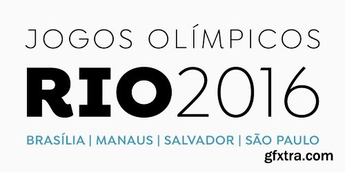
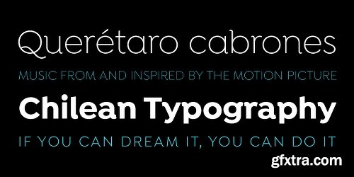
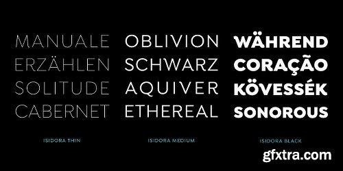
- Isidora is a modern geometric font based on the classic typefaces of the early 21st Century yet with a contemporary and functional touch. In spite of its strong and rational structure, the font also looks friendly and expressive, thanks to its rounded terminals. In addition, its diagonal terminal cuts give it a softer and more rounded appearance. Isidora consists of two 7-weight subfamilies: one (more classic) Regular and one Alternative (more contemporary and display). Both subfamilies come in italic version, giving a total of 28 fonts. Isidora is the perfect font for headlines, logotypes, branding, packaging, publishing and web use. The family contains a set of 438 characters—supporting 207 different languages—and also includes an alternative character set, which allows for more versatility when composing text.
Racon Font Family - 26 FONTS $442
26 Fonts | OTF | SALE PAGE
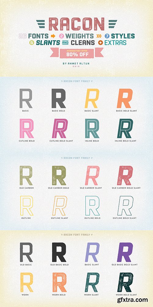
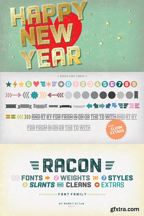
- Racon Font Family comes in two weights as regular and bold with seven styles. You can create unique and great designs with its classy, legible, elegant look and most preferred texture and clean styles. You can enrich your designs by using Racon Fonts with its clean and old styled extra figures. You can reach the keyboard codes of the extras as a pdf file from the “Gallery”. It would be a perfect choice for designing posters, affiches, logos, invitation cards, t-shirt and magazine prints, eye-pleasing typographic designs and more.
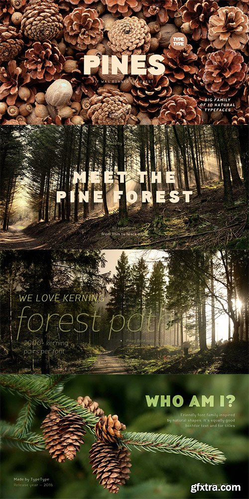
TT Pines Font Family 10 Fonts $200
- Imagine you've decided to cut letters out of paper thereby creating a modern sans-serif for a broad application range. What result would you get? We already know the answer! TT Pines is a fontfamily that we've carefully cut out of paper and then added lots of emotions and a few bright natural accidental details. Now you can create any text layouts and contemporary design with special warmth and friendliness that was inspired by paper. TT Pines fontfamily is great for any ecological design theme. Use if for websites, hand-made items, and eco-friendly products packaging. Our fontfamily is also great for ecological brand identity and navigation. We've named the font family TT Pines since it perfectly integrates into the natural environment and looks authentic and harmonious as if it came from the pine forest itself.
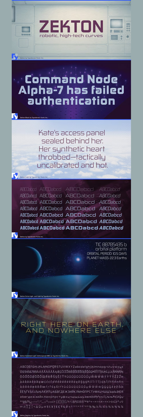
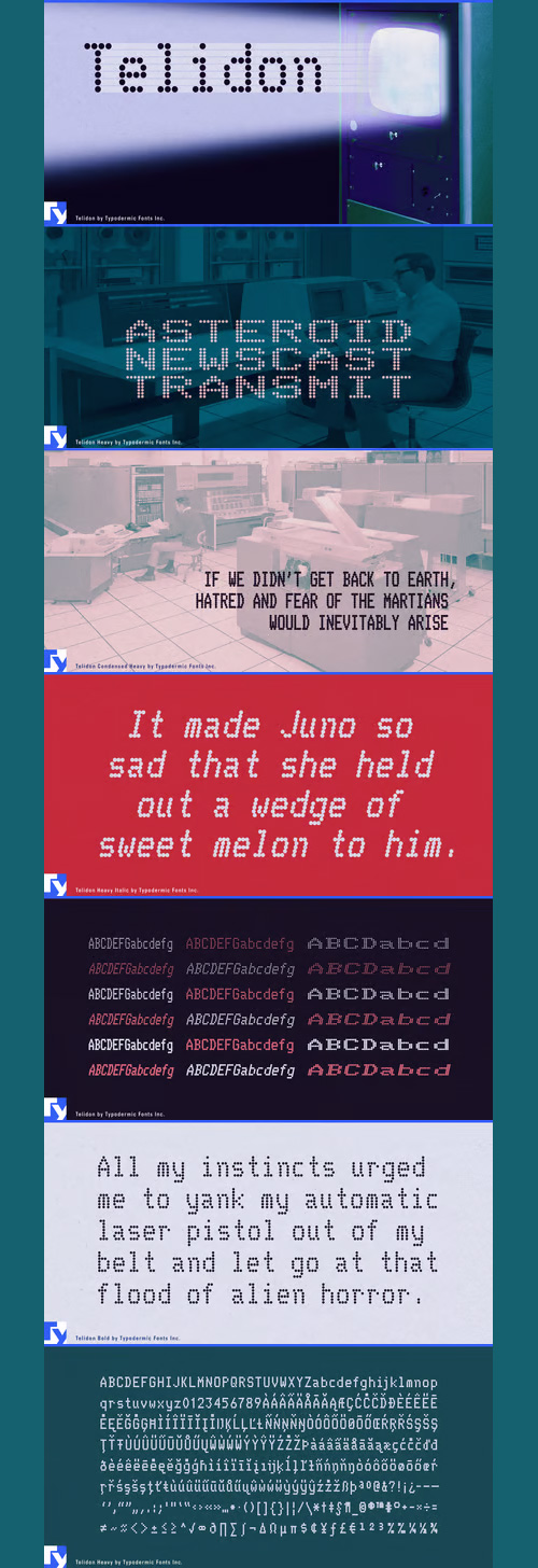
Telidon - Matrix Printer & LED Fonts - 18 Fonts 110$
18 Fonts | OTF/TTF/WoFF | RAR 1.1 MB | SALE PAGE
- Telidon is an font reminiscent of dot matrix printer fonts of the 1970s and 1980s and are still in use today on retail receipts. Telidon is useful for simulating LED pixel board graphics. If you want a rougher, more authentic dot matrix printer look, Telidon has a sister family called Telidon Ink which has a distressed, inky appearance. The extended styles have doubled pixels, just like the dot matrix fonts of yesteryear.
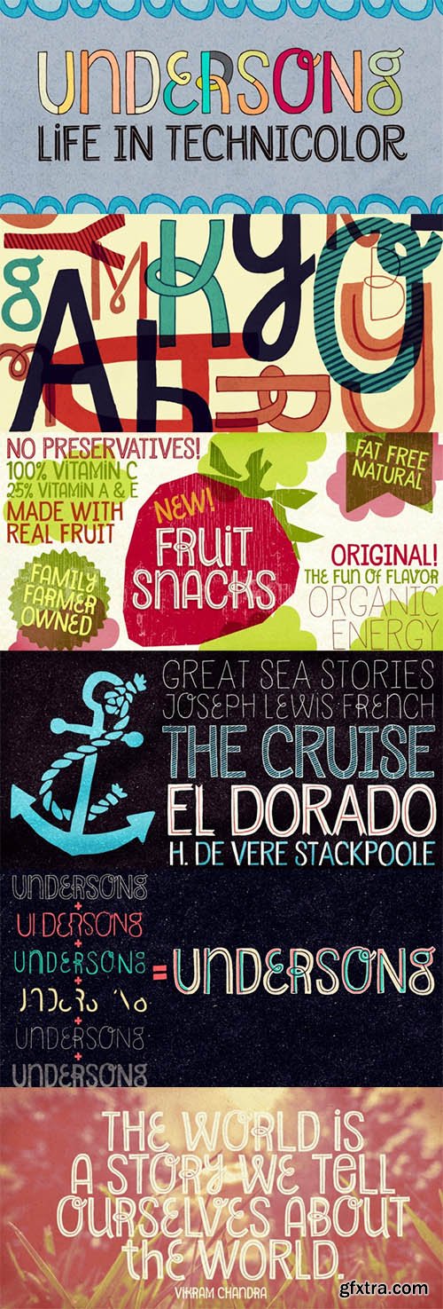
Undersong Font Family- 13 Fonts $247
13 Fonts | OTF/TTF | 8.64 MB | SALE PAGE
- Undersong brings 13 fancy hand-drawn stackable fonts which can be combined in many, many tasty ways. Layered or not, you'll see that these little ones work together scrumptiously well. For added flavor and freshness, each font brings at least 3 variations for each letter, making it for a cool natural handmade look. T-shirts, posters, book covers, packaging projects, Undersong will nicely fit many design applications. Some great font families out there are said to be workhorses. Figure this one like a work-unicorn: perfect for fantastic designs. Enjoy the ride!
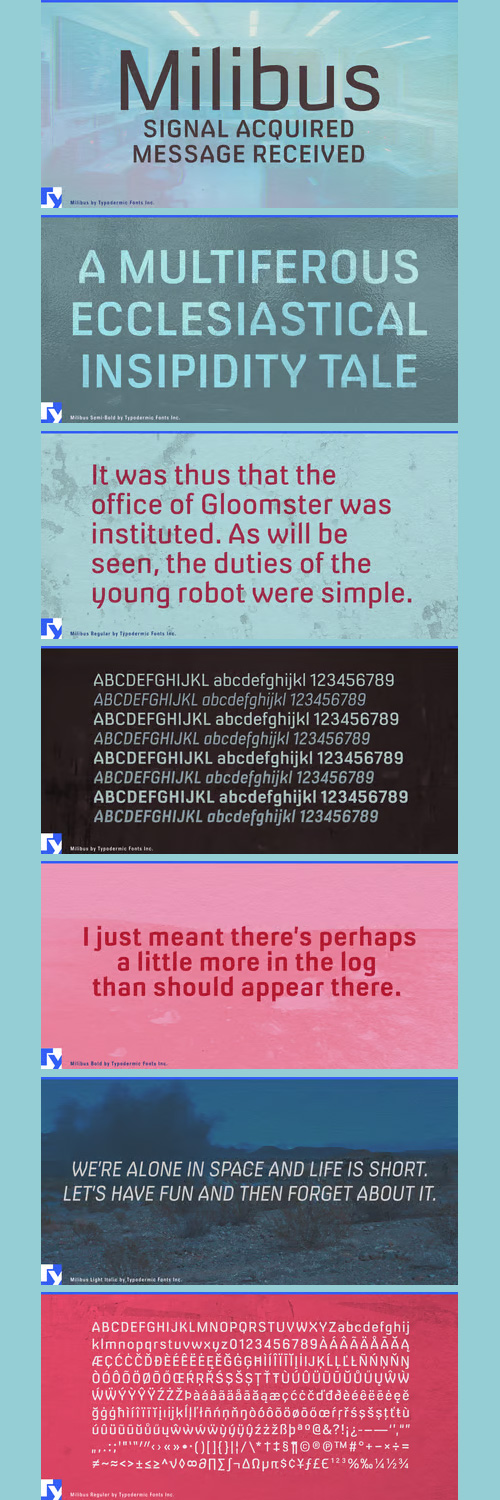
Milibus Font Family - 8 Fonts 240$
8 Fonts | OTF/TTF/WoFF | 644 KB | SALE PAGE
- Milibus is a smart, anti-retro sans with battleship styling, technical proportions and even color. Milibus was a stream of consciousness attempt to create something which has a technical/industrial look while avoiding some of the minimalist 1970’s truisms seen in most “techno” fonts: keep everything as modular, square and minimalist as possible. Milibus avoids those modular traps. The construction of the C and S are intentionally utilitarian and DIN-like which helps Milibus avoid looking like it’s simply minimalist for minimalism’s sake.
- The closed aperture (mouth) of C,G,J,S,a,c,e,s was done party to mimic a 20th Century technical quality but also to avoid the 1990’s platitude of “open means readable” (Lucida, Frutiger etc.). The whole font has a deliberately non-modular look: compare the lowercase latter and you can see how I avoided matching shapes. The vertical strokes on A,V,W,Y,w,v were inspired by 1980’s dot matrix printer fonts which often used flat sides out of geometric necessity. Those flat sides are the reason the lowercase y is unconventional: a orthodox y using flat sides looks awkward and constricted, hence the unique design. The slanted lowercase ascenders are a tribute to 20th Century highway sign lettering and it makes the lowercase l more identifiable from the capital I.
NeoSkola Bütün Kursları
Udemy Türkçe


Top Rated News
- TheBoudoirDivas All Tutorial
- 126,000 Royalty-Free 3D Models
- CreativeLive Tutorial Collections
- Fasttracktutorials Course
- Chaos Cosmos Library
- MRMockup - Mockup Bundle
- Finding North Photography
- Sean Archer
- John Gress Photography
- Motion Science
- AwTeaches
- Learn Squared
- PhotoWhoa
- Houdini-Course
- Photigy
- August Dering Photography
- StudioGuti
- Creatoom
- Creature Art Teacher
- Creator Foundry
- Patreon Collections
- Udemy - Turkce
- BigFilms
- Jerry Ghionis
- ACIDBITE
- BigMediumSmall
- Globe Plants
- Unleashed Education
- The School of Photography
- Visual Education
- LeartesStudios - Cosmos
- Fxphd
- All Veer Fancy Collection!
- All OJO Images
- All ZZVe Vectors
- CGTrader 1 CGTrader 2



















