


CreativeMarket - Marquee Chaos View - Color Fonts 2491855
OTF | PNG | SALE PAGE
36 new color OTF fonts | 12 old regular fonts


CreativeMarket Shop Bundle - Fonts, Logos, Patterns 3110842
OTF | TTF | PNG | SALE PAGE
63 Font Families - includes a varied range of typographic styles such as wedding fonts,
modern calligraphy, signature, brush lettering, layered, hand lettering, swash, hispter, travel and more.
Many have alternative glyphs, ligatures and swashes and contain
multi-lingual support. There are also a few layered fonts for you too!
125+ Logo Templates - These lovely logo templates can be edited to promote
different types of businesses such as jewellery, handmade products,
florists, IT, blogging, etc - with so many different styles of designs
you'll be sure to find your perfect logo within this bundle.
This pack offers hundreds of logo combinations and I'm sure that
you'll have some fun while you mix and match the graphics with
my fonts (or a font of your choice) to create the logo that
says it all about your business. Supplied in .psd and .eps vector formats.
260+ Graphics and Doodles - From hearts to horses, cameras to floral,
you’ll definitely find something in this bunch of graphics!
Supplied in .png or .psd and .eps vector formats.


InkyDeals - 200+ Fonts Collection
TTF | OTF | WEB FONT | SALE PAGE
Highly talented artists put this bundle together to give you the chance to expand
your font library with top professional designs!
This massive font collection with over 200 typography resources is exactly
what you need to be prepared for all of your projects.
Here you can find everything from modern calligraphy to
handmade typefaces that will invite your creativity.
Uppercase | Lowercase | Numeral | Accent (multilingual characters)
Ligature | Stylistic Sets | Swash


CreativeMarket Bravura SVG Font Duo & Extras! 2790271
OTF | PSD | SALE PAGE
- Introducing the Bravura SVG Font Duo: A bold and energetic brush font family full of pizzazz, quirkiness, and handpainted goodness. This excitable pair was designed to be loud, creative, and eye-catching. Making them perfect for the design of book covers, posters, apparel, packaging, editorial work, advertising, and more.
- Jam-packed with extras! This dynamic duo contains a full set of alternate characters to help improve the handwritten authenticity of your designs as well as an SVG version of each! Also included are three high-resolution PSD files containing hundreds of handpainted design elements to give your designs that extra boost!
- What's inside?
- Bravura Tall: A quirky handpainted brush font and the taller of the pair. Better suited for taking center stage! Use this font if you require the traditional vector .OTF format but still the textures of an authentic brush font.
- Bravura Stumpy: Just as quirky, but the stumpier of the pair. Better suited when complimenting it's taller sibling, although, just as prepared to take the mic. Use this font if you need the traditional vector format.
- Bravura Tall SVG & Bravura Stumpy SVG: Use these fonts to automagically create custom type designs as if they were handpainted directly onto the screen. With high quality, transparent acrylic paint textures featuring throughout, these fonts are great fun and super easy to work with, requiring zero extra work. Photoshop CC 2017 or Illustrator CC 2018 and above to use
- Original Handpainted Glyphs PSD: If you are unable to use the SVG fonts, or require the letters in a higher resolution, this PSD file has you covered! All of the original handpainted glyphs are here. Layered and organized.
- The Handpainted Toolkit: An extensive collection of high-resolution handpainted design elements that beautifully complement the aesthetics of the Bravura font family. From abstract shapes to arrows, from boxes to lines, naughts to crosses, and so much more.
- Multilingual Support: Both the traditional vector and SVG font formats include glyphs that support Basic Latin, and European languages such as; English, Spanish, Portuguese, German, French, Italian, Swedish, Danish, Dutch, and Finnish.
- Thanks a bunch for checking out the Bravura font duo, I'd love to hear what you think. So please, do not hesitate to leave a comment or shoot me a message and of course, if you have any questions, fire away!


123 Best-Selling Fonts & 552 Premium Graphics and Logos
OTF | TTF | PSD | AI | SALE PAGE
123 professional fonts - loaded with OpenType features
such as ligatures, swashes and alternates.
Wide range of typeface styles - monoline, modern calligraphy,
watercolor brush, grunge and more.
552 premium graphics and logo templates - ornaments,
illustrations, watercolor objects, labels, badges and more.
Perfect collection for a variety of projects - logo design, posters,
headlines, wedding cards, invitations, packaging, apparel, etc.


Creativemarket Ready For Fashion Font 506085
OTF | [leech=]https://creativemarket.com/Alfiyan/506085-Ready-For-Fashion-Font[/leech]
Use the font for product that you want to sell like t-shirt,
invitation card, poster, and other design products.
BONUS : 500 Watercolor Textures Packs+1080 Vintage Grunge Logo Variations


Collection of 10 Unique Fonts Familys - 47 Fonts
OTF | TTF | SALE PAGE
Really beef up your typeface toolbox with this gorgeous set of 10 unique fonts.
Besides alternate characters, many of these fonts include a ton of OpenType features
such as alternate characters, swashes, ornaments, stylistic alternates and more.
Feel free to use any of these fonts for as many personal or commercial projects as you'd like.
Add a real unique style to your latest project with these handmade lettering fonts.
Add a total nature feel to your work with a collection of animal, floral and illustrations.


CreativeMarket 94 IN 1 Font Bundle 1576574
OTF & TTF | WOFF | WOFF2 | SALE PAGE
- Also in this bundle is included a guide and permission. This guide contains my permission to use my fonts for commercial use, logo design, websites, e-books, online publications, phrase for sale, application design and on products for sale. And guide in which you will learn "How find and use alternates and swatches".
- This fonts are perfect for your blog or postcard for wedding. Also with their help, you can create a logo or beautiful frame for your home. Or just use these various fonts for logo, greeting cards, branding materials, business cards, quotes, posters and more!


CM Turmeric Font - Creative Lettering 346748
OTF | TTF
DemO
transparent PNG letters and shapes (1 letter resolution around 1500x1500 pix)
2 font files (otf & ttf) - regular & condensed italic (vector lettering in AI & EPS files)
effect and color options in PSD (adobe photoshop) file - 3 effects and
colors for light & dark backgrounds + instructions
more then 20 photos or backgrounds


OTF & TTF, WOFF & WOFF2
https://creativemarket.com/Mellow_Design_Lab/2261227-147-IN-1-Font-Bundle-SALE%21

CreativeMarket - Cheap Side Font Bundle 488781
This is a really cheap massive bundle, includes 33 OTF fonts from 11 authors.
The bundle will be available for limited time so be sure to get this before the deal expires!
https://creativemarket.com/CheapSide/488781-Cheap-Side-Font-Bundle


MightyDeals Glorious Font Bundle
21 Fonts, 60 Patterns, 200 Doodles
OTF | TTF | EPS | AI | PAT | JPG
")
")
")
")
")
MightyDeals- Wub Studio Font Bundle: 10 Font Families
(150+ Fonts and Extras)
10 Unique font families
50+ Individual typefaces
100 Colorful extras - badges, ribbons, banners, illustrations, corner sectors
Variety of additional styles - from thin to solid to gradient to inline
Amazing collection for any project you're working on - logos, totes, mugs, cards, pillows, prints, T-shirts, and tons more


CreativeMarket Jungle FONT+Extra Limited Time 482561
TTF | PSD | SALE PAGE
Upparcase | Number and Symbols | 17 Watercolor Styles | 4 Apstract Styles | 29 Paris Styles | 50 Illüstrations | 30 Swashes | 9 Splashs
Thick handmade, perfect brush strokes and curves of a font that is clear.
All files are seen in the presentation is made by the elements in the package.
Do you want, you can create the file you want to create too much.
You will notice the same brush in the movement of figures and symbols.
Flow in the brush elements is clearly evident. At the end of the letters in a beautiful spot in the movement will catch your attention.
Decorations are compatible with the font. There are appropriate decorations for every word and sentence you write.
Styles are excellent and simple colors, mixed colors, silvery, contains a great variety styles as much too complicated.
Illustrations are available. Cute and they should use a lot.
I highly recommend that you use splashes.


DealJumbo Handwritten Font Collection
OTF | TTF | SVG Font | PSD | EPS | PNG | Textures
26 font sets with 105 creative script & brush fonts + 10 graphics sets!
This bundle includes 6 SVG Fonts.
The OpenType-SVG format requires Photoshop CC 2017 or
Illustrator CC 2018 (or newer) but regular OTF format is also included.
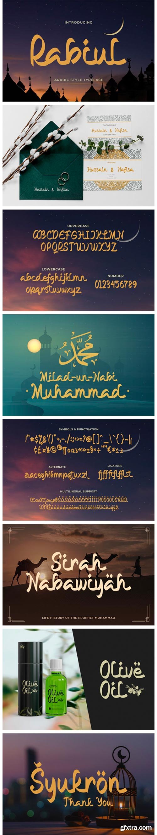
Rabiul - Arabic Style Typeface OTF & TTF
Rabiul is an interesting display font inspired by the style and feel of the Middle East.
This font is suitable for branding logos, Ramadan themes,
and any other projects you can think of creating.


Obak Delik is a display font
Obak Delik is a beautiful handwritten font perfect for any design you wish to create.
Add it to your creative projects, and notice how it makes them come alive!
OTF | TTF
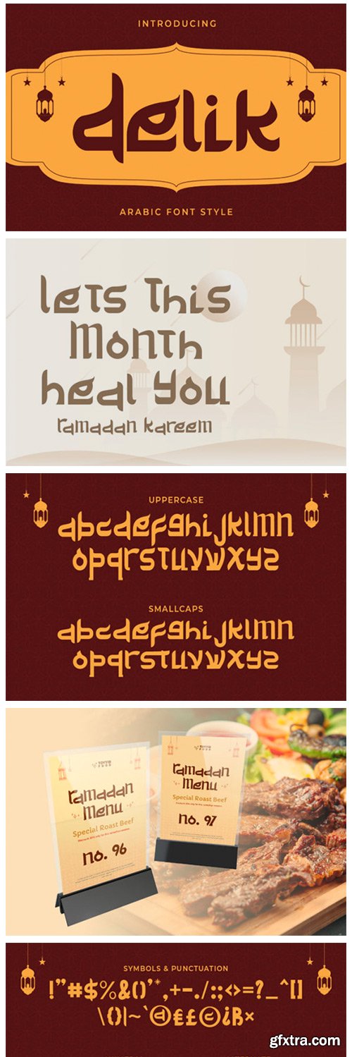
Delik - Arabic Style for Latins OTF 12386819
Delik is an interesting display font inspired by the Arabic style.
This font is suitable for branding logos, Islamic themes, Ramadan themes,
and any other projects you can think of.
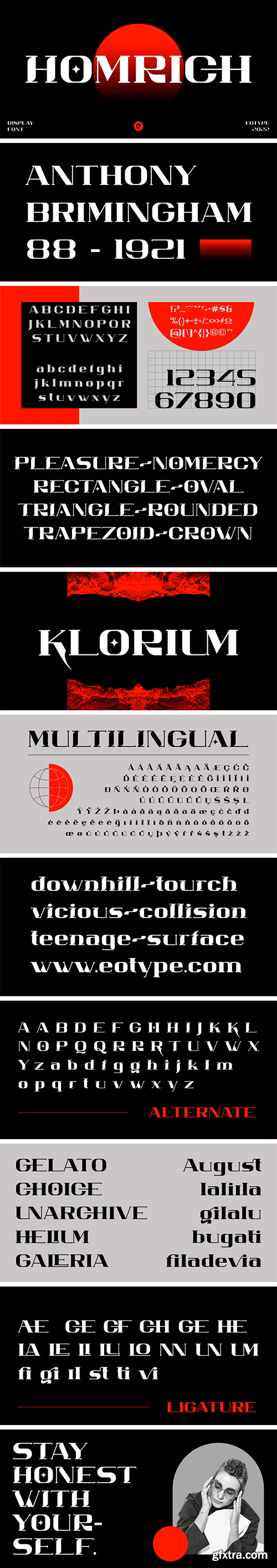
https://www.myfonts.com/collections/homrich-font-eotype
Homrich is font designed by Fajar Ramadan, with design combination between urban street wear themes. Homrich comes with stylistic, alternates, ligatures and supports multilingual languages. Create unique & beautiful logotype, use it as an elegant solution for your next magazine layout, or choose Homrich for any graphics that require a sleek look with a elegant.
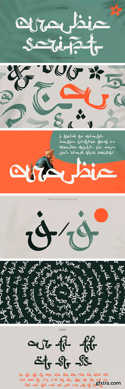
Arabic Script - Regular & Rough 2xTTF
2 TTF | Sale Page
- Hello! I'm happy to present you my new ethnic font family. I tried to create Latin letters font in Arabic style. Right now, you can type your text with Latin characters, and it can be read internationally. So, can you read this script? This font family consists of two font styles (regular and rough). Both of them will make an Arabic feel to every text you type using this font. I paid a lot of time for ligatures to provide flowing effect to every lettering. You can easily design Ramadan advertising, Islamic quotes posters, Arabic style greeting cards, Eastern brand logos, and others.

 The Gentleman Fonts Collection 164 Fonts in 50 Types
OTF, TTF, EOT, SVG, WOFF & WOFF2, EPS & AI
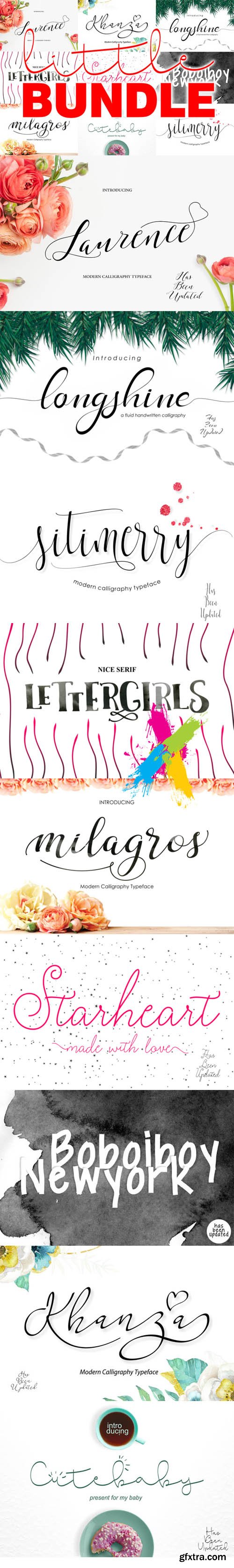
SreativeMarket - Little BUNDLE Live
OTF, WOFF, All Files | 8 mb
Boboiboy NewYork | Cute Baby Long | Cute Baby Regular | Khanza Script
Laurence Script | LETTER GIRLS SEXY | LETTER GIRLS
LongShine Script | Milagros Script | Sitimerry Script
126,000 Royalty-Free 3D Model

Udemy Türkçe


Top Rated News
- CreativeLive Tutorial Collections
- Fasttracktutorials Course
- Chaos Cosmos Library
- MRMockup - Mockup Bundle
- Finding North Photography
- Sean Archer
- John Gress Photography
- Motion Science
- AwTeaches
- Learn Squared
- PhotoWhoa
- Houdini-Course
- Photigy
- August Dering Photography
- StudioGuti
- Creatoom
- Creature Art Teacher
- Creator Foundry
- Patreon Collections
- Udemy - Turkce
- BigFilms
- Jerry Ghionis
- ACIDBITE
- BigMediumSmall
- Globe Plants
- Unleashed Education
- The School of Photography
- Visual Education
- LeartesStudios - Cosmos
- Fxphd
- All Veer Fancy Collection!
- All OJO Images
- All ZZVe Vectors
- CGTrader 1 CGTrader 2


