


Decora Arabic Font
TTF | 1 Font | + JPG Preview | SALE PAGE
Decora Arabic is a new creation of Naghi Naghashian.
Decora Arabic’s design fulfills the following needs:
- A. Explicitly crafted for use in electronic media fulfills the demands of electronic communication. A modern interpretation of Naskh which was invented as calligraphic style by Ebn Moghleh, a Persian savant in ninth century. This script is the most widely used and its popularity has increased through the centuries. Most recently, it has served as a basis for the typefaces that are in use today.
- B. Suitability for multiple applications. Gives the widest potential acceptability.
- C. Extreme legibility not only in small sizes, but also when the type is filtered or skewed, e.g., in Photoshop or Illustrator.
- Decora Arabic’s simplified forms may be artificial obliqued in InDesign or Illustrator, without any loss in quality for the effected text.
- D. An attractive typographic image. Decora Arabic was developed for multiple languages and writing conventions. Decora Arabic supports Arabic, Persian and Urdu. It also includes proportional and tabular numerals for the supported languages.
- E. The highest degree of calligraphic grace and the clarity of geometric typography.
- This typeface offers a fine balance between calligraphic tradition and the Roman aesthetic common in Latin typography.
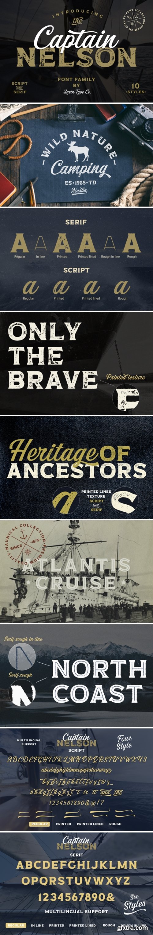
CreativeMarket - Captain Nelson 4356918
10 Fonts in OTF & TTF Types | RAR 3 MB | Sale Page
Full alphabet with Uppercase and Lowercase A-Z
Numbers, fractions, Punctuation and mathematical symbols
Alternates, Ligatures, Swash
Multilingual support
- Captain Nelson brings together two incredible fonts that will perfectly fit together to create stunning design results. While the script font delivers the charisma and charm, the serif version of this font duo will add a layer of confidence to your next design idea.
- Captain Nelson - this is a beautiful collection of fonts, which consists of a script and serifs, in this collection you will see serifs in a clean style, il line for clean, a rough style, il line rough style, printed, printed lined style, And script in clean, rough, printed, printed line style. With their help, a lot of options are opened for you to create your projects, both in vintage and in modern style. In the preview image, I tried to display it. I hope you will like it.
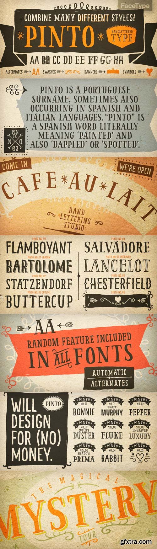
Pinto - Hand Lettered Look 14xOTF
OTF | 14 Fonts | JPEG Preview | 6.8 Mb RAR | SALE PAGE
- Pinto, designed by Vienna based typographer Georg Herold-Wildfellner, lets you transform type into an exciting and beautiful piece of work. The irregular, hand-lettered look adds a real human touch to things and comes along with a lot of loving details. Combine all font-styles the way you want, add some ornamental swashes or banners and even a single word becomes magnificent. Pinto shows a great flexibility and variety. It works similar to a toolbox: four subfamilies including shadow-, outline-, display- or layer-variations. On top of that is NO_05, a set of more than 800 different ornaments to dress up any typographic project. Browse through tons of swashes, flourishes, dividers, corners, ribbons, banners, frames, arrows, hearts and stars. The extensive character set includes uppercase letters in two automatically alternating versions (activate OpenType “Contextual Alternates”). All ornaments are abundant with details and often available in different stroke thicknesses. Scale them up to meet your personal needs!
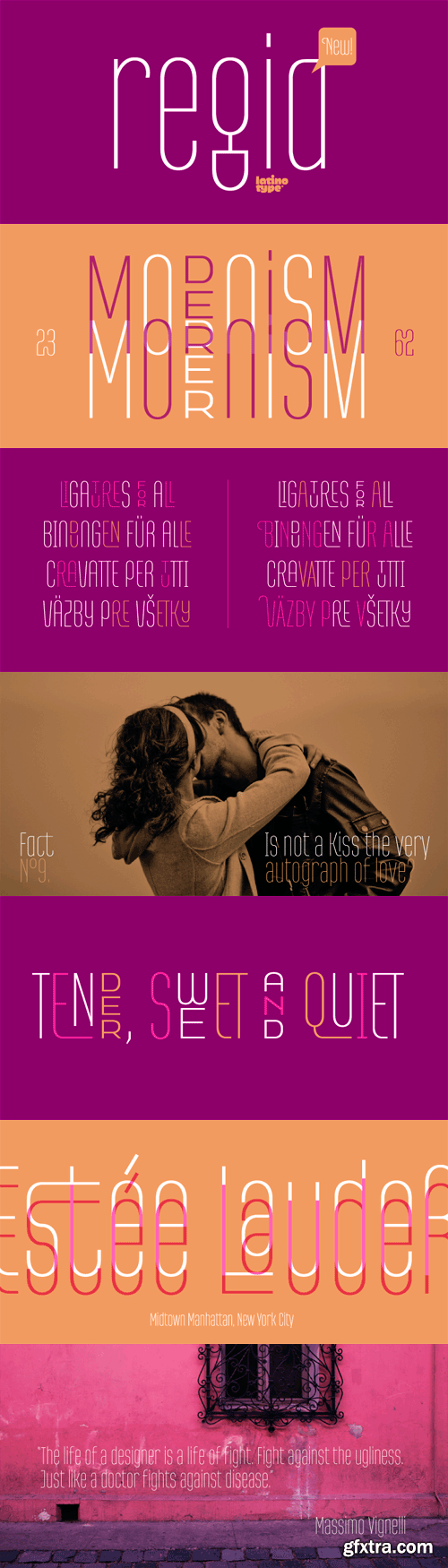
Regia Sans Pro - Thin & Condensed
OTF | 1 Font | JPEG Preview | 61 Kb RAR | SALE PAGE
- Regia Sans is a typeface that was designed in 2008 in Concepción, Chile, and was first released for sale by Latinotype. It is a very thin and condensed font with a modular design, well-suited for short texts, logos, magazines, posters, etc. This new version includes more than 1,300 characters in Opentype format, many ligatures (including diacritical marks and numbers), two groups of alternate characters, and some swash characters. Languages include: Basic Latin, Western European, Euro, Catalan, Baltic, Turkish, Central European, Romanian and Pan Africa Latin.
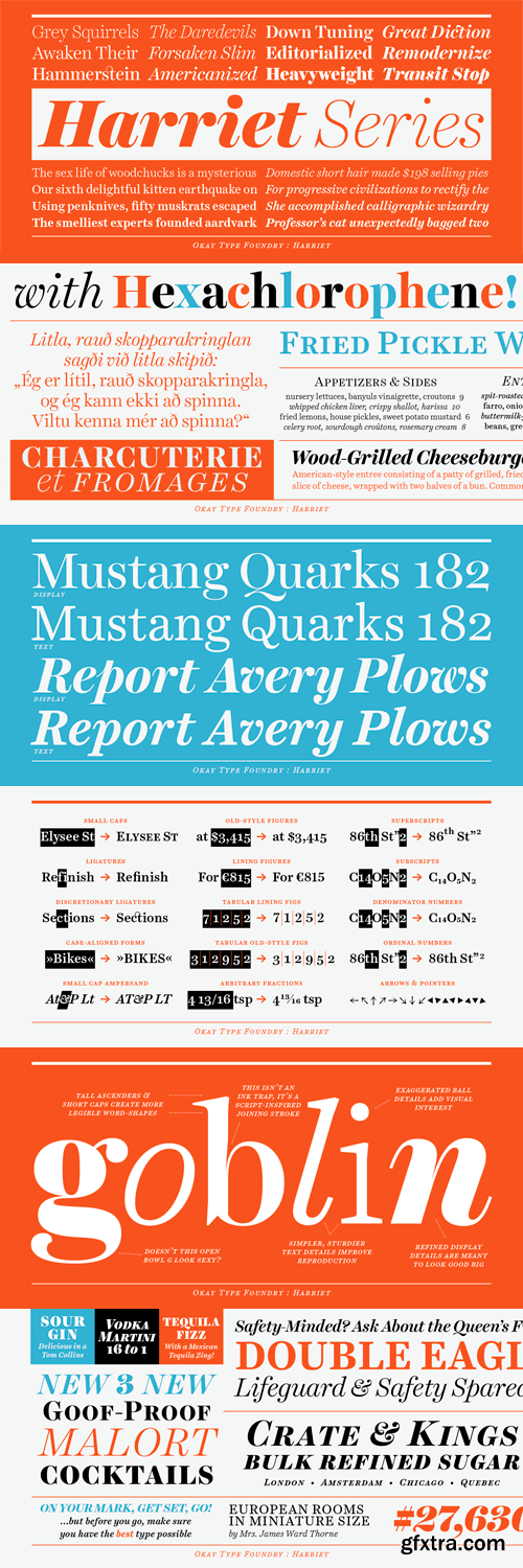
Harriet - Rational Serif Family 20xOTF
OTF | 20 Fonts | JPEG Preview | 2 Mb RAR
- The Harriet Series is a rational serif family. It’s a contemporary reflection of the serifs popular in mid-20th-century American and English design. Harriet draws inspiration from both transitional faces, such as Baskerville, and modern faces, such as Century, at the same time it is unburdened by any particular historical model. The display styles give it just enough exuberance to sparkle while the diligent, sturdy text styles make it a true workhorse. The Harriet Series was awarded a Certificate of Type Design Awesomeness from the Type Director’s Club in 2012.

Adriane Swash - A Fancy Look toClassic Style OTF
OTF | 1 Font | JPEG Preview | 6.6 Mb RAR | SALE PAGE
- The Swash version of Adriane Text features the best characteristics of this lineage, without losing the strong personality and elegant design featuring in your text styles, Adriane Swash brings a fancy look to this classic style. The family comes with a complete character set in Uppercase, Lowercase and Small Caps, and the Swash option can be activated through the OpenType features panel, including glyphs initial, intermediate and final, plus a wide range of stylistic ligatures, alternate glyphs, ornaments and languages.


True North Family - 20 Font $395
OTF | 28 MB | Sale PaGe
- True North is a vintage inspired typeface with 16 styles and a monoline script. True North comes with labels, extras and free banners. Extras include wild animals, catchwords, numbers, symbols, tools, maple leaves and trees.True North is a headline font with alternate capitals. Combine all 16 styles with the script, banners, labels and extras and you get a wonderful vintage design.True North Script is a playful, fully-connected monoline script full of ligatures and alternate forms. Its wide range of international characters and alternate use of the power of OpenType automatically creates the feel of hand-lettering.
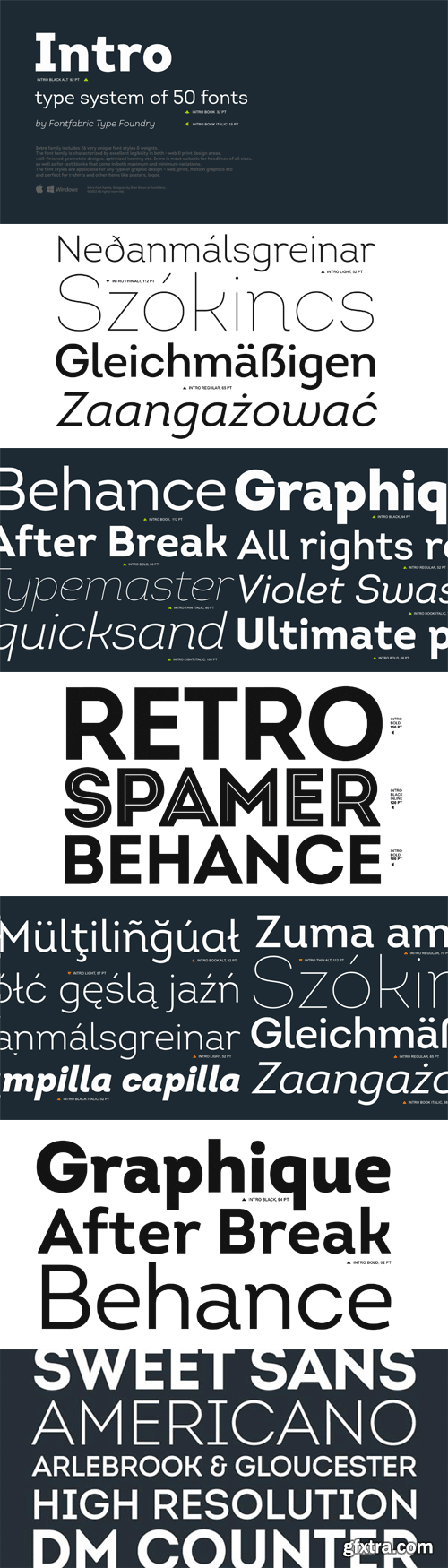
Intro - Excellent Legibility inPrint & Web
OTF | 51 Fonts (2015) | JPEG Preview | 4 Mb RAR | SALE PAGE
- The Intro font family consists of 50 unique font styles and weights. The family is characterized by excellent legibility both in print and on the web, a well-finished geometric design, optimized kerning, etc. Intro is most suitable for headlines of all sizes, but it does well in a variety of text lengths as well. The font’s various styles give it the versatility necessary to meet any type of graphic design challenge — web, print, motion graphics, etc. — and make it perfect for t-shirts, posters, and logos.
")
")
https://www.myfonts.com/fonts/intelligent-foundry/zona-pro/
- Zona Pro is a geometric sans-serif type family of 8 styles plus matching italics, designed by Kostas Bartsokas in 2013/14. It draws inspiration from 1920’s geometric style faces, having clean and highly readable shapes, and mixes it up in the heavier weights with a slight variance in the stroke widths, lending it a grotesque-ish unique and distinctive look.
-
Zona Pro is multifunctional and versatile. With its modern yet elegant form it performs amazingly in display sizes and headlines. At the same time its really tall x-height makes Zona Pro equally suited for editorials and shorter lines of text in smaller sizes (magazines, newspapers).
-
Zona Pro supports Greek, Western, Central and Eastern European languages, ligatures and special characters.
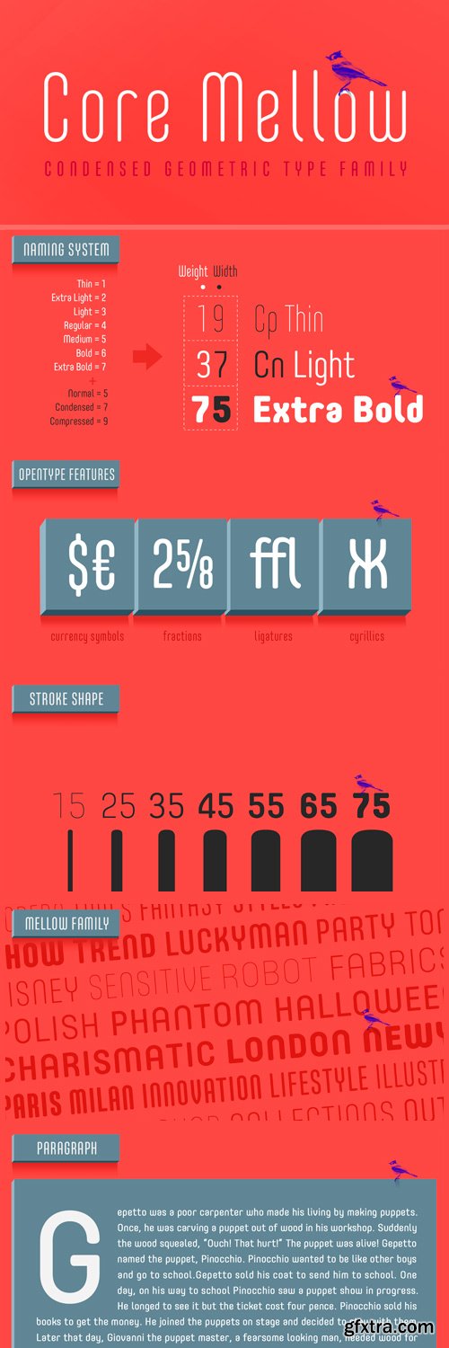
Core Mellow - Condensed Geometric Sans-Serif
OTF | 42 Fonts | JPEG Preview | 2.8 Mb RAR | SALE PAGE
- Core Mellow is a condensed geometric sans-serif typeface family that can be used in various applications especially for short texts. The letterforms in roman style are mild, minimal, simple, and clean in appearance. The Core Mellow Family consists of 3 widths (Compressed, Condensed, Normal), 7 weights (Thin, Extra Light, Light, Regular, Medium, Bold, Extra Bold) and Italic for each format. The Core Mellow provides a wide range of character sets to support Cyrillic, Central and Eastern European characters and advanced typographical support with features such as proportional Figures, tabular Figures, numerators, denominators, superscript, scientific Inferiors, subscript, fractions, standard ligatures, discretionary ligatures and stylistic alternates. Core Mellow looks smooth in any layout with its sleek rounded lines, use it for your magazines, brochures, web pages, screens, and so on.
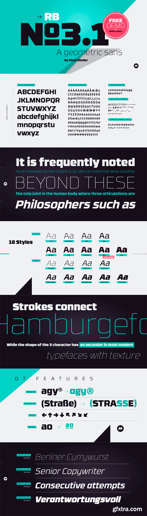
RBNo3.1 Font Family - 9 Weights 18xOTF
OTF | 18 Fonts | 1 Mb RAR | RBNo3.1 Font Family
RBNo3.1 is a sans serif typeface with a technical and geometric appearance.
The family includes 9 weights with matching italics.
Its large x-height makes it especially legible at small point sizes.
RBNo3.1 feels comfortable in technical surroundings with short text passages,
in brochures, catalogs, magazines, posters, websites, headlines or logos.
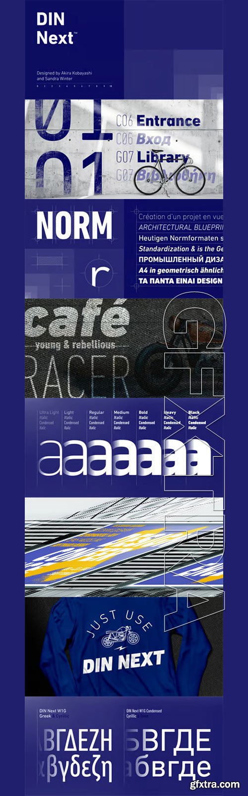
DIN Next - Mechanically Engraved Lettering
OTF | 49 Fonts | JPEG Preview | 3 Mb RAR | SALE PAGE
- The name DIN refers to the Deutsches Institut für Normung (in English, the German Institute for Standardization). The typeface began life as the DIN Institute’s standard no. DIN 1451, published in 1931. It contained several models of standard alphabets for mechanically engraved lettering, hand-lettering, lettering stencils and printing types. These were to be used in the areas of signage, traffic signs, wayfinding, lettering on technical drawings and technical documentation. Rooted in earlier designs for Germany’s railway companies, the alphabets were based on geometric shapes in order to be easily reproducible using compass and ruler. In post-1945 West Germany, the DIN alphabets were widely used, for instance on most road signs. They became available as fonts that were appreciated by designers for their industrial, somewhat quirky and “non-typographic” look and feel. From the 1990s onwards, more refined versions became available for use in book and magazine typography. DIN Next is a typographically corrected and expanded version of this quintessential 20th-century design.
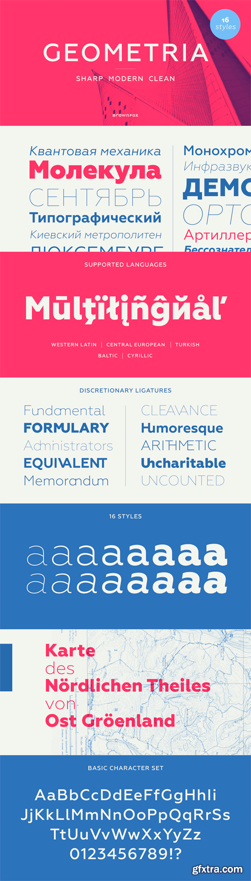
Geometria Font Family - 8 Weights, Multilingual
OTF | 16 Fonts | 2.2 Mb RAR | SALE PAGE
- Geometria is a new geometric sans serif. It consists of 16 fonts - eight weights with matching italics. The font includes multiple sets of figures and currency signs, alternate glyphs, a variety of experimental ligatures, and punctuation marks for the two cases. The 815 glyphs support 71 languages. Although geometric Sans Serifs have been in vogue for nearly a century, they have never been as ubiquitous. It is not improbable that the old adage would be phrased: "When in doubt, set it in geometric sans", had it been composed today. Have we not had enough? We think, not. Postmodern times demand a variety of expressions. The vision behind Geometria was to revisit the perennial favourite to lend subtle individuality to its tried and true forms. Geometria stands out in the crowd of similar fonts thanks to its complicated nature. It combines dynamic elements with a certain degree of stability. A slightly higher waistline of the capitals contributes to their distinctive appearance. If the upper case refers to the American grotesques of the 19th century, the lower case tends toward the forms of the Renaissance in its proportions. Geometria is a typeface of clean shapes that is well-suited for continuous reading, and it sets remarkably well. At the same time, it can be friendly, even flirtatious. Its distinct personality combines seeming opposites. At times it may appear serious, at times playful. On occasion, it may be deliberate, other times dynamic. It could seem rigid, then elegant. It is a typeface that could be perceived either as cutting-edge, or as nostalgic. A careful and discerning typographer will bring out and emphasize those aspects of its multifaceted personality that are needed to solve the problem at hand. Granshan 2013 award.
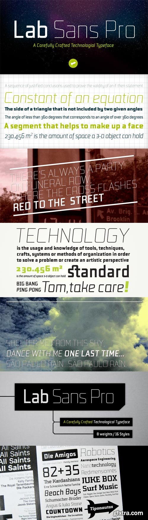
Lab Sans Pro - Technological Typeface
OTF | 16 Fonts | JPEG Preview | 6.2 Mb RAR | Lab Sans Pro Font Family
- Lab Sans Pro is a geometric sans-serif typeface with a technological and minimalist look and is suitable for use in large sizes. It has eight versatile weights, (from Thin to Black) including true italics for each one, and a wide range of stylish alternate characters to improve its use in different graphic contexts. The name of this typeface was inspired by an experiment, mixing a structure with calligraphic influences and completely geometrical and structured drawings. Lab Sans Pro has a wide range of OpenType® features such as: small caps, old style/titling and small caps figures, fractions, superior and inferior scripts, scientific components and ligatures. Versatile but original, precise but lively, Lab Sans Pro is a carefully crafted technological typeface designed by Tiponautas.


Trend - Sans & Slab Font Family
OTF | 21 Fonts | JPEG Preview | 3.4 Mb RAR | Sale Page
Trend is a font made of layers, taking as a basis a sans and a slab font.
It is the result of observation, search and study of the last global trends.
Trend tries to capture the aesthetics of fashion or even fashion itself,
integrating elements of a very popular and current trend.
It is a typeface designed to be used without need to add
anything external to it, because it has all components required for this.
Trend is trending.

PF Din Text Universal Font Family
DIN Text Universal is the most advanced DIN superfamily ever. It combines the powerful DIN Text Pro with DIN Text Arabic bringing the number of glyphs to 3320 per font. In fact, this set of fonts contains the most complete and powerful array of arabic features commercially available. It supports all variations of the Arabic script such as Persian, Urdu and Pashto. It is also enhanced with 30 advanced opentype features and kerning for all languages. The four major scripts Latin, Arabic, Cyrillic and Greek are now matched across the design of the whole family, respecting at the same time each one’s modern cultural identity. With its vast array of weights, the extended support for numerous languages, its careful and detailed design, it will prove to be extremely valuable for many complex corporate projects and corporations which operate internationally.
OTF | 8 Fonts | JPEG Preview | 4.1 Mb RAR

Aire - Arousing Argentina Curves
OTF | 9 Fonts | JPEG Preview | 4.4 Mb RAR | Aire Font Family][SALE PAGE
- After his success with Reina, Sproviero comes out with this big family of 7 members: Each of them loaded with lots of sophisticated ligatures, alternates and the entire cyrillic alphabet. The overall impression that the font gives is lightness and delicateness; that’s the reason the designer chose to call it Aire, or Air, in English. "Aire was somehow having a rest from my fat face Reina [...] It started as a really thin style of Reina, but it rapidly migrated from it and grew up alone. And how it grew..." The inspiration came from his own past creations: “The heavy strokes of Reina were shouting for a more delicate thing. Something more feminine. More fragile. Something which had a lot of elegance and fresh air inside”. Aire responds to this: Sproviero found that many of the typefaces of nowadays which are used for headlines (best known as display fonts) have almost always just one, maybe two weight styles. This was his opportunity to try something new. Aire makes it easier for the user to generate different levels/layers of communication thanks to its variety of styles. With this font you can solve entire decorative pieces of design with just one font, and that was the aim of it. Aire was designed to be playful yet formal: While none of its alternates are activated it can be useful for short to medium length texts; and when the user chooses to make use of its open-type decorative glyphs, it can be useful for headlines with dazzling results. On March of 2012, Aire was chosen to be part of the most important exhibition of typography in Latinoamerica: Tipos Latinos 2012. Aire is a family with many members. In total, the user can choose between almost 6,000 (!) glyphs (1,000 per style). Each member has variants inside, which are open-type programmed: The user decides which glyph to alternate, equalizing the amount of decoration wanted. Every decorative glyph has its weight adjusted to the style it belongs to. Exclusively for decoration, Aire Fleurons Pro is an open-type programmed set of ornaments. And last but not least, remember Aire is delicate. What’s my point? It is not recommended to activate all the alternates at the same time. It is typo-scientifically proved: A maximum of 3 or 4 alternates per word would be more than enough.
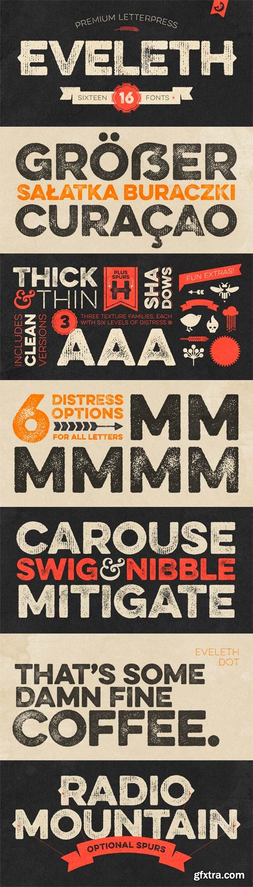
Eveleth Font Family - 3 Weights 16xOTF
OTF | 16 Fonts | JPEG Preview | 8.4 Mb RAR | [leech=https://www.fontpath.com/font/T5180/eveleth][SALE PAGE/leech]
Includes Shapes & Icons Eveleth Fonts!
- Eveleth from Yellow Design Studio is a premium high-resolution letterpress family with exceptional realism and vintage charm. It features 3 different sub-families each with its own unique printed texture. Each sub-family offers six distress options per letter and 3 options for all other characters allowing incredible control and customization. Bonus “spurs” have been included in every weight to add retro flair. Other features include a complimentary Thin weight, a shadow layer, a set of funky icons, a collection of useful shapes and emblems, and clean (non-distressed) versions. The font package includes character maps for the Icons and Shapes plus instructions for adding spurs.
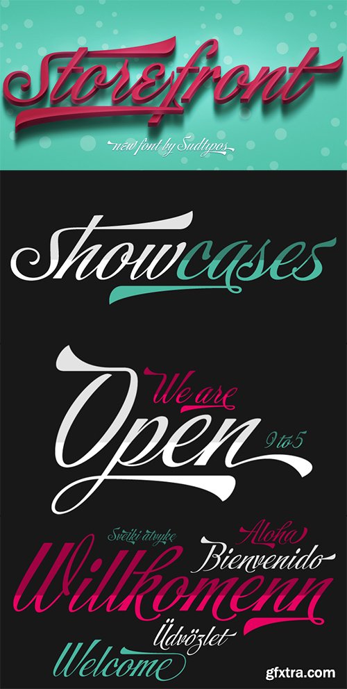
Storefront Pro Font - 1 Font $79
OTF | 1.11 MB | Sale Page
- Storefront is what the prolific and talented American sign painters of the 1920s and 1930s would have created if they had access to the advanced lettering and type technologies we have today. Rooted in an incomplete Alf Becker alphabet sample, Storefront is my usual overdose on alternates and swashes, my eternal attempt at giving typesetting that ever-elusive handmade impression.Though the main shapes, especially the majuscules, are almost a standard recitation of the natural evolution of nineteenth century scripts, the additional variants available within the font provide a leap in time to what sign makers and packagers are doing today. I can honestly say that Storefront’s influences are probably less historic and more in line with my recent travels and frequent supermarket visits. It’s difficult to avoid current visual culture when you're constantly bombarded with it. Not that I try. I certainly welcome the overflow. I'm probably addicted to it by now.With a very cool aesthetic, plenty of alternates and swashes, extended Latin language support, Storefront is over a thousand glyphs for your branding, packaging, and sign making pleasure.
126,000 Royalty-Free 3D Model

Udemy Türkçe


Top Rated News
- CreativeLive Tutorial Collections
- Fasttracktutorials Course
- Chaos Cosmos Library
- MRMockup - Mockup Bundle
- Finding North Photography
- Sean Archer
- John Gress Photography
- Motion Science
- AwTeaches
- Learn Squared
- PhotoWhoa
- Houdini-Course
- Photigy
- August Dering Photography
- StudioGuti
- Creatoom
- Creature Art Teacher
- Creator Foundry
- Patreon Collections
- Udemy - Turkce
- BigFilms
- Jerry Ghionis
- ACIDBITE
- BigMediumSmall
- Globe Plants
- Unleashed Education
- The School of Photography
- Visual Education
- LeartesStudios - Cosmos
- Fxphd
- All Veer Fancy Collection!
- All OJO Images
- All ZZVe Vectors
- CGTrader 1 CGTrader 2


