


Chalk Hand Lettering Font Family 3xTTF
TTF | 3 Fonts | JPEG Preview | 7.3 Mb RAR | SALE PAGE
- If you are into the vintage feel, you will love this one. This is as vintage as it probably gets. There are probably only a handful of places in the world where schools still use blackboards and chalk – they’ve given way to their white board and marker counterparts for decades now. White boards are definitely more practical and less messy when compared to chalk, but then if you are creatively inclined you will agree that a little bit of mess is worth it if you are going to get the effects that you desired! Well, we can give you the effects minus the mess with our chalk hand lettering fonts! As the name suggests, this font gives you that distinctly unique chalk on slate feel, and if you are wondering what’s distinct about it; writing on slate or blackboard was a slow process which required deliberated and concentrated efforts resulting in a handwriting which was usually quite different to a person’s handwriting on paper. Typography of chalk on slate was an everyday event in the classrooms of yesterday, and today we hardly ever get to see one of these if it all.

TTF | 56 Fonts | JPEG Preview | 7.3 Mb RAR | SALE PAGE
- The Core Sans M Family is a part of the Core Sans Series, such as Core Sans N, Core Sans N Rounded, Core Sans N SC, and Core Sans G. This font family has open and square letter shapes, and overall rounded finishes provide a soft and friendly appearance. Simple and modern shapes with a tall x-height make the text legible and the spaces between individual letter forms are precisely adjusted to create the perfect typesetting. The Core Sans M Family consists of 2 widths (Condensed, Normal), 7 weights (ExtraLight, Light, Regular, Medium, Bold, ExtraBold, Heavy), and Italics for each format. Small Caps versions are also available. It supports WGL4, which provides a wide range of character sets (CE, Greek, Cyrillic and Eastern European characters). Each font includes support for Superiors and Inferiors, Fractions, Tabular numbers, Arrows, Box drawings, Geometric shapes, Block elements, Mathematical operators, Miscellaneous symbols and Opentype Features such as Proportional Figures, Tabular Figures, Numerators, Denominators, Superscript, Scientific Inferiors, Subscript, Fractions and Standard Ligatures. The Core Sans M Family provides both OpenType (.OTF) and TrueType (.TTF) versions in the same package. We highly recommend it for use in books, web pages, screen displays, and so on.

Core Sans N Font Family
TTF & VFB | 54 Fonts | 13 Mb RAR | SALE PAGE
- The Core Sans N Family is a part of the Core Sans Series (Core Sans N SC, Core Sans N Rounded, Core Sans M, and Core Sans G). Letters in the Core Sans N Family are designed with genuine neo-grotesque and neutral shapes without any decorative distractions. The spaces between individual letter forms are precisely adjusted to create the perfect typesetting. The Core Sans N Family consists of 3 widths (Condensed, Normal, Extended), 9 weights (Thin, ExtraLight, Light, Regular, Medium, Bold, ExtraBold, Heavy, Black), and Italics for each format. It also supports WGL4, which provides a wide range of character sets (CE, Greek, Cyrillic and Eastern European characters). Each font includes support for Superiors and Inferiors, Fractions, Tabular numbers, Arrows, Box drawings, Geometric shapes, Block elements, Mathematical operators, Miscellaneous symbols and Opentype Features such as Proportional Figures, Tabular Figures, Numerators, Denominators, Superscript, Scientific Inferiors, Subscript, Fractions and Standard Ligatures. The Core Sans N Family provides both OpenType (.OTF) and TrueType (.TTF) versions in the same package. We highly recommend it for use in books, web pages, screen displays, and so on.


Vida Pro Font Family
OTF | 30 Fonts | JPEG Preview | 6.6 Mb RAR | SALE PAGE
- The new typeface family Vida was specifically designed for Czech Television in the framework of a competition for a new logo in summer 2006. The drawing of each letter form differs finely in its logic, which is a feature invisible at first. It is constructed on a puristic base, but it doesn't reject the natural anomalies already known from ages of experience with latin alphabet. That’s why e. g. upper left section of ‘n’ is constructed differently from that of ‘r’, similarly as ‘d’ doesn't repeat right-bottom ending after ‘u’, ‘9’ is not inverted ‘6’. Such details improve reading in continuous text. The behavior of all weights is consistent on CRT, plasma or LCD screens due to monolinear design; the lightest weight doesn't fade, the darkest isn't blurred, all is legible and clear in smallest sizes. Stem connections and endings were adjusted to avoid undesirable optical darkening. The goal we desired was to achieve balance appearance in both electronic and printed form.


Supria Sans Condensed
OTF | 18 Fonts | JPG Preview | 3.5 Mb RAR | SALE PAGE
- Beside Supria Sans™, the condensed version is the second component of the Supria type system. Encompassing the same six weights and three styles as Supria Sans, and characterised by the same approach to the modernist source material, this condensed set of fonts is 20% narrower than the normal version, allowing for significant space saving economies. Used together, Supria Sans and Supria Sans Condensed become much more than just a versatile and functional workhorse – ideal for resolving complex design issues with elegance and sophistication. Supria Sans Condensed™ is equipped for complex, professional typography. As an exclusively OpenType release, these fonts feature small caps, five variations of numerals, arrows and an extended character set to support Central and Eastern European as well as Western European languages.

Supria Sans
18 OTF Font Files | Designers: Hannes von Dohren | 2.9 MB | SALE PAGE
- Supria Sans™ and Supria Sans Condensed is an extended family of 36 fonts designed by Hannes von Döhren. It contains two widths, six weights and three styles, including the curvy, feminine Italic as well as the more conventional Oblique. Although it is inspired by the utilitarian clarity of Swiss type design, subtle curves and fine detailing impart a more playful character to the whole Supria Sans family. Supria Sans™ is equipped for complex, professional typography. As an exclusively OpenType release, these fonts feature small caps, five variations of numerals, arrows and an extended character set to support Central and Eastern European as well as Western European languages.
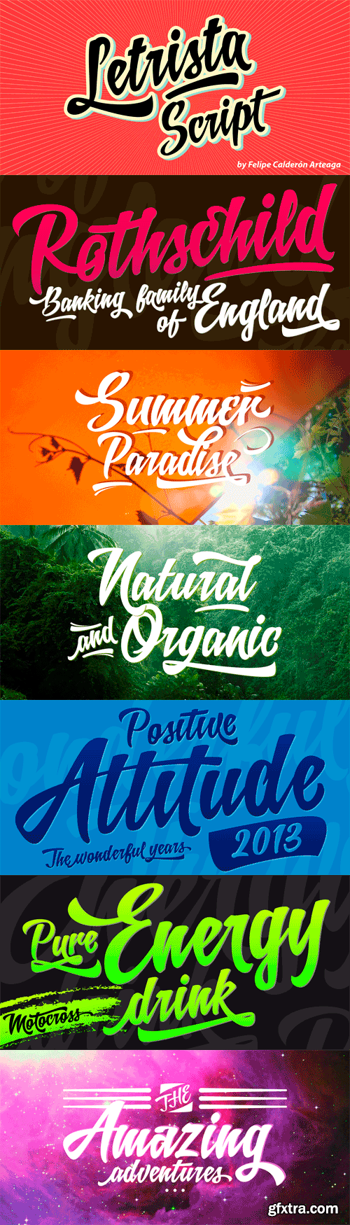
Letrista Script - Stylistics Alternative
OTF | 2 Fonts | JPG Previews | 15 Mb RAR | SALE PAGE
- Letrista Script is a product of observation and sensitivity of sign painter artists not only from United States but from other parts of the world, where the brushstrokes letters have reached a high level of importance in different context, where the writing makes fundamental part. With more than 1000 glyphs, this typography was created to achieve a unique texture without losing the legibility or force, to interact with the alternation of decorative characters and adornment that will surprise. After a year of working and checking with many artists, Letrista Script come up to the public with the guarantee of being an useful tool in your computer in the design time. When you know it, you surely won't stop using it, because of its beautiful characters and great texture. It is full of surprises and facilities for the users. Letrista Script includes standard ligatures, stylistics alternatives, discretionary ligatures, swashes, titling alternates and terminal forms, Stylistic Set 1, 2, 3 and 4, ornaments and a complete package of Catch Words.
OTF | JPEG Previews | 4.2 Mb RAR | SALE PAGE
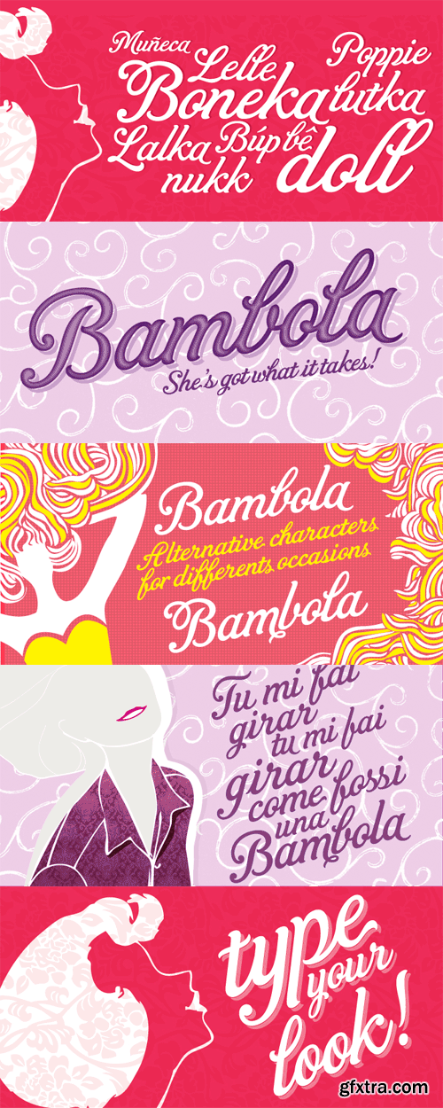
- BAMBOLA, Script put out by EdyType. Almost formal script, that gained a little weight. but she is taking care of that. BAMBOLA, a real doll, wants to be loved, she is trying hard to be popular. Is very conscious of her beauty, but trying not to be a show off. She'll be at ease in any place where normal faces gather, unpretentious, yet with a touch of class. Born to be readable, it’s ideal for packaging headlines and editorial work. Not thick, nor thin, just the exact weight, makes a good pattern at large texts, and reduces with no problems, her voluptuous initials makes it stand out always. A real romantic face, it belongs to the fashion world, where she’s come from. A real hip chick, she’s got what it takes!
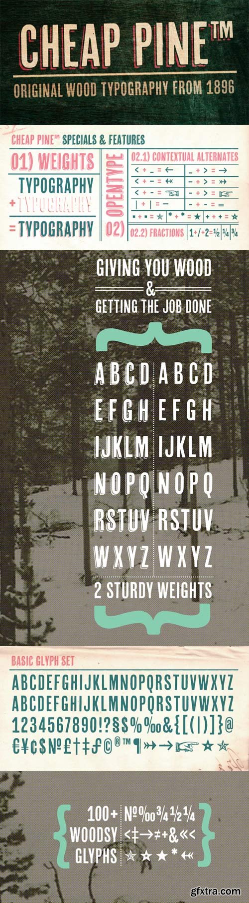
Cheap Pine- Wood Typography from 1896
OTF | 3 Fonts | JPEG Preview | 3.7 Mb RAR | SALE PAGE
Cheap Pine is a tribute to the wood type of the eighteenth century and nineteenth century.
You can use Cheap Pine Sans & Cheap Pine Shadow together to influence the color of the shadows.
The font contains arrows, hands, stars and other special glyphs
available through the OpenType ligatures feature.

Centrale Sans Inline - Authentic Humanist Design 4xOTF
https://www.myfonts.com/fonts/typedepot/centrale-sans-inline/
A humanist design typeface incorporating elements from the more rationally constructed grotesque typefaces. Its characteristics are relatively large x-height and open apertures. The overall effect suggests approachability without the sentimentality carried by some of the more authentic humanist designs – contemporary and precise.
OTF | 4 Fonts | + JPG Preview
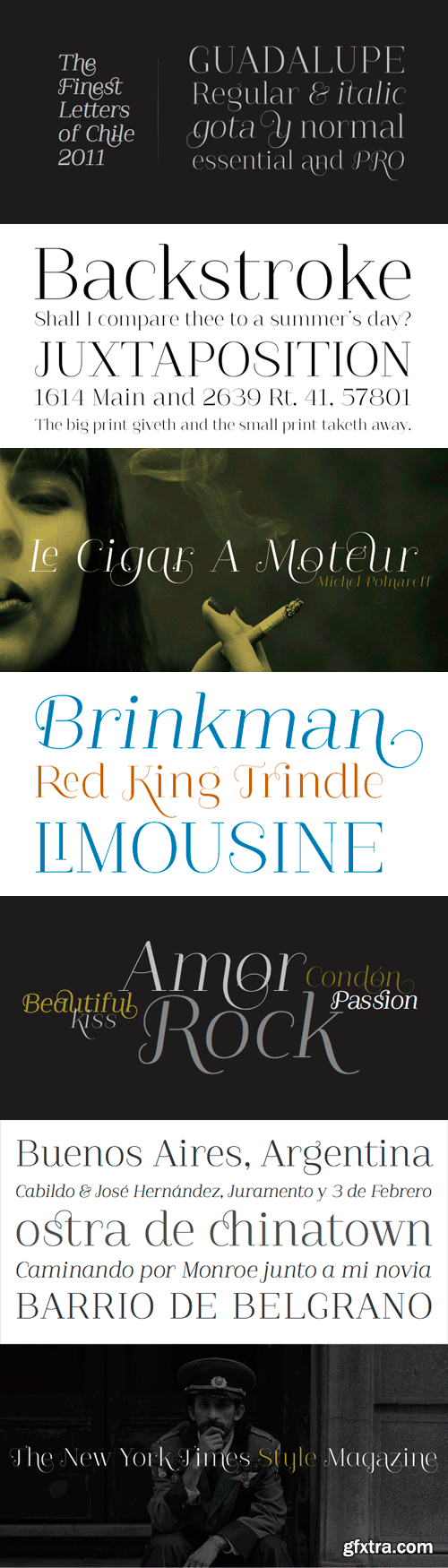
Guadalupe - The Finest Letters of Chile 4xOTF
OTF | 4 Fonts | JPEG Preview | 2.3 Mb RAR | Guadalupe Font Family]SALE PAGE
Guadalupe –from the family of classic Didots– is a high performance font
with a great set of alternates & swashes and carefully refined details.
Especially suited for fashion magazines, logotypes and luxury contexts
with a range of two different terminal versions;
“Regular” –a classic roman typeface– and “Gota”,
much more expressive for word setting.
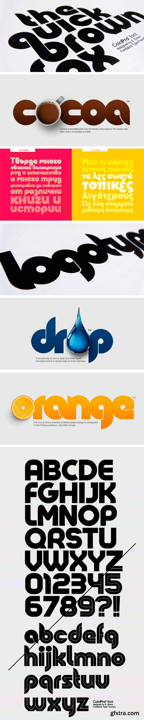
Colo Pro Font Family - 2 Fonts for $49
OTF | 2 Fonts | JPEG Preview | 3.9 Mb RAR | SALE PAGE
Colo Pro is a custom font which is applicable for any type of graphic design - web,
print, motion graphics, etc., and it is perfect for t-shirts and other items.
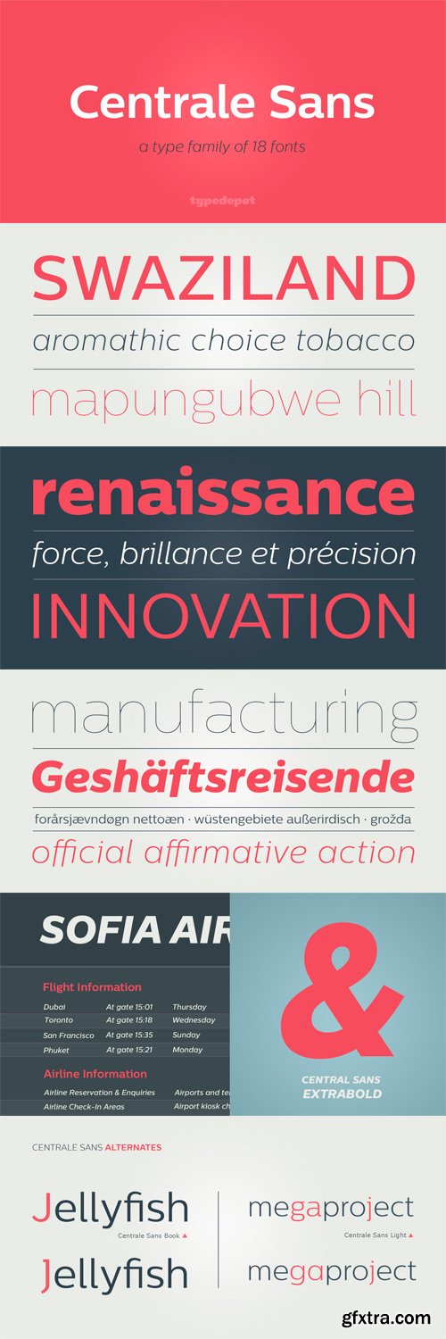
Centrale Sans Font Family 14xOTF
OTF | 14 Fonts | JPEG Preview | 3.5 Mb RAR | SALE PAGE
Centrale Sans is a modern sans serif typeface. Geometric by nature,
Centrale Sans is characterized by some humanistic features, resulting in a more warm and friendly look.
Its open bowls and its overall width make it highly legible and readable at small sizes.
The openness helps Centrale Sans to be a good performer on the screen as well.
Heroe - Poetic Curves 5xOTF
OTF | 5 Fonts | JPEG Preview | 4.2 Mb RAR | SALE PAGE
- Now my feelings about didones are more than evident. After some years of roman-abstinence (1) I present Heroe, an interesting combination of elegance and sensuality. Heroe, spanish for hero, takes some aspects of roman typefaces to the extreme like my main inspiration, the great Herb Lubalin, did in the majority of his works: Thins turned into hairlines, altered proportions (for display purposes), unique ball terminals, poetic curves and a graceful way of placing them together on a layout. Its classy style makes the font perfect for a wide range of uses. Imagine Heroe Inline (my favorite) dancing over a bottle of perfume; printed on the cover of a fashion magazine; lighting wedding invitations up. Its partner, Heroe Monoline, may help you to make more elaborated pieces of design. Just combine it with Heroe, or Heroe Inline and see how perfect they match. The difference between Pro and Std styles is the quantity of glyphs. While Pro styles have all the decorative characters available, Standard ones have only the basic set of them. Heroe Monoline Big and Heroe Monoline Small where made for better printing purposes. If you need to print the font in small sizes, then your choice should be Small. Heroe Monoline has the same alternates (and open-type code) as Heroe Pro and Inline, plus some decorative ligatures.


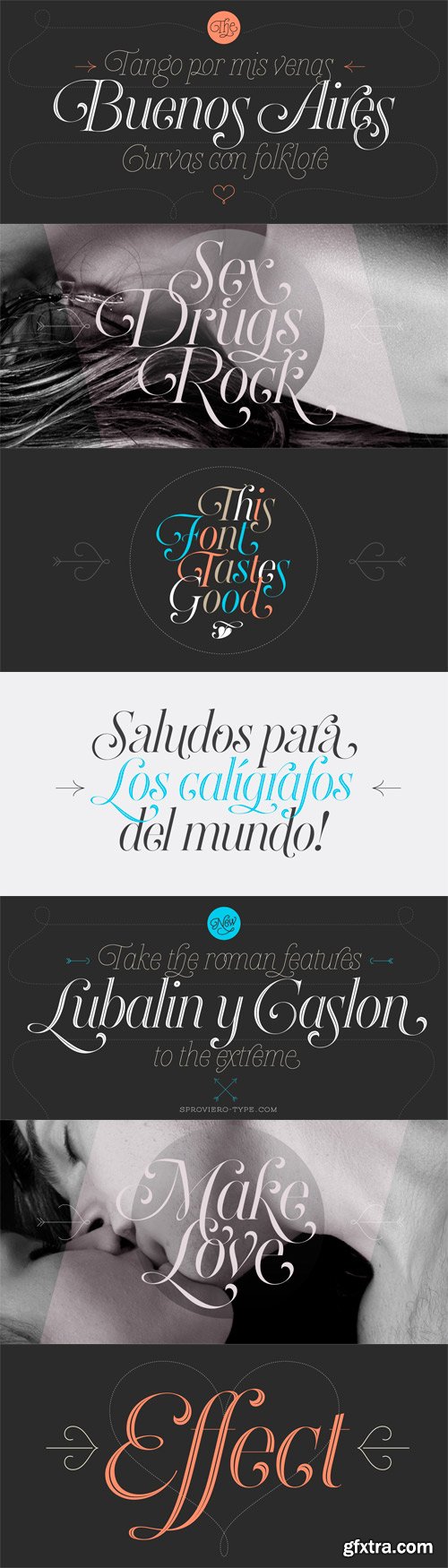
Paradise Script - For Calligraphy Lovers
OTF | 281 KB | Sale PaGe
- Paradise is a script font thought to be used in a wide range of pieces of design. From packaging to invitations, Paradise really looks elegant and sometimes playful at the same time.Maximiliano Sproviero designed the 6 styles of it; being each glyph carefully drawn to give their fresh results.The existence of Paradise Script One, Two, Three and Four makes this font hard to become a cliché: The possibilities of alternates, ligatures and combinations of them are huge.Calligraphy lovers know that words sometimes start or end with extra flourishes: This is the reason of Paradise Starters and Paradise Finishers, which will always give a sensual touch to the written word. Paradise Script and its variables make words taste good.


Breathe - Absolutely Fantastic
OTF | 3.12 MB | Sale PaGe
Reaching a total of more than 1000 glyphs, Breathe Pro is Maximiliano R. Sproviero’s gift of the year.
The aim of the designer was once more to give the user the chance to play and travel from
very formal and conservative letterforms to the amazing world of swashes and flourishes.
Possibilities of alternating and ligating characters in this font are absolutely fantastic.
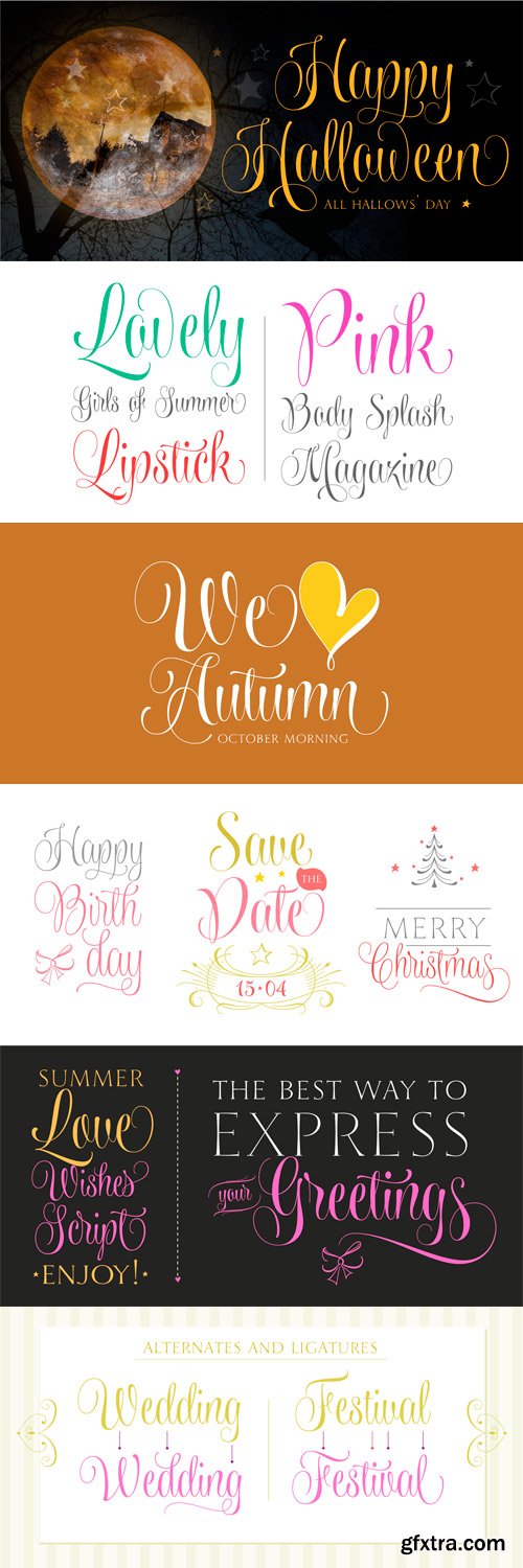
Wishes Script - Lovely Curves
OTF | 18 Fonts | JPEG Preview | 6.8 Mb RAR
- Wishes Script is the best way to express your greetings! All you want to say is more gorgeous when using this pretty font, since it beautifies every message. Programed with Open Type, Wishes offers the designer a complete range of possibilities: frames, ribbons, hearts, flowers, ornaments, swashes, endings, ligatures and all the alternates you need to make a wonderful work. With delicate and flowing curves which blend english style with lettering, Wishes Script works perfectly in greeting cards, invitations, weddings, posters, magazines, fashion world, logos, packagings, etc. Additionally, it can be used in small and big formats, due to its Display and Text styles. It works perfectly in both small and large sizes, preserving the delicacy of its thin strokes and ensuring them to be printed accurately in smaller sizes. You can get both styles in the Light, Regular and Bold weights. With more than 990 glyphs, the Pro Version of each option includes: Caps, (that match well with the style of the font, being a super legible way of writing) and a complete set of 197 ornaments that makes a perfect decoration. Caps and Ornaments are sold separately too!

Lovers Pro Script Font - 1 Font 35$
OTF/WoFF | RAR 93 KB | SALE PAGE
- Lovers is a romantic, elegant handwritten calligraphic script, with well over 300 additional characters, including standard and discretionary ligatures, swashes and stylistic alternatives. Use of its extensive OpenType features enable the designer to create text that constantly changes, giving the impression of genuine handwriting, but handwriting that has all the flair and styling of hand-done calligraphy produced towards the end of the twentieth century.Lovers is based on traditional calligraphic ideals, but I've combined these with my own brand of relaxed, handwritten spontaneity, to design a font that is formal yet free and accidental, traditional yet contemporary.The font’s extravagant curves and swashes make it perfect for valentine’s day and wedding media, book covers, greeting cards, and certificates, in fact for any design work that requires a romantic or opulently elegant look. The range of stylistic alternatives and swashes enable users to create a wide range of moods in their work. In many ways it is a calligraphy toolkit.Lovers contains the accented characters used in the major European languages. What sets it apart from most other calligraphic fonts is that it appears so genuinely handwritten and avoids the uptight formality that characterizes so many of the fonts in this genre.Try Lovers, enjoy its wealth of OpenType features and let its vigorous yet elegant exuberance delight you and enhance your creativity!
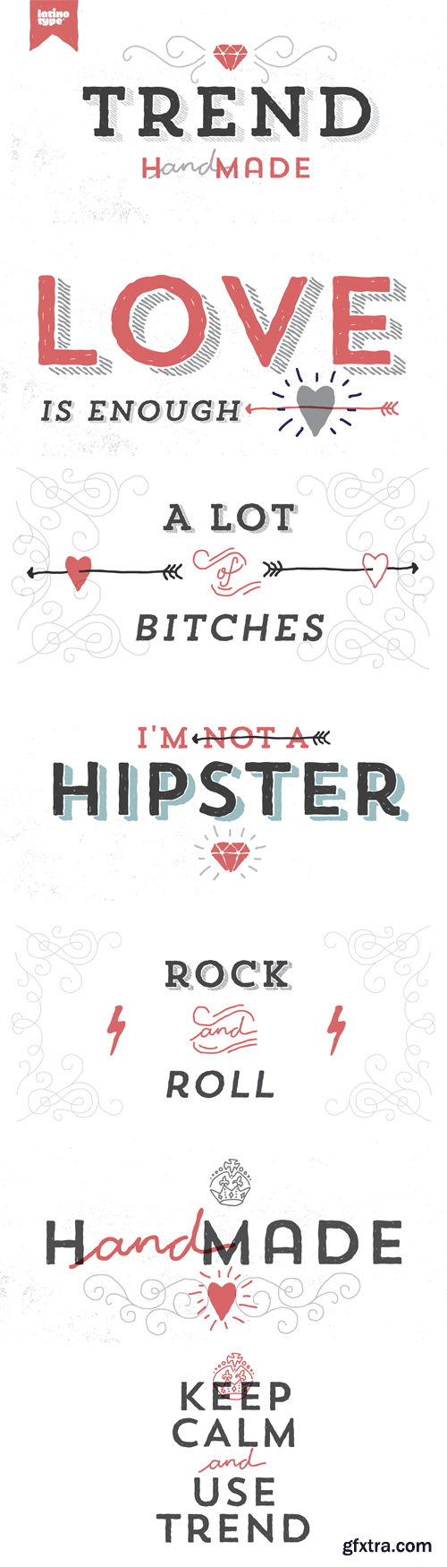
OTF | 21 Fonts | JPEG Preview | 3.4 Mb RAR | SALE PAGE
Trend & Trend Hand Made is a font made of layers, taking as a basis a sans and a slab font.
It is the result of observation, search and study of the last global trends.
Trend tries to capture the aesthetics of fashion or even fashion itself, integrating elements of
a very popular and current trend. It is a typeface designed to be used without need to add
anything external to it, because it has all components required for this. Trend is trending.
126,000 Royalty-Free 3D Model

Udemy Türkçe


Top Rated News
- CreativeLive Tutorial Collections
- Fasttracktutorials Course
- Chaos Cosmos Library
- MRMockup - Mockup Bundle
- Finding North Photography
- Sean Archer
- John Gress Photography
- Motion Science
- AwTeaches
- Learn Squared
- PhotoWhoa
- Houdini-Course
- Photigy
- August Dering Photography
- StudioGuti
- Creatoom
- Creature Art Teacher
- Creator Foundry
- Patreon Collections
- Udemy - Turkce
- BigFilms
- Jerry Ghionis
- ACIDBITE
- BigMediumSmall
- Globe Plants
- Unleashed Education
- The School of Photography
- Visual Education
- LeartesStudios - Cosmos
- Fxphd
- All Veer Fancy Collection!
- All OJO Images
- All ZZVe Vectors
- CGTrader 1 CGTrader 2


