


CreativeMarket - Stone Harbour Brush Font + Extras 426916
- I had SO. MUCH. FUN. making this font, and even MORE fun testing it out - I got started and just couldn't stop! - which is why this pack has so much inspiration for you guys. Seriously - as soon as this baby is uploaded - I'm off to go play more. I'm hoping you guys experience the same thing when you unwrap it and get stuck in!


Adagio Slab Script Font Family
OTF | 9 Fonts | JPEG Preview | 2.2 Mb RAR | SALE PAGE
Adagio Sans Script is an experimental vertical variety of a normal sans version, with the characteristics of handwriting. It has 9 weights and like the rest of Adagio family fonts over 400 characters. Thanks to its calligraphic feeling, Sans script version is a great compliment for the rest of the forms of Adagio Family.

Wallington Font Family
OTF | 2 Fonts | JPEG Preview | 3.5 Mb RAR | SALE PAGE
Wallington is a decorative-serif font embodying vintage and elegant curves with functional structure. Inspired by Old English cultures and their descendants between the mid-5th century and the mid-12th Century. Crafted with love and easy-to-read letter design. Wallington is made up of two styles, Wallington Regular that consists of 491 glyphs and Wallington Small Caps with 365 glyphs. All glyphs are divided into several OpenType features such as Ligature, Contextual Alternates, Old Style Numeric and some astonishing special characters that allows you to mix and match pairs of letters to fit your design. This variety encourages unusual and extroverted creation in lettering design. The typeface offers numerous combination possibilities between the basic glyph set and stylistic sets. The stylistic sets are alternate alphabets that you can access by using OpenType savvy programs such as Adobe Illustrator and Adobe InDesign. Wallington is an experimental and versatile font. Suitable for digital lettering, prints, logo, poster, t-shirt, packaging and applicable for some type of graphic design.

Taurunum Font Family
OTF | 5 Fonts | JPEG Preview | 2.3 Mb RAR | SALE PAGE
The initial idea for this font came when a friend of mine asked me to create a logo for a sports team that he was forming. Since it was a martial arts competitive sport, bold and striking lettering was needed to reflect that. When the logo was finished, I was really pleased whith the letters so I decided to create the entire font. Taurunum is made with intention to be used for display design (logos, posters, etc.), and combining the weights should give best results.

MB Noir Font Family
OTF | 8 Fonts | JPEG Preview | 4.1 Mb RAR | SALE PAGE
- MB NOIR is a 4 weight with italics font family that visually has different layers of style, at first glance its a modern clean geometry based face with some nice retro touches, it also has hints of the vintage about it, with a nod to the art deco style, with alternates and ligatures it gives a lot of scope for its uses and works very well at large and small sizes.

Clio Condensed - Simple & Stylish Typeface 24xOTF
OTF | 24 Fonts | JPEG Preview | 4.4 Mb RAR | SALE PAGE
Clio, Clio XS and Clio Condensed is a big family of 72 fonts.
They were designed by Gabriel de Souza in 2012.
They are simple and stylish and they have the ideal appearance to your work.
Furthermore, features such as italics, obliques, great language support and flexibility.

In a Jar - Display Typeface Based in Hand Lettering 6xOTF & Web Fonts
OTF | 6 Fonts | JPEG Preview | 2.9 Mb RAR | SALE PAGE
- In a Jar is a display typeface based in hand lettering. Inspired by the grandmother’s kitchen, its colors, forms, smells and the new way for rescue this old things. Designed for use in short text and big sizes is perfect for brand design, headlines, labels, greetings cards and all kind of things related to kitchen and foods. In a Jar is a sweet little family that include alternates, compounds words, ligatures plus a serie of dingbats and ornaments very cute to compliment and accentuate the handmade design. Try and enjoy all fun in a jar! Designed by Coto Mendoza with technical support of Luciano Vergara.

Transat Text - Geometric Sans Serif
OTF | 10 Fonts | JPEG Preview | 10 Mb RAR | SALE PAGE
- Transat Text is a geometric sans serif typeface, and is the more rational sibling to the unabashedly Art Deco "Transat". Transat Text has a slightly taller x-height than its counterpart, making it easier to read at small sizes, but also performs admirably in larger display settings. Transat Text includes many OpenType features, such as ligatures, small capitals, case sensitive forms, stylistic alternates, arbitrary fractions, and a full complement of proportional, tabular, and oldstyle figures. The Transat Text family includes 5 weights plus optically-corrected obliques.
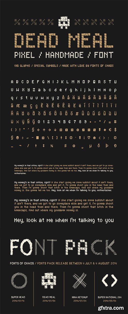
CreativeMarket - Dead Meal - Hand Drawn Pixel Font 55282
TTF, PSD, RTF | Web font | 0.3 Mb
Then guys you are at the right place. Dead Meal is an awesome pixel style font made by hand.
Each "fake" pixel is a nice square of slash pen.
Complete with 195 characters + special symbols like emoticon, skull, and more.

Salting 5614261 | OTF WOFF | 1.5 MB RAR
Salting is a hand-drawn font with a natural brush style.
It is the perfect font for your social media business designs,
advertisements, lettering, posters, and much more!


Neusharp Font Family 36xOTF
36 OTF Fonts | Previews | SALE PAGE
- Neusharp fonts are great for headlines and short paragraphs. It is suitable for making text quotes, documents, websites, logotypes, sports-themed designs, magazines, and other creative business designs, etc. Neusharp is a sans serif typeface with a sharp shape that is very impressive to have. This font family includes 36 fonts in various weights and styles, so there are plenty of options to make your product even more creative and engaging.

Green Ocha - Cartoon Playful Style
Introducing “Green Ocha” is a cartoon playful style typeface. Step into a world of whimsy and fun with “Green Ocha,” a playful cartoon font that’s bursting with groovy energy. With its quirky design and cheerful demeanor, Green Ocha adds a splash of personality to any project, whether it’s for children’s books, comic books, or creative branding.

Sancoale Slab Font Family 36xOTF
OTF | 36 Fonts | JPEG Preview | 6.3 Mb RAR | SALE PAGE
- The contemporary feel of the Sancoale superfamily takes a bolder turn with this futuristic slab. Built from Sancoale’s successfully simple geometry, Slab’s serif elements and tall x-height give the face an energetic, yet clean figure that easily complements its cousins: Sancoale Softened--a sans with blunted terminals; Sancoale Narrow; and, of course, the original Sancoale itself. The weights of each member have been balanced carefully to ensure compatibility with the others, and when used together, the combination creates a powerful design that is easy to identify. With weights ranging from the classier Thin to the authoritative Black, Slab opens the door to a range of applications. Used in different text sizes, its tech image is legible and neutral enough for longer bodies of copy--both in print and on the web. Have a more prominent need? The web font also stands out well in a headline or even as a display face. Slabís great personality puts a strong foot forward without giving its reader a kick in the teeth. Whatever the task, this font’s one to capture the Zeitgeist into your work. All Insigne fonts are fully loaded with OpenType features. Sancoale Slab is also equipped for complex professional typography, including alternates with stems, small caps and plenty of alts, including “normalized” capitals and lowercase letters. The face includes a number of numeral sets, including fractions, old-style and lining figures with superiors and inferiors. OpenType-capable applications such as Quark or the Adobe suite can take full advantage of automatically replacing ligatures and alternates. You can find these features demonstrated in the .pdf brochure. Included are small caps, fractions, old-style and lining numbers, scientific superior/inferior figures, complete ordinal and inferior alphabet, and a set of symbols and arrows. The Sancoale family also includes the glyphs to support a wide range of languages, including Central, Eastern and Western European languages. In all, Sancoale Slab supports over 40 languages that use the extended Latin script, making the new addition a great choice for multi-lingual publications and packaging.

Romeo Font Family 9xOTF
OTF | 9 Fonts | JPEG Preview | 3.2 Mb RAR | Romeo Font Family]SALE PAGE
- Romeo is a perfect couple of Julieta , they are a condensed, unicase family full of swashy love. Inspired by romanticism, Romeo is a charming and versatile typeface. By alternating uppercase and lowercase, and mixing them with alternate characters, ligatures, swashes and endings, you obtain endless possibilities of composition, with 810 glyphs available in the Pro font. In case you don’t need all these alternatives, there is also an Essential version consisting of 247 characters. In addition, Romeo has an affordable set of ornaments, connectors and catchwords to complete this attractive display system.
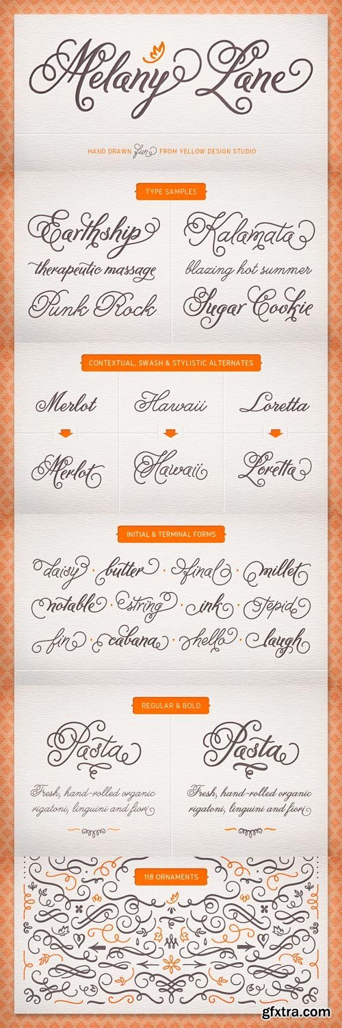
Melany Lane Font Family 5xOTF
OTF | 5 Fonts | JPEG Preview | 5 Mb RAR | SALE PAGE
- Melany Lane from Yellow Design Studio is a flourishy script based on traditional letterforms, but with the added quirks and warmth of hand-drawn type. The base character set has traditionally connected letters and an expressive charm. Contextual alternates add flair with unconnected letters and additional contour options. Mix in swash and stylistic alternates for extra funkiness and fun. Melany Lane features regular and bold versions, 118 eclectic ornaments (also in regular and bold), and a free set of 14 seamless background patterns. It includes over 1300 glyphs and 364 ligatures that create interesting letter combinations and fix overlapping letter pairs. Opentype features including contextual alternates, swash, stylistic sets, ligatures, initial and terminal forms and old-style figures. It performs best with opentype friendly applications.

Core Slab M Font Family Bundle 31xTTF
TTF | 31 Fonts | JPEG Preview | 7.5 MB RAR | SALE PAGE
- Core Slab M is the serif companion to Core Sans M (Text family of the month. May, 2013). This font family has open and square letter shapes, and overall rounded finishes and serifs provide a soft and friendly appearance but also it is strong in headline. Simple and modern shapes with a tall x-height make the text legible and the spaces between individual letter forms are precisely adjusted to create the perfect typesetting. Core Slab M Family consists of 2 widths (Condensed, Normal), 7 weights ExtraLight, Light, Regular, Medium, Bold, ExtraBold, Heavy), and Italics for each format. Combination fonts such as Core Slab M Ice, Berg and Iceberg are also available. Each font includes support for Superiors and Inferiors, Fractions, Tabular numbers, Arrows, Box drawings, Geometric shapes, Block elements, Mathematical operators, Miscellaneous symbols and Opentype Features such as Proportional Figures, Tabular Figures, Numerators, Denominators, Superscript, Scientific Inferiors, Subscript, Fractions and Standard Ligatures. We highly recommend it for use in books, web pages, screen displays, and so on.

Ollie - Casual Signage Script OTF
OTF | 1 Font | JPEG Preview | 7.1 Mb RAR | SALE PAGE
- Meet Ollie, a casual signage script whose friendly, bouncy exterior belies a heart of sophisticated OpenType programming. This font is designed to make the most of OpenType savvy applications, and as such is recommended for professional design use. Or to put it another way: Make sure that contextual alternates and ligatures are always turned on! Ollie includes about 900 glyphs, many of which are automagical substitutions to keep the text flowing smoothly, and to pseudo-randomly pick different glyphs to avoid repetition. With contextual alternates turned on (as they should be by default), most lowercase letters will alternate between at least two different forms. The powerful OpenType programming makes the font itself ‘look back’ (up to eight characters) on previously used letters; typing “banana” will give you three different a’s and two different n’s (the last a is a special ‘end form’ character). The calt feature controls many other ‘special effects’ which all add together to give a smooth-flowing, hand-lettered look. These effects include start and end forms (and indeed, ‘loner’ forms) of many letters, which are automatically substituted in at beginnings or ends of words, or when the previous or next letter doesn't connect. Another special feature tests to see if there is room for the crossbar of t (or tt ligature) to extend further over the previous or next letter, or both, as is often the case. The last main effect of the calt feature is to substitute certain letters typed before any ‘e’ character, to make for a more natural connection (see the pe combination in ‘Schizotype’ in the first poster). Ligatures should be on by default, for a much nicer looking tt combination, and a few others besides. The swash feature should be used sparingly (one glyph at a time, really) to apply a more extravagant look to g,j and y in the lower case, and quite a few of the upper case too.

RBNo2.1 Font Family 28xOTF
OTF | 28 Fonts | JPEG Preview | 5 Mb RAR | SALE PAGE
RBNo2.1 is a condensed sans serif typeface with a technical and geometric appearance.
The family includes 2 versions (RBNo2.1a and RBNo2.1b) and has 7 weights with
matching italics. RBNo2.1 feels comfortable in technical surroundings with
short text passages, in brochures, catalogs, magazines, posters, websites headlines and logos.

Reznik Font Family 18xOTF
OTF | 18 Fonts | JPEG Preview | 2.8 Mb RAR | SALE PAGE
- A compact sans serif with a technical origin. Each character was drafted out from a grid template and then refined through the application of subtle curved detailing. The result is a precise, contemporary typeface best suited to identity, mobile and video game development. Details include 9 weights with italics, 500 characters, 5 variations of numerals, stylistic alternatives, manually edited kerning and Opentype features.

Revisal Font Family 14xOTF
OTF | 14 Fonts | JPEG Preview | 5.8 Mb RAR | SALE PAGE
- Revisal is a humanist sans family. Open forms are very useful for signage. The Revisal family includes 7 weights, from Hairline to Black, with their corresponding italics. Each font includes OpenType Features such as Stylistic Alternates, Proportional Figure, Tabular Figures, Numerator, Superscript, Denominators, Scientific Inferiors, Subscript, Ordinals and Fractions.
 ,
,PF Baseline Pro Font Family 6xTTF
TTF | 6 Fonts | JPEG Preview | 4.2 Mb RAR | SALE PAGE
- An ultra modern typeface which combined with the proper text font can revive any dull-looking document. The wide simple forms combined with the selective application of a few distinct characteristics has resulted a stylish typeface which shines in the top 10 of our most wanted list. The powerful new “Pro” version comes complete with Greek and Cyrillic and includes a number of stylistic alternates as well as 2 groups of stylistic alternate sets, the last group being unicase characters.

Metroscript - A Vintage Sport Style 5xOTF
OTF | 5 Fonts | JPEG Preview | SAŞE PAGE
- Michael Doret had been doing lettering in styles similar to Metroscript in his design work for many years, but with the advent of OpenType technology he realized that he could actually put together a script font that would finally do justice to this style, and be almost indistinguishable from hand-lettering. There was no one single inspiration for Metroscript: rather it is an amalgam of many different scripts that were popular hand-lettered styles between the 1920s and the 1950s. Metroscript is suggestive of vintage sports ephemera—especially when tails are added to words—but is also appropriate in virtually any context. Its many ligatures, swashes, alternates, foreign accented characters and tails—all of which connect seamlessly—set it apart from most other script fonts. For a better understanding of its unique features please download The Metroscript User Manual from the Gallery section. All the above features are accessible from Metroscript’s OpenType font. Also included in the same package is a folder of five Metroscript fonts specifically designed for those who only have applications that are not OpenType compatible. By installing the fonts from this folder instead of the OpenType folder, anyone will be able to access all of Metroscript’s unique features.

OTF | 16 Fonts | JPEG Preview | 5.2 Mb RAR | SALE PAGE
- Stereotypes is a one-man foundry based in south-west Germany, run by Sascha Timplan. A long-time DJ, Sascha’s introduction to letterforms came in the form of documentary films on hip-hop culture and graffiti. “Ultimately, it was my love for music that brought me to graphic design,” he said in his 2014 Creative Characters interview. “I always had sketchbooks with me and my main interest apart from DJing was graffiti. I only drew on paper, never walls. I wasn’t able to draw people or cartoon characters, so what I was left with was lettering.” Since joining MyFonts in 2009, his foundry has produced a collection of diverse, original and very useable typefaces. “I feel that all of my fonts from the early years belong in the category of display faces,” he said. “Now, hopefully, the time has come to design more text fonts or type systems such as Christel, which I’m really proud of.” Sascha has also seen great success with St Ryde, a humanistic sans-serif face that was named one of MyFonts Top Fonts in the year of its release. The name of his foundry, Stereotypes, is a nod to his passion for both typography and music – it has nothing to do with cliched ideas. Of his ever-growing knowledge and skill in his art, he says, “As in most creative disciplines, a long period of self-study in type design is almost inevitable. If you want to persist, you have to work on yourself every day. It’s the school of hard knocks.”
126,000 Royalty-Free 3D Model

Udemy Türkçe


Top Rated News
- CreativeLive Tutorial Collections
- Fasttracktutorials Course
- Chaos Cosmos Library
- MRMockup - Mockup Bundle
- Finding North Photography
- Sean Archer
- John Gress Photography
- Motion Science
- AwTeaches
- Learn Squared
- PhotoWhoa
- Houdini-Course
- Photigy
- August Dering Photography
- StudioGuti
- Creatoom
- Creature Art Teacher
- Creator Foundry
- Patreon Collections
- Udemy - Turkce
- BigFilms
- Jerry Ghionis
- ACIDBITE
- BigMediumSmall
- Globe Plants
- Unleashed Education
- The School of Photography
- Visual Education
- LeartesStudios - Cosmos
- Fxphd
- All Veer Fancy Collection!
- All OJO Images
- All ZZVe Vectors
- CGTrader 1 CGTrader 2


